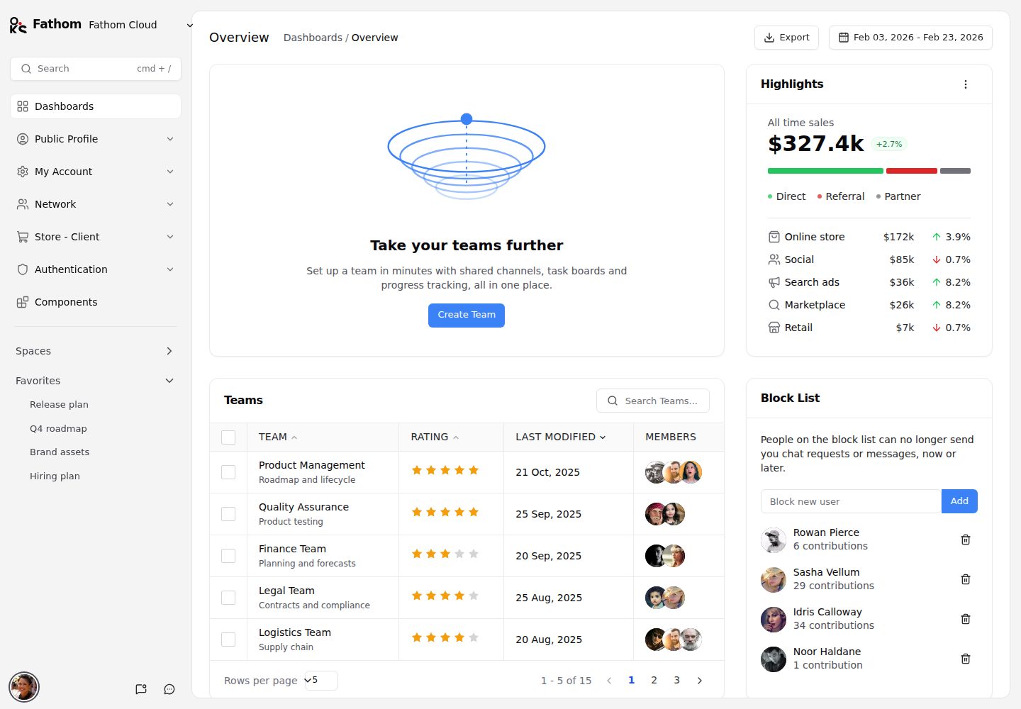
All interface components come from oks-ui; Tailwind CSS is used only for layout
Next.jsReactAdmin dashboardE-commerce
fathom — Next.js Admin dashboard Template
By OKS-PROJECTS
Fathom is a multi-page admin template built on Next.js and the oks-ui component library, covering dashboards, account and security, billing, team permissions, a network directory, an e-commerce storefront and authentication flows, with light and dark themes.
Explore the design
Compare the page layouts and mobile experience. Open any screenshot for a closer look.
Desktop homepage1 / 2
Desktop captureTop of page
Actual screenshot captured by the server browser.
All pages & views 2
Screenshots show visual appearance; interactive behavior may differ.
Recorded 2026-10-13View source
What stands out
A quick read of the recorded project description.
Covers a large number of pages including dashboards, account security, billing, team permissions, a network directory, an e-commerce storefront and authentication
Provides diverse list forms such as 9 public profile layouts, 5 user card layouts and 6 user table layouts
Includes a built-in cmd + / command palette for page search
Light and dark themes are switched via data-theme and remembered in local storage
Colors are driven by CSS variables with the --app- prefix; resetting the theme only requires changing tokens
Template Details
Fathom is an admin template built entirely with the oks-ui component library; all interface components come from oks-ui, and Tailwind CSS is used only for layout. The project is based on Next.js (App Router) and TypeScript, uses lucide-react for icons, date-fns for date handling, and clsx for class name composition. No other UI, chart or form libraries are included.
The template covers a broad set of pages: the dashboard includes overview, team, blocklist and charts; the public profile area provides 9 profile layouts, projects, portfolio, team, network, activity and activity promotion pages; the my account area includes getting started, user and company profiles, four settings layouts, billing (basic, enterprise, plans, history), security (overview, allowed IPs, privacy, devices, backup, sessions, logs), members and roles (team, team information, members, import, roles, two permission views), integrations, notifications, API keys, appearance, invite friends and activity; the network area provides getting started, five user card layouts and six user table layouts; the e-commerce client includes home, search results (grid and list), product details, wishlist, four-step checkout, my orders and order receipts; there are also a component gallery, classic and branded sign-in, sign-up, two-step verification, check your email, reset password, welcome message, account deactivation, 404 and 500 pages. It also provides a page search command palette (cmd + /), light and dark themes, and responsive layouts from mobile to wide desktop.
In terms of code organization, routes are under src/app, the (app) group holds pages with the shell, while authentication and error pages are separate; src/components is layered by shell, ui, dashboard, account, profile, network, store and auth; src/data holds the navigation tree and sample data; src/styles contains theme.css (tokens and oks-ui overrides) and shell.css (layout). The ui layer consists of a few building blocks: Surface wraps oks-ui's Card with the template's border-only look, PageHeader and Container unify the title bar and width, and DataGridCard is a sortable, selectable table card with a rows-per-page footer. The theme is switched via the data-theme attribute on the root element and remembered in local storage; colors come from CSS variables with the --app- prefix, layered on top of oks-ui's own tokens.
All names, companies, addresses and numbers are fictional; avatars come from a public placeholder service, and products and illustrations are generated in code. The template is released under the MIT license, but third-party assets such as demo images, fonts and icons must be checked against their respective licenses, and external services such as domains, hosting, databases and payments may incur separate charges.
Next.jsReactAdminE-commerce
Is it right for your project?
Use Cases
- Building an admin system that needs complete settings modules such as account, security, billing and team permissions
- Preparing storefront interfaces for an e-commerce project, including product lists, details, wishlist and four-step checkout
- Community or social products that need public user profiles, a network directory and multiple card/table layouts
- Using it as a reference example for the oks-ui component library to see how tables, charts, forms, drawers and modals are used
Suitable For
- Admin projects using Next.js App Router and TypeScript
- Teams that want to use oks-ui as a unified component library and handle layout only with Tailwind
- Products that need light and dark themes and responsive layouts covering mobile to wide desktop
- Developers who need a large set of ready-made page structures (account, team, billing, authentication, error pages) as a starting point
Getting started & customization
Use these recorded setup notes alongside the repository instructions for your chosen version.
- 1
Run npm install to install dependencies, then npm run dev to start the development server
- 2
The default access address is http://localhost:3000
- 3
Available scripts include npm run build to build a production version, npm run start to run the production build, and npm run lint to run ESLint
- 4
Sample data is fictional, avatars come from a public placeholder service, and they must be replaced before connecting real data
- 5
The code is under the MIT license, but third-party assets such as demo images, fonts and icons must be checked separately for licensing
License & source material
Usage conditions & limitations
Free to use · keep license noticeThis entry covers the free version in the public repository under the MIT license; the free scope is the code of this version and does not mean that external services or third-party assets are free.
Must comply with when using
- Free use, modification, commercial use and distribution of this version's code are permitted.
- When distributing copies or substantial portions of the code, retain the original author's copyright notice and the full MIT license notice.
- The code is provided as is; warranties and limitations of liability are governed by the original license and applicable law.
Additional costs & items to verify
- Demo images, fonts, icons and other third-party assets must be checked against their respective licenses and cannot be judged solely by the code's MIT license.
- External services such as domains, hosting, databases, payments or AI may incur separate charges.
- The template's interface components depend entirely on the oks-ui component library; before use, oks-ui must be installed via npm and included as a runtime dependency.
- All UI components such as tables, charts, forms, drawers and modals come from oks-ui, and the template interface cannot be used independently of that library.
- Tailwind CSS is used only for layout; style customization must follow this positioning and cannot replace oks-ui as a complete UI component solution.
- Avatars depend on a public placeholder service for loading; before connecting to a production environment, they must be replaced with your own assets, otherwise availability may be affected by that external service.
- Names, companies, addresses and numbers in the sample data are fictional and cannot be used directly as real business data.
View Original Text Basis
Permission is hereby granted, free of charge
Original License Text
An admin template built entirely with [oks-ui](https://www.npmjs.com/package/oks-ui).
Original README
oks-ui for every UI component, including tables, charts, forms, drawers and modals
Original README
Tailwind CSS v4 for layout only
Original README
Avatars load from a public placeholder service; product and illustration art is generated in code.
Original README
https://github.com/OKS-PROJECTS/fathom/blob/main/LICENSEhttps://github.com/OKS-PROJECTS/fathom/blob/main/README.mdAll names, companies, addresses and figures are invented.
Original README
Compiled by DeepSeek based on repository license and README ·2026-10-13. Results only cover the materials read; dependencies, images, fonts, and subsequent term changes are subject to their respective original texts.
Project checks & description sources
Template Information
- Source platforms
- GitHub
- Documentation and maintenance reference score
- More documented · 85 / 100
- Technologies
- Next.js · React
- Website type
- Admin dashboard · E-commerce
How this score is calculated
Our heuristic uses license records (up to 30), a demo link (12), a preview (10), stars (15), recorded maintenance (15), description completeness (8), feature records (5) and classification data (5). It is not a code, security or performance test, or a Google score. A link does not establish tested functionality.
What to verify for this project
- Repository update recorded
- 2026-10-13
- Screenshot last checked
- 2026-10-13
A demo link is listed. Check it with your own content and viewport sizes; its presence does not confirm that forms, authentication or payments work.
The catalog identifies Next.js as the primary stack. Check the actual dependency manifest and lockfile for versions and hosting requirements. These notes use recorded metadata, not a code audit or a deployment test.
Use a selection guide →How this description was prepared
AI-assisted description based on catalog records and repository material. Repository authors are not automatically the reviewers of this description.
Review declaration: [email protected] · 2026-10-13
Inspect the recorded source material
SHA-256: 7b95d1c2adba45d1fabf8952ea322dc717e2dd207ed31d23ff5701b54c11aa9a
2026-10-13T05:13:27.800Z
Source file / repository# Fathom
An admin template built entirely with [oks-ui](https://www.npmjs.com/package/oks-ui).
Fathom is a complete multi-page admin: a dashboard, public profiles, account and
security settings, billing, team and role management, a network directory, a
storefront with checkout, and the authentication flows. All of the interface is
oks-ui components; Tailwind CSS is used only for layout.
**[Live demo](https://oks-projects.github.io/fathom/)** · **[Repository](https://github.com/OKS-PROJECTS/fathom)**

## Screenshots
| | |
| --- | --- |
|  |  |
|  |  |
|  |  |
|  | |
## What is included
| Area | Pages |
| --- | --- |
| Dashboard | Overview with highlights, teams, block list and charts |
| Public Profile | 9 profile layouts, projects (2 and 3 columns), works, teams, network, activity, campaigns (card, list), empty state |
| My Account | Get started, user and company profile, four settings layouts, billing (basic, enterprise, plans, history), security (overview, allowed IPs, privacy, devices, backup, sessions, log), members and roles (teams, team info, members, import, roles, two permission views), integrations, notifications, API keys, appearance, invite a friend, activity |
| Network | Get started, five user-card layouts, six user tables |
| Store - Client | Home, search results (grid, list), product details, wishlist, four-step checkout, my orders, order receipt |
| Components | A gallery of the oks-ui components used across the template, at `/components` |
| Authentication | Classic and Branded sign in, sign up, two-factor, check email, reset password; welcome message; account deactivated; 404 and 500 |
Also included: a command palette for page search (`cmd + /`), light and dark
themes, and responsive layouts from phone to wide desktop.
## Stack
- Next.js (App Router) and TypeScript
- oks-ui for every UI component, including tables, charts, forms, drawers and modals
- Tailwind CSS v4 for layout only
- lucide-react for icons, date-fns for dates, clsx for class names
No other UI, chart or form library is used.
## Getting started
```bash
npm install
npm run dev
```
Open <http://localhost:3000>.
| Script | What it does |
| --- | --- |
| `npm run dev` | Start the development server |
| `npm run build` | Create a production build |
| `npm run start` | Serve the production build |
| `npm run lint` | Run ESLint |
## Project layout
```
src/
app/ Routes. (app) holds pages inside the shell; auth and error pages are standalone
components/
shell/ Sidebar, header panels, search, user menu
ui/ Shared building blocks: Surface (card), PageHeader, DataGridCard, ...
dashboard/ account/ profile/ network/ store/ auth/ Page-level components
data/ Navigation tree and sample data (all fictional)
styles/ theme.css (tokens and oks-ui overrides) and shell.css (layout)
lib/ Theme switching and avatar helper
```
## How the `ui/` layer works
Pages are assembled from a small set of building blocks in `src/components/ui`.
`Surface` wraps the oks-ui `Card` with the template's border-only look.
`PageHeader` and `Container` give every page the same title bar and width.
`DataGridCard` is a sortable, selectable table card with a rows-per-page footer.
Everything visual is driven by tokens in `src/styles/theme.css`, so retheming
means editing those tokens, not the components.
## Theming
Light and dark are switched with a `data-theme` attribute on the root element and
remembered in local storage. Colours come from CSS variables prefixed `--app-`
(surfaces, borders, text) on top of oks-ui's own tokens, which already invert
for dark mode.
## Sample data
All names, companies, addresses and figures are invented. Avatars load from a
public placeholder service; product and illustration art is generated in code.
## Changelog
See [CHANGELOG.md](CHANGELOG.md).
## License
MIT
Explore similar templates
Compare previews and descriptions within the same stack and category.
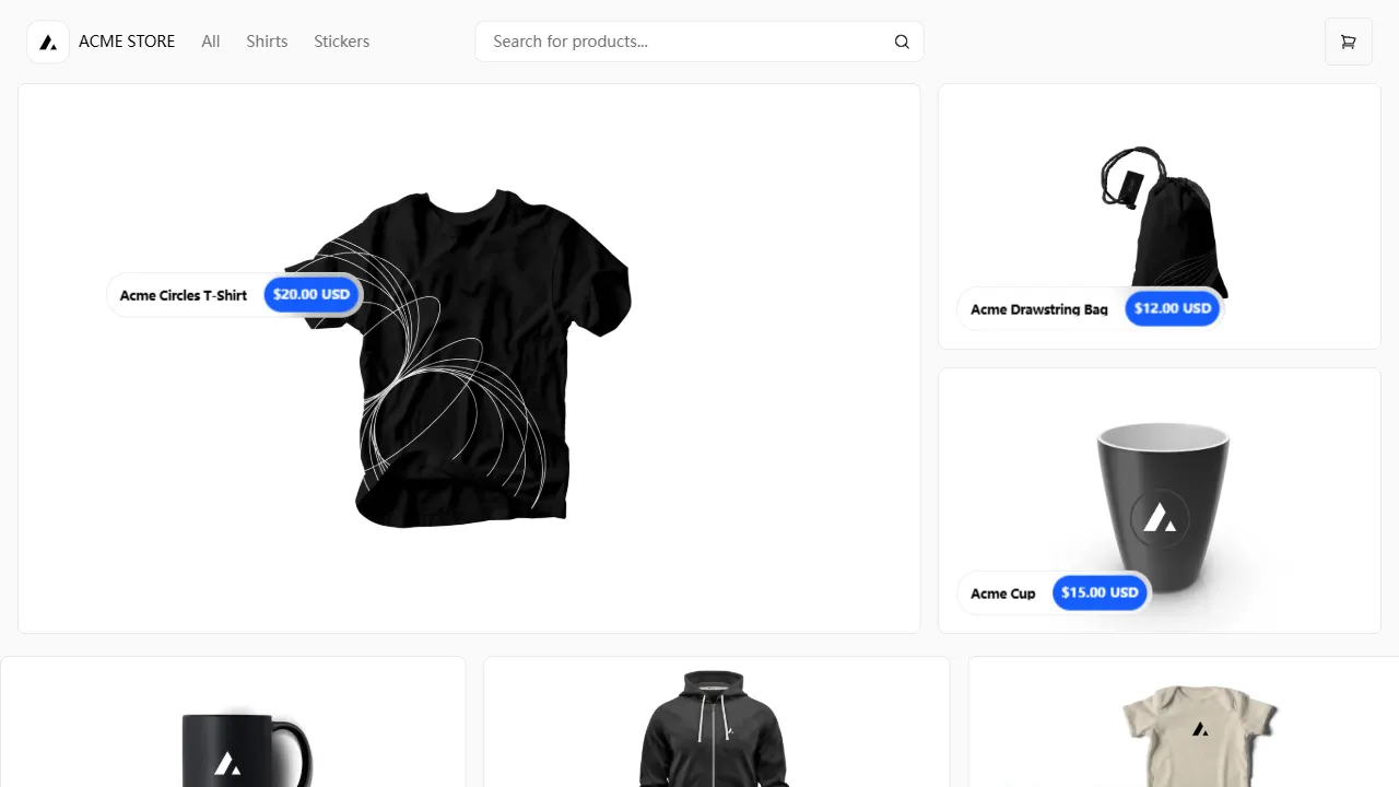
Next.js Commerce
Vercel's officially maintained Next.js App Router ecommerce starter with deep Shopify integration, offering a complete product catalog, cart, and checkout flow. Core logic is modular for swapping backends, and community provider versions exist for BigCommerce, Medusa, and Saleor.
Next.js · E-commerce
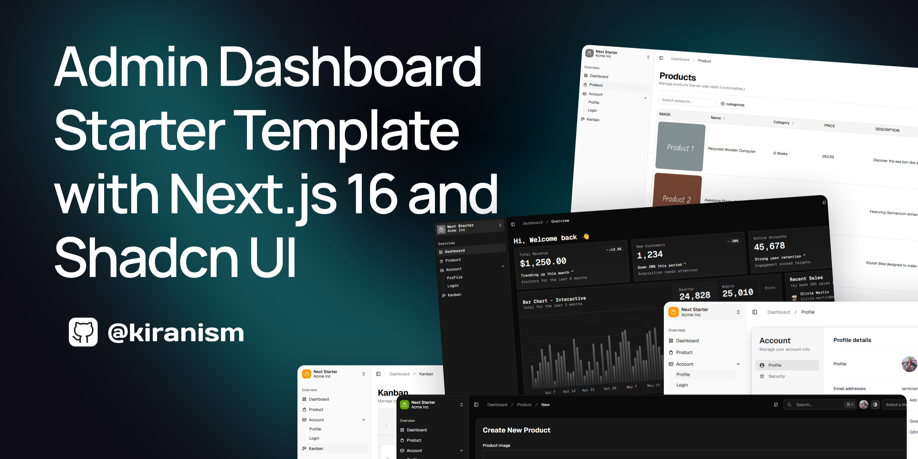
next-shadcn-dashboard-starter
An MIT-licensed admin dashboard starter built with Next.js 16, shadcn/ui, Tailwind CSS v4, and TypeScript.
Next.js · Admin dashboard
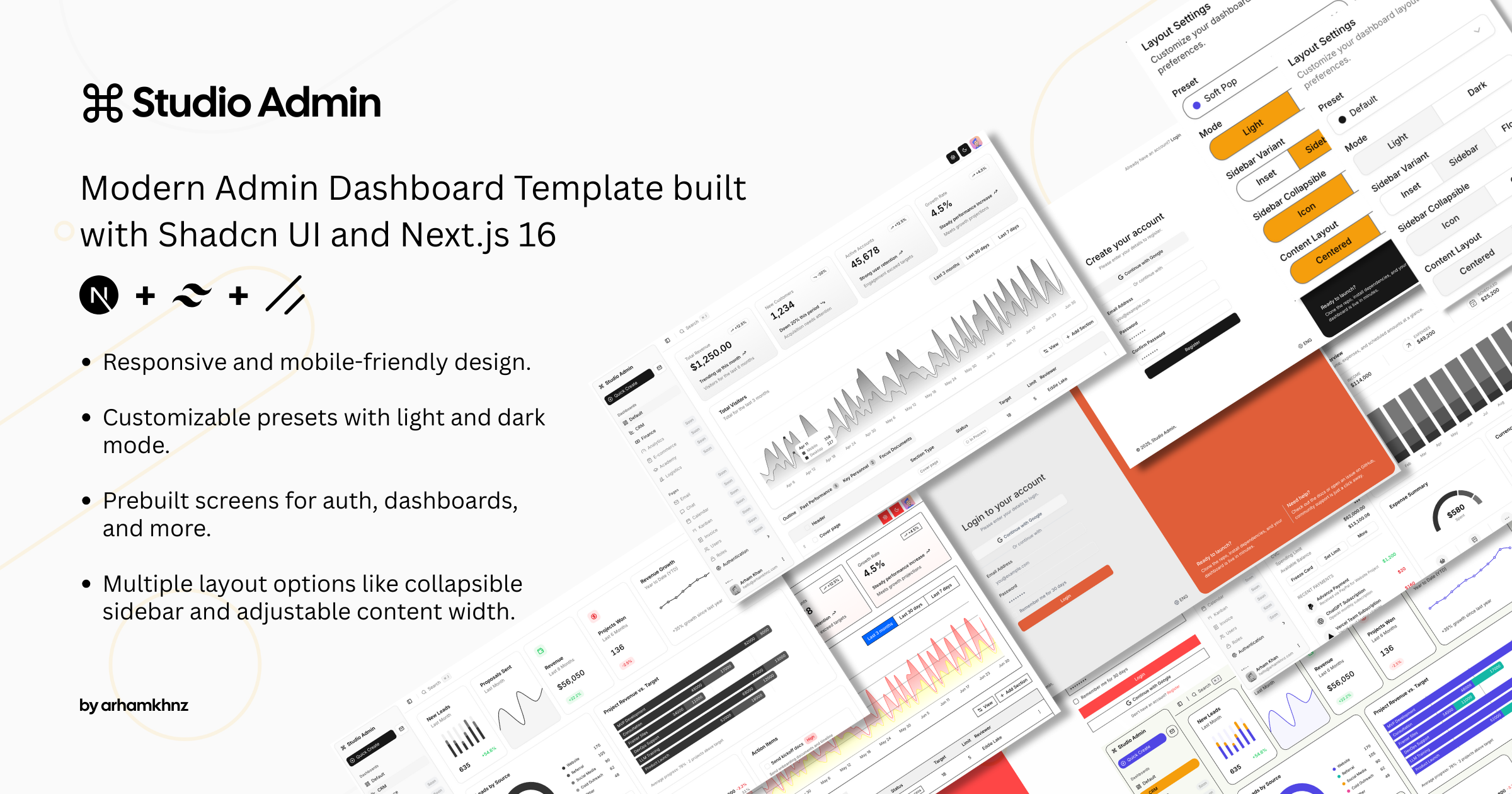
Studio Admin · Radix UI
Studio Admin is an admin dashboard template built with Next.js 16, TypeScript, Tailwind CSS v4, and Shadcn UI.
Next.js · Admin dashboard
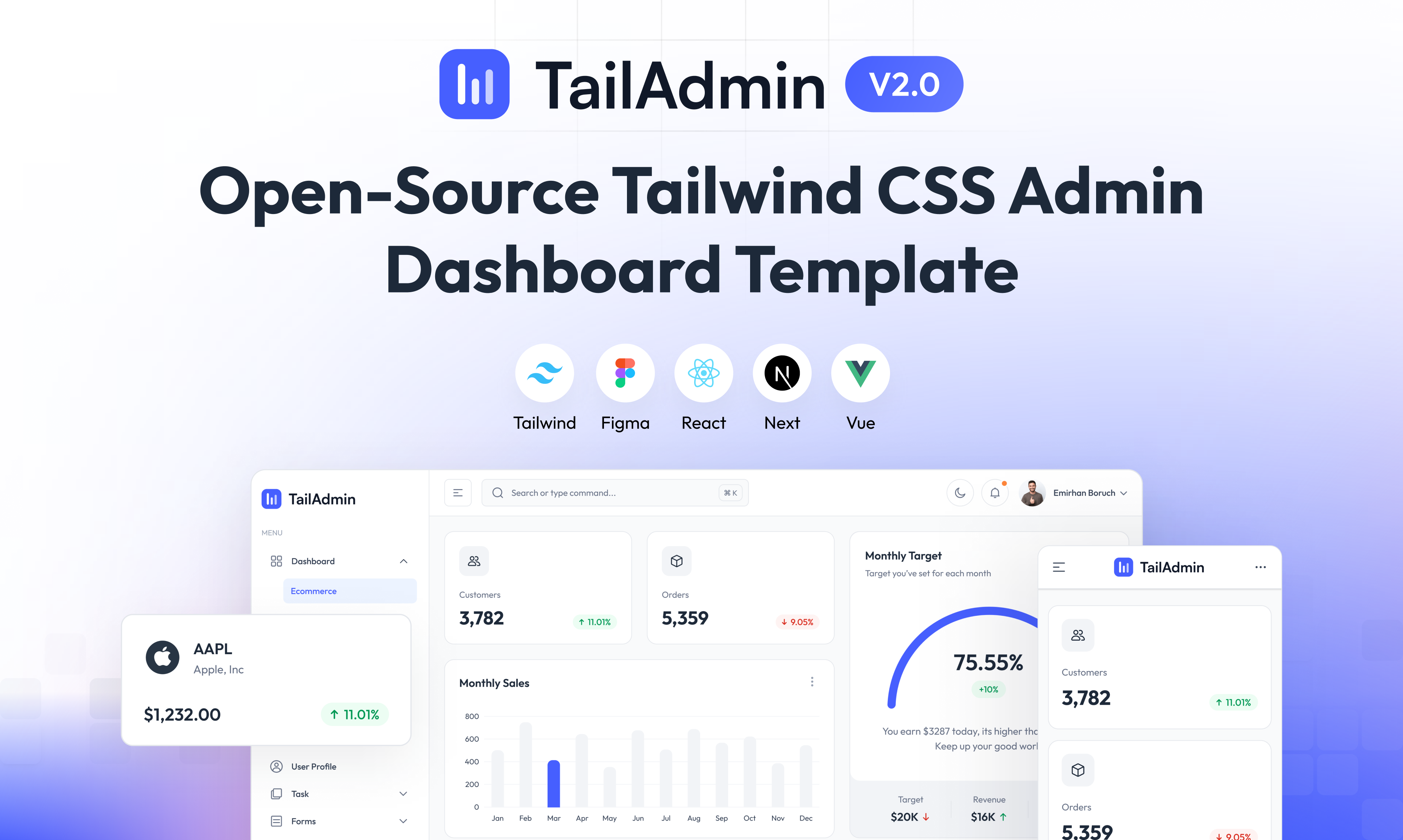
free-nextjs-admin-dashboard
A free, open-source admin dashboard template built on Next.js 16, React 19, TypeScript, and Tailwind CSS v4. It provides a collapsible sidebar, charts, tables, authentication forms, modals, dropdowns, and dark mode, with internationalization and RTL support since version 2.4.0.
Next.js · Admin dashboard
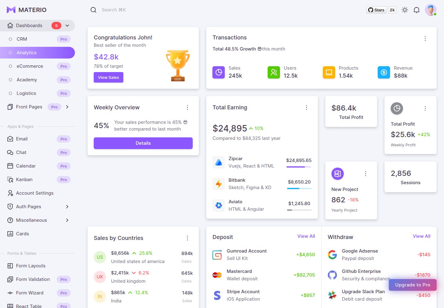
materio-mui-nextjs-admin-template-free
Materio Free is a Next.js admin dashboard template based on App Router and MUI, integrating Tailwind CSS and available in TypeScript and JavaScript versions.
Next.js · Admin dashboard
nextjs-postgres-nextauth-tailwindcss-template
A Vercel-maintained Next.js App Router admin dashboard starter with Auth.js GitHub OAuth, Postgres, Tailwind CSS, and Shadcn UI, plus a sample products table, seed endpoint, and CRUD interface.
Next.js · Admin dashboard