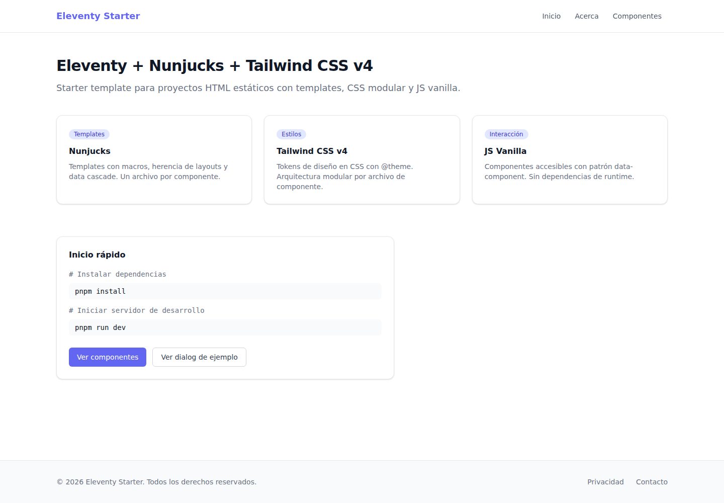
Eleventy with Nunjucks template engine, outputting static HTML
EleventyStarter
eleventy-starter — Eleventy Starter Template
By Osvalam86
A static site starter based on Eleventy and Tailwind CSS v4, using Nunjucks templates, layered CSS tokens, and native JS components, with development and build scripts included.
Explore the design
Compare the page layouts and mobile experience. Open any screenshot for a closer look.
Desktop homepage1 / 3
Desktop captureTop of page
Actual screenshot captured by the server browser.
All pages & views 3
Screenshots show visual appearance; interactive behavior may differ.
Recorded 2026-10-02View source
What stands out
A quick read of the recorded project description.
Tailwind CSS v4 with two layers of CSS tokens: primitive and theme
Built-in Button, Card, and Dialog Nunjucks macro components
Native JS interactive components: dialog, dropdown, menu, tabs
Provides dev, build, clean, and Prettier formatting scripts
Template Details
This is an Eleventy starter for static HTML projects, using Nunjucks as the template engine, Tailwind CSS v4 for styling, and native JavaScript for interactive components. The repository provides development and build scripts: dev runs Eleventy and Tailwind CLI in parallel with hot reload, build processes CSS first then generates HTML to dist/, and there are also clean and Prettier formatting commands. The project uses pnpm as its package manager.
The styling architecture is split into two layers: primitive.css defines raw color and scale values in :root, and theme.css defines semantic tokens in @theme, from which Tailwind generates corresponding utility classes. Component styles are written directly in .njk macros, returning Tailwind class names via a Nunjucks mapping table, without using @apply or separate component CSS files.
Pages are organized with one subdirectory per page, containing index.njk and a same-named index.11tydata.json, the latter controlling layout, permalink, title, and content variables through Eleventy data cascading. Built-in macros include Button, Card, and Dialog; Dialog uses {% call %} to pass in body content, and triggering and closing are handled via data-component attributes paired with native JS components (dialog, dropdown, menu, tabs). The repository does not provide a dependency manifest check, so specific version numbers are not listed.
Usage limitations: the template is a static site generator and does not include server-side logic; third-party assets such as demo images, fonts, and icons must be checked separately under their respective licenses; external services like domains and hosting may incur costs.
EleventyStarter
Is it right for your project?
Use Cases
- Building multi-page sites primarily outputting static HTML
- Projects needing unified management of colors and typographic scales via CSS tokens
- Page development where buttons, cards, and dialogs are reused via Nunjucks macros
- Using pnpm and planning to deploy to static hosting platforms like Netlify or Vercel
Suitable For
- Front-end developers familiar with Nunjucks and Tailwind CSS
- Projects needing a lightweight static site skeleton rather than a full CMS
- Teams comfortable writing Tailwind class names directly in template files
Getting started & customization
Use these recorded setup notes alongside the repository instructions for your chosen version.
- 1
After cloning the repository, run pnpm install to install dependencies
- 2
Run pnpm run dev to start the development server, default address localhost:8080
- 3
Run pnpm run build to generate static files into the dist/ directory
- 4
When adjusting brand colors and fonts, modify the raw values in primitive.css and update the semantic references in theme.css accordingly
License & source material
Usage conditions & limitations
Free to use · keep license noticeThis entry covers the free version under the MIT license from the public repository; the free scope applies to that version's code and does not imply that external services or third-party assets are free.
Must comply with when using
- Free use, modification, commercial use, and distribution of that version's code are permitted.
- When distributing copies or substantial portions of the code, retain the original author's copyright notice and the full MIT license notice.
- The code is provided as is; warranties and limitations of liability are governed by the original license and applicable law.
Additional costs & items to verify
- Note that the development team should use the compiled files in dist/, while authors work in src/; this is a workflow convention, not a license restriction.
- If using Google Fonts, you need to add the link yourself in the head of base.njk; this is an external service integration note.
- Deploying to hosting platforms like Netlify or Vercel may incur external service costs and should be evaluated independently.
- Demo images, fonts, icons, and other third-party assets must be checked under their respective licenses and cannot be judged solely by the code's MIT license.
- External services such as domains, hosting, databases, payments, or AI may incur additional charges.
View Original Text Basis
Permission is hereby granted, free of charge
Original License Text
El equipo de desarrollo consume los archivos compilados en `dist/`. El autor trabaja en `src/`.
Original README
Si usas Google Fonts, añadir el `<link>` en `src/_includes/layouts/base.njk` dentro del `<head>`.
Original README
https://github.com/Osvalam86/eleventy-starter/blob/main/LICENSEhttps://github.com/Osvalam86/eleventy-starter/blob/main/README.mdPlataformas compatibles: **Netlify**, **Vercel**, **GitHub Pages**, **Cloudflare Pages** y cualquier servidor estático (Apache, nginx).
Original README
Compiled by DeepSeek based on repository license and README ·2026-10-02. Results only cover the materials read; dependencies, images, fonts, and subsequent term changes are subject to their respective original texts.
Project checks & description sources
Template Information
- Source platforms
- GitHub
- Documentation and maintenance reference score
- More documented · 83 / 100
- Technologies
- Eleventy
- Website type
- Starter
How this score is calculated
Our heuristic uses license records (up to 30), a demo link (12), a preview (10), stars (15), recorded maintenance (15), description completeness (8), feature records (5) and classification data (5). It is not a code, security or performance test, or a Google score. A link does not establish tested functionality.
What to verify for this project
- Repository update recorded
- 2026-04-28
- Screenshot last checked
- 2026-10-02
A demo link is listed. Check it with your own content and viewport sizes; its presence does not confirm that forms, authentication or payments work.
The catalog identifies Eleventy as the primary stack. Check the actual dependency manifest and lockfile for versions and hosting requirements. These notes use recorded metadata, not a code audit or a deployment test.
Use a selection guide →How this description was prepared
AI-assisted description based on catalog records and repository material. Repository authors are not automatically the reviewers of this description.
Automatically checked against source and license rules; no manual editorial review.
Inspect the recorded source material
SHA-256: bb892adad206e8118468e6effcb05ed2ad45b90c46d884d5d727327f80a945a0
2026-10-02T11:12:53.697Z
Source file / repository# Eleventy Starter
Starter template con Eleventy + Tailwind CSS v4 listo para proyectos rápidos.
## 🚀 Demo
https://eleventy-starter-osva.netlify.app/
## Preview

## ✨ Features
- Eleventy v3 + Nunjucks
- Tailwind CSS v4 utility-first
- Sistema de tokens CSS (primitivos + semánticos)
- Componentes accesibles (JS vanilla)
- Ready para deploy (Netlify, Vercel, etc.)





Starter template para proyectos HTML estáticos. Nunjucks como motor de templates, Tailwind CSS v4 con arquitectura modular de tokens y JS vanilla para componentes accesibles.
El equipo de desarrollo consume los archivos compilados en `dist/`. El autor trabaja en `src/`.
---
## Inicio rápido
Clona el template y empieza a trabajar en segundos:
```bash
# Clonar el repositorio
git clone https://github.com/Osvalam86/eleventy-starter.git mi-proyecto
cd mi-proyecto
# Instalar dependencias
pnpm install
# Iniciar servidor de desarrollo
pnpm run dev
```
Abrir [http://localhost:8080](http://localhost:8080).
---
## Scripts
| Comando | Descripción |
| ------------------- | --------------------------------------------------------- |
| `pnpm run dev` | Servidor de desarrollo con hot-reload en `localhost:8080` |
| `pnpm run build` | Genera el sitio estático en `dist/` (CSS minificado) |
| `pnpm run clean` | Elimina la carpeta `dist/` |
| `pnpm format` | Formatea todos los archivos `src/` con Prettier |
| `pnpm format:check` | Verifica formato sin modificar archivos (útil en CI) |
El script `dev` corre Eleventy y Tailwind CLI en paralelo. El script `build` los ejecuta en secuencia: CSS primero, luego HTML.
---
## Estructura de carpetas
```
eleventy-starter/
├── .eleventy.js # Configuración de Eleventy
├── .eleventyignore # Archivos que Eleventy debe ignorar
├── .prettierignore
├── prettier.config.js # Prettier + prettier-plugin-tailwindcss
├── .vscode/
│ └── settings.json # formatOnSave automático con Prettier
├── package.json
│
├── src/
│ ├── _data/
│ │ ├── site.json # Metadata global (nombre, url, idioma, copyright)
│ │ └── nav.json # Items de navegación
│ │
│ ├── _includes/
│ │ ├── layouts/
│ │ │ ├── base.njk # Shell HTML completo (head, body, scripts)
│ │ │ └── page.njk # Layout estándar (extiende base.njk)
│ │ ├── partials/
│ │ │ ├── header.njk # Barra de navegación
│ │ │ └── footer.njk # Pie de página
│ │ └── components/
│ │ ├── button.njk # Macro: Button(props)
│ │ ├── card.njk # Macro: Card(props)
│ │ └── dialog.njk # Macro: Dialog(props) con {% call %}
│ │
│ ├── assets/
│ │ ├── css/
│ │ │ ├── input.css # Entry point de Tailwind CSS
│ │ │ ├── primitive.css # Tokens crudos en :root
│ │ │ ├── theme.css # Tokens semánticos en @theme
│ │ │ ├── base.css # Estilos base del body y tipografía (CSS puro)
│ │ │ └── utilities/
│ │ │ ├── focus.css
│ │ │ └── scrollbar.css
│ │ ├── images/ # Imágenes (copiadas tal cual a dist/)
│ │ └── fonts/ # Fuentes (copiadas tal cual a dist/)
│ │
│ ├── js/
│ │ ├── main.js # Entry point — importa e inicializa componentes
│ │ └── components/
│ │ ├── dialog.js
│ │ ├── dropdown.js
│ │ ├── menu.js
│ │ └── tabs.js
│ │
│ └── pages/
│ ├── index.njk → dist/index.html
│ ├── index.11tydata.json # Data de la home (layout, título, contenido)
│ ├── about/
│ │ ├── index.njk → dist/about/index.html
│ │ └── index.11tydata.json
│ └── components/
│ ├── index.njk → dist/components/index.html
│ └── index.11tydata.json
│
└── dist/ # BUILD OUTPUT — no incluido en git
├── index.html
├── css/styles.css
└── js/main.js
```
---
## Arquitectura CSS
El sistema de tokens usa dos capas separadas para evitar acoplamiento entre valores crudos y su uso semántico.
### Capa 1 — `primitive.css`
Define los valores crudos en `:root`. No genera utilidades de Tailwind. Sirve como fuente única de verdad para colores, escalas y valores base del proyecto.
```css
/* src/assets/css/primitive.css */
:root {
--color-primary-50: #eef2ff;
--color-primary-100: #e0e7ff;
}
```
### Capa 2 — `theme.css`
Define los tokens semánticos dentro de `@theme`. Tailwind v4 lee este bloque y genera automáticamente todas las utilidades: `text-brand-500`, `bg-brand-100`, `border-brand-700`, etc.
```css
/* src/assets/css/theme.css */
@theme {
/* Colores de marca */
--color-brand-50: var(--color-primary-50);
--color-brand-100: var(--color-primary-100);
--color-brand-900: var(--color-primary-900);
/* Tipografía */
--font-sans: "Inter", ui-sans-serif, system-ui, sans-serif;
--font-mono: "JetBrains Mono", ui-monospace, monospace;
}
```
**Para adaptar el starter a un nuevo proyecto:** modifica los valores en `primitive.css` y actualiza las referencias en `theme.css`. El resto del código no cambia.
### Estilos en componentes
Los estilos viven directamente en cada macro `.njk`, sin archivos CSS separados ni `@apply`. Las variantes se resuelven con mapas Nunjucks que devuelven las clases Tailwind correspondientes:
```njk
{# button.njk #}
{%- set sizeMap = {
"sm": "px-3 py-1.5 text-xs",
"md": "px-4 py-2 text-sm",
"lg": "px-6 py-3 text-base"
} -%}
{%- set variantMap = {
"primary": "bg-brand-500 text-white hover:bg-brand-600",
"secondary": "border border-gray-300 bg-white text-gray-700 hover:bg-gray-50",
"ghost": "text-gray-600 hover:bg-gray-100 hover:text-gray-900"
} -%}
```
Para los elementos que no usan macro (badges inline, campos de formulario), las clases se escriben directamente en el HTML del template que los consume.
---
## Crear páginas
Cada página vive en su propia subcarpeta dentro de `src/pages/` y se compone de dos archivos:
- `index.njk` — el template HTML/Nunjucks, sin front matter
- `index.11tydata.json` — el data file con metadata y contenido de la página
```
src/pages/
└── mi-pagina/
├── index.njk
└── index.11tydata.json → aplica solo a index.njk de esta carpeta
```
**`index.11tydata.json`** — controla el layout, la ruta y el contenido:
```json
{
"layout": "page.njk",
"permalink": "/mi-pagina/index.html",
"title": "Mi página",
"pageTitle": "Título visible en el H1",
"pageSubtitle": "Subtítulo opcional debajo del H1.",
"sections": [{ "heading": "Sección uno", "body": "Texto de la sección." }]
}
```
**`index.njk`** — solo markup, consume las variables del data file:
```njk
<div class="space-y-10">
{% for section in sections %}
<section>
<h2 class="text-base font-semibold text-gray-900">{{ section.heading }}</h2>
<p class="text-sm text-gray-500">{{ section.body }}</p>
</section>
{% endfor %}
</div>
```
> Este patrón usa el [Data Cascade de Eleventy](https://www.11ty.dev/docs/data-cascade/): el `.11tydata.json` aplica únicamente al template con el mismo nombre, sin contaminar el namespace global de `_data/`.
---
## Macros de componentes
Importa el macro al inicio de la página y llámalo con un objeto de props.
### Button
Genera `<button>` o `<a>` según si se pasa `href`.
```njk
{% from "components/button.njk" import Button %}
{# Botón estándar #}
{{ Button({ label: "Guardar", variant: "primary" }) }}
{# Enlace con tamaño grande #}
{{ Button({ label: "Ver más", variant: "secondary", size: "lg", href: "/about/" }) }}
{# Con atributos HTML adicionales #}
{{ Button({ label: "Abrir", variant: "ghost", attrs: 'data-component="dialog-trigger" data-target="mi-dialog"' }) }}
```
| Prop | Tipo | Default | Opciones |
| ---------- | ------- | ----------- | ----------------------------------------- |
| `label` | string | — | Texto del botón (requerido) |
| `variant` | string | `"primary"` | `"primary"` \| `"secondary"` \| `"ghost"` |
| `size` | string | `"md"` | `"sm"` \| `"md"` \| `"lg"` |
| `href` | string | — | Convierte el elemento en `<a>` |
| `type` | string | `"button"` | `"button"` \| `"submit"` \| `"reset"` |
| `disabled` | boolean | — | Deshabilita el elemento |
| `attrs` | string | — | Atributos HTML adicionales como string |
### Card
Tarjeta de contenido con badge opcional y variante de enlace.
```njk
{% from "components/card.njk" import Card %}
{# Tarjeta estática #}
{{ Card({ title: "Título", description: "Descripción de la tarjeta." }) }}
{# Con badge #}
{{ Card({ title: "Artículo", description: "Texto.", badge: "Nuevo" }) }}
{# Toda la tarjeta como enlace #}
{{ Card({ title: "Ver más", description: "Texto.", href: "/articulo/", badge: "Link" }) }}
{# Sin efecto hover #}
{{ Card({ title: "Estático", description: "Sin hover.", hover: false }) }}
```
| Prop | Tipo | Default | Descripción |
| ------------- | ------- | ------- | ------------------------------------------- |
| `title` | string | — | Título de la tarjeta (requerido) |
| `description` | string | — | Texto descriptivo |
| `badge` | string | — | Badge encima del título |
| `href` | string | — | Convierte la tarjeta en enlace |
| `hover` | boolean | `true` | Agrega `hover:shadow-md` al pasar el cursor |
| `class` | string | — | Clases CSS adicionales |
### Dialog
Usa `{% call %}` para pasar el contenido del cuerpo al macro.
```njk
{% from "components/button.njk" import Button %}
{% from "components/dialog.njk" import Dialog %}
{# Trigger — puede estar en cualquier parte de la página #}
{{ Button({
label: "Abrir",
variant: "secondary",
attrs: 'data-component="dialog-trigger" data-target="mi-dialog"'
}) }}
{# Panel del dialog #}
{% call Dialog({ id: "mi-dialog", title: "Confirmar acción", size: "sm" }) %}
<p class="text-sm text-gray-600 mb-6">Esta acción no se puede deshacer.</p>
<div class="flex justify-end gap-3">
{{ Button({ label: "Cancelar", variant: "ghost", attrs: 'data-component="dialog-close"' }) }}
{{ Button({ label: "Confirmar", variant: "primary" }) }}
</div>
{% endcall %}
```
| Prop | Tipo | Default | Descripción |
| ------------- | ------ | ------- | ----------------------------------------------------------------------------- |
| `id` | string | — | ID único del dialog (requerido, debe coincidir con `data-target` del trigger) |
| `title` | string | — | Título en el header |
| `description` | string | — | Subtítulo opcional en el header |
| `size` | string | `"md"` | `"sm"` \| `"md"` \| `"lg"` \| `"xl"` |
| `class` | string | — | Clases adicionales al panel |
El dialog gestiona foco, `aria-modal`, cierre con `Escape` y click en backdrop de forma automática vía `dialog.js`.
---
## Agregar componentes JS
Cada componente exporta una función `init(root)`. El atributo `data-component` conecta el comportamiento con el HTML sin acoplarse a clases CSS.
**1. Crear el módulo en `src/js/components/`:**
```javascript
// src/js/components/tooltip.js
export function initTooltips(root) {
root.querySelectorAll('[data-component="tooltip"]').forEach((el) => {
// lógica del componente
});
}
```
**2. Importar e inicializar en `src/js/main.js`:**
```javascript
import { initTooltips } from "./components/tooltip.js";
document.addEventListener("DOMContentLoaded", () => {
initTooltips(document);
});
```
**3. Usar en el template con `data-component`:**
```html
<span data-component="tooltip" data-tip="Texto del tooltip"> Hover aquí </span>
```
---
## Adaptar para un nuevo proyecto
Al usar este starter como base, sigue este checklist antes de empezar a maquetar.
### 1. Renombrar el repositorio y el paquete
Si clonas el repo manualmente (sin usar "Use this template" en GitHub):
```bash
# Clonar con el nombre del nuevo proyecto
git clone https://github.com/Osvalam86/eleventy-starter.git mi-nuevo-proyecto
cd mi-nuevo-proyecto
# Desconectar del repositorio de origen y apuntar al nuevo remote
git remote remove origin
git remote add origin https://github.com/TU_USUARIO/mi-nuevo-proyecto.git
```
Actualizar el nombre del paquete en `package.json`:
```json
{
"name": "mi-nuevo-proyecto"
}
```
### 2. Actualizar los datos del sitio
Editar `src/_data/site.json` con los datos reales del proyecto:
```json
{
"name": "Nombre del Proyecto",
"description": "Descripción del proyecto.",
"url": "https://mi-proyecto.com",
"lang": "es",
"copyright": "Todos los derechos reservados."
}
```
Editar `src/_data/nav.json` con la navegación real. Elimina o agrega items según la estructura de páginas del proyecto:
```json
{
"primary": [
{ "label": "Inicio", "url": "/" },
{ "label": "Servicios", "url": "/servicios/" }
],
"footer": [{ "label": "Privacidad", "url": "/privacidad/" }]
}
```
### 3. Reemplazar la paleta de colores
Abrir `src/assets/css/primitive.css` y sustituir los valores hex de `--color-primary-*` con la paleta del proyecto. Figma exporta colores en hex directamente — pégalos aquí:
```css
:root {
--color-primary-50: #fdf4ff; /* ← reemplazar con la paleta del proyecto */
--color-primary-100: #fae8ff;
--color-primary-200: #f5d0fe;
--color-primary-300: #f0abfc;
--color-primary-400: #e879f9;
--color-primary-500: #d946ef; /* ← color principal */
--color-primary-600: #c026d3;
--color-primary-700: #a21caf;
--color-primary-800: #86198f;
--color-primary-900: #701a75;
}
```
`theme.css` no necesita cambios — las referencias `var(--color-primary-*)` apuntan automáticamente a los nuevos valores. Las utilidades de Tailwind (`text-brand-500`, `bg-brand-100`, etc.) se regeneran solas.
### 4. Actualizar las fuentes
En `src/assets/css/theme.css`, cambiar las fuentes del proyecto:
```css
@theme {
--font-sans: "Tu Fuente", ui-sans-serif, system-ui, sans-serif;
--font-mono: ui-monospace, monospace;
}
```
Si usas Google Fonts, añadir el `<link>` en `src/_includes/layouts/base.njk` dentro del `<head>`.
### 5. Limpiar las páginas de demo
Eliminar o vaciar el contenido de las páginas de ejemplo. Cada página se compone de su `index.njk` y su `index.11tydata.json`:
- `src/pages/index.*` — reemplazar con la home real
- `src/pages/about/` — adaptar o eliminar la carpeta completa
- `src/pages/components/` — mantener como referencia interna o eliminar si no es necesario
### Lo que NO hay que cambiar
- La estructura de carpetas `src/` — Eleventy y Tailwind dependen de ella
- Los archivos en `src/_includes/` — los macros y layouts son reutilizables tal cual
- Los archivos en `src/js/` — los componentes JS funcionan sin configuración adicional
- `src/assets/css/theme.css` — solo cambiar si se necesitan tokens semánticos nuevos
---
## Prettier
El proyecto incluye [Prettier](https://prettier.io/) con [`prettier-plugin-tailwindcss`](https://github.com/tailwindlabs/prettier-plugin-tailwindcss) para ordenar clases Tailwind automáticamente.
La configuración está en `prettier.config.js`. El plugin necesita saber dónde está el CSS de entrada de Tailwind v4 (no hay `tailwind.config.js`), por eso se declara `tailwindStylesheet`.
**Uso en el día a día:**
Si usas VSCode, el formato se aplica automáticamente al guardar (configurado en `.vscode/settings.json`). Para formatear todo el proyecto manualmente:
```bash
# Formatea y reescribe
pnpm format
# Solo verifica sin modificar (útil en CI)
pnpm format:check
```
> `src/_includes/layouts/` está excluido del formateo en `.prettierignore` porque los layouts usan comentarios Nunjucks `{# #}` que el parser HTML de Prettier no soporta. El resto de `.njk`, `.js` y `.css` se formatea sin problemas.
---
## Deploy
El output en `dist/` son archivos HTML, CSS y JS estáticos — se pueden servir desde cualquier hosting estático.
```bash
# Generar build de producción
pnpm run build
```
El contenido de `dist/` está listo para subir. Plataformas compatibles: **Netlify**, **Vercel**, **GitHub Pages**, **Cloudflare Pages** y cualquier servidor estático (Apache, nginx).
### Demo en producción: https://eleventy-starter-osva.netlify.app/
---
## Licencia
MIT © Osvaldo Ocampo
---
## Autor
[](https://github.com/Osvalam86)
[](https://medium.com/@osvaldo.ocampo)
Explore similar templates
Compare previews and descriptions within the same stack and category.
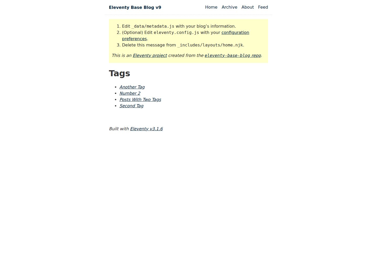
eleventy-base-blog
The officially maintained Eleventy blog starter template, MIT licensed, includes posts, tag pages, archives, an about page, a 404 page, an Atom feed, and sitemap.xml, with per-page CSS bundling, syntax highlighting, and image optimization.
Eleventy · Blog
eleventy-garden
An Eleventy-based digital garden starter template for building a personal knowledge site organized through hyperlinks. It supports Roam-style double-bracket links, backlink display, and hover cards for backlinks.
Eleventy · Starter
eleventastic
Eleventastic is an Eleventy starter kit by Max Böck, used as the base for new 11ty projects. It integrates Sass, Webpack, SVG icon sprites, critical CSS, and HTML minification into the 11ty build without external steps.
Eleventy · Starter
neat-starter
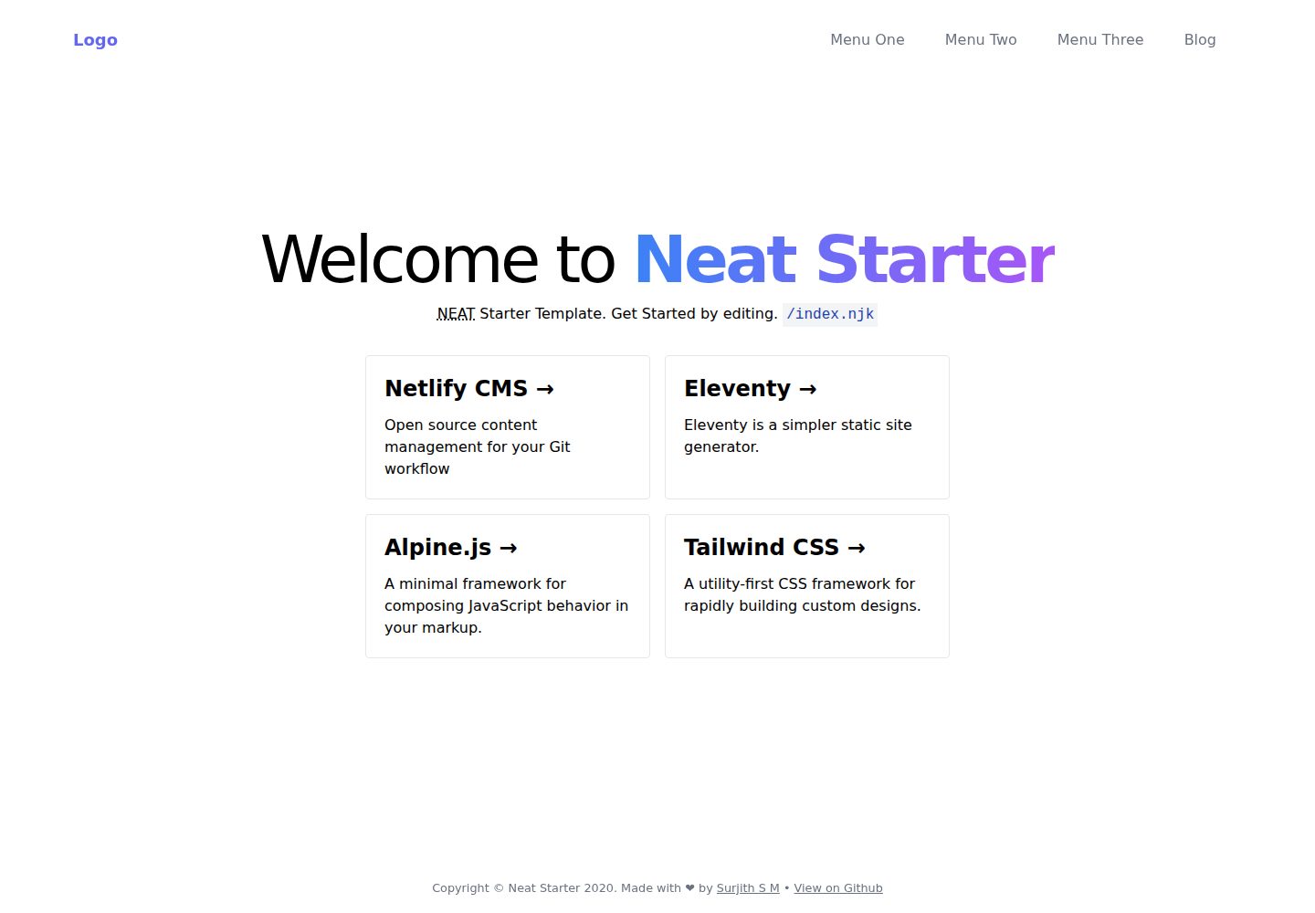
An Eleventy-based static site starter template integrating Netlify CMS, Alpine.js, and Tailwind CSS. It provides a ready-to-run example site, a one-click Netlify deploy button, and an MIT-licensed codebase.
Eleventy · Starter
Eleventy-Starter-Boilerplate
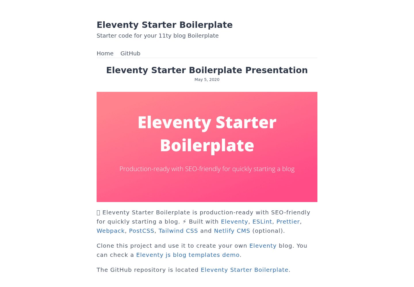
An Eleventy-based blog starter template with Tailwind CSS, Webpack, PostCSS, ESLint, and Prettier, optional Netlify CMS, and built-in SEO metadata, sitemap, and 404 page.
Eleventy · Blog
eleventy-plus-vite
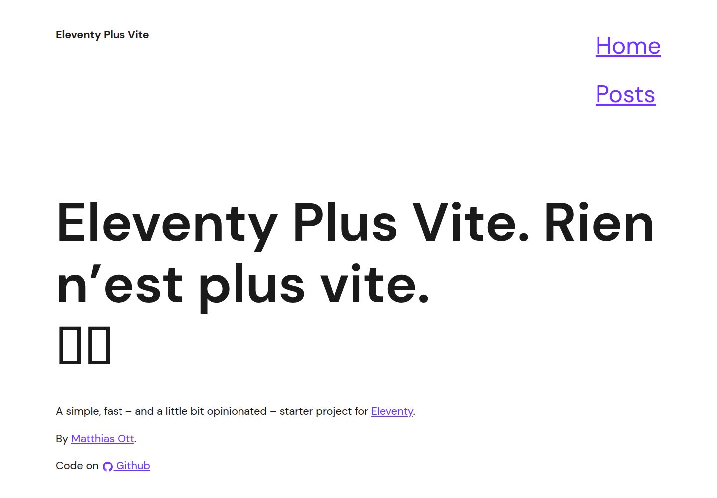
A static site starter combining Eleventy and Vite, with a live-reloading development server, Vite-based production post-processing, a PostCSS pipeline with Autoprefixer and cssnano, critical CSS inlining and asynchronous CSS loading, a web font loading strategy example, fluid typography, basic dark mode, an…
Eleventy · Starter