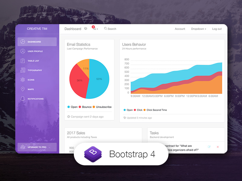
Responsive admin dashboard template built on React Bootstrap
ReactHTMLAdmin dashboardStarter
light-bootstrap-dashboard-react-boilerplate — React Admin dashboard Template
By saissei
A boilerplate for the Light Bootstrap Dashboard React admin template built on React Bootstrap, including example pages such as sidebar, cards, tables, maps, and user profile.
Explore the design
Compare the page layouts and mobile experience. Open any screenshot for a closer look.
Author preview
Author-provided previewTop of page
Preview provided in the project README.
One original preview is available. Open the full image to inspect the design.
Screenshots show visual appearance; interactive behavior may differ.
Recorded 2026-10-03View source
What stands out
A quick read of the recorded project description.
Includes example pages such as Dashboard, User Profile, Table List, Notifications, Maps, Icons, Typography, and Upgrade
Provides reusable components such as Card, StatsCard, UserCard, Tasks, Sidebar, Navbars, Footer, and FormInputs
Sidebar supports six colors: black, azure, green, orange, red, and purple, plus a background image option
Licensed under MIT, allowing free use, modification, commercial use, and distribution of this version's code
Template Details
This repository is the boilerplate version of Creative Tim's Light Bootstrap Dashboard React. The tech stack is React, built on React Bootstrap, and it follows the visual style of Light Bootstrap Dashboard with responsive page layouts.
The template provides common admin dashboard pages and component examples: Dashboard, User Profile, Table List, Notifications, Maps, Icons, Typography, Upgrade views, as well as components such as Card, StatsCard, UserCard, Tasks, Sidebar, Navbars, Footer, FormInputs, CustomButton, CustomCheckbox, CustomRadio, and FixedPlugin. The sidebar offers six colors: black, azure, green, orange, red, and purple, and supports a background image option. The README states it can be used for admin panels, project management systems, web application backends, CMS, or CRM scenarios.
Usage limitations: The repository is a free version under the MIT license, but third-party assets such as demo images, fonts, and icons must be checked separately under their respective licenses; external services such as domains, hosting, and databases may incur separate charges. The browser support statement in the README is for the 'last two versions' of Chrome, Firefox, Edge, Safari, and Opera, which was the author's support target at the time and does not represent current actual compatibility. The repository was last updated relatively early and does not provide a dependency version list, so dependency compatibility must be verified before use.
ReactHTMLAdminBoilerplate
Is it right for your project?
Use Cases
- Building the front-end skeleton for an admin backend or operations panel
- As a starting point for the interface of a project management system, CMS, or CRM
- Quickly introducing a Bootstrap-style dashboard layout and components into a React project
- For learning React Bootstrap component organization and admin page structure
Suitable For
- Front-end developers who need a starting template for a React admin dashboard
- Admin projects that use a Bootstrap-style design language and prefer a lightweight visual style
- Teams that want to obtain and modify the code for free under the MIT license
- Projects that need ready-made example pages (tables, maps, notifications, user profile) as references
Getting started & customization
Use these recorded setup notes alongside the repository instructions for your chosen version.
- 1
Code can be obtained by git clone, downloading the GitHub zip, or from the Creative Tim product page
- 2
The documentation link in the README points to online documentation at demos.creative-tim.com
- 3
The repository does not provide a dependency version list; compatibility of each dependency in package.json must be checked before installation
- 4
Third-party assets such as demo images, fonts, and icons must be checked separately under their respective licenses and cannot be judged solely by the MIT license
- 5
The repository was last updated in 2020; before use, it is advisable to confirm compatibility of dependencies with the current build toolchain
License & source material
Usage conditions & limitations
Free to use · keep license noticeThis entry covers the free version under the MIT license in the public repository; the free scope is the code of this version and does not mean external services or third-party assets are free.
Must comply with when using
- Free use, modification, commercial use, and distribution of this version's code are permitted.
- When distributing copies or substantial portions of the code, retain the original author's copyright notice and the full MIT license notice.
- The code is provided as is; warranties and limitations of liability are governed by the original license and applicable law.
Additional costs & items to verify
- The code is provided free under the MIT license, permitting use, copying, modification, merging, publishing, distribution, sublicensing, and/or sale, provided the copyright notice and license notice are retained in all copies or substantial portions.
- Creative Tim's copyright notice must be retained when using or distributing and must not be removed or altered.
- Documentation is hosted on the author's website; for offline use or self-deployment, note that documentation links point to external sites and may require internet access.
- Browser support is only the author's stated target range (last two versions of Chrome, Firefox, Edge, Safari, Opera) and does not represent current actual compatibility; verify before use.
- Demo images, fonts, icons, and other third-party assets must be checked under their respective licenses and cannot be judged solely by the code's MIT license.
- External services such as domains, hosting, databases, payments, or AI may incur separate charges.
View Original Text Basis
Permission is hereby granted, free of charge
Original License Text
Licensed under MIT (https://github.com/creativetimofficial/light-bootstrap-dashboard-react/blob/master/LICENSE.md)
Original README
Copyright 2018 Creative Tim (https://www.creative-tim.com?ref=lbdr-readme)
Original README
The documentation for the Light Bootstrap Dashboard React is hosted at our [website](https://demos.creative-tim.com/light-bootstrap-dashboard-react/#/documentation/?ref=lbdr-readme).
Original README
https://github.com/saissei/light-bootstrap-dashboard-react-boilerplate/blob/master/LICENSE.mdhttps://github.com/saissei/light-bootstrap-dashboard-react-boilerplate/blob/master/README.mdAt present, we officially aim to support the last two versions of the following browsers:
Original README
Compiled by DeepSeek based on repository license and README ·2026-10-03. Results only cover the materials read; dependencies, images, fonts, and subsequent term changes are subject to their respective original texts.
Project checks & description sources
Template Information
- Source platforms
- GitHub
- Documentation and maintenance reference score
- Partly documented · 61 / 100
- Technologies
- React · HTML
- Website type
- Admin dashboard · Starter
How this score is calculated
Our heuristic uses license records (up to 30), a demo link (12), a preview (10), stars (15), recorded maintenance (15), description completeness (8), feature records (5) and classification data (5). It is not a code, security or performance test, or a Google score. A link does not establish tested functionality.
What to verify for this project
- Repository update recorded
- 2020-09-04
- Screenshot last checked
- 2026-10-03
No demo link is recorded. Use the repository instructions to evaluate the project locally; the screenshot alone cannot establish interactive behavior.
The catalog identifies React as the primary stack. Check the actual dependency manifest and lockfile for versions and hosting requirements. These notes use recorded metadata, not a code audit or a deployment test.
Use a selection guide →How this description was prepared
AI-assisted description based on catalog records and repository material. Repository authors are not automatically the reviewers of this description.
Automatically checked against source and license rules; no manual editorial review.
Inspect the recorded source material
SHA-256: 7cd91c746834b03c995d2b5aac18b25f0f6bf6713fece0e30bf3c5169ac114b6
2026-10-03T06:04:09.921Z
Source file / repository# [Light Bootstrap Dashboard React](https://demos.creative-tim.com/light-bootstrap-dashboard-react/#/?ref=lbdr-readme) [](https://twitter.com/intent/tweet?url=https%3A%2F%2Fcreativetimofficial.github.io%2Flight-bootstrap-dashboard-react&text=Light%20Bootstrap%20Dashboard%20React%20-%20Free%20Bootstrap%20Admin%20Template&original_referer=https%3A%2F%2Fdemos.creative-tim.com%2Flight-bootstrap-dashboard-react%2F&via=creativetim&hashtags=react%2Cbootstrap%2Creact-bootstrap%2Ccreativetim%2Ccreative-tim)
  []() []() [](https://discord.gg/E4aHAQy)
**[Light Bootstrap Dashboard React](https://demos.creative-tim.com/light-bootstrap-dashboard-react/#/?ref=lbdr-readme)** is an admin dashboard template designed to be beautiful and simple. It is built on top of [React Bootstrap](https://5c507d49471426000887a6a7--react-bootstrap.netlify.com/), using [Light Bootstrap Dashboard](https://www.creative-tim.com/product/light-bootstrap?ref=lbdr-readme) and it is fully responsive. It comes with a big collections of elements that will offer you multiple possibilities to create the app that best fits your needs. It can be used to create admin panels, project management systems, web applications backend, CMS or CRM.
The product represents a big suite of front-end developer tools that can help you jump start your project. We have created it thinking about things you actually need in a dashboard. Light Bootstrap Dashboard React contains multiple handpicked and optimized plugins. Everything is designed to fit with one another. As you will be able to see, the dashboard you can access on Creative Tim is a customization of this product.
It comes with 6 filter colors for the sidebar (`black`, `azure`,`green`,`orange`,`red`,`purple`) and an option to have a background image.
## Table of Contents
* [Versions](#versions)
* [Demo](#demo)
* [Quick Start](#quick-start)
* [Documentation](#documentation)
* [File Structure](#file-structure)
* [Browser Support](#browser-support)
* [Resources](#resources)
* [Reporting Issues](#reporting-issues)
* [Technical Support or Questions](#technical-support-or-questions)
* [Licensing](#licensing)
* [Useful Links](#useful-links)
## Versions
[<img src="https://raw.githubusercontent.com/creativetimofficial/public-assets/master/logos/html-logo.jpg" width="60" height="60" />](https://www.creative-tim.com/product/light-bootstrap-dashboard?ref=lbdr-readme)[<img src="https://raw.githubusercontent.com/creativetimofficial/public-assets/master/logos/react-logo.jpg" width="60" height="60" />](https://www.creative-tim.com/product/light-bootstrap-dashboard-react?ref=lbdr-readme)[<img src="https://raw.githubusercontent.com/creativetimofficial/public-assets/master/logos/vue-logo.jpg" width="60" height="60" />](https://www.creative-tim.com/product/vue-light-bootstrap-dashboard?ref=lbdr-readme)[<img src="https://raw.githubusercontent.com/creativetimofficial/public-assets/master/logos/angular-logo.jpg" width="60" height="60" />](https://www.creative-tim.com/product/light-bootstrap-dashboard-angular2?ref=lbdr-readme)
| HTML | React | Vue | Angular |
| --- | --- | --- | --- |
| [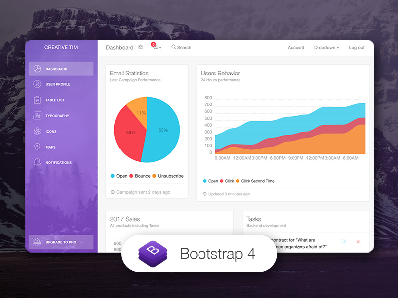](https://www.creative-tim.com/product/light-bootstrap-dashboard?ref=lbdr-readme) | [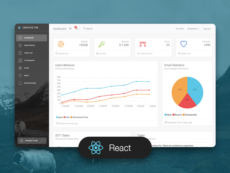](https://www.creative-tim.com/product/light-bootstrap-dashboard-react?ref=lbdr-readme) | [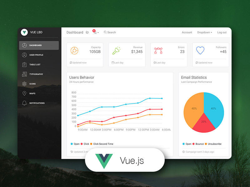](https://www.creative-tim.com/product/vue-light-bootstrap-dashboard?ref=lbdr-readme) | [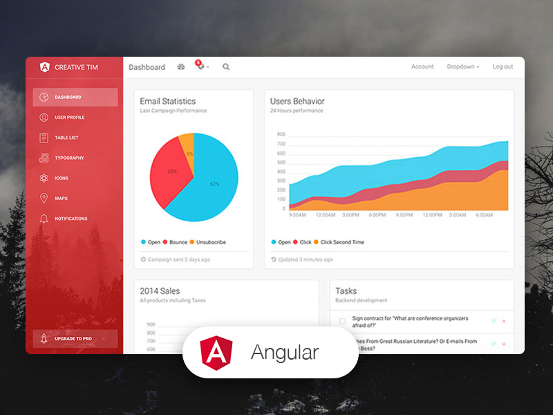](https://www.creative-tim.com/product/light-bootstrap-dashboard-angular2?ref=lbdr-readme) |
## Demo
| Dashboard | User Profile | Tables | Maps |
| --- | --- | --- | --- | --- |
| [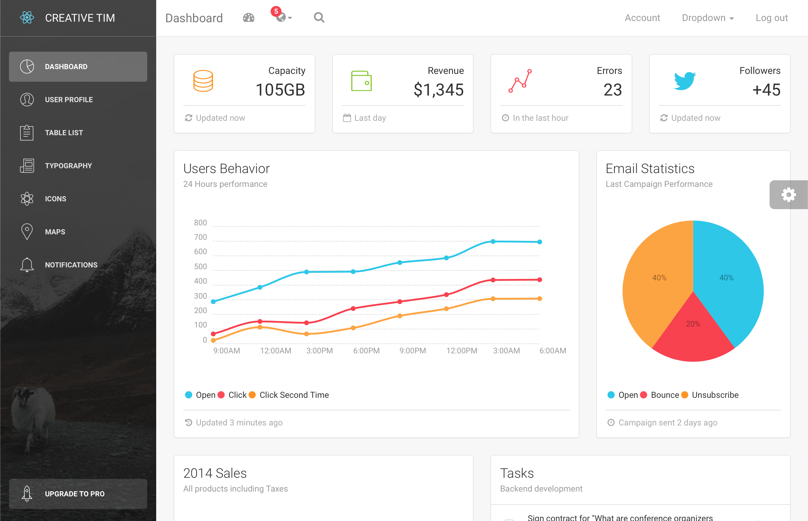](https://demos.creative-tim.com/light-bootstrap-dashboard-react/#/admin/dashboard?ref=lbdr-readme) | [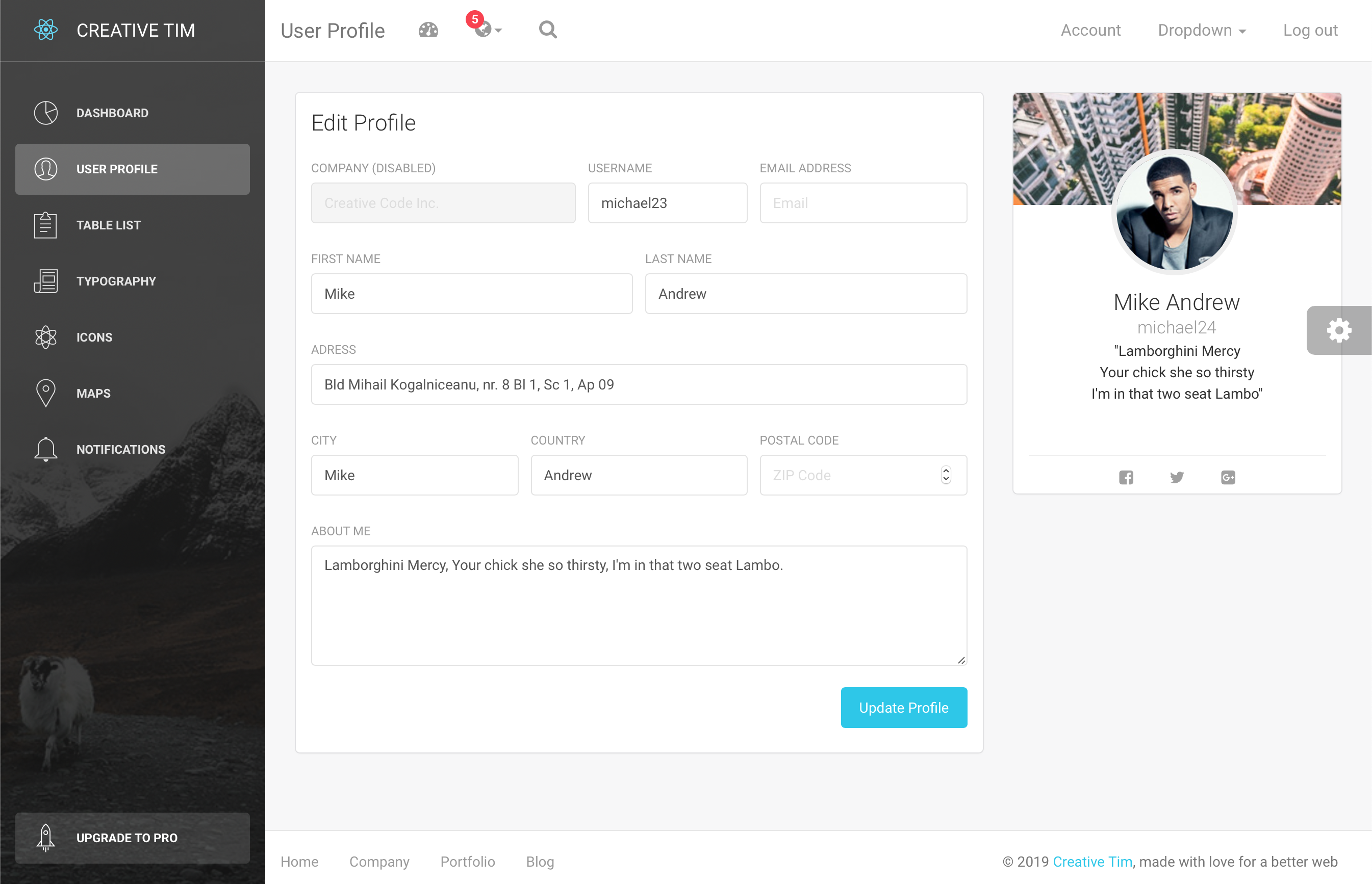](https://demos.creative-tim.com/light-bootstrap-dashboard-react/#/admin/user-page?ref=lbdr-readme) | [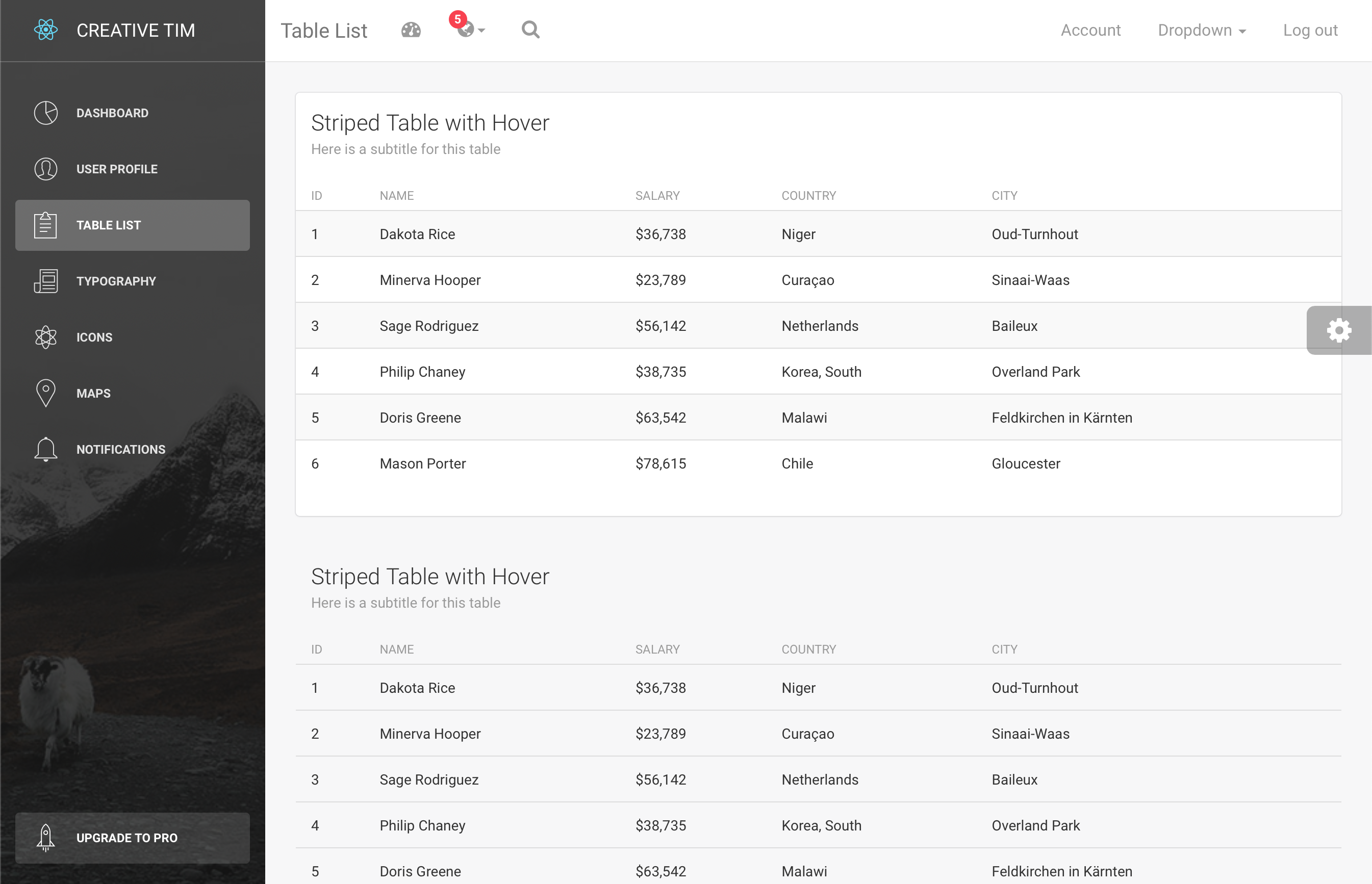](https://demos.creative-tim.com/light-bootstrap-dashboard-react/#/admin/table-list?ref=lbdr-readme) | [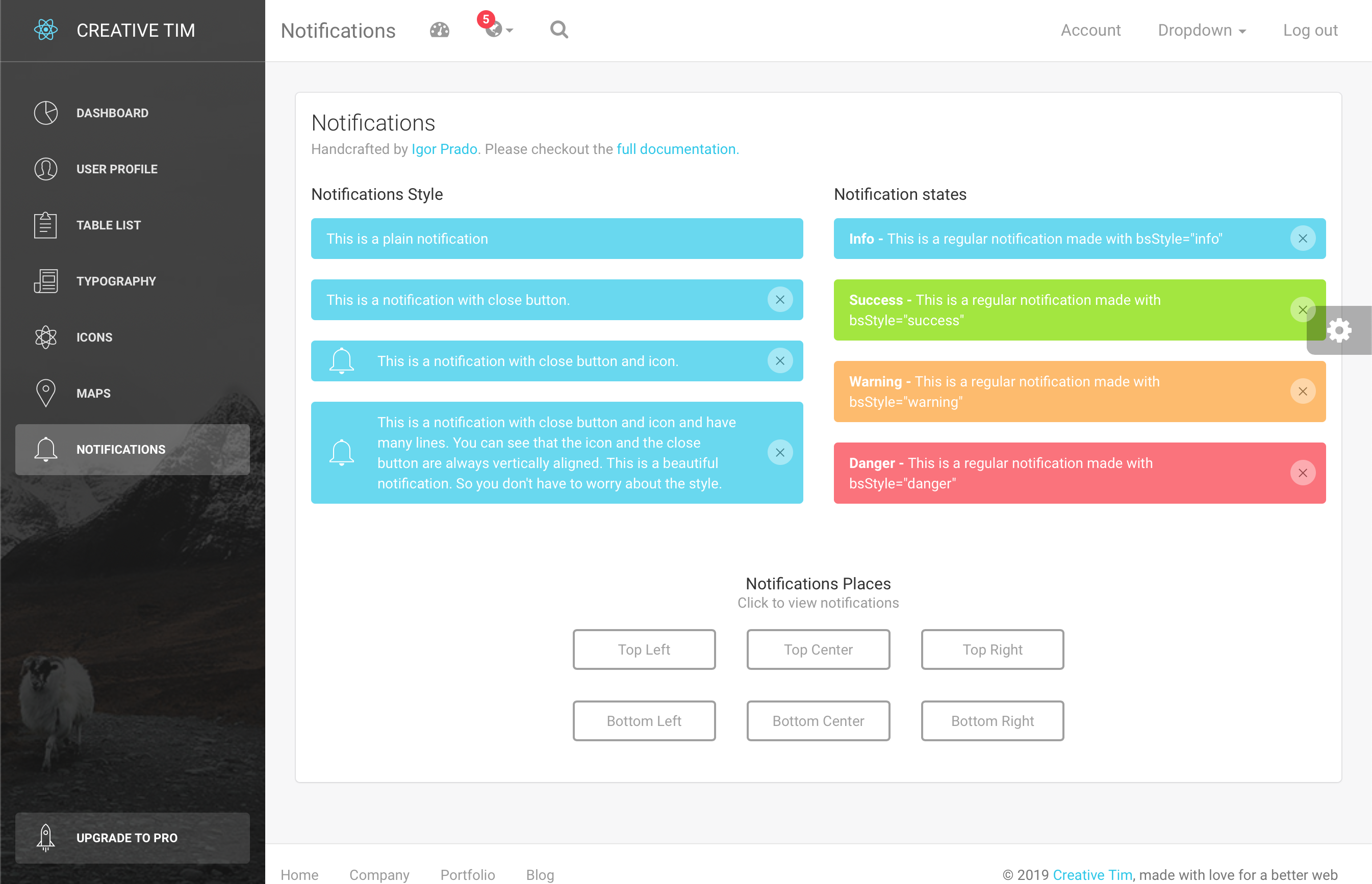](https://demos.creative-tim.com/light-bootstrap-dashboard-react/#/admin/notifications?ref=lbdr-readme) |
[View More](https://demos.creative-tim.com/light-bootstrap-dashboard-react/#/admin/dashboard?ref=lbdr-readme).
## Quick start
Quick start options:
- Clone the repo: `git clone https://github.com/creativetimofficial/light-bootstrap-dashboard-react.git`.
- [Download from Github](https://github.com/creativetimofficial/light-bootstrap-dashboard-react/archive/master.zip).
- [Download from Creative Tim](https://www.creative-tim.com/product/light-bootstrap-dashboard-react?ref=lbdr-readme).
## Documentation
The documentation for the Light Bootstrap Dashboard React is hosted at our [website](https://demos.creative-tim.com/light-bootstrap-dashboard-react/#/documentation/?ref=lbdr-readme).
## File Structure
Within the download you'll find the following directories and files:
```
light-bootstrap-dashboard-react
.
├── CHANGELOG.md
├── ISSUE_TEMPLATE.md
├── LICENSE.md
├── README.md
├── jsconfig.json
├── package.json
├── Documentation
│ ├── css
│ │ ├── demo.css
│ │ ├── documentation.css
│ │ └── light-bootstrap-dashboard.css
│ ├── img
│ └── tutorial-components.html
├── public
│ ├── favicon.ico
│ ├── index.html
│ └── manifest.json
└── src
├── index.js
├── logo.svg
├── routes.js
├── assets
│ ├── css
│ │ ├── animate.min.css
│ │ ├── demo.css
│ │ ├── light-bootstrap-dashboard-react.css
│ │ ├── light-bootstrap-dashboard-react.css.map
│ │ ├── light-bootstrap-dashboard-react.min.css
│ │ └── pe-icon-7-stroke.css
│ ├── fonts
│ ├── img
│ │ ├── faces
│ └── sass
│ ├── lbd
│ │ └── mixins
│ └── light-bootstrap-dashboard-react.scss
├── components
│ ├── Card
│ │ └── Card.jsx
│ ├── CustomButton
│ │ └── CustomButton.jsx
│ ├── CustomCheckbox
│ │ └── CustomCheckbox.jsx
│ ├── CustomRadio
│ │ └── CustomRadio.jsx
│ ├── FixedPlugin
│ │ └── FixedPlugin.jsx
│ ├── Footer
│ │ └── Footer.jsx
│ ├── FormInputs
│ │ └── FormInputs.jsx
│ ├── Navbars
│ │ ├── AdminNavbar.jsx
│ │ └── AdminNavbarLinks.jsx
│ ├── Sidebar
│ │ └── Sidebar.jsx
│ ├── StatsCard
│ │ └── StatsCard.jsx
│ ├── Tasks
│ │ └── Tasks.jsx
│ └── UserCard
│ └── UserCard.jsx
├── layouts
│ └── Admin.jsx
├── variables
│ └── Variables.jsx
└── views
├── Dashboard.jsx
├── Icons.jsx
├── Maps.jsx
├── Notifications.jsx
├── TableList.jsx
├── Typography.jsx
├── Upgrade.jsx
└── UserProfile.jsx
```
## Browser Support
At present, we officially aim to support the last two versions of the following browsers:
<img src="https://s3.amazonaws.com/creativetim_bucket/github/browser/chrome.png" width="64" height="64"> <img src="https://s3.amazonaws.com/creativetim_bucket/github/browser/firefox.png" width="64" height="64"> <img src="https://s3.amazonaws.com/creativetim_bucket/github/browser/edge.png" width="64" height="64"> <img src="https://s3.amazonaws.com/creativetim_bucket/github/browser/safari.png" width="64" height="64"> <img src="https://s3.amazonaws.com/creativetim_bucket/github/browser/opera.png" width="64" height="64">
## Resources
- Demo: https://demos.creative-tim.com/light-bootstrap-dashboard-react/#/admin/dashboard?ref=lbdr-readme
- Download Page: https://www.creative-tim.com/product/light-bootstrap-dashboard-react?ref=lbdr-readme
- Documentation: https://demos.creative-tim.com/light-bootstrap-dashboard-react/#/documentation/tutorial?ref=lbdr-readme
- License Agreement: https://www.creative-tim.com/license?ref=lbdr-readme
- Support: https://www.creative-tim.com/contact-us?ref=lbdr-readme
- Issues: [Github Issues Page](https://github.com/creativetimofficial/light-bootstrap-dashboard-react/issues)
## Reporting Issues
We use GitHub Issues as the official bug tracker for the Light Bootstrap Dashboard React. Here are some advices for our users that want to report an issue:
1. Make sure that you are using the latest version of the Light Bootstrap Dashboard React. Check the CHANGELOG from your dashboard on our [website](https://www.creative-tim.com/?ref=lbdr-readme).
2. Providing us reproducible steps for the issue will shorten the time it takes for it to be fixed.
3. Some issues may be browser specific, so specifying in what browser you encountered the issue might help.
## Technical Support or Questions
If you have questions or need help integrating the product please [contact us](https://www.creative-tim.com/contact-us?ref=lbdr-readme) instead of opening an issue.
## Licensing
- Copyright 2018 Creative Tim (https://www.creative-tim.com?ref=lbdr-readme)
- Licensed under MIT (https://github.com/creativetimofficial/light-bootstrap-dashboard-react/blob/master/LICENSE.md)
## Useful Links
More products from Creative Tim: <https://www.creative-tim.com/products?ref=lbdr-readme>
Tutorials: <https://www.youtube.com/channel/UCVyTG4sCw-rOvB9oHkzZD1w>
Freebies: <https://www.creative-tim.com/products?ref=lbdr-readme>
Affiliate Program (earn money): <https://www.creative-tim.com/affiliates/new?ref=lbdr-readme>
Social Media:
Twitter: <https://twitter.com/CreativeTim>
Facebook: <https://www.facebook.com/CreativeTim>
Dribbble: <https://dribbble.com/creativetim>
Google+: <https://plus.google.com/+CreativetimPage>
Instagram: <https://instagram.com/creativetimofficial>
Explore similar templates
Compare previews and descriptions within the same stack and category.
ant-design-pro
Ant Design Pro is an enterprise-grade React admin scaffold built on React 19, Umi Max 4, and antd 6 with TypeScript.
React · Admin dashboard

react-boilerplate
A production-grade React + Redux starter for experienced developers, integrating Redux, redux-saga, styled-components, and react-router, with offline-first and PWA support, CLI code generation, and built-in testing and CI configuration. Requires Node.js v8.15.1 and npm v5 or higher; not suitable for beginners.
React · Starter
coreui-free-react-admin-template
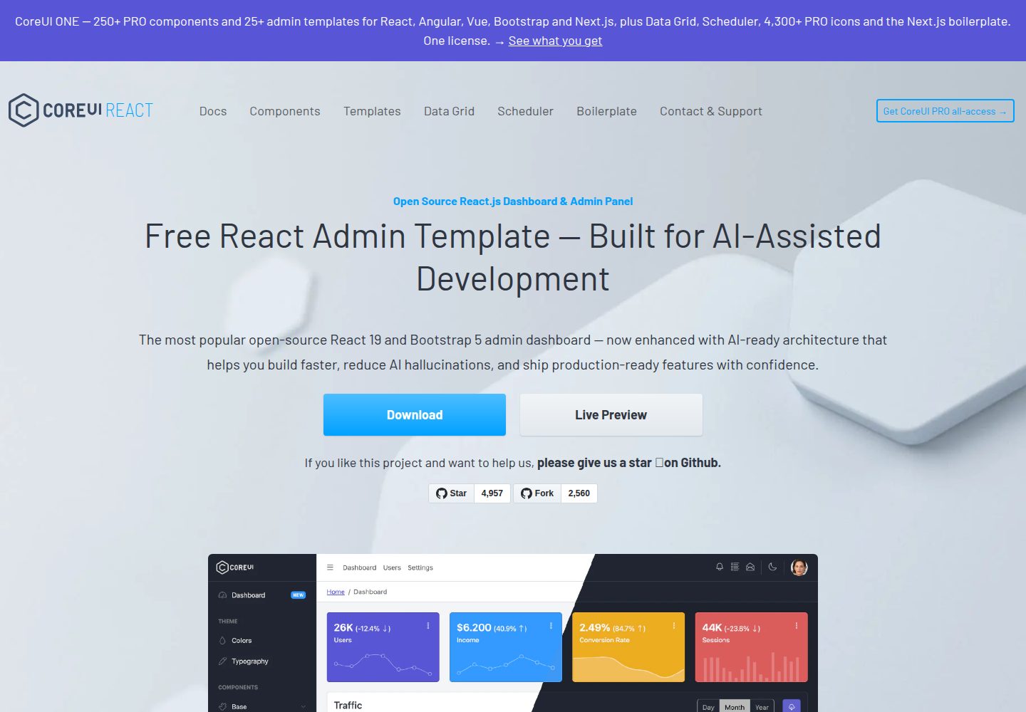
CoreUI's free React admin template, built on React and the CoreUI component library, provides dashboard layouts, sidebar navigation, routing, and example views. It includes .cursorrules, ARCHITECTURE.md, and DEVELOPMENT.md context files, plus JSDoc comments and PropTypes, to support AI-assisted development.
React · Admin dashboard
fastapi-react
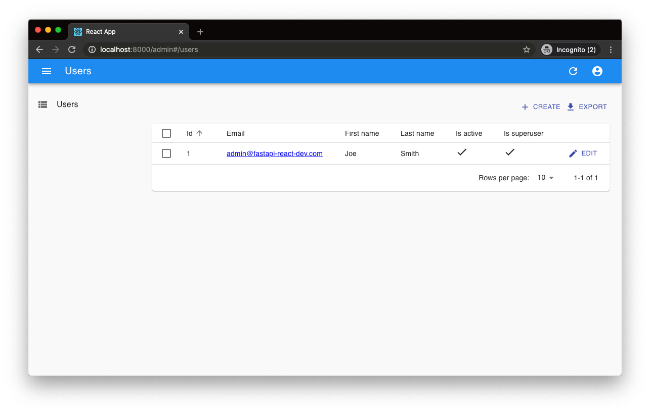
A Cookiecutter template for FastAPI + React (TypeScript) full-stack projects, integrating PostgreSQL, SQLAlchemy, Alembic, Celery, Redis, JWT authentication, a react-admin admin panel, and a Docker Compose development environment with Nginx reverse proxy.
React · Admin dashboard

react-antd-admin-template
A React + Ant Design admin template for mid- and back-office products, with built-in login/logout, dynamic routing, permission checks, and user management.
React · Admin dashboard
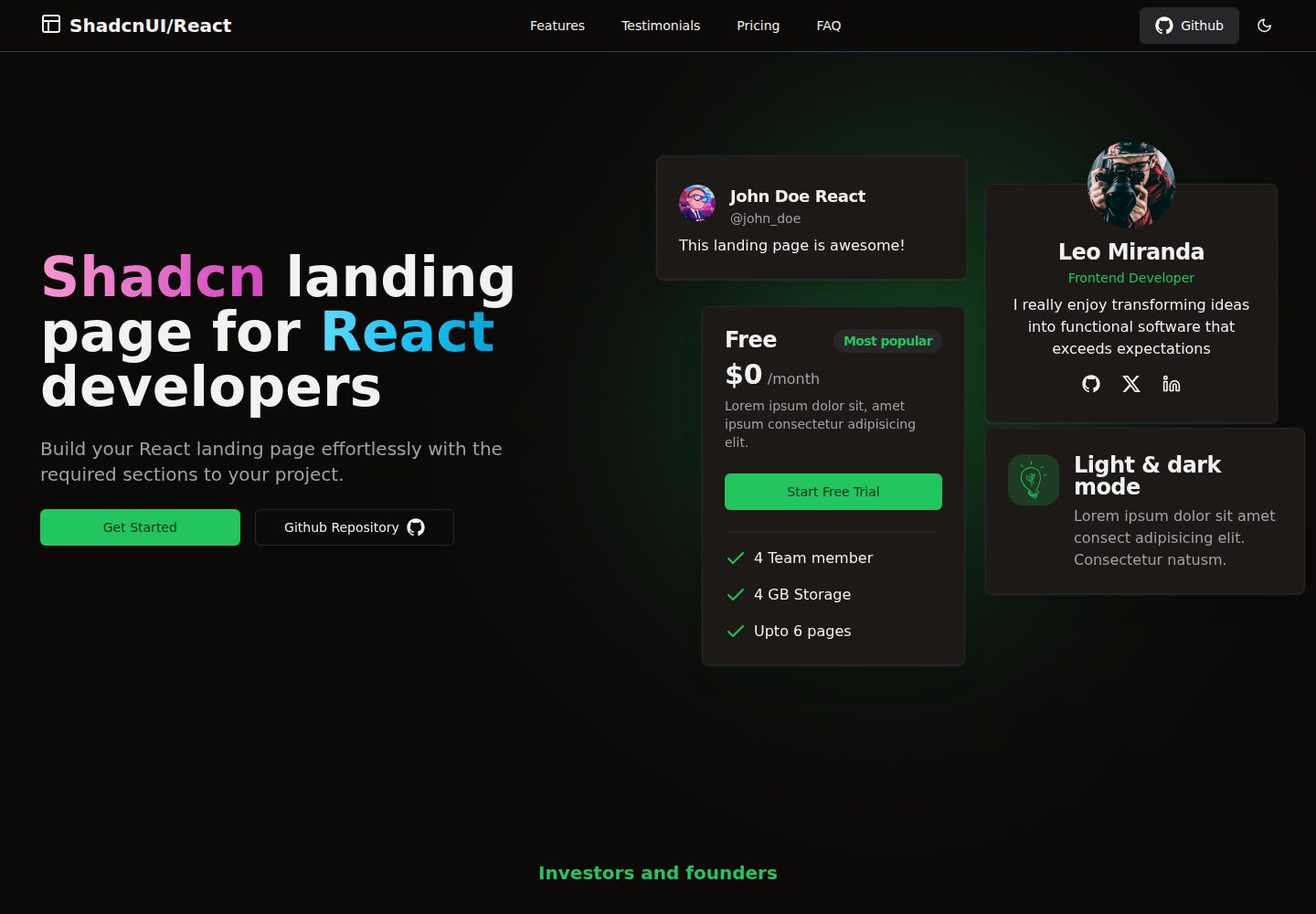
shadcn-landing-page
A free React landing page template built with TypeScript, Tailwind and Shadcn/UI, offering 16 ready-to-use sections such as Navbar, Hero, Pricing, FAQ and Footer, with responsive layout, dark mode and meta tags.
React · Corporate Website