以 README 文档为主体,集中整理前端入门工具、编辑器插件与 CSS 方法论
HTML启动器
web-dev-starter-pack — HTML 启动器模板
作者 jackryanoracoy
面向前端初学者的教育型入门资料包,汇总推荐工具、编辑器插件、CSS 方法论(BEM、SMACSS、ITCSS)以及一个基于 HTML 与 CSS 变量的静态模板。
看看你的网站会是什么样
浏览真实页面截图,比较内容排版与手机效果。点击下方缩略图切换,放大查看整页细节。
全部页面与视图 2
截图用于了解视觉与布局,交互效果请以实际项目为准。
采集于 2026-10-02查看来源
值得关注的模板亮点
从已有项目资料中,快速了解它的特点。
用代码示例讲解 BEM 命名、SMACSS 五类划分和 ITCSS 分层结构
附带纯 HTML/CSS 静态模板,dist 下按 base、component、layout、setting、style、utility 拆分样式文件
通过 :root 中的 CSS 变量定义灰阶色板与字体族,便于统一调整主题
内置 411px 至 1200px 五档最小宽度断点,以及 .sr-only 可访问性辅助类
采用 MIT 许可,允许免费使用、修改、商用和分发
模板详细介绍
这是一个以文档为主的前端入门资料仓库,仓库名与描述都指向“Web 开发入门包”,内容分为推荐工具、推荐插件、流行方法论和附带模板四部分。推荐工具部分列出 Visual Studio Code、Git 以及 GitHub Desktop、Sourcetree、GitKraken 等 Git 客户端,并附有各自的百科与下载链接;插件部分介绍 EditorConfig、Live SASS Compiler 和 Autoprefixer,其中 Live SASS Compiler 的商店页面被用作本模板的演示链接。方法论部分用文字与代码示例讲解 BEM 的 block--modifier-value 命名、SMACSS 的 Base/Layout/Module/State/Theme 五类划分,以及 ITCSS 的 Settings、Base、Layout、Components、Utilities 分层结构。附带模板是一个纯 HTML/CSS 的静态起点:dist 目录下按 base、component、layout、setting、style、utility 拆分 CSS 文件,scripts 下有一个 script.js,source 目录用于存放源文件;使用方式是把 dist 中的文件复制到项目根目录后开始开发。模板通过 :root 下的 CSS 变量定义灰阶色板与字体族,并提供 411px、576px、768px、992px、1200px 五档最小宽度断点,以及 .sr-only 与 .sr-only--focusable 两个可访问性辅助类。仓库采用 MIT 许可,可免费使用、修改、商用和分发,但演示图片、字体、图标等第三方素材需单独核对许可。仓库更新停留在 2020 年,README 中提到的 Moonshine、Twilightbloom 等关联项目需自行确认现状。
HTML启动器
适合你的项目吗?
适用场景
- 前端初学者按 README 顺序了解常用编辑器、Git 客户端与插件
- 学习 BEM、SMACSS、ITCSS 等 CSS 组织方法并对照代码示例理解命名与分层
- 把 dist 目录中的 CSS 与 JS 文件复制到新项目,作为静态页面的样式起点
- 在已有静态站点中参考其 CSS 变量与断点设置,统一颜色和响应式规则
适合人群
- 刚接触前端、需要一份工具与方法论索引的开发者
- 希望用纯 HTML/CSS 起步、不引入构建工具的小型静态项目
- 想参考 ITCSS 分层方式组织样式文件的前端学习者
- 需要可访问性辅助类(如跳过导航链接)的静态页面作者
上手与定制指南
结合仓库当前版本的说明,按下面的资料检查内容、配置与运行要求。
- 1
仓库以文档和静态文件为主,README 未说明需要安装依赖或执行构建命令
- 2
使用模板时把 dist 目录下的文件复制到项目根目录,再基于其代码库继续开发
- 3
页面需使用 HTML5 doctype 并包含 viewport meta 标签,以配合模板的响应式断点
- 4
调整主题时修改 :root 中的 CSS 变量,或参考 settings.css 与 SCSS 源文件中的变量和 mixin
- 5
演示图片、字体、图标等第三方素材需按各自许可单独核对,不能仅凭代码的 MIT 许可判断
授权与来源资料
使用条件与限制
免费使用 · 保留许可声明本次收录的是公开仓库中采用 MIT 许可的免费版本;免费范围为该版本代码,不代表外部服务或第三方素材免费。
使用时需要遵守
- 允许免费使用、修改、商用和分发该版本代码。
- 分发代码副本或实质性部分时,保留原作者版权声明和完整 MIT 许可声明。
- 代码按现状提供;担保与责任限制以原许可证及适用法律为准。
额外费用与待核对事项
- 演示图片、字体、图标及其他第三方素材需按各自许可核对,不能仅凭代码的 MIT 许可判断。
- 域名、托管、数据库、支付或 AI 等外部服务可能另外收费。
查看原文依据
https://github.com/jackryanoracoy/web-dev-starter-pack/blob/master/LICENSE.txthttps://github.com/jackryanoracoy/web-dev-starter-pack/blob/master/README.mdPermission is hereby granted, free of charge
许可证原文
DeepSeek 根据仓库许可证和 README 整理 ·2026-10-02。结果仅覆盖已读取资料,依赖、图片、字体及后续条款变更以各自原文为准。
项目核对记录与介绍依据
模板资料
- 来源平台
- GitHub
- 资料与维护参考分
- 资料一般 · 68 / 100
- 技术栈
- HTML
- 网站类型
- 启动器
这个分数如何计算
本站按许可资料(最高30分)、演示链接(12分)、预览图(10分)、Star数(15分)、记录的维护时间(15分)、描述完整度(8分)、功能记录(5分)和分类资料(5分)计算。它不是代码、安全或性能测试,也不是 Google 评分;有链接不代表已实测可用。
这个项目需要核对什么
- 记录的仓库更新时间
- 2020-01-25
- 截图检查日期
- 2026-10-02
已收录演示链接。请用你的内容与屏幕尺寸检查;有演示不代表表单、认证或支付已经可用。
目录记录的主要技术栈是 HTML。请通过依赖清单和锁文件核对实际版本与托管要求。这些说明基于收录资料,不代表代码审计或部署实测。
查看具体选型方法 →介绍的制作与核对状态
介绍由 AI 辅助整理目录与仓库资料。仓库作者不等于这篇介绍的审核者。
已完成服务器许可规则与 AI 来源核对;未经过人工编辑审核。
查看当时使用的来源资料
SHA-256: 1e1d54dccf0b252f245d09339446eca2bce5c31a79f3322e333f73e94f3a55d6
2026-10-02T23:35:53.412Z
来源文件 / 仓库# Web Dev Starter Pack (WDSP)
A Simple Educational Guide For Startup Web Developer - Tools, Methodologies, Templates, etc...
## Recommended Tools
#### Visual Studio Code
Visual Studio Code is a source-code editor developed by Microsoft for Windows, Linux and macOS. It includes support for debugging, embedded Git control and GitHub, syntax highlighting, intelligent code completion, snippets, and code refactoring.
[Read more on Wikipedia](https://en.wikipedia.org/wiki/Visual_Studio_Code)
[Download VS Code](https://code.visualstudio.com/)
#### GIT
Git is a distributed version-control system for tracking changes in source code during software development. It is designed for coordinating work among programmers, but it can be used to track changes in any set of files. Its goals include speed, data integrity, and support for distributed, non-linear workflows.
[Read more on Wikipedia](https://en.wikipedia.org/wiki/Git)
[Download GIT](https://git-scm.com/downloads)
#### GitHub Desktop - Electron
GitHub Desktop is an open source Electron-based GitHub app. It is written in TypeScript and uses React.
[Read more on Wikipedia](https://en.wikipedia.org/wiki/Atlassian)
[Download GitHub Desktop](https://desktop.github.com/)
#### Sourcetree - Atlassian
A Git GUI that offers a visual representation of your repositories. Sourcetree is a free Git client for Windows and Mac.
[Read more on Wikipedia](https://en.wikipedia.org/wiki/Electron_(software_framework))
[Download Sourcetree](https://www.sourcetreeapp.com/)
#### GitKraken - Axosoft
The Git GUI Client for Windows/Mac/Linux development.
[Read more on Wikipedia](https://en.wikipedia.org/wiki/Axosoft)
[Download GitKraken](https://www.gitkraken.com/)
___
## Recommended Plugins
#### EditorConfig
EditorConfig helps maintain consistent coding styles for multiple developers working on the same project across various editors and IDEs. The EditorConfig project consists of a file format for defining coding styles and a collection of text editor plugins that enable editors to read the file format and adhere to defined styles. EditorConfig files are easily readable and they work nicely with version control systems.
[Download EditorConfig](https://editorconfig.org/#download)
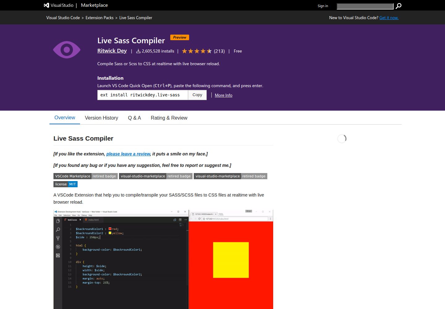
#### Live SASS Compiler
A VSCode Extension that help you to compile/transpile your SASS/SCSS files to CSS files at realtime with live browser reload.
[Download Live SASS Compiler](https://marketplace.visualstudio.com/items?itemName=ritwickdey.live-sass)
#### Autoprefixer
Parse CSS and add vendor prefixes automatically.
[Download Autoprefixer](https://marketplace.visualstudio.com/items?itemName=mrmlnc.vscode-autoprefixer)
___
## Popular Methodologies
#### BEM - Block Element Modifier
Block Element Modifier is a methodology that helps you to create reusable components and code sharing in front-end development
Let’s look how one particular element on a page can be implemented in BEM.
We can have a normal button for usual cases, and two more states for different ones. Because we style blocks by class selectors with BEM, we can implement them using any tags we want (button, a or even div). The naming rules tell us to use block--modifier-value syntax.
```
<button class="button">
Normal button
</button>
<button class="button button--state-success">
Success button
</button>
<button class="button button--state-danger">
Danger button
</button>
```
```
.button {
display: inline-block;
border-radius: 3px;
padding: 7px 12px;
border: 1px solid #D5D5D5;
background-image: linear-gradient(#EEE, #DDD);
font: 700 13px/18px Helvetica, arial;
}
.button--state-success {
color: #FFF;
background: #569E3D linear-gradient(#79D858, #569E3D) repeat-x;
border-color: #4A993E;
}
.button--state-danger {
color: #900;
}
```
**Modularity** - Block styles are never dependent on other elements on a page, so you will never experience problems from cascading.
**Reusability** - Composing independent blocks in different ways, and reusing them intelligently, reduces the amount of CSS code that you will have to maintain.
**Structure** - BEM methodology gives your CSS code a solid structure that remains simple and easy to understand.
[Read the full documentation of BEM](http://getbem.com/introduction/)
#### SMACSS - Scalable and Modular Architecture for CSS
SMACSS is a way to examine your design process and as a way to fit those rigid frameworks into a flexible thought process. It is an attempt to document a consistent approach to site development when using CSS.
At the very core of SMACSS is categorization. By categorizing CSS rules, we begin to see patterns and can define better practices around each of these patterns.
**Base** - They are almost exclusively single element selectors but it could include attribute selectors, pseudo-class selectors, child selectors or sibling selectors. Essentially, a base style says that wherever this element is on the page, it should look like this.
**Layout** - divide the page into sections. Layouts hold one or more modules together.
**Module** - are the reusable, modular parts of our design. They are the callouts, the sidebar sections, the product lists and so on.
**State** - are ways to describe how our modules or layouts will look when in a particular state. Is it hidden or expanded? Is it active or inactive? They are about describing how a module or layout looks on screens that are smaller or bigger. They are also about describing how a module might look in different views like the home page or the inside page.
**Theme** - are similar to state rules in that they describe how modules or layouts might look. Most sites don’t require a layer of theming but it is good to be aware of it.
By separating rules into the five categories, naming convention is beneficial for immediately understanding which category a particular style belongs to and its role within the overall scope of the page.
```
// Example Module
.example { ... }
// Callout Module
.callout { ... }
// Callout Module with State
.callout.is-collapsed { ... }
// Form field module
.field { ... }
// Inline layout
.l-inline { ... }
```
[Read the full documentation of SMACSS](http://smacss.com/)
#### ITCSS - Inverted Triangle CSS
ITCSS stands for Inverted Triangle CSS and it helps you to organize your project CSS files in such a way that you can better deal with (not always easy-to-deal with) CSS specifics like global namespace, cascade and selectors specificity.
One of the key principles of ITCSS is that it separates your CSS codebase to several sections (called layers), which take the form of the inverted triangle.
```
_______________ Reach _______________
+++++++++++++++++++++++++++++++++++++ |
+ SETTING + |
++++ BASE/GENERIC ++++ |
+++++++ OBJECT +++++++ Specificity
++++++++++ COMPONTENT ++++++++++ |
+++++++++++++ UTILITY +++++++++++++ |
++++++++++++++++ +++++++++++++++++ |
```
**Settings** - Used with preprocessors and contain font, colors definitions, globally used mixins and functions etc.
**Base** - Reset and/or normalize styles, box-sizing definition, etc. This is the first layer which generates actual CSS.
**Layout** - Class-based selectors which define undecorated design patterns, for example media object known from OOCSS.
**Components** - Specific UI components. This is where the majority of our work takes place and our UI components are often composed of Objects and Components.
**Utilities** - Utilities and helper classes with ability to override anything which goes before in the triangle, eg. hide helper class.
No official documentation for ITCSS yet, but you can try [Moonshine](https://github.com/jackryanoracoy/moonshine) and [Twilightbloom](https://github.com/jackryanoracoy/twilightbloom/) both are using ITCSS methodology.
___
## Included Template
A scalable and maintainable architecture for building responsive, mobile-first web apps or sites.
This will helps you build not only fast but scalable and maintainable web apps or sites. With this you have a package that is built with the combined knowledge and effort of some great developers, from their methodology, codes, packages, etc...
Be sure to have your pages set up with the latest design and development standards. That means using an HTML5 doctype and including a viewport meta tag for proper responsive behaviors.
#### Contents
Discover what’s included in the package. Once downloaded, unzip the compressed folder and you’ll see something similar to this:
```
web-dev-starter-pack/
└── dist/
├── styles/
│ ├── base.css
│ ├── component.css
│ ├── layout.css
│ ├── setting.css
│ ├── style.css
│ └── utility.css
├── scripts/
│ └── script.js
└── source/
```
Now you can copy files from **dist** folder to your projects root folder and start your project with the template's code base.
#### Theming
Customize Moonshine with CSS variables or SASS variables for global style preferences for easy theming and component changes. Here are the CSS variables we include (note that the :root is required). For more info, please check settings.css or the scss code base (mixins, variables etc...).
```
:root {
/* Color */
--grey-50: #FAFAFA;
--grey-100: #F5F5F5;
--grey-200: #EEEEEE;
--grey-300: #E0E0E0;
--grey-400: #BDBDBD;
--grey-500: #9E9E9E;
--grey-600: #757575;
--grey-700: #616161;
--grey-800: #424242;
--grey-900: #212121;
/* font-family */
--font-family-sans-serif: -apple-system, BlinkMacSystemFont, "Segoe UI", Roboto, "Helvetica Neue", Arial, sans-serif, "Apple Color Emoji", "Segoe UI Emoji", "Segoe UI Symbol";
--font-family-monospace: SFMono-Regular, Menlo, Monaco, Consolas, "Liberation Mono", "Courier New", monospace;
}
```
#### Breakpoints
This template uses a handful of media queries to create sensible breakpoints for layouts and interfaces. These breakpoints are mostly based on minimum viewport widths and allow us to scale up elements as the viewport changes.
```
// Extra small devices (411px and up)
@media (min-width: 411px) {...}
// Small devices (576px and up)
@media (min-width: 576px) {...}
// Medium devices (768px and up)
@media (min-width: 768px) {...}
// Large devices (992px and up)
@media (min-width: 992px) {...}
// Extra large devices (1200px and up)
@media (min-width: 1200px) {...}
```
#### Accessibility
Content which should be visually hidden, but remain accessible to assistive technologies such as screen readers, can be styled using the .sr-only class. This will ensure that the control becomes visible once focused (for sighted keyboard users).
```
<p class="text-danger">
<span class="sr-only">Danger: </span>
This action is not reversible
</p>
```
For visually hidden interactive controls, such as traditional “skip” links, .sr-only can be combined with the .sr-only--focusable class. This will ensure that the control becomes visible once focused (for sighted keyboard users).
```
<a class="sr-only sr-only--focusable" href="#site-content">Skip to main content</a>
```
To extend template's accessibility please see [WAI-ARIA](https://www.w3.org/WAI/standards-guidelines/aria/), [WCAG 2.0](https://www.w3.org/TR/WCAG20/) and similar accessibility standards and requirements.
#### Methodologies
Organize project files that can better deal with CSS specifics like global namespace, cascade and selectors specificity.
Shares the same methodology of some popular methodologies like ITCSS, BEM, SMACSS and OOCSS.
This approach is to ensure everyone who participates in the development of a website works with a single codebase and speaks the same language.
##### Naming Convention
Highly useful, powerful, and simple naming convention that makes your front-end code easier to read and understand, easier to work with, easier to scale, more robust and explicit, and a lot more strict.
**prefix** - (u) utility, (l) layout, (c) component, and (js) javascript related classes.
**name** - preferred class/object name.
**modifier** - preferred modifier name.
**viewport** - (sm) small, (md) medium, (lg) large, (xl) extra large.
**int** - integer (0, 1, 2, 3, 4, 5, 6, 7, 8, 9).
**others** - min, max, auto.
```
.prefix-name {...}
.prefix-name-int {...}
.prefix-name-viewport {...}
.prefix-name-viewport-int {...}
.prefix-name--modifier {...}
.prefix-name--modifier-int {...}
.prefix-name--modifier-viewport {...}
.prefix-name--modifier-viewport-int {...}
.prefix-name__child {...}
.prefix-name__child-int {...}
.prefix-name__child-viewport {...}
.prefix-name__child-viewport-int {...}
```
Samples:
```
.l-flex {...}
.l-flex--wrp-no {...}
.l-flex--wrp-no-md {...}
.l-flex__item {...}
.l-flex__item-12 {...}
.l-flex__item-md {...}
.l-flex__item-md-12 {...}
.u-mar-top-10 {...}
.u-mar-top-sm-20 {...}
.u-mar-top-md-50 {...}
```
Import order:
```
@import "setting.css";
@import "base.css";
@import "layout.css";
@import "component.css";
@import "utility.css";
```
#### Samples
Here are some sample of what to expect on this template, For more info please check *.css.
##### Container
```
<div class="l-container">
<!-- Content here -->
</div>
<div class="l-container l-container--fluid">
<!-- Content here -->
</div>
```
##### Flex
```
<div class="l-flex">
<div class="l-flex__item-12 l-flex__item-md-6"><!-- Content here --></div>
<div class="l-flex__item-12 l-flex__item-md-6"><!-- Content here --></div>
</div>
```
##### Cluster Gap
```
// You can omit adding class name "l-gap__item" on "l-gap" child item (only if the child item is a "div").
<div class="l-flex l-gap-20">
<div class="l-gap__item"><!-- Content here --></div>
<div class="l-gap__item"><!-- Content here --></div>
</div>
```
##### Parallax
```
<div class="l-parallax">
<img class="u-parallax__image" src="/assets/images/xxx.jpg" alt="Image">
</div>
```
##### Tab
```
<ul class="c-tab-link">
<li class="c-tab-link__item" data-tab="tab-1">Tab 1</li>
<li class="c-tab-link__item" data-tab="tab-2">Tab 2</li>
</ul>
<div id="tab-1" class="c-tab-content js-current">
<!-- Content here -->
</div>
<div id="tab-2" class="c-tab-content">
<!-- Content here -->
</div>
```
##### Button
```
<a class="c-button" href="#">Button</a>
```
##### Card
```
<div class="c-card">
<div class="c-card__content">
<!-- Content here -->
</div>
</div>
```
##### Hidden
```
<div class="u-hidden">
<!-- Hidden content here (all screen) -->
</div>
<div class="u-hidden-xs-min">
<!-- Hidden content here (411px and up) -->
</div>
<div class="u-hidden-sm-min">
<!-- Hidden content here (576px and up) -->
</div>
<div class="u-hidden-md-min">
<!-- Hidden content here (768px and up) -->
</div>
<div class="u-hidden-lg-min">
<!-- Hidden content here (992px and up) -->
</div>
<div class="u-hidden-xl-min">
<!-- Hidden content here (1200px and up) -->
</div>
<div class="u-hidden-xs-max">
<!-- Hidden content here (410px and down) -->
</div>
<div class="u-hidden-sm-max">
<!-- Hidden content here (575px and down) -->
</div>
<div class="u-hidden-md-max">
<!-- Hidden content here (767px and down) -->
</div>
<div class="u-hidden-lg-max">
<!-- Hidden content here (991px and down) -->
</div>
<div class="u-hidden-xl-max">
<!-- Hidden content here (1199px and down) -->
</div>
```
##### Float
```
<div class="clearfix">
<div class="u-float-left">
<!-- Floating content here -->
</div>
</div>
<div class="clearfix">
<div class="u-float-left u-float-right-sm u-float-none-md">
<!-- Floating content here (float left on 575px below, float right on 576px and above, no float on 768px and above) -->
</div>
</div>
```
##### Width and Height
```
<div class="u-width-100 u-height-100">
<!-- 100& width and height -->
</div>
```
##### Padding
```
<div class="u-pad-bottom-10 u-pad-bottom-sm-20">
<!-- Add padding (10px padding on 575px below, 20px padding on 576 and above) -->
</div>
```
##### Margin
```
<div class="u-mar-bottom-10 u-mar-bottom-sm-20">
<!-- Add margin (10px margin on 575px below, 20px margin on 576 and above) -->
</div>
```
##### Typography
```
<div class="u-text-center u-text-left-md">
<!-- Align text (align center on 575px below, align left on 576 and above) -->
</div>
```
##### Object fit
```
<img class="u-object-fit u-object-fit--cover" src="/assets/images/xxx.jpg" alt="Image">
```
##### Bordered
```
<div class="u-bordered u-bordered--bottom u-bordered--top-sm">
<!-- Add border (bottom border on 575px below, top border on 576 and above) -->
</div>
```
##### List
```
<ul class="u-list">
<li><!-- List (Without style) --></li>
</ul>
```
##### Color
```
<div class="u-background-color-dark">
<p class="u-color-light">Text color is light, container color is dark.</p>
</div>
```
##### Image
```
<img class="u-image-fluid u-display-block u-mar" src="/assets/images/xxx.jpg" alt="Center Block Fluid Image">
```
___
## How To?
**How to use template** - This template uses SASS code base but all you need is the compiled code base located at "dist" folder, you can copy files from dist folder to your projects root folder and start your project with the template's code base.
```
e.g. "styles" and "scripts" folders on your new project's folder.
```
**How to change class-name** - This template contain source SASS file this will let us replace "class-name" the easiest way, locate and edit the source according to your preference.
```
e.g. ".u-mar-bottom-10" to ".u-mb-10" or ".mb-10", ".l-flex" to ".l-row" or ".row", etc...
```
**How to change naming convention** - This template uses BEM naming convention if you want to opt out using this naming convention you can edit source SASS file, locate and edit the source according to your preference.
```
e.g. ".l-flex__item" to ".l-flex_item" or ".flex-item", ".l-container .l-container--fluid" to ".l-container .is_fluid" or ".container .fluid", etc...
```
**How to disable media query for non-responsive website** - This template can disable or remove codes under a media query, locate main SASS files and change the "$responsive" value to "false".
```
e.g. changed line "$resposive: true;" with "$resposive: false;".
```
___
## Other Templates
**Moonshine** - A scalable and maintainable architecture.
[By: Jack Ryan Oracoy](mailto:[email protected])
[GitHub](https://github.com/jackryanoracoy/moonshine) | [Website](https://jackryanoracoy.github.io/moonshine)
**Twilightbloom** - A simple yet scalable and maintainable architecture (JA).
[By: Jack Ryan Oracoy](mailto:[email protected])
[GitHub](https://github.com/jackryanoracoy/twilightbloom) | [Website](https://jackryanoracoy.github.io/twilightbloom)
看看同类模板
对比同技术栈与用途的模板,找到更适合的视觉与内容结构。
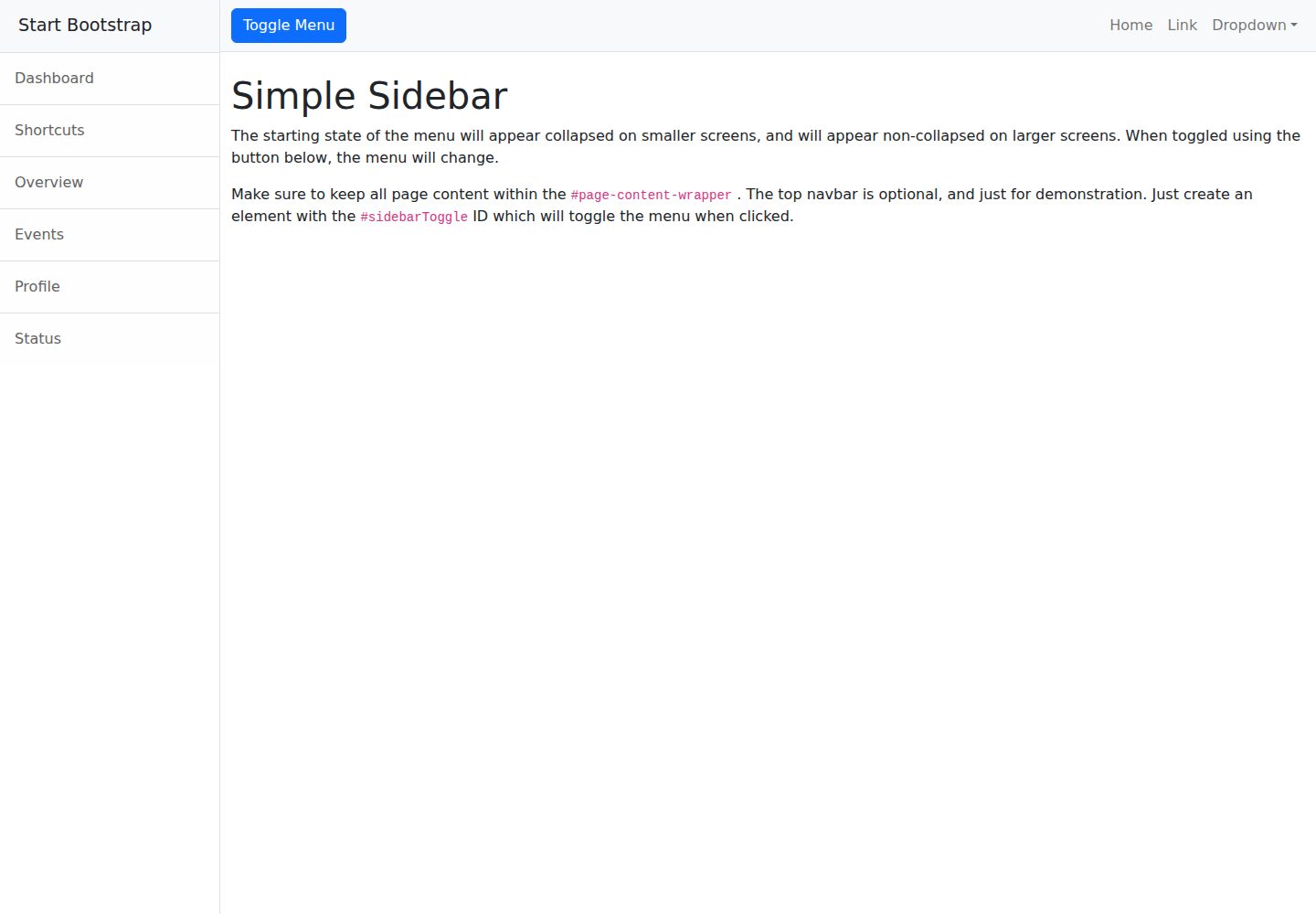
startbootstrap-simple-sidebar
An off canvas sidebar navigation Bootstrap HTML template created by Start Bootstrap
HTML · 启动器
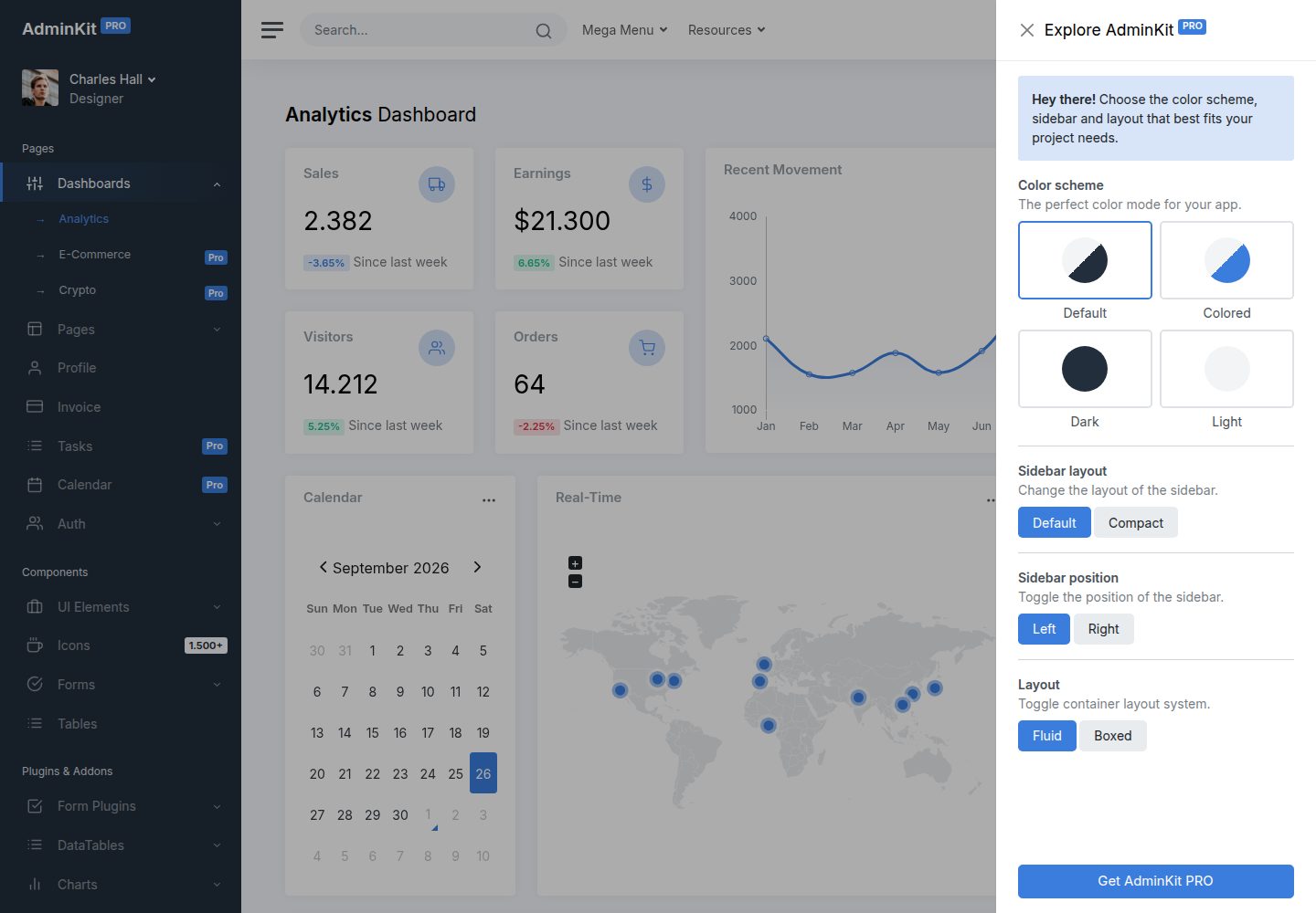
adminkit
AdminKit is a free & open-source HTML dashboard & admin template based on Bootstrap 5
HTML · 后台
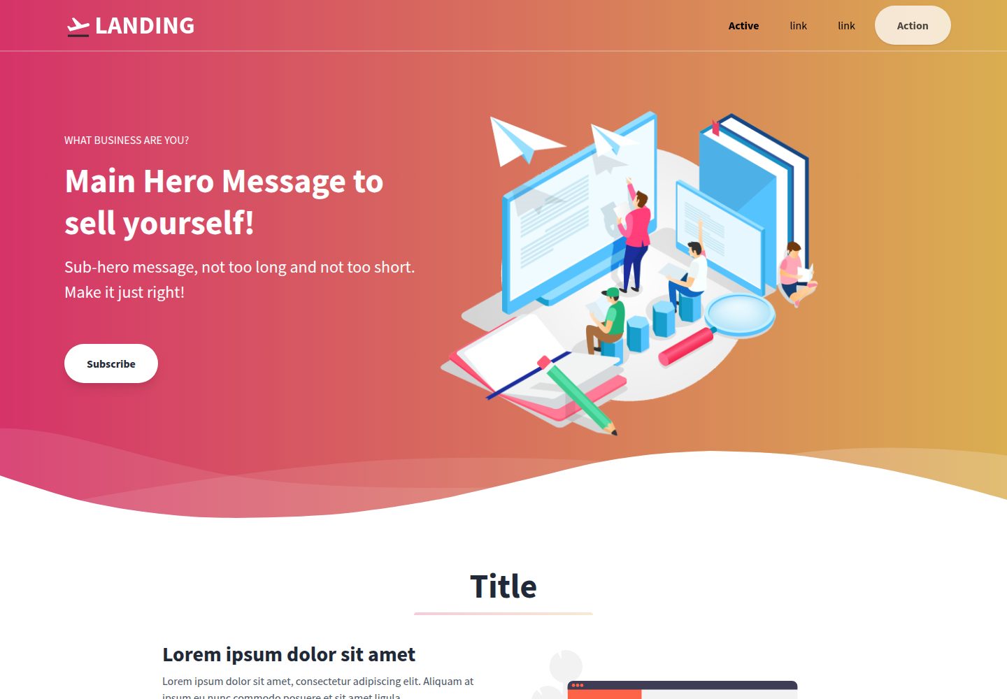
Landing-Page
Tailwind CSS Starter Template - Landing Page
HTML · 企业官网
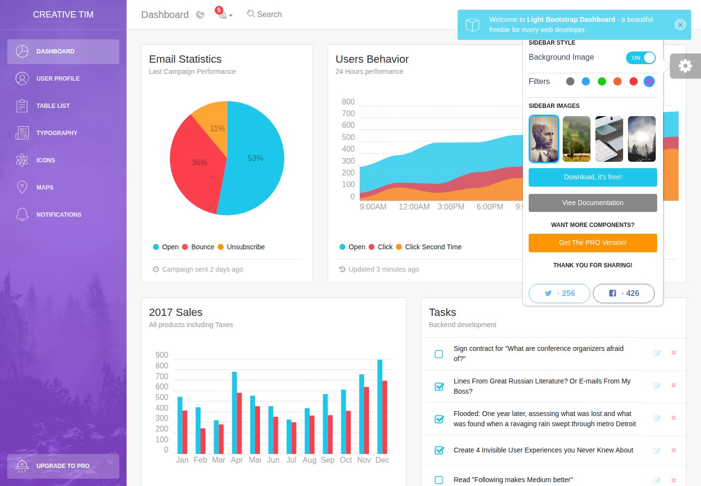
light-bootstrap-dashboard
Light Bootstrap Dashboard is an admin dashboard template designed to be beautiful and simple.
HTML · 后台
sing-app
💥Free and open-source admin dashboard template built with Bootstrap 4.5 💥
HTML · 后台
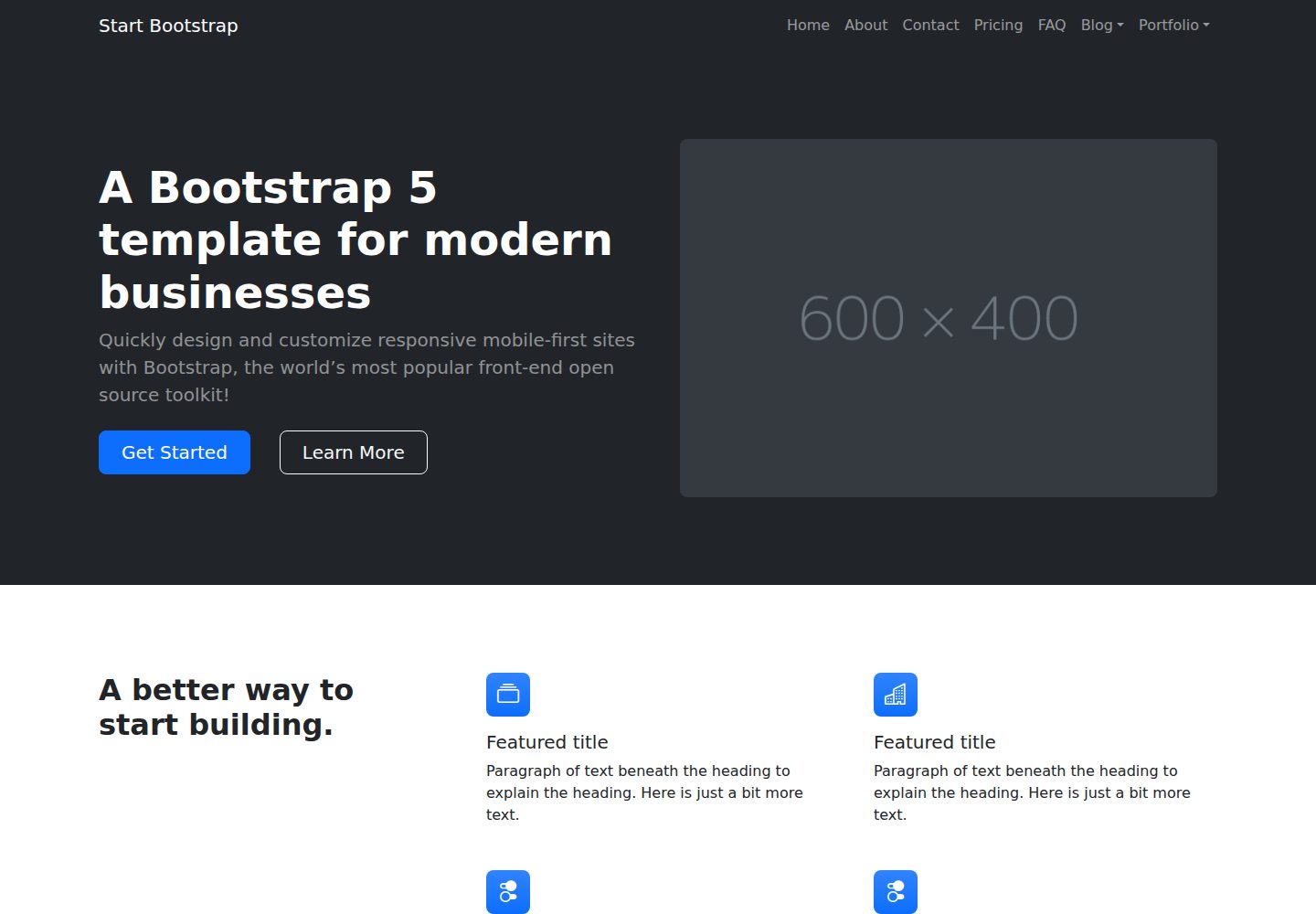
startbootstrap-modern-business
A multipurpose Bootstrap full website template created by Start Bootstrap
HTML · 启动器