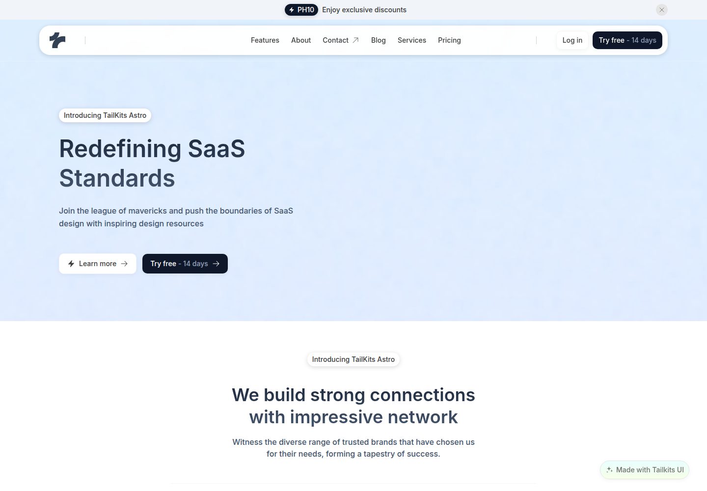
基于 Astro 与 Tailwind CSS 的落地页主题,默认输出静态页面
Astro企业官网
tailkits-astro — Astro 企业官网模板
作者 tailkits
Tailkits Astro 是一个基于 Astro 与 Tailwind CSS 的开源落地页主题,提供导航、Hero、功能、定价、评价等模块化组件,适合搭建企业官网或产品落地页。
看看你的网站会是什么样
浏览真实页面截图,比较内容排版与手机效果。点击下方缩略图切换,放大查看整页细节。
全部页面与视图 2
截图用于了解视觉与布局,交互效果请以实际项目为准。
采集于 2026-10-02查看来源
值得关注的模板亮点
从已有项目资料中,快速了解它的特点。
提供 Banner、Navigation、Hero、LogoCloud、Feature、Stats、Cta、HowItWorks、Testimonials、Pricing、Footer 等模块化组件
使用 BaseLayout.astro 统一管理 HTML 结构与 meta 标签
在 global.css 中预置 container-custom、btn-primary、btn-secondary、card、text-gradient 等自定义样式类
默认采用 Tailwind 蓝色主色与 Inter 字体,可按 README 指引替换
仓库采用 MIT 许可,允许免费使用、修改、商用和分发该版本代码
模板详细介绍
Tailkits Astro 是 Tailkits 在 GitHub 上开源的 Astro 落地页主题,仓库采用 MIT 许可。它面向企业官网与产品落地页场景,用 Astro 与 Tailwind CSS 构建,默认输出静态页面。
模板把首页拆成多个可复用的 Astro 组件:Banner(可关闭公告条)、Navigation(含移动端菜单的页头)、Hero(带渐变文字与 CTA 按钮)、LogoCloud(客户 Logo 展示)、Feature(功能与收益列表)、Stats(大数字统计)、Cta(行动号召)、HowItWorks(流程说明)、Testimonials(客户评价轮播)、Pricing(含功能对比的定价方案)和 Footer(链接与社交媒体)。页面由 src/pages/index.astro 组织,外层使用 src/layouts/BaseLayout.astro 承载 HTML 结构与 meta 标签。
样式方面,主题使用 Tailwind 默认蓝色作为主色,字体为 Google Fonts 的 Inter,并在 src/styles/global.css 中定义了 .container-custom、.btn-primary、.btn-secondary、.card、.text-gradient 等自定义类。README 说明可通过修改组件中的颜色类或在 tailwind.config.mjs 中扩展颜色来自定义配色,也可在 BaseLayout.astro、tailwind.config.mjs 与 global.css 中更换字体。
使用限制:README 提到演示页在 src/pages/index.astro 中带有可选的 “Made with Tailkits UI” 徽标,生产环境可自行移除;模板代码采用 MIT 许可,但演示图片、字体、图标等第三方素材需按各自许可核对。README 还推荐了 TailKits UI 的付费组件库,属于外部服务,与本仓库的免费代码范围无关。
Astro企业官网
适合你的项目吗?
适用场景
- 搭建企业官网或产品落地页的起始模板
- 需要 Hero、功能展示、定价、客户评价等常见营销区块的静态站点
- 希望以 Astro 组件方式组织首页结构、便于逐块替换内容的项目
- 作为学习 Astro 与 Tailwind CSS 组合使用的示例项目
适合人群
- 使用 Astro 与 Tailwind CSS 的前端开发者
- 需要快速搭建落地页原型或营销页面的团队
- 接受 MIT 许可并愿意自行核对第三方素材授权的使用者
上手与定制指南
结合仓库当前版本的说明,按下面的资料检查内容、配置与运行要求。
- 1
需要 Node.js 18+ 以及 npm、yarn 或 pnpm 之一
- 2
克隆仓库后执行 npm install(或 yarn/pnpm install)安装依赖
- 3
执行 npm run dev(或对应包管理器命令)启动开发服务器,默认访问 http://localhost:4321
- 4
执行 npm run build 生成 dist/ 目录用于部署,可部署到 Vercel、Netlify、GitHub Pages、Cloudflare Pages 等平台
- 5
演示页在 src/pages/index.astro 中带有可选的 “Made with Tailkits UI” 徽标,生产环境可移除
授权与来源资料
使用条件与限制
免费使用 · 保留许可声明本次收录的是公开仓库中采用 MIT 许可的免费版本;免费范围为该版本代码,不代表外部服务或第三方素材免费。
使用时需要遵守
- 允许免费使用、修改、商用和分发该版本代码。
- 分发代码副本或实质性部分时,保留原作者版权声明和完整 MIT 许可声明。
- 代码按现状提供;担保与责任限制以原许可证及适用法律为准。
额外费用与待核对事项
- README 推荐 TailKits UI 的 200+ 付费高级组件与区块,属于外部付费服务,不在本仓库免费代码范围内,需另行购买。
- 演示页在 src/pages/index.astro 中包含可选的 “Made with Tailkits UI” 徽标,生产环境可自行移除。
- 图标来自 Heroicons,字体为 Inter,演示图片等第三方素材需按各自许可核对,MIT 许可仅覆盖本仓库代码。
- 演示图片、字体、图标及其他第三方素材需按各自许可核对,不能仅凭代码的 MIT 许可判断。
- 域名、托管、数据库、支付或 AI 等外部服务可能另外收费。
查看原文依据
Permission is hereby granted, free of charge
许可证原文
Check out 200+ premium landing page components and sections at [TailKits UI](https://tailkits.com/ui/)
README 原文
This template includes an optional “Made with Tailkits UI” badge in src/pages/index.astro for the demo. You may remove it for production
README 原文
https://github.com/tailkits/tailkits-astro/blob/main/LICENSEhttps://github.com/tailkits/tailkits-astro/blob/main/README.mdIcons from [Heroicons](https://heroicons.com)
README 原文
DeepSeek 根据仓库许可证和 README 整理 ·2026-10-02。结果仅覆盖已读取资料,依赖、图片、字体及后续条款变更以各自原文为准。
项目核对记录与介绍依据
模板资料
- 来源平台
- GitHub
- 资料与维护参考分
- 资料较完整 · 81 / 100
- 技术栈
- Astro
- 网站类型
- 企业官网
这个分数如何计算
本站按许可资料(最高30分)、演示链接(12分)、预览图(10分)、Star数(15分)、记录的维护时间(15分)、描述完整度(8分)、功能记录(5分)和分类资料(5分)计算。它不是代码、安全或性能测试,也不是 Google 评分;有链接不代表已实测可用。
这个项目需要核对什么
- 记录的仓库更新时间
- 2025-09-11
- 截图检查日期
- 2026-10-02
已收录演示链接。请用你的内容与屏幕尺寸检查;有演示不代表表单、认证或支付已经可用。
目录记录的主要技术栈是 Astro。请通过依赖清单和锁文件核对实际版本与托管要求。这些说明基于收录资料,不代表代码审计或部署实测。
查看具体选型方法 →介绍的制作与核对状态
介绍由 AI 辅助整理目录与仓库资料。仓库作者不等于这篇介绍的审核者。
已完成服务器许可规则与 AI 来源核对;未经过人工编辑审核。
查看当时使用的来源资料
SHA-256: 85d9f73baeb5e7980d0db1846beeddf0095fdaf014b11ac276db35ee32ce2c8a
2026-10-02T09:48:22.571Z
来源文件 / 仓库
# Tailkits Astro
A modern, beautiful Astro starter theme powered by Tailwind CSS. Perfect for building fast, responsive websites with exceptional performance and developer experience.
## ✨ Features
- **⚡ Lightning Fast**: Built with Astro for optimal performance with zero JS by default
- **🎨 Beautiful Design**: Modern UI components styled with Tailwind CSS v4
- **📱 Fully Responsive**: Mobile-first design that looks perfect on all devices
- **🔧 Developer Friendly**: TypeScript support, modern tooling, and clean code structure
- **🚀 SEO Optimized**: Meta tags, semantic HTML, and performance-focused
- **🎯 Accessible**: WCAG compliant with proper focus states and semantic markup
> **💡 Want more components?** Check out 200+ premium landing page components and sections at [TailKits UI](https://tailkits.com/ui/) - perfectly matching this template's design system and ready to copy & paste into your Astro project.
## 🚀 Quick Start
### Prerequisites
- Node.js 18+
- npm, yarn, or pnpm
### Installation
1. **Clone the repository**
```bash
git clone https://github.com/yourusername/tailkits-astro.git
cd tailkits-astro
```
2. **Install dependencies**
```bash
npm install
# or
yarn install
# or
pnpm install
```
3. **Start the development server**
```bash
npm run dev
# or
yarn dev
# or
pnpm dev
```
4. **Open your browser**
Visit [http://localhost:4321](http://localhost:4321) to see your site running locally.
## 🛠️ Tech Stack
- **[Astro](https://astro.build)** - The web framework for content-driven websites
- **[Tailwind CSS v4](https://tailwindcss.com)** - A utility-first CSS framework
- **[TypeScript](https://www.typescriptlang.org)** - JavaScript with syntax for types
- **[Inter Font](https://fonts.google.com/specimen/Inter)** - Modern, clean typography
## 📁 Project Structure
```
/
├── public/
│ └── favicon.svg
├── src/
│ ├── components/ # Reusable UI components
│ │ ├── Banner.astro
│ │ ├── Cta.astro
│ │ ├── Feature.astro
│ │ ├── Footer.astro
│ │ ├── Hero.astro
│ │ ├── HowItWorks.astro
│ │ ├── LogoCloud.astro
│ │ ├── Navigation.astro
│ │ ├── Pricing.astro
│ │ ├── Stats.astro
│ │ └── Testimonials.astro
│ ├── layouts/ # Page layouts
│ │ └── BaseLayout.astro
│ ├── pages/ # File-based routing
│ │ └── index.astro
│ └── styles/ # Global styles
│ └── global.css
├── astro.config.mjs
├── tailwind.config.mjs
├── tsconfig.json
└── package.json
```
## 🎨 Customization
> **⚠️ Production Note**: This template includes an optional “Made with Tailkits UI” badge in src/pages/index.astro for the demo. You may remove it for production
### Components
The theme is built with modular components that you can easily customize:
- **`BaseLayout.astro`** - Main layout with HTML structure and meta tags
- **`Banner.astro`** - Dismissible announcement banner
- **`Navigation.astro`** - Header navigation with mobile menu
- **`Hero.astro`** - Hero section with gradient text and CTA buttons
- **`LogoCloud.astro`** - Company logos display section
- **`Feature.astro`** - Features showcase with benefits list
- **`Stats.astro`** - Statistics display with large numbers
- **`Cta.astro`** - Call-to-action section
- **`HowItWorks.astro`** - Process explanation section
- **`Testimonials.astro`** - Customer testimonials carousel
- **`Pricing.astro`** - Pricing plans with feature comparison
- **`Footer.astro`** - Footer with links and social media
### Colors
The theme uses Tailwind's default blue color palette as the primary color. You can easily change this by:
1. Updating component files to use different color classes (e.g., `bg-green-600` instead of `bg-blue-600`)
2. Or add custom colors in `tailwind.config.mjs`:
```js
theme: {
extend: {
colors: {
primary: {
// Your custom color scale
50: '#eff6ff',
// ... rest of your colors
},
},
},
},
```
### Typography
The theme uses Inter font from Google Fonts. You can change this in:
1. `src/layouts/BaseLayout.astro` - Update the Google Fonts link in the SEO component
2. `tailwind.config.mjs` - Update the font family configuration
3. `src/styles/global.css` - Update the body font-family
### Components
Custom component classes are defined in `src/styles/global.css`:
- `.container-custom` - Responsive container with padding
- `.btn-primary` / `.btn-secondary` - Button styles
- `.card` - Card component style
- `.text-gradient` - Gradient text effect
## 🚀 Deployment
### Build for Production
```bash
npm run build
```
This creates a `dist/` folder with your built site ready for deployment.
### Deploy to Popular Platforms
- **Vercel**: Connect your GitHub repo to Vercel for automatic deployments
- **Netlify**: Drag and drop the `dist/` folder or connect via Git
- **GitHub Pages**: Use the official Astro GitHub Pages action
- **Cloudflare Pages**: Connect your repo for edge deployment
See the [Astro deployment docs](https://docs.astro.build/en/guides/deploy/) for more options.
## 📚 Documentation
- [Astro Documentation](https://docs.astro.build)
- [Tailwind CSS Documentation](https://tailwindcss.com/docs)
- [TypeScript Documentation](https://www.typescriptlang.org/docs)
## 🤝 Contributing
Contributions are welcome! Please feel free to submit a Pull Request. For major changes, please open an issue first to discuss what you would like to change.
## 📄 License
This project is licensed under the MIT License - see the [LICENSE](LICENSE) file for details.
## 🙏 Acknowledgments
- Built with [Astro](https://astro.build)
- Styled with [Tailwind CSS](https://tailwindcss.com)
- Icons from [Heroicons](https://heroicons.com)
- Typography by [Inter](https://rsms.me/inter/)
看看同类模板
对比同技术栈与用途的模板,找到更适合的视觉与内容结构。
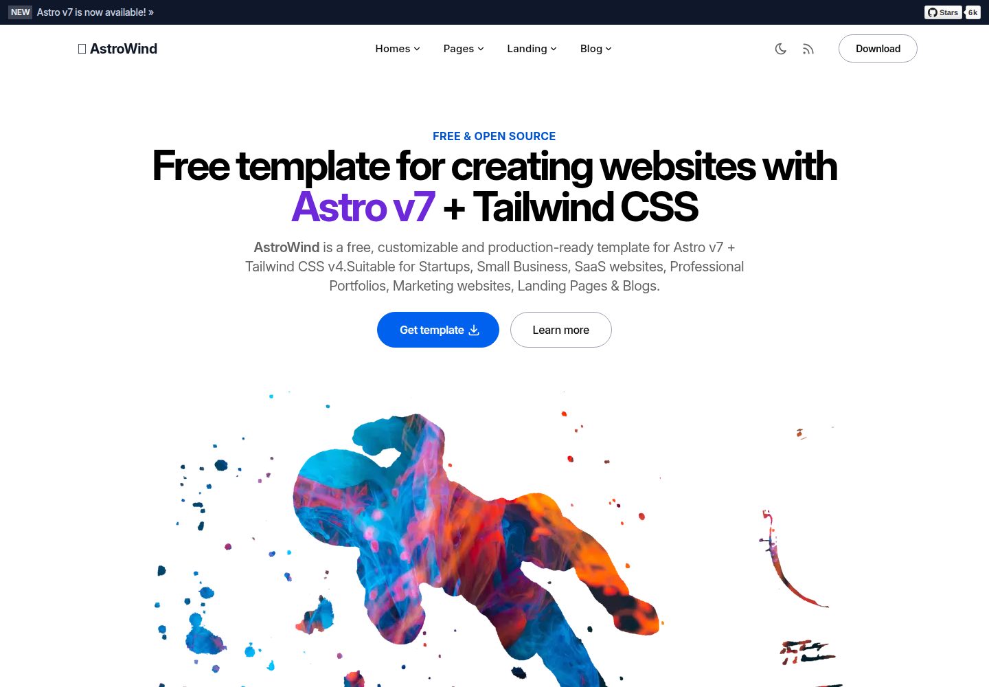
astrowind
⭕️ AstroWind: A free template using Astro v7 and Tailwind CSS v4. Astro starter theme.
Astro · 博客
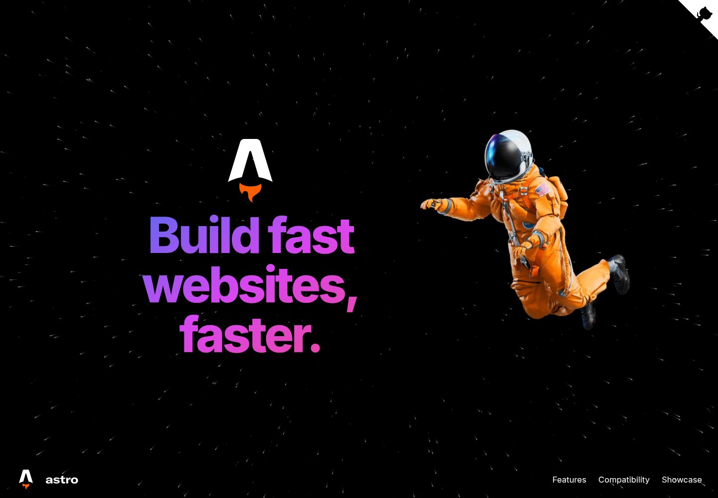
astro-landing-page
An Astro + Tailwind CSS Example/Template for Landing Pages
Astro · 企业官网
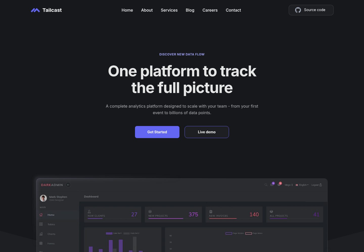
Tailcast
Dark-themed website template built on Astro and Tailwind CSS
Astro · 企业官网
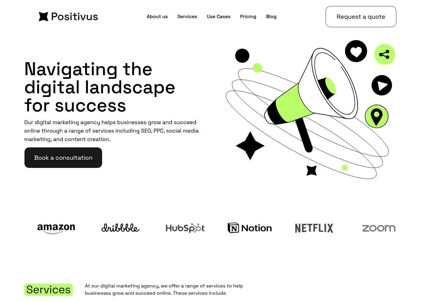
Positivus
A stunning and versatile Astro theme designed for digital marketing agencies.
Astro · 企业官网
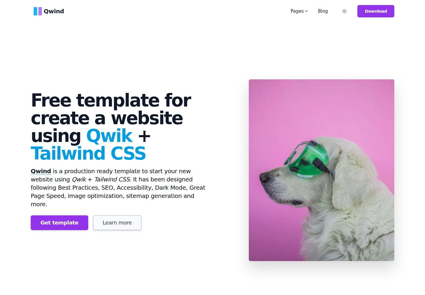
qwind
⭕️ Qwind: A template to make your website using Qwik + Tailwind CSS.
Astro · 工具站

agency-landing-page-Astrojs
A simple agency landing page made with astrojs and tailwindcss
Astro · 企业官网