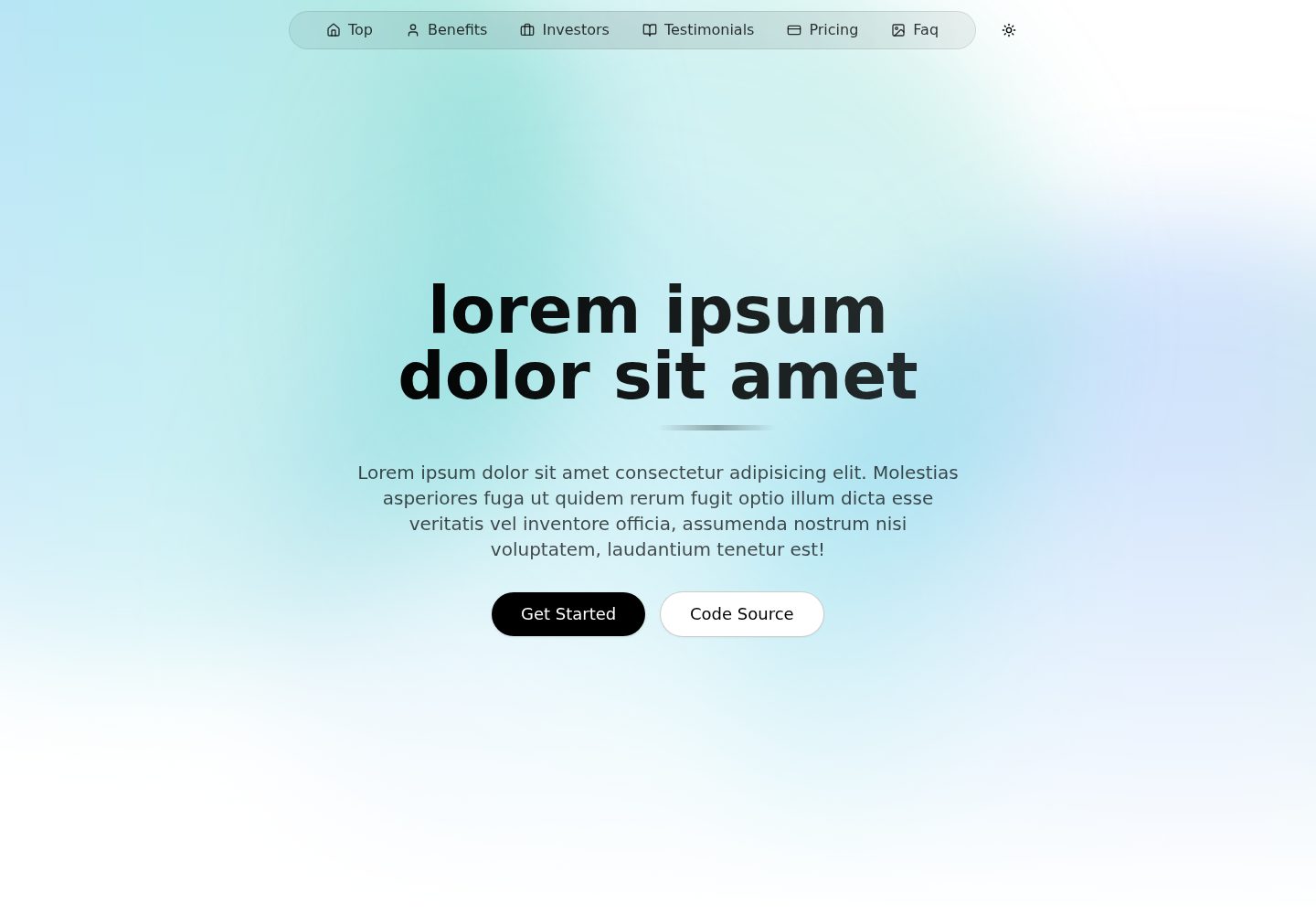
Built with Next.js and TypeScript, with styling based on Tailwind CSS
Next.jsReactCorporate Website
nextjs-shadcn-landing — Next.js Business Template
By anibalalpizar
A free and open-source landing page template built with Next.js and shadcn/ui, using TypeScript and Tailwind CSS, with built-in light and dark themes and semantic color tokens, suitable for quickly building corporate websites or product introduction pages.
Explore the design
Compare the page layouts and mobile experience. Open any screenshot for a closer look.
Desktop homepage1 / 2
Desktop captureTop of page
Actual screenshot captured by the server browser.
All pages & views 2
Screenshots show visual appearance; interactive behavior may differ.
Recorded 2026-10-03View source
What stands out
A quick read of the recorded project description.
Includes shadcn/ui starter components: button, badge, dropdown-menu, navigation-menu
Provides light and dark theme switching via next-themes, following the system by default
Defines a complete set of semantic color tokens in globals.css, covering both light and dark themes
Code is organized in layers: app, components/sections, components/ui, lib, types
MIT-licensed, allowing free use, modification, commercialization, and distribution
Template Details
This is an open-source template for corporate websites and product landing pages. The repository is MIT-licensed and can be used, modified, commercialized, and distributed for free. The template uses Next.js as its framework, is written in TypeScript, has a styling layer based on Tailwind CSS, and its components come from the shadcn/ui starter set, including reusable base components such as button, badge, dropdown-menu, and navigation-menu.
For theming, the project provides a ThemeProvider via next-themes, enables system theme following in the root layout (defaultTheme="system", enableSystem), and enables class-mode dark mode in the Tailwind configuration. In globals.css, semantic CSS variables are defined separately for :root and .dark, covering tokens such as background, foreground, card, popover, primary, secondary, muted, accent, destructive, border, input, ring, and chart-1 through chart-5. Components can reference them directly with Tailwind utility classes and automatically adapt to light and dark modes.
In terms of page structure, src/app/page.tsx handles the composition of the landing page, src/components/sections stores each section and its subcomponents, src/components/ui stores shadcn/ui components, and src/lib and src/types hold utility functions and type definitions respectively. The README provides commands for cloning the repository, installing dependencies, starting the development server, and building the production version, along with component usage examples.
In terms of limitations, the template only provides the basic components and section structure needed for a landing page; it does not include backend, database, payment, or content management functionality. Third-party assets such as images, fonts, and icons in the demo need to be checked separately under their respective licenses; their usability cannot be determined solely from the code's MIT license.
Next.jsCorporate Website
Is it right for your project?
Use Cases
- Building a corporate website or product introduction landing page
- Using as a starter template for Next.js and shadcn/ui projects
- Display-oriented pages that need light/dark theme switching and a semantic color system
- Referencing shadcn/ui components when introducing them into an existing Tailwind CSS project
Suitable For
- Frontend developers who need to quickly build a landing page
- Teams familiar with Next.js, TypeScript, and Tailwind CSS
- Projects that want to customize a corporate website based on shadcn/ui
- Users who accept the MIT license and independently verify third-party asset licensing
Getting started & customization
Use these recorded setup notes alongside the repository instructions for your chosen version.
- 1
After cloning the repository, enter the directory and run npm install to install dependencies
- 2
Use npm run dev to start the development server and npm run build to build the production version
- 3
Theme configuration is in src/app/layout.tsx and tailwind.config.ts; color tokens are defined in src/app/globals.css
- 4
Third-party assets such as demo images, fonts, and icons need to be checked separately under their respective licenses
- 5
External services such as domains, hosting, databases, payments, or AI may incur additional costs
License & source material
Usage conditions & limitations
Free to use · keep license noticeThis entry covers the free version under the MIT license in the public repository; the free scope is the code of this version and does not mean that external services or third-party assets are free.
Must comply with when using
- The code of this version may be used, modified, commercialized, and distributed for free.
- When distributing copies or substantial portions of the code, retain the original author's copyright notice and the complete MIT license notice.
- The code is provided as is; warranties and limitations of liability are governed by the original license and applicable law.
Additional costs & items to verify
- Demo images, fonts, icons, and other third-party assets must be checked under their respective licenses; they cannot be judged solely by the code's MIT license.
- External services such as domains, hosting, databases, payments, or AI may incur separate charges.
View Original Text Basis
https://github.com/anibalalpizar/nextjs-shadcn-landing/blob/master/LICENSEhttps://github.com/anibalalpizar/nextjs-shadcn-landing/blob/master/README.mdPermission is hereby granted, free of charge
Original License Text
Compiled by DeepSeek based on repository license and README ·2026-10-04. Results only cover the materials read; dependencies, images, fonts, and subsequent term changes are subject to their respective original texts.
Project checks & description sources
Template Information
- Source platforms
- GitHub
- Documentation and maintenance reference score
- More documented · 87 / 100
- Technologies
- Next.js · React
- Website type
- Corporate Website
How this score is calculated
Our heuristic uses license records (up to 30), a demo link (12), a preview (10), stars (15), recorded maintenance (15), description completeness (8), feature records (5) and classification data (5). It is not a code, security or performance test, or a Google score. A link does not establish tested functionality.
What to verify for this project
- Repository update recorded
- 2026-08-15
- Screenshot last checked
- 2026-10-04
A demo link is listed. Check it with your own content and viewport sizes; its presence does not confirm that forms, authentication or payments work.
The catalog identifies Next.js as the primary stack. Check the actual dependency manifest and lockfile for versions and hosting requirements. These notes use recorded metadata, not a code audit or a deployment test.
Use a selection guide →How this description was prepared
AI-assisted description based on catalog records and repository material. Repository authors are not automatically the reviewers of this description.
Review declaration: [email protected] · 2026-10-04
Inspect the recorded source material
SHA-256: d3885933501316fbed0a77c55d4c92ab28f6b88001e797f9ab087bc47e29fb7f
2026-10-04T13:55:33.997Z
Source file / repository# 🚀 Shadcn/ui landing
A modern, fast, and user-friendly landing page built with cutting-edge frontend technologies. Perfect for developers who want to kickstart their projects with a solid foundation.
<div style="display: flex; justify-content: center; gap: 20px;">
<img src="https://github.com/user-attachments/assets/c10a943f-efa8-4024-b0bb-5eca2402f52e" alt="Node.js" width="400">
<img src="https://github.com/user-attachments/assets/c79c7102-3968-4e04-9221-22560e0cabab" alt="JavaScript" width="400">
</div>
## 🌐 Live Demo
Check out the live demo: [View Demo](https://nextjs-shadcn-landing.vercel.app)
[](https://nextjs-shadcn-landing.vercel.app)
## ✨ Features
- 📱 **Responsive Design** - Works seamlessly on desktop, tablet, and mobile
- 🎨 **Modern UI/UX** - Clean and intuitive interface with smooth animations
- ⚡ **Lightning Fast** - Optimized for speed with Next.js
- 🎯 **Type-Safe** - Built with TypeScript for better development experience
- 🎨 **shadcn/ui Starter Set** - Includes reusable primitives (button, badge, dropdown-menu, navigation-menu)
## 🌗 Theme Provider + Semantic Tokens
This project uses the standard shadcn theme setup with `next-themes`:
- `ThemeProvider` wrapper in `src/app/layout.tsx` with:
- `attribute="class"`
- `defaultTheme="system"`
- `enableSystem`
- `disableTransitionOnChange`
- `darkMode: ["class"]` enabled in `tailwind.config.ts`
- CSS variables defined in `src/app/globals.css` for light (`:root`) and dark (`.dark`) themes.
Semantic tokens available for Tailwind utilities include:
- `background`, `foreground`
- `card`, `card-foreground`
- `popover`, `popover-foreground`
- `primary`, `primary-foreground`
- `secondary`, `secondary-foreground`
- `muted`, `muted-foreground`
- `accent`, `accent-foreground`
- `destructive`, `destructive-foreground`
- `border`, `input`, `ring`
- `chart-1` to `chart-5`
Example usage:
```tsx
<section className="bg-background text-foreground border-border">
<h2 className="text-primary">Semantic theme token example</h2>
<p className="text-muted-foreground">
Automatically adapts to light/dark mode.
</p>
</section>
```
## 🛠️ Installation
1. Clone the repository:
```bash
git clone https://github.com/anibalalpizar/nextjs-shadcn-landing.git
```
2. Install dependencies:
```bash
cd nextjs-shadcn-landing
npm install
```
## 🚀 Usage
Start the development server:
```bash
npm run dev
```
Build for production:
```bash
npm run build
```
## 💻 Code Examples
### Component Usage
```tsx
import { Button } from "@/components/ui/button"
function HeroSection() {
return (
<section className="space-y-6 rounded-2xl border bg-card p-6 shadow-sm">
<p className="text-sm font-medium uppercase tracking-[0.2em] text-muted-foreground">
Launch faster
</p>
<h1 className="text-3xl font-bold tracking-tight text-foreground">
Welcome to our landing page
</h1>
<p className="max-w-xl text-muted-foreground">
Start building something amazing.
</p>
<Button>Get Started</Button>
</section>
)
}
```
## 🛠️ Tech Stack
Our landing page is built with modern frontend technologies:
- [](https://nextjs.org/) - React framework for production
- [](https://www.typescriptlang.org/) - Type-safe JavaScript
- [](https://tailwindcss.com/) - Utility-first CSS framework
- [](https://ui.shadcn.com/) - Re-usable components
## 📊 Project Structure
```
.
├── src/
│ ├── app/
│ │ ├── fonts/ # Font configurations
│ │ ├── layout.tsx # Root layout
│ │ └── page.tsx # Landing page composition
│ ├── components/
│ │ ├── sections/ # Landing sections + section subcomponents
│ │ ├── ui/ # shadcn/ui components
│ │ │ ├── badge.tsx
│ │ │ ├── button.tsx
│ │ │ ├── dropdown-menu.tsx
│ │ │ └── navigation-menu.tsx
│ │ └── theme-provider.tsx
│ ├── lib/ # Utility functions
│ └── types/ # TypeScript type definitions
```
## 🤝 Contributing
1. Fork the repository
2. Create your feature branch (`git checkout -b feature/AmazingFeature`)
3. Commit your changes (`git commit -m 'Add some AmazingFeature'`)
4. Push to the branch (`git push origin feature/AmazingFeature`)
5. Open a Pull Request
## 📝 License
This project is licensed under the MIT License - see the [LICENSE](LICENSE) file for details.
---
⭐️ If you found this project helpful, please give it a star!
Explore similar templates
Compare previews and descriptions within the same stack and category.
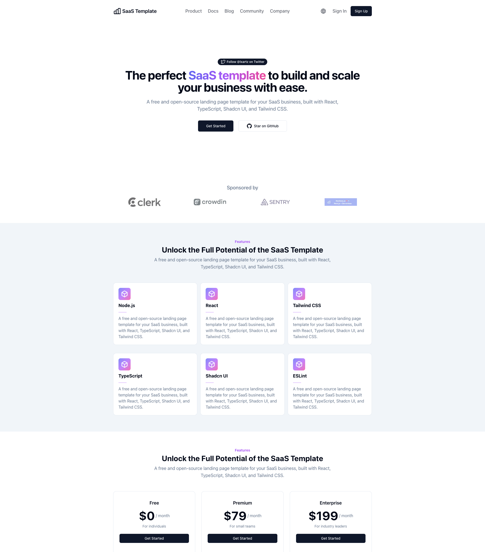
SaaS-Boilerplate
SaaS-Boilerplate is an open-source SaaS starter template built with Next.js App Router, React 19, TypeScript, Tailwind CSS, and Shadcn UI.
Next.js · SaaS
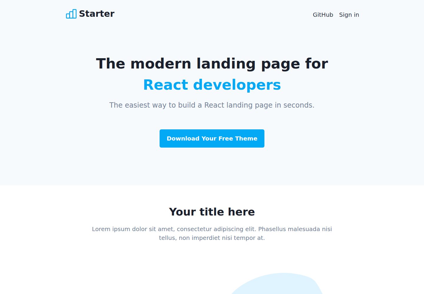
Next-JS-Landing-Page-Starter-Template
A free Next.js landing page starter template written in Tailwind CSS and TypeScript, featuring built-in navbar, hero, features, CTA banner, and footer sections.
Next.js · Corporate Website
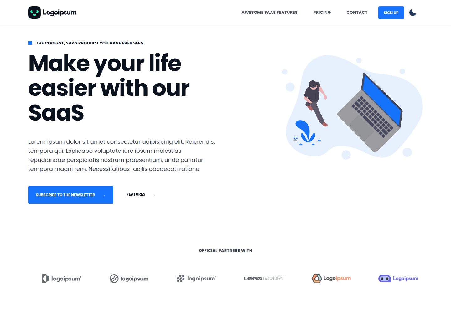
next-saas-starter
A free Next.js SaaS marketing landing page template from Blazity, using static generation and styled-components with no extra UI library.
Next.js · SaaS
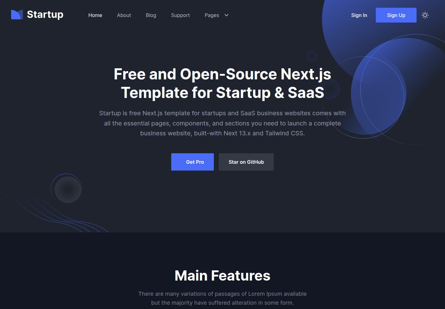
startup-nextjs
Startup is a free, MIT-licensed Next.js template from NextJSTemplates for SaaS startups and corporate landing pages.
Next.js · SaaS
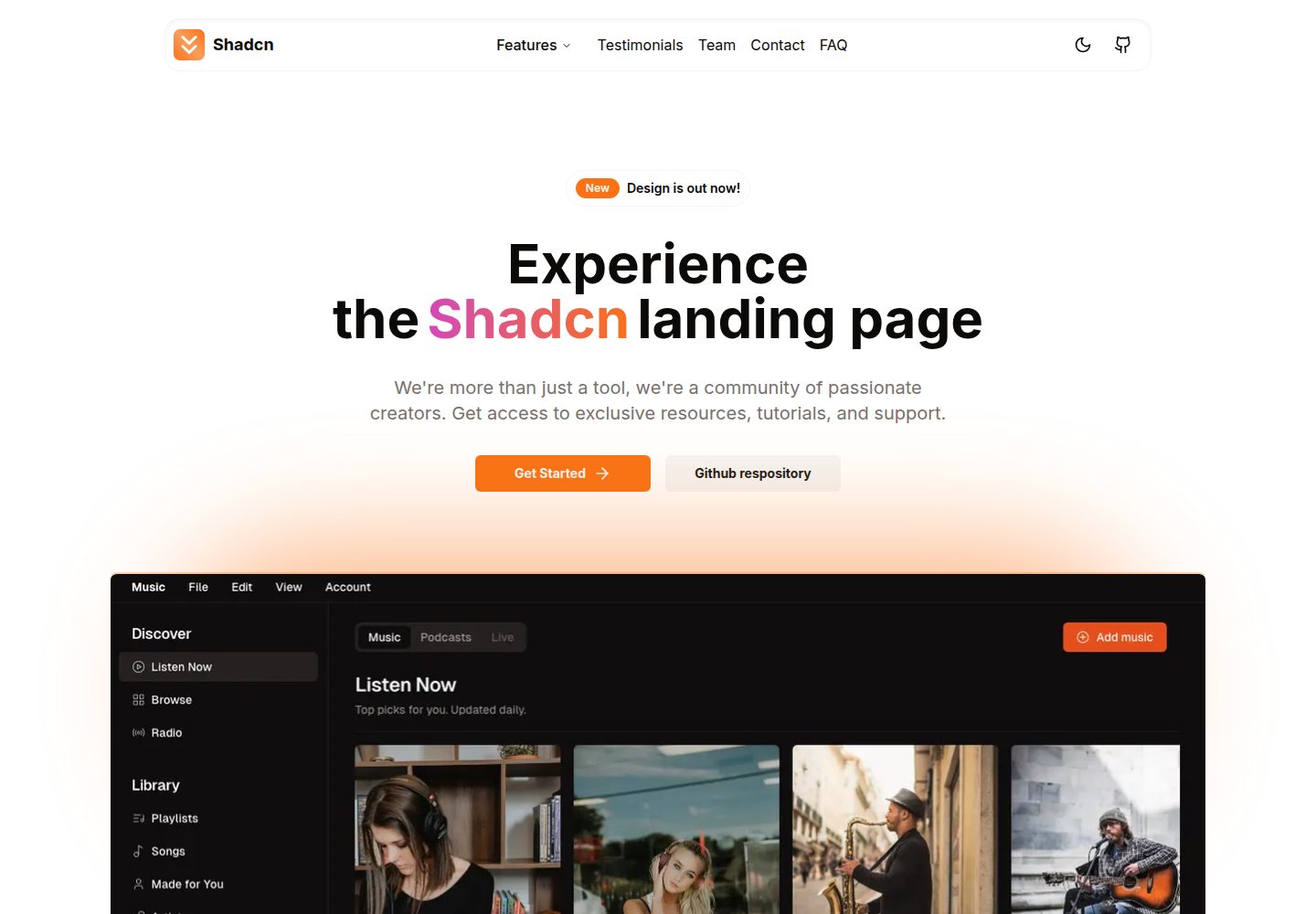
shadcn-landing-page
A Next.js landing page template built with Shadcn, TypeScript, and Tailwind, converted from a Shadcn-Vue version. It includes sections such as Navbar, mobile Sidebar, Hero, Pricing, FAQ, and Footer, and highlights responsive design, navigation, and dark mode.
Next.js · Corporate Website
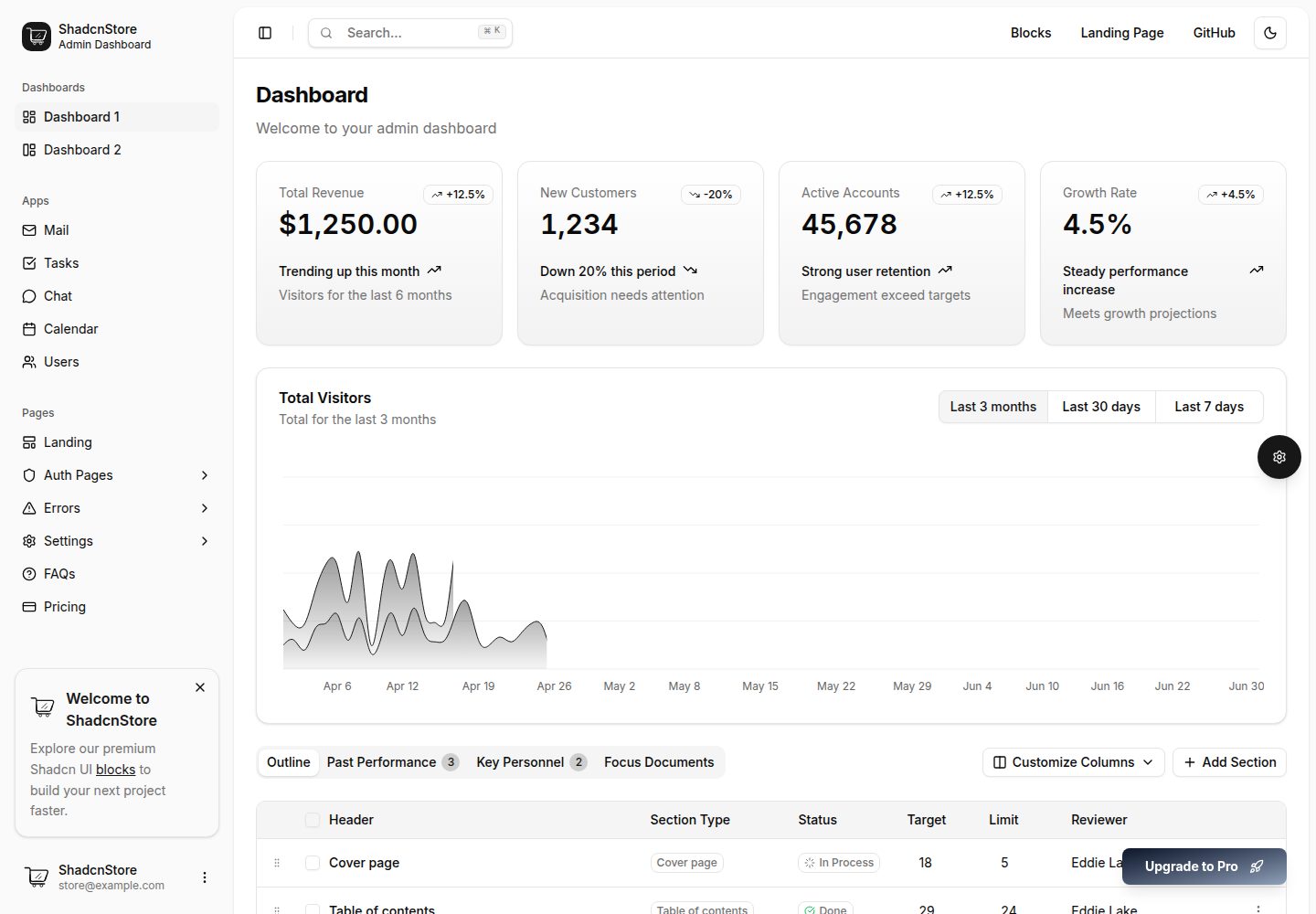
shadcn-dashboard-landing-template
An open-source admin dashboard and marketing landing page template built on shadcn/ui and Tailwind CSS, with both Vite + React and Next.js versions in one repository.
Next.js · Admin dashboard