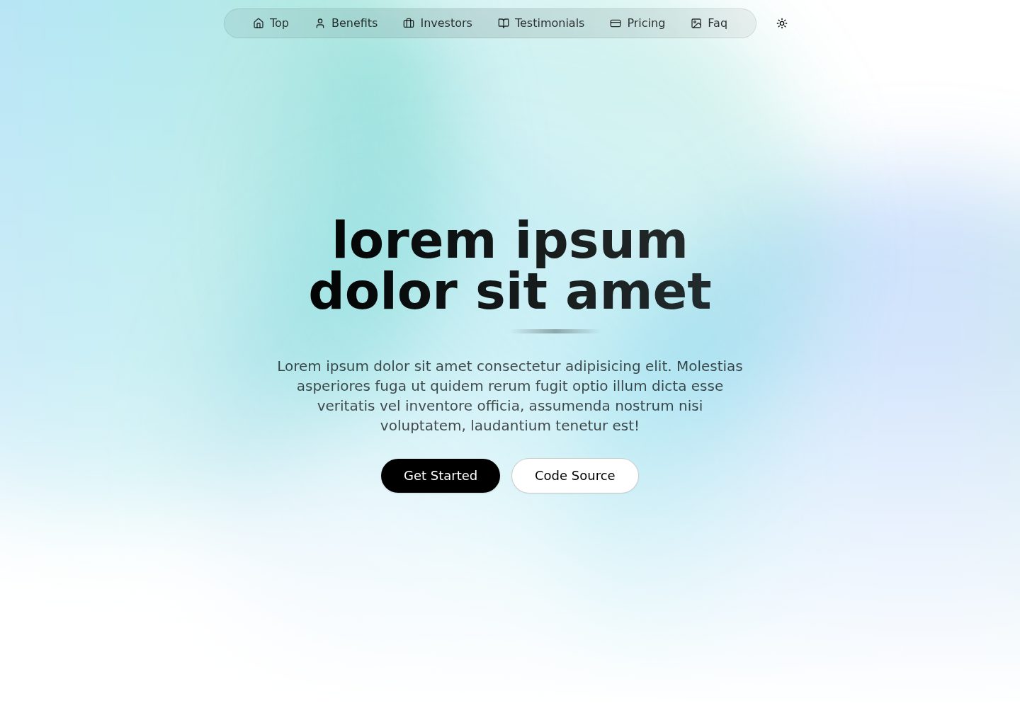
使用 Next.js 与 TypeScript 构建,样式基于 Tailwind CSS
Next.jsReact企业官网
nextjs-shadcn-landing — Next.js 企业官网模板
作者 anibalalpizar
基于 Next.js 与 shadcn/ui 的免费开源落地页模板,采用 TypeScript 与 Tailwind CSS,内置明暗主题与语义化颜色令牌,适合快速搭建企业官网或产品介绍页。
看看你的网站会是什么样
浏览真实页面截图,比较内容排版与手机效果。点击下方缩略图切换,放大查看整页细节。
全部页面与视图 2
截图用于了解视觉与布局,交互效果请以实际项目为准。
采集于 2026-10-03查看来源
值得关注的模板亮点
从已有项目资料中,快速了解它的特点。
内置 shadcn/ui 起步组件:button、badge、dropdown-menu、navigation-menu
通过 next-themes 提供明暗主题切换,默认跟随系统
在 globals.css 中定义完整的语义化颜色令牌,覆盖明暗两套主题
代码按 app、components/sections、components/ui、lib、types 分层组织
采用 MIT 许可,允许免费使用、修改、商用与分发
模板详细介绍
这是一个面向企业官网与产品落地页场景的开源模板,仓库采用 MIT 许可,可免费使用、修改、商用与分发。模板以 Next.js 为框架,使用 TypeScript 编写,样式层基于 Tailwind CSS,组件来自 shadcn/ui 的起步集合,包含 button、badge、dropdown-menu 与 navigation-menu 等可复用基础组件。
主题方面,项目通过 next-themes 提供 ThemeProvider,在根布局中启用系统主题跟随(defaultTheme="system"、enableSystem),并在 Tailwind 配置中开启 class 模式的暗色模式。globals.css 中为 :root 与 .dark 分别定义了语义化 CSS 变量,覆盖 background、foreground、card、popover、primary、secondary、muted、accent、destructive、border、input、ring 以及 chart-1 至 chart-5 等令牌,组件可直接以 Tailwind 工具类引用,自动适配明暗模式。
页面结构上,src/app/page.tsx 负责落地页的组合,src/components/sections 存放各分区及其子组件,src/components/ui 存放 shadcn/ui 组件,src/lib 与 src/types 分别放置工具函数与类型定义。README 提供了克隆仓库、安装依赖、启动开发服务器与构建生产版本的命令,并附有组件用法示例。
限制方面,模板仅提供落地页所需的基础组件与分区结构,不包含后端、数据库、支付或内容管理功能;演示中的图片、字体、图标等第三方素材需按各自许可单独核对,不能仅凭代码的 MIT 许可判断可用性。
Next.js企业官网
适合你的项目吗?
适用场景
- 搭建企业官网或产品介绍落地页
- 作为 Next.js 与 shadcn/ui 项目的起始模板
- 需要明暗主题切换与语义化颜色体系的展示型页面
- 在已有 Tailwind CSS 项目中引入 shadcn/ui 组件参考
适合人群
- 需要快速搭建落地页的前端开发者
- 熟悉 Next.js、TypeScript 与 Tailwind CSS 的团队
- 希望以 shadcn/ui 为基础定制企业官网的项目
- 接受 MIT 许可并自行核对第三方素材授权的使用者
上手与定制指南
结合仓库当前版本的说明,按下面的资料检查内容、配置与运行要求。
- 1
克隆仓库后进入目录执行 npm install 安装依赖
- 2
使用 npm run dev 启动开发服务器,npm run build 构建生产版本
- 3
主题配置位于 src/app/layout.tsx 与 tailwind.config.ts,颜色令牌定义在 src/app/globals.css
- 4
演示图片、字体、图标等第三方素材需按各自许可单独核对
- 5
域名、托管、数据库、支付或 AI 等外部服务可能产生额外费用
授权与来源资料
使用条件与限制
免费使用 · 保留许可声明本次收录的是公开仓库中采用 MIT 许可的免费版本;免费范围为该版本代码,不代表外部服务或第三方素材免费。
使用时需要遵守
- 允许免费使用、修改、商用和分发该版本代码。
- 分发代码副本或实质性部分时,保留原作者版权声明和完整 MIT 许可声明。
- 代码按现状提供;担保与责任限制以原许可证及适用法律为准。
额外费用与待核对事项
- 演示图片、字体、图标及其他第三方素材需按各自许可核对,不能仅凭代码的 MIT 许可判断。
- 域名、托管、数据库、支付或 AI 等外部服务可能另外收费。
查看原文依据
https://github.com/anibalalpizar/nextjs-shadcn-landing/blob/master/LICENSEhttps://github.com/anibalalpizar/nextjs-shadcn-landing/blob/master/README.mdPermission is hereby granted, free of charge
许可证原文
DeepSeek 根据仓库许可证和 README 整理 ·2026-10-04。结果仅覆盖已读取资料,依赖、图片、字体及后续条款变更以各自原文为准。
项目核对记录与介绍依据
模板资料
- 来源平台
- GitHub
- 资料与维护参考分
- 资料较完整 · 87 / 100
- 技术栈
- Next.js · React
- 网站类型
- 企业官网
这个分数如何计算
本站按许可资料(最高30分)、演示链接(12分)、预览图(10分)、Star数(15分)、记录的维护时间(15分)、描述完整度(8分)、功能记录(5分)和分类资料(5分)计算。它不是代码、安全或性能测试,也不是 Google 评分;有链接不代表已实测可用。
这个项目需要核对什么
- 记录的仓库更新时间
- 2026-08-15
- 截图检查日期
- 2026-10-04
已收录演示链接。请用你的内容与屏幕尺寸检查;有演示不代表表单、认证或支付已经可用。
目录记录的主要技术栈是 Next.js。请通过依赖清单和锁文件核对实际版本与托管要求。这些说明基于收录资料,不代表代码审计或部署实测。
查看具体选型方法 →介绍的制作与核对状态
介绍由 AI 辅助整理目录与仓库资料。仓库作者不等于这篇介绍的审核者。
审核声明: [email protected] · 2026-10-04
查看当时使用的来源资料
SHA-256: d3885933501316fbed0a77c55d4c92ab28f6b88001e797f9ab087bc47e29fb7f
2026-10-04T13:55:33.997Z
来源文件 / 仓库# 🚀 Shadcn/ui landing
A modern, fast, and user-friendly landing page built with cutting-edge frontend technologies. Perfect for developers who want to kickstart their projects with a solid foundation.
<div style="display: flex; justify-content: center; gap: 20px;">
<img src="https://github.com/user-attachments/assets/c10a943f-efa8-4024-b0bb-5eca2402f52e" alt="Node.js" width="400">
<img src="https://github.com/user-attachments/assets/c79c7102-3968-4e04-9221-22560e0cabab" alt="JavaScript" width="400">
</div>
## 🌐 Live Demo
Check out the live demo: [View Demo](https://nextjs-shadcn-landing.vercel.app)
[](https://nextjs-shadcn-landing.vercel.app)
## ✨ Features
- 📱 **Responsive Design** - Works seamlessly on desktop, tablet, and mobile
- 🎨 **Modern UI/UX** - Clean and intuitive interface with smooth animations
- ⚡ **Lightning Fast** - Optimized for speed with Next.js
- 🎯 **Type-Safe** - Built with TypeScript for better development experience
- 🎨 **shadcn/ui Starter Set** - Includes reusable primitives (button, badge, dropdown-menu, navigation-menu)
## 🌗 Theme Provider + Semantic Tokens
This project uses the standard shadcn theme setup with `next-themes`:
- `ThemeProvider` wrapper in `src/app/layout.tsx` with:
- `attribute="class"`
- `defaultTheme="system"`
- `enableSystem`
- `disableTransitionOnChange`
- `darkMode: ["class"]` enabled in `tailwind.config.ts`
- CSS variables defined in `src/app/globals.css` for light (`:root`) and dark (`.dark`) themes.
Semantic tokens available for Tailwind utilities include:
- `background`, `foreground`
- `card`, `card-foreground`
- `popover`, `popover-foreground`
- `primary`, `primary-foreground`
- `secondary`, `secondary-foreground`
- `muted`, `muted-foreground`
- `accent`, `accent-foreground`
- `destructive`, `destructive-foreground`
- `border`, `input`, `ring`
- `chart-1` to `chart-5`
Example usage:
```tsx
<section className="bg-background text-foreground border-border">
<h2 className="text-primary">Semantic theme token example</h2>
<p className="text-muted-foreground">
Automatically adapts to light/dark mode.
</p>
</section>
```
## 🛠️ Installation
1. Clone the repository:
```bash
git clone https://github.com/anibalalpizar/nextjs-shadcn-landing.git
```
2. Install dependencies:
```bash
cd nextjs-shadcn-landing
npm install
```
## 🚀 Usage
Start the development server:
```bash
npm run dev
```
Build for production:
```bash
npm run build
```
## 💻 Code Examples
### Component Usage
```tsx
import { Button } from "@/components/ui/button"
function HeroSection() {
return (
<section className="space-y-6 rounded-2xl border bg-card p-6 shadow-sm">
<p className="text-sm font-medium uppercase tracking-[0.2em] text-muted-foreground">
Launch faster
</p>
<h1 className="text-3xl font-bold tracking-tight text-foreground">
Welcome to our landing page
</h1>
<p className="max-w-xl text-muted-foreground">
Start building something amazing.
</p>
<Button>Get Started</Button>
</section>
)
}
```
## 🛠️ Tech Stack
Our landing page is built with modern frontend technologies:
- [](https://nextjs.org/) - React framework for production
- [](https://www.typescriptlang.org/) - Type-safe JavaScript
- [](https://tailwindcss.com/) - Utility-first CSS framework
- [](https://ui.shadcn.com/) - Re-usable components
## 📊 Project Structure
```
.
├── src/
│ ├── app/
│ │ ├── fonts/ # Font configurations
│ │ ├── layout.tsx # Root layout
│ │ └── page.tsx # Landing page composition
│ ├── components/
│ │ ├── sections/ # Landing sections + section subcomponents
│ │ ├── ui/ # shadcn/ui components
│ │ │ ├── badge.tsx
│ │ │ ├── button.tsx
│ │ │ ├── dropdown-menu.tsx
│ │ │ └── navigation-menu.tsx
│ │ └── theme-provider.tsx
│ ├── lib/ # Utility functions
│ └── types/ # TypeScript type definitions
```
## 🤝 Contributing
1. Fork the repository
2. Create your feature branch (`git checkout -b feature/AmazingFeature`)
3. Commit your changes (`git commit -m 'Add some AmazingFeature'`)
4. Push to the branch (`git push origin feature/AmazingFeature`)
5. Open a Pull Request
## 📝 License
This project is licensed under the MIT License - see the [LICENSE](LICENSE) file for details.
---
⭐️ If you found this project helpful, please give it a star!
看看同类模板
对比同技术栈与用途的模板,找到更适合的视觉与内容结构。
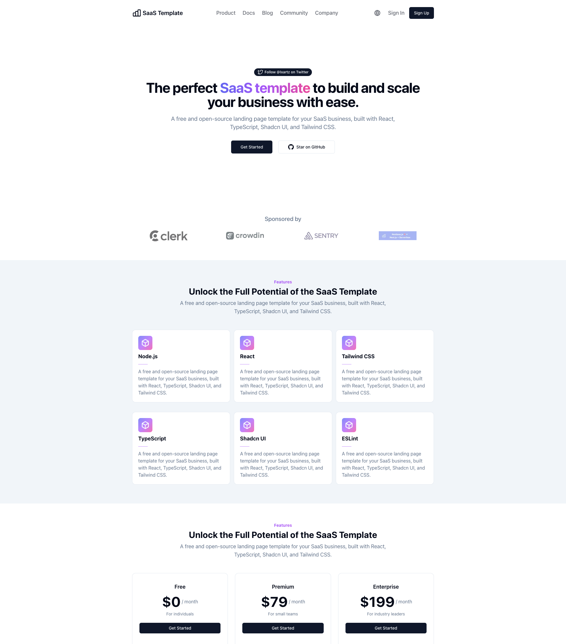
SaaS-Boilerplate
🚀🎉📚 SaaS Boilerplate built with Next.js + Tailwind CSS + Shadcn UI + TypeScript. ⚡️ Full-stack React applic…
Next.js · SaaS
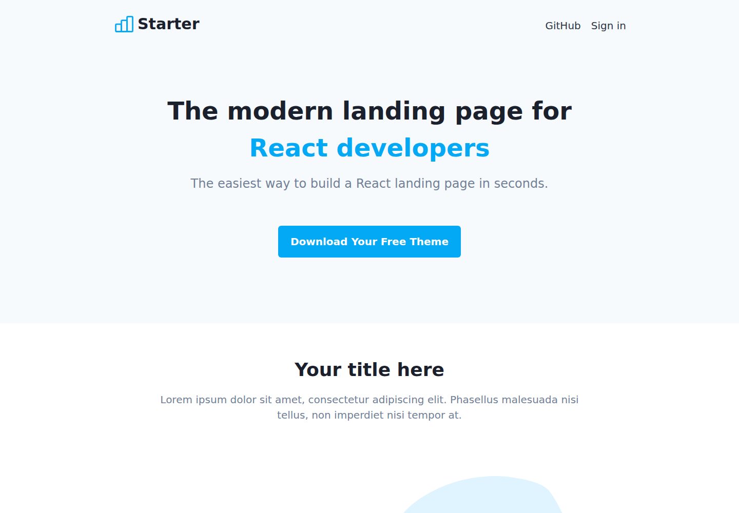
Next-JS-Landing-Page-Starter-Template
🚀 Free NextJS Landing Page Template written in Tailwind CSS 3 and TypeScript ⚡️ Made with developer experienc…
Next.js · 企业官网
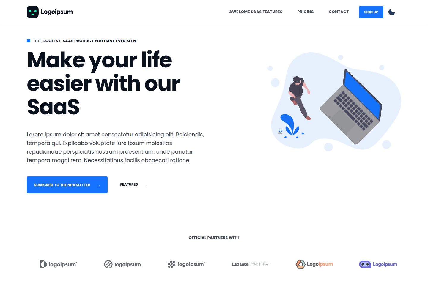
next-saas-starter
⚡️ Free Next.js responsive landing page template for SaaS products made using JAMStack architecture.
Next.js · SaaS
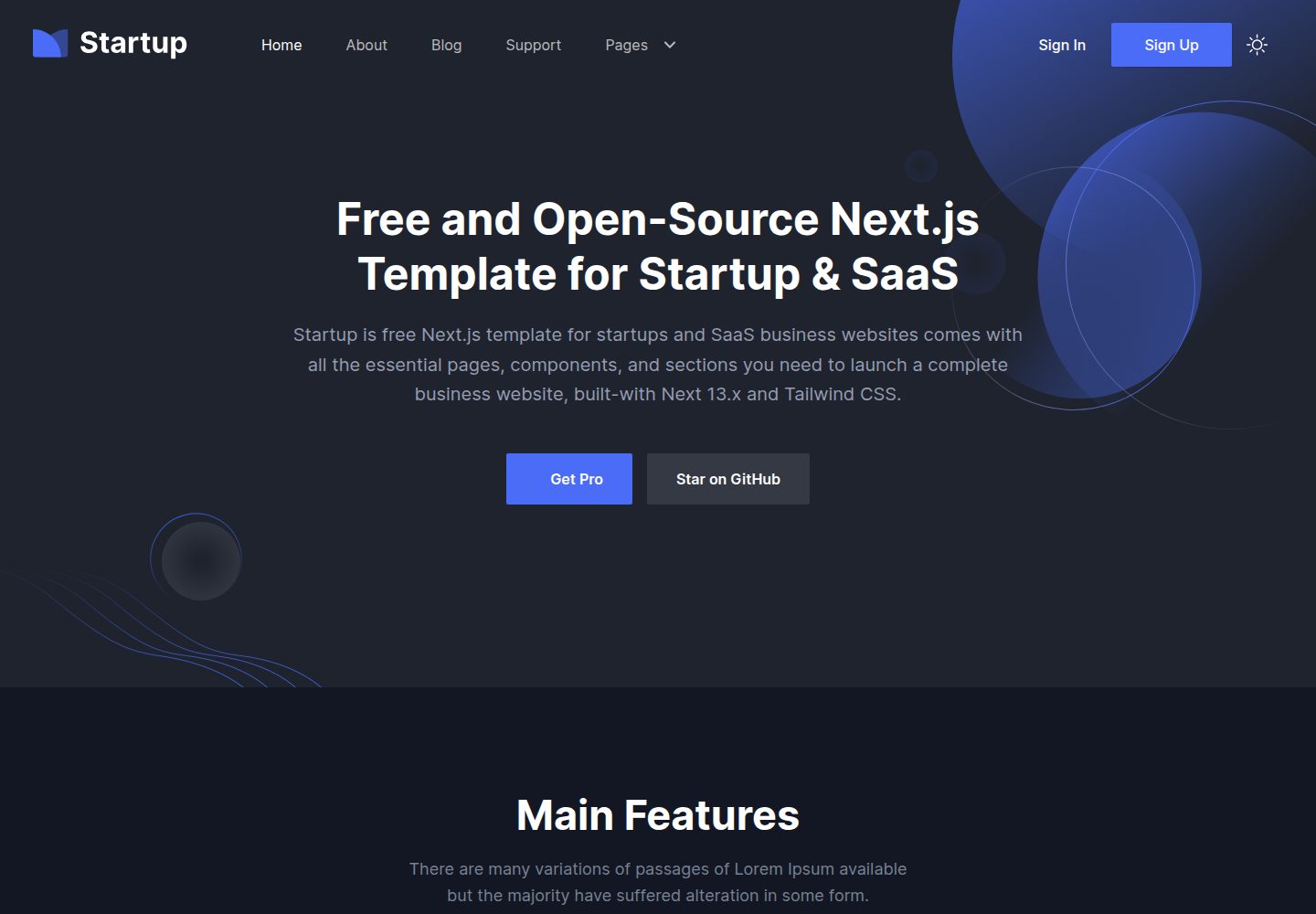
startup-nextjs
Startup is free Next.js template for SaaS startups comes with all the essential pages, components, and section…
Next.js · SaaS
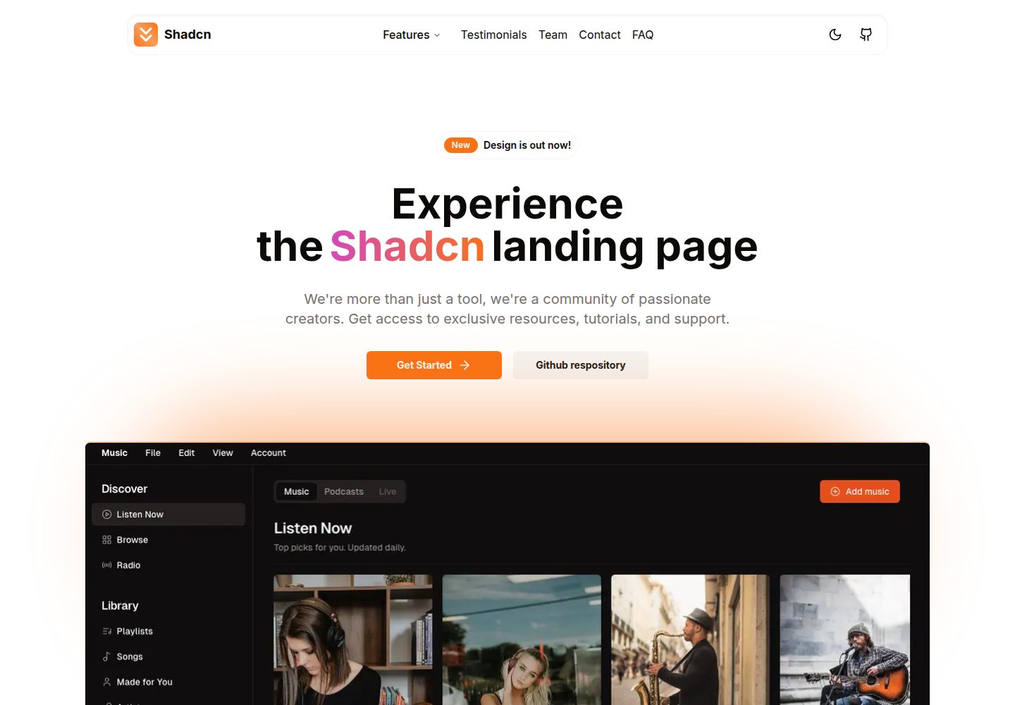
shadcn-landing-page
New design 🎉 Nextjs + Shadcn + TypeScript + Tailwind. Landing page template ease-to-use
Next.js · 企业官网
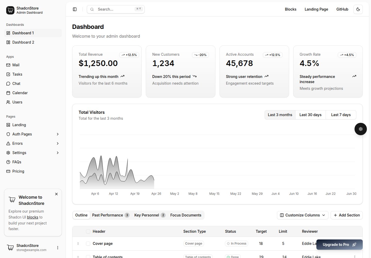
shadcn-dashboard-landing-template
Accelerate your development with a sleek, open-source admin dashboard and landing page built on Vite-React, Ne…
Next.js · 后台