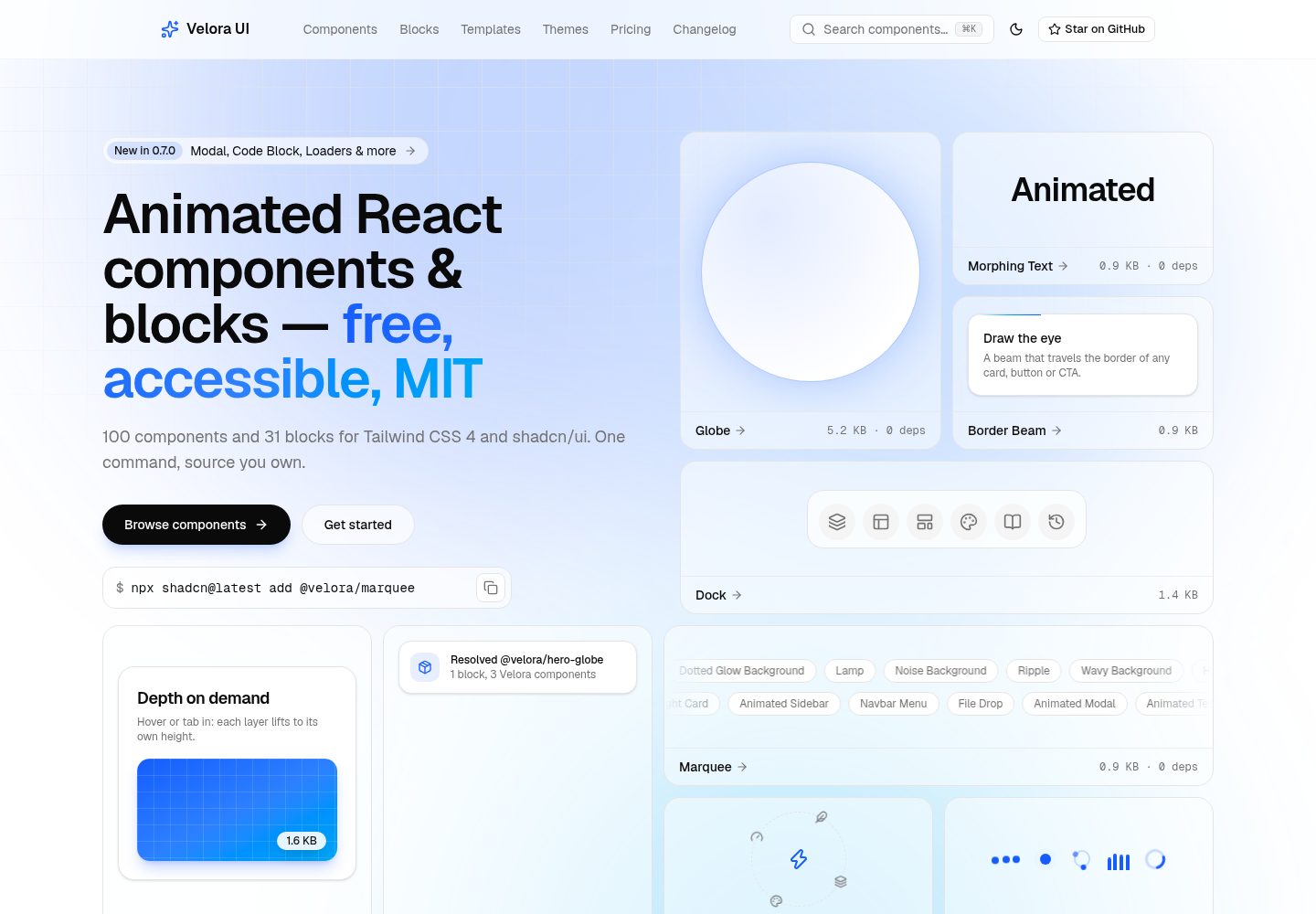
100 animated shadcn/ui components organized by categories such as background, text, button, card, navigation, form, and scroll
Next.jsReactCorporate Website
velora-ui — Next.js Business Template
By ColorlibHQ
Velora UI is an MIT-licensed open-source project maintained by ColorlibHQ, offering 100 animated shadcn/ui components, 31 blocks, and a multi-page SaaS landing page template built on Next.js.
Explore the design
Compare the page layouts and mobile experience. Open any screenshot for a closer look.
Desktop homepage1 / 3
Desktop captureTop of page
Actual screenshot captured by the server browser.
All pages & views 3
Screenshots show visual appearance; interactive behavior may differ.
Recorded 2026-10-01View source
What stands out
A quick read of the recorded project description.
31 directly installable blocks covering Hero, features, pricing, testimonials, CTA, logo cloud, FAQ, navigation, and footer
Complete multi-page SaaS template including home, component library, themes, pricing, MDX blog, changelog, about, contact, login, signup, and 404
Components distributed as standard shadcn registry entries, supporting installation via shadcn CLI by name or URL
Components read shadcn CSS variables, allowing brand color switching by modifying seven variables, with six preset themes provided
Each component documentation page lists gzip size, dependency count, and reduced-motion support
Template Details
Velora UI targets React and shadcn/ui projects, with the repository providing both a component library and a complete landing page template. Components are distributed as standard shadcn registry entries and can be installed via the shadcn CLI by name or URL; they include keyframes and brand tokens and can be used independently in existing projects. The template includes pages for a SaaS landing page, component catalog, themes, pricing, MDX blog, changelog, about, contact, login, signup, and 404, with page data inlined in each page file.
The project uses Next.js, React, Tailwind CSS, shadcn/ui, Motion, and TypeScript. The README states that components do not depend on Radix or Base UI and can adapt to different primitive layers; each component documentation page lists gzip size, dependency count, and reduced-motion status. Contact and authentication forms are front-end-only demos and require your own backend or authentication service.
Regarding licensing, the code is under the MIT license, permitting free use, modification, commercial use, and distribution, provided the copyright notice and license notice are retained when distributing. Third-party assets such as demo images, fonts, and icons must be checked against their respective licenses; external services like domains, hosting, and databases may incur separate charges.
Next.jsReactCorporate website
Is it right for your project?
Use Cases
- Quickly introduce animated shadcn/ui components into React or Next.js projects
- Build a SaaS product website by directly reusing or adapting the complete landing page template
- Install blocks on demand in existing shadcn projects, such as Hero, pricing table, or FAQ
- Use shadcn MCP to let AI coding assistants browse and install components by name
- Build product content sections using MDX blog and changelog pages
Suitable For
- Front-end developers using React and shadcn/ui
- Teams needing a free MIT-licensed component library or landing page template
- Projects wanting to control brand colors uniformly via CSS variables
- Developers needing reduced-motion and accessibility annotation references
Getting started & customization
Use these recorded setup notes alongside the repository instructions for your chosen version.
- 1
After cloning the repository, install dependencies with pnpm install and start the development server with pnpm dev
- 2
Components can be installed via npx shadcn@latest add https://velora.colorlib.com/r/<name>.json
- 3
Modify brand colors in the token block of src/app/globals.css, or copy presets from /themes
- 4
Place blog posts in src/app/blog/(posts)/<slug>/page.mdx and register them in src/lib/blog-posts.ts
- 5
Contact and authentication forms are front-end demos and require your own backend or authentication service
License & source material
Usage conditions & limitations
Free to use · keep license noticeThis entry covers the free version under the MIT license in the public repository; the free scope applies to that version's code and does not imply that external services or third-party assets are free.
Must comply with when using
- Free use, modification, commercial use, and distribution of that version's code are permitted.
- When distributing copies or substantial portions of the code, retain the original author's copyright notice and the full MIT license notice.
- The code is provided as is; warranties and limitations of liability are governed by the original license and applicable law.
Additional costs & items to verify
- When using the template, do not run pnpm add -D typescript, as it will replace the aliased v6 package and break lint; wait until typescript-eslint supports TypeScript 7.1 before merging dependencies.
- The contact form and login/signup forms are front-end-only demos without backend logic; you must integrate your own backend or authentication service to use them in practice.
- Before installing components by name, you must register the @velora namespace; otherwise, the shorthand installation command cannot be used.
- Demo images, fonts, icons, and other third-party assets must be checked against their respective licenses; they cannot be judged solely by the code's MIT license.
- External services such as domains, hosting, databases, payments, or AI may incur separate charges.
View Original Text Basis
Permission is hereby granted, free of charge
Original License Text
Do not run `pnpm add -D typescript` in this repo: it replaces the aliased v6 package and > breaks linting.
Original README
contact and auth forms are frontend-only demos; wire them to your backend or auth provider.
Original README
https://github.com/ColorlibHQ/velora-ui/blob/main/LICENSEhttps://github.com/ColorlibHQ/velora-ui/blob/main/README.mdregister the namespace once and install by name
Original README
Compiled by DeepSeek based on repository license and README ·2026-10-02. Results only cover the materials read; dependencies, images, fonts, and subsequent term changes are subject to their respective original texts.
Project checks & description sources
Template Information
- Source platforms
- GitHub
- Documentation and maintenance reference score
- More documented · 92 / 100
- Technologies
- Next.js · React
- Website type
- Corporate Website
How this score is calculated
Our heuristic uses license records (up to 30), a demo link (12), a preview (10), stars (15), recorded maintenance (15), description completeness (8), feature records (5) and classification data (5). It is not a code, security or performance test, or a Google score. A link does not establish tested functionality.
What to verify for this project
- Repository update recorded
- 2026-09-30
- Screenshot last checked
- 2026-10-02
A demo link is listed. Check it with your own content and viewport sizes; its presence does not confirm that forms, authentication or payments work.
The catalog identifies Next.js as the primary stack. Check the actual dependency manifest and lockfile for versions and hosting requirements. These notes use recorded metadata, not a code audit or a deployment test.
Use a selection guide →How this description was prepared
AI-assisted description based on catalog records and repository material. Repository authors are not automatically the reviewers of this description.
Automatically checked against source and license rules; no manual editorial review.
Inspect the recorded source material
SHA-256: dd9e64c0ad8ceb6d211a5b27cabf8eb2c196ba1821dd806eece2c3556f8edf17
2026-10-02T02:18:08.120Z
Source file / repository<div align="center">
# Velora UI
**Free, MIT-licensed animated components and complete landing templates for React.**
100 animated shadcn/ui components and a full multi-page SaaS template — home, pricing, blog (MDX), auth, changelog, contact and 404 — built with Next.js 16, Tailwind CSS 4 and Motion. The free tier isn't a teaser: everything on the site ships under MIT, commercial use included.
[](https://velora.colorlib.com)
[](./LICENSE)
[](https://github.com/ColorlibHQ/velora-ui/stargazers)





<a href="https://velora.colorlib.com">
<img src=".github/screenshots/hero.webp" alt="Velora UI — landing pages that feel alive" width="100%">
</a>
</div>
## Screenshots
<table>
<tr>
<td width="50%" align="center">
<a href="https://velora.colorlib.com/components"><img src=".github/screenshots/components.webp" alt="Component catalog — 100 animated components grouped by category"></a>
<br><sub><b>Component catalog</b> — 100 components, grouped by category, one CLI command to install.</sub>
</td>
<td width="50%" align="center">
<a href="https://velora.colorlib.com/themes"><img src=".github/screenshots/themes.webp" alt="Themes — rebrand from one token block"></a>
<br><sub><b>Themes</b> — swap the whole identity by editing seven CSS variables.</sub>
</td>
</tr>
<tr>
<td width="50%" align="center">
<a href="https://velora.colorlib.com/components/border-beam"><img src=".github/screenshots/component-page.webp" alt="Component docs page with size, dependency and reduced-motion badges"></a>
<br><sub><b>Every component ships its receipts</b> — gzip size, dependency count and reduced-motion status, plus live demo, install command and source.</sub>
</td>
<td width="50%" align="center">
<a href="https://velora.colorlib.com/pricing"><img src=".github/screenshots/pricing.webp" alt="Pricing — the whole product is free"></a>
<br><sub><b>The whole product is free</b> — every component and the complete template under MIT.</sub>
</td>
</tr>
</table>
## Why Velora
- **The free tier is the whole product.** Complete assembled pages, not just isolated components. The kind of template that costs $149–$299 elsewhere is the baseline here.
- **Animations with receipts.** Every component's docs page shows its gzipped size (0.3–3 KB for 97 of them; the dependency-free Globe carries its own land map at 5.2 KB — no Three.js, no WebGL) and dependency count. 51 of 100 components have zero runtime dependencies; the rest use Motion and nothing else.
- **Tokens, not hardcoded hues.** Components read your shadcn CSS variables. Rebrand every gradient, beam and glow by editing seven variables — ready-made presets on the [themes page](https://velora.colorlib.com/themes).
- **Motion that asks permission.** Every component handles `prefers-reduced-motion` itself — so it still does after you install it — and documents what reduced-motion, keyboard and screen-reader users get on its docs page.
- **Primitive-agnostic.** Velora components import neither Radix nor Base UI — they work in any shadcn project, whichever primitive layer you use.
## What's inside
### 100 animated components
| Category | Components |
|----------|-----------|
| **Backgrounds** | Aurora Background · Background Beams · Background Boxes · Dotted Glow Background · Flickering Grid · Grid & Dot Pattern · Lamp · Light Rays · Meteors · Noise Background · Particles · Retro Grid · Ripple · Shooting Stars · Vortex · Wavy Background |
| **Text** | Animated Gradient Text · Flip Words · Hyper Text · Morphing Text · Number Ticker · Sparkles Text · Text Highlighter · Text Hover Effect · Text Reveal · Text Shimmer · Typewriter · Word Rotate |
| **Buttons** | Confetti · Magnetic Button · Moving Border · Rainbow Button · Ripple Button · Shimmer Button · Stateful Button · Theme Toggler |
| **Cards & Layout** | Animated List · Animated Tooltip · Avatar Circles · Bento Grid · Card Hover Effect · Card Stack · Compare Slider · Direction Aware Hover · Dock · Draggable Card · Evervault Card · Expandable Card · File Tree · Focus Cards · Glare Card · Layout Grid · Marquee · Orbiting Circles · Spotlight Card · Tilt Card · Wobble Card |
| **Navigation** | Animated Sidebar · Animated Tabs · Floating Navbar · Navbar Menu · Resizable Navbar · Sticky Banner |
| **Forms** | File Drop · Stepper · Vanish Input |
| **Overlays** | Animated Modal |
| **Loaders** | Loaders · Multi Step Loader |
| **Social Proof** | Animated Testimonials · Logo Cloud · Tweet Card |
| **Scroll** | Container Scroll · Hero Parallax · Macbook Scroll · Parallax Grid · Scroll Progress · Scroll Velocity · Sticky Scroll · Timeline · Tracing Beam |
| **Effects** | Animated Beam · Blur Fade · Border Beam · Glowing Effect |
| **3D** | 3D Card · 3D Pin |
| **Carousels** | 3D Marquee · Apple Cards Carousel · Image Slider |
| **Cursor & Pointer** | Following Pointer · Lens · Pointer Highlight · Smooth Cursor |
| **Data & Maps** | Globe · World Map |
| **Mockups** | Browser Mockup · Code Block · iPhone Mockup · Terminal |
Browse them all — with live demos, props, install commands and source — at [velora.colorlib.com/components](https://velora.colorlib.com/components). New here? Start with [Get started](https://velora.colorlib.com/components/get-started), or register the namespace once and install by name:
```bash
npx shadcn@latest registry add @velora=https://velora.colorlib.com/r/{name}.json
npx shadcn@latest add @velora/marquee
```
Coming from another library? See the measured comparisons with [Aceternity UI](https://velora.colorlib.com/compare/aceternity-ui) and [Magic UI](https://velora.colorlib.com/compare/magic-ui).
### 31 free blocks
Complete sections built from Velora components — preview them at desktop, tablet and mobile widths, copy the code, or install one with the shadcn CLI and it brings every component it uses along:
```bash
npx shadcn@latest add https://velora.colorlib.com/r/hero-globe.json
```
| Category | Blocks |
|----------|--------|
| **[Hero Sections](https://velora.colorlib.com/blocks/hero-sections)** | Aurora hero · Globe split hero · Product screenshot hero · Phone split hero · Wavy hero · Developer tool hero |
| **[Feature Sections](https://velora.colorlib.com/blocks/feature-sections)** | Bento feature grid · Icon feature grid · Tabbed product tour · Alternating screenshot rows · Numbered steps |
| **[Pricing Sections](https://velora.colorlib.com/blocks/pricing-sections)** | Three-tier pricing · Single plan pricing · Pricing comparison table |
| **[Testimonial Sections](https://velora.colorlib.com/blocks/testimonial-sections)** | Testimonial marquee · Featured testimonial · Testimonial grid |
| **[CTA Sections](https://velora.colorlib.com/blocks/cta-sections)** | Vortex CTA band · Split CTA with product visual · Newsletter sign-up |
| **[Logo Clouds](https://velora.colorlib.com/blocks/logo-clouds)** | Logo marquee · Logo grid |
| **[FAQ Sections](https://velora.colorlib.com/blocks/faq-sections)** | Centered FAQ accordion · Two-column FAQ |
| **[Navbars](https://velora.colorlib.com/blocks/navbars)** | Floating pill navbar · Mega menu navbar |
| **[Footers](https://velora.colorlib.com/blocks/footers)** | Link columns footer · Giant wordmark footer · Newsletter footer |
| **[Login & Sign-up](https://velora.colorlib.com/blocks/auth-sections)** | Split login page · Sign-up card |
### The complete template
A production landing site, not a component sandbox — browse it at [/templates](https://velora.colorlib.com/templates). Every page is real, static-rendered and yours to keep:
| Page | What you get |
|------|--------------|
| [SaaS landing](https://velora.colorlib.com/templates/saas) | Animated hero, feature bento, integrations, sample testimonials, pricing, FAQ and CTA — in `src/app/templates/saas/page.tsx`; move it to `src/app/page.tsx` to make it your homepage |
| [Components](https://velora.colorlib.com/components) | Browsable gallery + a docs page per component (demo · props · install · source) |
| [Themes](https://velora.colorlib.com/themes) | Six brand presets with live token switching |
| [Pricing](https://velora.colorlib.com/pricing) | Free vs. Pro tiers with feature comparison |
| [Blog](https://velora.colorlib.com/blog) | MDX-powered blog with three starter posts |
| [Changelog](https://velora.colorlib.com/changelog) | Release timeline |
| [About](https://velora.colorlib.com/about) · [Contact](https://velora.colorlib.com/contact) | Company page + frontend-only contact form |
| [Login](https://velora.colorlib.com/login) · [Signup](https://velora.colorlib.com/signup) | Auth screens (frontend-only) |
| 404 | Styled not-found page |
## Install components
Every component is a standard shadcn registry item:
```bash
npx shadcn@latest add https://velora.colorlib.com/r/aurora-background.json
```
Components carry their own keyframes and brand tokens, so they work standalone in existing projects. Browse the full catalog at [velora.colorlib.com/components](https://velora.colorlib.com/components).
### Use with AI agents
Velora is a standard shadcn registry, so it plugs into the shadcn MCP server with zero extra setup — an agent in Cursor, Claude Code or VS Code can browse and install Velora components by name:
```bash
pnpm dlx shadcn@latest mcp init --client claude
```
For discovery, [llms.txt](https://velora.colorlib.com/llms.txt) lists every component with its install command, gzipped size and dependency count — so an agent can pick components by cost, not just by looks.
## Use the template
```bash
git clone https://github.com/ColorlibHQ/velora-ui.git my-landing
cd my-landing
pnpm install
pnpm dev
```
Then make it yours:
1. **Content** — pages live in `src/app/`, section data is inline per page.
2. **Brand** — swap the token block in `src/app/globals.css` (or copy a preset from `/themes`).
3. **Blog** — add MDX files under `src/app/blog/(posts)/<slug>/page.mdx` and register them in `src/lib/blog-posts.ts`.
4. **Forms** — contact and auth forms are frontend-only demos; wire them to your backend or auth provider.
## Scripts
```bash
pnpm dev # dev server (Turbopack)
pnpm build # production build (all pages static)
pnpm lint # eslint
pnpm registry:build # component stats + registry.json + public/r/*.json + llms.txt
```
## Stack
Next.js 16 · React 19 · Tailwind CSS 4 · shadcn/ui · Motion · TypeScript
### About the TypeScript setup
TypeScript 7 is a native (Go) compiler that ships **only** a `tsc` binary — no `tsserver`
and no JavaScript compiler API. Editors and `typescript-eslint` still need the API, so this
repo installs both, which is the arrangement the TypeScript team documents:
| Dependency | Resolves to | Used by |
|------------|-------------|---------|
| `typescript` | `@typescript/typescript6` (v6 API + `tsc6`) | editor language service, `typescript-eslint` |
| `typescript-native` | `typescript` v7 (`tsc`) | `next build` type checking |
`next build` runs the project-local `tsc`, so type checking uses the native compiler
(~3× faster here), while your editor and `pnpm lint` keep working. Nothing in the
component source depends on this — it is purely a toolchain detail.
> Do not run `pnpm add -D typescript` in this repo: it replaces the aliased v6 package and
> breaks linting. Collapse both entries back to a plain `typescript` dependency once
> `typescript-eslint` supports TypeScript 7.1.
## License
[MIT](./LICENSE) — free for personal and commercial use, no attribution required.
Explore similar templates
Compare previews and descriptions within the same stack and category.
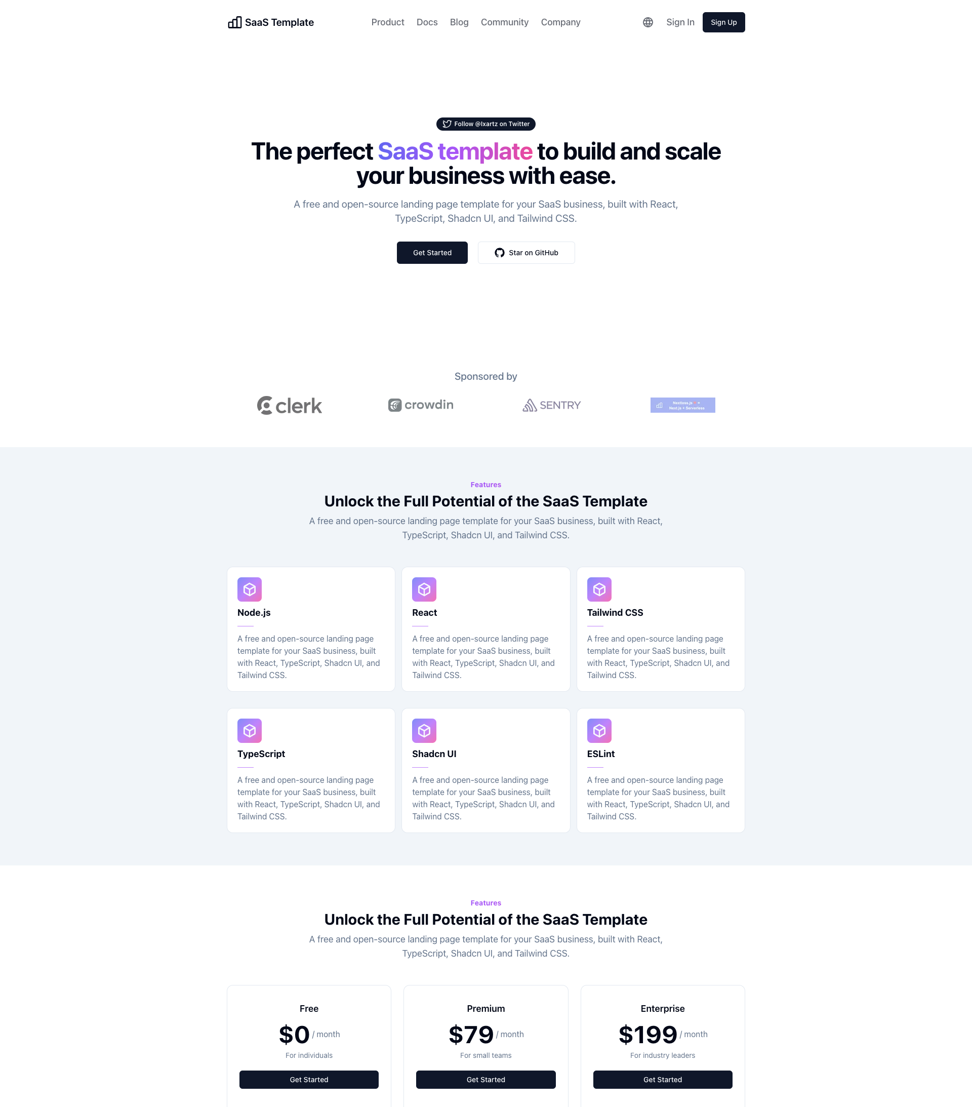
SaaS-Boilerplate
SaaS-Boilerplate is an open-source SaaS starter template built with Next.js App Router, React 19, TypeScript, Tailwind CSS, and Shadcn UI.
Next.js · SaaS
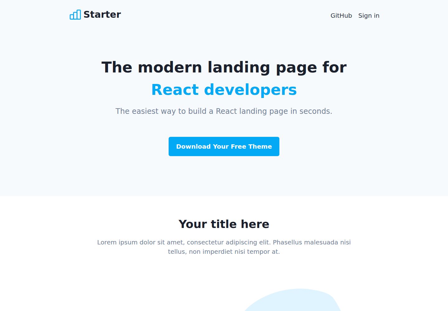
Next-JS-Landing-Page-Starter-Template
A free Next.js landing page starter template written in Tailwind CSS and TypeScript, featuring built-in navbar, hero, features, CTA banner, and footer sections.
Next.js · Corporate Website
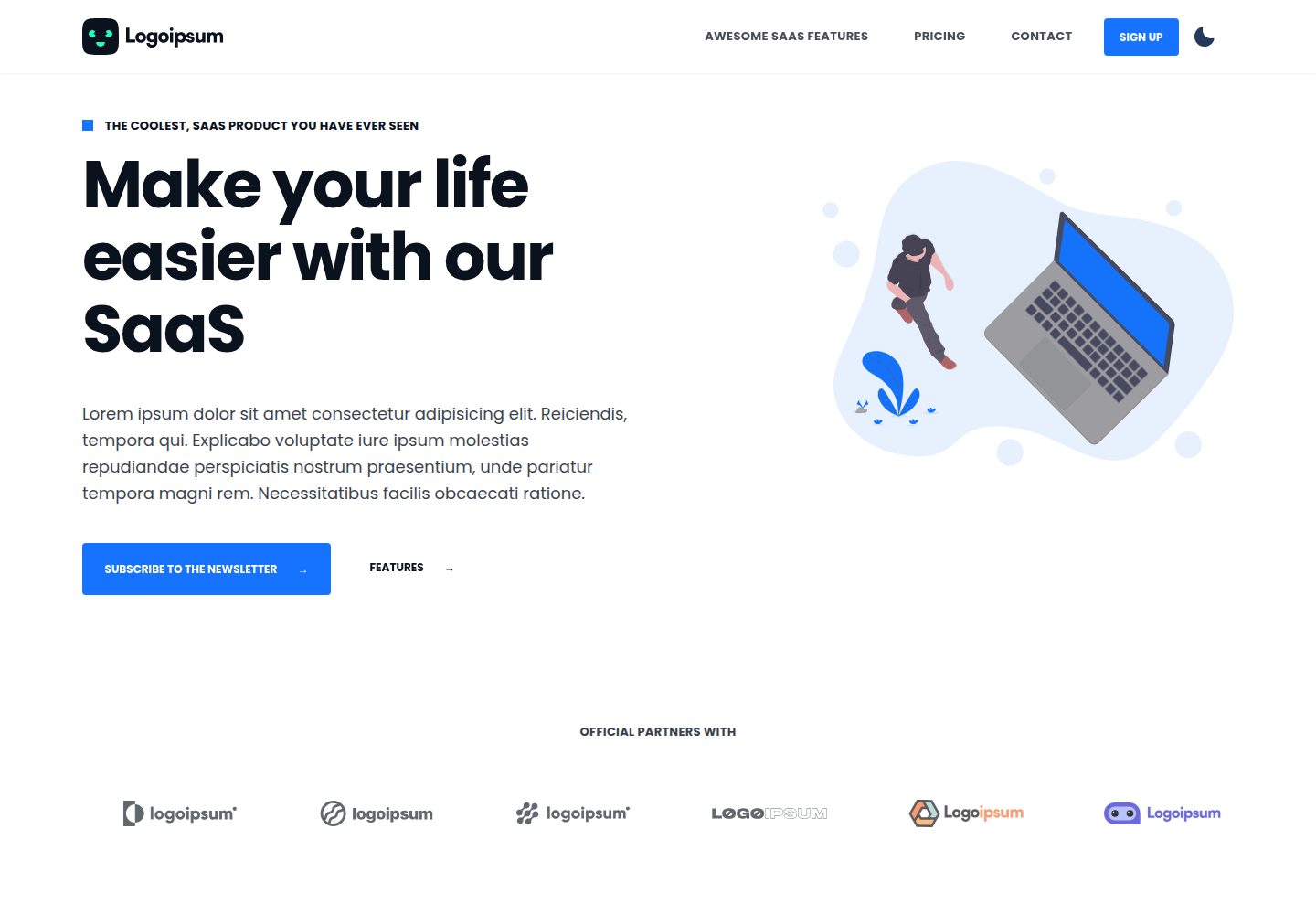
next-saas-starter
A free Next.js SaaS marketing landing page template from Blazity, using static generation and styled-components with no extra UI library.
Next.js · SaaS
startup-nextjs
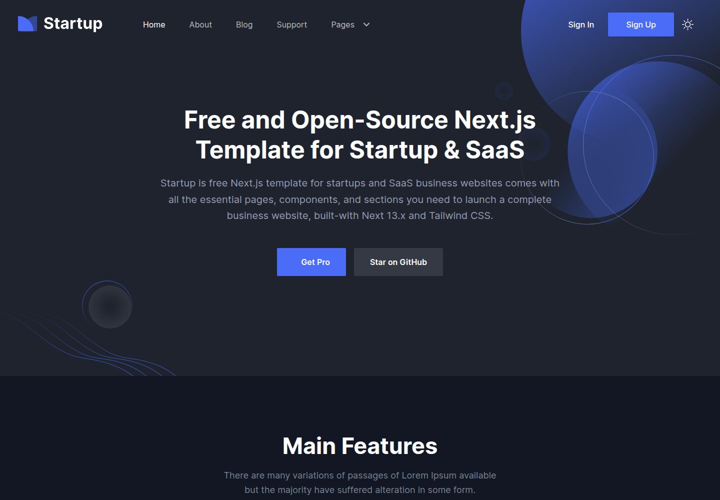
Startup is a free, MIT-licensed Next.js template from NextJSTemplates for SaaS startups and corporate landing pages.
Next.js · SaaS
shadcn-landing-page
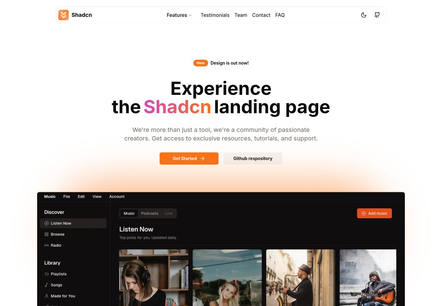
A Next.js landing page template built with Shadcn, TypeScript, and Tailwind, converted from a Shadcn-Vue version. It includes sections such as Navbar, mobile Sidebar, Hero, Pricing, FAQ, and Footer, and highlights responsive design, navigation, and dark mode.
Next.js · Corporate Website
shadcn-dashboard-landing-template
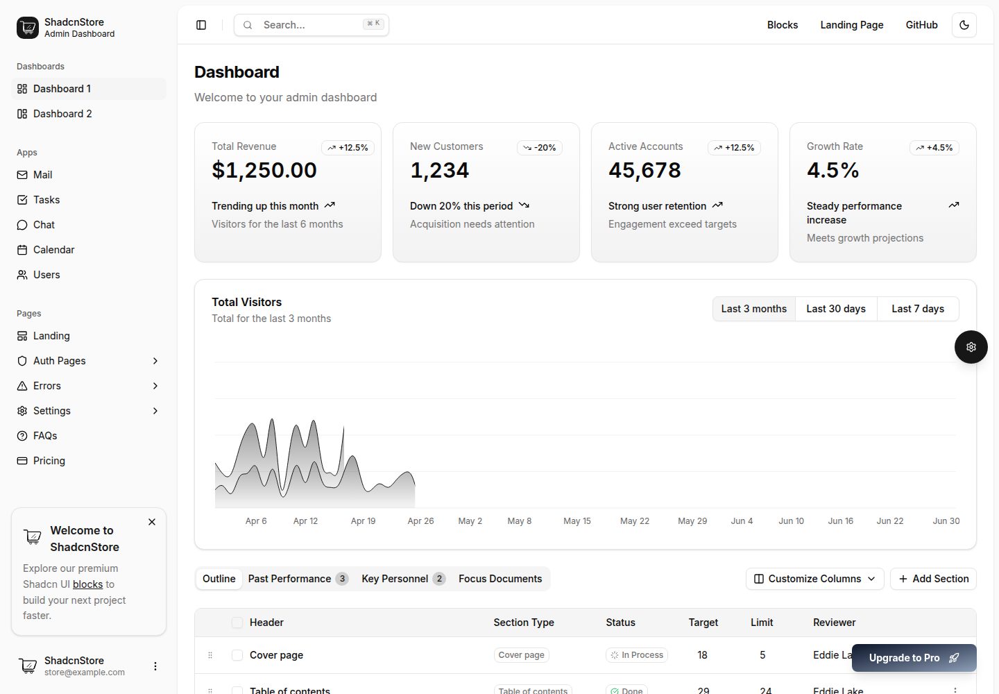
An open-source admin dashboard and marketing landing page template built on shadcn/ui and Tailwind CSS, with both Vite + React and Next.js versions in one repository.
Next.js · Admin dashboard