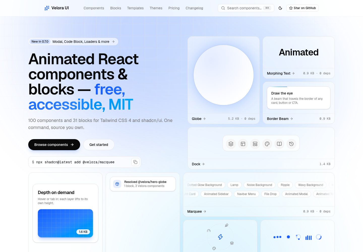
100 个带动画的 shadcn/ui 组件,按背景、文字、按钮、卡片、导航、表单、滚动等类别组织
Next.jsReact企业官网
velora-ui — Next.js 企业官网模板
作者 ColorlibHQ
Velora UI 是 ColorlibHQ 维护的 MIT 许可开源项目,提供 100 个带动画的 shadcn/ui 组件、31 个区块和一套基于 Next.js 的多页 SaaS 落地页模板。
看看你的网站会是什么样
浏览真实页面截图,比较内容排版与手机效果。点击下方缩略图切换,放大查看整页细节。
全部页面与视图 3
截图用于了解视觉与布局,交互效果请以实际项目为准。
采集于 2026-10-01查看来源
值得关注的模板亮点
从已有项目资料中,快速了解它的特点。
31 个可直接安装的区块,覆盖 Hero、功能、定价、评价、CTA、Logo 云、FAQ、导航和页脚
完整多页 SaaS 模板,含首页、组件库、主题、定价、MDX 博客、更新日志、关于、联系、登录、注册和 404
组件以标准 shadcn registry 条目分发,支持 shadcn CLI 按名称或 URL 安装
组件读取 shadcn CSS 变量,可通过修改七个变量切换品牌配色,并提供六套预设主题
每个组件文档页标注 gzip 体积、依赖数量和 reduced-motion 支持情况
模板详细介绍
Velora UI 面向 React 与 shadcn/ui 项目,仓库同时提供组件库和完整落地页模板。组件以标准 shadcn registry 条目分发,可通过 shadcn CLI 按名称或 URL 安装,组件自带关键帧与品牌 token,可独立用于现有项目。模板部分包含 SaaS 落地页、组件目录、主题、定价、MDX 博客、更新日志、关于、联系、登录、注册和 404 等页面,页面数据内联在各页面文件中。
项目使用 Next.js、React、Tailwind CSS、shadcn/ui、Motion 和 TypeScript。README 说明组件不依赖 Radix 或 Base UI,可适配不同 primitive 层;每个组件文档页标注 gzip 体积、依赖数量与 reduced-motion 状态。联系和认证表单为纯前端演示,需要自行接入后端或认证服务。
许可方面,代码采用 MIT 许可,允许免费使用、修改、商用和分发,分发时需保留版权声明与许可声明。演示图片、字体、图标等第三方素材需按各自许可核对;域名、托管、数据库等外部服务可能另外收费。
Next.jsReact企业官网
适合你的项目吗?
适用场景
- 为 React 或 Next.js 项目快速引入带动画的 shadcn/ui 组件
- 搭建 SaaS 产品官网,直接复用或改造完整落地页模板
- 在已有 shadcn 项目中按需安装区块,例如 Hero、定价表或 FAQ
- 通过 shadcn MCP 让 AI 编程助手按名称浏览和安装组件
- 使用 MDX 博客和更新日志页面搭建产品内容板块
适合人群
- 使用 React 与 shadcn/ui 的前端开发者
- 需要免费 MIT 许可组件库或落地页模板的团队
- 希望以 CSS 变量统一控制品牌配色的项目
- 需要 reduced-motion 与可访问性标注参考的开发者
上手与定制指南
结合仓库当前版本的说明,按下面的资料检查内容、配置与运行要求。
- 1
克隆仓库后使用 pnpm install 安装依赖,pnpm dev 启动开发服务器
- 2
组件可通过 npx shadcn@latest add https://velora.colorlib.com/r/<name>.json 安装
- 3
品牌配色在 src/app/globals.css 的 token 块中修改,或从 /themes 复制预设
- 4
博客文章放在 src/app/blog/(posts)/<slug>/page.mdx,并在 src/lib/blog-posts.ts 中注册
- 5
联系与认证表单为前端演示,需自行接入后端或认证服务
授权与来源资料
使用条件与限制
免费使用 · 保留许可声明本次收录的是公开仓库中采用 MIT 许可的免费版本;免费范围为该版本代码,不代表外部服务或第三方素材免费。
使用时需要遵守
- 允许免费使用、修改、商用和分发该版本代码。
- 分发代码副本或实质性部分时,保留原作者版权声明和完整 MIT 许可声明。
- 代码按现状提供;担保与责任限制以原许可证及适用法律为准。
额外费用与待核对事项
- 使用模板时不要执行 pnpm add -D typescript,否则会替换别名化的 v6 包并破坏 lint;需等 typescript-eslint 支持 TypeScript 7.1 后再合并依赖。
- 联系表单与登录/注册表单仅为纯前端演示,不含后端逻辑,需自行接入后端或认证服务才能实际使用。
- 按名称安装组件前需先注册 @velora 命名空间,否则无法使用简写安装命令。
- 演示图片、字体、图标及其他第三方素材需按各自许可核对,不能仅凭代码的 MIT 许可判断。
- 域名、托管、数据库、支付或 AI 等外部服务可能另外收费。
查看原文依据
Permission is hereby granted, free of charge
许可证原文
Do not run `pnpm add -D typescript` in this repo: it replaces the aliased v6 package and > breaks linting.
README 原文
contact and auth forms are frontend-only demos; wire them to your backend or auth provider.
README 原文
https://github.com/ColorlibHQ/velora-ui/blob/main/LICENSEhttps://github.com/ColorlibHQ/velora-ui/blob/main/README.mdregister the namespace once and install by name
README 原文
DeepSeek 根据仓库许可证和 README 整理 ·2026-10-02。结果仅覆盖已读取资料,依赖、图片、字体及后续条款变更以各自原文为准。
项目核对记录与介绍依据
模板资料
- 来源平台
- GitHub
- 资料与维护参考分
- 资料较完整 · 92 / 100
- 技术栈
- Next.js · React
- 网站类型
- 企业官网
这个分数如何计算
本站按许可资料(最高30分)、演示链接(12分)、预览图(10分)、Star数(15分)、记录的维护时间(15分)、描述完整度(8分)、功能记录(5分)和分类资料(5分)计算。它不是代码、安全或性能测试,也不是 Google 评分;有链接不代表已实测可用。
这个项目需要核对什么
- 记录的仓库更新时间
- 2026-09-30
- 截图检查日期
- 2026-10-02
已收录演示链接。请用你的内容与屏幕尺寸检查;有演示不代表表单、认证或支付已经可用。
目录记录的主要技术栈是 Next.js。请通过依赖清单和锁文件核对实际版本与托管要求。这些说明基于收录资料,不代表代码审计或部署实测。
查看具体选型方法 →介绍的制作与核对状态
介绍由 AI 辅助整理目录与仓库资料。仓库作者不等于这篇介绍的审核者。
已完成服务器许可规则与 AI 来源核对;未经过人工编辑审核。
查看当时使用的来源资料
SHA-256: dd9e64c0ad8ceb6d211a5b27cabf8eb2c196ba1821dd806eece2c3556f8edf17
2026-10-02T02:18:08.120Z
来源文件 / 仓库<div align="center">
# Velora UI
**Free, MIT-licensed animated components and complete landing templates for React.**
100 animated shadcn/ui components and a full multi-page SaaS template — home, pricing, blog (MDX), auth, changelog, contact and 404 — built with Next.js 16, Tailwind CSS 4 and Motion. The free tier isn't a teaser: everything on the site ships under MIT, commercial use included.
[](https://velora.colorlib.com)
[](./LICENSE)
[](https://github.com/ColorlibHQ/velora-ui/stargazers)





<a href="https://velora.colorlib.com">
<img src=".github/screenshots/hero.webp" alt="Velora UI — landing pages that feel alive" width="100%">
</a>
</div>
## Screenshots
<table>
<tr>
<td width="50%" align="center">
<a href="https://velora.colorlib.com/components"><img src=".github/screenshots/components.webp" alt="Component catalog — 100 animated components grouped by category"></a>
<br><sub><b>Component catalog</b> — 100 components, grouped by category, one CLI command to install.</sub>
</td>
<td width="50%" align="center">
<a href="https://velora.colorlib.com/themes"><img src=".github/screenshots/themes.webp" alt="Themes — rebrand from one token block"></a>
<br><sub><b>Themes</b> — swap the whole identity by editing seven CSS variables.</sub>
</td>
</tr>
<tr>
<td width="50%" align="center">
<a href="https://velora.colorlib.com/components/border-beam"><img src=".github/screenshots/component-page.webp" alt="Component docs page with size, dependency and reduced-motion badges"></a>
<br><sub><b>Every component ships its receipts</b> — gzip size, dependency count and reduced-motion status, plus live demo, install command and source.</sub>
</td>
<td width="50%" align="center">
<a href="https://velora.colorlib.com/pricing"><img src=".github/screenshots/pricing.webp" alt="Pricing — the whole product is free"></a>
<br><sub><b>The whole product is free</b> — every component and the complete template under MIT.</sub>
</td>
</tr>
</table>
## Why Velora
- **The free tier is the whole product.** Complete assembled pages, not just isolated components. The kind of template that costs $149–$299 elsewhere is the baseline here.
- **Animations with receipts.** Every component's docs page shows its gzipped size (0.3–3 KB for 97 of them; the dependency-free Globe carries its own land map at 5.2 KB — no Three.js, no WebGL) and dependency count. 51 of 100 components have zero runtime dependencies; the rest use Motion and nothing else.
- **Tokens, not hardcoded hues.** Components read your shadcn CSS variables. Rebrand every gradient, beam and glow by editing seven variables — ready-made presets on the [themes page](https://velora.colorlib.com/themes).
- **Motion that asks permission.** Every component handles `prefers-reduced-motion` itself — so it still does after you install it — and documents what reduced-motion, keyboard and screen-reader users get on its docs page.
- **Primitive-agnostic.** Velora components import neither Radix nor Base UI — they work in any shadcn project, whichever primitive layer you use.
## What's inside
### 100 animated components
| Category | Components |
|----------|-----------|
| **Backgrounds** | Aurora Background · Background Beams · Background Boxes · Dotted Glow Background · Flickering Grid · Grid & Dot Pattern · Lamp · Light Rays · Meteors · Noise Background · Particles · Retro Grid · Ripple · Shooting Stars · Vortex · Wavy Background |
| **Text** | Animated Gradient Text · Flip Words · Hyper Text · Morphing Text · Number Ticker · Sparkles Text · Text Highlighter · Text Hover Effect · Text Reveal · Text Shimmer · Typewriter · Word Rotate |
| **Buttons** | Confetti · Magnetic Button · Moving Border · Rainbow Button · Ripple Button · Shimmer Button · Stateful Button · Theme Toggler |
| **Cards & Layout** | Animated List · Animated Tooltip · Avatar Circles · Bento Grid · Card Hover Effect · Card Stack · Compare Slider · Direction Aware Hover · Dock · Draggable Card · Evervault Card · Expandable Card · File Tree · Focus Cards · Glare Card · Layout Grid · Marquee · Orbiting Circles · Spotlight Card · Tilt Card · Wobble Card |
| **Navigation** | Animated Sidebar · Animated Tabs · Floating Navbar · Navbar Menu · Resizable Navbar · Sticky Banner |
| **Forms** | File Drop · Stepper · Vanish Input |
| **Overlays** | Animated Modal |
| **Loaders** | Loaders · Multi Step Loader |
| **Social Proof** | Animated Testimonials · Logo Cloud · Tweet Card |
| **Scroll** | Container Scroll · Hero Parallax · Macbook Scroll · Parallax Grid · Scroll Progress · Scroll Velocity · Sticky Scroll · Timeline · Tracing Beam |
| **Effects** | Animated Beam · Blur Fade · Border Beam · Glowing Effect |
| **3D** | 3D Card · 3D Pin |
| **Carousels** | 3D Marquee · Apple Cards Carousel · Image Slider |
| **Cursor & Pointer** | Following Pointer · Lens · Pointer Highlight · Smooth Cursor |
| **Data & Maps** | Globe · World Map |
| **Mockups** | Browser Mockup · Code Block · iPhone Mockup · Terminal |
Browse them all — with live demos, props, install commands and source — at [velora.colorlib.com/components](https://velora.colorlib.com/components). New here? Start with [Get started](https://velora.colorlib.com/components/get-started), or register the namespace once and install by name:
```bash
npx shadcn@latest registry add @velora=https://velora.colorlib.com/r/{name}.json
npx shadcn@latest add @velora/marquee
```
Coming from another library? See the measured comparisons with [Aceternity UI](https://velora.colorlib.com/compare/aceternity-ui) and [Magic UI](https://velora.colorlib.com/compare/magic-ui).
### 31 free blocks
Complete sections built from Velora components — preview them at desktop, tablet and mobile widths, copy the code, or install one with the shadcn CLI and it brings every component it uses along:
```bash
npx shadcn@latest add https://velora.colorlib.com/r/hero-globe.json
```
| Category | Blocks |
|----------|--------|
| **[Hero Sections](https://velora.colorlib.com/blocks/hero-sections)** | Aurora hero · Globe split hero · Product screenshot hero · Phone split hero · Wavy hero · Developer tool hero |
| **[Feature Sections](https://velora.colorlib.com/blocks/feature-sections)** | Bento feature grid · Icon feature grid · Tabbed product tour · Alternating screenshot rows · Numbered steps |
| **[Pricing Sections](https://velora.colorlib.com/blocks/pricing-sections)** | Three-tier pricing · Single plan pricing · Pricing comparison table |
| **[Testimonial Sections](https://velora.colorlib.com/blocks/testimonial-sections)** | Testimonial marquee · Featured testimonial · Testimonial grid |
| **[CTA Sections](https://velora.colorlib.com/blocks/cta-sections)** | Vortex CTA band · Split CTA with product visual · Newsletter sign-up |
| **[Logo Clouds](https://velora.colorlib.com/blocks/logo-clouds)** | Logo marquee · Logo grid |
| **[FAQ Sections](https://velora.colorlib.com/blocks/faq-sections)** | Centered FAQ accordion · Two-column FAQ |
| **[Navbars](https://velora.colorlib.com/blocks/navbars)** | Floating pill navbar · Mega menu navbar |
| **[Footers](https://velora.colorlib.com/blocks/footers)** | Link columns footer · Giant wordmark footer · Newsletter footer |
| **[Login & Sign-up](https://velora.colorlib.com/blocks/auth-sections)** | Split login page · Sign-up card |
### The complete template
A production landing site, not a component sandbox — browse it at [/templates](https://velora.colorlib.com/templates). Every page is real, static-rendered and yours to keep:
| Page | What you get |
|------|--------------|
| [SaaS landing](https://velora.colorlib.com/templates/saas) | Animated hero, feature bento, integrations, sample testimonials, pricing, FAQ and CTA — in `src/app/templates/saas/page.tsx`; move it to `src/app/page.tsx` to make it your homepage |
| [Components](https://velora.colorlib.com/components) | Browsable gallery + a docs page per component (demo · props · install · source) |
| [Themes](https://velora.colorlib.com/themes) | Six brand presets with live token switching |
| [Pricing](https://velora.colorlib.com/pricing) | Free vs. Pro tiers with feature comparison |
| [Blog](https://velora.colorlib.com/blog) | MDX-powered blog with three starter posts |
| [Changelog](https://velora.colorlib.com/changelog) | Release timeline |
| [About](https://velora.colorlib.com/about) · [Contact](https://velora.colorlib.com/contact) | Company page + frontend-only contact form |
| [Login](https://velora.colorlib.com/login) · [Signup](https://velora.colorlib.com/signup) | Auth screens (frontend-only) |
| 404 | Styled not-found page |
## Install components
Every component is a standard shadcn registry item:
```bash
npx shadcn@latest add https://velora.colorlib.com/r/aurora-background.json
```
Components carry their own keyframes and brand tokens, so they work standalone in existing projects. Browse the full catalog at [velora.colorlib.com/components](https://velora.colorlib.com/components).
### Use with AI agents
Velora is a standard shadcn registry, so it plugs into the shadcn MCP server with zero extra setup — an agent in Cursor, Claude Code or VS Code can browse and install Velora components by name:
```bash
pnpm dlx shadcn@latest mcp init --client claude
```
For discovery, [llms.txt](https://velora.colorlib.com/llms.txt) lists every component with its install command, gzipped size and dependency count — so an agent can pick components by cost, not just by looks.
## Use the template
```bash
git clone https://github.com/ColorlibHQ/velora-ui.git my-landing
cd my-landing
pnpm install
pnpm dev
```
Then make it yours:
1. **Content** — pages live in `src/app/`, section data is inline per page.
2. **Brand** — swap the token block in `src/app/globals.css` (or copy a preset from `/themes`).
3. **Blog** — add MDX files under `src/app/blog/(posts)/<slug>/page.mdx` and register them in `src/lib/blog-posts.ts`.
4. **Forms** — contact and auth forms are frontend-only demos; wire them to your backend or auth provider.
## Scripts
```bash
pnpm dev # dev server (Turbopack)
pnpm build # production build (all pages static)
pnpm lint # eslint
pnpm registry:build # component stats + registry.json + public/r/*.json + llms.txt
```
## Stack
Next.js 16 · React 19 · Tailwind CSS 4 · shadcn/ui · Motion · TypeScript
### About the TypeScript setup
TypeScript 7 is a native (Go) compiler that ships **only** a `tsc` binary — no `tsserver`
and no JavaScript compiler API. Editors and `typescript-eslint` still need the API, so this
repo installs both, which is the arrangement the TypeScript team documents:
| Dependency | Resolves to | Used by |
|------------|-------------|---------|
| `typescript` | `@typescript/typescript6` (v6 API + `tsc6`) | editor language service, `typescript-eslint` |
| `typescript-native` | `typescript` v7 (`tsc`) | `next build` type checking |
`next build` runs the project-local `tsc`, so type checking uses the native compiler
(~3× faster here), while your editor and `pnpm lint` keep working. Nothing in the
component source depends on this — it is purely a toolchain detail.
> Do not run `pnpm add -D typescript` in this repo: it replaces the aliased v6 package and
> breaks linting. Collapse both entries back to a plain `typescript` dependency once
> `typescript-eslint` supports TypeScript 7.1.
## License
[MIT](./LICENSE) — free for personal and commercial use, no attribution required.
看看同类模板
对比同技术栈与用途的模板,找到更适合的视觉与内容结构。
SaaS-Boilerplate
🚀🎉📚 SaaS Boilerplate built with Next.js + Tailwind CSS + Shadcn UI + TypeScript. ⚡️ Full-stack React applic…
Next.js · SaaS
Next-JS-Landing-Page-Starter-Template
🚀 Free NextJS Landing Page Template written in Tailwind CSS 3 and TypeScript ⚡️ Made with developer experienc…
Next.js · 企业官网

next-saas-starter
⚡️ Free Next.js responsive landing page template for SaaS products made using JAMStack architecture.
Next.js · SaaS
startup-nextjs
Startup is free Next.js template for SaaS startups comes with all the essential pages, components, and section…
Next.js · SaaS
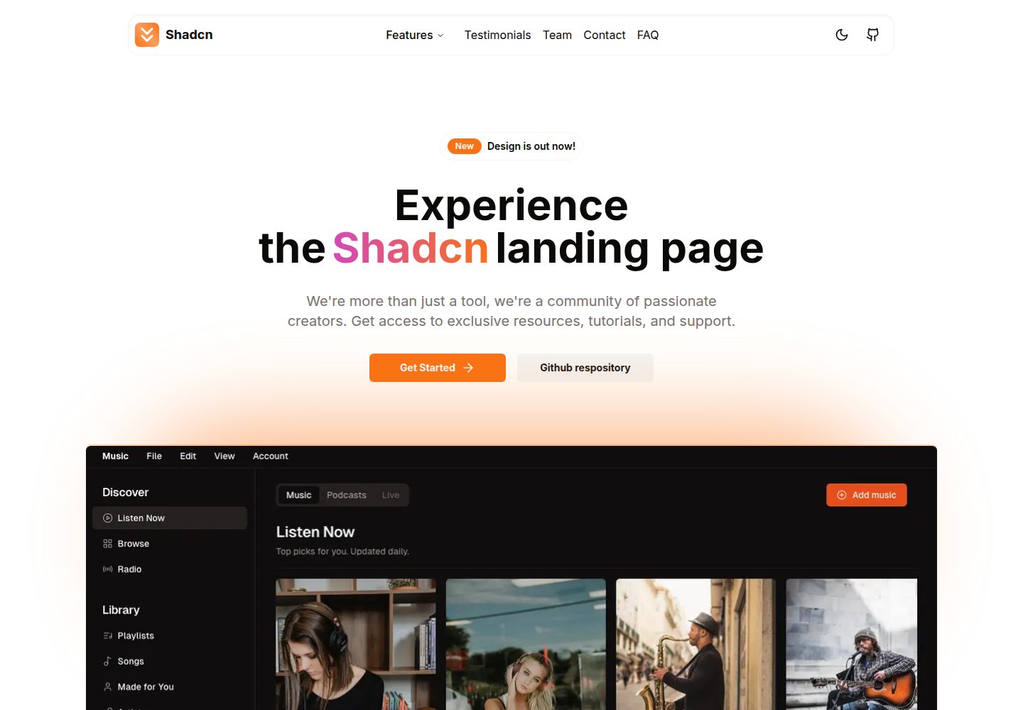
shadcn-landing-page
New design 🎉 Nextjs + Shadcn + TypeScript + Tailwind. Landing page template ease-to-use
Next.js · 企业官网
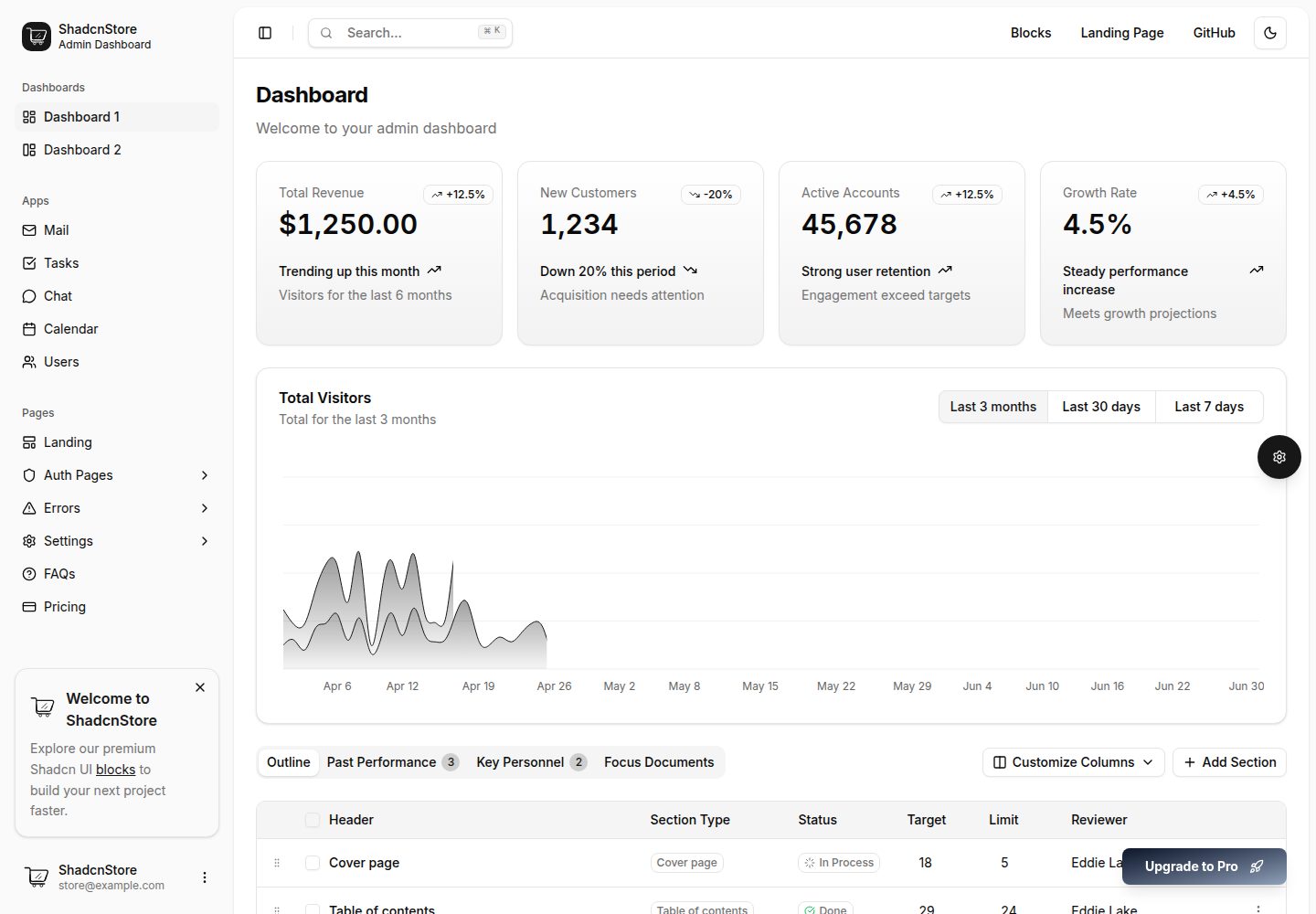
shadcn-dashboard-landing-template
Accelerate your development with a sleek, open-source admin dashboard and landing page built on Vite-React, Ne…
Next.js · 后台