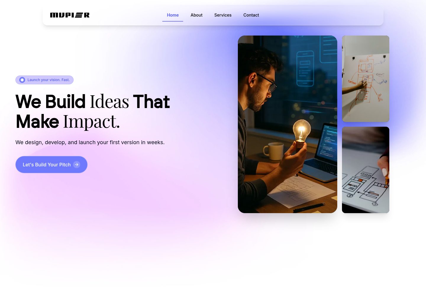
Includes multiple pages such as home, about, services, portfolio, team, and contact
ReactCorporate Website
react-it-solutions-agency-template — React Business Template
By fedilayoub
MVPier is a React corporate website template for IT solutions agencies and technology companies, released under the MIT license, with pages for home, about, services, portfolio, team, and contact.
Explore the design
Compare the page layouts and mobile experience. Open any screenshot for a closer look.
Desktop homepage1 / 2
Desktop captureTop of page
Actual screenshot captured by the server browser.
All pages & views 2
Screenshots show visual appearance; interactive behavior may differ.
Recorded 2026-10-02View source
What stands out
A quick read of the recorded project description.
Built with React, TypeScript, Vite, Tailwind CSS, and Framer Motion
Provides reusable components including navigation bar, hero, testimonials, subscription, and call-to-action blocks
Implements client-side routing via React Router, with new pages registered in App.tsx
Released under the MIT license, permitting commercial use, modification, and distribution of this version of the code
Template Details
MVPier is a free and open-source React template positioned as a corporate website or MVP landing page for IT solutions agencies, startups, and technology companies. The pages listed in the repository description include home, about, services, portfolio, team, and contact, along with a navigation bar, hero section, feature showcase, customer testimonials, subscription component, and call-to-action blocks.
Technically, the template uses React and TypeScript, with Vite as the build tool, Tailwind CSS for styling, Framer Motion and Lottie React for animations, React Router for routing, Lucide React for icons, and ESLint configured. The project structure places reusable components in src/components, pages in src/pages, and includes hooks and lib directories; colors can be adjusted in tailwind.config.ts, and new pages must be registered in src/App.tsx for routing.
Regarding usage limitations, the materials do not describe backend APIs, a CMS, or form submission services, so the actual data handling of the contact form and subscription component must be verified in the code. The licensing of third-party assets such as demo images, fonts, and icons must be confirmed separately and cannot be assumed from the code's MIT license alone. The repository has few stars, and the materials contain no test results for performance, accessibility, or browser compatibility.
ReactCorporate Website
Is it right for your project?
Use Cases
- Building a corporate website for an IT solutions agency to showcase services and case studies
- Creating a marketing landing page for a technology startup's product MVP
- Serving as a reference for component and page structure in React + TypeScript + Tailwind projects
- Reusing its navigation, testimonial, or subscription blocks in an existing React project
Suitable For
- IT service and consulting companies needing a quick-start corporate website
- Front-end developers familiar with React and Tailwind CSS who want to modify the source code themselves
- Projects focused on presentational pages that do not rely on built-in backend capabilities
Getting started & customization
Use these recorded setup notes alongside the repository instructions for your chosen version.
- 1
Requires Node.js 16 or higher, and one of npm, yarn, or pnpm
- 2
After cloning the repository, install dependencies and run npm run dev, which starts by default at http://localhost:5173
- 3
Build output is generated via npm run build into the dist directory, and can be previewed locally with npm run preview
- 4
Branding, images, and copy need to be replaced in the public directory and in the example content within src/components and src/pages
- 5
When deploying to Netlify, the build command is npm run build and the publish directory is dist
License & source material
Usage conditions & limitations
Free to use · keep license noticeThis entry covers the free version under the MIT license from the public repository; the free scope applies to this version of the code and does not imply that external services or third-party assets are free.
Must comply with when using
- Permits free use, modification, commercial use, and distribution of this version of the code.
- When distributing copies or substantial portions of the code, retain the original author's copyright notice and the full MIT license notice.
- The code is provided as is; warranties and limitations of liability are governed by the original license and applicable law.
Additional costs & items to verify
- Demo images, fonts, icons, and other third-party assets must be checked against their respective licenses and cannot be assumed from the code's MIT license alone.
- External services such as domain, hosting, database, payment, or AI may incur additional charges.
View Original Text Basis
Compiled by DeepSeek based on repository license and README ·2026-10-02. Results only cover the materials read; dependencies, images, fonts, and subsequent term changes are subject to their respective original texts.
Project checks & description sources
Template Information
- Source platforms
- GitHub
- Documentation and maintenance reference score
- More documented · 83 / 100
- Technologies
- React
- Website type
- Corporate Website
How this score is calculated
Our heuristic uses license records (up to 30), a demo link (12), a preview (10), stars (15), recorded maintenance (15), description completeness (8), feature records (5) and classification data (5). It is not a code, security or performance test, or a Google score. A link does not establish tested functionality.
What to verify for this project
- Repository update recorded
- 2025-12-22
- Screenshot last checked
- 2026-10-02
A demo link is listed. Check it with your own content and viewport sizes; its presence does not confirm that forms, authentication or payments work.
The catalog identifies React as the primary stack. Check the actual dependency manifest and lockfile for versions and hosting requirements. These notes use recorded metadata, not a code audit or a deployment test.
Use a selection guide →How this description was prepared
AI-assisted description based on catalog records and repository material. Repository authors are not automatically the reviewers of this description.
Automatically checked against source and license rules; no manual editorial review.
Inspect the recorded source material
SHA-256: 1e70e534fb19df901444c819accf7b14cac8683b6bc70a674caad2b46eb9d1b5
2026-10-02T15:18:45.873Z
Source file / repository# MVPier - IT Solutions Agency Template
<div align="center">
<img src="./public/mvpier_hero.png" alt="MVPier Hero" width="100%" />
<p align="center">
<strong>A modern, free and open-source React template for IT solutions agencies</strong>
</p>
<p align="center">
Build your MVP faster and easier with this beautiful, fully-responsive template
</p>
<p align="center">
<a href="https://mvpier.netlify.app/" target="_blank">Live Demo</a> •
<a href="#features">Features</a> •
<a href="#installation">Installation</a> •
<a href="#usage">Usage</a> •
<a href="#license">License</a>
</p>
</div>
---
## Table of Contents
- [Demo](#demo)
- [About](#about)
- [Features](#features)
- [Tech Stack](#tech-stack)
- [Getting Started](#getting-started)
- [Prerequisites](#prerequisites)
- [Installation](#installation)
- [Usage](#usage)
- [Project Structure](#project-structure)
- [Customization](#customization)
- [Deployment](#deployment)
- [Contributing](#contributing)
- [License](#license)
- [Author](#author)
## Demo
**[View Live Demo →](https://mvpier.netlify.app/)**
Experience the template in action! The live demo showcases all features, components, and pages included in this template.
## About
**MVPier** is a professional, modern, and fully-responsive React template designed specifically for IT solutions agencies, startups, and tech companies. Built with the latest web technologies, this template helps you create a stunning online presence quickly and efficiently.
Whether you're launching a new agency, showcasing your services, or building an MVP for your tech business, MVPier provides all the essential components and pages you need to get started immediately.
## Features
- **Modern & Beautiful Design** - Clean, professional UI with smooth animations
- **Fully Responsive** - Optimized for all devices and screen sizes
- **Lightning Fast** - Built with Vite for blazing-fast performance
- **Smooth Animations** - Powered by Framer Motion for fluid interactions
- **SEO Optimized** - Meta tags and semantic HTML for better search rankings
- **Tailwind CSS** - Utility-first CSS framework for easy customization
- **Modular Components** - Reusable and well-organized component structure
- **Multiple Pages** - Home, About, Services, Portfolio, Team, Contact, and more
- **TypeScript** - Type-safe code for better development experience
- **Easy to Customize** - Well-documented and easy to modify
- **Lottie Animations** - Engaging vector animations
- **Newsletter Integration** - Built-in newsletter signup component
- **Testimonials Section** - Showcase client feedback
- **Call-to-Action Sections** - Convert visitors into clients
## Tech Stack
- **[React 18](https://react.dev/)** - Modern React with hooks
- **[TypeScript](https://www.typescriptlang.org/)** - Type-safe JavaScript
- **[Vite](https://vitejs.dev/)** - Next-generation frontend tooling
- **[Tailwind CSS](https://tailwindcss.com/)** - Utility-first CSS framework
- **[Framer Motion](https://www.framer.com/motion/)** - Production-ready animation library
- **[React Router](https://reactrouter.com/)** - Client-side routing
- **[Lucide React](https://lucide.dev/)** - Beautiful & consistent icons
- **[Lottie React](https://www.npmjs.com/package/lottie-react)** - Render Adobe After Effects animations
- **[ESLint](https://eslint.org/)** - Code linting and quality
## Getting Started
### Prerequisites
Before you begin, ensure you have the following installed:
- **Node.js** (version 16 or higher)
- **npm** or **yarn** or **pnpm**
### Installation
1. **Clone the repository**
```bash
git clone https://github.com/fedilayoub/react-it-solutions-agency-template.git
cd mvpier
```
2. **Install dependencies**
```bash
npm install
# or
yarn install
# or
pnpm install
```
3. **Start the development server**
```bash
npm run dev
# or
yarn dev
# or
pnpm dev
```
4. **Open your browser**
Navigate to `http://localhost:5173` to see your app running.
## Usage
### Available Scripts
- `npm run dev` - Start development server
- `npm run build` - Build for production
- `npm run build:dev` - Build in development mode
- `npm run preview` - Preview production build locally
- `npm run lint` - Run ESLint to check code quality
### Building for Production
```bash
npm run build
```
The optimized production files will be in the `dist` directory.
## Project Structure
```
mvpier/
├── public/ # Static assets
│ ├── mvpier_hero.png # Hero image
│ ├── mvpier_logo.svg # Logo files
│ └── ... # Other images and assets
├── src/
│ ├── components/ # Reusable React components
│ │ ├── Navbar.tsx
│ │ ├── Hero.tsx
│ │ ├── Features.tsx
│ │ ├── Testimonials.tsx
│ │ ├── Footer.tsx
│ │ └── ...
│ ├── pages/ # Page components
│ │ ├── Index.tsx # Home page
│ │ ├── About.tsx
│ │ ├── Services.tsx
│ │ ├── Portfolio.tsx
│ │ ├── Team.tsx
│ │ ├── Contact.tsx
│ │ └── ...
│ ├── hooks/ # Custom React hooks
│ ├── lib/ # Utility functions
│ ├── App.tsx # Main app component
│ ├── main.tsx # Entry point
│ └── index.css # Global styles
├── index.html
├── package.json
├── tailwind.config.ts # Tailwind configuration
├── vite.config.ts # Vite configuration
└── tsconfig.json # TypeScript configuration
```
## Customization
### Changing Colors
Edit `tailwind.config.ts` to customize the color scheme:
```typescript
export default {
theme: {
extend: {
colors: {
// Add your custom colors here
}
}
}
}
```
### Updating Content
1. **Logo & Branding**: Replace logo files in `public/` directory
2. **Images**: Add your images to `public/` folder
3. **Text Content**: Edit component files in `src/components/` and `src/pages/`
4. **Meta Tags**: Update `index.html` for SEO
### Adding New Pages
1. Create a new component in `src/pages/`
2. Add the route in `src/App.tsx`
```typescript
<Route path="/your-page" element={<YourPage />} />
```
## Deployment
### Deploying to Vercel
1. Push your code to GitHub
2. Import your repository on [Vercel](https://vercel.com)
3. Deploy with one click
### Deploying to Netlify
1. Push your code to GitHub
2. Connect your repository on [Netlify](https://netlify.com)
3. Build command: `npm run build`
4. Publish directory: `dist`
### Deploying to GitHub Pages
```bash
npm run build
# Deploy the dist folder to GitHub Pages
```
## Contributing
Contributions are what make the open-source community such an amazing place to learn, inspire, and create. Any contributions you make are **greatly appreciated**.
1. Fork the Project
2. Create your Feature Branch (`git checkout -b feature/AmazingFeature`)
3. Commit your Changes (`git commit -m 'Add some AmazingFeature'`)
4. Push to the Branch (`git push origin feature/AmazingFeature`)
5. Open a Pull Request
## License
This project is licensed under the **MIT License** - see the [LICENSE](LICENSE) file for details.
This means you are free to:
- Use commercially
- Modify
- Distribute
- Private use
## Author
**Fedil Ayoub**
- GitHub: [@fedilayoub](https://github.com/fedilayoub)
## Acknowledgments
- [React](https://react.dev/)
- [Vite](https://vitejs.dev/)
- [Tailwind CSS](https://tailwindcss.com/)
- [Framer Motion](https://www.framer.com/motion/)
- [Lucide Icons](https://lucide.dev/)
---
<div align="center">
<p>Made with love by Fedil Ayoub</p>
<p>If you find this template helpful, please give it a star</p>
</div>
Explore similar templates
Compare previews and descriptions within the same stack and category.
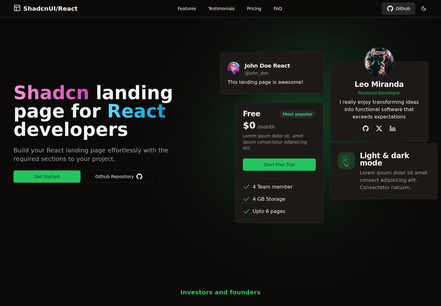
shadcn-landing-page
A free React landing page template built with TypeScript, Tailwind and Shadcn/UI, offering 16 ready-to-use sections such as Navbar, Hero, Pricing, FAQ and Footer, with responsive layout, dark mode and meta tags.
React · Corporate Website
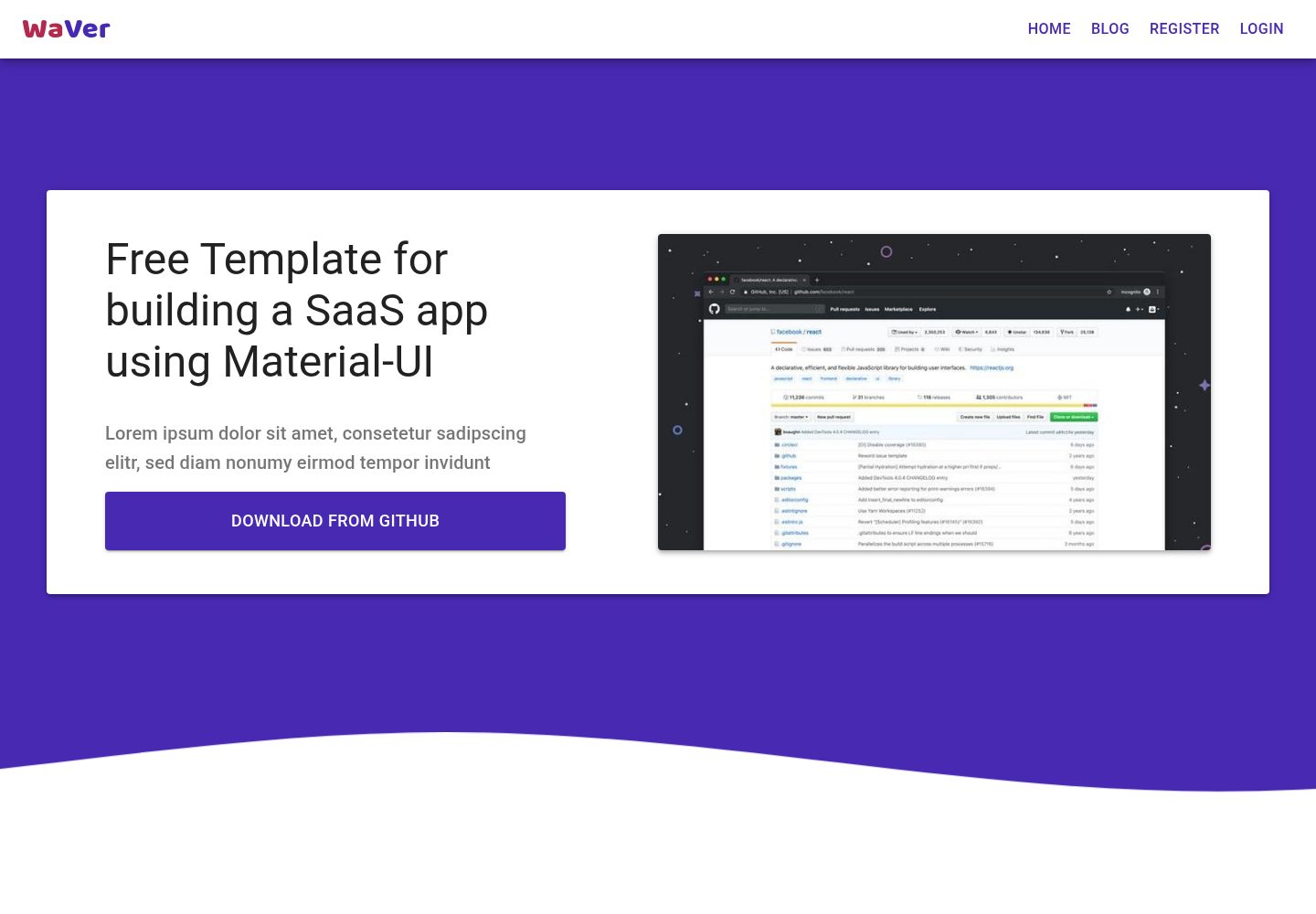
react-saas-template
A React and Material-UI template for SaaS or admin websites, offering dashboard, chart, blog, payment, and file upload components. It uses Create-React-App, React-Router, Recharts, React-Stripe-js, React-Dropzone, and React-Cropper, with theme colors centralized in src/theme.js.
React · Admin dashboard
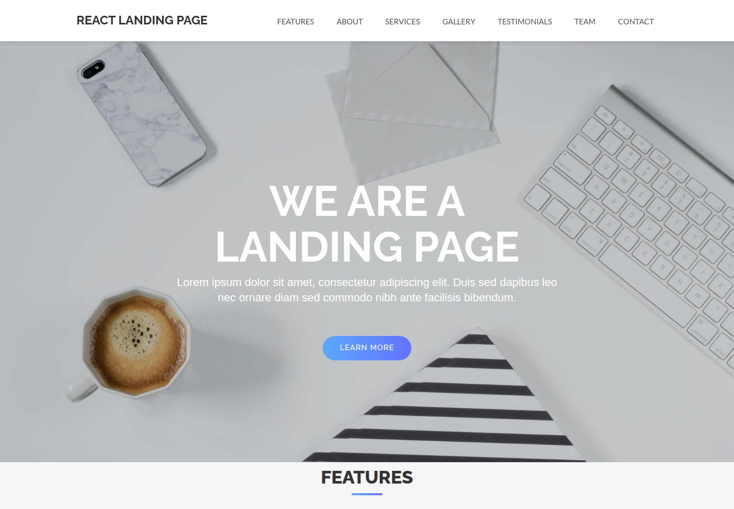
React-Landing-Page-Template
A React single-page landing page template for startups and service businesses, with copy and image references centralized in data.json, assets in public/img/, styles in public/css/, and a contact form that requires your own EmailJS service ID, template ID, and Public Key.
React · Corporate Website
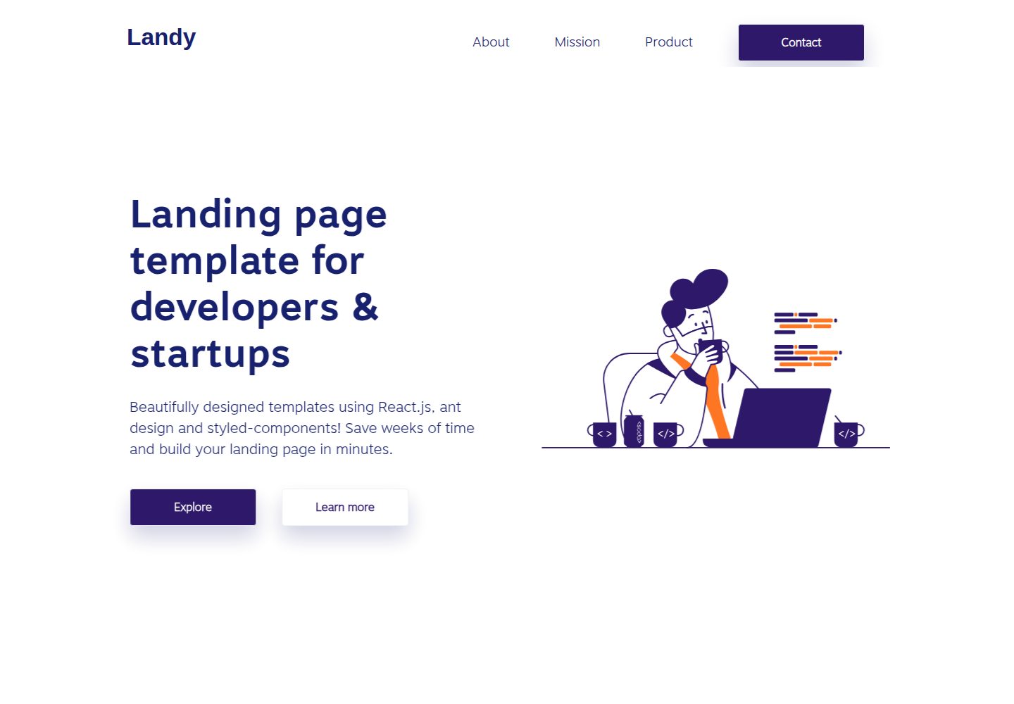
landy-react-template
Landy is an open-source React single-page landing page template written in TypeScript, aimed at developers and startup teams.
React · Corporate Website
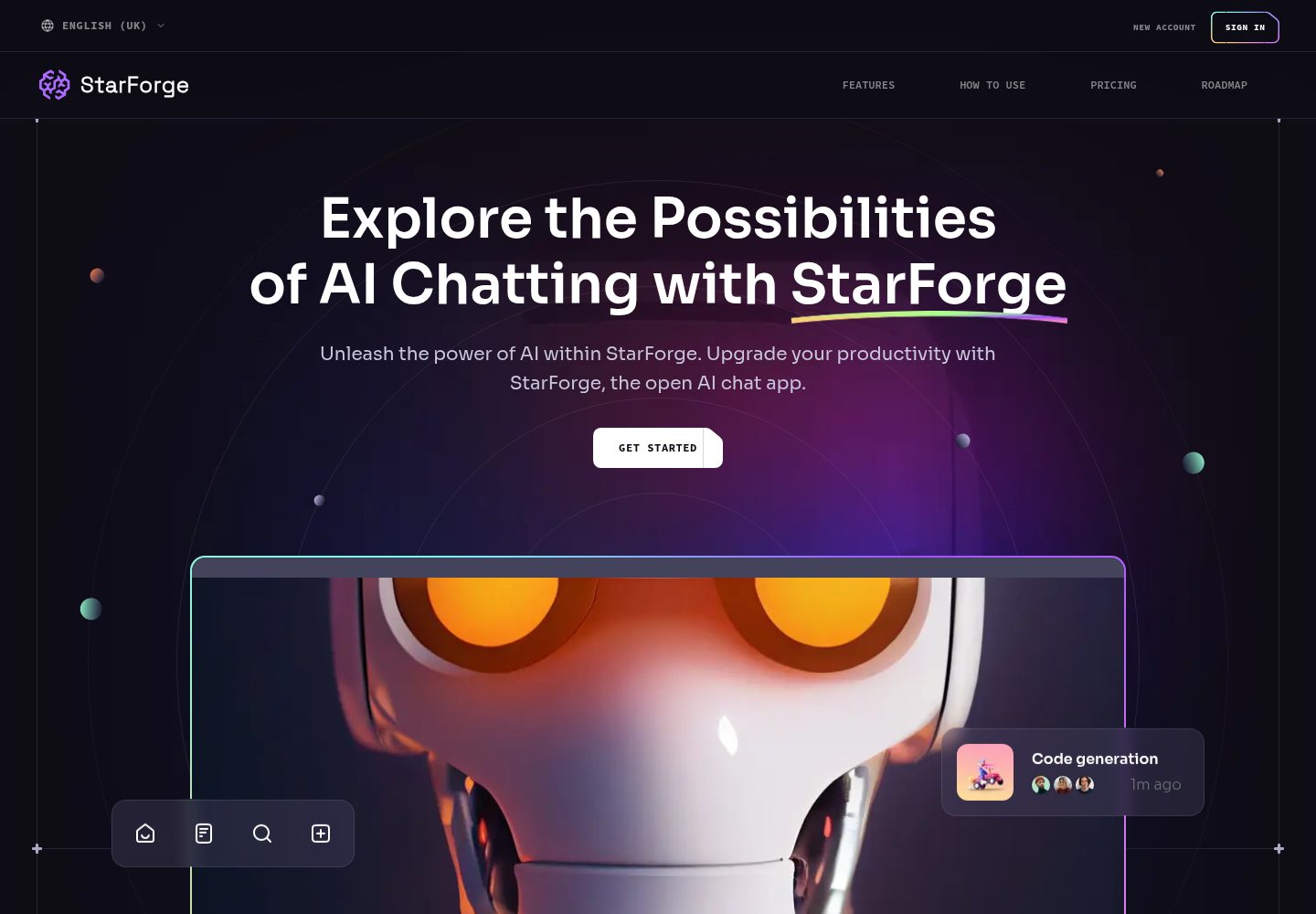
ai-saas-landing-starter
StarForge is an AI SaaS landing page starter template built with Next.js, React, and Tailwind CSS, featuring a Hero section with parallax scrolling and an animated Bento grid layout.
React · SaaS

landing-page-template-reactjs
A responsive corporate website template built with React and Material UI 5, featuring Home, About, and Contact pages with shared navigation.
React · Corporate Website