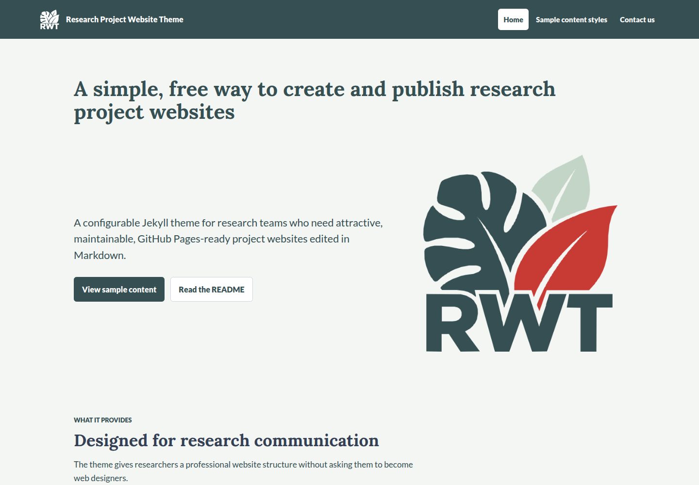
Can be referenced directly as a remote_theme by GitHub Pages project sites without being published as a RubyGem
HTMLStarter
jcu-research-website-theme — HTML Starter Template
By jcu-eresearch
A Jekyll theme for research project communication, reusable via remote_theme on GitHub Pages project sites, with content maintained in Markdown.
Explore the design
Compare the page layouts and mobile experience. Open any screenshot for a closer look.
Desktop homepage1 / 2
Desktop captureTop of page
Actual screenshot captured by the server browser.
All pages & views 2
Screenshots show visual appearance; interactive behavior may differ.
Recorded 2026-10-02View source
What stands out
A quick read of the recorded project description.
Provides two-level navigation with parent items that have submenus, supporting hover, click, keyboard operation, and Escape to close
The landing-page layout supports split screens and background heroes, achievement tiles, carousels, card grids, people and impact sections, and partner logos
Content blocks can be declared in front matter or written inline in Markdown body text using blockquotes with class names
Includes four built-in admonition types—note, important, warning, and caution—with configurable colors
The jcudl-catalog layout provides the mount element and script/style loading for the JCU Digital Library catalog
Template Details
This repository is a configurable Jekyll theme for outward-facing research project sites. It is designed for GitHub Pages, allowing research teams to write content in Markdown while reusing the theme's layouts, navigation, content blocks, and sample assets. The repository itself is both a remote theme that can be referenced via remote_theme and a demo site showcasing available page types and content blocks.
To use it, declare remote_theme in the project site's _config.yml and enable the jekyll-remote-theme plugin; the theme does not need to be published as a RubyGem, and the repository must remain public. The theme provides page layouts, two-level navigation (including dropdown menus), a full-width landing-page layout, and components driven by a blocks list in front matter, including achievements, carousel, standard, feature, highlight, and partner-logos. There is also a jcudl-catalog layout for hosting the mount element required by the JCU Digital Library catalog; this layout loads the Material Symbols stylesheet, catalog styles, and scripts, and renders <div id="jcudlc">.
Content blocks can be declared in front matter or written inline in Markdown body text using blockquotes with class names, supporting colored backgrounds, cards, accent lines, full width, left/right image floats, and four admonition types: note, important, warning, and caution. Partner logos and image galleries are implemented via the .jcu-partner-logos and .jcu-image-gallery classes, with the maximum number per row controlled by theme_settings. Theme settings cover colors, fonts, button shapes, content alignment, breadcrumbs, favicon, project and header logos, and more; the theme does not include an institutional logo, and the sample project logo is the RWT tropical leaf mark, which can be removed or replaced. The README notes that the theme currently does not include a footer.
HTMLLauncher
Is it right for your project?
Use Cases
- Research teams building and maintaining project introduction sites on GitHub Pages
- Writing pages such as research background, project setup, results, and contact information in Markdown
- Adding content blocks such as image galleries, partner logos, carousels, and card grids to project pages
- Embedding the JCU Digital Library catalog page in a project site
Suitable For
- Research project teams using Jekyll and GitHub Pages
- Project sites that want to maintain content in Markdown and reuse consistent layouts and navigation
- Communication-oriented sites that need components such as two-level navigation, admonitions, galleries, and partner logos
Getting started & customization
Use these recorded setup notes alongside the repository instructions for your chosen version.
- 1
In the project site's _config.yml, set remote_theme: jcu-eresearch/jcu-research-website-theme and enable the jekyll-remote-theme plugin; the repository must remain public
- 2
Configure navigation in _data/navigation.yml; if omitted, it falls back to a single Home link; navigation supports two levels
- 3
The theme does not include an institutional logo; the sample project_logo is the RWT tropical leaf mark, which can be removed or replaced with your own image and alt text
- 4
When using the jcudl-catalog layout, place jcudl-style.css in assets/css/ and jcudl.js in assets/js/; the paths can be overridden via front matter
- 5
The README states that the theme currently does not include a footer; third-party assets such as demo images, fonts, and icons must be checked against their respective licenses
License & source material
Usage conditions & limitations
Free to use · keep license noticeThis entry covers the free version under the MIT license in the public repository; the free scope is the code of that version and does not mean external services or third-party assets are free.
Must comply with when using
- You may use, modify, commercialize, and distribute the code of this version for free.
- When distributing copies or substantial portions of the code, retain the original author's copyright notice and the complete MIT license notice.
- The code is provided as is; warranties and limitations of liability are governed by the original license and applicable law.
Additional costs & items to verify
- When using the theme as a remote theme, the repository hosting the theme must remain public; otherwise, other projects cannot reference it via remote_theme.
- The theme does not include an institutional logo; the sample project logo is the RWT tropical leaf mark, which you must remove or replace with your own image and set alt text.
- The theme currently does not include a footer; if a site needs a footer, you must implement it yourself.
- When using the jcudl-catalog layout, you must provide jcudl-style.css and jcudl.js yourself and place them in the specified paths; otherwise, the catalog will not load properly.
- The sample partner logos are placeholder assets only and must be replaced with logos provided by your own partners.
- Demo images, fonts, icons, and other third-party assets must be checked against their respective licenses; they cannot be judged solely by the code's MIT license.
- External services such as domains, hosting, databases, payments, or AI may incur additional charges.
View Original Text Basis
Permission is hereby granted, free of charge
Original License Text
Before other projects can consume this theme, keep this repository public on GitHub.
Original README
The theme does not include an institutional logo.
Original README
The theme does not currently include a footer.
Original README
Place `jcudl-style.css` at `assets/css/jcudl-style.css` and `jcudl.js` at `assets/js/jcudl.js`
Original README
https://github.com/jcu-eresearch/jcu-research-website-theme/blob/main/LICENSEhttps://github.com/jcu-eresearch/jcu-research-website-theme/blob/main/README.mdReplace the placeholders with logos supplied by your own partners.
Original README
Compiled by DeepSeek based on repository license and README ·2026-10-02. Results only cover the materials read; dependencies, images, fonts, and subsequent term changes are subject to their respective original texts.
Project checks & description sources
Template Information
- Source platforms
- GitHub
- Documentation and maintenance reference score
- More documented · 80 / 100
- Technologies
- HTML
- Website type
- Starter
How this score is calculated
Our heuristic uses license records (up to 30), a demo link (12), a preview (10), stars (15), recorded maintenance (15), description completeness (8), feature records (5) and classification data (5). It is not a code, security or performance test, or a Google score. A link does not establish tested functionality.
What to verify for this project
- Repository update recorded
- 2026-10-02
- Screenshot last checked
- 2026-10-02
A demo link is listed. Check it with your own content and viewport sizes; its presence does not confirm that forms, authentication or payments work.
The catalog identifies HTML as the primary stack. Check the actual dependency manifest and lockfile for versions and hosting requirements. These notes use recorded metadata, not a code audit or a deployment test.
Use a selection guide →How this description was prepared
AI-assisted description based on catalog records and repository material. Repository authors are not automatically the reviewers of this description.
Automatically checked against source and license rules; no manual editorial review.
Inspect the recorded source material
SHA-256: 2155e4f401b54a47ad97434f946c32b934d14a4cac5734f3b015aebc8842fdb4
2026-10-02T07:54:09.059Z
Source file / repository# Research Project Website Theme A configurable Jekyll theme for research project communications. The theme is designed for GitHub Pages, so research teams can maintain project websites with Markdown content while reusing shared layouts, navigation, content blocks, and sample assets. This repository is both: - a reusable remote Jekyll theme, consumed with `remote_theme` - a live sample site showing the page types and content blocks available in the theme ## Use as a remote theme Create a Jekyll/GitHub Pages repository for your research project, then add this to the project site's `_config.yml`: ```yml remote_theme: jcu-eresearch/jcu-research-website-theme plugins: - jekyll-remote-theme ``` For production project sites, pin a release once this theme has tagged versions: ```yml remote_theme: jcu-eresearch/[email protected] plugins: - jekyll-remote-theme ``` GitHub Pages can load public GitHub-hosted Jekyll themes with `remote_theme`. The theme does not need to be published as a RubyGem. Before other projects can consume this theme, keep this repository public on GitHub. For local development in a consuming project, use a Gemfile such as: ```ruby source "https://rubygems.org" gem "github-pages", group: :jekyll_plugins ``` ## Minimal project configuration In the project site's `_config.yml`, set the project identity and theme settings: ```yml title: "Research Project Website Theme" description: "A configurable static website for research project communications." url: "https://USERNAME.github.io" baseurl: "/REPOSITORY-NAME" remote_theme: jcu-eresearch/jcu-research-website-theme plugins: - jekyll-remote-theme markdown: kramdown kramdown: input: GFM theme_settings: show_breadcrumbs: true favicon: "/assets/images/rwt/favicon-colour-transparent.png" app_icon: "/assets/images/rwt/app-colour-transparent.png" project_logo: "/assets/images/rwt/app-colour-transparent.png" header_logo: "/assets/images/rwt/app-reverse-mono-transparent.png" project_logo_alt: "Project logo" sidebar_logo_tile_background: "transparent" sidebar_logo_tile_border_color: "transparent" # Optional project-logo-specific overrides. Leave commented to use the sidebar logo tile settings above. #sidebar_project_logo_tile_background: "#FFFFFF" #sidebar_project_logo_tile_border_color: "rgba(255, 255, 255, 0.45)" font_family: "Lato, Arial, Helvetica, sans-serif" heading_font_family: "Lora, Georgia, serif" primary_color: "#354F52" primary_text_color: "#FFFFFF" primary_link_color: "#FFFFFF" secondary_color: "#C3D5C7" secondary_text_color: "#354F52" secondary_link_color: "#354F52" text_color: "#344054" heading_color: "#344054" background_color: "#F4F6F3" background_text_color: "#344054" background_link_color: "#354F52" surface_color: "#FFFFFF" surface_text_color: "#344054" surface_link_color: "#354F52" # Alert colours: left border, background, text and links. note_color: "#354F52" note_background_color: "#EDF2EF" note_text_color: "#354F52" note_link_color: "#354F52" important_color: "#527C66" important_background_color: "#E7F0EA" important_text_color: "#354F52" important_link_color: "#354F52" warning_color: "#C83B35" warning_background_color: "#FBECEB" warning_text_color: "#354F52" warning_link_color: "#922C27" caution_color: "#A86A2B" caution_background_color: "#FFF3E0" caution_text_color: "#354F52" caution_link_color: "#75471A" border_color: "#D0D5DD" # content_alignment options: "left", "center" content_alignment: "left" button_shape: "rectangular" table_banded_rows: true block_separator_style: "none" partner_logo_max_height: "6rem" partner_logo_max_items_per_row: 3 image_gallery_max_items_per_row: 3 page_card_columns: 3 page_card_link_text: "Read more" defaults: - scope: path: "" type: "pages" values: layout: "page" ``` The theme does not include an institutional logo. The sample `project_logo` above is the RWT tropical leaf mark; remove that setting to show only the project title, or add your own image to the consuming site's `assets/images/` folder and set its path and alt text. The generic favicon can also be replaced with your own file. Each background colour has a matching `*_text_color` and `*_link_color`. Set both to colours with enough contrast against that background. `text_color` remains a fallback for older configurations when `background_text_color` is omitted. The white `surface_color` is used for cards and other raised panels. `warning_color` colours Warning alerts. The optional `header_logo` appears at the left of the shared site header, falling back to `project_logo` when omitted. The sample uses the transparent white reverse mono mark on the dark title bar. `project_logo` and `app_icon` use the coloured transparent mark; `app_icon` supplies the Apple touch icon. The header navigation is used on every page and changes to a burger menu on smaller screens. The optional `favicon` appears in the browser tab. Set `favicon: false` to omit the favicon link. The `markdown` and `kramdown` settings enable GitHub-flavoured Markdown features such as pipe tables and task lists. Set `theme_settings.content_alignment` to `left` or `center` to control how content is aligned within page, block, card, and landing-page section containers. The default is `left`. Set `theme_settings.button_shape` to `rectangular` (the default) for straight edges with slightly rounded corners, or `lozenge` for fully rounded ends. This site-wide setting applies to hero and content action buttons, menu controls and navigation highlights, and carousel controls. Action buttons use `primary_color` and `primary_link_color` for the first button, and `surface_color` and `surface_link_color` for the second, with `border_color` for its border. These colours are consistent across heroes and content sections. Small carousel indicators become rounded squares or circles respectively. Missing or unrecognised values use `rectangular`. ## Navigation Add `_data/navigation.yml` in the project site: ```yml - title: Home url: / - title: Project url: /project/ children: - title: Research context url: /project/research-context/ - title: Project setting url: /project/project-setting/ - title: Contact url: /contact/ ``` If navigation is omitted, the theme falls back to a single Home link. Navigation supports two levels. Top-level items appear in the header and any `children` appear in a dropdown menu. A parent with children becomes a single submenu button styled like a navigation link. It opens on hover, click, or tap; keyboard users can use Enter, Space, or Arrow Down. The first submenu link, Overview, leads to the parent's URL. Escape closes the submenu and returns focus to its button. ## Add a page Create a Markdown file in the project site, such as `outputs.md`: ```yml --- title: Outputs permalink: /outputs/ blocks: - type: image-text title: "Project outputs" content: | Add reports, papers, datasets, or links here. --- ``` Then add it to `_data/navigation.yml`: ```yml - title: Outputs url: /outputs/ ``` ## Full-width page layout Use `layout: landing-page` for a polished project page driven by front matter. It supports split-image and background heroes, achievement tiles, a carousel, styled sections before or after the carousel, card grids for media/projects/news, people and impact sections, optional section action buttons, and partner logos. Add those components to the page's ordered `blocks` list. Each block declares a `type` of `achievements`, `carousel`, `standard`, `feature`, `highlight`, or `partner-logos`. See `landing_page_styles.md` for the editable front matter pattern and the CSS classes generated by the layout. ## JavaScript catalogue layout Use `layout: jcudl-catalog` for a page that keeps the project header and provides the mount element required by the JCU Digital Library catalogue. The theme does not currently include a footer. Place `jcudl-style.css` at `assets/css/jcudl-style.css` and `jcudl.js` at `assets/js/jcudl.js`, then create a page such as `catalog.md`: ```yml --- layout: jcudl-catalog title: Project catalogue permalink: /catalog/ --- ``` The layout loads the Material Symbols stylesheet, the catalogue stylesheet, and the catalogue script, and renders the required `<div id="jcudlc">` element. To let the catalogue fill the available width below the header, set `catalog_full_width: true` in the page front matter. By default, the catalogue stays within the normal page margins. ```yml --- layout: jcudl-catalog title: Project catalogue catalog_full_width: true --- ``` The local asset locations can be overridden when needed: ```yml jcudl_stylesheet: /catalog/jcudl-style.css jcudl_script: /catalog/jcudl.js ``` ## Content block types Content blocks can be added in front matter, or simple narrative blocks can be written inline in the Markdown body. ### Inline blocks Use Markdown blockquote notation with a short class line when you want styled blocks to appear among ordinary page content: ```md > ## Section title > > Markdown content can include **emphasis**, [links](https://www.jcu.edu.au/), and lists. {:.jcu-block .jcu-block--coloured-bkgnd} ``` Inline block options: - `.jcu-block--coloured-bkgnd`: use the configured secondary colour across the full content panel - `.jcu-block--card`: use the theme card colour with a border - `.jcu-block--accent`: add a primary-colour line to the left of a block - `.jcu-block--full`: allow the block to use the full content width - `.jcu-block--image-left`: float the first image in the block to the left - `.jcu-block--image-right`: float the first image in the block to the right Place the class line directly underneath the block it should style. When normal Markdown content follows an inline block, the theme adds extra spacing automatically. For GitHub-style alerts, use a labelled blockquote with a JCU alert class: ```md > **Note** > > Highlights information that users should take into account. {:.jcu-alert .jcu-alert--note} ``` Alert options are `.jcu-alert--note`, `.jcu-alert--important`, `.jcu-alert--warning`, and `.jcu-alert--caution`. For inline partner logos, use standard Markdown images and linked images, then add the `.jcu-partner-logos` class. The maximum number of tiles in each row is set by `theme_settings.partner_logo_max_items_per_row`. ```md     {:.jcu-partner-logos} ``` For an inline image gallery, use standard Markdown images or linked images, then add the `.jcu-image-gallery` class. The maximum number of tiles in each row is set by `theme_settings.image_gallery_max_items_per_row`. ```md []({{ "/sample-content/content-blocks/southern-cassowary/" | relative_url }}) []({{ "/sample-content/content-blocks/lumholtzs-tree-kangaroo/" | relative_url }}) []({{ "/sample-content/content-blocks/estuarine-crocodile/" | relative_url }}) {:.jcu-image-gallery} ``` ### Alert blocks Use `type: alert` in the page layout. It shares its colours and appearance with Markdown `.jcu-alert` blocks: ```yml - type: alert alert_type: "note" title: "Before you begin" content: | **Markdown** content, lists, and links are supported here. ``` `alert_type` accepts `note`, `important`, `warning`, or `caution`; missing or unrecognised values use `note`. `title` is plain text and defaults to the type name. These are static information boxes, not live announcements. For each type, `theme_settings` provides four colour settings. For example, `warning_color` controls the left border, `warning_background_color` the panel, `warning_text_color` the heading and body, and `warning_link_color` its links. If a background setting is omitted, it uses a 10% tint of that type's border colour against white. These settings also control Markdown alerts. ### Text-only block ```yml - type: image-text title: "Section title" content: | Markdown content goes here. ``` ### Two column ```yml - type: two-column title: "Section title" columns: - title: "Left column" content: | Markdown content goes here. - title: "Right column" content: | Markdown content goes here. ``` ### Image and text ```yml - type: image-text title: "Context with supporting image" image: "/assets/sample-images/card-research-context.svg" image_alt: "Abstract illustration of research context" image_position: "right" image_size: "medium" background: "secondary" background_mode: "block" caption: "Optional image caption." content: | Markdown content goes here. ``` Options: - `image_position`: `left` or `right` - `image_size`: `small`, `medium`, or `large` - with a secondary background, the image sits flush against its left or right panel edge; text and captions retain padding, and stacked images span the panel width on small screens - omit `background` to place the block directly on the page without panel padding - omit `image` to display the text at the full content-panel width - `one-column` remains a supported alias for `image-text` - backgrounds stay within the content panel, with the same padding and rounded corners as the former one-column block; `background_mode: "behind"` is treated as `"block"` for these two type names ### Block backgrounds Any content block can use the configured secondary colour as its background: ```yml - type: image-text title: "Section title" background: "secondary" background_mode: "block" content: | Markdown content goes here. ``` Image-text blocks (including the `one-column` alias) always keep their background within the block. Other block types support `background_mode: "block"` to colour the block itself, or `background_mode: "behind"` to place a larger coloured panel behind it. Block separator options are `none`, `line`, `accent`, and `band`. The `accent` style uses `primary_color`. The landing-page layout does not show breadcrumbs. Other pages show breadcrumbs unless `theme_settings.show_breadcrumbs` is set to `false`. ### Markdown tables Markdown pipe tables use the configured secondary colour for the header row. Internal table lines use a muted version of the secondary colour, with no lines on the outer edges. ```md | Syntax | Description | | ----------- | ----------- | | Header | Title | | Paragraph | Text | ``` Set alternating table row backgrounds in `_config.yml`: ```yml theme_settings: table_banded_rows: true ``` ### Image gallery ```yml - type: gallery title: "Featured links" columns: 3 items: - title: "Project context" image: "/assets/sample-images/gallery-background.svg" url: "/project/research-context/" ``` For front matter gallery blocks, `columns` overrides `theme_settings.image_gallery_max_items_per_row`. Inline `.jcu-image-gallery` blocks use only the value from `_config.yml`. Both gallery styles treat the configured value as a maximum and step down to fewer tiles per row as the screen narrows. ### Partner logos Set logo defaults in `_config.yml`: ```yml theme_settings: partner_logo_max_height: "6rem" partner_logo_max_items_per_row: 3 ``` Then add a logo block to any page: ```yml - type: partner-logos title: "Project partners" background: "secondary" columns: 3 content: | Optional introductory text. partners: - name: "Partner organisation" logo: "/assets/sample-images/partner-placeholder.svg" - name: "Rainforest research partner" logo: "/assets/sample-images/partner-rainforest.svg" - name: "Reef research partner" logo: "/assets/sample-images/partner-reef.svg" - name: "Funding partner" logo: "/assets/sample-images/partner-mosaic.svg" ``` Both layouts support `background: "primary"` or `"secondary"`, using the matching text and link colours. Omit `background` for the normal page background. In the `page` layout, colour stays within a padded content panel; in `landing-page`, it forms a full-width band. Partner-logo blocks use this standard treatment even if an older block specifies `background_mode`. Use transparent logos that remain readable on the chosen colour. White sample versions are available as `partner-*-reverse-mono.svg`; the primary-background examples use these. For front matter partner-logo blocks in either layout, `columns` overrides `theme_settings.partner_logo_max_items_per_row`. Inline `.jcu-partner-logos` blocks use only the value from `_config.yml`. Both partner logo styles treat the configured value as a maximum and step down to fewer logos per row as the screen narrows. ### Cards with content supplied in the block Use `type: cards` in the `page` layout to write card content directly in front matter. Cards use the same surface colours, borders, and layout as `page-cards`. The card fields match landing-page section cards: ```yml - type: cards title: "Project highlights" columns: 2 content: | Optional introductory Markdown. cards: - title: "Research context" image: "/assets/sample-images/card-research-context.svg" image_alt: "Abstract research context illustration" text: | **Markdown** is supported in each card's text. url: "/sample-content/" link_text: "Learn more" - title: "Project priorities" text: "Images and links are optional." ``` - `cards` supplies the list, in display order; no folder lookup is performed. - Each card accepts `title`, `text`, `image`, `image_alt`, `url`, and `link_text`. - A text link appears when both `url` and `link_text` are supplied. Images link to `url` when provided. - `columns` overrides `theme_settings.page_card_columns` (default: 3). - With `columns: 1`, image cards use a wide row on desktop; text-only cards occupy the full row. At 900px or less, cards stack into a single column. - The block also accepts `background` and `background_mode`, like page cards. ### Page cards Set card defaults in `_config.yml`: ```yml theme_settings: page_card_columns: 3 page_card_link_text: "Read more" ``` Then add a card block to any page. The `folder` value matches Markdown pages in that folder: ```yml - type: page-cards title: "Project pages" folder: "project-pages/" columns: 2 link_text: "Read more" ``` Each page in the folder can provide card metadata: ```yml --- title: Research context permalink: /project/research-context/ order: 1 image: "/assets/sample-images/card-research-context.svg" summary: "A short overview of the project setting." --- ``` If `columns: 1`, each card uses a wide layout with the image on the left and the summary on the right on desktop screens. ## Local development Use Ruby `3.3.4` to match the GitHub Pages build environment, then run: ```bash bundle install bundle exec jekyll serve ``` The configured GitHub Pages URL for this sample repository is: ```text https://PaulineLawrey.github.io/jcu-research-website-theme/ ``` ## Maintaining the theme Keep reusable presentation files in these folders: - `_layouts` - `_includes` - `_data` - `assets` Sample content for previewing the theme is grouped under `sample-content/`. Sample-only media, including transparent partner logo placeholders in different proportions, is grouped under `assets/sample-images/`. Replace the placeholders with logos supplied by your own partners. Research project sites that use this as a remote theme should create their own content pages and navigation data. When releasing a stable version, create a Git tag such as `v1.0.0` and tell consuming sites to pin that tag in `remote_theme`.
Explore similar templates
Compare previews and descriptions within the same stack and category.
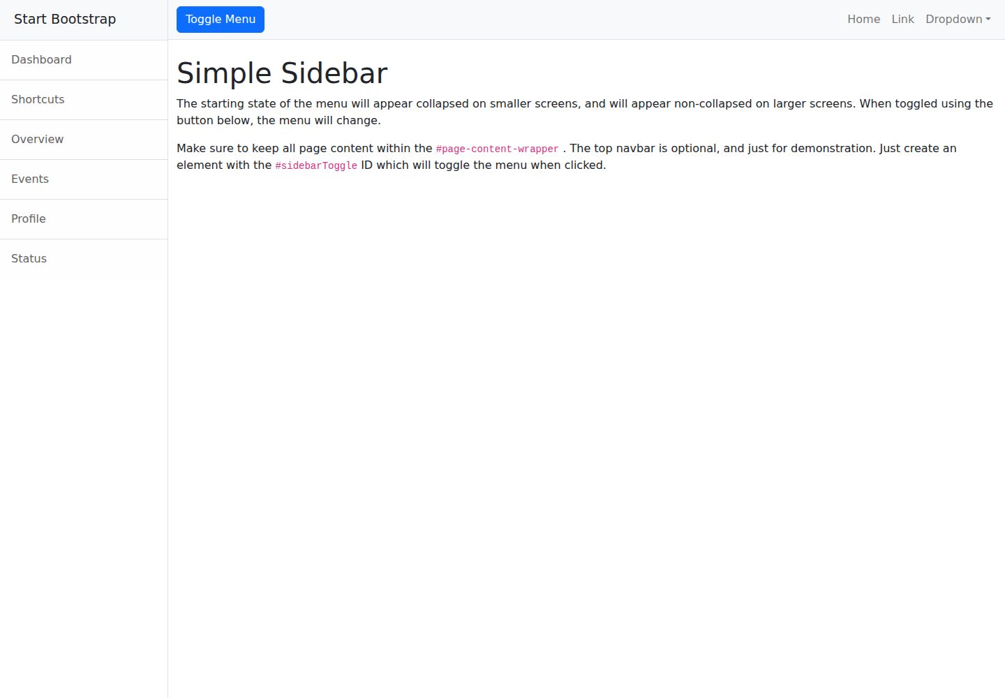
startbootstrap-simple-sidebar
A Bootstrap off-canvas sidebar navigation HTML starter template from Start Bootstrap. It provides directly editable HTML and CSS in the dist directory, while the source uses Pug, SCSS, and JavaScript with npm build scripts for live preview and compilation.
HTML · Starter
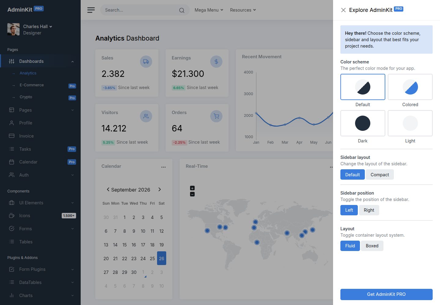
adminkit
AdminKit is a free, MIT-licensed HTML admin and dashboard template built on Bootstrap 5. The free version includes 15 demo pages, 1 plugin, and 1 color scheme, with hundreds of UI components, forms, tables, charts, and icons.
HTML · Admin dashboard
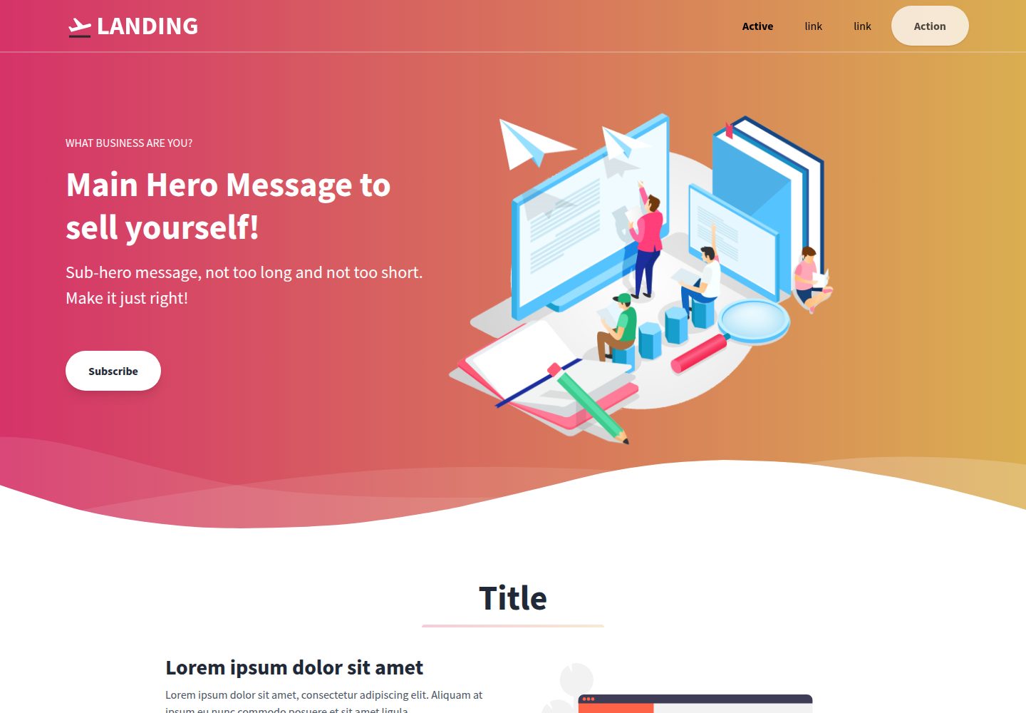
Landing-Page
A general-purpose landing page HTML template maintained by Tailwind Toolbox, written in pure HTML and loading the complete Tailwind CSS via CDN.
HTML · Corporate Website
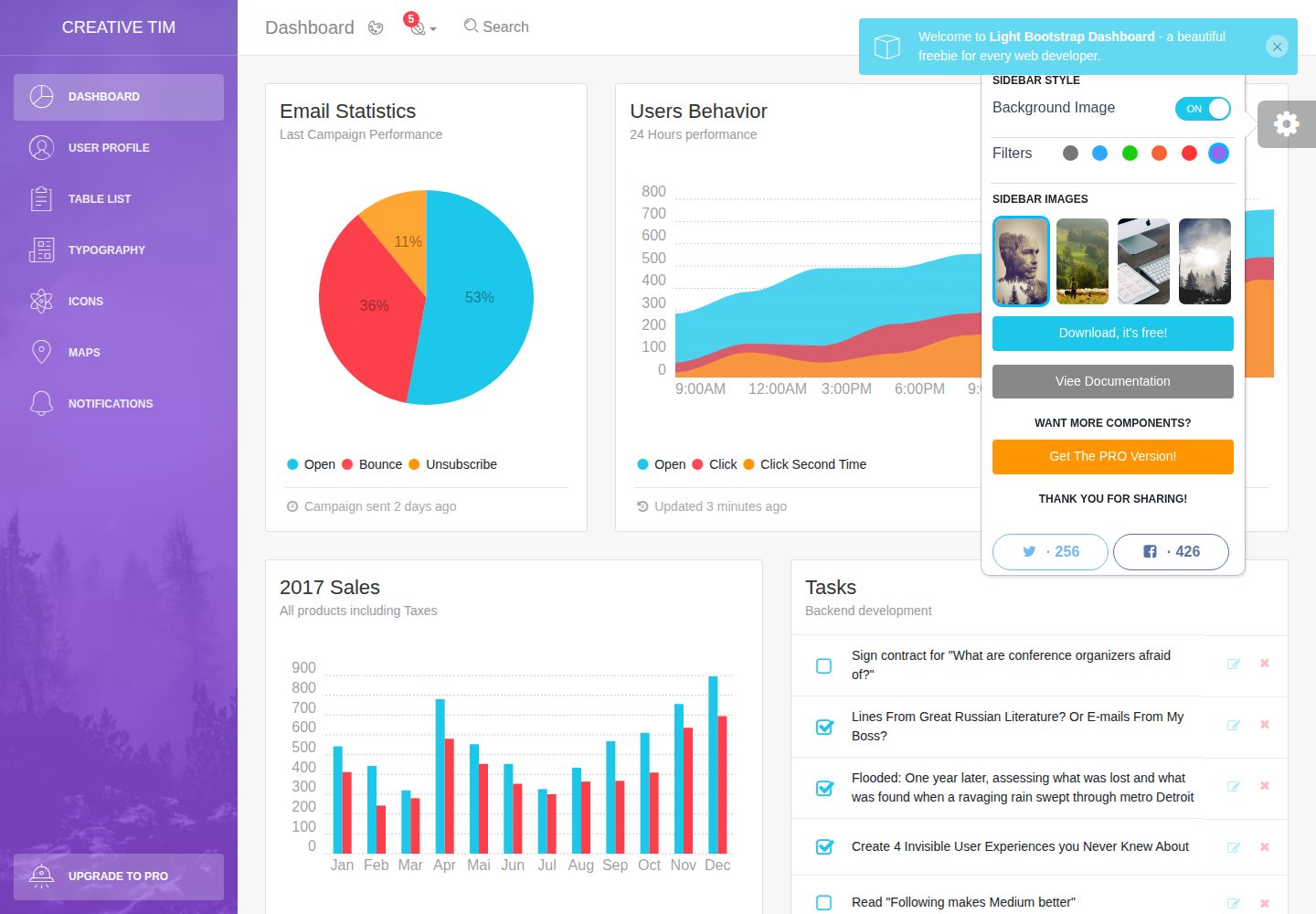
light-bootstrap-dashboard
Light Bootstrap Dashboard is a free, MIT-licensed admin dashboard template from Creative Tim, built on Bootstrap with a responsive static HTML structure.
HTML · Admin dashboard
sing-app
Sing App Lite is a free, open-source admin dashboard template from Flatlogic, built with Bootstrap 4.5 and SCSS. It provides a responsive layout, dashboard examples, typography, tables, notifications, basic charts, icons, maps, and a hover sidebar, along with styled Bootstrap components.
HTML · Admin dashboard
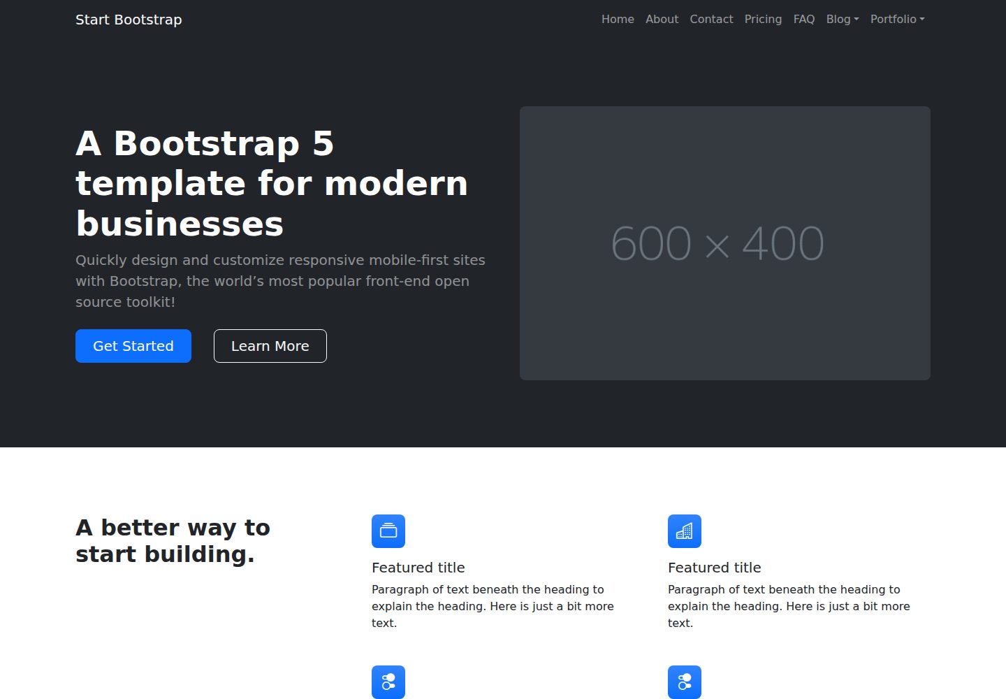
startbootstrap-modern-business
Modern Business is a multipurpose Bootstrap full-site HTML template from Start Bootstrap with 17 standalone pages covering home, about, services, portfolio, pricing, blog, FAQ, and contact.
HTML · Starter