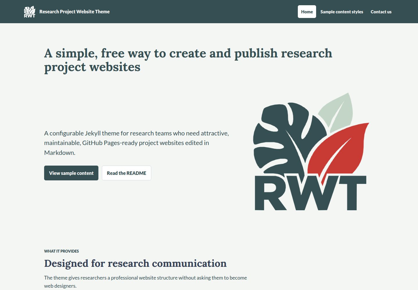
可作为 remote_theme 被 GitHub Pages 项目站点直接引用,无需发布为 RubyGem
HTML启动器
jcu-research-website-theme — HTML 启动器模板
作者 jcu-eresearch
面向科研项目传播的 Jekyll 主题,通过 remote_theme 复用到 GitHub Pages 项目站点,用 Markdown 维护内容。
看看你的网站会是什么样
浏览真实页面截图,比较内容排版与手机效果。点击下方缩略图切换,放大查看整页细节。
全部页面与视图 2
截图用于了解视觉与布局,交互效果请以实际项目为准。
采集于 2026-10-02查看来源
值得关注的模板亮点
从已有项目资料中,快速了解它的特点。
提供两级导航,父级带子菜单,支持悬停、点击、键盘操作与 Escape 关闭
landing-page 布局支持分屏与背景 hero、成就磁贴、轮播、卡片网格、人物与影响力区块、合作伙伴徽标
内容区块可在 front matter 声明,也可在 Markdown 正文中用带类名的引用块内联书写
内置 note、important、warning、caution 四种警示块,颜色可配置
jcudl-catalog 布局为 JCU Digital Library 目录提供挂载元素与脚本样式加载
模板详细介绍
该仓库是一个可配置的 Jekyll 主题,用于科研项目的对外传播站点。它面向 GitHub Pages 设计,研究团队可以用 Markdown 编写内容,同时复用主题提供的布局、导航、内容区块和示例素材。仓库本身既是可通过 remote_theme 引用的远程主题,也是一个展示可用页面类型与内容区块的示例站点。
使用方式是在项目站点的 _config.yml 中声明 remote_theme 并启用 jekyll-remote-theme 插件,主题无需发布为 RubyGem;仓库需保持公开。主题提供页面布局、两级导航(含下拉菜单)、全宽 landing-page 布局,以及由 front matter 中 blocks 列表驱动的组件,包括 achievements、carousel、standard、feature、highlight、partner-logos。另有 jcudl-catalog 布局,用于承载 JCU Digital Library 目录所需的挂载元素,该布局加载 Material Symbols 样式表、目录样式和脚本,并渲染 <div id="jcudlc">。
内容区块既可在 front matter 中声明,也可在 Markdown 正文里用带类名的引用块内联书写,支持彩色背景、卡片、强调线、全宽、图片左右浮动等样式,以及 note、important、warning、caution 四种警示块。合作伙伴徽标和图片画廊通过 .jcu-partner-logos、.jcu-image-gallery 类实现,每行最大数量由 theme_settings 控制。主题设置涵盖颜色、字体、按钮形状、内容对齐、面包屑、favicon、项目与页眉徽标等;主题不包含机构徽标,示例中的项目徽标为 RWT 热带叶片标记,可移除或替换。README 提到主题当前不包含页脚。
HTML启动器
适合你的项目吗?
适用场景
- 科研团队在 GitHub Pages 上搭建并维护项目介绍站点
- 用 Markdown 撰写研究背景、项目设置、成果与联系方式等页面
- 为项目页面加入图片画廊、合作伙伴徽标、轮播和卡片网格等内容区块
- 在项目站点中嵌入 JCU Digital Library 目录页面
适合人群
- 使用 Jekyll 与 GitHub Pages 的科研项目团队
- 希望以 Markdown 维护内容、复用统一布局与导航的项目站点
- 需要两级导航、警示块、画廊与合作伙伴徽标等组件的传播型站点
上手与定制指南
结合仓库当前版本的说明,按下面的资料检查内容、配置与运行要求。
- 1
在项目站点 _config.yml 中设置 remote_theme: jcu-eresearch/jcu-research-website-theme 并启用 jekyll-remote-theme 插件;仓库需保持公开
- 2
在 _data/navigation.yml 中配置导航,省略时回退为单个 Home 链接;导航支持两级
- 3
主题不包含机构徽标,示例中的 project_logo 为 RWT 热带叶片标记,可移除或替换为自有图片并设置 alt 文本
- 4
使用 jcudl-catalog 布局时,需将 jcudl-style.css 放在 assets/css/、jcudl.js 放在 assets/js/,路径可通过 front matter 覆盖
- 5
README 说明主题当前不包含页脚;演示图片、字体、图标等第三方素材需按各自许可核对
授权与来源资料
使用条件与限制
免费使用 · 保留许可声明本次收录的是公开仓库中采用 MIT 许可的免费版本;免费范围为该版本代码,不代表外部服务或第三方素材免费。
使用时需要遵守
- 允许免费使用、修改、商用和分发该版本代码。
- 分发代码副本或实质性部分时,保留原作者版权声明和完整 MIT 许可声明。
- 代码按现状提供;担保与责任限制以原许可证及适用法律为准。
额外费用与待核对事项
- 使用该主题作为远程主题时,承载主题的仓库必须保持公开,否则其他项目无法通过 remote_theme 引用。
- 主题不包含机构徽标;示例中的项目徽标为 RWT 热带叶片标记,需自行移除或替换为自有图片并设置替代文本。
- 主题当前不包含页脚,站点若需要页脚需自行实现。
- 使用 jcudl-catalog 布局时,必须自行提供 jcudl-style.css 与 jcudl.js 并放置到指定路径,否则目录无法正常加载。
- 示例合作伙伴徽标仅为占位素材,需替换为自有合作伙伴提供的徽标。
- 演示图片、字体、图标及其他第三方素材需按各自许可核对,不能仅凭代码的 MIT 许可判断。
- 域名、托管、数据库、支付或 AI 等外部服务可能另外收费。
查看原文依据
Permission is hereby granted, free of charge
许可证原文
Before other projects can consume this theme, keep this repository public on GitHub.
README 原文
The theme does not include an institutional logo.
README 原文
The theme does not currently include a footer.
README 原文
Place `jcudl-style.css` at `assets/css/jcudl-style.css` and `jcudl.js` at `assets/js/jcudl.js`
README 原文
https://github.com/jcu-eresearch/jcu-research-website-theme/blob/main/LICENSEhttps://github.com/jcu-eresearch/jcu-research-website-theme/blob/main/README.mdReplace the placeholders with logos supplied by your own partners.
README 原文
DeepSeek 根据仓库许可证和 README 整理 ·2026-10-02。结果仅覆盖已读取资料,依赖、图片、字体及后续条款变更以各自原文为准。
项目核对记录与介绍依据
模板资料
- 来源平台
- GitHub
- 资料与维护参考分
- 资料较完整 · 80 / 100
- 技术栈
- HTML
- 网站类型
- 启动器
这个分数如何计算
本站按许可资料(最高30分)、演示链接(12分)、预览图(10分)、Star数(15分)、记录的维护时间(15分)、描述完整度(8分)、功能记录(5分)和分类资料(5分)计算。它不是代码、安全或性能测试,也不是 Google 评分;有链接不代表已实测可用。
这个项目需要核对什么
- 记录的仓库更新时间
- 2026-10-02
- 截图检查日期
- 2026-10-02
已收录演示链接。请用你的内容与屏幕尺寸检查;有演示不代表表单、认证或支付已经可用。
目录记录的主要技术栈是 HTML。请通过依赖清单和锁文件核对实际版本与托管要求。这些说明基于收录资料,不代表代码审计或部署实测。
查看具体选型方法 →介绍的制作与核对状态
介绍由 AI 辅助整理目录与仓库资料。仓库作者不等于这篇介绍的审核者。
已完成服务器许可规则与 AI 来源核对;未经过人工编辑审核。
查看当时使用的来源资料
SHA-256: 2155e4f401b54a47ad97434f946c32b934d14a4cac5734f3b015aebc8842fdb4
2026-10-02T07:54:09.059Z
来源文件 / 仓库# Research Project Website Theme A configurable Jekyll theme for research project communications. The theme is designed for GitHub Pages, so research teams can maintain project websites with Markdown content while reusing shared layouts, navigation, content blocks, and sample assets. This repository is both: - a reusable remote Jekyll theme, consumed with `remote_theme` - a live sample site showing the page types and content blocks available in the theme ## Use as a remote theme Create a Jekyll/GitHub Pages repository for your research project, then add this to the project site's `_config.yml`: ```yml remote_theme: jcu-eresearch/jcu-research-website-theme plugins: - jekyll-remote-theme ``` For production project sites, pin a release once this theme has tagged versions: ```yml remote_theme: jcu-eresearch/[email protected] plugins: - jekyll-remote-theme ``` GitHub Pages can load public GitHub-hosted Jekyll themes with `remote_theme`. The theme does not need to be published as a RubyGem. Before other projects can consume this theme, keep this repository public on GitHub. For local development in a consuming project, use a Gemfile such as: ```ruby source "https://rubygems.org" gem "github-pages", group: :jekyll_plugins ``` ## Minimal project configuration In the project site's `_config.yml`, set the project identity and theme settings: ```yml title: "Research Project Website Theme" description: "A configurable static website for research project communications." url: "https://USERNAME.github.io" baseurl: "/REPOSITORY-NAME" remote_theme: jcu-eresearch/jcu-research-website-theme plugins: - jekyll-remote-theme markdown: kramdown kramdown: input: GFM theme_settings: show_breadcrumbs: true favicon: "/assets/images/rwt/favicon-colour-transparent.png" app_icon: "/assets/images/rwt/app-colour-transparent.png" project_logo: "/assets/images/rwt/app-colour-transparent.png" header_logo: "/assets/images/rwt/app-reverse-mono-transparent.png" project_logo_alt: "Project logo" sidebar_logo_tile_background: "transparent" sidebar_logo_tile_border_color: "transparent" # Optional project-logo-specific overrides. Leave commented to use the sidebar logo tile settings above. #sidebar_project_logo_tile_background: "#FFFFFF" #sidebar_project_logo_tile_border_color: "rgba(255, 255, 255, 0.45)" font_family: "Lato, Arial, Helvetica, sans-serif" heading_font_family: "Lora, Georgia, serif" primary_color: "#354F52" primary_text_color: "#FFFFFF" primary_link_color: "#FFFFFF" secondary_color: "#C3D5C7" secondary_text_color: "#354F52" secondary_link_color: "#354F52" text_color: "#344054" heading_color: "#344054" background_color: "#F4F6F3" background_text_color: "#344054" background_link_color: "#354F52" surface_color: "#FFFFFF" surface_text_color: "#344054" surface_link_color: "#354F52" # Alert colours: left border, background, text and links. note_color: "#354F52" note_background_color: "#EDF2EF" note_text_color: "#354F52" note_link_color: "#354F52" important_color: "#527C66" important_background_color: "#E7F0EA" important_text_color: "#354F52" important_link_color: "#354F52" warning_color: "#C83B35" warning_background_color: "#FBECEB" warning_text_color: "#354F52" warning_link_color: "#922C27" caution_color: "#A86A2B" caution_background_color: "#FFF3E0" caution_text_color: "#354F52" caution_link_color: "#75471A" border_color: "#D0D5DD" # content_alignment options: "left", "center" content_alignment: "left" button_shape: "rectangular" table_banded_rows: true block_separator_style: "none" partner_logo_max_height: "6rem" partner_logo_max_items_per_row: 3 image_gallery_max_items_per_row: 3 page_card_columns: 3 page_card_link_text: "Read more" defaults: - scope: path: "" type: "pages" values: layout: "page" ``` The theme does not include an institutional logo. The sample `project_logo` above is the RWT tropical leaf mark; remove that setting to show only the project title, or add your own image to the consuming site's `assets/images/` folder and set its path and alt text. The generic favicon can also be replaced with your own file. Each background colour has a matching `*_text_color` and `*_link_color`. Set both to colours with enough contrast against that background. `text_color` remains a fallback for older configurations when `background_text_color` is omitted. The white `surface_color` is used for cards and other raised panels. `warning_color` colours Warning alerts. The optional `header_logo` appears at the left of the shared site header, falling back to `project_logo` when omitted. The sample uses the transparent white reverse mono mark on the dark title bar. `project_logo` and `app_icon` use the coloured transparent mark; `app_icon` supplies the Apple touch icon. The header navigation is used on every page and changes to a burger menu on smaller screens. The optional `favicon` appears in the browser tab. Set `favicon: false` to omit the favicon link. The `markdown` and `kramdown` settings enable GitHub-flavoured Markdown features such as pipe tables and task lists. Set `theme_settings.content_alignment` to `left` or `center` to control how content is aligned within page, block, card, and landing-page section containers. The default is `left`. Set `theme_settings.button_shape` to `rectangular` (the default) for straight edges with slightly rounded corners, or `lozenge` for fully rounded ends. This site-wide setting applies to hero and content action buttons, menu controls and navigation highlights, and carousel controls. Action buttons use `primary_color` and `primary_link_color` for the first button, and `surface_color` and `surface_link_color` for the second, with `border_color` for its border. These colours are consistent across heroes and content sections. Small carousel indicators become rounded squares or circles respectively. Missing or unrecognised values use `rectangular`. ## Navigation Add `_data/navigation.yml` in the project site: ```yml - title: Home url: / - title: Project url: /project/ children: - title: Research context url: /project/research-context/ - title: Project setting url: /project/project-setting/ - title: Contact url: /contact/ ``` If navigation is omitted, the theme falls back to a single Home link. Navigation supports two levels. Top-level items appear in the header and any `children` appear in a dropdown menu. A parent with children becomes a single submenu button styled like a navigation link. It opens on hover, click, or tap; keyboard users can use Enter, Space, or Arrow Down. The first submenu link, Overview, leads to the parent's URL. Escape closes the submenu and returns focus to its button. ## Add a page Create a Markdown file in the project site, such as `outputs.md`: ```yml --- title: Outputs permalink: /outputs/ blocks: - type: image-text title: "Project outputs" content: | Add reports, papers, datasets, or links here. --- ``` Then add it to `_data/navigation.yml`: ```yml - title: Outputs url: /outputs/ ``` ## Full-width page layout Use `layout: landing-page` for a polished project page driven by front matter. It supports split-image and background heroes, achievement tiles, a carousel, styled sections before or after the carousel, card grids for media/projects/news, people and impact sections, optional section action buttons, and partner logos. Add those components to the page's ordered `blocks` list. Each block declares a `type` of `achievements`, `carousel`, `standard`, `feature`, `highlight`, or `partner-logos`. See `landing_page_styles.md` for the editable front matter pattern and the CSS classes generated by the layout. ## JavaScript catalogue layout Use `layout: jcudl-catalog` for a page that keeps the project header and provides the mount element required by the JCU Digital Library catalogue. The theme does not currently include a footer. Place `jcudl-style.css` at `assets/css/jcudl-style.css` and `jcudl.js` at `assets/js/jcudl.js`, then create a page such as `catalog.md`: ```yml --- layout: jcudl-catalog title: Project catalogue permalink: /catalog/ --- ``` The layout loads the Material Symbols stylesheet, the catalogue stylesheet, and the catalogue script, and renders the required `<div id="jcudlc">` element. To let the catalogue fill the available width below the header, set `catalog_full_width: true` in the page front matter. By default, the catalogue stays within the normal page margins. ```yml --- layout: jcudl-catalog title: Project catalogue catalog_full_width: true --- ``` The local asset locations can be overridden when needed: ```yml jcudl_stylesheet: /catalog/jcudl-style.css jcudl_script: /catalog/jcudl.js ``` ## Content block types Content blocks can be added in front matter, or simple narrative blocks can be written inline in the Markdown body. ### Inline blocks Use Markdown blockquote notation with a short class line when you want styled blocks to appear among ordinary page content: ```md > ## Section title > > Markdown content can include **emphasis**, [links](https://www.jcu.edu.au/), and lists. {:.jcu-block .jcu-block--coloured-bkgnd} ``` Inline block options: - `.jcu-block--coloured-bkgnd`: use the configured secondary colour across the full content panel - `.jcu-block--card`: use the theme card colour with a border - `.jcu-block--accent`: add a primary-colour line to the left of a block - `.jcu-block--full`: allow the block to use the full content width - `.jcu-block--image-left`: float the first image in the block to the left - `.jcu-block--image-right`: float the first image in the block to the right Place the class line directly underneath the block it should style. When normal Markdown content follows an inline block, the theme adds extra spacing automatically. For GitHub-style alerts, use a labelled blockquote with a JCU alert class: ```md > **Note** > > Highlights information that users should take into account. {:.jcu-alert .jcu-alert--note} ``` Alert options are `.jcu-alert--note`, `.jcu-alert--important`, `.jcu-alert--warning`, and `.jcu-alert--caution`. For inline partner logos, use standard Markdown images and linked images, then add the `.jcu-partner-logos` class. The maximum number of tiles in each row is set by `theme_settings.partner_logo_max_items_per_row`. ```md     {:.jcu-partner-logos} ``` For an inline image gallery, use standard Markdown images or linked images, then add the `.jcu-image-gallery` class. The maximum number of tiles in each row is set by `theme_settings.image_gallery_max_items_per_row`. ```md []({{ "/sample-content/content-blocks/southern-cassowary/" | relative_url }}) []({{ "/sample-content/content-blocks/lumholtzs-tree-kangaroo/" | relative_url }}) []({{ "/sample-content/content-blocks/estuarine-crocodile/" | relative_url }}) {:.jcu-image-gallery} ``` ### Alert blocks Use `type: alert` in the page layout. It shares its colours and appearance with Markdown `.jcu-alert` blocks: ```yml - type: alert alert_type: "note" title: "Before you begin" content: | **Markdown** content, lists, and links are supported here. ``` `alert_type` accepts `note`, `important`, `warning`, or `caution`; missing or unrecognised values use `note`. `title` is plain text and defaults to the type name. These are static information boxes, not live announcements. For each type, `theme_settings` provides four colour settings. For example, `warning_color` controls the left border, `warning_background_color` the panel, `warning_text_color` the heading and body, and `warning_link_color` its links. If a background setting is omitted, it uses a 10% tint of that type's border colour against white. These settings also control Markdown alerts. ### Text-only block ```yml - type: image-text title: "Section title" content: | Markdown content goes here. ``` ### Two column ```yml - type: two-column title: "Section title" columns: - title: "Left column" content: | Markdown content goes here. - title: "Right column" content: | Markdown content goes here. ``` ### Image and text ```yml - type: image-text title: "Context with supporting image" image: "/assets/sample-images/card-research-context.svg" image_alt: "Abstract illustration of research context" image_position: "right" image_size: "medium" background: "secondary" background_mode: "block" caption: "Optional image caption." content: | Markdown content goes here. ``` Options: - `image_position`: `left` or `right` - `image_size`: `small`, `medium`, or `large` - with a secondary background, the image sits flush against its left or right panel edge; text and captions retain padding, and stacked images span the panel width on small screens - omit `background` to place the block directly on the page without panel padding - omit `image` to display the text at the full content-panel width - `one-column` remains a supported alias for `image-text` - backgrounds stay within the content panel, with the same padding and rounded corners as the former one-column block; `background_mode: "behind"` is treated as `"block"` for these two type names ### Block backgrounds Any content block can use the configured secondary colour as its background: ```yml - type: image-text title: "Section title" background: "secondary" background_mode: "block" content: | Markdown content goes here. ``` Image-text blocks (including the `one-column` alias) always keep their background within the block. Other block types support `background_mode: "block"` to colour the block itself, or `background_mode: "behind"` to place a larger coloured panel behind it. Block separator options are `none`, `line`, `accent`, and `band`. The `accent` style uses `primary_color`. The landing-page layout does not show breadcrumbs. Other pages show breadcrumbs unless `theme_settings.show_breadcrumbs` is set to `false`. ### Markdown tables Markdown pipe tables use the configured secondary colour for the header row. Internal table lines use a muted version of the secondary colour, with no lines on the outer edges. ```md | Syntax | Description | | ----------- | ----------- | | Header | Title | | Paragraph | Text | ``` Set alternating table row backgrounds in `_config.yml`: ```yml theme_settings: table_banded_rows: true ``` ### Image gallery ```yml - type: gallery title: "Featured links" columns: 3 items: - title: "Project context" image: "/assets/sample-images/gallery-background.svg" url: "/project/research-context/" ``` For front matter gallery blocks, `columns` overrides `theme_settings.image_gallery_max_items_per_row`. Inline `.jcu-image-gallery` blocks use only the value from `_config.yml`. Both gallery styles treat the configured value as a maximum and step down to fewer tiles per row as the screen narrows. ### Partner logos Set logo defaults in `_config.yml`: ```yml theme_settings: partner_logo_max_height: "6rem" partner_logo_max_items_per_row: 3 ``` Then add a logo block to any page: ```yml - type: partner-logos title: "Project partners" background: "secondary" columns: 3 content: | Optional introductory text. partners: - name: "Partner organisation" logo: "/assets/sample-images/partner-placeholder.svg" - name: "Rainforest research partner" logo: "/assets/sample-images/partner-rainforest.svg" - name: "Reef research partner" logo: "/assets/sample-images/partner-reef.svg" - name: "Funding partner" logo: "/assets/sample-images/partner-mosaic.svg" ``` Both layouts support `background: "primary"` or `"secondary"`, using the matching text and link colours. Omit `background` for the normal page background. In the `page` layout, colour stays within a padded content panel; in `landing-page`, it forms a full-width band. Partner-logo blocks use this standard treatment even if an older block specifies `background_mode`. Use transparent logos that remain readable on the chosen colour. White sample versions are available as `partner-*-reverse-mono.svg`; the primary-background examples use these. For front matter partner-logo blocks in either layout, `columns` overrides `theme_settings.partner_logo_max_items_per_row`. Inline `.jcu-partner-logos` blocks use only the value from `_config.yml`. Both partner logo styles treat the configured value as a maximum and step down to fewer logos per row as the screen narrows. ### Cards with content supplied in the block Use `type: cards` in the `page` layout to write card content directly in front matter. Cards use the same surface colours, borders, and layout as `page-cards`. The card fields match landing-page section cards: ```yml - type: cards title: "Project highlights" columns: 2 content: | Optional introductory Markdown. cards: - title: "Research context" image: "/assets/sample-images/card-research-context.svg" image_alt: "Abstract research context illustration" text: | **Markdown** is supported in each card's text. url: "/sample-content/" link_text: "Learn more" - title: "Project priorities" text: "Images and links are optional." ``` - `cards` supplies the list, in display order; no folder lookup is performed. - Each card accepts `title`, `text`, `image`, `image_alt`, `url`, and `link_text`. - A text link appears when both `url` and `link_text` are supplied. Images link to `url` when provided. - `columns` overrides `theme_settings.page_card_columns` (default: 3). - With `columns: 1`, image cards use a wide row on desktop; text-only cards occupy the full row. At 900px or less, cards stack into a single column. - The block also accepts `background` and `background_mode`, like page cards. ### Page cards Set card defaults in `_config.yml`: ```yml theme_settings: page_card_columns: 3 page_card_link_text: "Read more" ``` Then add a card block to any page. The `folder` value matches Markdown pages in that folder: ```yml - type: page-cards title: "Project pages" folder: "project-pages/" columns: 2 link_text: "Read more" ``` Each page in the folder can provide card metadata: ```yml --- title: Research context permalink: /project/research-context/ order: 1 image: "/assets/sample-images/card-research-context.svg" summary: "A short overview of the project setting." --- ``` If `columns: 1`, each card uses a wide layout with the image on the left and the summary on the right on desktop screens. ## Local development Use Ruby `3.3.4` to match the GitHub Pages build environment, then run: ```bash bundle install bundle exec jekyll serve ``` The configured GitHub Pages URL for this sample repository is: ```text https://PaulineLawrey.github.io/jcu-research-website-theme/ ``` ## Maintaining the theme Keep reusable presentation files in these folders: - `_layouts` - `_includes` - `_data` - `assets` Sample content for previewing the theme is grouped under `sample-content/`. Sample-only media, including transparent partner logo placeholders in different proportions, is grouped under `assets/sample-images/`. Replace the placeholders with logos supplied by your own partners. Research project sites that use this as a remote theme should create their own content pages and navigation data. When releasing a stable version, create a Git tag such as `v1.0.0` and tell consuming sites to pin that tag in `remote_theme`.
看看同类模板
对比同技术栈与用途的模板,找到更适合的视觉与内容结构。
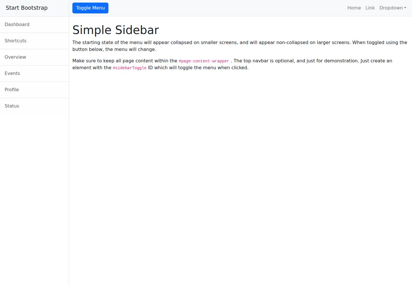
startbootstrap-simple-sidebar
An off canvas sidebar navigation Bootstrap HTML template created by Start Bootstrap
HTML · 启动器
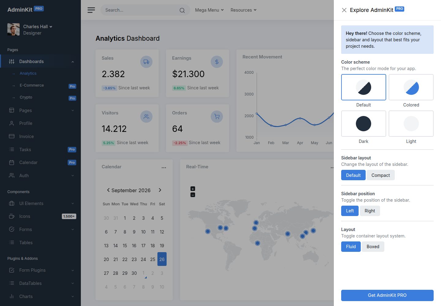
adminkit
AdminKit is a free & open-source HTML dashboard & admin template based on Bootstrap 5
HTML · 后台
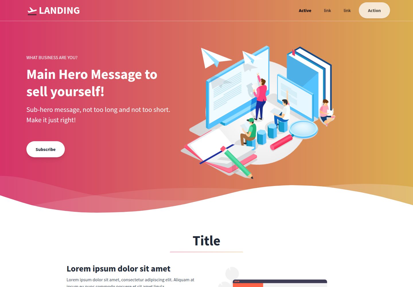
Landing-Page
Tailwind CSS Starter Template - Landing Page
HTML · 企业官网
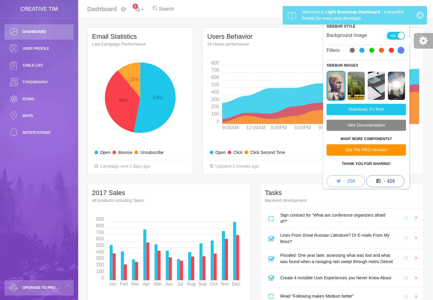
light-bootstrap-dashboard
Light Bootstrap Dashboard is an admin dashboard template designed to be beautiful and simple.
HTML · 后台
sing-app
💥Free and open-source admin dashboard template built with Bootstrap 4.5 💥
HTML · 后台
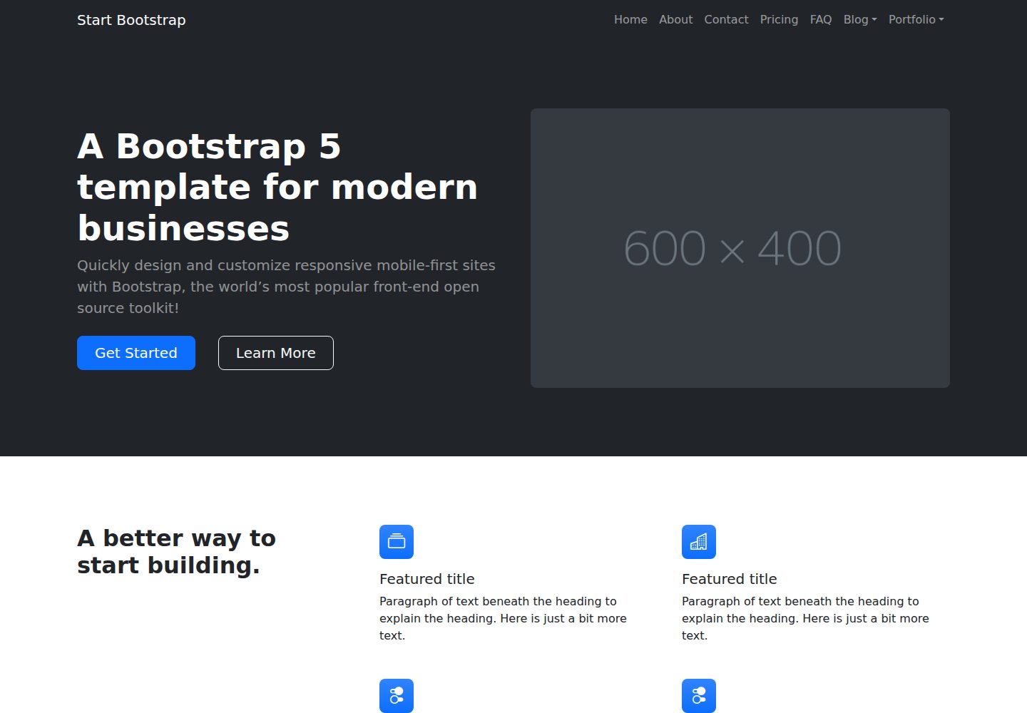
startbootstrap-modern-business
A multipurpose Bootstrap full website template created by Start Bootstrap
HTML · 启动器