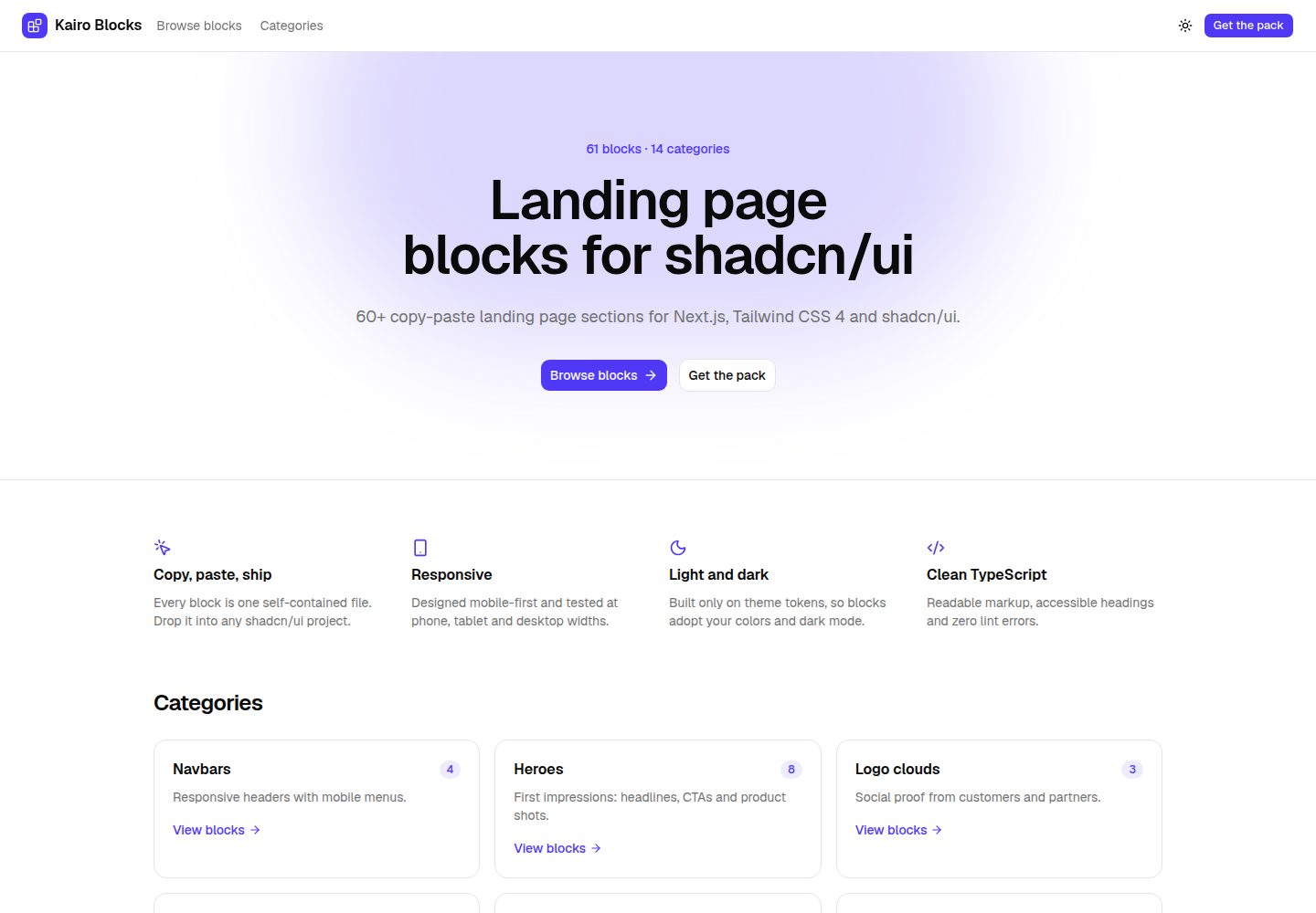
10 landing page blocks: navbar, hero, logo cloud, features, stats, testimonials, pricing, FAQ, CTA, footer
Next.jsReactCorporate Website
kairo-blocks-lite — Next.js Business Template
By jeffev
Kairo Blocks Lite is a free collection of landing page blocks for Next.js and shadcn/ui projects, containing 10 copy-paste standalone .tsx files under the MIT license.
Explore the design
Compare the page layouts and mobile experience. Open any screenshot for a closer look.
Desktop homepage1 / 3
Desktop captureTop of page
Actual screenshot captured by the server browser.
All pages & views 3
Screenshots show visual appearance; interactive behavior may differ.
Recorded 2026-10-07View source
What stands out
A quick read of the recorded project description.
Each block is a single self-contained .tsx file that can be copy-pasted into any shadcn/ui project
Uses only shadcn/ui theme tokens, automatically adapting to the project's colors, border radius, and dark mode
No external images or additional npm packages; only shadcn/ui, lucide-react, and Next.js are required
Includes a showcase site for locally viewing desktop, tablet, and mobile previews plus code
MIT license, permitting use in personal and commercial projects
Template Details
Kairo Blocks Lite provides 10 landing page blocks covering navbar, hero, logo cloud, features, stats, testimonials, pricing, FAQ, call to action, and footer. Each block is a single self-contained .tsx file that can be copied directly into any shadcn/ui project, with sample data placed as constants at the top of the component for easy replacement. Blocks use only shadcn/ui theme tokens, so they follow the colors, border radius, and dark mode defined in the project's globals.css. The README states that blocks are responsive at mobile, tablet, and desktop widths, and do not depend on external images or additional npm packages, using only shadcn/ui, lucide-react, and Next.js. navbar-01 and pricing-01 begin with "use client" because they use state (mobile menu, billing toggle). The repository also includes a showcase site that can be browsed locally with npm run dev to view desktop, tablet, and mobile previews of the blocks plus code views; npm run build generates a static site deployable anywhere. The free scope is limited to the code in this Lite version; the full Kairo Blocks is a separately sold package of 61 blocks.
Next.jsReactCorporate Website
Is it right for your project?
Use Cases
- Quickly building a corporate website or product landing page for Next.js and shadcn/ui projects
- Reusing blocks directly under an existing shadcn/ui theme to keep visual style consistent
- Browsing each block's appearance at different screen widths and its source code locally via the showcase site
- Using the stateful navbar-01 and pricing-01 directly on pages that need a mobile menu or billing toggle
Suitable For
- Front-end developers using Next.js and shadcn/ui
- Corporate website projects that need to quickly assemble landing page blocks
- Teams that want block styles to follow their own theme tokens
- Personal or commercial projects that accept the MIT license and will replace the sample content themselves
Getting started & customization
Use these recorded setup notes alongside the repository instructions for your chosen version.
- 1
The project must already have Tailwind CSS and shadcn/ui configured; refer to the official shadcn/ui documentation for installation
- 2
Copy the block .tsx files into any directory in the project (e.g., components/sections/) and add the required shadcn/ui components as noted in the comments at the top of each file
- 3
Replace the sample copy, links, and data in the constants at the top of the component
- 4
navbar-01 and pricing-01 begin with "use client" because they use state, so they must be used in an environment that supports client components
- 5
To run the showcase site: npm install, then npm run dev, and visit http://localhost:3000; npm run build generates a static site in out/
License & source material
Usage conditions & limitations
Free to use · keep license noticeThis entry covers the free version under the MIT license in the public repository; the free scope is limited to this version's code and does not mean external services or third-party assets are free.
Must comply with when using
- The code in this version may be used, modified, used commercially, and distributed free of charge.
- When distributing copies or substantial portions of the code, retain the original author's copyright notice and the full MIT license notice.
- The code is provided as is; warranties and limitations of liability are governed by the original license and applicable law.
Additional costs & items to verify
- Demo images, fonts, icons, and other third-party assets must be checked against their respective licenses; the code's MIT license alone cannot be used to judge them.
- External services such as domains, hosting, databases, payments, or AI may incur separate charges.
- The free scope is limited to the 10 blocks in this Lite repository; the full Kairo Blocks (61 blocks, 14 categories) must be purchased separately on Payhip and is not included in the free offering.
- The full Kairo Blocks kit is sold separately and is subject to its own license; it is not covered by the authorization of this MIT-licensed free repository.
- Before using the blocks, the target project must already have Tailwind CSS 4 and shadcn/ui configured; otherwise they cannot be copied and used directly.
- Each block depends on the shadcn/ui components listed at its top, and those components must first be added via the shadcn CLI for the block to render correctly.
View Original Text Basis
Permission is hereby granted, free of charge
Original License Text
> **Want more?** [Kairo Blocks](https://payhip.com/b/gD6od) has **61 blocks in 14 categories**: every variant of > these sections plus team, blog, contact and newsletter blocks.
Original README
The full Kairo Blocks pack is sold separately under its own license.
Original README
Your project needs Tailwind CSS 4 and shadcn/ui ([setup guide](https://ui.shadcn.com/docs/installation)).
Original README
https://github.com/jeffev/kairo-blocks-lite/blob/main/LICENSE.mdhttps://github.com/jeffev/kairo-blocks-lite/blob/main/README.mdAdd the shadcn/ui components it imports. Every block lists them at the top of the file:
Original README
Compiled by DeepSeek based on repository license and README ·2026-10-07. Results only cover the materials read; dependencies, images, fonts, and subsequent term changes are subject to their respective original texts.
Project checks & description sources
Template Information
- Source platforms
- GitHub
- Documentation and maintenance reference score
- More documented · 85 / 100
- Technologies
- Next.js · React
- Website type
- Corporate Website
How this score is calculated
Our heuristic uses license records (up to 30), a demo link (12), a preview (10), stars (15), recorded maintenance (15), description completeness (8), feature records (5) and classification data (5). It is not a code, security or performance test, or a Google score. A link does not establish tested functionality.
What to verify for this project
- Repository update recorded
- 2026-10-06
- Screenshot last checked
- 2026-10-07
A demo link is listed. Check it with your own content and viewport sizes; its presence does not confirm that forms, authentication or payments work.
The catalog identifies Next.js as the primary stack. Check the actual dependency manifest and lockfile for versions and hosting requirements. These notes use recorded metadata, not a code audit or a deployment test.
Use a selection guide →How this description was prepared
AI-assisted description based on catalog records and repository material. Repository authors are not automatically the reviewers of this description.
Review declaration: [email protected] · 2026-10-07
Inspect the recorded source material
SHA-256: 4aac3e1d5f69428ec1cf88cd3d48bf5aa5291bf9b1d99b7a89e7bb3eb7dc766f
2026-10-07T00:48:29.781Z
Source file / repository# Kairo Blocks Lite
10 free landing page sections for **Next.js 16**, **Tailwind CSS 4** and **shadcn/ui**. Every block is a single,
self-contained `.tsx` file you can copy into any shadcn/ui project. MIT licensed.
| Category | Block |
|---|---|
| Navbar | `navbar-01`: responsive header with a mobile menu |
| Hero | `hero-01`: centered hero with product shot |
| Logo cloud | `logos-01`: logo grid |
| Features | `features-01`: three-column icon grid |
| Stats | `stats-01`: four big numbers |
| Testimonials | `testimonials-01`: three testimonial cards |
| Pricing | `pricing-01`: three tiers with billing toggle |
| FAQ | `faq-01`: accordion |
| Call to action | `cta-01`: primary banner with two buttons |
| Footer | `footer-01`: logo with four link columns |
- Built only on shadcn/ui theme tokens, so every block adopts your colors, radius and dark mode
- Responsive at phone, tablet and desktop widths
- No external images or extra npm packages: only shadcn/ui, `lucide-react` and Next.js
- Accessible markup: heading order, labelled controls, keyboard-friendly menus and accordions
> **Want more?** [Kairo Blocks](https://payhip.com/b/gD6od) has **61 blocks in 14 categories**: every variant of
> these sections plus team, blog, contact and newsletter blocks.
> [Live demo of the full pack](https://kairo-blocks-demo.jeffev123.workers.dev).
## Using a block in your project
Your project needs Tailwind CSS 4 and shadcn/ui ([setup guide](https://ui.shadcn.com/docs/installation)).
1. Copy the file, for example `src/blocks/hero/hero-01.tsx`, into your project
(any folder, e.g. `components/sections/`).
2. Add the shadcn/ui components it imports. Every block lists them at the top of the file:
```bash
npx shadcn@latest add button badge
```
3. Render it:
```tsx
import Hero01 from "@/components/sections/hero-01";
export default function Page() {
return <Hero01 />;
}
```
4. Replace the sample copy, links and data (kept in constants at the top of each component) with your own.
Each file also exports a small `meta` object used by the showcase; you can delete it. `navbar-01` and
`pricing-01` start with `"use client"` because they use state (mobile menu, billing toggle).
## Running the showcase
```bash
npm install
npm run dev
```
Open http://localhost:3000 to browse the blocks with live previews (desktop, tablet and mobile) and the code
view. `npm run build` produces a static site in `out/` that you can deploy anywhere.
## Customizing the look
Blocks use theme tokens (`bg-primary`, `text-muted-foreground`, `border`…), so changing your shadcn/ui theme
in `globals.css` restyles every block at once.
## License
[MIT](./LICENSE.md). Use the blocks in personal and commercial projects. The full Kairo Blocks pack is sold
separately under its own license.
Made by [Jefferson Valandro](https://jeffev.github.io/jeffersonvalandro/) · [ValandroUI](https://payhip.com/ValandroUI)
Explore similar templates
Compare previews and descriptions within the same stack and category.
SaaS-Boilerplate
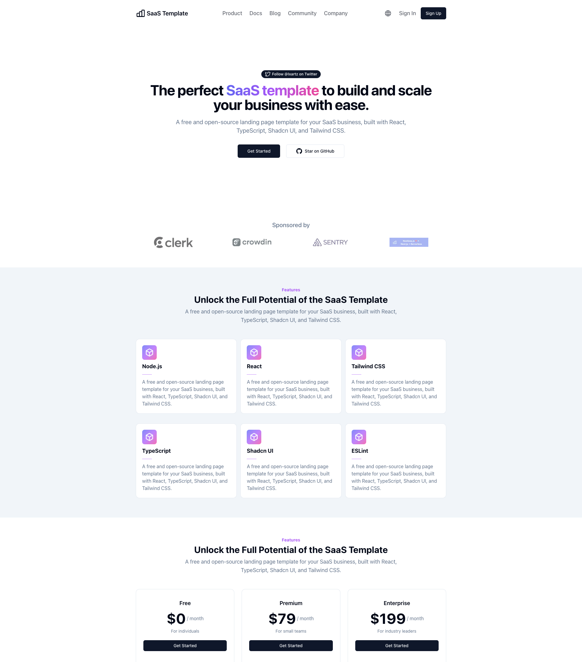
SaaS-Boilerplate is an open-source SaaS starter template built with Next.js App Router, React 19, TypeScript, Tailwind CSS, and Shadcn UI.
Next.js · SaaS
Next-JS-Landing-Page-Starter-Template
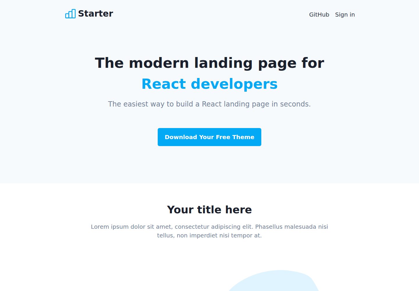
A free Next.js landing page starter template written in Tailwind CSS and TypeScript, featuring built-in navbar, hero, features, CTA banner, and footer sections.
Next.js · Corporate Website
next-saas-starter
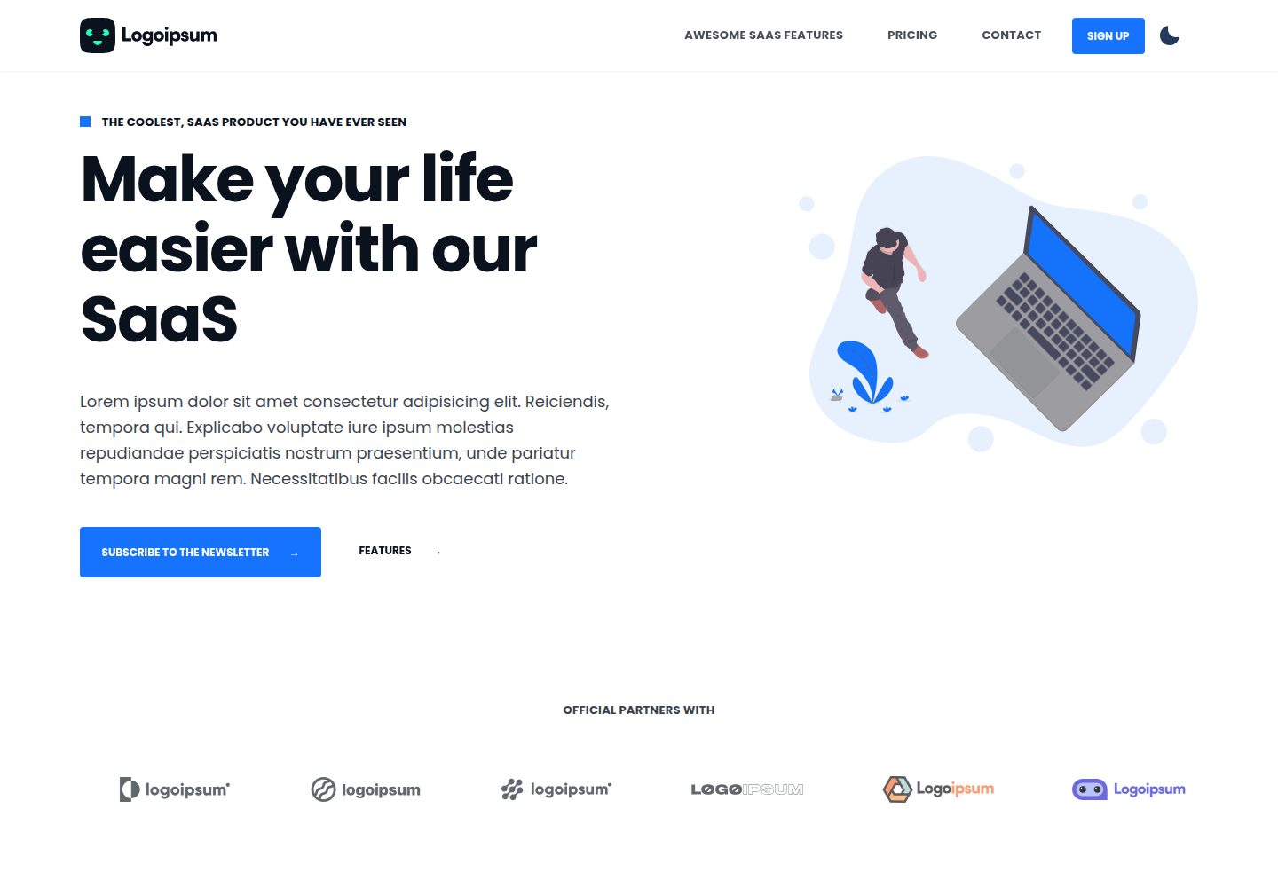
A free Next.js SaaS marketing landing page template from Blazity, using static generation and styled-components with no extra UI library.
Next.js · SaaS
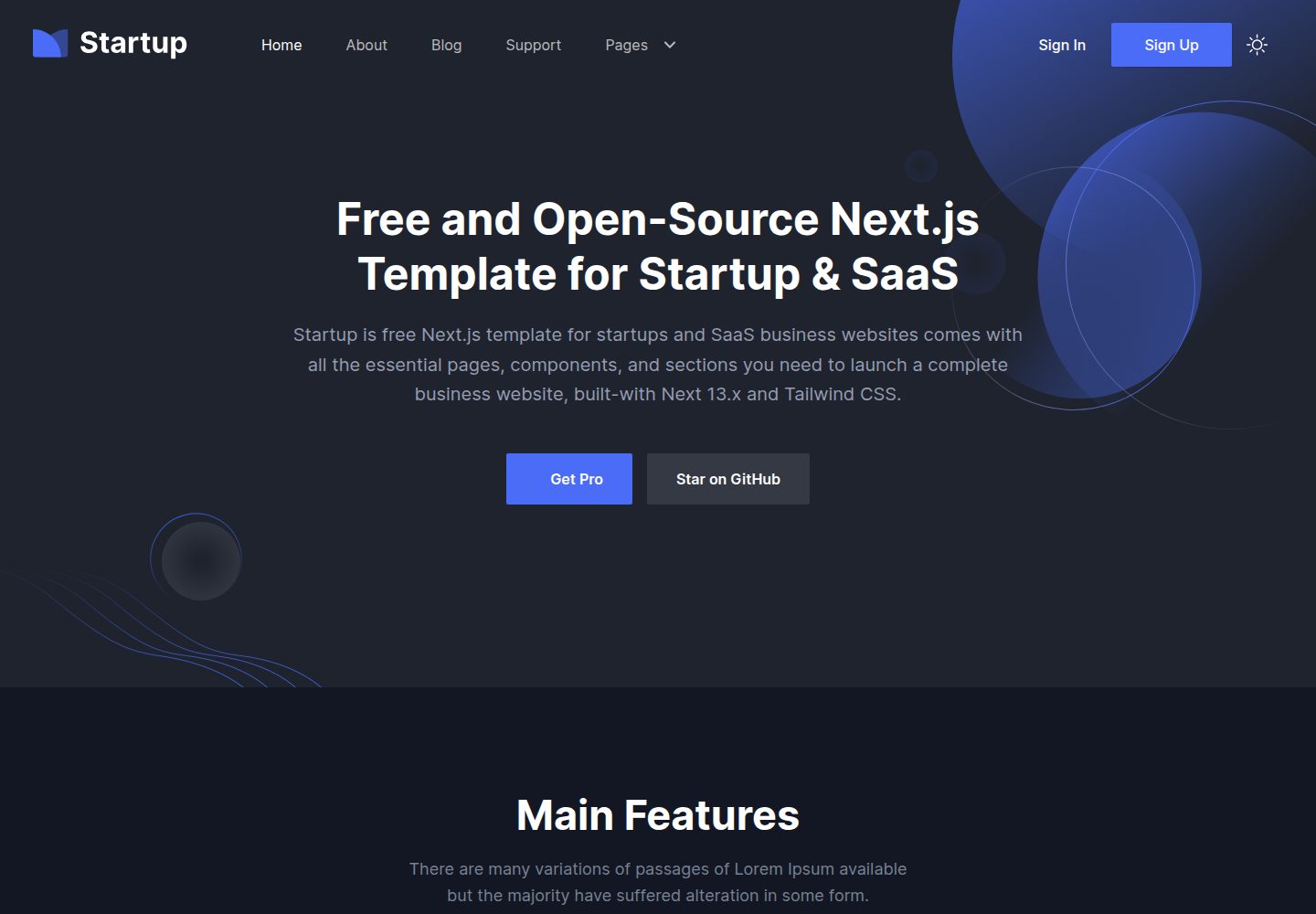
startup-nextjs
Startup is a free, MIT-licensed Next.js template from NextJSTemplates for SaaS startups and corporate landing pages.
Next.js · SaaS
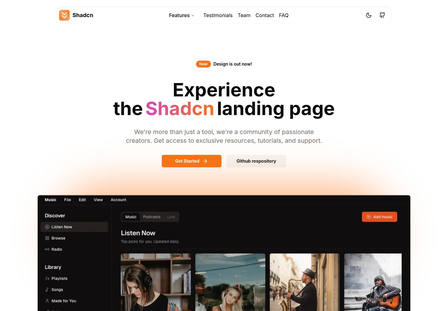
shadcn-landing-page
A Next.js landing page template built with Shadcn, TypeScript, and Tailwind, converted from a Shadcn-Vue version. It includes sections such as Navbar, mobile Sidebar, Hero, Pricing, FAQ, and Footer, and highlights responsive design, navigation, and dark mode.
Next.js · Corporate Website
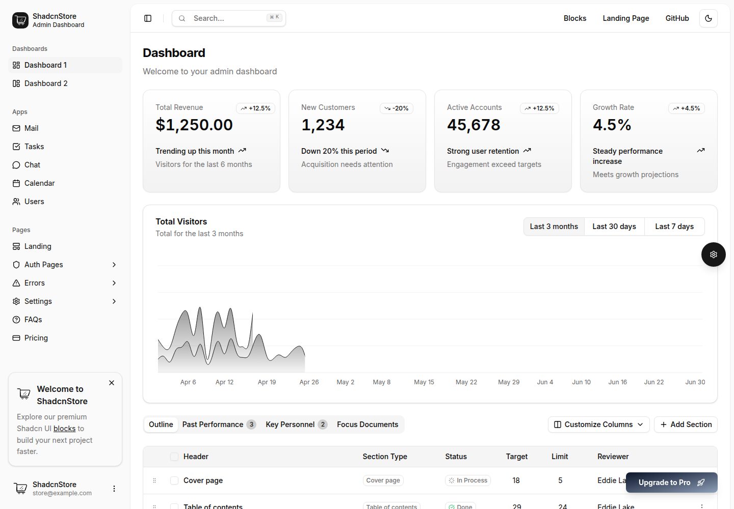
shadcn-dashboard-landing-template
An open-source admin dashboard and marketing landing page template built on shadcn/ui and Tailwind CSS, with both Vite + React and Next.js versions in one repository.
Next.js · Admin dashboard