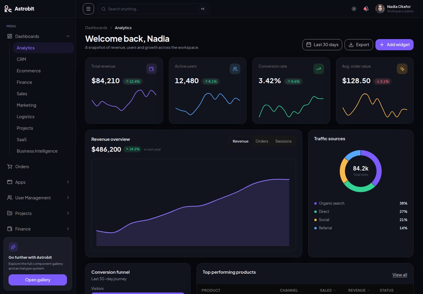
The interface is composed entirely of oks-ui components, with no second UI library or chart library introduced
AstroViteReactAdmin dashboard
astrobit — Astro Admin dashboard Template
By OKS-PROJECTS
Astrobit is an admin dashboard template built on the oks-ui component library, using Vite + React with an Astro project structure, dark-first, with config-driven pages.
Explore the design
Compare the page layouts and mobile experience. Open any screenshot for a closer look.
Desktop homepage
Desktop captureTop of page
Actual screenshot captured by the server browser.
One original preview is available. Open the full image to inspect the design.
Screenshots show visual appearance; interactive behavior may differ.
Recorded 2026-09-30View source
What stands out
A quick read of the recorded project description.
Dark-first with a light theme included; theme variables are centralized in src/styles/theme.css
The sidebar's roughly 167 entries all correspond to real pages
Pages are config-driven; lists, forms, details, boards, etc. are generated from configuration objects
Uses deterministic mock data under src/data/; the repository contains no backend
Includes custom pages such as chat, mail, calendar, file management, Gantt and heatmap
Template Details
Astrobit is an admin dashboard template whose interface is assembled entirely from oks-ui components: buttons, inputs, charts, tables, navigation trees, boards and command palettes all use oks-ui components directly, with no second UI library or chart library introduced. The template only hand-assembles the application shell (sidebar, header, content frame and mobile drawer).
The tech stack is Vite + React, react-router-dom, Tailwind (for layout only), lucide-react and oks-ui. The theme is dark-first and also includes a light theme, unified in src/styles/theme.css and controlled via brand color scales and --app-* variables. Data is deterministic mock data under src/data/; there is no backend in the repository. The sidebar's roughly 167 entries all correspond to real pages.
Page organization is in three layers: src/Components/ui/ is a thin adapter layer that renames oks-ui components (Card, Table, Progress, Board, etc.) to the template's own vocabulary and wires in theme variables; src/Components/Commom/ is the application shell, including Sidebar, Header, InnerTemplate and Footer; src/Pages/InnerPages/ and src/data/*.jsx are config-driven, where lists, forms, details, settings, boards or reports are generated from configuration objects plus prototype components, and custom pages such as chat, mail, calendar, file management, Gantt and heatmap also live here.
Limitations to note: avatars call i.pravatar.cc via avatarUrl(), which is the only external runtime dependency and should be replaced with local assets or data-URIs for production deployment; after upgrading oks-ui, a dark mode visual check is recommended because the library's token blocks are zero-specificity (:where()), so semantic color scales not redeclared in the template's dark block fall back to the light scales.
AstroViteReactAdmin
Is it right for your project?
Use Cases
- Building admin system interfaces that need a large number of dashboard page prototypes
- Demonstrating or evaluating how the oks-ui component library is used in a complete admin panel
- Serving as a reference for config-driven page structure to quickly add list, form or report pages
- Admin projects that need a dark-first theme and want to adjust brand colors uniformly
Suitable For
- Frontend developers who need a starter admin dashboard template
- Projects using the React and Vite stack that want to reuse a component library
- Interface prototyping work that needs a dark theme and many example pages
- Teams that want to extend pages via configuration rather than writing each page by hand
Getting started & customization
Use these recorded setup notes alongside the repository instructions for your chosen version.
- 1
Run npm install to install dependencies, npm run dev to start the development server, npm run build to generate a production build, npm run lint to check with oxlint, and npm run preview to preview the production build
- 2
Avatars depend on the external service i.pravatar.cc; before production deployment, replace them with local assets or a data-URI generator
- 3
After upgrading oks-ui, check Chip, Alert, Badge and floating panels in dark mode, and complete the dark semantic color scales if necessary
- 4
Third-party assets such as demo images, fonts and icons must be checked separately under their respective licenses; the code's MIT license does not cover these assets
License & source material
Usage conditions & limitations
Free to use · keep license noticeThis listing covers the free version under the MIT license in the public repository; the free scope is the code of that version and does not mean external services or third-party assets are free.
Must comply with when using
- Free use, modification, commercial use and distribution of this version's code are permitted.
- When distributing copies or substantial portions of the code, retain the original author's copyright notice and the full MIT license notice.
- The code is provided as is; warranties and limitations of liability are governed by the original license and applicable law.
Additional costs & items to verify
- Avatars call the external service i.pravatar.cc via avatarUrl(), which is the template's only external runtime dependency; for production deployment, replace it with local assets or a data-URI generator, otherwise pages will make requests to that third-party service.
- After upgrading oks-ui, perform a dark mode visual check (Chip, Alert, Badge, floating panels); because the library's token blocks are zero-specificity :where(), semantic color scales not redeclared in the template's dark block fall back to the light scales, so the dark scales must be kept complete.
- Demo images, fonts, icons and other third-party assets must be checked under their respective licenses and cannot be judged solely by the code's MIT license.
- External services such as domains, hosting, databases, payments or AI may incur additional charges.
View Original Text Basis
Permission is hereby granted, free of charge
Original License Text
**Avatars** use `avatarUrl()` → i.pravatar.cc (deterministic by seed, falls back to initials on any load error). This is the one external runtime dependency — swap it for local assets or a data-URI generator for a real deployment.
Original README
https://github.com/OKS-PROJECTS/astrobit/blob/main/LICENSEhttps://github.com/OKS-PROJECTS/astrobit/blob/main/README.md**On an oks-ui upgrade:** run a quick dark-mode visual pass (soft `Chip` / > `Alert` / `Badge` / overlay panels). oks-ui's token blocks are > zero-specificity (`:where()`), so any semantic stop this template's dark block > doesn't re-declare falls through to the light ramp. Keep the dark ramp > complete when the library's palette changes.
Original README
Compiled by DeepSeek based on repository license and README ·2026-09-30. Results only cover the materials read; dependencies, images, fonts, and subsequent term changes are subject to their respective original texts.
Project checks & description sources
Template Information
- Source platforms
- GitHub
- Documentation and maintenance reference score
- More documented · 85 / 100
- Technologies
- Astro · Vite · React
- Website type
- Admin dashboard
How this score is calculated
Our heuristic uses license records (up to 30), a demo link (12), a preview (10), stars (15), recorded maintenance (15), description completeness (8), feature records (5) and classification data (5). It is not a code, security or performance test, or a Google score. A link does not establish tested functionality.
What to verify for this project
- Repository update recorded
- 2026-09-01
- Screenshot last checked
- 2026-09-30
A demo link is listed. Check it with your own content and viewport sizes; its presence does not confirm that forms, authentication or payments work.
The catalog identifies Astro as the primary stack. Check the actual dependency manifest and lockfile for versions and hosting requirements. These notes use recorded metadata, not a code audit or a deployment test.
Use a selection guide →How this description was prepared
AI-assisted description based on catalog records and repository material. Repository authors are not automatically the reviewers of this description.
Automatically checked against source and license rules; no manual editorial review.
Inspect the recorded source material
SHA-256: 0df79a0ba88fe574634e91540d9e5f7fd9ec5f253c0ce1693461db4171331a15
2026-09-30T09:03:08.247Z
Source file / repository# Astrobit
An admin dashboard template built **entirely with [oks-ui](https://www.npmjs.com/package/oks-ui)** —
every button, input, chart, table, nav tree, board and command palette is an
oks-ui component, used as shipped. `src/styles/theme.css` contains **zero `.oks*`
selectors** — no overrides, no `!important`. The only thing assembled by hand is
the app shell (sidebar + header + content frame + mobile drawer). No second UI
library, no second charting library.
**Live demo:** <https://oks-projects.github.io/astrobit/> · **Repository:** <https://github.com/OKS-PROJECTS/astrobit>
[](https://oks-projects.github.io/astrobit/)
- **Stack:** Vite + React 19 · react-router-dom v7 · Tailwind v4 (layout only) ·
lucide-react · `oks-ui ^1.1.2`
- **Theme:** dark-first, light included, one `src/styles/theme.css`
- **Data:** deterministic mock data in `src/data/` — there is no backend
- **Routes:** every entry in the sidebar (~167) resolves to a real page
## Scripts
```bash
npm install
npm run dev # start the dev server
npm run build # production build
npm run lint # oxlint
npm run preview # preview the production build
```
## oks-ui vs. hand-built
As of oks-ui 1.1 the library ships the whole application layer — `Card`, `Table`,
`Pagination`, `Nav`, `Breadcrumbs`, `Board`, `Timeline`, `EmptyState`,
`Skeleton`, `Progress`, `CircularProgress`, `Accordion`, `SegmentedControl`,
`CommandPalette`, `Calendar`, `SplitLayout`, `Message`, `Chart type="heatmap"` —
on top of the buttons / forms / overlays / charts it already had.
| Layer | What it is |
| --- | --- |
| `src/Components/ui/` | **Thin adapters** (~15–40 lines each). `Surface` → `Card`, `DataTable` → `Table`, `MeterList` → `Progress`, `BoardView` → `Board`, … — they rename props to Astrobit's vocabulary and wire the `--app-*` tokens, then delegate. Kept so the ~23 call sites stay terse and stable. |
| `src/Components/Commom/` | The **app shell** — `Sidebar` (oks-ui `Nav` + `renderItem` for router links), `Header` (⌘K `CommandPalette`, theme toggle), `InnerTemplate` (responsive frame + mobile `Drawer`), `Footer`. The one genuinely composed piece; oks-ui deliberately doesn't ship an `AppShell`. |
| `src/Pages/InnerPages/` + `src/data/*.jsx` | **Config-driven archetypes.** A list, form, detail view, settings panel, board or report is a config object consumed by an archetype component. Add an entry, wire the route, done. Bespoke screens (chat, email, calendar, file manager, gantt, heatmap) live here too. |
## Theming
Edit `src/styles/theme.css`:
- **Rebrand:** repoint the brand ramp (`--oks-palette-brand-*`) and the `--app-*`
layer. Light, dark and every component follow automatically.
- **Two blocks:** `:root` is light, `:root[data-theme="dark"]` is dark. The dark
block re-declares the full reversed semantic ramp
(`--oks-palette-{success,warning,danger,info,brand}-50…950`) plus the surface,
border and form-field tokens.
> **On an oks-ui upgrade:** run a quick dark-mode visual pass (soft `Chip` /
> `Alert` / `Badge` / overlay panels). oks-ui's token blocks are
> zero-specificity (`:where()`), so any semantic stop this template's dark block
> doesn't re-declare falls through to the light ramp. Keep the dark ramp
> complete when the library's palette changes.
See [CHANGELOG.md](./CHANGELOG.md) for release history and the compatible oks-ui range.
## Notes
- **Avatars** use `avatarUrl()` → i.pravatar.cc (deterministic by seed, falls
back to initials on any load error). This is the one external runtime
dependency — swap it for local assets or a data-URI generator for a real
deployment.
## Screenshots
| Component gallery | Team members (list archetype) |
| --- | --- |
|  |  |
## License
[MIT](./LICENSE) © OKS-PROJECTS
Explore similar templates
Compare previews and descriptions within the same stack and category.
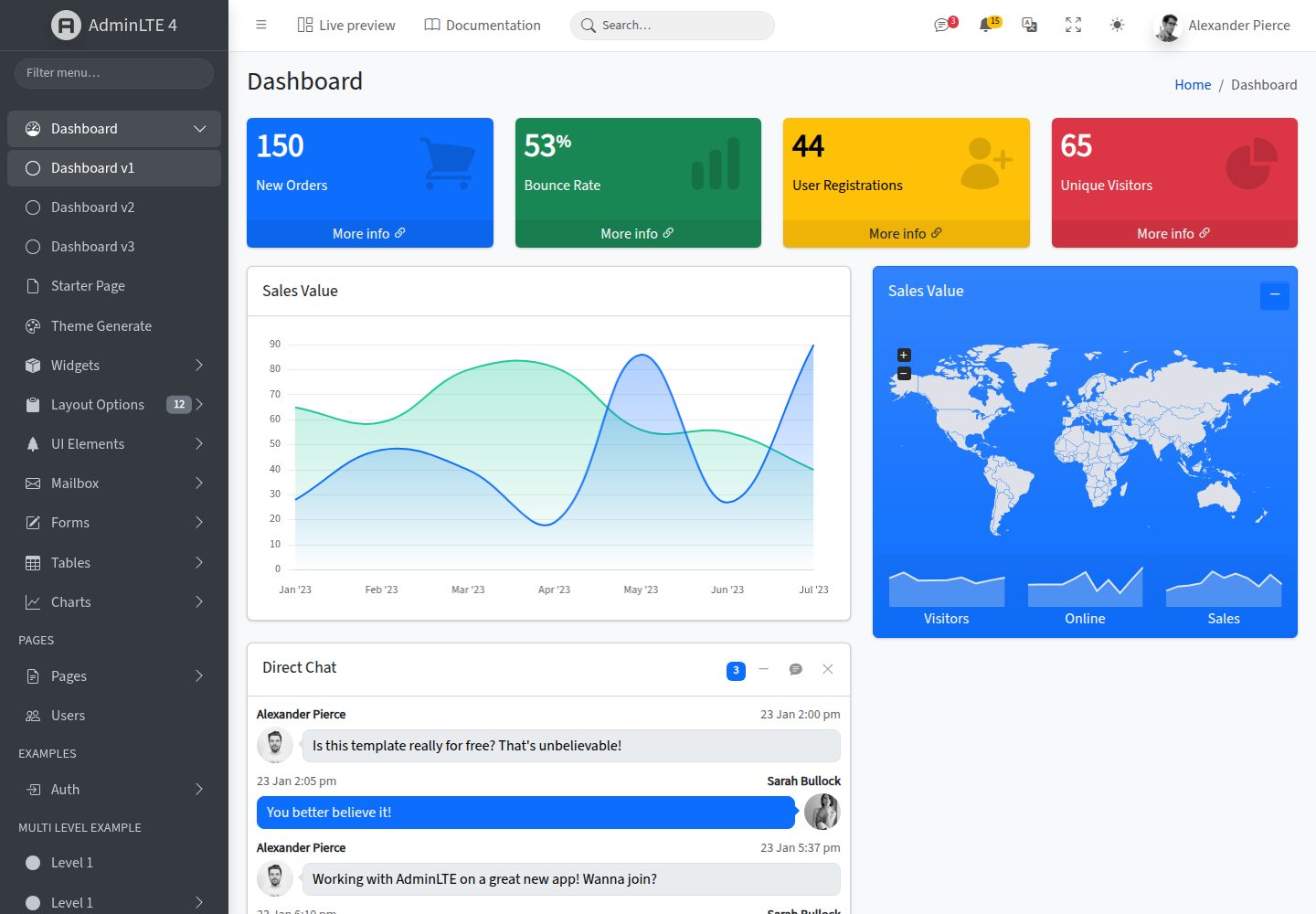
AdminLTE
AdminLTE is a free, open-source admin dashboard template built on Bootstrap 5 and vanilla JavaScript, with no jQuery dependency.
Astro · Admin dashboard
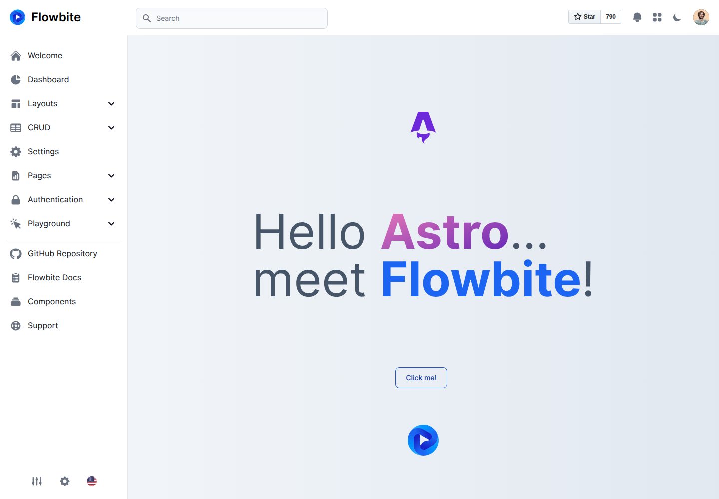
flowbite-astro-admin-dashboard
A free, open-source admin dashboard template built with Astro, Flowbite, and Tailwind CSS. It offers example pages for dashboards, stacked layouts, product and user CRUD, settings, pricing, authentication flows, and error states, plus charts, tables, widgets, modals, and drawers.
Astro · Admin dashboard
accessible-astro-dashboard
An accessibility-focused Astro admin template with a login page, dashboard overview, and example pages for media, messages, products, settings, and users. It includes SkipLinks, keyboard-operable sidebar navigation, dark mode, and localStorage-based preferences, with Accessible Astro Components and Astro Icon preinstalled.
Astro · Admin dashboard
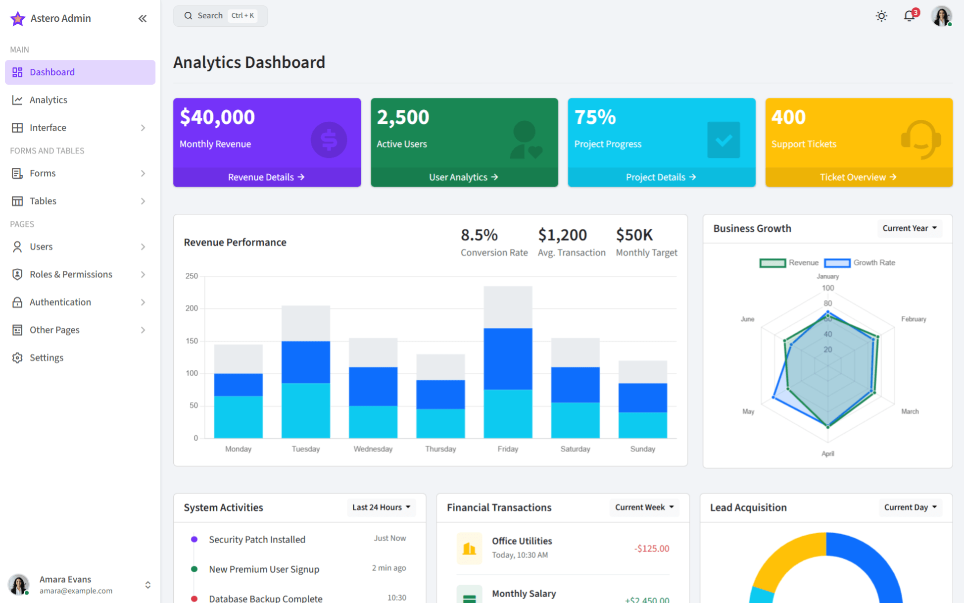
bootstrap-admin-template
AsteroAdmin is a responsive admin template built with Astro and Bootstrap 5.3.3, offering light and dark themes, RTL support, and multiple dashboard layouts. It provides an analytics dashboard, compact sidebar, offcanvas navigation, and examples of charts, tables, and forms.
Astro · Admin dashboard
accessible-astro-docs
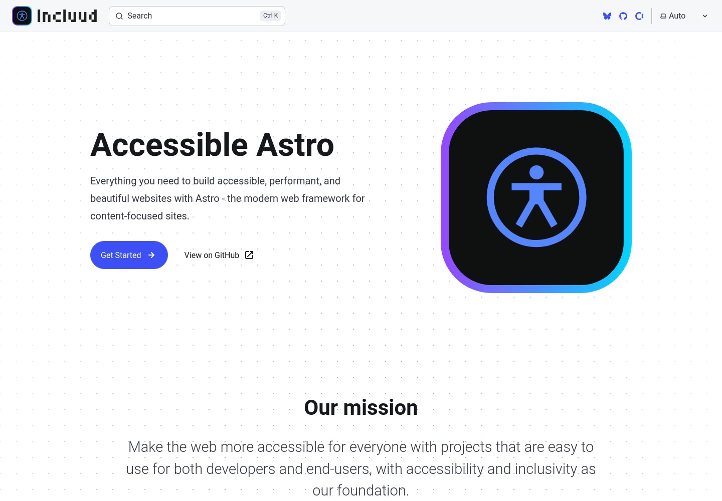
Official documentation site for the Accessible Astro projects, built with Astro's Starlight theme. It documents the Starter, Components, and Dashboard accessibility tools, with component descriptions, interactive examples, code snippets, accessibility guidelines, and TypeScript examples.
Astro · Admin dashboard
astro-blog
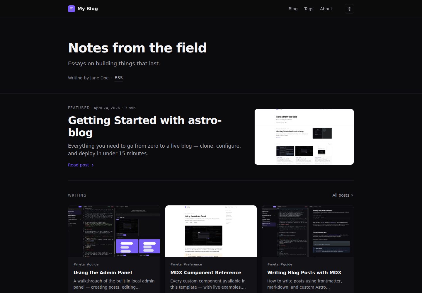
An Astro 6 blog template with a browser admin panel available only in development, where you write and publish MDX posts with autosave, component insertion, image upload, and live preview.
Astro · Admin dashboard