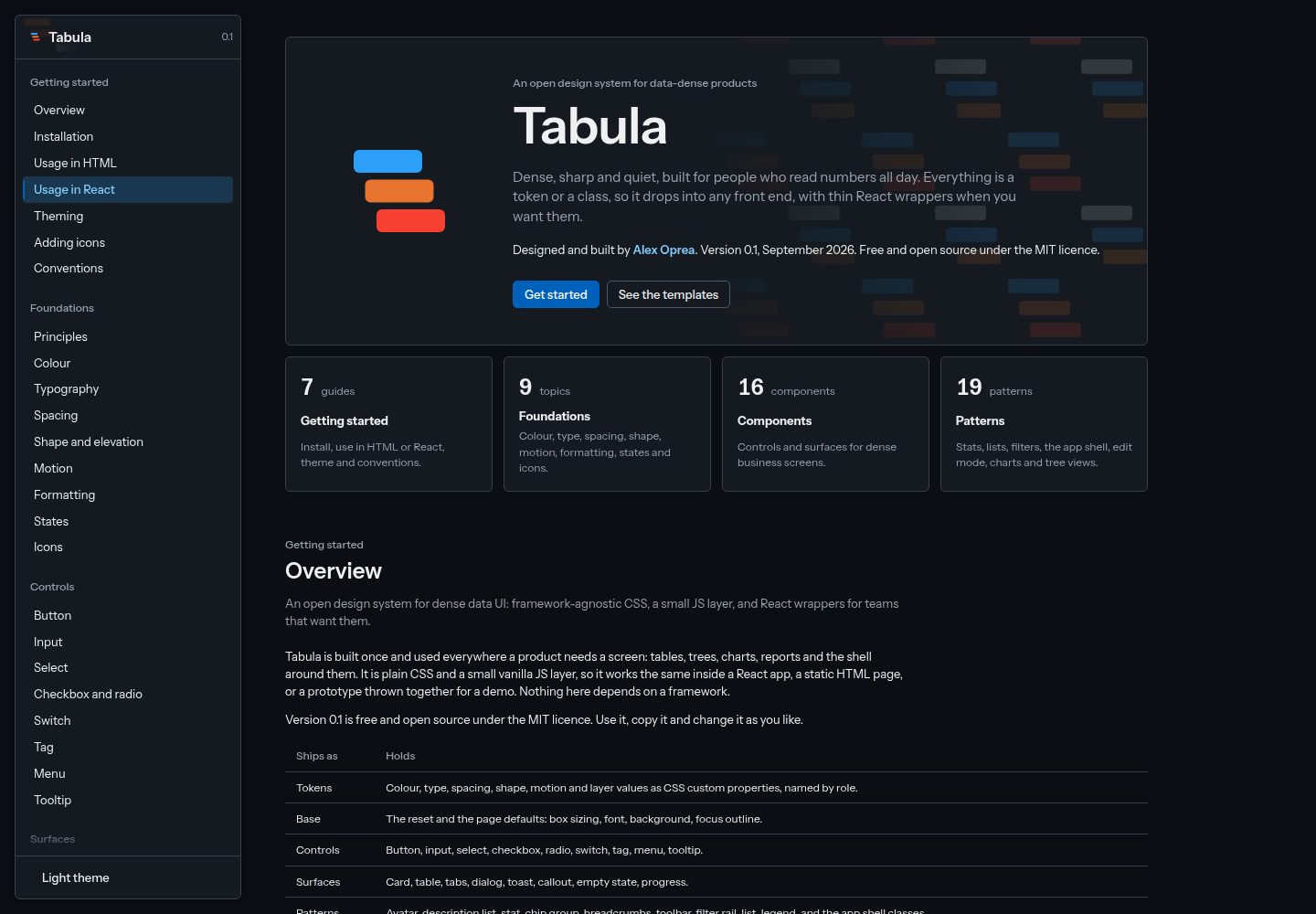
150 design tokens, with 57 palette values mapped to 93 role tokens, 6 of which are for chart series
ReactAdmin dashboard
tabula — React Admin dashboard Template
By opreadoru
Tabula is an open design system for data-dense products, offering design tokens, CSS components, a lightweight JS behavior layer, charts, React wrapper components, and six template pages based on generated data.
Explore the design
Compare the page layouts and mobile experience. Open any screenshot for a closer look.
Desktop homepage1 / 2
Desktop captureTop of page
Actual screenshot captured by the server browser.
All pages & views 2
Screenshots show visual appearance; interactive behavior may differ.
Recorded 2026-10-02View source
What stands out
A quick read of the recorded project description.
16 components (8 controls, 8 surfaces) and 19 patterns covering the app shell, edit mode, timeline, chart library, and tree view
Vanilla JS behavior layer including dropdowns, dialogs, tabs, tooltips, sortable tables, notifications, card collapse, card focus, expandable charts, layout editor, widget zones, app shell, eight chart builders, and tree view
src/format.js provides formatting functions for numbers, amounts, percentages, dates, and file sizes
Six template pages based on the same set of generated generic business data: dashboard, analytics, data table, record detail, report, and layout editor
React wrapper components are provided, mapping props to the same class names, to be copied as source files
Template Details
Tabula is an open design system for data-dense products, designed and developed by Alex Oprea and released under the MIT license. It includes 150 design tokens (57 palette values mapped to 93 role tokens, 6 of which are for chart series), 16 components (8 controls, 8 surfaces), and 19 patterns covering the app shell, edit mode, timeline, chart library, and tree view. The behavior layer is written in vanilla JS and includes dropdowns, dialogs, tabs, tooltips, sortable tables, notifications, card collapse, card focus, expandable charts, layout editor, widget zones, app shell, eight chart builders, and tree view. src/format.js provides formatting functions for numbers, amounts, percentages, dates, and file sizes. The pages/ directory contains six template pages: dashboard, analytics, data table, record detail, report, and layout editor, all based on the same set of generated generic business data. docs/ is the documentation site, showing live examples, exact markup, rules, and correct/incorrect usage for each component, as well as foundations such as color, typography, spacing, shape, formatting, states, and icons.
Usage: copy the src folder into your project; no package installation or build is required. In plain HTML, load the styles and the lightweight behavior layer, then bind data-tb-* attributes via tb.init(root); markup from any framework will work. Card collapse, card focus, and expandable charts require importing their respective modules separately. Edit mode and widget zones are mounted by the page via mountEditMode and mountZone, passing in the product's widget catalog. The app bar is mounted via mountShell, requiring brand, tabs, submenus, and account information. Charts come from src/charts.js, and the four tree views come from src/tree.js. React wrapper components are in the react/ directory as source files to copy into your project, mapping props to the same class names. For dark theme, just add the tb-dark class to <html>.
Conventions: class names start with tb-, modifiers use --, states use is-, and behaviors use data-tb-*; only tokens are used in components and pages, with no raw colors; all on-screen numbers go through src/format.js formatting functions; patterns used in two pages are moved into the system; documentation is updated in sync with component changes. Icons come from Lucide (ISC license), and the font is Instrument Sans (SIL Open Font License).
ReactAdmin
Is it right for your project?
Use Cases
- Building data-dense admin interfaces such as dashboards, analytics pages, data tables, and report pages
- Using components and behaviors in plain HTML or any frontend framework via class names and data-tb-* attributes
- Copying the wrapper components from the react/ directory in React projects to reuse the same class names and styles
- Referencing the six template pages in pages/ to quickly set up page structures based on generated business data
- Adjusting brand colors uniformly by modifying role tokens in src/tokens.css, and switching dark theme with the tb-dark class
Suitable For
- Developers who need a design system for data-dense admin interfaces
- Teams building admin backends with React or plain HTML
- Projects that want to integrate a design system by copying source code without introducing a build step
- Products that need template pages such as dashboards, data tables, and reports as a starting point
Getting started & customization
Use these recorded setup notes alongside the repository instructions for your chosen version.
- 1
To use Tabula, simply copy the src folder into your project; no package installation or build step is required.
- 2
In plain HTML, load src/tabula.css and src/tabula.js, then call tb.init(document) to bind behaviors; call it again after rendering new markup.
- 3
Card collapse, card focus, and expandable charts are optional features and require importing src/collapse.js, src/focus.js, or src/expand.js respectively.
- 4
Edit mode and widget zones must be mounted via mountEditMode from src/edit.js and mountZone from src/zone.js, passing in the product's widget catalog.
- 5
Running the documentation site locally requires Node.js; run npm install and npx vite --port 5190, and the docs are at http://localhost:5190/.
License & source material
Usage conditions & limitations
Free to use · keep license noticeThis entry covers the free version under the MIT license in the public repository; the free scope is the code of this version and does not imply that external services or third-party assets are free.
Must comply with when using
- You may use, modify, commercialize, and distribute the code of this version for free.
- When distributing copies or substantial portions of the code, retain the original author's copyright notice and the complete MIT license notice.
- The code is provided as is; warranties and limitations of liability are governed by the original license and applicable law.
Additional costs & items to verify
- Node.js and npm install to install Vite are only required to run the documentation site locally; using Tabula in a project itself does not require these dependencies.
- Card collapse, card focus, and expandable charts are optional features and require importing the corresponding modules separately to enable them.
- Edit mode and widget zones must be mounted by the page calling mountEditMode and mountZone, passing in the product's own widget catalog.
- The app bar must be mounted via mountShell, passing in product data such as brand, tabs, submenus, and account information.
- Icons come from Lucide (ISC license) and the font is Instrument Sans (SIL OFL); these third-party resources are subject to their own licenses, which differ from the MIT code license.
- Demo images, fonts, icons, and other third-party assets must be checked against their respective licenses and cannot be judged solely by the code's MIT license.
- External services such as domains, hosting, databases, payments, or AI may incur additional charges.
View Original Text Basis
Permission is hereby granted, free of charge
Original License Text
It needs Node.js, and `npm install` only fetches Vite, the local server.
Original README
Card collapse, card focus and expandable charts are opt-in: import `src/collapse.js`, `src/focus.js` or `src/expand.js` once.
Original README
Edit mode and widget zones are mounted by the page with `mountEditMode` from `src/edit.js` and `mountZone` from `src/zone.js`, with the product's widget catalogue passed in.
Original README
The app bar is mounted with `mountShell` from `src/shell.js`, with the product's brand, tabs, submenus and account passed in
Original README
https://github.com/opreadoru/tabula/blob/main/LICENSEhttps://github.com/opreadoru/tabula/blob/main/README.mdIcons from [Lucide](https://lucide.dev), ISC licence, inlined as SVG. Instrument Sans, SIL Open Font License.
Original README
Compiled by DeepSeek based on repository license and README ·2026-10-02. Results only cover the materials read; dependencies, images, fonts, and subsequent term changes are subject to their respective original texts.
Project checks & description sources
Template Information
- Source platforms
- GitHub
- Documentation and maintenance reference score
- More documented · 80 / 100
- Technologies
- React
- Website type
- Admin dashboard
How this score is calculated
Our heuristic uses license records (up to 30), a demo link (12), a preview (10), stars (15), recorded maintenance (15), description completeness (8), feature records (5) and classification data (5). It is not a code, security or performance test, or a Google score. A link does not establish tested functionality.
What to verify for this project
- Repository update recorded
- 2026-09-30
- Screenshot last checked
- 2026-10-02
A demo link is listed. Check it with your own content and viewport sizes; its presence does not confirm that forms, authentication or payments work.
The catalog identifies React as the primary stack. Check the actual dependency manifest and lockfile for versions and hosting requirements. These notes use recorded metadata, not a code audit or a deployment test.
Use a selection guide →How this description was prepared
AI-assisted description based on catalog records and repository material. Repository authors are not automatically the reviewers of this description.
Automatically checked against source and license rules; no manual editorial review.
Inspect the recorded source material
SHA-256: 2f424f5e1351be7186eae85853d267e91259c5993018027d9c3583a275bf043a
2026-10-02T07:06:41.952Z
Source file / repository# Tabula
An open design system for data-dense products: tables, trees, charts and reports that people read all day. It is dense, sharp and quiet. Everything is a token or a class, so it drops into any front end, with thin React wrappers when you want them.
Version 0.1, September 2026. Designed and built by [Alex Oprea](https://opreadoru.com). Free and open source under the MIT licence.
See it live: [the documentation](https://opreadoru.github.io/tabula/) and [the template pages](https://opreadoru.github.io/tabula/pages/dashboard.html).
https://github.com/user-attachments/assets/67ce81c7-9cdc-45e6-8b68-1590ae0ab2a7
## What is inside
- **150 tokens** in `src/tokens.css`: 57 palette values behind 93 role tokens, six of them for chart series. Components use roles only, so the brand changes one file.
- **Light and dark themes.** The `tb-dark` class redefines 40 roles. Nothing else changes.
- **16 components** (8 controls, 8 surfaces) and **19 patterns**, including the app shell, edit mode, a timeline, a chart library and tree views.
- **Behaviours** in plain JS: dropdowns, dialogs, tabs, tooltips, sortable tables, toasts, card collapse, card focus, expandable charts, a layout editor and widget zones, the app shell, eight chart builders and the tree views.
- **Formatters** in `src/format.js` for every number, amount, percentage, date and file size.
- **Template pages** in `pages/`: a dashboard, analytics, a data table, a record in detail, a report and a layout editor, on one seeded set of generic business data.
- **A documentation site** with a live example, the exact markup, rules and do and don't for every component, plus the foundations: colour, type, spacing, shape, formatting, states and icons.
## Run the docs on your machine
The docs and templates are [live on GitHub Pages](https://opreadoru.github.io/tabula/), so this is only for working on Tabula itself. It needs Node.js, and `npm install` only fetches Vite, the local server. Using Tabula in a project needs none of this (see "Use it" below).
```
npm install
npx vite --port 5190
```
The documentation opens at `http://localhost:5190/`, and the templates at `http://localhost:5190/pages/dashboard.html`.
## Use it
Copy the `src` folder into your project. Download the ZIP from the green Code button or clone the repo. There is no package to install, and nothing to build.
In plain HTML, load the styles and the small behaviour layer, then use the classes:
```html
<link rel="stylesheet" href="src/tabula.css">
<script type="module">
import { tb } from './src/tabula.js'
tb.init(document)
</script>
<button class="tb-button tb-button--primary" type="button">Save</button>
<span class="tb-tag tb-tag--danger">Overdue</span>
```
`tb.init(root)` wires the behaviours through `data-tb-*` attributes, so markup from any framework works. Call it again after rendering new markup. `tb.toast({ message, intent })` shows a toast.
Card collapse, card focus and expandable charts are opt-in: import `src/collapse.js`, `src/focus.js` or `src/expand.js` once. Edit mode and widget zones are mounted by the page with `mountEditMode` from `src/edit.js` and `mountZone` from `src/zone.js`, with the product's widget catalogue passed in.
The app bar is mounted with `mountShell` from `src/shell.js`, with the product's brand, tabs, submenus and account passed in; it also loads collapse, focus and expand. Charts come from `src/charts.js` and the four tree views from `src/tree.js`. The templates in `pages/` show each of them on a full page.
In React, the wrappers in `react/` map props to the same classes. They are source files to copy next to your own components. See `react/README.md`.
For the dark theme, put `tb-dark` on `<html>`.
## Conventions
- Classes start with `tb-`. Modifiers use `--`, states use `is-`, behaviours use `data-tb-*`.
- Tokens only. No raw colours in components or pages.
- Numbers on screen go through the formatters in `src/format.js`.
- A pattern used on two pages moves into the system.
- The documentation changes with every component change.
## Folders
```
src/ the system: tokens, base styles, components, behaviours, formatters
docs/ the documentation site
pages/ template pages built on the system, with their shared data
react/ thin React wrappers, source only
```
## Credits
Icons from [Lucide](https://lucide.dev), ISC licence, inlined as SVG. Instrument Sans, SIL Open Font License.
## Licence
MIT. See `LICENSE`.
Explore similar templates
Compare previews and descriptions within the same stack and category.
ant-design-pro
Ant Design Pro is an enterprise-grade React admin scaffold built on React 19, Umi Max 4, and antd 6 with TypeScript.
React · Admin dashboard
coreui-free-react-admin-template
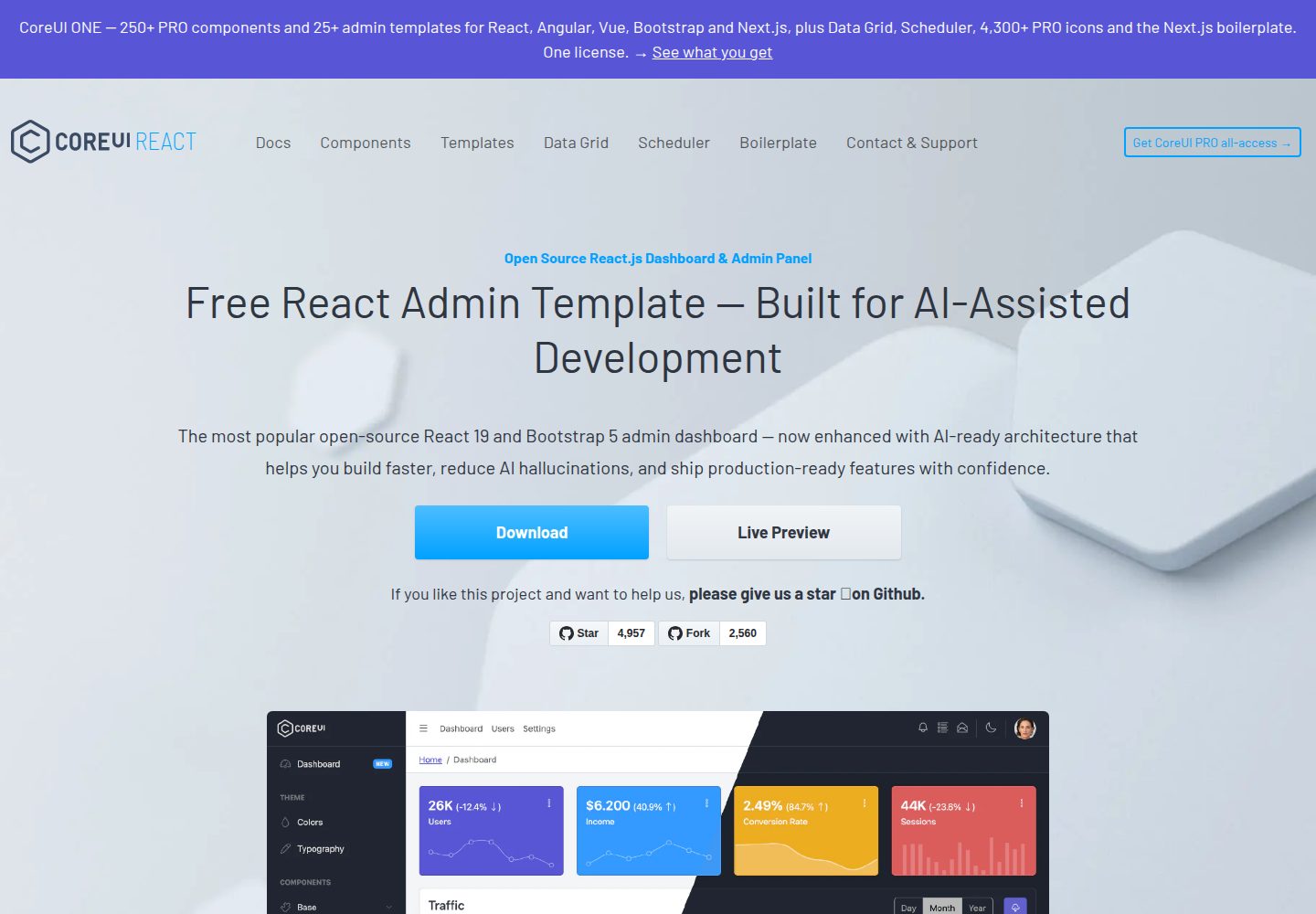
CoreUI's free React admin template, built on React and the CoreUI component library, provides dashboard layouts, sidebar navigation, routing, and example views. It includes .cursorrules, ARCHITECTURE.md, and DEVELOPMENT.md context files, plus JSDoc comments and PropTypes, to support AI-assisted development.
React · Admin dashboard
fastapi-react
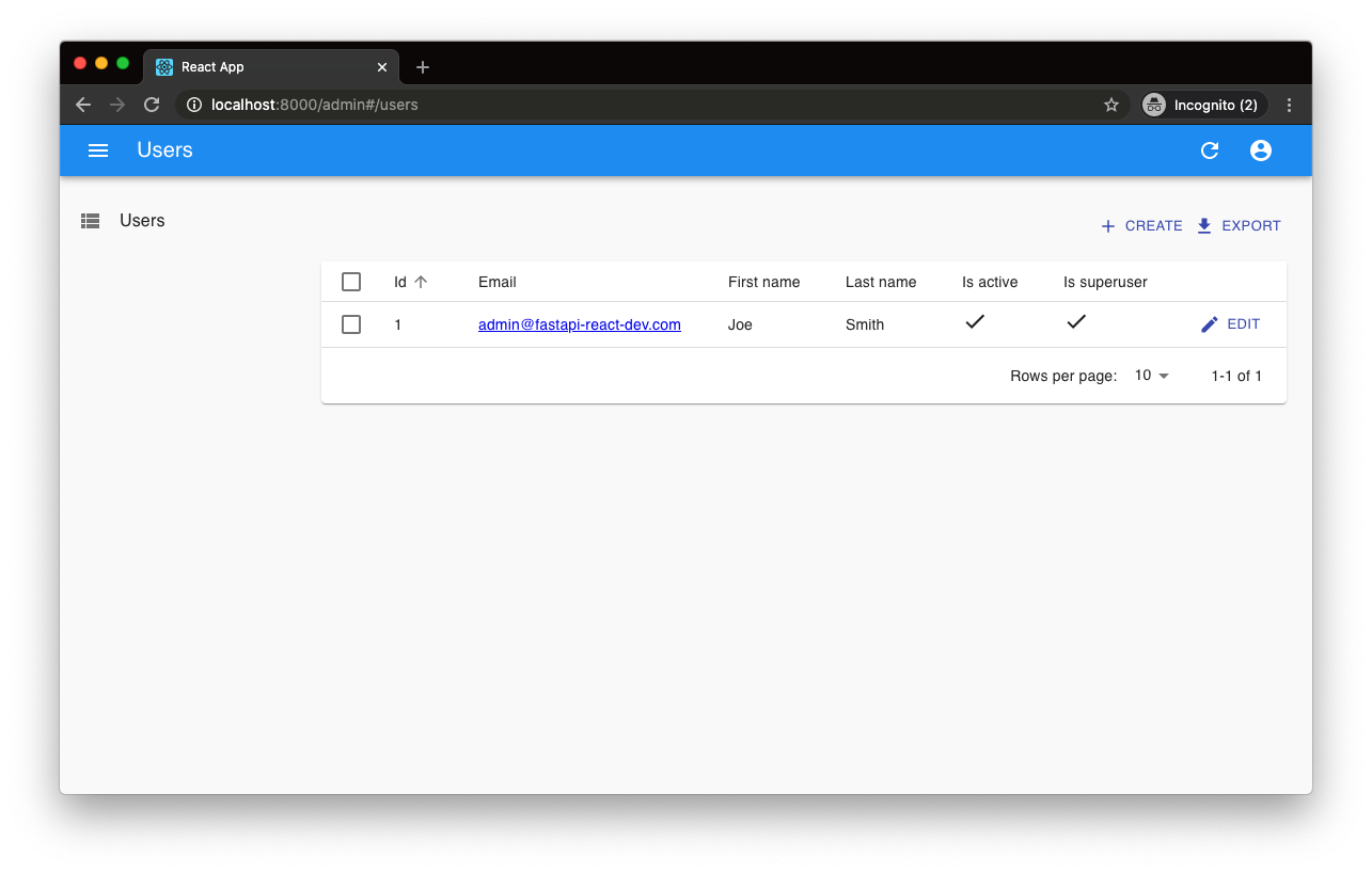
A Cookiecutter template for FastAPI + React (TypeScript) full-stack projects, integrating PostgreSQL, SQLAlchemy, Alembic, Celery, Redis, JWT authentication, a react-admin admin panel, and a Docker Compose development environment with Nginx reverse proxy.
React · Admin dashboard

react-antd-admin-template
A React + Ant Design admin template for mid- and back-office products, with built-in login/logout, dynamic routing, permission checks, and user management.
React · Admin dashboard
react-saas-template
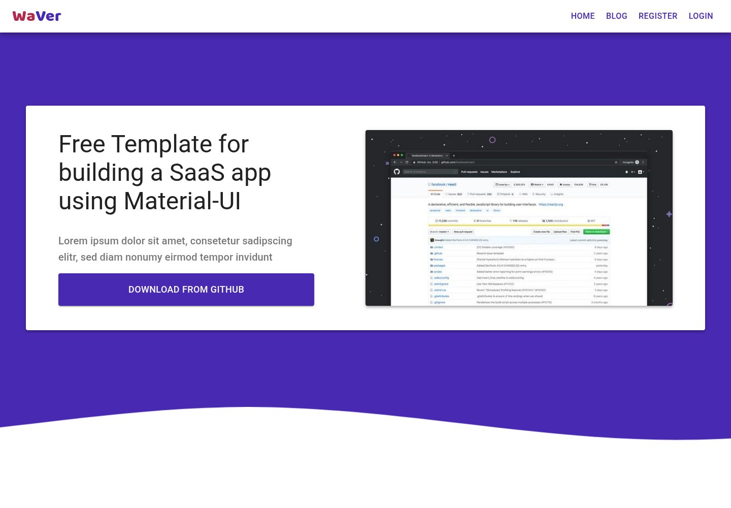
A React and Material-UI template for SaaS or admin websites, offering dashboard, chart, blog, payment, and file upload components. It uses Create-React-App, React-Router, Recharts, React-Stripe-js, React-Dropzone, and React-Cropper, with theme colors centralized in src/theme.js.
React · Admin dashboard
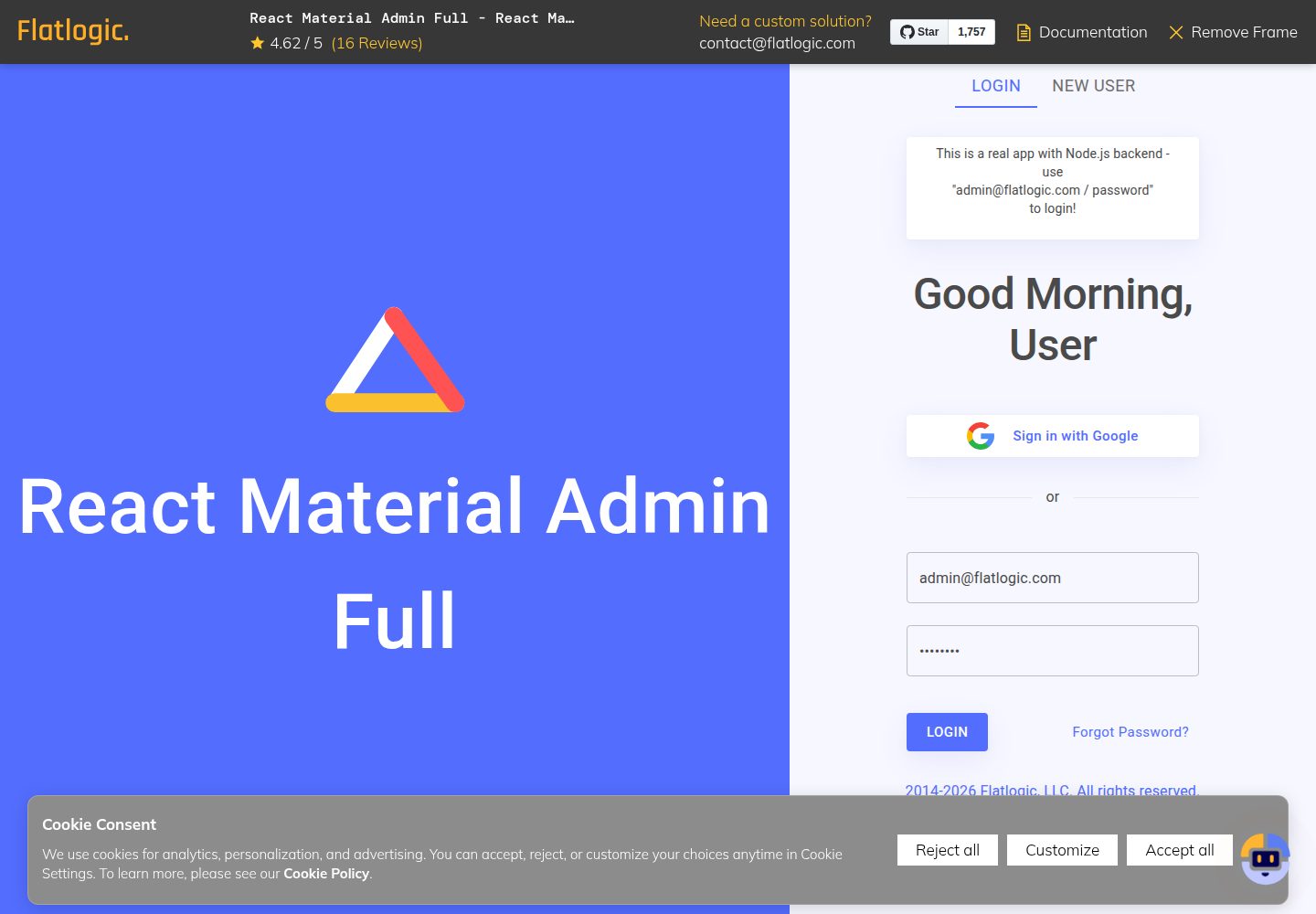
react-material-admin
React Material Admin is an MIT-licensed React admin template by Flatlogic, built on Material-UI. It provides dashboards, charts, tables, authentication, profile, and notification pages, with three color themes and responsive layouts.
React · Admin dashboard