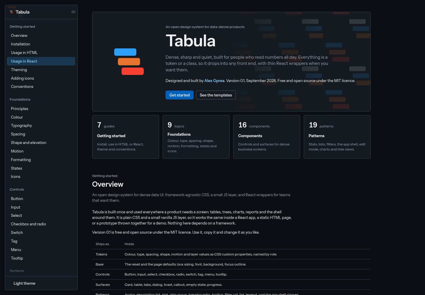
150 个设计令牌,57 个调色板值映射为 93 个角色令牌,其中 6 个用于图表系列
React后台
tabula — React 后台模板
作者 opreadoru
Tabula 是一套面向数据密集型产品的开源设计系统,提供设计令牌、CSS 组件、轻量 JS 行为层、图表、React 包装组件,以及六个基于生成数据的模板页面。
看看你的网站会是什么样
浏览真实页面截图,比较内容排版与手机效果。点击下方缩略图切换,放大查看整页细节。
全部页面与视图 2
截图用于了解视觉与布局,交互效果请以实际项目为准。
采集于 2026-10-02查看来源
值得关注的模板亮点
从已有项目资料中,快速了解它的特点。
16 个组件(8 个控件、8 个表面)和 19 个模式,覆盖应用外壳、编辑模式、时间线、图表库和树视图
原生 JS 行为层,包括下拉菜单、对话框、标签页、工具提示、可排序表格、通知、卡片折叠、卡片聚焦、可展开图表、布局编辑器、部件区域、应用外壳、八个图表构建器和树视图
src/format.js 提供数字、金额、百分比、日期和文件大小的格式化函数
六个模板页面基于同一组生成的通用业务数据:仪表盘、分析、数据表格、记录详情、报告和布局编辑器
提供 React 包装组件,将 props 映射到相同的类名,作为源文件复制使用
模板详细介绍
Tabula 是一套面向数据密集型产品的开源设计系统,由 Alex Oprea 设计并开发,采用 MIT 许可。它包含 150 个设计令牌(57 个调色板值映射为 93 个角色令牌,其中 6 个用于图表系列)、16 个组件(8 个控件、8 个表面)和 19 个模式,覆盖应用外壳、编辑模式、时间线、图表库和树视图。行为层用原生 JS 编写,包括下拉菜单、对话框、标签页、工具提示、可排序表格、通知、卡片折叠、卡片聚焦、可展开图表、布局编辑器、部件区域、应用外壳、八个图表构建器和树视图。src/format.js 提供数字、金额、百分比、日期和文件大小的格式化函数。pages/ 目录下包含六个模板页面:仪表盘、分析、数据表格、记录详情、报告和布局编辑器,均基于同一组生成的通用业务数据。docs/ 是文档站点,展示每个组件的实时示例、精确标记、规则和正误用法,以及颜色、字体、间距、形状、格式化、状态和图标等基础内容。
使用方式:将 src 文件夹复制到项目中即可,无需安装包或构建。在纯 HTML 中加载样式和轻量行为层,通过 tb.init(root) 绑定 data-tb-* 属性,任何框架的标记都能工作。卡片折叠、卡片聚焦和可展开图表需要单独导入对应模块。编辑模式和部件区域由页面通过 mountEditMode 和 mountZone 挂载,并传入产品的部件目录。应用栏通过 mountShell 挂载,需传入品牌、标签页、子菜单和账户信息。图表来自 src/charts.js,四种树视图来自 src/tree.js。React 包装组件位于 react/ 目录,是供复制到项目中的源文件,将 props 映射到相同的类名。深色主题只需在 <html> 上添加 tb-dark 类。
约定方面:类名以 tb- 开头,修饰符用 --,状态用 is-,行为用 data-tb-*;组件和页面中只使用令牌,不出现原始颜色;屏幕上的数字都经过 src/format.js 的格式化函数;在两个页面中使用的模式会移入系统;文档随组件变更同步更新。图标来自 Lucide(ISC 许可),字体为 Instrument Sans(SIL Open Font License)。
React后台
适合你的项目吗?
适用场景
- 构建数据密集型后台界面,如仪表盘、分析页、数据表格和报告页
- 在纯 HTML 或任意前端框架中通过类名和 data-tb-* 属性使用组件与行为
- 在 React 项目中复制 react/ 目录下的包装组件,复用相同的类名和样式
- 参考 pages/ 中的六个模板页面,快速搭建基于生成业务数据的页面结构
- 通过修改 src/tokens.css 中的角色令牌统一调整品牌颜色,并利用 tb-dark 类切换深色主题
适合人群
- 需要数据密集型后台界面设计系统的开发者
- 使用 React 或纯 HTML 构建管理后台的团队
- 希望以复制源码方式集成设计系统、不引入构建步骤的项目
- 需要仪表盘、数据表格、报告等模板页面作为起点的产品
上手与定制指南
结合仓库当前版本的说明,按下面的资料检查内容、配置与运行要求。
- 1
使用 Tabula 只需将 src 文件夹复制到项目中,无需安装包或构建步骤。
- 2
在纯 HTML 中加载 src/tabula.css 和 src/tabula.js,调用 tb.init(document) 绑定行为;渲染新标记后需再次调用。
- 3
卡片折叠、卡片聚焦和可展开图表为可选功能,需分别导入 src/collapse.js、src/focus.js 或 src/expand.js。
- 4
编辑模式和部件区域需通过 src/edit.js 的 mountEditMode 和 src/zone.js 的 mountZone 挂载,并传入产品的部件目录。
- 5
在本地运行文档站点需要 Node.js,执行 npm install 和 npx vite --port 5190,文档位于 http://localhost:5190/。
授权与来源资料
使用条件与限制
免费使用 · 保留许可声明本次收录的是公开仓库中采用 MIT 许可的免费版本;免费范围为该版本代码,不代表外部服务或第三方素材免费。
使用时需要遵守
- 允许免费使用、修改、商用和分发该版本代码。
- 分发代码副本或实质性部分时,保留原作者版权声明和完整 MIT 许可声明。
- 代码按现状提供;担保与责任限制以原许可证及适用法律为准。
额外费用与待核对事项
- 仅在本地运行文档站点时需要 Node.js 并执行 npm install 安装 Vite;在项目中使用 Tabula 本身无需这些依赖。
- 卡片折叠、卡片聚焦和可展开图表为可选功能,需分别额外导入对应模块才能启用。
- 编辑模式和部件区域需由页面调用 mountEditMode 与 mountZone 挂载,并传入产品自身的部件目录。
- 应用栏需通过 mountShell 挂载,并传入品牌、标签页、子菜单和账户信息等产品数据。
- 图标来自 Lucide(ISC 许可),字体为 Instrument Sans(SIL OFL),这些第三方资源适用各自许可,与 MIT 代码许可不同。
- 演示图片、字体、图标及其他第三方素材需按各自许可核对,不能仅凭代码的 MIT 许可判断。
- 域名、托管、数据库、支付或 AI 等外部服务可能另外收费。
查看原文依据
Permission is hereby granted, free of charge
许可证原文
It needs Node.js, and `npm install` only fetches Vite, the local server.
README 原文
Card collapse, card focus and expandable charts are opt-in: import `src/collapse.js`, `src/focus.js` or `src/expand.js` once.
README 原文
Edit mode and widget zones are mounted by the page with `mountEditMode` from `src/edit.js` and `mountZone` from `src/zone.js`, with the product's widget catalogue passed in.
README 原文
The app bar is mounted with `mountShell` from `src/shell.js`, with the product's brand, tabs, submenus and account passed in
README 原文
https://github.com/opreadoru/tabula/blob/main/LICENSEhttps://github.com/opreadoru/tabula/blob/main/README.mdIcons from [Lucide](https://lucide.dev), ISC licence, inlined as SVG. Instrument Sans, SIL Open Font License.
README 原文
DeepSeek 根据仓库许可证和 README 整理 ·2026-10-02。结果仅覆盖已读取资料,依赖、图片、字体及后续条款变更以各自原文为准。
项目核对记录与介绍依据
模板资料
- 来源平台
- GitHub
- 资料与维护参考分
- 资料较完整 · 80 / 100
- 技术栈
- React
- 网站类型
- 后台
这个分数如何计算
本站按许可资料(最高30分)、演示链接(12分)、预览图(10分)、Star数(15分)、记录的维护时间(15分)、描述完整度(8分)、功能记录(5分)和分类资料(5分)计算。它不是代码、安全或性能测试,也不是 Google 评分;有链接不代表已实测可用。
这个项目需要核对什么
- 记录的仓库更新时间
- 2026-09-30
- 截图检查日期
- 2026-10-02
已收录演示链接。请用你的内容与屏幕尺寸检查;有演示不代表表单、认证或支付已经可用。
目录记录的主要技术栈是 React。请通过依赖清单和锁文件核对实际版本与托管要求。这些说明基于收录资料,不代表代码审计或部署实测。
查看具体选型方法 →介绍的制作与核对状态
介绍由 AI 辅助整理目录与仓库资料。仓库作者不等于这篇介绍的审核者。
已完成服务器许可规则与 AI 来源核对;未经过人工编辑审核。
查看当时使用的来源资料
SHA-256: 2f424f5e1351be7186eae85853d267e91259c5993018027d9c3583a275bf043a
2026-10-02T07:06:41.952Z
来源文件 / 仓库# Tabula
An open design system for data-dense products: tables, trees, charts and reports that people read all day. It is dense, sharp and quiet. Everything is a token or a class, so it drops into any front end, with thin React wrappers when you want them.
Version 0.1, September 2026. Designed and built by [Alex Oprea](https://opreadoru.com). Free and open source under the MIT licence.
See it live: [the documentation](https://opreadoru.github.io/tabula/) and [the template pages](https://opreadoru.github.io/tabula/pages/dashboard.html).
https://github.com/user-attachments/assets/67ce81c7-9cdc-45e6-8b68-1590ae0ab2a7
## What is inside
- **150 tokens** in `src/tokens.css`: 57 palette values behind 93 role tokens, six of them for chart series. Components use roles only, so the brand changes one file.
- **Light and dark themes.** The `tb-dark` class redefines 40 roles. Nothing else changes.
- **16 components** (8 controls, 8 surfaces) and **19 patterns**, including the app shell, edit mode, a timeline, a chart library and tree views.
- **Behaviours** in plain JS: dropdowns, dialogs, tabs, tooltips, sortable tables, toasts, card collapse, card focus, expandable charts, a layout editor and widget zones, the app shell, eight chart builders and the tree views.
- **Formatters** in `src/format.js` for every number, amount, percentage, date and file size.
- **Template pages** in `pages/`: a dashboard, analytics, a data table, a record in detail, a report and a layout editor, on one seeded set of generic business data.
- **A documentation site** with a live example, the exact markup, rules and do and don't for every component, plus the foundations: colour, type, spacing, shape, formatting, states and icons.
## Run the docs on your machine
The docs and templates are [live on GitHub Pages](https://opreadoru.github.io/tabula/), so this is only for working on Tabula itself. It needs Node.js, and `npm install` only fetches Vite, the local server. Using Tabula in a project needs none of this (see "Use it" below).
```
npm install
npx vite --port 5190
```
The documentation opens at `http://localhost:5190/`, and the templates at `http://localhost:5190/pages/dashboard.html`.
## Use it
Copy the `src` folder into your project. Download the ZIP from the green Code button or clone the repo. There is no package to install, and nothing to build.
In plain HTML, load the styles and the small behaviour layer, then use the classes:
```html
<link rel="stylesheet" href="src/tabula.css">
<script type="module">
import { tb } from './src/tabula.js'
tb.init(document)
</script>
<button class="tb-button tb-button--primary" type="button">Save</button>
<span class="tb-tag tb-tag--danger">Overdue</span>
```
`tb.init(root)` wires the behaviours through `data-tb-*` attributes, so markup from any framework works. Call it again after rendering new markup. `tb.toast({ message, intent })` shows a toast.
Card collapse, card focus and expandable charts are opt-in: import `src/collapse.js`, `src/focus.js` or `src/expand.js` once. Edit mode and widget zones are mounted by the page with `mountEditMode` from `src/edit.js` and `mountZone` from `src/zone.js`, with the product's widget catalogue passed in.
The app bar is mounted with `mountShell` from `src/shell.js`, with the product's brand, tabs, submenus and account passed in; it also loads collapse, focus and expand. Charts come from `src/charts.js` and the four tree views from `src/tree.js`. The templates in `pages/` show each of them on a full page.
In React, the wrappers in `react/` map props to the same classes. They are source files to copy next to your own components. See `react/README.md`.
For the dark theme, put `tb-dark` on `<html>`.
## Conventions
- Classes start with `tb-`. Modifiers use `--`, states use `is-`, behaviours use `data-tb-*`.
- Tokens only. No raw colours in components or pages.
- Numbers on screen go through the formatters in `src/format.js`.
- A pattern used on two pages moves into the system.
- The documentation changes with every component change.
## Folders
```
src/ the system: tokens, base styles, components, behaviours, formatters
docs/ the documentation site
pages/ template pages built on the system, with their shared data
react/ thin React wrappers, source only
```
## Credits
Icons from [Lucide](https://lucide.dev), ISC licence, inlined as SVG. Instrument Sans, SIL Open Font License.
## Licence
MIT. See `LICENSE`.
看看同类模板
对比同技术栈与用途的模板,找到更适合的视觉与内容结构。
ant-design-pro
Ant Design Pro 是 Ant Design 官方推出的企业级中后台前端脚手架,基于 React 19、Umi Max 4 和 antd 6 构建,内置 TypeScript 支持。
React · 后台
coreui-free-react-admin-template
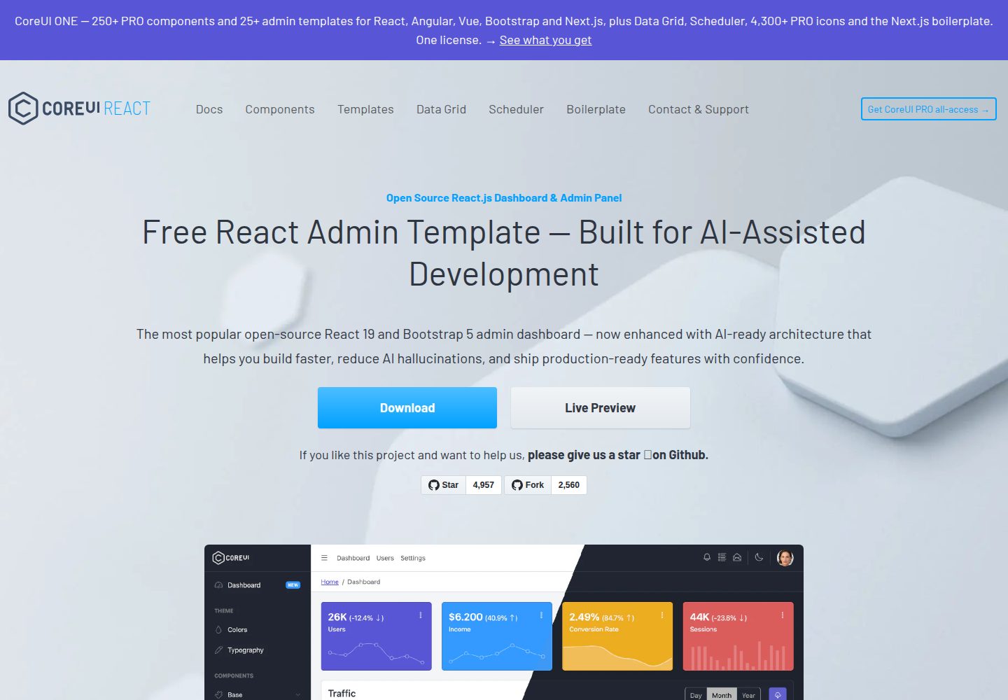
Free React Admin & Dashboard Template Built for AI-Assisted Development
React · 后台
fastapi-react
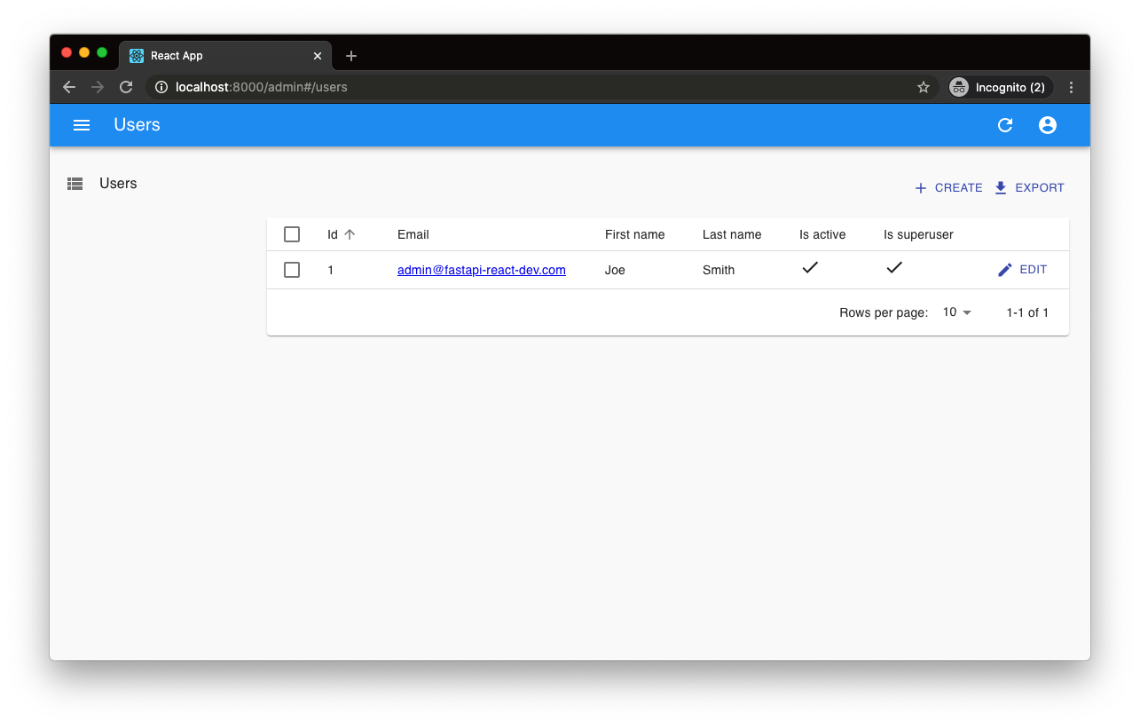
fastapi-react 是一个基于 Cookiecutter 的模板,用于快速搭建 FastAPI 与 React(TypeScript)的全栈项目。
React · 后台

react-antd-admin-template
一个基于React+Antd的后台管理模版,在线预览https://nlrx-wjc.github.io/react-antd-admin-template/
React · 后台
react-saas-template
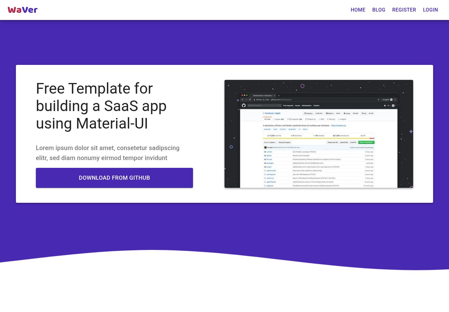
🌊 Template for building an SaaS / admin website using React + Material-UI
React · 后台
react-material-admin
☄️React Material Admin is a React template built with Material-UI
React · 后台