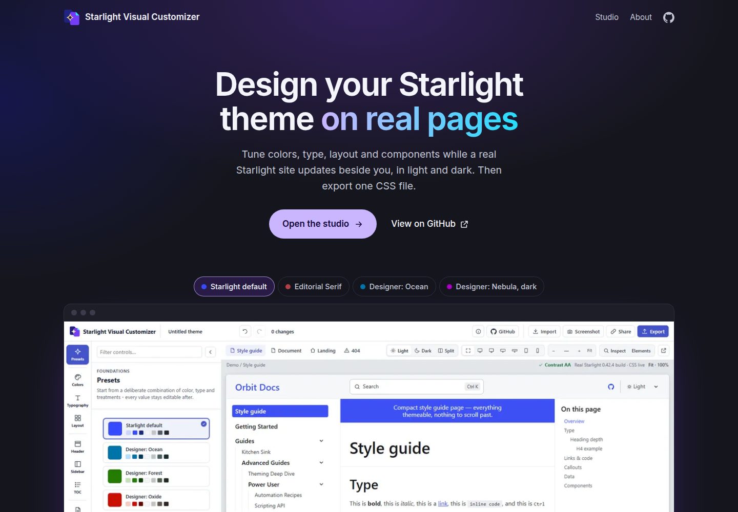
Preview themes in a real Starlight page frame rather than a static mockup, switching between style guide, long document, landing page and 404 page
AstroDocumentationTool Site
starlight-visual-customizer — Astro Documentation Template
By prisant-labs
A visual theme editor for Astro Starlight documentation sites that adjusts colors, fonts, layout and component styles on real Starlight pages and exports a theme.css for use with customCss.
Explore the design
Compare the page layouts and mobile experience. Open any screenshot for a closer look.
Desktop homepage1 / 3
Desktop captureTop of page
Actual screenshot captured by the server browser.
All pages & views 3
Screenshots show visual appearance; interactive behavior may differ.
Recorded 2026-10-09View source
What stands out
A quick read of the recorded project description.
Covers colors, fonts, type scale, content width, header, sidebar, table of contents, asides, cards, tables, tabs, code blocks and footer
Provides nine presets, with all values remaining editable after selection
Side-by-side light and dark comparison, reporting whether text color combinations meet WCAG AA contrast
With Inspect enabled, click a page element to locate the corresponding style control
Export theme.css and APPLY-THEME.md, or copy a message for coding agents, using Starlight's built-in customCss with no plugin required
Template Details
This is a Starlight theme editing tool that runs in the browser, open-sourced by Prisant Labs under the MIT license and not affiliated with the official Astro team. It extends the scope of Starlight's built-in color theme editor: the built-in editor can only set accent and gray colors, whereas this tool also covers typography, layout and component styles, including fonts, type scale, content width, header, sidebar, table of contents, asides, cards, tables, tabs, code blocks and footer.
In use, you can start from nine presets (from Starlight default to Editorial Serif, High Contrast Mono), and every value remains editable afterward. The preview is a real Starlight build embedded in an iframe, not a mockup, and you can switch between the style guide, long document, landing page and 404 page, with side-by-side light and dark comparison; above the preview it reports whether text color combinations meet WCAG AA contrast in both modes. With Inspect enabled, clicking a page element opens the corresponding control; device width coverage ranges from a 390-pixel phone to a 2560-pixel ultrawide. Every change is a single-step undo, share links carry the full theme and current page in the URL, and opening a share link first asks whether to replace the saved theme.
Export offers two one-click methods: copy a message containing setup steps and the full stylesheet to paste to coding agents such as Claude Code, Codex or Cursor; or download a zip containing theme.css and APPLY-THEME.md. The theme uses Starlight's built-in customCss option, with no plugin installation required. You can also export the tool's own settings for later import and continued editing, as well as a PNG screenshot of the preview.
On privacy, theme state, preview and export all run client-side and are stored in localStorage or share links; the tool's only network request is loading variable fonts for the preview from cdn.jsdelivr.net (Fontsource). Running locally requires Node 22; enter the app directory, install dependencies, then build and preview, which by default opens at http://localhost:4420/studio/. It builds for the root path by default; if you need to deploy under a subpath, set SVC_SITE_BASE before building and previewing. The repository contains 291 unit tests, 14 browser end-to-end suites and a round-trip test (applying a real export to a newly scaffolded Starlight site and comparing computed styles against the live preview).
AstroDocumentationTool Site
Is it right for your project?
Use Cases
- Quickly try out a color and typography scheme for an Astro Starlight documentation site
- Check whether text contrast meets WCAG AA in both light and dark modes
- Hand the exported theme.css to coding agents such as Claude Code or Cursor for automatic integration into a project
- Send the full theme and current page to others via a share link for review or collaboration
- Run the tool locally and deploy it under a subpath (such as a GitHub Pages project site)
Suitable For
- Developers building documentation sites with Astro Starlight who want to customize the theme
- Front-end staff who need to adjust style details without modifying Starlight source code
- Documentation maintainers concerned with light/dark mode contrast and accessibility
- Teams that want to hand theme configuration directly to coding agents for integration
Getting started & customization
Use these recorded setup notes alongside the repository instructions for your chosen version.
- 1
Running locally requires Node 22; enter the app directory, run npm install and npm run build, then serve with npm run preview:bg at http://localhost:4420
- 2
Open http://localhost:4420/studio/ to enter the editor, which by default shows the style guide page of the demo site
- 3
When integrating with your own site, put the exported CSS into src/styles/theme.css and include it as the last item in the Starlight customCss array in astro.config.mjs (this CSS is unlayered, and the last item wins on conflicts)
- 4
If you selected non-default web fonts, install @fontsource-variable/<font> for each package name listed in the exported file, then rebuild
- 5
Builds for the root path by default; when deploying under a subpath, set SVC_SITE_BASE before astro build and astro preview
License & source material
Usage conditions & limitations
Free to use · keep license noticeThis entry covers the free version in the public repository under the MIT license; the free scope is that version's code and does not imply that external services or third-party assets are free.
Must comply with when using
- You may use, modify, commercially use and distribute this version's code for free.
- When distributing copies or substantial portions of the code, retain the original author's copyright notice and the full MIT license notice.
- The code is provided as is; warranties and limitations of liability are governed by the original license and applicable law.
Additional costs & items to verify
- Demo images, fonts, icons and other third-party assets must be checked against their respective licenses and cannot be judged solely by the code's MIT license.
- External services such as domains, hosting, databases, payments or AI may incur separate charges.
- The tool's only network request is loading variable web fonts for the preview from cdn.jsdelivr.net (Fontsource); offline or when that CDN is unreachable, font previews may not display correctly.
- If a theme uses non-default web fonts, install the @fontsource-variable/<font> dependency for each package name listed in the exported file, otherwise the fonts will not take effect.
- Running locally requires a Node 22 environment.
- When integrating with your own site, the exported CSS must be the last item in the Starlight customCss array, because this CSS is unlayered and only the last item takes effect on style conflicts.
- Builds for the root path by default; to deploy under a subpath (such as a GitHub Pages project site), you must set the SVC_SITE_BASE environment variable before astro build and astro preview.
View Original Text Basis
Permission is hereby granted, free of charge
Original License Text
The studio makes only one kind of network request on its own: it loads the variable web fonts you preview from `cdn.jsdelivr.net` (Fontsource).
Original README
If you picked a non-default web font, `npm install` each `@fontsource-variable/<font>` package the file lists.
Original README
You need Node 22.
Original README
In `astro.config.mjs`, add that file as the **last** entry of Starlight's `customCss` array. The theme's CSS is unlayered, so the last entry wins any tie with another stylesheet.
Original README
https://github.com/prisant-labs/starlight-visual-customizer/blob/main/LICENSEhttps://github.com/prisant-labs/starlight-visual-customizer/blob/main/README.mdTo serve it under a sub-path, such as a GitHub Pages project site at `https://<user>.github.io/<repo>/`, set `SVC_SITE_BASE` before `astro build` and `astro preview`.
Original README
Compiled by DeepSeek based on repository license and README ·2026-10-09. Results only cover the materials read; dependencies, images, fonts, and subsequent term changes are subject to their respective original texts.
Project checks & description sources
Template Information
- Source platforms
- GitHub
- Documentation and maintenance reference score
- More documented · 85 / 100
- Technologies
- Astro
- Website type
- Documentation · Tool Site
How this score is calculated
Our heuristic uses license records (up to 30), a demo link (12), a preview (10), stars (15), recorded maintenance (15), description completeness (8), feature records (5) and classification data (5). It is not a code, security or performance test, or a Google score. A link does not establish tested functionality.
What to verify for this project
- Repository update recorded
- 2026-10-09
- Screenshot last checked
- 2026-10-09
A demo link is listed. Check it with your own content and viewport sizes; its presence does not confirm that forms, authentication or payments work.
The catalog identifies Astro as the primary stack. Check the actual dependency manifest and lockfile for versions and hosting requirements. These notes use recorded metadata, not a code audit or a deployment test.
Use a selection guide →How this description was prepared
AI-assisted description based on catalog records and repository material. Repository authors are not automatically the reviewers of this description.
Review declaration: [email protected] · 2026-10-09
Inspect the recorded source material
SHA-256: d6f2c326ed38b4b9230eb20255d9f2289a2520b5df410ce2b3043c62eb6131a8
2026-10-09T01:24:48.011Z
Source file / repository# Starlight Visual Customizer
**A free visual theme editor for [Starlight](https://starlight.astro.build/). Restyle colors,
fonts, layout and components on real Starlight pages, then export one CSS file.**
[](https://projects.prisantlabs.com/starlight-visual-customizer/studio/)
[](https://github.com/prisant-labs/starlight-visual-customizer/releases)
[](LICENSE)
[](https://starlight.astro.build/)
[](https://astro.build/)
[](https://projects.prisantlabs.com/starlight-visual-customizer/studio/)
Starlight Visual Customizer is an independent, open-source project by Prisant Labs, released
under the MIT license. It is not affiliated with or endorsed by the Astro team.
Starlight's built-in color theme editor sets an accent color and a gray. This editor covers
typography, layout and component styles too. Every change appears at once on real Starlight
pages, in light mode and dark mode.
## What you can do
- **Start from a preset.** Nine presets range from Starlight's own default to Editorial Serif and
High Contrast Mono. Every value stays editable after you pick one.
- **Change the whole look, not just the palette.** Colors, fonts, the type scale, the content
width, the header, the sidebar, the table of contents, callouts, cards, tables, tabs, code
blocks and the footer each have their own controls.
- **See your theme on real pages.** The preview is an actual Starlight build in a frame, not a
mockup. Switch between a style guide, a long document, a landing page and the 404 page.
- **Check light and dark together.** Split view shows both modes side by side. The contrast check
above the preview reports whether text color pairs meet WCAG AA contrast in both modes.
- **Find the control for any element.** Turn on Inspect, then click an element on the page to
open the controls that style it.
- **Preview at real sizes.** Device widths run from a 390-pixel phone to a 2560-pixel ultra-wide
screen.
- **Undo anything, and share the result.** Every change is one undo step. A share link carries
the whole theme and the page you were viewing in its URL. Opening one never silently replaces
a theme you saved: the studio asks first.
<table>
<tr>
<td width="50%"><img src="docs/images/studio-split.png" alt="Split view: the same page in light mode and dark mode, side by side"></td>
<td width="50%"><img src="docs/images/studio-colors.png" alt="The Colors group: accent and gray hue sliders, hex fields and the generated swatches"></td>
</tr>
<tr>
<td><b>Light and dark, side by side.</b> Split view renders the page in both modes from one theme.</td>
<td><b>Colors that stay readable.</b> Pick a hue or type a hex value; Starlight's palette algorithm tunes lightness per role.</td>
</tr>
<tr>
<td><img src="docs/images/studio-export.png" alt="The Export dialog, with the agent message, the files for your site, and the customizer's own settings and screenshot"></td>
<td><img src="docs/images/studio-about.png" alt="The About dialog describing the project"></td>
</tr>
<tr>
<td><b>Export in one click.</b> Copy a message for your coding agent, or download theme.css and the setup steps as a zip.</td>
<td><b>About the project.</b> What the studio does and where to learn more about Starlight.</td>
</tr>
</table>
## How export works
Export gives you two ways to get a theme onto your own site, each one click. The theme uses
Starlight's own `customCss` option, so there is no plugin to install.
- **Copy for your coding agent** copies one message with the setup steps and the whole stylesheet,
to paste into Claude Code, Codex, Cursor or similar.
- **Download the files (.zip)** downloads `theme.css` and `APPLY-THEME.md`, numbered setup steps
you can follow yourself, in one folder.
The studio also exports its own settings, so you can import a theme later and keep editing, and a
PNG screenshot of the preview.
The steps inside `APPLY-THEME.md` (or the pasted message) are generated for each theme, and they
are the same every time:
1. Add the theme's CSS to `src/styles/theme.css` in your project.
2. In `astro.config.mjs`, add that file as the **last** entry of Starlight's `customCss` array.
The theme's CSS is unlayered, so the last entry wins any tie with another stylesheet.
3. If you picked a non-default web font, `npm install` each `@fontsource-variable/<font>`
package the file lists.
4. Rebuild.
A round-trip test checks this promise. It applies a real export to a freshly scaffolded Starlight
site, then compares the computed styles with the studio's own live preview.
## Privacy
Your theme never leaves your browser. The state, the preview and the export all run and stay on
the client, in `localStorage` and, if you use one, a share link. The studio makes only one kind of
network request on its own: it loads the variable web fonts you preview from `cdn.jsdelivr.net`
(Fontsource). [`THIRD-PARTY-NOTICES.md`](THIRD-PARTY-NOTICES.md) lists every dependency and its
license.
## Run it locally
You need Node 22.
```bash
cd app
npm install
npm run build
npm run preview:bg # serves dist/ in the background on http://localhost:4420
```
Open <http://localhost:4420/studio/>. The studio opens on the demo site's style guide page. Pick
a preset, adjust the controls, then open **Export**.
[`docs/development.md`](docs/development.md) covers the dev server, the ports and the background
servers.
### Serving under a sub-path
The app builds for `/` by default. To serve it under a sub-path, such as a GitHub Pages project
site at `https://<user>.github.io/<repo>/`, set `SVC_SITE_BASE` before `astro build` and
`astro preview`. Every internal link goes through one base-path helper, so nothing else changes.
See ["Serving under a sub-path"](docs/development.md#serving-under-a-sub-path) for the exact
commands.
## Tests
| Suite | What it checks |
|---|---|
| `npm test` (291 unit tests) | The CSS, `APPLY-THEME.md` and agent-message emitters, the manifest, state, share-link decoding, the checks on every theme that comes from outside the studio, sidebar-link safety, color math, the sidebar parser, undo and redo, and the base-path helper. No browser needed. |
| `npm run test:e2e` (14 browser suites) | The product page, every control's visual effect and target, the studio shell, Studio sizing, share links, Inspect, hex color entry, the structure editor, PNG screenshot export and the Export dialog, against a running preview |
| `npm run test:roundtrip` | Applies a real export to a freshly scaffolded Starlight site and compares its computed styles with the studio's live preview |
Every pull request runs the unit tests and a production build in CI. The suite-by-suite
breakdown and commands are in [`docs/testing.md`](docs/testing.md).
## Documentation
[`docs/`](docs/README.md) documents the project for people who want to understand, change or
maintain it. It covers [what each part of the studio does](docs/studio.md), the
[export format](docs/export-format.md), the [architecture](docs/architecture.md), the
[security model](docs/security-model.md), and the [decisions](docs/decisions/README.md) behind the
design. Coding agents start at [`AGENTS.md`](AGENTS.md).
## Built with
[Astro](https://astro.build/) and [Starlight](https://starlight.astro.build/), with
[culori](https://github.com/Evercoder/culori) for color math, [vanilla-colorful](https://github.com/web-padawan/vanilla-colorful)
for the color picker, [fflate](https://github.com/101arrowz/fflate) for the zip download and
[modern-screenshot](https://github.com/qq15725/modern-screenshot) for PNG export.
## Contributing
Bug reports, ideas and themes are welcome. Report a bug under
[Issues](https://github.com/prisant-labs/starlight-visual-customizer/issues/new/choose), and bring
questions and ideas to
[Discussions](https://github.com/prisant-labs/starlight-visual-customizer/discussions). To share a
theme, post its share link in Show and tell. [`SUPPORT.md`](SUPPORT.md) lists where every kind of
question goes. [`CONTRIBUTING.md`](CONTRIBUTING.md) explains how to run the app and its tests.
[`SECURITY.md`](SECURITY.md) explains how to report a vulnerability privately, and
[`ACCESSIBILITY.md`](ACCESSIBILITY.md) explains how to report an accessibility barrier.
## Releases
Each release is tagged, and its notes are on the
[Releases page](https://github.com/prisant-labs/starlight-visual-customizer/releases). The same
notes live in the repository under [`docs/releases/`](docs/releases/README.md), one file per
release. [`CHANGELOG.md`](CHANGELOG.md) lists the notable changes in each release.
## License
[MIT](LICENSE). Third-party licenses and attributions are in
[`THIRD-PARTY-NOTICES.md`](THIRD-PARTY-NOTICES.md).
**Your exported themes are yours.** The MIT license covers the studio's own source code. The
files you export (`theme.css`, `APPLY-THEME.md`, the agent message and the settings file) are
yours to use, change and publish however you like, with no attribution or license notice required.
`theme.css` names this tool, with a link, in its header comment, and `APPLY-THEME.md` and the
agent message each end with the same line; keep them or delete them.
Starlight Visual Customizer is an independent, open-source project by Prisant Labs. It is not
affiliated with or endorsed by the Astro team.
Explore similar templates
Compare previews and descriptions within the same stack and category.
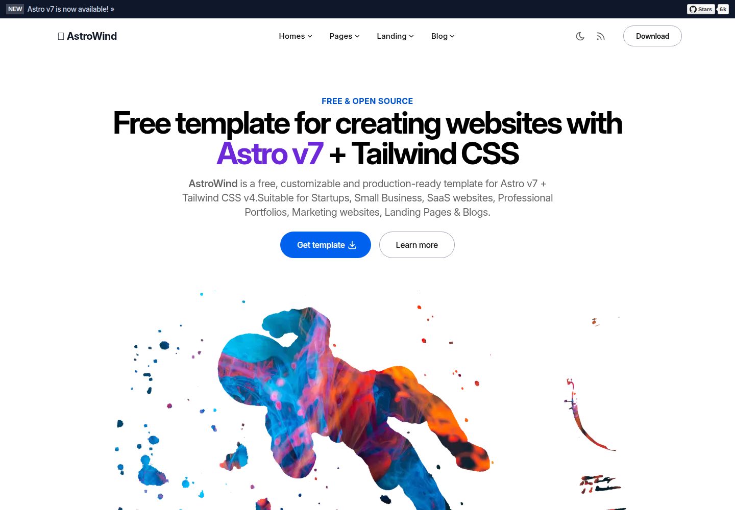
astrowind
AstroWind is a free, open-source Astro starter theme using Astro and Tailwind CSS, released under the MIT license.
Astro · Blog
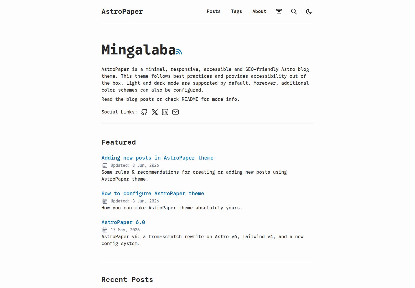
astro-paper
AstroPaper is a minimal, responsive, accessible, and SEO-friendly Astro blog theme. Articles are stored as Markdown/MDX in src/content/posts/, with subdirectories affecting URLs.
Astro · Blog
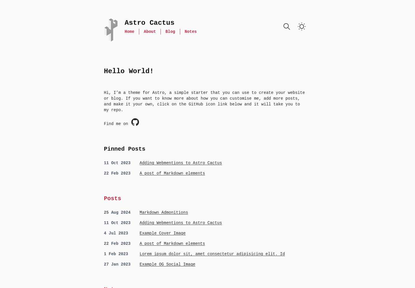
astro-theme-cactus
Astro Cactus is an Astro-based blog and portfolio theme that uses Markdown/MDX content collections to manage posts, notes, and tags, with frontmatter type-checked by a schema.
Astro · Portfolio
astrofy
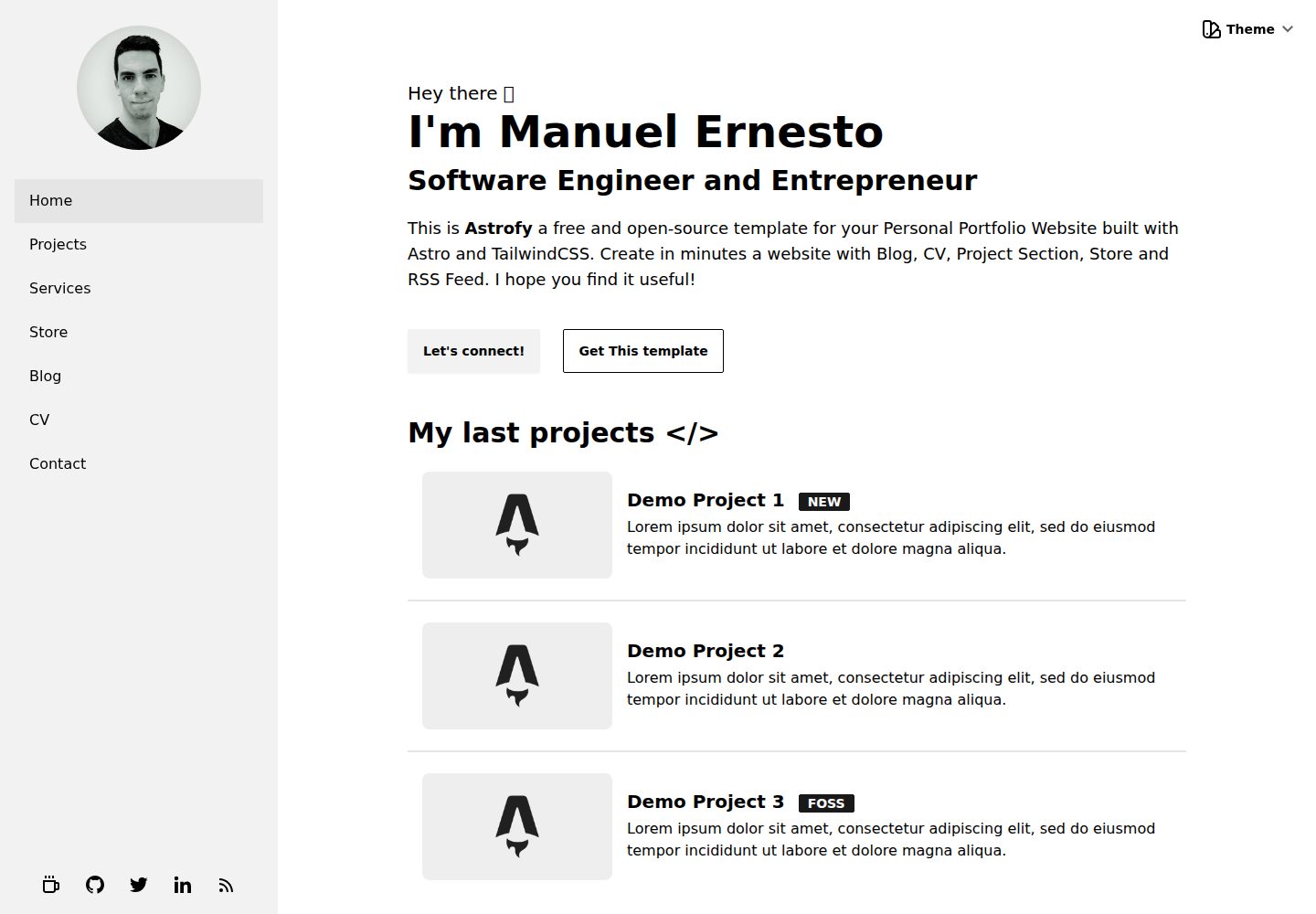
Astrofy is a free and open-source personal portfolio website template built with Astro and TailwindCSS, with built-in blog, CV timeline, project showcase, store, and RSS feed modules.
Astro · Portfolio
bookworm-light-astro
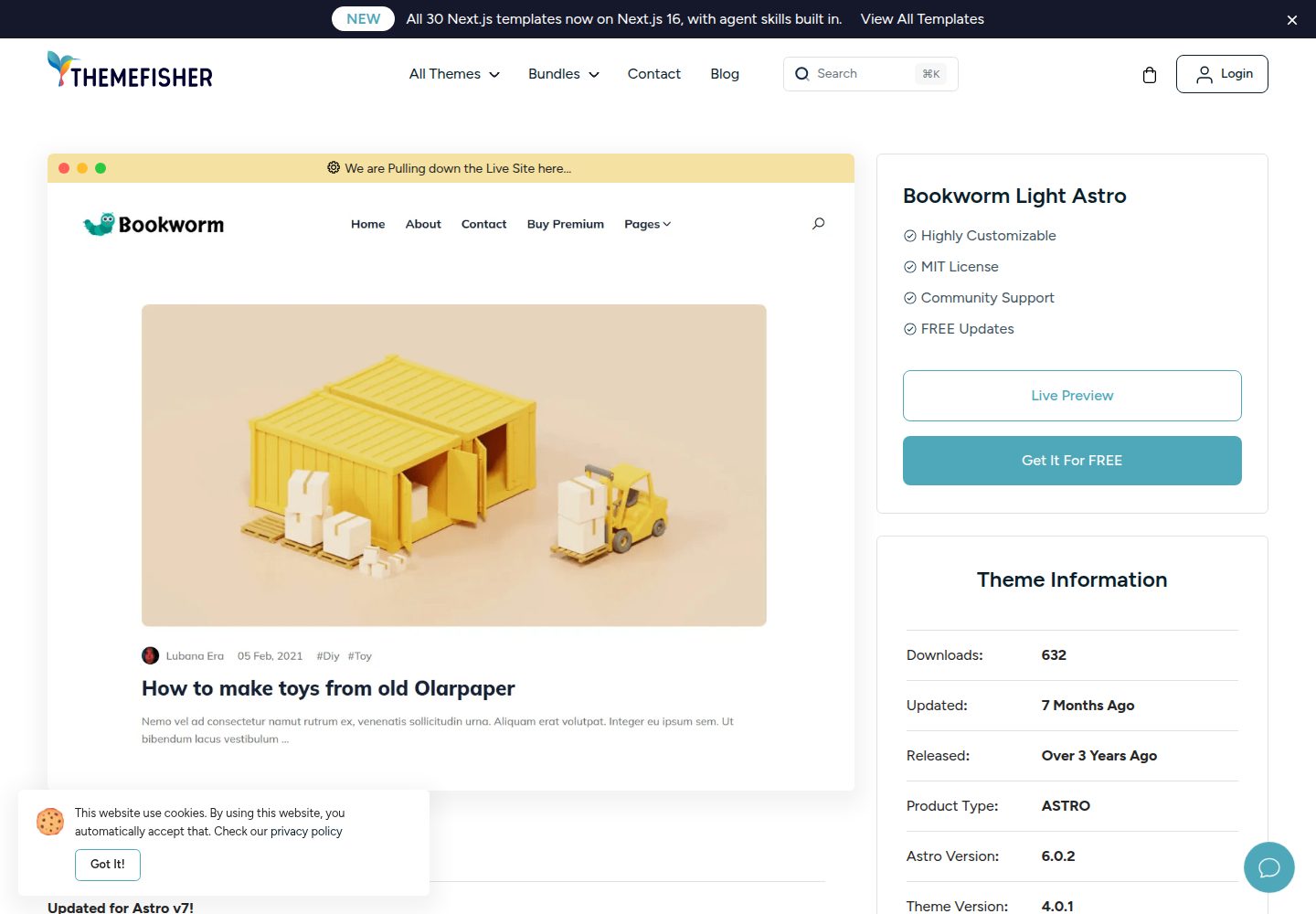
Bookworm Light Astro is a free, MIT-licensed Astro blog theme by Themefisher for personal or multi-author sites. It offers minimal Tailwind CSS styling, author list and individual author pages, tags, categories, related posts, social sharing, and FuseJS site search.
Astro · Blog
qwind
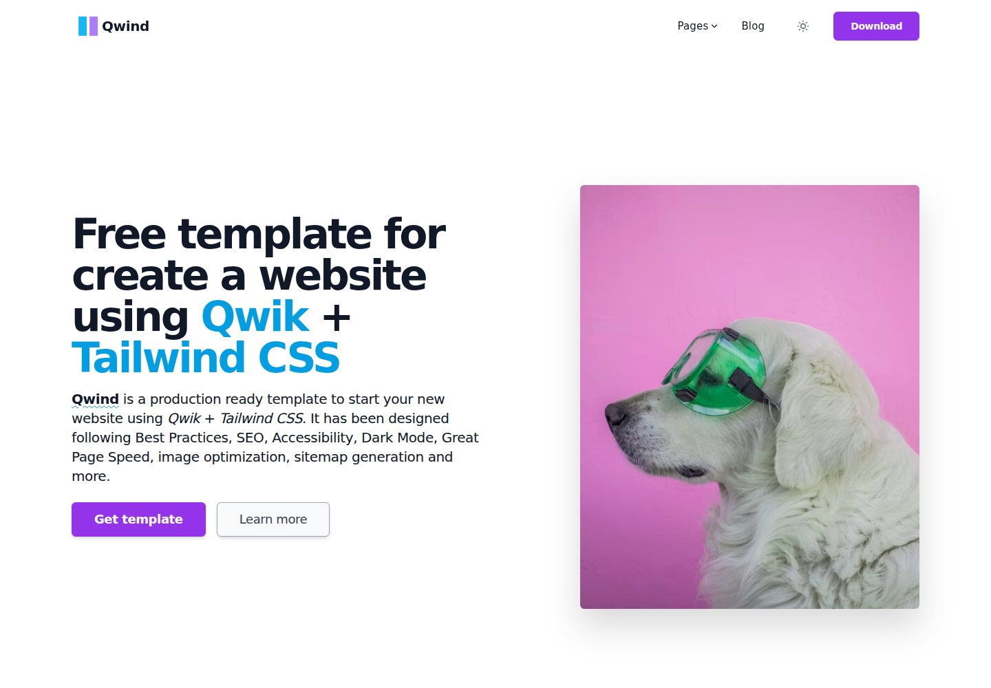
Qwind is a free and open-source website template built on Qwik and Tailwind CSS, featuring directory-based routing via QwikCity, a Markdown blog, dark mode, and static deployment configuration.
Astro · Tool Site