Integrates the DaisyUI component library with Tailwind CSS
LaravelStarter
laravel-daisyui-starter — Laravel Starter Template
By sanjayacloud
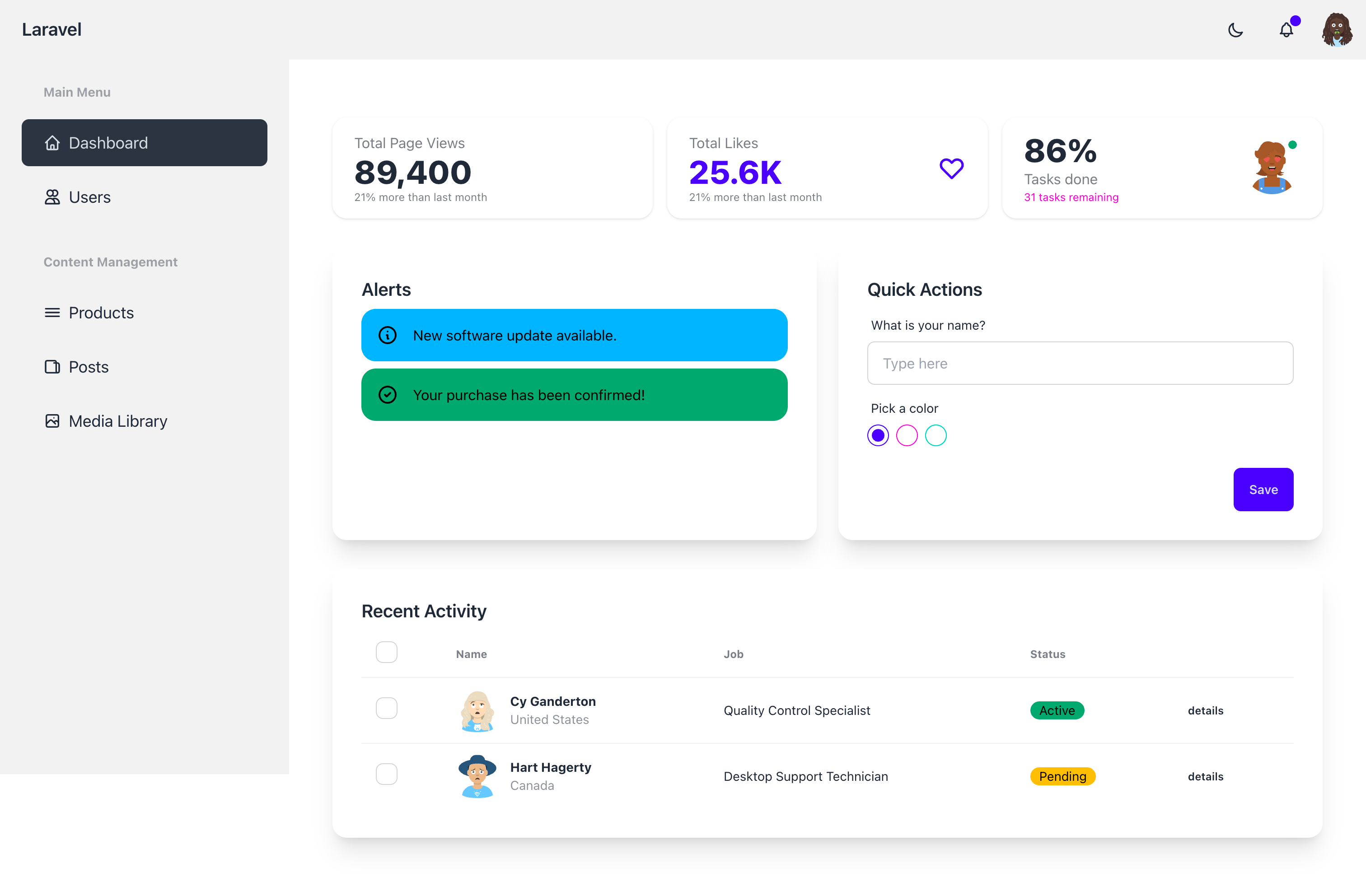
A Laravel-based starter template that integrates DaisyUI components with Tailwind CSS, offering dark mode, authentication pages, and a sample dashboard.
Explore the design
Compare the page layouts and mobile experience. Open any screenshot for a closer look.
Author preview
Author-provided previewTop of page
Preview provided in the project README.
One original preview is available. Open the full image to inspect the design.
Screenshots show visual appearance; interactive behavior may differ.
Recorded 2026-10-03View source
What stands out
A quick read of the recorded project description.
Provides dark mode switching, with the theme persisted via localStorage
Includes a base layout such as a responsive navbar and user dropdown
Comes with a dashboard example containing stat cards, alerts, forms, and data tables
Authentication pages are based on Laravel Breeze, covering login, registration, password reset, and profile pages
Theme colors are configured via CSS variables and support switching with data-theme
Template Details
This is a starter template for Laravel projects that integrates the DaisyUI component library with Tailwind CSS into a Laravel application, providing a ready-to-use interface foundation. The project is distributed as a Composer package; the installation command publishes asset files and sample pages and configures Vite and the theme.
The template includes a base layout (responsive navbar, theme switcher, user dropdown), with the theme persisted via localStorage. Sample pages cover a dashboard that displays stat cards, alerts, form elements, and data tables; common component examples include buttons, cards, badges, avatars, and dropdowns. The authentication part is based on Laravel Breeze and provides routes for login, registration, password reset, and profile pages.
Theme configuration uses CSS variables written in resources/css/app.css, allowing adjustment of color variables such as primary, secondary, accent, neutral, base-100, as well as info, success, warning, and error, and switching between light and dark themes via the data-theme attribute.
Before use, note the following: the repository README requires PHP ^8.2, Laravel ^12.0, and a Node.js and NPM environment; the installation process depends on Laravel Breeze and requires selecting Blade with Alpine when prompted. The template code is MIT-licensed, but third-party assets such as sample images, fonts, and icons require separate license verification, and external services such as domains, hosting, and databases may incur additional charges.
LaravelStarter
Is it right for your project?
Use Cases
- Quickly set up a DaisyUI-styled interface foundation for a new Laravel project
- Introduce DaisyUI components and light/dark theme switching into an existing Laravel application
- Refer to sample pages and component code to build interfaces such as stat cards, tables, and forms
- Apply a consistent DaisyUI visual style to Laravel Breeze authentication pages
Suitable For
- Developers using Laravel who want to adopt DaisyUI as their UI component library
- Laravel projects that need ready-made authentication pages and a dashboard example
- Teams that prefer configuring themes via CSS variables rather than JavaScript
Getting started & customization
Use these recorded setup notes alongside the repository instructions for your chosen version.
- 1
Environment requirements: PHP ^8.2, Laravel ^12.0, Node.js and NPM
- 2
Laravel Breeze must be installed first, and Blade with Alpine must be selected when prompted
- 3
After installing the package via Composer, run php artisan daisyui-starter:install to publish assets and build the frontend
- 4
During development, run php artisan serve and npm run dev separately
- 5
If a stability error occurs during installation, the README recommends using the dev-main version instead; third-party asset licenses must be verified separately
License & source material
Usage conditions & limitations
Free to use · keep license noticeThis entry covers the free version under the MIT license in the public repository; the free scope applies to that version's code and does not mean external services or third-party assets are free.
Must comply with when using
- The code of this version may be used, modified, used commercially, and distributed free of charge.
- When distributing copies or substantial portions of the code, retain the original author's copyright notice and the full MIT license notice.
- The code is provided as is; warranties and limitations of liability are governed by the original license and applicable law.
Additional costs & items to verify
- Using this template requires PHP 8.2 or later, Laravel 12.0 or later, and a Node.js and NPM environment; otherwise installation and building are not possible.
- The installation process depends on Laravel Breeze; Breeze must first be installed via Composer and breeze:install run, and Blade with Alpine must be selected when prompted.
- The template is distributed as a Composer package and must be installed at the specified version via that command, relying on Composer and network access to Packagist.
- After installation, that Artisan command must be run to publish assets, install NPM packages, configure Vite and the theme, and build frontend assets.
- Development requires starting Laravel's built-in server, and npm run dev must also be run in a separate terminal to enable the Vite development server.
- If a stability error occurs during installation, the README recommends using the dev-main development branch version, which may be unstable.
- Demo images, fonts, icons, and other third-party assets must be verified under their respective licenses and cannot be judged solely by the code's MIT license.
- External services such as domains, hosting, databases, payments, or AI may incur additional charges.
View Original Text Basis
Permission is hereby granted, free of charge
Original License Text
PHP ^8.2 - Laravel ^12.0 - Node.js & NPM
Original README
composer require laravel/breeze --dev php artisan breeze:install
Original README
composer require sanjaya/laravel-daisyui-starter:v1.0
Original README
php artisan daisyui-starter:install
Original README
php artisan serve
Original README
https://github.com/sanjayacloud/laravel-daisyui-starter/blob/main/LICENSE.mdhttps://github.com/sanjayacloud/laravel-daisyui-starter/blob/main/README.mdcomposer require sanjaya/laravel-daisyui-starter:dev-main
Original README
Compiled by DeepSeek based on repository license and README ·2026-10-03. Results only cover the materials read; dependencies, images, fonts, and subsequent term changes are subject to their respective original texts.
Project checks & description sources
Template Information
- Source platforms
- GitHub
- Documentation and maintenance reference score
- Partly documented · 65 / 100
- Technologies
- Laravel
- Website type
- Starter
How this score is calculated
Our heuristic uses license records (up to 30), a demo link (12), a preview (10), stars (15), recorded maintenance (15), description completeness (8), feature records (5) and classification data (5). It is not a code, security or performance test, or a Google score. A link does not establish tested functionality.
What to verify for this project
- Repository update recorded
- 2025-07-16
- Screenshot last checked
- 2026-10-03
No demo link is recorded. Use the repository instructions to evaluate the project locally; the screenshot alone cannot establish interactive behavior.
The catalog identifies Laravel as the primary stack. Check the actual dependency manifest and lockfile for versions and hosting requirements. These notes use recorded metadata, not a code audit or a deployment test.
Use a selection guide →How this description was prepared
AI-assisted description based on catalog records and repository material. Repository authors are not automatically the reviewers of this description.
Review declaration: [email protected] · 2026-10-04
Inspect the recorded source material
SHA-256: a558721cfce5497fdc575a5cfe79f7bae63f3248e32ca13d8d81aacbb3666745
2026-10-03T19:30:30.823Z
Source file / repository# Laravel DaisyUI Starter Kit
A beautiful Laravel starter kit with DaisyUI integration, providing a modern and responsive UI framework for your Laravel applications. Built with Tailwind CSS v4 and the latest DaisyUI.
## Features
- 🎨 DaisyUI components integration
- 🌓 Dark mode support with theme persistence
- 📱 Responsive design
- 🎯 CSS-first theme configuration
- 🚀 Easy to customize
- 📦 Simple installation
- 🔐 Authentication with Laravel Breeze
- ⚡ Tailwind CSS v4 integration
- 📱 Ready-to-use example pages and components
## Requirements
- PHP ^8.2
- Laravel ^12.0
- Node.js & NPM
## Installation
1. Create a new Laravel project:
```bash
laravel new my-project
cd my-project
```
2. Install Laravel Breeze:
```bash
composer require laravel/breeze --dev
php artisan breeze:install
```
When prompted, select the "Blade with Alpine" option.
3. Install the package via composer:
```bash
composer require sanjaya/laravel-daisyui-starter:v1.0
```
4. Run the installation command:
```bash
php artisan daisyui-starter:install
```
This will:
- Publish the package assets and example pages
- Install required NPM packages
- Configure Vite with Tailwind CSS
- Set up the theme configuration
- Build the assets
5. Start your development server:
```bash
php artisan serve
```
6. In a separate terminal, start the Vite development server:
```bash
npm run dev
```
## Example Pages and Components
The package comes with pre-built example pages showcasing various DaisyUI components:
### Layout Structure
The base layout (`resources/views/vendor/layouts/app.blade.php`) includes:
- Responsive navigation bar
- Theme switcher (light/dark mode)
- User dropdown menu
- Automatic theme persistence using localStorage
To use the layout in your views:
```php
<x-app-layout>
<!-- Your content here -->
</x-app-layout>
```
### Dashboard Example
The dashboard example (`resources/views/vendor/dashboard.blade.php`) demonstrates:
1. **Stats Cards**:
```html
<div class="stats shadow">
<div class="stat">
<div class="stat-title">Total Page Views</div>
<div class="stat-value">89,400</div>
<div class="stat-desc">21% more than last month</div>
</div>
</div>
```
2. **Alert Components**:
```html
<div class="alert alert-info">
<svg xmlns="http://www.w3.org/2000/svg" fill="none" viewBox="0 0 24 24" class="stroke-current shrink-0 w-6 h-6">
<path stroke-linecap="round" stroke-linejoin="round" stroke-width="2" d="M13 16h-1v-4h-1m1-4h.01M21 12a9 9 0 11-18 0 9 9 0 0118 0z"></path>
</svg>
<span>New software update available.</span>
</div>
```
3. **Form Elements**:
```html
<div class="form-control w-full">
<label class="label">
<span class="label-text">What is your name?</span>
</label>
<input type="text" placeholder="Type here" class="input input-bordered w-full" />
</div>
```
4. **Data Tables**:
```html
<div class="overflow-x-auto">
<table class="table">
<thead>
<tr>
<th>Name</th>
<th>Job</th>
<th>Status</th>
</tr>
</thead>
<tbody>
<tr>
<td>John Doe</td>
<td>Developer</td>
<td><div class="badge badge-success">Active</div></td>
</tr>
</tbody>
</table>
</div>
```
### Common Components
1. **Buttons**:
```html
<button class="btn">Button</button>
<button class="btn btn-primary">Primary</button>
<button class="btn btn-secondary">Secondary</button>
<button class="btn btn-accent">Accent</button>
<button class="btn btn-ghost">Ghost</button>
```
2. **Cards**:
```html
<div class="card bg-base-100 shadow-xl">
<div class="card-body">
<h2 class="card-title">Card Title</h2>
<p>Content</p>
<div class="card-actions justify-end">
<button class="btn btn-primary">Action</button>
</div>
</div>
</div>
```
3. **Badges**:
```html
<div class="badge">Default</div>
<div class="badge badge-primary">Primary</div>
<div class="badge badge-secondary">Secondary</div>
<div class="badge badge-accent">Accent</div>
```
4. **Avatars**:
```html
<div class="avatar">
<div class="w-24 rounded-full">
<img src="user-avatar.jpg" />
</div>
</div>
```
5. **Dropdowns**:
```html
<div class="dropdown">
<label tabindex="0" class="btn m-1">Click</label>
<ul tabindex="0" class="dropdown-content menu p-2 shadow bg-base-100 rounded-box w-52">
<li><a>Item 1</a></li>
<li><a>Item 2</a></li>
</ul>
</div>
```
## Screenshots
### Dashboard

### Login Page

## Theme Configuration
Themes are now configured directly in your CSS using CSS variables, following Tailwind CSS v4's CSS-first approach. The configuration is located in `resources/css/app.css`:
```css
@layer theme {
:root {
--theme: "light";
--color-primary: oklch(0.6569 0.196 275.75);
--color-secondary: oklch(0.7176 0.158 342.55);
--color-accent: oklch(0.7059 0.169 183.61);
/* ... other color variables ... */
}
[data-theme="dark"] {
--theme: "dark";
--color-base-100: oklch(0.2 0 0);
}
}
```
### Customizing Colors
To customize your theme colors, modify the CSS variables in `resources/css/app.css`. Available color variables:
- `--color-primary`: Main brand color
- `--color-secondary`: Secondary brand color
- `--color-accent`: Accent color
- `--color-neutral`: Neutral color
- `--color-base-100`: Background color
- `--color-info`: Information color
- `--color-success`: Success color
- `--color-warning`: Warning color
- `--color-error`: Error color
### Switching Themes
To switch themes in your Blade templates:
```html
<html data-theme="light">
<!-- For light theme -->
</html>
<!-- OR -->
<html data-theme="dark">
<!-- For dark theme -->
</html>
```
For dynamic theme switching:
```php
<html data-theme="{{ $theme }}">
<!-- Your content -->
</html>
```
## Usage
After installation, you can use DaisyUI components in your views:
```html
<button class="btn btn-primary">Primary Button</button>
<div class="card">
<div class="card-body">
<h2 class="card-title">Card Title</h2>
<p>Card content</p>
</div>
</div>
```
### Authentication
The package integrates with Laravel Breeze for authentication. All auth views are styled with DaisyUI components. Available routes:
- Login: `/login`
- Register: `/register`
- Password Reset: `/forgot-password`
- Profile: `/profile`
## Troubleshooting
### Common Issues
1. If you get a stability error when installing, use:
```bash
composer require sanjaya/laravel-daisyui-starter:dev-main
```
2. If assets are not showing up correctly:
- Make sure you've published all assets
- Clear your Laravel cache: `php artisan cache:clear`
- Rebuild your npm assets: `npm run build`
3. If themes are not applying:
- Ensure the `data-theme` attribute is properly set on your HTML elements
- Check that your CSS variables are correctly defined in `resources/css/app.css`
- Make sure Vite is properly building your assets
## Security
If you discover any security related issues, please create a issue using the issue tracker.
## License
The MIT License (MIT). Please see [License File](LICENSE.md) for more information.Explore similar templates
Compare previews and descriptions within the same stack and category.
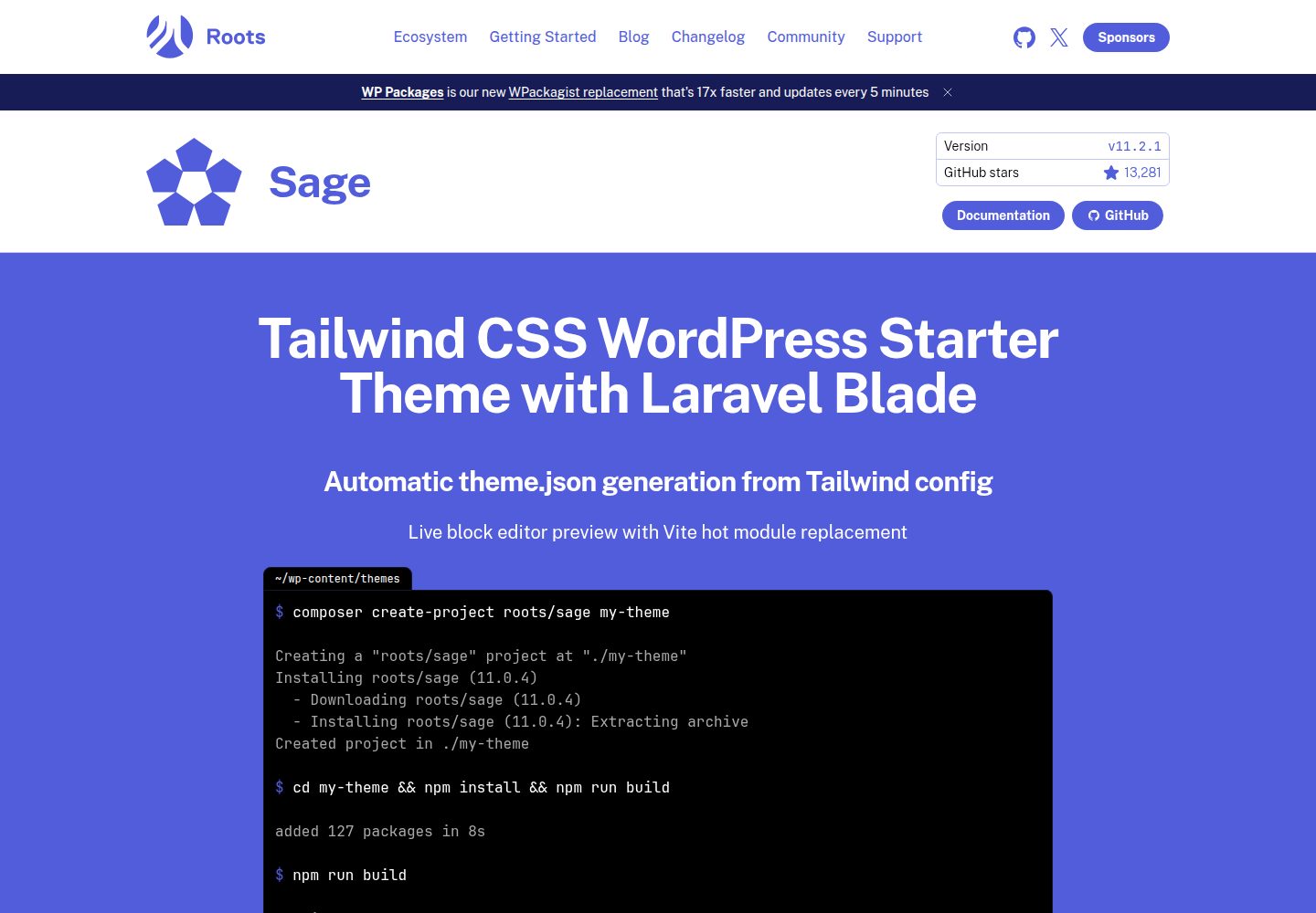
sage
Sage is a WordPress starter theme maintained by Roots, using Laravel Blade components and templates, Vite builds, Tailwind CSS, and built-in block editor support.
Laravel · Starter
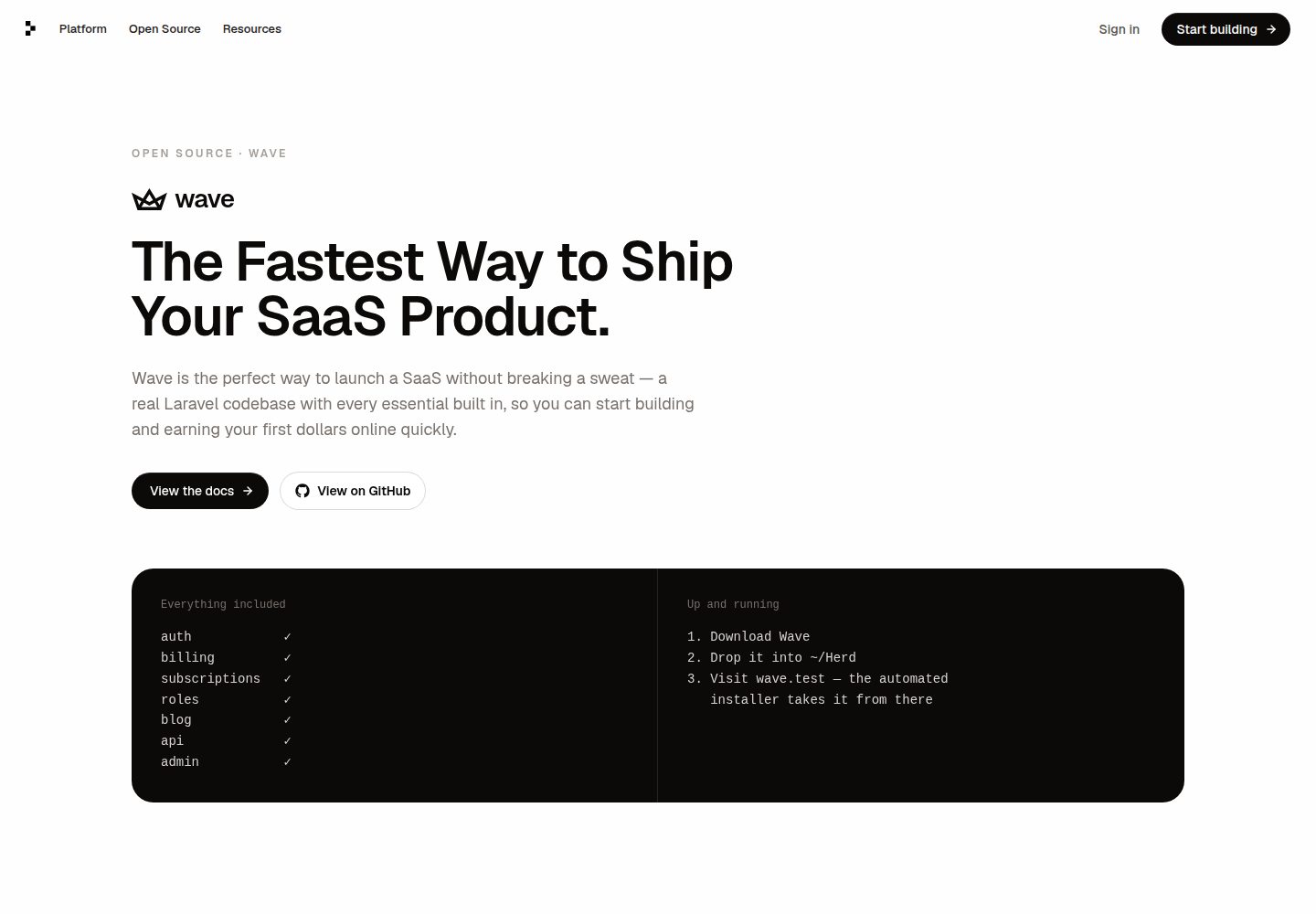
wave
Wave is an open-source SaaS starter kit built on Laravel and released under the MIT license.
Laravel · SaaS
filament-starter
A Laravel TALL stack starter template maintained by Log1x, with a preconfigured Filament admin panel and plugins including Curator, Gravatar, Exceptions, Jobs Monitor, Breezy, Peek, and Logger.
Laravel · Starter
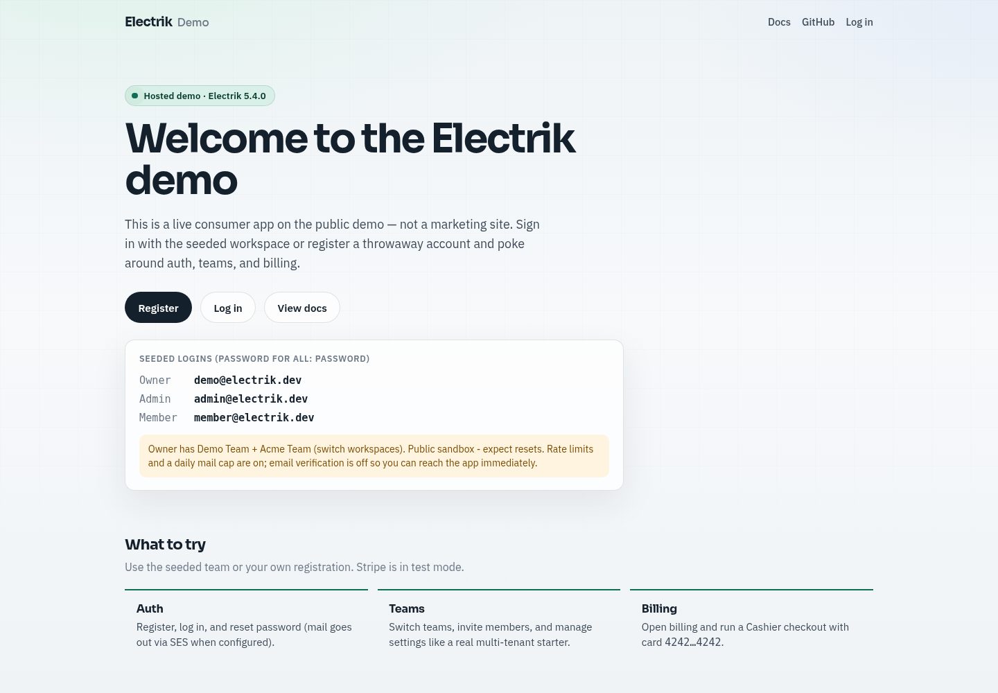
electrik
Electrik is a Laravel SaaS starter kit installed as a Composer package, with authentication, teams, Stripe subscription billing, and the Slate 3 interface under the Electrik\ namespace rather than copied into App\.
Laravel · SaaS
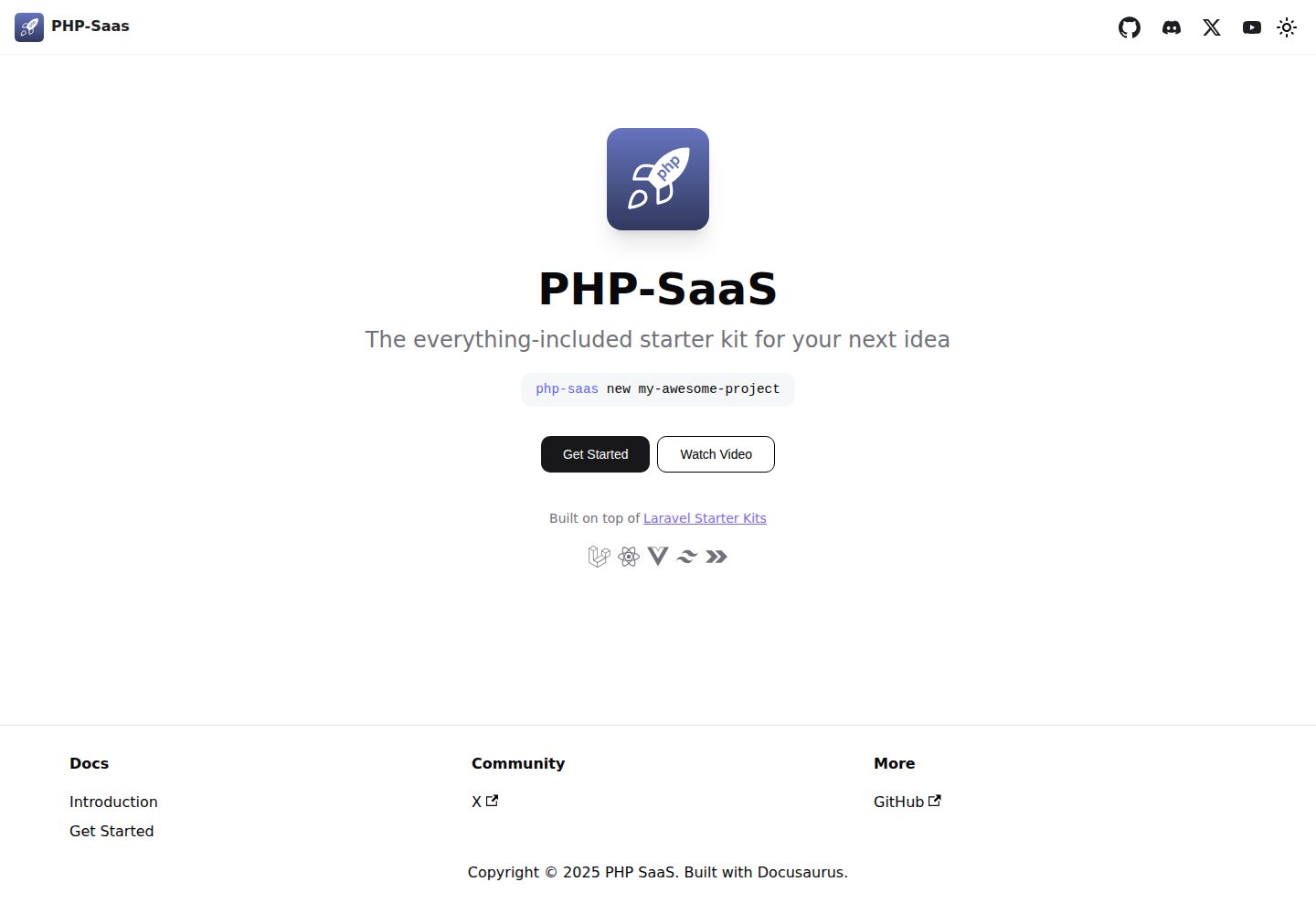
php-saas
php-saas is a Laravel-based SaaS starter positioned as an everything-included kit. It generates new projects via a global Composer command and includes authentication with two-factor, API tokens, Stripe and Paddle billing, and project, team, and organization management.
Laravel · SaaS
filament-jetstream
A Laravel starter kit that implements Jetstream-like authentication and account features using Filament's native panels and components. It includes login, registration, two-factor authentication, session management, user profiles, and optional teams and API tokens.
Laravel · Starter