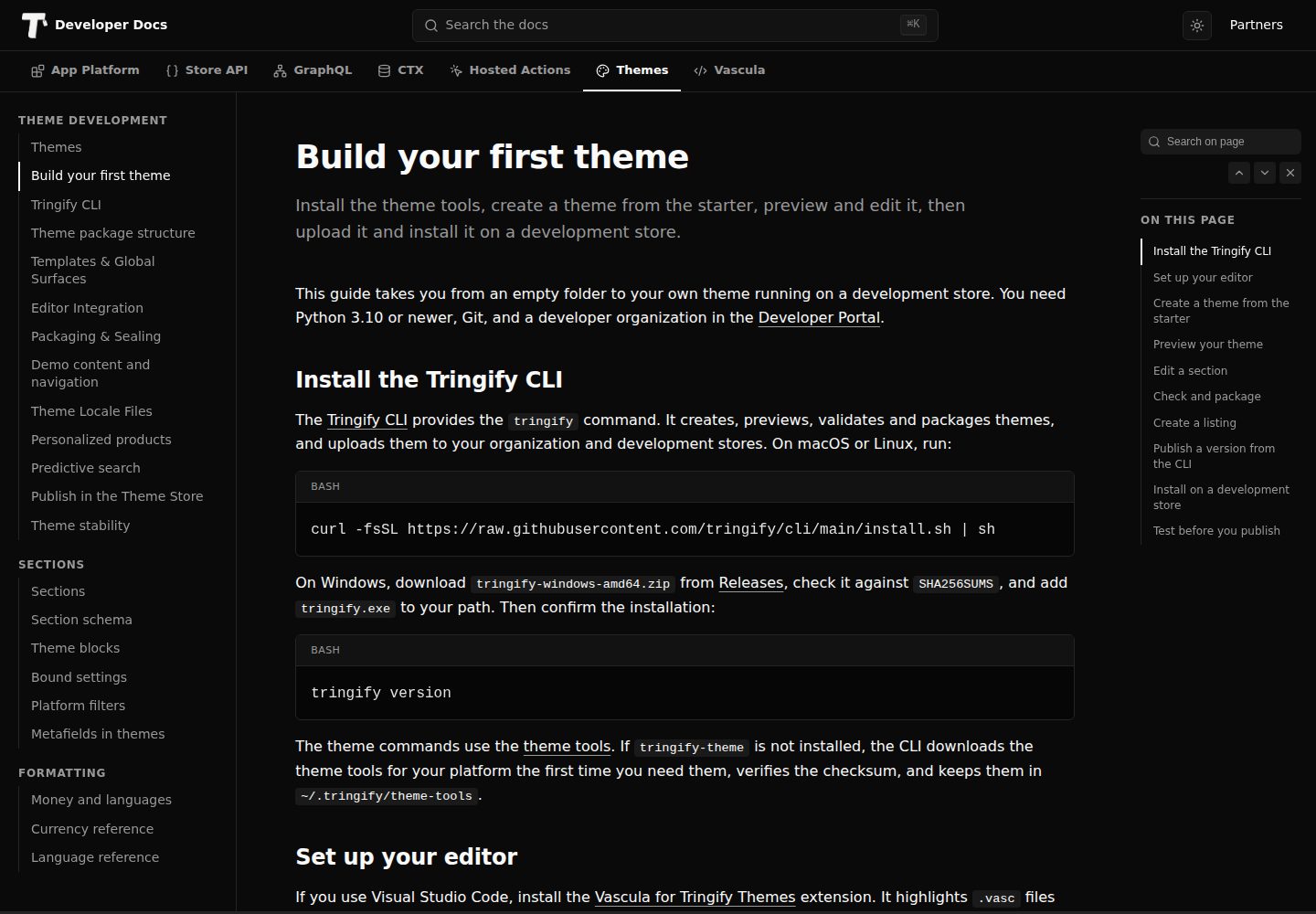
Provides 38 editable sections covering store interfaces such as product discovery, product options, cart, customer access, content, and legal pages
HTMLE-commerceStarter
theme-starter — HTML Ecommerce Template
By tringify
Official Tringify e-commerce store theme starter template, built with HTML and Vascula, containing 38 editable sections and complete store page templates for custom theme development.
Explore the design
Compare the page layouts and mobile experience. Open any screenshot for a closer look.
Desktop homepage1 / 3
Desktop captureTop of page
Actual screenshot captured by the server browser.
All pages & views 3
Screenshots show visual appearance; interactive behavior may differ.
Recorded 2026-10-02View source
What stands out
A quick read of the recorded project description.
Includes complete page templates for home, shop, product, collection, cart, account, blogs, policies, and more
Built-in Paper and Soft Neutral full-site style presets, each with light and inverted color schemes
Each section consists of body.html, style.css, and schema.json, with shared styles centralized in src/_shared.css
demo/catalog.json provides preview data including 10 products, collections, categories, brands, navigation, and three blog articles
Product sections support options such as Buy Now, gallery layout, image aspect ratio, and full display or fill crop
Template Details
theme-starter is the official Tringify store theme starter template, written in HTML and Vascula, positioned as a starting point for building Tringify storefront themes. It provides 38 editable sections covering product discovery, product options, cart actions, customer access, content, legal pages, store status, localization notices, consent controls, and reusable homepage sections. The template includes complete page templates for home, shop, product, collection, category, brand, vendor, search, cart, wishlist, account, sign-in, registration, blogs, articles, pages, policies, order tracking, password access, maintenance, coming soon, and not found, along with two full-site style presets, Paper and Soft Neutral, each with corresponding light and inverted color schemes.
The development workflow relies on the tringify-theme command provided by Tringify theme tools and requires Python 3.10 or higher. You can create a repository via GitHub's Use this template, or initialize a new theme from the template with tringify-theme init, then start a local preview with tringify-theme preview, which automatically rebuilds on save. Each editable section consists of body.html, style.css, and schema.json under src/sections/<name>/, with shared styles in src/_shared.css. Before publishing, validate with tringify-theme check, then package as a ZIP with tringify-theme package, upload to the Themes area of the Tringify Developer Portal, and install on a development store for testing.
The template includes demo/catalog.json for preview data, containing 10 products, variants, color swatches, unavailable options, sale prices, ratings, six cart lines, collections, categories, brands, vendors, navigation, pages, and three full blog articles, intended only for local preview and not modifying the merchant's real catalog. Theme settings provide controls for body font and heading font selection, body size, content width, section spacing, corner radius, button corner radius, content links, and color schemes. Product sections support options such as Buy Now, gallery layout, image aspect ratio, and full display or fill crop; the header supports logo selection, brand alignment, inline navigation or menu icon, search and account visibility, cart count display, and sticky options. Menus support up to three levels, with the demo menu limited to a maximum of 12 sibling items per level and 48 items per full menu.
Usage limitations: the template code is under the MIT license, free to use, modify, commercialize, and distribute, but the copyright notice and full MIT license statement must be retained when distributing; third-party assets such as demo images, fonts, and icons require separate verification under their respective licenses. External services such as domain, hosting, database, payment, or AI may incur additional charges. Sample copy, shipping thresholds, inventory, or review claims in the template should not be used directly in a live store; before publishing, test scenarios such as sign-in, registration, resend, error messages, password access, missing images, long titles, keyboard focus, and empty states on a development store with real products.
HTMLE-commerceStarter
Is it right for your project?
Use Cases
- Building a Tringify store theme from scratch using this template as the initial code structure
- Extending sections or adjusting page templates on an existing theme, referencing its section organization and schema approach
- Building a complete front end for a Tringify store including products, cart, account, content, and legal pages
- Previewing the rendering of home, product, cart, and content pages locally using demo data
- Adjusting fonts, content width, spacing, corner radius, and color schemes via theme settings to form a brand appearance
Suitable For
- Front-end developers familiar with HTML, CSS, and JSON
- Teams needing to develop custom themes for Tringify stores
- Merchants or agencies wanting to do secondary development based on the official starter template
- Developers needing local preview and packaging workflows to validate themes
Getting started & customization
Use these recorded setup notes alongside the repository instructions for your chosen version.
- 1
Install Tringify theme tools to get the tringify-theme command, and prepare Python 3.10 or higher
- 2
Create a repository via GitHub's Use this template, or initialize a new theme from the template with tringify-theme init
- 3
Use tringify-theme preview for local preview; after saving files under src/sections/, the preview automatically rebuilds
- 4
Before publishing, run tringify-theme check to validate, then package as a ZIP with tringify-theme package and upload to the Tringify Developer Portal
- 5
demo/catalog.json is only for local preview; for a live store, select real products and collections in the theme editor
License & source material
Usage conditions & limitations
Free to use · keep license noticeThis entry covers the free version under the MIT license in a public repository; the free scope is the code of this version and does not imply that external services or third-party assets are free.
Must comply with when using
- Free to use, modify, commercialize, and distribute the code of this version.
- When distributing copies or substantial portions of the code, retain the original author's copyright notice and the full MIT license statement.
- The code is provided as is; warranties and limitations of liability are governed by the original license and applicable law.
Additional costs & items to verify
- Development and preview depend on the tringify-theme command provided by the external tool Tringify theme tools and require Python 3.10 or higher, which is an additional environment requirement.
- Publishing a theme requires uploading the packaged ZIP to the Tringify Developer Portal and installing it on a development store, depending on a Tringify platform account and store environment.
- Built-in images are sample photography assets only; before official release, replace them with images matching the store's products, and verify third-party asset licenses separately.
- Private API credentials must not be stored in theme files or browser code; when accessing external services, follow their documented authorization models.
- Passing validation only confirms package compatibility, not appearance or shopping flow correctness; before publishing, still test on a development store with real products.
- Demo images, fonts, icons, and other third-party assets require verification under their respective licenses and cannot be judged solely by the code's MIT license.
- External services such as domain, hosting, database, payment, or AI may incur additional charges.
View Original Text Basis
Permission is hereby granted, free of charge
Original License Text
Tringify theme tools](https://github.com/tringify/theme-tools), which provide the `tringify-theme` command.
Original README
Upload the ZIP in the Tringify Developer Portal under **Themes**, install it on a development store
Original README
The bundled images provide sample photography. Choose imagery that represents the store's products before publishing.
Original README
Keep private API credentials out of theme files and browser code.
Original README
https://github.com/tringify/theme-starter/blob/main/LICENSEhttps://github.com/tringify/theme-starter/blob/main/README.mdPassing validation confirms package compatibility. It does not assess appearance or shopper flows.
Original README
Compiled by DeepSeek based on repository license and README ·2026-10-02. Results only cover the materials read; dependencies, images, fonts, and subsequent term changes are subject to their respective original texts.
Project checks & description sources
Template Information
- Source platforms
- GitHub
- Documentation and maintenance reference score
- More documented · 85 / 100
- Technologies
- HTML
- Website type
- E-commerce · Starter
How this score is calculated
Our heuristic uses license records (up to 30), a demo link (12), a preview (10), stars (15), recorded maintenance (15), description completeness (8), feature records (5) and classification data (5). It is not a code, security or performance test, or a Google score. A link does not establish tested functionality.
What to verify for this project
- Repository update recorded
- 2026-10-02
- Screenshot last checked
- 2026-10-02
A demo link is listed. Check it with your own content and viewport sizes; its presence does not confirm that forms, authentication or payments work.
The catalog identifies HTML as the primary stack. Check the actual dependency manifest and lockfile for versions and hosting requirements. These notes use recorded metadata, not a code audit or a deployment test.
Use a selection guide →How this description was prepared
AI-assisted description based on catalog records and repository material. Repository authors are not automatically the reviewers of this description.
Automatically checked against source and license rules; no manual editorial review.
Inspect the recorded source material
SHA-256: d42357fd79565b241e986efb593a7d8f1251f843a6eca8740d0fa6af0c376a07
2026-10-02T15:55:17.215Z
Source file / repository# Tringify Starter Theme An editable Vascula theme for building Tringify storefronts. Use it as the starting point for your own theme. Starter provides 38 editable sections across every storefront surface: product discovery, product options, cart actions, customer access, content, legal pages, store states, localization prompts, consent controls, and reusable home-page sections. ## Requirements - [Tringify theme tools](https://github.com/tringify/theme-tools), which provide the `tringify-theme` command. - Python 3.10 or newer. ## Create your theme Select **Use this template** on GitHub to create your own repository from Starter, or clone it: ```sh git clone https://github.com/tringify/theme-starter tringify-theme init my-theme --from theme-starter --name "My Theme" cd my-theme tringify-theme preview ``` `init` creates a new directory, sets the theme name, builds the sections, and validates the result. Open the printed preview URL and edit the files under `src/sections/`; the preview rebuilds as you save. When the theme is ready: ```sh tringify-theme check tringify-theme package dist/my-theme.zip ``` Upload the ZIP in the Tringify Developer Portal under **Themes**, install it on a development store, and test it with that store's products. The [Build your first theme](https://dev-docs.tringify.com/themes/build-your-first-theme) guide walks through each step. ## Edit sections Each editable section has `body.html`, `style.css`, and `schema.json` under `src/sections/<name>/`. Shared styles live in `src/_shared.css`. Edit these source files, then build or package. Keep `src/.generated-sections.json` in version control. It identifies generated section files so the builder can remove obsolete outputs safely. Directly authored sections are preserved; do not edit generated `.vasc` files separately from their source. The builder updates the section index in `theme.json`. When adding or renaming a section, also update its surface permissions in `theme.json` and its instances in `templates/`. Declare the data a section reads in `ctx_needs`. Read fields such as `product.title` directly and use the `money` filter for storefront prices. Use documented form tags for shopper actions. Do not construct authentication or cart requests from undocumented fields. ## Sections and presets Starter includes full templates for home, shop, product, collection, category, brand, vendor, search, cart, wishlist, account, sign-in, registration, blogs, articles, pages, policies, order tracking, password access, maintenance, coming soon, not found, and global surfaces. Merchants can add featured products, featured collections, image with text, and rich text to the home page. Section presets provide alternate starting arrangements, including split and centered heroes, different product-grid densities, image placement choices, and text alignment choices. The theme includes two whole-theme style presets: - **Paper** — the default black-and-white presentation. - **Soft Neutral** — an optional warm neutral presentation. Both presets include matching light and inverse color schemes. They are starting points and remain editable in Store Admin. ## Reusable content blocks **Content Blocks** can be added to home, product, page, collection, category, brand, and vendor templates. It supports up to 12 ordered blocks. Add, reorder, hide, or remove blocks in the editor; their order is the reading order on the storefront. An empty section renders no surrounding space. Four reusable theme blocks are supplied: **Heading**, **Text**, **Button**, and **Image**. Their source is in `blocks/*.vasc`; edit the markup and schema together. A button appears after its label and link are supplied. An image appears after an image is selected, uses its full proportions, and has editable alternative text and an optional caption. The section also accepts compatible blocks from installed apps. **Story with Blocks** provides a heading and text as a starting arrangement. **Empty Content Section** starts without blocks. Section alignment and content width remain editable. Keep essential product selection and purchase controls in the product section; content blocks do not replace their validation. ## Buy Now The product section includes **Show Buy Now**. When enabled, Buy Now uses the selected variant and quantity and opens checkout for that selection. Items already in the shopper’s cart remain there. Both purchase buttons stay disabled until a required variant selection is complete. Buy Now uses the same product form with `name="purchase_intent" value="buy_now"` on its submit button. Keep the product, variant, quantity, and any declared buyer-writable properties in that form. The hosted action validates the selection before opening checkout. Do not clear the cart or add the selection to it first. Products requiring an app’s customization must use that app’s purchase action after the shopper completes the customization. A theme must not manufacture artifact identifiers or bypass the app’s required fields. Cart and wishlist actions show a dismissible confirmation with a link to the updated selection. The Global Overlay section listens to the documented `tf:action-done` event after the section refresh; it does not submit a second request. Buy Now opens checkout directly without showing an Add to Cart confirmation. Keep confirmation text in the theme's locale files. The product's wishlist button uses `tf:action-success` and the returned `product_session_state.product.wishlist.direct_saved` value to update its label. The shopper's selected options and quantity remain unchanged. This form saves the product itself; a saved variant does not make the product-only form say Remove from Wishlist. ## Customer and password forms Sign-in and registration use the methods enabled in Customer Settings. When both methods are available, the preferred method appears first. The phone field uses the supplied countries and calling codes, supports search, and preserves the national number when the shopper changes the calling code. Countries that share a calling code are not inferred from that code alone. Verification uses the six-digit code form. Email newsletter consent appears unchecked during email registration only when the store enables it. Password-protected stores use the store-password form and display its returned errors. The form display is not a substitute for platform validation. Check sign-in, registration, resend, errors, and password access against your development store before publishing. ## Demo catalog `demo/catalog.json` supplies realistic preview data without changing a merchant's catalog. It includes 10 products, variants, color swatches, unavailable options, sale pricing, ratings, six cart lines, collections, categories, brands, vendors, navigation, pages, and three complete journal articles. Choose products and collections for featured sections in the theme editor. On a live store, a featured section stays hidden until it has selected catalog items. Local previews populate these sections from the demo pack; fictional products and prices are never a live fallback. Content images use `image_url` with a fallback width, `image_srcset: max:` with a bounded candidate ladder, and `sizes` derived from the section's columns, gaps and breakpoints. `image_loading` assigns the first page-content image high priority, the next two eager loading, and later images lazy loading. Keep this filter out of global surfaces: header/footer logos stay explicitly eager and drawer images stay explicitly lazy. The bundled images provide sample photography. Choose imagery that represents the store's products before publishing. The home hero and Image with Text section also include an optional Starter image; choose an image in the editor to replace it, or turn off **Use Starter Image When Empty**. ## Design controls Starter starts with system fonts and includes separate **Body Font** and **Heading Font** pickers. System choices require no font download. Theme Settings also controls **Body Text Size**, **Content Width**, **Section Spacing**, **Corner Radius**, **Button Corner Radius**, **Content Links**, and color schemes. Range controls keep sizes within supported limits. The shared rules are in `src/_shared.css`; section-specific rules are in each section's `style.css`. In the product section, **Gallery Layout** controls the desktop arrangement. **Image Proportions** offers Square, Portrait, and Landscape frames. **Show Full Image** keeps the whole image visible, with space around it when its proportions differ from the frame. **Fill the Frame** fills the frame and may crop the edges. On smaller screens, multiple images scroll horizontally so shoppers can reach the product details without scrolling through every photo. The header includes a logo picker, logo width, brand alignment, inline desktop navigation or a menu icon, search and account visibility, cart-count visibility, and a sticky-header option. The default menu icon sits before the logo or store name on desktop and mobile, with an icon-only cart at the other end. Merchants can choose Inline Links for desktop navigation. Icons retain accessible labels. The header uses the selected menu. Until one is selected, it links to Shop and Collections. The announcement is off by default. Enable it and add wording that matches the store's actual offers; shipping thresholds should never be copied from sample content. Menus support three levels. Select a parent item to expand its children; **View All** opens the parent's destination when it has one. Label-only groups expand without an empty link. Links preserve the merchant's choice to open a new tab. Desktop navigation uses dropdowns, and the menu-icon layout keeps nested groups inside one scrolling panel. Disclosures can be activated using the keyboard. The demo menu includes both nested groups and a new-tab product link. Demo menus allow up to 12 sibling items, three levels, and 48 items in each complete menu. Each item has a `title`, a `target`, optional `children`, and optional `open_in_new_tab`. Use `label` for a non-linking group with children, `shop` or `collections` for indexes, and references such as `product:ceramic-mug` for catalog items. Invalid references are rejected when the theme is checked or imported. These are demo-pack limits; merchants manage their actual menus in Store Admin. ## Develop with real data Use both the author contract and a rendered example while building a section: ```sh tringify-theme contract tringify-theme context . --page product --entity ceramic-mug ``` `contract` describes the fields and allowed values. `context` shows sample values for the selected page. Neither replaces testing with the store's own products. Check products with and without images, descriptions, vendors, variants, sale prices, and quantity limits. Optional text can be `null`; an empty string also needs an explicit blank check when you want to hide its surrounding markup. Display prices using `money`, keep account or cart actions on their documented forms, and use resource pickers for merchant selections. Keep private API credentials out of theme files and browser code. Use GraphQL only through its documented access model; a sample CTX value is not authorization to access a customer's data. ## Review before publishing Check the home page, catalog, product, cart, account, and content pages at narrow mobile, tablet, and desktop widths. Review both presets, long titles, missing images, translated labels, keyboard focus, image cropping, and empty states. Check the rendered result after each design change; a successful package check cannot assess appearance. Keep developer instructions in this README or the documentation. Shopper-facing sample copy should read like storefront content. Write clear editor labels, provide useful empty states, and avoid claims about delivery, stock, reviews, or returns unless the store supplies them. ## Text and editor labels Shopper messages are in `locales/en.json`. Editor labels are in `locales/en.schema.json`. Keep both namespaces readable and translated when adding a language. Use sentence case for descriptions and title case for section, preset, and control names. ## Preview and import The local preview covers every current route and supports responsive inspection with the bundled demo catalog. It does not replace a development-store test for stateful shopper actions. Upload your package in the Developer Portal and install it on a development store as an inactive theme, then use the store preview and editor. Verify section and style presets, real product options, prices, cart updates, customer access, localization, consent, and mobile layouts with that store's configuration. Passing validation confirms package compatibility. It does not assess appearance or shopper flows. ## Documentation - [Build your first theme](https://dev-docs.tringify.com/themes/build-your-first-theme) - [Theme development](https://dev-docs.tringify.com/themes/) - [Theme package structure](https://dev-docs.tringify.com/themes/theme-package-structure) - [Vascula template language](https://vascula.dev) ## License Starter is available under the [MIT License](LICENSE). Build your own themes from it, including themes you publish.
Explore similar templates
Compare previews and descriptions within the same stack and category.
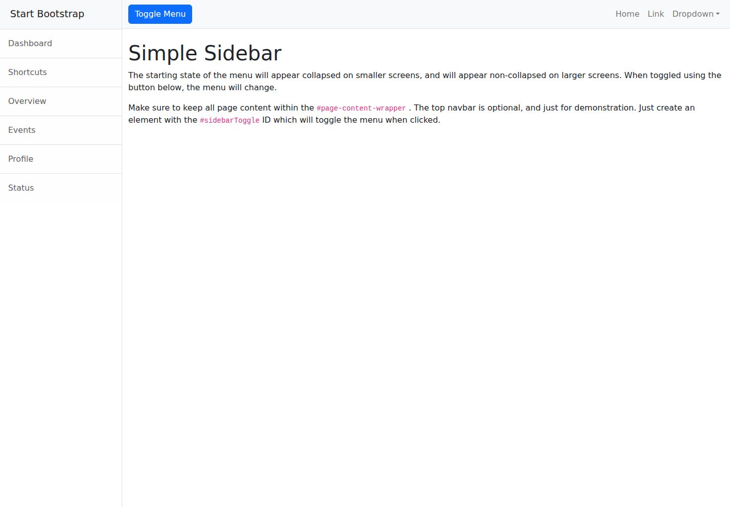
startbootstrap-simple-sidebar
A Bootstrap off-canvas sidebar navigation HTML starter template from Start Bootstrap. It provides directly editable HTML and CSS in the dist directory, while the source uses Pug, SCSS, and JavaScript with npm build scripts for live preview and compilation.
HTML · Starter
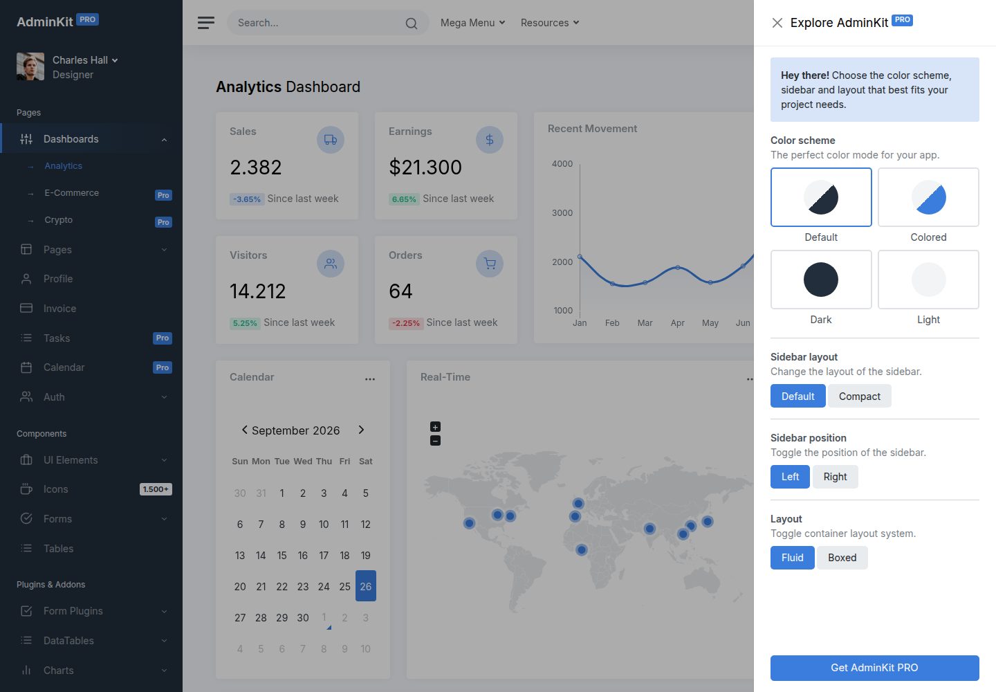
adminkit
AdminKit is a free, MIT-licensed HTML admin and dashboard template built on Bootstrap 5. The free version includes 15 demo pages, 1 plugin, and 1 color scheme, with hundreds of UI components, forms, tables, charts, and icons.
HTML · Admin dashboard
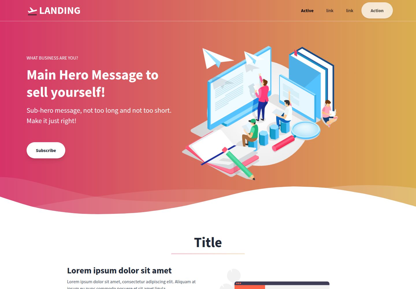
Landing-Page
A general-purpose landing page HTML template maintained by Tailwind Toolbox, written in pure HTML and loading the complete Tailwind CSS via CDN.
HTML · Corporate Website
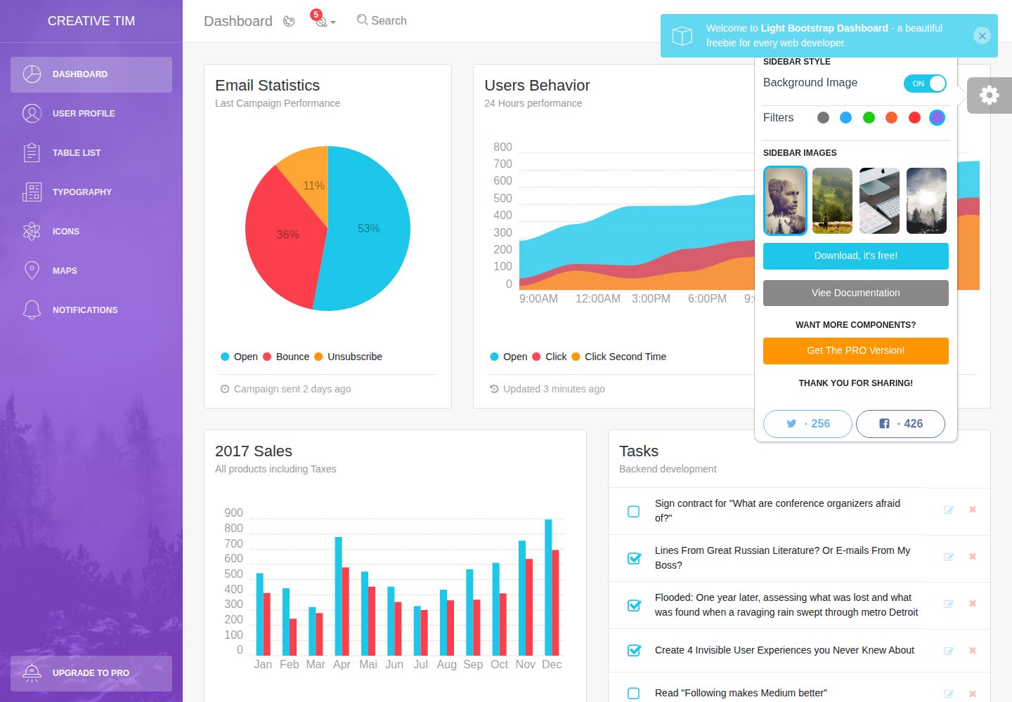
light-bootstrap-dashboard
Light Bootstrap Dashboard is a free, MIT-licensed admin dashboard template from Creative Tim, built on Bootstrap with a responsive static HTML structure.
HTML · Admin dashboard
sing-app
Sing App Lite is a free, open-source admin dashboard template from Flatlogic, built with Bootstrap 4.5 and SCSS. It provides a responsive layout, dashboard examples, typography, tables, notifications, basic charts, icons, maps, and a hover sidebar, along with styled Bootstrap components.
HTML · Admin dashboard
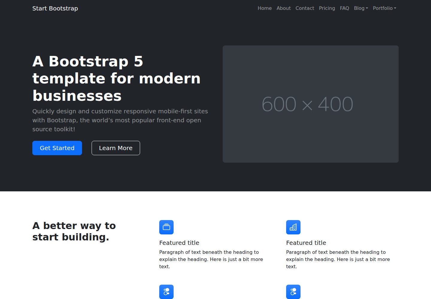
startbootstrap-modern-business
Modern Business is a multipurpose Bootstrap full-site HTML template from Start Bootstrap with 17 standalone pages covering home, about, services, portfolio, pricing, blog, FAQ, and contact.
HTML · Starter