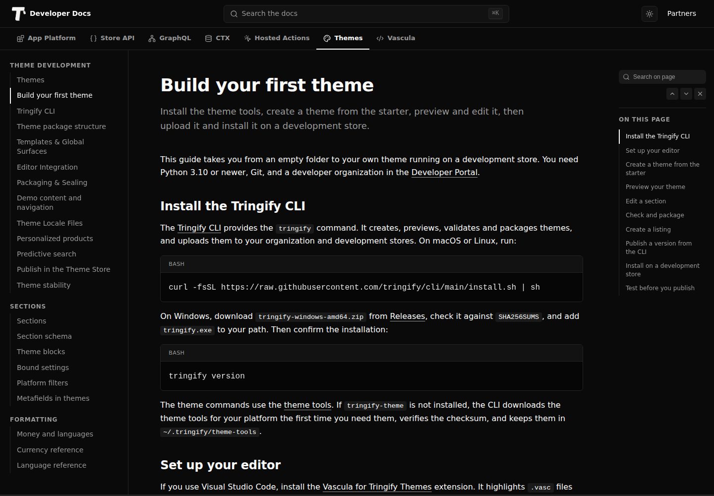
提供 38 个可编辑区块,覆盖商品发现、商品选项、购物车、客户访问、内容与法律页面等店铺界面
HTML电商启动器
theme-starter — HTML 电商模板
作者 tringify
Tringify 官方提供的电商店铺主题起始模板,基于 HTML 与 Vascula,包含 38 个可编辑区块和完整店铺页面模板,用于二次开发自定义主题。
看看你的网站会是什么样
浏览真实页面截图,比较内容排版与手机效果。点击下方缩略图切换,放大查看整页细节。
全部页面与视图 3
截图用于了解视觉与布局,交互效果请以实际项目为准。
采集于 2026-10-02查看来源
值得关注的模板亮点
从已有项目资料中,快速了解它的特点。
包含 home、shop、product、collection、cart、account、blogs、policies 等完整页面模板
内置 Paper 与 Soft Neutral 两套整站风格预设,各含浅色与反色配色方案
每个区块由 body.html、style.css、schema.json 组成,共享样式集中在 src/_shared.css
demo/catalog.json 提供 10 件商品及集合、分类、品牌、导航和三篇日志文章等预览数据
商品区块支持 Buy Now、图库布局、图片比例与完整显示或填充裁切等选项
模板详细介绍
theme-starter 是 Tringify 官方发布的店铺主题起始模板,采用 HTML 与 Vascula 编写,定位为构建 Tringify storefront 主题的起点。它提供 38 个可编辑区块,覆盖商品发现、商品选项、购物车操作、客户访问、内容、法律页面、店铺状态、本地化提示、同意控制以及可复用的首页区块。模板自带 home、shop、product、collection、category、brand、vendor、search、cart、wishlist、account、sign-in、registration、blogs、articles、pages、policies、order tracking、password access、maintenance、coming soon、not found 等完整页面模板,并包含 Paper 与 Soft Neutral 两套整站风格预设,均配有对应的浅色与反色配色方案。
开发工作流依赖 Tringify theme tools 提供的 tringify-theme 命令,要求 Python 3.10 或更高版本。可通过 GitHub 的 Use this template 创建仓库,或使用 tringify-theme init 从模板初始化新主题,随后用 tringify-theme preview 启动本地预览并在保存时自动重建。每个可编辑区块由 src/sections/<name>/ 下的 body.html、style.css 和 schema.json 组成,共享样式位于 src/_shared.css。发布前可用 tringify-theme check 校验,再用 tringify-theme package 打包为 ZIP,上传到 Tringify Developer Portal 的 Themes 区域并安装到开发店铺测试。
模板内置 demo/catalog.json 提供预览数据,包含 10 件商品、变体、色板、不可用选项、促销价、评分、六条购物车行、集合、分类、品牌、供应商、导航、页面以及三篇完整日志文章,仅用于本地预览,不会改动商户真实目录。主题设置提供正文字体与标题字体选择、正文尺寸、内容宽度、区块间距、圆角、按钮圆角、内容链接和配色方案等控制项。商品区块支持 Buy Now、图库布局、图片比例、完整显示或填充裁切等选项;页头支持 Logo 选择、品牌对齐、内联导航或菜单图标、搜索与账户可见性、购物车数量显示以及吸顶选项。菜单最多支持三级,演示菜单限制为每级最多 12 个同级项、每个完整菜单最多 48 项。
使用限制方面:模板代码采用 MIT 许可,可免费使用、修改、商用和分发,但分发时需保留版权声明与完整 MIT 许可声明;演示图片、字体、图标等第三方素材需按各自许可单独核对。域名、托管、数据库、支付或 AI 等外部服务可能另行收费。模板中的示例文案、配送门槛、库存或评价等声明不应直接用于正式店铺,发布前需在开发店铺用真实商品测试登录、注册、重发、错误提示、密码访问、图片缺失、长标题、键盘焦点和空状态等场景。
HTML电商启动器
适合你的项目吗?
适用场景
- 从零开始构建 Tringify 店铺主题,以该模板作为初始代码结构
- 在已有主题基础上扩展区块或调整页面模板,参考其区块组织与 schema 写法
- 为 Tringify 店铺搭建包含商品、购物车、账户、内容与法律页面的完整前端
- 在本地使用 demo 数据预览首页、商品页、购物车和内容页的渲染效果
- 通过主题设置调整字体、内容宽度、间距、圆角和配色方案,形成品牌外观
适合人群
- 熟悉 HTML、CSS 与 JSON 的前端开发者
- 需要为 Tringify 店铺开发自定义主题的团队
- 希望以官方起始模板为基准进行二次开发的商户或代理商
- 需要本地预览与打包流程来验证主题的开发者
上手与定制指南
结合仓库当前版本的说明,按下面的资料检查内容、配置与运行要求。
- 1
需安装 Tringify theme tools 以获得 tringify-theme 命令,并准备 Python 3.10 或更高版本
- 2
可通过 GitHub 的 Use this template 创建仓库,或使用 tringify-theme init 从模板初始化新主题
- 3
本地预览使用 tringify-theme preview,保存 src/sections/ 下的文件后预览会自动重建
- 4
发布前运行 tringify-theme check 校验,再用 tringify-theme package 打包为 ZIP 上传到 Tringify Developer Portal
- 5
demo/catalog.json 仅用于本地预览,正式店铺需在主题编辑器中选用真实商品与集合
授权与来源资料
使用条件与限制
免费使用 · 保留许可声明本次收录的是公开仓库中采用 MIT 许可的免费版本;免费范围为该版本代码,不代表外部服务或第三方素材免费。
使用时需要遵守
- 允许免费使用、修改、商用和分发该版本代码。
- 分发代码副本或实质性部分时,保留原作者版权声明和完整 MIT 许可声明。
- 代码按现状提供;担保与责任限制以原许可证及适用法律为准。
额外费用与待核对事项
- 开发与预览依赖外部工具 Tringify theme tools 提供的 tringify-theme 命令,并需 Python 3.10 或更高版本,属于额外环境要求。
- 发布主题需将打包 ZIP 上传至 Tringify Developer Portal 并安装到开发店铺,依赖 Tringify 平台账号与店铺环境。
- 内置图片仅为示例摄影素材,正式发布前需自行替换为符合店铺商品的图片,第三方素材许可需单独核对。
- 主题文件与浏览器代码中不得存放私有 API 凭证,涉及外部服务访问时需遵循其文档化授权模型。
- 通过校验仅确认包兼容性,不代表外观或购物流程正确,发布前仍需在开发店铺用真实商品测试。
- 演示图片、字体、图标及其他第三方素材需按各自许可核对,不能仅凭代码的 MIT 许可判断。
- 域名、托管、数据库、支付或 AI 等外部服务可能另外收费。
查看原文依据
Permission is hereby granted, free of charge
许可证原文
Tringify theme tools](https://github.com/tringify/theme-tools), which provide the `tringify-theme` command.
README 原文
Upload the ZIP in the Tringify Developer Portal under **Themes**, install it on a development store
README 原文
The bundled images provide sample photography. Choose imagery that represents the store's products before publishing.
README 原文
Keep private API credentials out of theme files and browser code.
README 原文
https://github.com/tringify/theme-starter/blob/main/LICENSEhttps://github.com/tringify/theme-starter/blob/main/README.mdPassing validation confirms package compatibility. It does not assess appearance or shopper flows.
README 原文
DeepSeek 根据仓库许可证和 README 整理 ·2026-10-02。结果仅覆盖已读取资料,依赖、图片、字体及后续条款变更以各自原文为准。
项目核对记录与介绍依据
模板资料
- 来源平台
- GitHub
- 资料与维护参考分
- 资料较完整 · 85 / 100
- 技术栈
- HTML
- 网站类型
- 电商 · 启动器
这个分数如何计算
本站按许可资料(最高30分)、演示链接(12分)、预览图(10分)、Star数(15分)、记录的维护时间(15分)、描述完整度(8分)、功能记录(5分)和分类资料(5分)计算。它不是代码、安全或性能测试,也不是 Google 评分;有链接不代表已实测可用。
这个项目需要核对什么
- 记录的仓库更新时间
- 2026-10-02
- 截图检查日期
- 2026-10-02
已收录演示链接。请用你的内容与屏幕尺寸检查;有演示不代表表单、认证或支付已经可用。
目录记录的主要技术栈是 HTML。请通过依赖清单和锁文件核对实际版本与托管要求。这些说明基于收录资料,不代表代码审计或部署实测。
查看具体选型方法 →介绍的制作与核对状态
介绍由 AI 辅助整理目录与仓库资料。仓库作者不等于这篇介绍的审核者。
已完成服务器许可规则与 AI 来源核对;未经过人工编辑审核。
查看当时使用的来源资料
SHA-256: d42357fd79565b241e986efb593a7d8f1251f843a6eca8740d0fa6af0c376a07
2026-10-02T15:55:17.215Z
来源文件 / 仓库# Tringify Starter Theme An editable Vascula theme for building Tringify storefronts. Use it as the starting point for your own theme. Starter provides 38 editable sections across every storefront surface: product discovery, product options, cart actions, customer access, content, legal pages, store states, localization prompts, consent controls, and reusable home-page sections. ## Requirements - [Tringify theme tools](https://github.com/tringify/theme-tools), which provide the `tringify-theme` command. - Python 3.10 or newer. ## Create your theme Select **Use this template** on GitHub to create your own repository from Starter, or clone it: ```sh git clone https://github.com/tringify/theme-starter tringify-theme init my-theme --from theme-starter --name "My Theme" cd my-theme tringify-theme preview ``` `init` creates a new directory, sets the theme name, builds the sections, and validates the result. Open the printed preview URL and edit the files under `src/sections/`; the preview rebuilds as you save. When the theme is ready: ```sh tringify-theme check tringify-theme package dist/my-theme.zip ``` Upload the ZIP in the Tringify Developer Portal under **Themes**, install it on a development store, and test it with that store's products. The [Build your first theme](https://dev-docs.tringify.com/themes/build-your-first-theme) guide walks through each step. ## Edit sections Each editable section has `body.html`, `style.css`, and `schema.json` under `src/sections/<name>/`. Shared styles live in `src/_shared.css`. Edit these source files, then build or package. Keep `src/.generated-sections.json` in version control. It identifies generated section files so the builder can remove obsolete outputs safely. Directly authored sections are preserved; do not edit generated `.vasc` files separately from their source. The builder updates the section index in `theme.json`. When adding or renaming a section, also update its surface permissions in `theme.json` and its instances in `templates/`. Declare the data a section reads in `ctx_needs`. Read fields such as `product.title` directly and use the `money` filter for storefront prices. Use documented form tags for shopper actions. Do not construct authentication or cart requests from undocumented fields. ## Sections and presets Starter includes full templates for home, shop, product, collection, category, brand, vendor, search, cart, wishlist, account, sign-in, registration, blogs, articles, pages, policies, order tracking, password access, maintenance, coming soon, not found, and global surfaces. Merchants can add featured products, featured collections, image with text, and rich text to the home page. Section presets provide alternate starting arrangements, including split and centered heroes, different product-grid densities, image placement choices, and text alignment choices. The theme includes two whole-theme style presets: - **Paper** — the default black-and-white presentation. - **Soft Neutral** — an optional warm neutral presentation. Both presets include matching light and inverse color schemes. They are starting points and remain editable in Store Admin. ## Reusable content blocks **Content Blocks** can be added to home, product, page, collection, category, brand, and vendor templates. It supports up to 12 ordered blocks. Add, reorder, hide, or remove blocks in the editor; their order is the reading order on the storefront. An empty section renders no surrounding space. Four reusable theme blocks are supplied: **Heading**, **Text**, **Button**, and **Image**. Their source is in `blocks/*.vasc`; edit the markup and schema together. A button appears after its label and link are supplied. An image appears after an image is selected, uses its full proportions, and has editable alternative text and an optional caption. The section also accepts compatible blocks from installed apps. **Story with Blocks** provides a heading and text as a starting arrangement. **Empty Content Section** starts without blocks. Section alignment and content width remain editable. Keep essential product selection and purchase controls in the product section; content blocks do not replace their validation. ## Buy Now The product section includes **Show Buy Now**. When enabled, Buy Now uses the selected variant and quantity and opens checkout for that selection. Items already in the shopper’s cart remain there. Both purchase buttons stay disabled until a required variant selection is complete. Buy Now uses the same product form with `name="purchase_intent" value="buy_now"` on its submit button. Keep the product, variant, quantity, and any declared buyer-writable properties in that form. The hosted action validates the selection before opening checkout. Do not clear the cart or add the selection to it first. Products requiring an app’s customization must use that app’s purchase action after the shopper completes the customization. A theme must not manufacture artifact identifiers or bypass the app’s required fields. Cart and wishlist actions show a dismissible confirmation with a link to the updated selection. The Global Overlay section listens to the documented `tf:action-done` event after the section refresh; it does not submit a second request. Buy Now opens checkout directly without showing an Add to Cart confirmation. Keep confirmation text in the theme's locale files. The product's wishlist button uses `tf:action-success` and the returned `product_session_state.product.wishlist.direct_saved` value to update its label. The shopper's selected options and quantity remain unchanged. This form saves the product itself; a saved variant does not make the product-only form say Remove from Wishlist. ## Customer and password forms Sign-in and registration use the methods enabled in Customer Settings. When both methods are available, the preferred method appears first. The phone field uses the supplied countries and calling codes, supports search, and preserves the national number when the shopper changes the calling code. Countries that share a calling code are not inferred from that code alone. Verification uses the six-digit code form. Email newsletter consent appears unchecked during email registration only when the store enables it. Password-protected stores use the store-password form and display its returned errors. The form display is not a substitute for platform validation. Check sign-in, registration, resend, errors, and password access against your development store before publishing. ## Demo catalog `demo/catalog.json` supplies realistic preview data without changing a merchant's catalog. It includes 10 products, variants, color swatches, unavailable options, sale pricing, ratings, six cart lines, collections, categories, brands, vendors, navigation, pages, and three complete journal articles. Choose products and collections for featured sections in the theme editor. On a live store, a featured section stays hidden until it has selected catalog items. Local previews populate these sections from the demo pack; fictional products and prices are never a live fallback. Content images use `image_url` with a fallback width, `image_srcset: max:` with a bounded candidate ladder, and `sizes` derived from the section's columns, gaps and breakpoints. `image_loading` assigns the first page-content image high priority, the next two eager loading, and later images lazy loading. Keep this filter out of global surfaces: header/footer logos stay explicitly eager and drawer images stay explicitly lazy. The bundled images provide sample photography. Choose imagery that represents the store's products before publishing. The home hero and Image with Text section also include an optional Starter image; choose an image in the editor to replace it, or turn off **Use Starter Image When Empty**. ## Design controls Starter starts with system fonts and includes separate **Body Font** and **Heading Font** pickers. System choices require no font download. Theme Settings also controls **Body Text Size**, **Content Width**, **Section Spacing**, **Corner Radius**, **Button Corner Radius**, **Content Links**, and color schemes. Range controls keep sizes within supported limits. The shared rules are in `src/_shared.css`; section-specific rules are in each section's `style.css`. In the product section, **Gallery Layout** controls the desktop arrangement. **Image Proportions** offers Square, Portrait, and Landscape frames. **Show Full Image** keeps the whole image visible, with space around it when its proportions differ from the frame. **Fill the Frame** fills the frame and may crop the edges. On smaller screens, multiple images scroll horizontally so shoppers can reach the product details without scrolling through every photo. The header includes a logo picker, logo width, brand alignment, inline desktop navigation or a menu icon, search and account visibility, cart-count visibility, and a sticky-header option. The default menu icon sits before the logo or store name on desktop and mobile, with an icon-only cart at the other end. Merchants can choose Inline Links for desktop navigation. Icons retain accessible labels. The header uses the selected menu. Until one is selected, it links to Shop and Collections. The announcement is off by default. Enable it and add wording that matches the store's actual offers; shipping thresholds should never be copied from sample content. Menus support three levels. Select a parent item to expand its children; **View All** opens the parent's destination when it has one. Label-only groups expand without an empty link. Links preserve the merchant's choice to open a new tab. Desktop navigation uses dropdowns, and the menu-icon layout keeps nested groups inside one scrolling panel. Disclosures can be activated using the keyboard. The demo menu includes both nested groups and a new-tab product link. Demo menus allow up to 12 sibling items, three levels, and 48 items in each complete menu. Each item has a `title`, a `target`, optional `children`, and optional `open_in_new_tab`. Use `label` for a non-linking group with children, `shop` or `collections` for indexes, and references such as `product:ceramic-mug` for catalog items. Invalid references are rejected when the theme is checked or imported. These are demo-pack limits; merchants manage their actual menus in Store Admin. ## Develop with real data Use both the author contract and a rendered example while building a section: ```sh tringify-theme contract tringify-theme context . --page product --entity ceramic-mug ``` `contract` describes the fields and allowed values. `context` shows sample values for the selected page. Neither replaces testing with the store's own products. Check products with and without images, descriptions, vendors, variants, sale prices, and quantity limits. Optional text can be `null`; an empty string also needs an explicit blank check when you want to hide its surrounding markup. Display prices using `money`, keep account or cart actions on their documented forms, and use resource pickers for merchant selections. Keep private API credentials out of theme files and browser code. Use GraphQL only through its documented access model; a sample CTX value is not authorization to access a customer's data. ## Review before publishing Check the home page, catalog, product, cart, account, and content pages at narrow mobile, tablet, and desktop widths. Review both presets, long titles, missing images, translated labels, keyboard focus, image cropping, and empty states. Check the rendered result after each design change; a successful package check cannot assess appearance. Keep developer instructions in this README or the documentation. Shopper-facing sample copy should read like storefront content. Write clear editor labels, provide useful empty states, and avoid claims about delivery, stock, reviews, or returns unless the store supplies them. ## Text and editor labels Shopper messages are in `locales/en.json`. Editor labels are in `locales/en.schema.json`. Keep both namespaces readable and translated when adding a language. Use sentence case for descriptions and title case for section, preset, and control names. ## Preview and import The local preview covers every current route and supports responsive inspection with the bundled demo catalog. It does not replace a development-store test for stateful shopper actions. Upload your package in the Developer Portal and install it on a development store as an inactive theme, then use the store preview and editor. Verify section and style presets, real product options, prices, cart updates, customer access, localization, consent, and mobile layouts with that store's configuration. Passing validation confirms package compatibility. It does not assess appearance or shopper flows. ## Documentation - [Build your first theme](https://dev-docs.tringify.com/themes/build-your-first-theme) - [Theme development](https://dev-docs.tringify.com/themes/) - [Theme package structure](https://dev-docs.tringify.com/themes/theme-package-structure) - [Vascula template language](https://vascula.dev) ## License Starter is available under the [MIT License](LICENSE). Build your own themes from it, including themes you publish.
看看同类模板
对比同技术栈与用途的模板,找到更适合的视觉与内容结构。
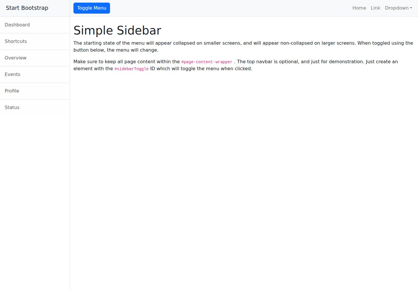
startbootstrap-simple-sidebar
An off canvas sidebar navigation Bootstrap HTML template created by Start Bootstrap
HTML · 启动器
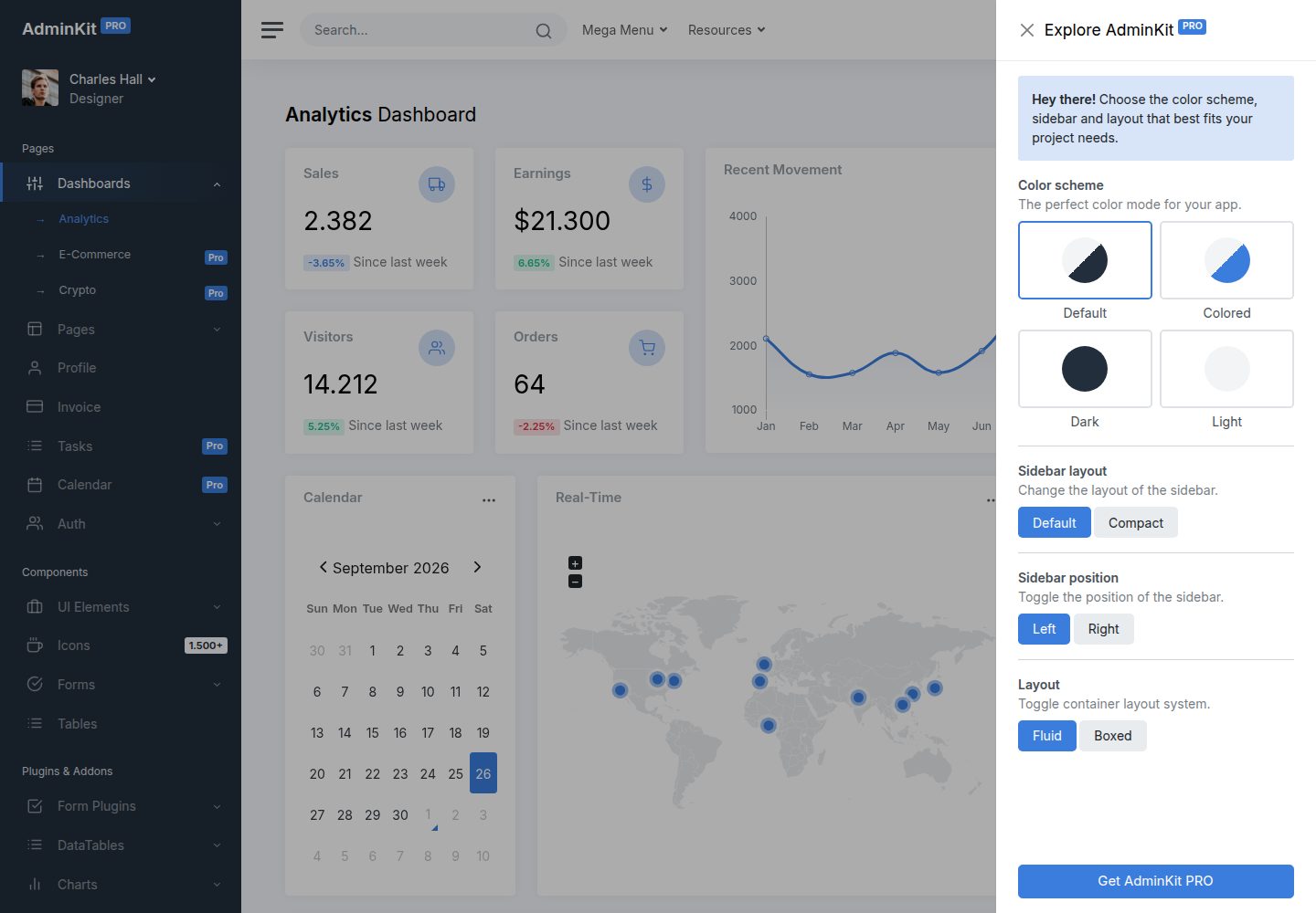
adminkit
AdminKit is a free & open-source HTML dashboard & admin template based on Bootstrap 5
HTML · 后台
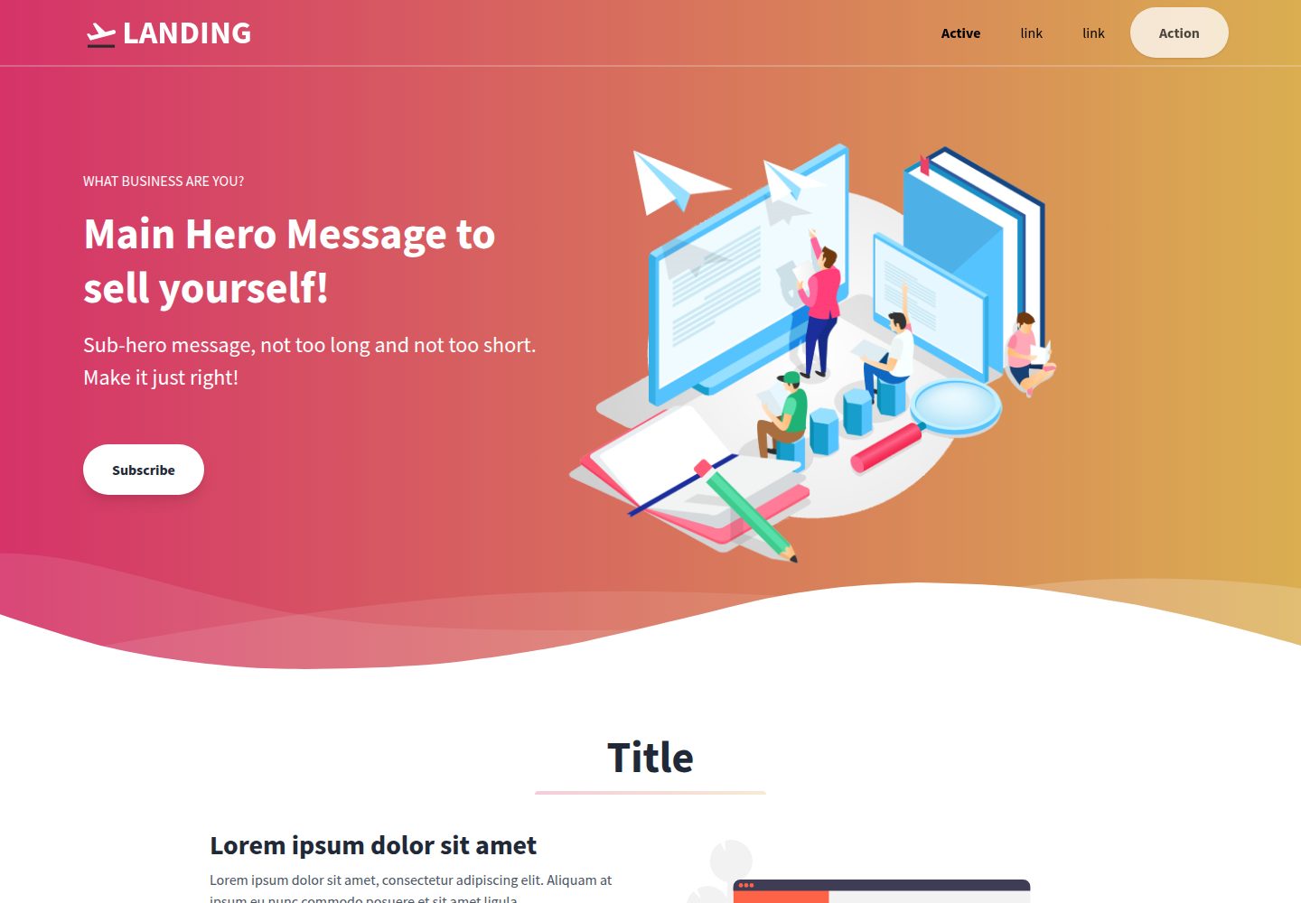
Landing-Page
Tailwind CSS Starter Template - Landing Page
HTML · 企业官网
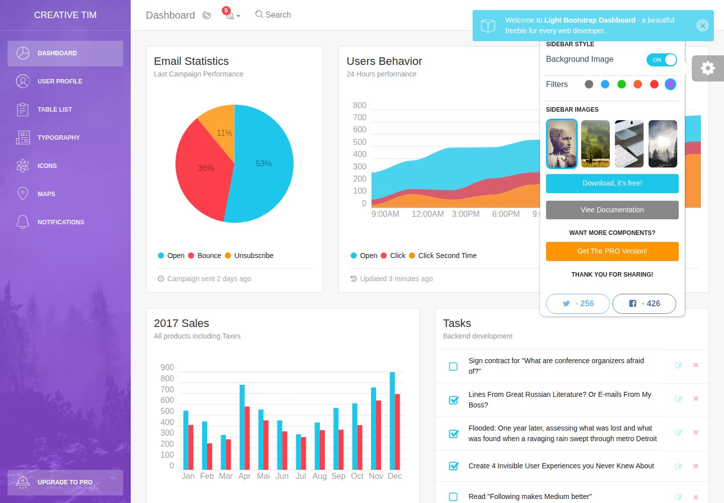
light-bootstrap-dashboard
Light Bootstrap Dashboard is an admin dashboard template designed to be beautiful and simple.
HTML · 后台
sing-app
💥Free and open-source admin dashboard template built with Bootstrap 4.5 💥
HTML · 后台
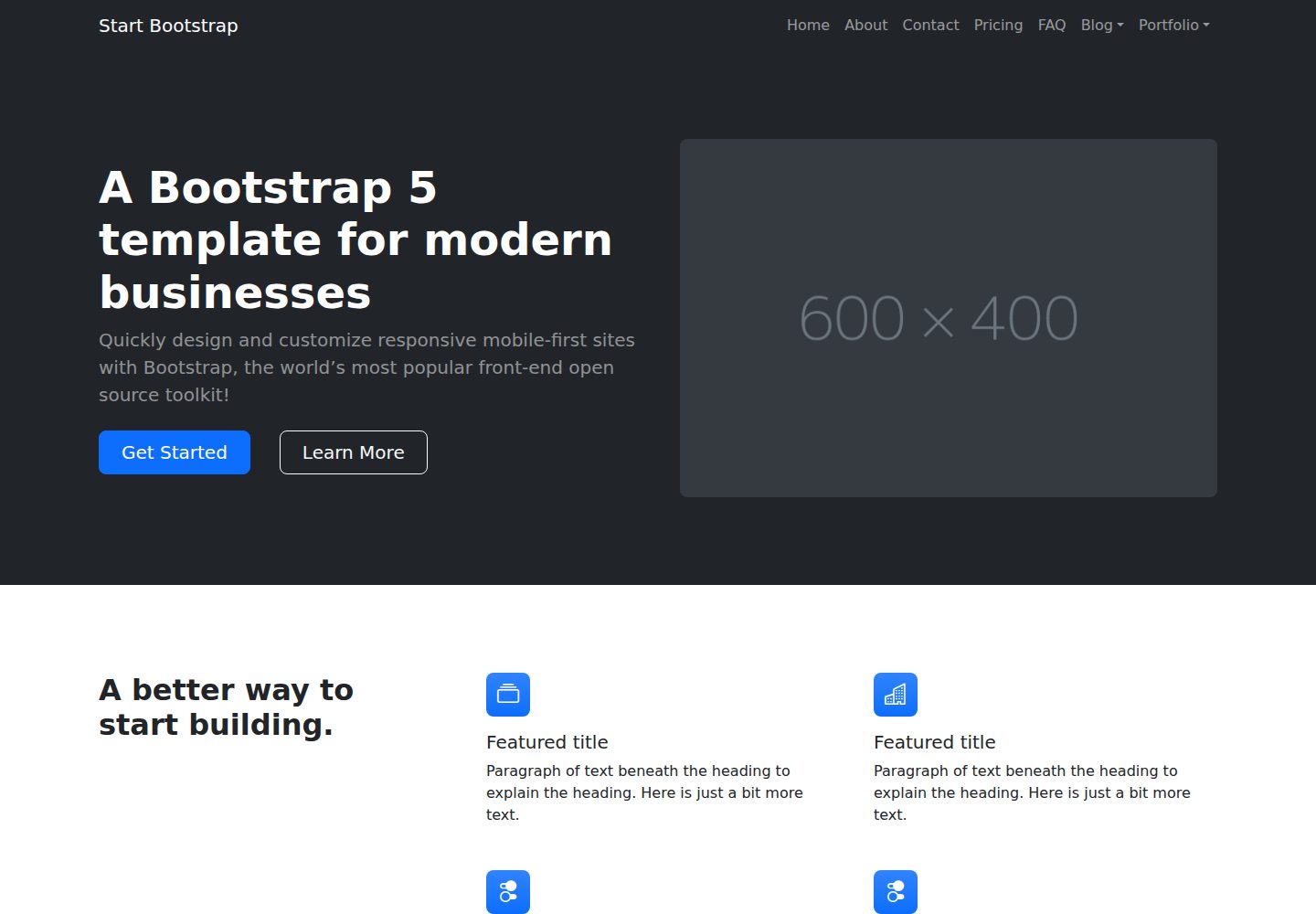
startbootstrap-modern-business
A multipurpose Bootstrap full website template created by Start Bootstrap
HTML · 启动器