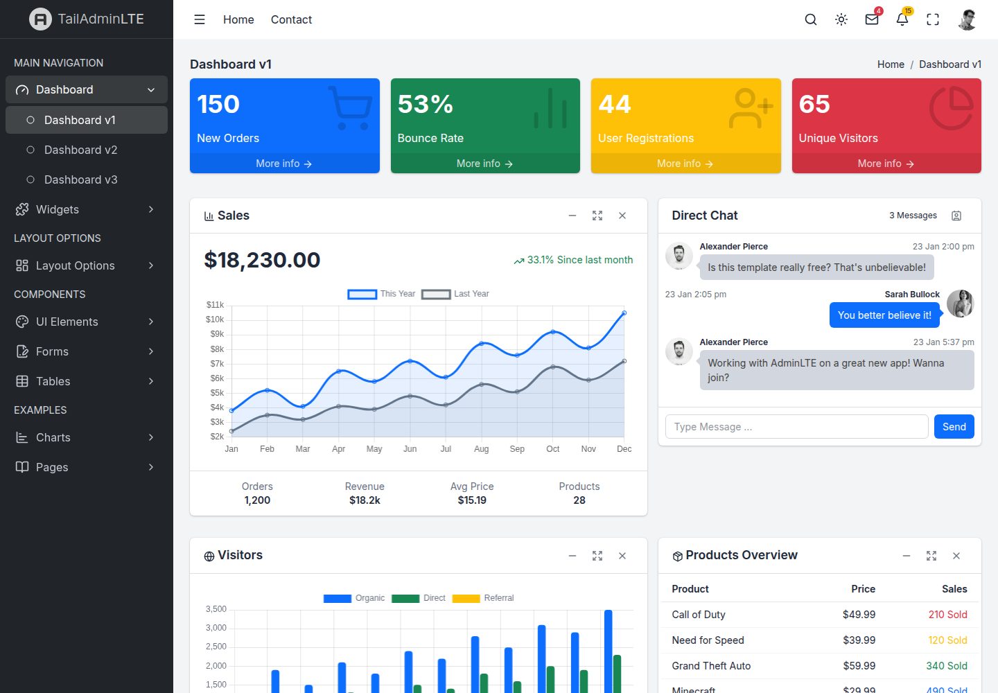
Includes 41 pages covering dashboards, widgets, UI elements, forms, tables, charts, layout variants, authentication, and error pages
ReactAdmin dashboard
tailadminlte-react — React Admin dashboard Template
By wilocampo
TailAdminLTE React is an AdminLTE v4-style admin template rewritten with React, TypeScript, and Tailwind CSS. It includes 41 pages and 24 reusable components under the MIT license.
Explore the design
Compare the page layouts and mobile experience. Open any screenshot for a closer look.
Desktop homepage1 / 2
Desktop captureTop of page
Actual screenshot captured by the server browser.
All pages & views 2
Screenshots show visual appearance; interactive behavior may differ.
Recorded 2026-10-13View source
What stands out
A quick read of the recorded project description.
Provides 24 reusable components, including SmallBox, InfoBox, AppCard, DirectChat, DataTable, AppAlert, AppModal, AppToast, AppCallout, and InputGroup
Uses Tailwind CSS v4 @theme design tokens to centrally manage style variables such as colors, sidebar width, and header height
Dark mode supports light, dark, and auto modes, persists via localStorage, and updates Chart.js chart colors responsively
Uses Zustand to manage sidebar, dark mode, layout, and accessibility state, and React Router 7 for nested layouts and lazy-loaded routes
The DataTable component includes built-in sorting, search, filtering, and pagination
Template Details
TailAdminLTE React is an admin dashboard template built with React 18, TypeScript, Vite, Tailwind CSS v4, Zustand, and React Router 7. Its goal is to reimplement the AdminLTE v4 interface using modern frontend technologies. The project provides 41 pages covering three dashboard sets, widgets, UI elements, forms, tables, charts, layout variants, authentication, and error pages. It also includes 24 reusable components such as SmallBox, InfoBox, AppCard, DirectChat, DataTable, AppAlert, AppModal, AppToast, AppCallout, InputGroup, and several Chart.js chart wrappers. State management uses Zustand to separately manage the sidebar, dark mode, layout, and accessibility settings. Routing uses React Router 7 with support for nested layouts and lazy-loaded pages. Dark mode offers light, dark, and auto modes, persisted to localStorage. Styling is centrally configured through Tailwind CSS v4 @theme design tokens. The project requires Node.js 18+ and npm 9+. The development server runs on port 3000 by default, and build output goes to the dist directory for deployment to static hosting services. The README also notes that HTML and Vue 3 versions exist, sharing the same CSS and visual output.
ReactAdmin dashboard
Is it right for your project?
Use Cases
- Development scenarios that need an AdminLTE-style admin interface rewritten with React and Tailwind CSS
- Quickly building admin dashboard prototypes that include dashboards, tables, charts, forms, and authentication pages
- Using ready-made cards, modals, notifications, alerts, data tables, and other common admin components in a project
- Admin projects that need light/dark/auto dark mode switching and chart colors that respond to theme changes
- As a reference project for learning how React 18, TypeScript, Zustand, React Router 7, and Tailwind CSS v4 work together
Suitable For
- Frontend developers familiar with React and TypeScript who need an admin dashboard template
- Projects that want to modify and extend the code under the MIT license
- Admin interface projects that need static deployment to hosting services such as Netlify, Vercel, or Cloudflare Pages
- Teams that prefer customizing styles with Tailwind CSS utility classes and design tokens
Getting started & customization
Use these recorded setup notes alongside the repository instructions for your chosen version.
- 1
Requires Node.js 18+ (LTS recommended) and npm 9+
- 2
After cloning the repository, run npm install to install dependencies, then run npm run dev to start the development server at http://localhost:3000 by default
- 3
Run npm run build to generate a production build in the dist directory; use npm run preview to preview the production build
- 4
The code is under the MIT license. When distributing copies or substantial portions of the code, retain the original author's copyright notice and the full MIT license notice
- 5
Demo images, fonts, icons, and other third-party assets must be checked against their respective licenses; the code's MIT license alone is not sufficient to determine their terms
License & source material
Usage conditions & limitations
Free to use · keep license noticeThis entry covers the free version in the public repository under the MIT license; the free scope applies to that version's code and does not mean external services or third-party assets are free.
Must comply with when using
- You may use, modify, commercialize, and distribute this version's code for free.
- When distributing copies or substantial portions of the code, retain the original author's copyright notice and the full MIT license notice.
- The code is provided as is; warranties and limitations of liability are governed by the original license and applicable law.
Additional costs & items to verify
- Demo images, fonts, icons, and other third-party assets must be checked against their respective licenses; the code's MIT license alone is not sufficient to determine their terms.
- External services such as domains, hosting, databases, payments, or AI may incur separate charges.
View Original Text Basis
https://github.com/wilocampo/tailadminlte-react/blob/main/LICENSEhttps://github.com/wilocampo/tailadminlte-react/blob/main/README.mdPermission is hereby granted, free of charge
Original License Text
Compiled by DeepSeek based on repository license and README ·2026-10-13. Results only cover the materials read; dependencies, images, fonts, and subsequent term changes are subject to their respective original texts.
Project checks & description sources
Template Information
- Source platforms
- GitHub
- Documentation and maintenance reference score
- More documented · 80 / 100
- Technologies
- React
- Website type
- Admin dashboard
How this score is calculated
Our heuristic uses license records (up to 30), a demo link (12), a preview (10), stars (15), recorded maintenance (15), description completeness (8), feature records (5) and classification data (5). It is not a code, security or performance test, or a Google score. A link does not establish tested functionality.
What to verify for this project
- Repository update recorded
- 2026-03-24
- Screenshot last checked
- 2026-10-13
A demo link is listed. Check it with your own content and viewport sizes; its presence does not confirm that forms, authentication or payments work.
The catalog identifies React as the primary stack. Check the actual dependency manifest and lockfile for versions and hosting requirements. These notes use recorded metadata, not a code audit or a deployment test.
Use a selection guide →How this description was prepared
AI-assisted description based on catalog records and repository material. Repository authors are not automatically the reviewers of this description.
Review declaration: [email protected] · 2026-10-13
Inspect the recorded source material
SHA-256: d2b471a9a0e08045c56ef3c20f991189007df0dd51baf3268b859720e5f40a6b
2026-10-13T11:27:10.667Z
Source file / repository# TailAdminLTE React
**AdminLTE v4 reimagined with React 18 + Tailwind CSS** — A free, open-source admin dashboard template built with React 18, TypeScript, Zustand, and React Router. Clone it and build your next admin panel on top.
<h3 align="center">
<a href="https://tailadminlte-react.vercel.app/">Live Demo</a>
</h3>
<p align="center">
<a href="https://tailadminlte-react.vercel.app/">
<img src="docs/screenshots/dashboard-v1-light.png" alt="TailAdminLTE React Dashboard" width="100%">
</a>
</p>
<p align="center">
<a href="https://tailadminlte-react.vercel.app/">Live Demo</a> •
<a href="#features">Features</a> •
<a href="#screenshots">Screenshots</a> •
<a href="#quick-start">Quick Start</a> •
<a href="#tech-stack">Tech Stack</a> •
<a href="#project-structure">Project Structure</a> •
<a href="#pages">Pages</a> •
<a href="#components">Components</a> •
<a href="#dark-mode">Dark Mode</a> •
<a href="#customization">Customization</a> •
<a href="#other-versions">Other Versions</a> •
<a href="#credits">Credits</a> •
<a href="#license">License</a>
</p>
---
## Features
- **41+ pages** — Dashboards, widgets, UI elements, forms, tables, charts, auth pages, error pages, layout demos, and more
- **React 18** — Functional components with hooks throughout
- **24 reusable components** — SmallBox, InfoBox, AppCard, DirectChat, DataTable, chart wrappers, modals, alerts, and more
- **Tailwind CSS v4** — CSS-first configuration with custom design tokens via `@theme`
- **Zustand** — Lightweight state management for sidebar, dark mode, layout, and accessibility
- **React Router 7** — SPA with nested layouts, lazy-loaded pages, and route handle metadata
- **Chart.js + react-chartjs-2** — Interactive charts with reactive dark mode color adaptation
- **Dark mode** — Three modes (Light / Dark / Auto) with `localStorage` persistence and system preference detection
- **Fully responsive** — Mobile-first design with collapsible sidebar, responsive grids, and touch-friendly interactions
- **Accessible** — WCAG 2.1 AA features: skip links, ARIA labels, keyboard navigation, reduced motion support
- **TypeScript** — Full type safety with shared interfaces and typed component props
- **Fast builds** — Vite-powered dev server with HMR and optimized production builds with code splitting
---
## Screenshots
### Dashboard — Light & Dark Mode
| Light Mode | Dark Mode |
|:---:|:---:|
|  |  |
### Dashboard Variants
| Dashboard v2 | Dashboard v3 |
|:---:|:---:|
|  |  |
### Widgets
| Small Box Widgets | Card Widgets |
|:---:|:---:|
|  |  |
### Charts
| Chart.js Charts | Inline/Sparkline Charts |
|:---:|:---:|
|  |  |
### UI Elements
| General UI | Buttons | Modals |
|:---:|:---:|:---:|
|  |  |  |
### Forms & Tables
| Form Elements | Data Tables |
|:---:|:---:|
|  |  |
### Auth & Example Pages
| Login v1 | Login v2 | Profile |
|:---:|:---:|:---:|
|  |  |  |
| Invoice | 404 Error | RTL Layout |
|:---:|:---:|:---:|
|  |  |  |
### Mobile Responsive
<p align="center">
<img src="docs/screenshots/mobile-view.png" alt="Mobile View" width="280">
</p>
---
## Quick Start
### Prerequisites
- [Node.js](https://nodejs.org/) 18+ (LTS recommended)
- npm 9+
### Installation
```bash
# Clone the repository
git clone https://github.com/wilocampo/tailadminlte-react.git
cd tailadminlte-react
# Install dependencies
npm install
# Start development server
npm run dev
```
Open [http://localhost:3000](http://localhost:3000) in your browser.
### Build for Production
```bash
npm run build
```
Output is in the `dist/` directory, ready to deploy to any static hosting service (Netlify, Vercel, Cloudflare Pages, etc.).
### Preview Production Build
```bash
npm run preview
```
---
## Tech Stack
| Technology | Version | Purpose |
|:---|:---|:---|
| [React](https://react.dev/) | 18.x | UI framework with functional components + hooks |
| [TypeScript](https://www.typescriptlang.org/) | 5.x | Type safety |
| [Vite](https://vitejs.dev/) | 8.x | Build tool and dev server with HMR |
| [React Router](https://reactrouter.com/) | 7.x | SPA routing with nested layouts |
| [Zustand](https://zustand.docs.pmnd.rs/) | 5.x | Lightweight state management |
| [Tailwind CSS](https://tailwindcss.com/) | v4 | CSS-first utility framework with `@theme` tokens |
| [Lucide React](https://lucide.dev/) | latest | 1500+ SVG icon components |
| [Chart.js](https://www.chartjs.org/) | 4.x | Interactive data visualization |
| [react-chartjs-2](https://react-chartjs-2.js.org/) | 5.x | React wrapper for Chart.js |
---
## Project Structure
```
src/
├── assets/
│ └── css/
│ ├── app.css # Tailwind v4 entry + @theme design tokens
│ ├── layout/ # Grid: app-wrapper, header, sidebar, footer, main
│ ├── components/ # Widget CSS: cards, small-box, info-box, etc.
│ └── pages/ # Page-specific CSS: auth, lockscreen
├── components/
│ ├── layout/ # AppHeader, AppSidebar, AppFooter, ContentHeader,
│ │ # SidebarMenu, SidebarMenuItem
│ ├── widgets/ # SmallBox, InfoBox, AppCard, DirectChat
│ ├── ui/ # AppAlert, AppModal, AppToast, AppCallout, DarkModeToggle
│ ├── charts/ # LineChart, BarChart, DoughnutChart, PieChart,
│ │ # RadarChart, PolarAreaChart, MixedChart
│ ├── forms/ # InputGroup
│ └── tables/ # DataTable (sort, search, paginate)
├── hooks/
│ ├── useCardWidget.ts # Card collapse/maximize/remove logic
│ ├── useSlideToggle.ts # Animate height open/close
│ ├── useFullscreen.ts # Fullscreen API wrapper
│ ├── useThemeColors.ts # Reactive chart colors for dark mode
│ └── useTodoList.ts # Todo state management
├── stores/
│ ├── sidebar.ts # useSidebarStore (Zustand)
│ ├── darkMode.ts # useDarkModeStore (Zustand)
│ ├── layout.ts # useLayoutStore (Zustand)
│ └── accessibility.ts # useAccessibilityStore (Zustand)
├── layouts/
│ ├── DefaultLayout.tsx # Sidebar + header + main + footer
│ ├── AuthLayout.tsx # Centered card, no sidebar
│ └── ErrorLayout.tsx # Full-page error display
├── pages/ # 41 page components organized by category
├── data/
│ └── navigation.ts # Typed sidebar menu structure
├── router/
│ └── index.tsx # React Router with nested layout routes
├── types/
│ └── index.ts # Shared TypeScript interfaces
└── main.tsx # App init: React DOM, Router, Chart.js, stores
```
---
## Pages
### Dashboards (3)
- **Dashboard v1** — Sales line chart, direct chat, visitor bar chart, small boxes, info boxes
- **Dashboard v2** — Revenue/expense charts, orders table, goal completion, quick stats
- **Dashboard v3** — Doughnut chart, interactive todo list, activity timeline, system metrics
### Widgets (3)
- **Small Box** — All color variants with icons and footer links
- **Info Box** — With and without progress bars
- **Cards** — Outlined, colored, tabbed, collapsed, loading overlay, interactive tools
### UI Elements (5)
- **General** — Alerts, badges, callouts, progress bars, spinners, dropdowns, accordion
- **Icons** — Searchable Lucide icons grid
- **Timeline** — Vertical timeline with mixed content
- **Buttons** — Solid, outline, sizes, groups, gradients, icon buttons, loading states
- **Modals** — Default, sized, scrollable, centered, colored headers, form modals
### Forms (2) • Tables (2) • Charts (2)
### Layout Variants (10) • Auth & Error Pages (7) • Example Pages (7)
**41 pages total** — see [the live demo](https://tailadminlte-react.vercel.app/) for the full experience.
---
## Components
### Widget Components
| Component | Props | Description |
|:---|:---|:---|
| `SmallBox` | `bgColor`, `value`, `label`, `icon`, `link?`, `linkText?` | KPI stat widget |
| `InfoBox` | `icon`, `iconBg`, `label`, `value`, `progressValue?`, `progressColor?` | Metric box with optional progress |
| `AppCard` | `title?`, `icon?`, `interactive?`, `collapsed?`, `loading?`, `children`, `footer?`, `header?`, `tools?` | Universal card with collapse/maximize/remove |
| `DirectChat` | `title`, `variant?`, `messages`, `contacts`, `badgeCount?`, `onSend?` | Chat widget |
### UI Components
| Component | Props | Description |
|:---|:---|:---|
| `AppAlert` | `variant`, `icon?`, `title?`, `dismissible?`, `children` | Inline alert |
| `AppModal` | `open`, `onOpenChange`, `title`, `size?`, `children`, `footer?` | Dialog modal with portal |
| `AppToast` | `variant`, `title`, `message`, `autoDismiss?`, `delay?`, `onClose?` | Floating notification |
| `AppCallout` | `variant`, `title?`, `children` | Information block |
| `DataTable` | `columns`, `rows`, `searchable?`, `filterable?`, `pageSize?`, `renderCell?` | Sort, search, filter, paginate |
| `InputGroup` | `value`, `onChange`, `type?`, `icon?`, `iconPosition?` | Input with icon |
### Chart Components
All share: `data`, `options?`, `height?` props with reactive dark mode colors.
`LineChart` • `BarChart` • `DoughnutChart` • `PieChart` • `RadarChart` • `PolarAreaChart` • `MixedChart`
---
## Dark Mode
Three modes: **Light** (default), **Dark**, **Auto** (follows system preference).
```tsx
import { useDarkModeStore } from '@/stores/darkMode'
function MyComponent() {
const { mode, toggle, setMode } = useDarkModeStore()
return <button onClick={toggle}>Current: {mode}</button>
}
```
Toggle via the navbar icon. Persisted to `localStorage`. Charts reactively update colors.
---
## Customization
### Design Tokens
All tokens in `src/assets/css/app.css` via Tailwind v4's `@theme`:
```css
@theme {
--color-primary: #0d6efd;
--color-success: #198754;
--sidebar-width: 250px;
--header-height: 3.5rem;
/* ... */
}
```
### Adding a New Page
1. Create `src/pages/custom/MyPage.tsx`
2. Add route in `src/router/index.tsx` with `handle: { activePage, pageTitle }`
3. Optionally add sidebar item in `src/data/navigation.ts`
---
## Other Versions
| Version | Repository | Demo |
|:---|:---|:---|
| **HTML** (Alpine.js + Handlebars) | [tailadminlte](https://github.com/wilocampo/tailadminlte) | — |
| **Vue 3** (Pinia + Vue Router) | [tailadminlte-vue](https://github.com/wilocampo/tailadminlte-vue) | [Demo](https://tailadminlte-vue.vercel.app/) |
| **React 18** (Zustand + React Router) | This repo | [Demo](https://tailadminlte-react.vercel.app/) |
All versions share identical CSS and produce pixel-for-pixel identical visual output.
---
## Credits
TailAdminLTE is a **community recreation** of [AdminLTE](https://adminlte.io/) using Tailwind CSS.
- **Original project:** [AdminLTE v4](https://github.com/ColorlibHQ/AdminLTE) by [ColorlibHQ](https://github.com/ColorlibHQ) (MIT License)
- [React](https://react.dev/) • [Tailwind CSS](https://tailwindcss.com/) • [Vite](https://vitejs.dev/) • [Zustand](https://zustand.docs.pmnd.rs/) • [Chart.js](https://www.chartjs.org/) • [Lucide](https://lucide.dev/) • [Inter font](https://rsms.me/inter/)
### Disclaimer
TailAdminLTE is an **independent project** not affiliated with or endorsed by AdminLTE or ColorlibHQ.
---
## Contributing
Contributions welcome! Fork, branch, commit, push, PR.
---
## License
[MIT](LICENSE) — same as the original AdminLTE.
Explore similar templates
Compare previews and descriptions within the same stack and category.
ant-design-pro
Ant Design Pro is an enterprise-grade React admin scaffold built on React 19, Umi Max 4, and antd 6 with TypeScript.
React · Admin dashboard
coreui-free-react-admin-template
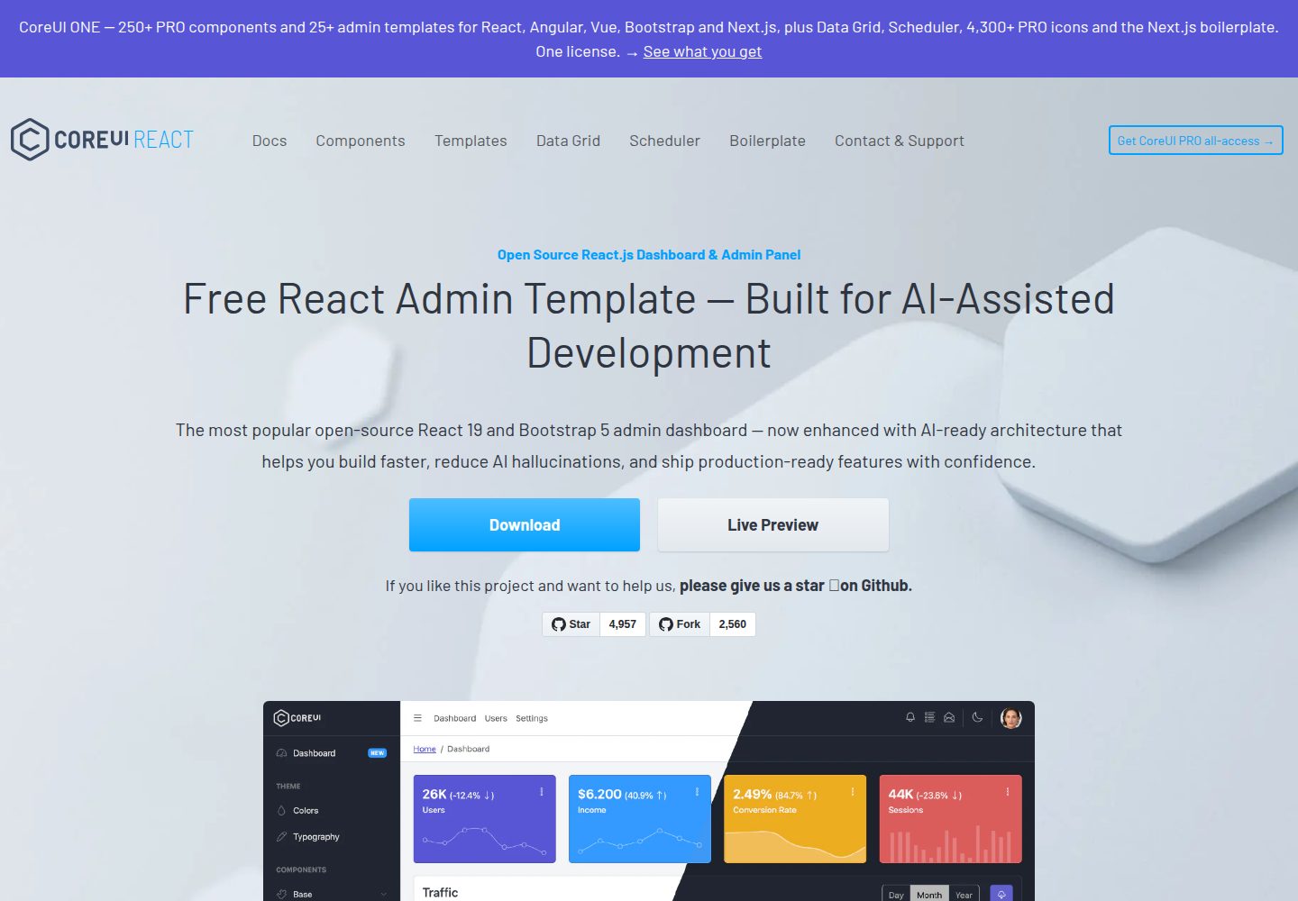
CoreUI's free React admin template, built on React and the CoreUI component library, provides dashboard layouts, sidebar navigation, routing, and example views. It includes .cursorrules, ARCHITECTURE.md, and DEVELOPMENT.md context files, plus JSDoc comments and PropTypes, to support AI-assisted development.
React · Admin dashboard
fastapi-react
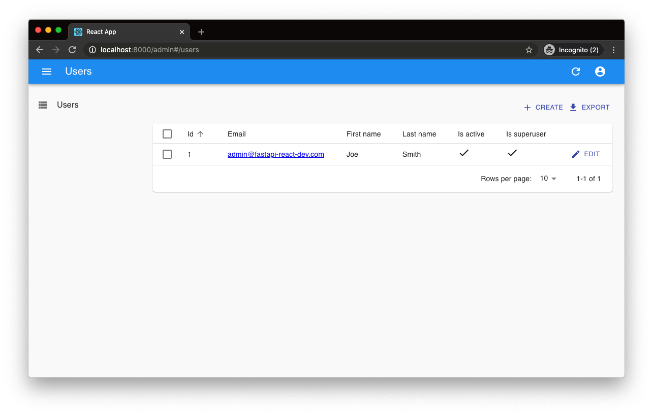
A Cookiecutter template for FastAPI + React (TypeScript) full-stack projects, integrating PostgreSQL, SQLAlchemy, Alembic, Celery, Redis, JWT authentication, a react-admin admin panel, and a Docker Compose development environment with Nginx reverse proxy.
React · Admin dashboard

react-antd-admin-template
A React + Ant Design admin template for mid- and back-office products, with built-in login/logout, dynamic routing, permission checks, and user management.
React · Admin dashboard
react-saas-template
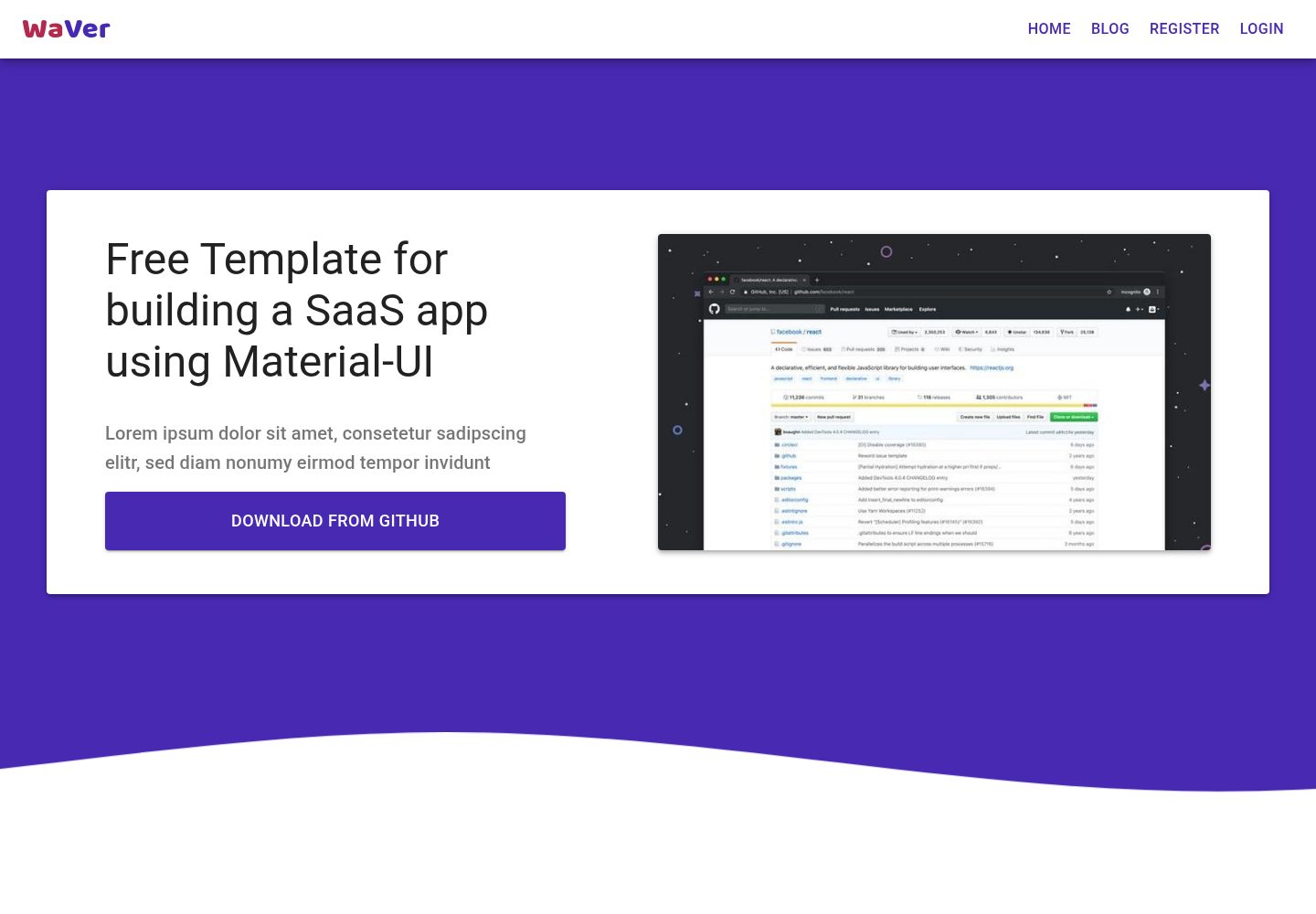
A React and Material-UI template for SaaS or admin websites, offering dashboard, chart, blog, payment, and file upload components. It uses Create-React-App, React-Router, Recharts, React-Stripe-js, React-Dropzone, and React-Cropper, with theme colors centralized in src/theme.js.
React · Admin dashboard
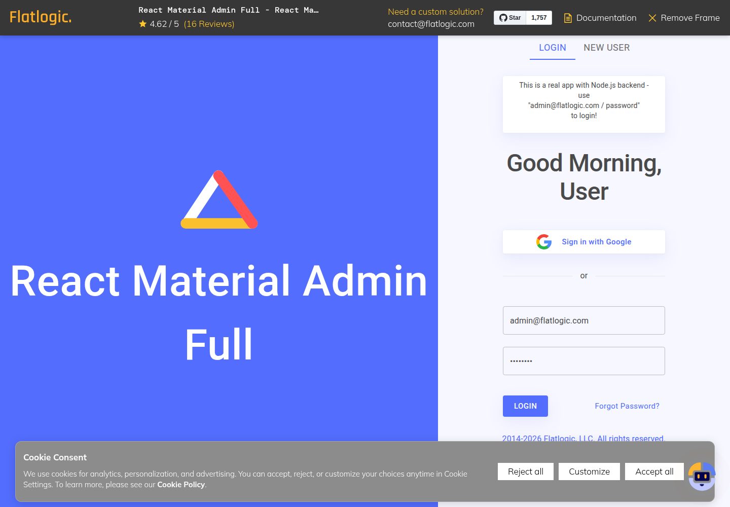
react-material-admin
React Material Admin is an MIT-licensed React admin template by Flatlogic, built on Material-UI. It provides dashboards, charts, tables, authentication, profile, and notification pages, with three color themes and responsive layouts.
React · Admin dashboard