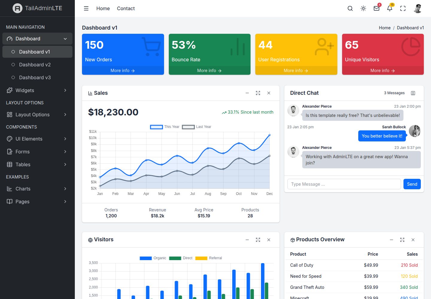
包含 41 个页面,覆盖仪表盘、小部件、UI 元素、表单、表格、图表、布局变体、认证与错误页等分类
React后台
tailadminlte-react — React 后台模板
作者 wilocampo
TailAdminLTE React 是用 React、TypeScript 与 Tailwind CSS 重写的 AdminLTE v4 风格后台模板,包含 41 个页面与 24 个可复用组件,采用 MIT 许可。
看看你的网站会是什么样
浏览真实页面截图,比较内容排版与手机效果。点击下方缩略图切换,放大查看整页细节。
全部页面与视图 2
截图用于了解视觉与布局,交互效果请以实际项目为准。
采集于 2026-10-13查看来源
值得关注的模板亮点
从已有项目资料中,快速了解它的特点。
提供 24 个可复用组件,包括 SmallBox、InfoBox、AppCard、DirectChat、DataTable、AppAlert、AppModal、AppToast、AppCallout 与 InputGroup
使用 Tailwind CSS v4 的 @theme 设计令牌集中管理颜色、侧边栏宽度、头部高度等样式变量
深色模式支持浅色、深色、自动三种模式,通过 localStorage 持久化,并让 Chart.js 图表颜色响应式更新
采用 Zustand 管理侧边栏、深色模式、布局与无障碍状态,使用 React Router 7 实现嵌套布局与懒加载路由
DataTable 组件内置排序、搜索、筛选与分页能力
模板详细介绍
TailAdminLTE React 是一个基于 React 18、TypeScript、Vite、Tailwind CSS v4、Zustand 与 React Router 7 构建的后台管理模板,目标是把 AdminLTE v4 的界面用现代前端技术重新实现。项目提供 41 个页面,覆盖三套仪表盘、小部件、UI 元素、表单、表格、图表、布局变体、认证与错误页等;同时包含 24 个可复用组件,如 SmallBox、InfoBox、AppCard、DirectChat、DataTable、AppAlert、AppModal、AppToast、AppCallout、InputGroup 以及多种 Chart.js 图表封装。状态管理使用 Zustand,分别管理侧边栏、深色模式、布局与无障碍设置;路由使用 React Router 7,支持嵌套布局与懒加载页面。深色模式提供浅色、深色、自动三种模式,并持久化到 localStorage。样式通过 Tailwind CSS v4 的 @theme 设计令牌集中配置。项目要求 Node.js 18+ 与 npm 9+,开发服务器默认运行在 3000 端口,构建产物输出到 dist 目录,可部署到静态托管服务。README 还说明存在 HTML 与 Vue 3 版本,三者共享相同 CSS 与视觉输出。
React后台
适合你的项目吗?
适用场景
- 需要一套 AdminLTE 风格后台界面,并希望用 React 与 Tailwind CSS 重写实现的开发场景
- 快速搭建包含仪表盘、表格、图表、表单和认证页的管理后台原型
- 在项目中使用现成的卡片、模态框、通知、警告、数据表格等后台常用组件
- 需要浅色/深色/自动深色模式切换,并希望图表颜色随主题响应式变化的后台项目
- 作为学习 React 18、TypeScript、Zustand、React Router 7 与 Tailwind CSS v4 组合使用的参考项目
适合人群
- 熟悉 React 与 TypeScript,需要后台管理模板的前端开发者
- 希望基于 MIT 许可代码进行修改和二次开发的项目
- 需要静态部署到 Netlify、Vercel 或 Cloudflare Pages 等托管服务的后台界面项目
- 偏好 Tailwind CSS 工具类与设计令牌方式定制样式的团队
上手与定制指南
结合仓库当前版本的说明,按下面的资料检查内容、配置与运行要求。
- 1
需要 Node.js 18+(建议 LTS)与 npm 9+
- 2
克隆仓库后运行 npm install 安装依赖,再运行 npm run dev 启动开发服务器,默认地址为 http://localhost:3000
- 3
运行 npm run build 生成生产构建,输出目录为 dist;可用 npm run preview 预览生产构建
- 4
代码采用 MIT 许可,分发代码副本或实质性部分时需保留原作者版权声明和完整 MIT 许可声明
- 5
演示图片、字体、图标及其他第三方素材需按各自许可核对,不能仅凭代码的 MIT 许可判断
授权与来源资料
使用条件与限制
免费使用 · 保留许可声明本次收录的是公开仓库中采用 MIT 许可的免费版本;免费范围为该版本代码,不代表外部服务或第三方素材免费。
使用时需要遵守
- 允许免费使用、修改、商用和分发该版本代码。
- 分发代码副本或实质性部分时,保留原作者版权声明和完整 MIT 许可声明。
- 代码按现状提供;担保与责任限制以原许可证及适用法律为准。
额外费用与待核对事项
- 演示图片、字体、图标及其他第三方素材需按各自许可核对,不能仅凭代码的 MIT 许可判断。
- 域名、托管、数据库、支付或 AI 等外部服务可能另外收费。
查看原文依据
https://github.com/wilocampo/tailadminlte-react/blob/main/LICENSEhttps://github.com/wilocampo/tailadminlte-react/blob/main/README.mdPermission is hereby granted, free of charge
许可证原文
DeepSeek 根据仓库许可证和 README 整理 ·2026-10-13。结果仅覆盖已读取资料,依赖、图片、字体及后续条款变更以各自原文为准。
项目核对记录与介绍依据
模板资料
- 来源平台
- GitHub
- 资料与维护参考分
- 资料较完整 · 80 / 100
- 技术栈
- React
- 网站类型
- 后台
这个分数如何计算
本站按许可资料(最高30分)、演示链接(12分)、预览图(10分)、Star数(15分)、记录的维护时间(15分)、描述完整度(8分)、功能记录(5分)和分类资料(5分)计算。它不是代码、安全或性能测试,也不是 Google 评分;有链接不代表已实测可用。
这个项目需要核对什么
- 记录的仓库更新时间
- 2026-03-24
- 截图检查日期
- 2026-10-13
已收录演示链接。请用你的内容与屏幕尺寸检查;有演示不代表表单、认证或支付已经可用。
目录记录的主要技术栈是 React。请通过依赖清单和锁文件核对实际版本与托管要求。这些说明基于收录资料,不代表代码审计或部署实测。
查看具体选型方法 →介绍的制作与核对状态
介绍由 AI 辅助整理目录与仓库资料。仓库作者不等于这篇介绍的审核者。
审核声明: [email protected] · 2026-10-13
查看当时使用的来源资料
SHA-256: d2b471a9a0e08045c56ef3c20f991189007df0dd51baf3268b859720e5f40a6b
2026-10-13T11:27:10.667Z
来源文件 / 仓库# TailAdminLTE React
**AdminLTE v4 reimagined with React 18 + Tailwind CSS** — A free, open-source admin dashboard template built with React 18, TypeScript, Zustand, and React Router. Clone it and build your next admin panel on top.
<h3 align="center">
<a href="https://tailadminlte-react.vercel.app/">Live Demo</a>
</h3>
<p align="center">
<a href="https://tailadminlte-react.vercel.app/">
<img src="docs/screenshots/dashboard-v1-light.png" alt="TailAdminLTE React Dashboard" width="100%">
</a>
</p>
<p align="center">
<a href="https://tailadminlte-react.vercel.app/">Live Demo</a> •
<a href="#features">Features</a> •
<a href="#screenshots">Screenshots</a> •
<a href="#quick-start">Quick Start</a> •
<a href="#tech-stack">Tech Stack</a> •
<a href="#project-structure">Project Structure</a> •
<a href="#pages">Pages</a> •
<a href="#components">Components</a> •
<a href="#dark-mode">Dark Mode</a> •
<a href="#customization">Customization</a> •
<a href="#other-versions">Other Versions</a> •
<a href="#credits">Credits</a> •
<a href="#license">License</a>
</p>
---
## Features
- **41+ pages** — Dashboards, widgets, UI elements, forms, tables, charts, auth pages, error pages, layout demos, and more
- **React 18** — Functional components with hooks throughout
- **24 reusable components** — SmallBox, InfoBox, AppCard, DirectChat, DataTable, chart wrappers, modals, alerts, and more
- **Tailwind CSS v4** — CSS-first configuration with custom design tokens via `@theme`
- **Zustand** — Lightweight state management for sidebar, dark mode, layout, and accessibility
- **React Router 7** — SPA with nested layouts, lazy-loaded pages, and route handle metadata
- **Chart.js + react-chartjs-2** — Interactive charts with reactive dark mode color adaptation
- **Dark mode** — Three modes (Light / Dark / Auto) with `localStorage` persistence and system preference detection
- **Fully responsive** — Mobile-first design with collapsible sidebar, responsive grids, and touch-friendly interactions
- **Accessible** — WCAG 2.1 AA features: skip links, ARIA labels, keyboard navigation, reduced motion support
- **TypeScript** — Full type safety with shared interfaces and typed component props
- **Fast builds** — Vite-powered dev server with HMR and optimized production builds with code splitting
---
## Screenshots
### Dashboard — Light & Dark Mode
| Light Mode | Dark Mode |
|:---:|:---:|
|  |  |
### Dashboard Variants
| Dashboard v2 | Dashboard v3 |
|:---:|:---:|
|  |  |
### Widgets
| Small Box Widgets | Card Widgets |
|:---:|:---:|
|  |  |
### Charts
| Chart.js Charts | Inline/Sparkline Charts |
|:---:|:---:|
|  |  |
### UI Elements
| General UI | Buttons | Modals |
|:---:|:---:|:---:|
|  |  |  |
### Forms & Tables
| Form Elements | Data Tables |
|:---:|:---:|
|  |  |
### Auth & Example Pages
| Login v1 | Login v2 | Profile |
|:---:|:---:|:---:|
|  |  |  |
| Invoice | 404 Error | RTL Layout |
|:---:|:---:|:---:|
|  |  |  |
### Mobile Responsive
<p align="center">
<img src="docs/screenshots/mobile-view.png" alt="Mobile View" width="280">
</p>
---
## Quick Start
### Prerequisites
- [Node.js](https://nodejs.org/) 18+ (LTS recommended)
- npm 9+
### Installation
```bash
# Clone the repository
git clone https://github.com/wilocampo/tailadminlte-react.git
cd tailadminlte-react
# Install dependencies
npm install
# Start development server
npm run dev
```
Open [http://localhost:3000](http://localhost:3000) in your browser.
### Build for Production
```bash
npm run build
```
Output is in the `dist/` directory, ready to deploy to any static hosting service (Netlify, Vercel, Cloudflare Pages, etc.).
### Preview Production Build
```bash
npm run preview
```
---
## Tech Stack
| Technology | Version | Purpose |
|:---|:---|:---|
| [React](https://react.dev/) | 18.x | UI framework with functional components + hooks |
| [TypeScript](https://www.typescriptlang.org/) | 5.x | Type safety |
| [Vite](https://vitejs.dev/) | 8.x | Build tool and dev server with HMR |
| [React Router](https://reactrouter.com/) | 7.x | SPA routing with nested layouts |
| [Zustand](https://zustand.docs.pmnd.rs/) | 5.x | Lightweight state management |
| [Tailwind CSS](https://tailwindcss.com/) | v4 | CSS-first utility framework with `@theme` tokens |
| [Lucide React](https://lucide.dev/) | latest | 1500+ SVG icon components |
| [Chart.js](https://www.chartjs.org/) | 4.x | Interactive data visualization |
| [react-chartjs-2](https://react-chartjs-2.js.org/) | 5.x | React wrapper for Chart.js |
---
## Project Structure
```
src/
├── assets/
│ └── css/
│ ├── app.css # Tailwind v4 entry + @theme design tokens
│ ├── layout/ # Grid: app-wrapper, header, sidebar, footer, main
│ ├── components/ # Widget CSS: cards, small-box, info-box, etc.
│ └── pages/ # Page-specific CSS: auth, lockscreen
├── components/
│ ├── layout/ # AppHeader, AppSidebar, AppFooter, ContentHeader,
│ │ # SidebarMenu, SidebarMenuItem
│ ├── widgets/ # SmallBox, InfoBox, AppCard, DirectChat
│ ├── ui/ # AppAlert, AppModal, AppToast, AppCallout, DarkModeToggle
│ ├── charts/ # LineChart, BarChart, DoughnutChart, PieChart,
│ │ # RadarChart, PolarAreaChart, MixedChart
│ ├── forms/ # InputGroup
│ └── tables/ # DataTable (sort, search, paginate)
├── hooks/
│ ├── useCardWidget.ts # Card collapse/maximize/remove logic
│ ├── useSlideToggle.ts # Animate height open/close
│ ├── useFullscreen.ts # Fullscreen API wrapper
│ ├── useThemeColors.ts # Reactive chart colors for dark mode
│ └── useTodoList.ts # Todo state management
├── stores/
│ ├── sidebar.ts # useSidebarStore (Zustand)
│ ├── darkMode.ts # useDarkModeStore (Zustand)
│ ├── layout.ts # useLayoutStore (Zustand)
│ └── accessibility.ts # useAccessibilityStore (Zustand)
├── layouts/
│ ├── DefaultLayout.tsx # Sidebar + header + main + footer
│ ├── AuthLayout.tsx # Centered card, no sidebar
│ └── ErrorLayout.tsx # Full-page error display
├── pages/ # 41 page components organized by category
├── data/
│ └── navigation.ts # Typed sidebar menu structure
├── router/
│ └── index.tsx # React Router with nested layout routes
├── types/
│ └── index.ts # Shared TypeScript interfaces
└── main.tsx # App init: React DOM, Router, Chart.js, stores
```
---
## Pages
### Dashboards (3)
- **Dashboard v1** — Sales line chart, direct chat, visitor bar chart, small boxes, info boxes
- **Dashboard v2** — Revenue/expense charts, orders table, goal completion, quick stats
- **Dashboard v3** — Doughnut chart, interactive todo list, activity timeline, system metrics
### Widgets (3)
- **Small Box** — All color variants with icons and footer links
- **Info Box** — With and without progress bars
- **Cards** — Outlined, colored, tabbed, collapsed, loading overlay, interactive tools
### UI Elements (5)
- **General** — Alerts, badges, callouts, progress bars, spinners, dropdowns, accordion
- **Icons** — Searchable Lucide icons grid
- **Timeline** — Vertical timeline with mixed content
- **Buttons** — Solid, outline, sizes, groups, gradients, icon buttons, loading states
- **Modals** — Default, sized, scrollable, centered, colored headers, form modals
### Forms (2) • Tables (2) • Charts (2)
### Layout Variants (10) • Auth & Error Pages (7) • Example Pages (7)
**41 pages total** — see [the live demo](https://tailadminlte-react.vercel.app/) for the full experience.
---
## Components
### Widget Components
| Component | Props | Description |
|:---|:---|:---|
| `SmallBox` | `bgColor`, `value`, `label`, `icon`, `link?`, `linkText?` | KPI stat widget |
| `InfoBox` | `icon`, `iconBg`, `label`, `value`, `progressValue?`, `progressColor?` | Metric box with optional progress |
| `AppCard` | `title?`, `icon?`, `interactive?`, `collapsed?`, `loading?`, `children`, `footer?`, `header?`, `tools?` | Universal card with collapse/maximize/remove |
| `DirectChat` | `title`, `variant?`, `messages`, `contacts`, `badgeCount?`, `onSend?` | Chat widget |
### UI Components
| Component | Props | Description |
|:---|:---|:---|
| `AppAlert` | `variant`, `icon?`, `title?`, `dismissible?`, `children` | Inline alert |
| `AppModal` | `open`, `onOpenChange`, `title`, `size?`, `children`, `footer?` | Dialog modal with portal |
| `AppToast` | `variant`, `title`, `message`, `autoDismiss?`, `delay?`, `onClose?` | Floating notification |
| `AppCallout` | `variant`, `title?`, `children` | Information block |
| `DataTable` | `columns`, `rows`, `searchable?`, `filterable?`, `pageSize?`, `renderCell?` | Sort, search, filter, paginate |
| `InputGroup` | `value`, `onChange`, `type?`, `icon?`, `iconPosition?` | Input with icon |
### Chart Components
All share: `data`, `options?`, `height?` props with reactive dark mode colors.
`LineChart` • `BarChart` • `DoughnutChart` • `PieChart` • `RadarChart` • `PolarAreaChart` • `MixedChart`
---
## Dark Mode
Three modes: **Light** (default), **Dark**, **Auto** (follows system preference).
```tsx
import { useDarkModeStore } from '@/stores/darkMode'
function MyComponent() {
const { mode, toggle, setMode } = useDarkModeStore()
return <button onClick={toggle}>Current: {mode}</button>
}
```
Toggle via the navbar icon. Persisted to `localStorage`. Charts reactively update colors.
---
## Customization
### Design Tokens
All tokens in `src/assets/css/app.css` via Tailwind v4's `@theme`:
```css
@theme {
--color-primary: #0d6efd;
--color-success: #198754;
--sidebar-width: 250px;
--header-height: 3.5rem;
/* ... */
}
```
### Adding a New Page
1. Create `src/pages/custom/MyPage.tsx`
2. Add route in `src/router/index.tsx` with `handle: { activePage, pageTitle }`
3. Optionally add sidebar item in `src/data/navigation.ts`
---
## Other Versions
| Version | Repository | Demo |
|:---|:---|:---|
| **HTML** (Alpine.js + Handlebars) | [tailadminlte](https://github.com/wilocampo/tailadminlte) | — |
| **Vue 3** (Pinia + Vue Router) | [tailadminlte-vue](https://github.com/wilocampo/tailadminlte-vue) | [Demo](https://tailadminlte-vue.vercel.app/) |
| **React 18** (Zustand + React Router) | This repo | [Demo](https://tailadminlte-react.vercel.app/) |
All versions share identical CSS and produce pixel-for-pixel identical visual output.
---
## Credits
TailAdminLTE is a **community recreation** of [AdminLTE](https://adminlte.io/) using Tailwind CSS.
- **Original project:** [AdminLTE v4](https://github.com/ColorlibHQ/AdminLTE) by [ColorlibHQ](https://github.com/ColorlibHQ) (MIT License)
- [React](https://react.dev/) • [Tailwind CSS](https://tailwindcss.com/) • [Vite](https://vitejs.dev/) • [Zustand](https://zustand.docs.pmnd.rs/) • [Chart.js](https://www.chartjs.org/) • [Lucide](https://lucide.dev/) • [Inter font](https://rsms.me/inter/)
### Disclaimer
TailAdminLTE is an **independent project** not affiliated with or endorsed by AdminLTE or ColorlibHQ.
---
## Contributing
Contributions welcome! Fork, branch, commit, push, PR.
---
## License
[MIT](LICENSE) — same as the original AdminLTE.
看看同类模板
对比同技术栈与用途的模板,找到更适合的视觉与内容结构。
ant-design-pro
Ant Design Pro 是 Ant Design 官方推出的企业级中后台前端脚手架,基于 React 19、Umi Max 4 和 antd 6 构建,内置 TypeScript 支持。
React · 后台
coreui-free-react-admin-template
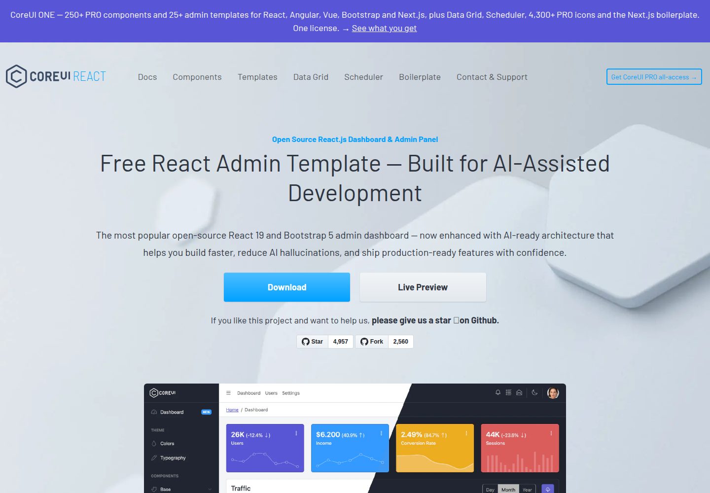
Free React Admin & Dashboard Template Built for AI-Assisted Development
React · 后台
fastapi-react
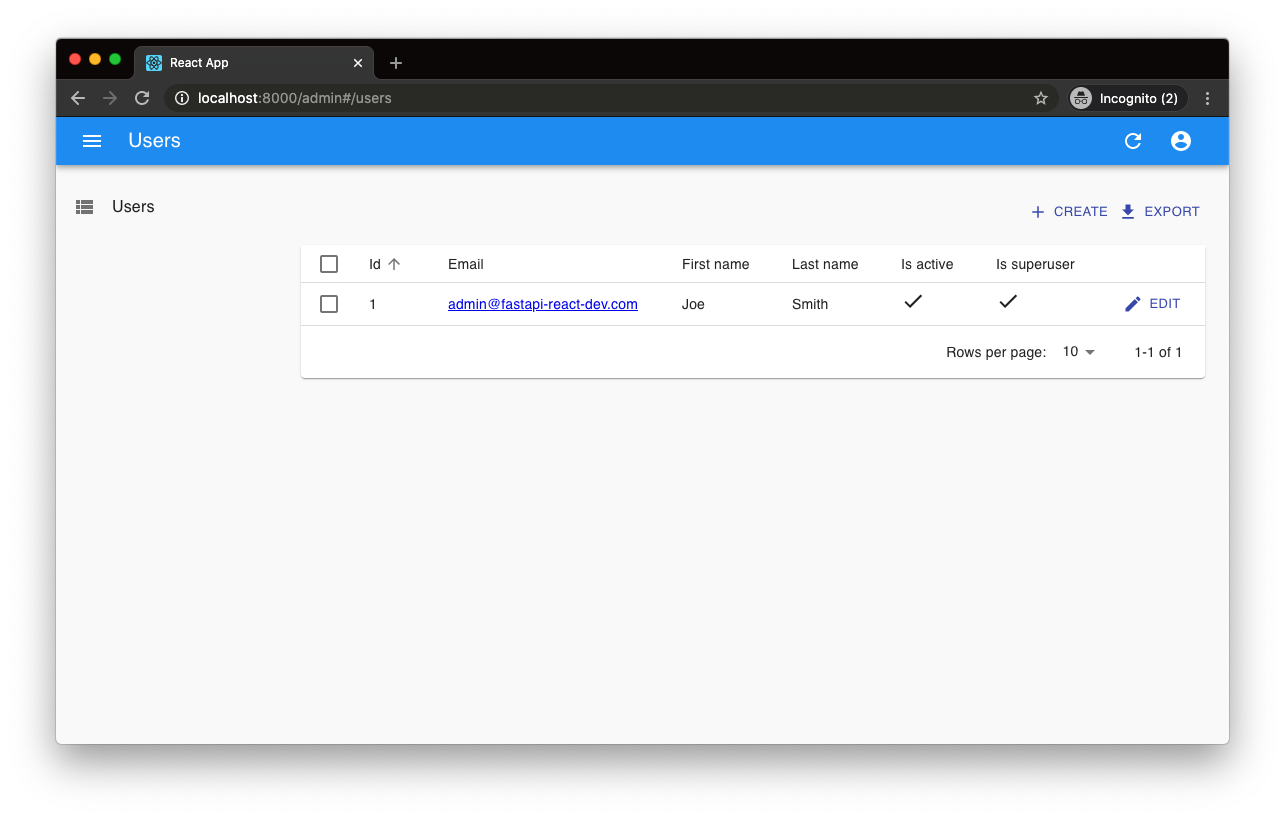
fastapi-react 是一个基于 Cookiecutter 的模板,用于快速搭建 FastAPI 与 React(TypeScript)的全栈项目。
React · 后台

react-antd-admin-template
一个基于React+Antd的后台管理模版,在线预览https://nlrx-wjc.github.io/react-antd-admin-template/
React · 后台
react-saas-template
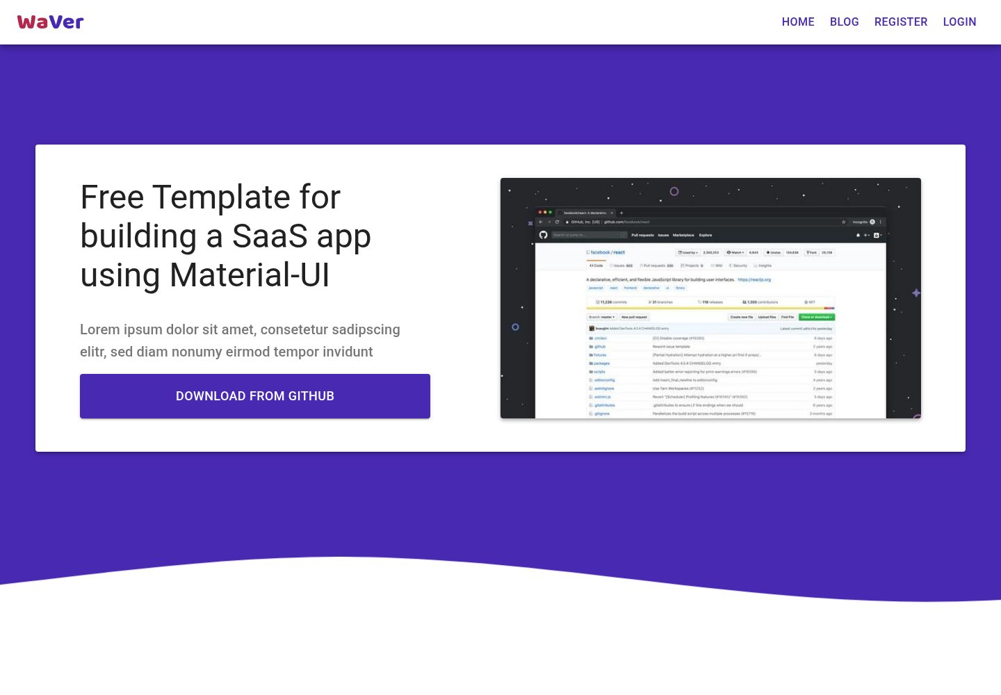
🌊 Template for building an SaaS / admin website using React + Material-UI
React · 后台
react-material-admin
☄️React Material Admin is a React template built with Material-UI
React · 后台