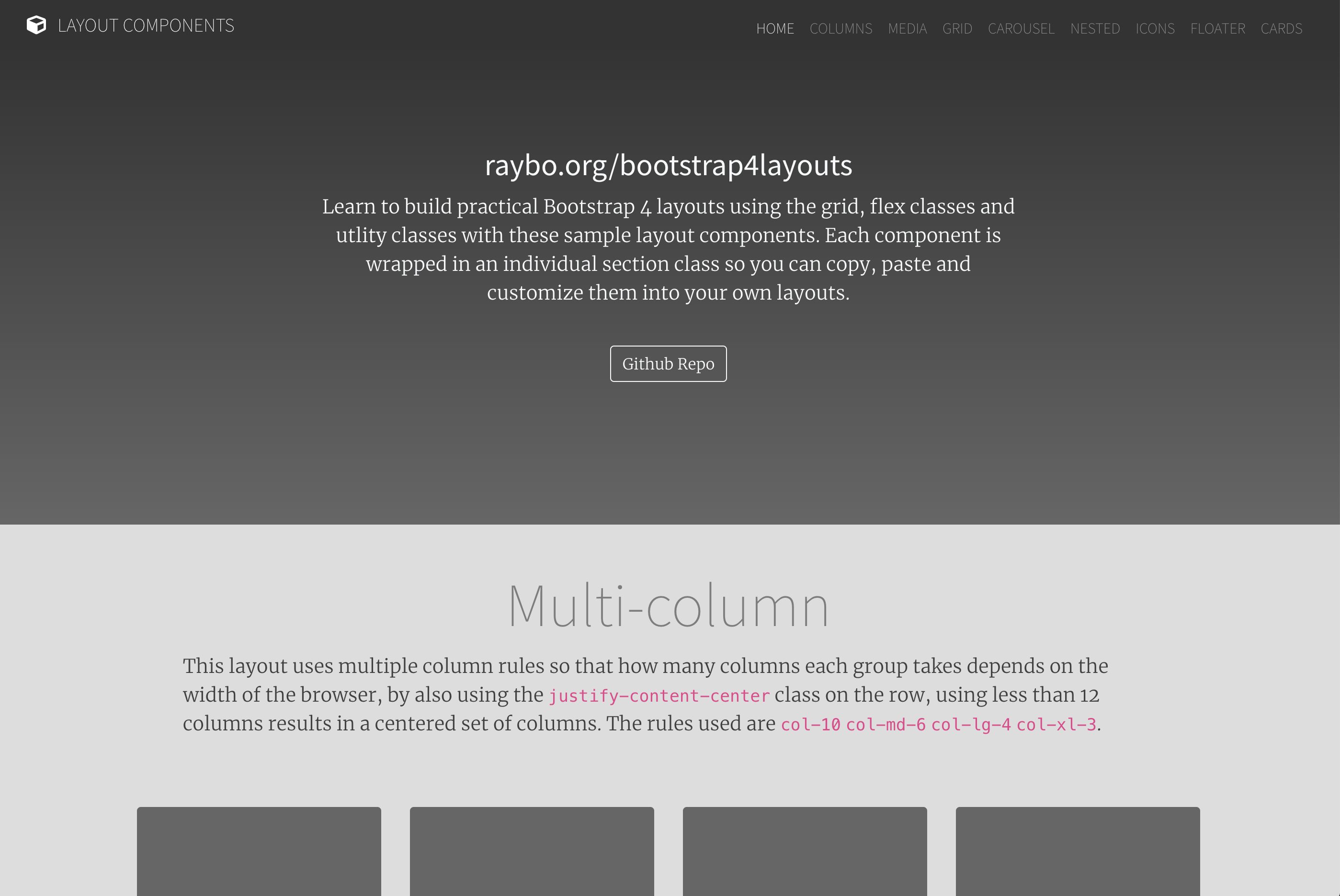
基于 Bootstrap 4 的响应式单页网站模板
HTML启动器
bootstrapProject — HTML 启动器模板
作者 adaashong
基于 Bootstrap 4 布局课程示例整理的单页响应式网站模板,提供多种布局示例供起步使用。
看看你的网站会是什么样
浏览真实页面截图,比较内容排版与手机效果。点击下方缩略图切换,放大查看整页细节。
目前有 1 张原始预览,可打开完整图片查看设计细节。
截图用于了解视觉与布局,交互效果请以实际项目为准。
采集于 2026-10-02查看来源
值得关注的模板亮点
从已有项目资料中,快速了解它的特点。
提供 Column Based、Media、Grid、Carousel、Nested、Icons、Floater、Cards 八种布局示例
每个布局封装在独立 <article> 中,使用 page- 前缀 id 便于定位
多数布局附带可选 <header>,结构相对直观
README 邀请通过 Pull Request 提交新布局
模板详细介绍
这是一个用于构建 Bootstrap 4 响应式网站的 HTML 模板,源自作者在 LinkedIn Learning 课程《Bootstrap 4 Layouts: Responsive Single-Page Design》中使用的示例。仓库以单页形式组织,每个布局放在独立的 <article> 标签中,并带有 page- 前缀的 id;除 Floater 布局外,多数布局还包含可选的 <header>。
模板提供以下布局:Column Based(列布局)、Media(媒体对象)、Grid(网格)、Carousel(轮播)、Nested(嵌套)、Icons(图标)、Floater(浮动图文)、Cards(卡片)。每个布局用于展示 Bootstrap 布局体系的不同方面,例如 Floater 布局通过 row、align-items-center、justify-content-center 以及 col-8 col-md-4 与 col-10 col-md-6 等栅格类组合实现图文并排。
仓库本身是起步模板,README 中邀请通过 Pull Request 补充更多布局;未说明构建流程、依赖管理或部署方式。演示图片引用自外部域名,需自行替换或核对素材许可。
HTML启动器
适合你的项目吗?
适用场景
- 需要一个 Bootstrap 4 单页站点起步骨架时
- 想对照示例学习 Bootstrap 栅格与布局类组合方式时
- 为不同内容区块(图文、卡片、轮播、图标)挑选现成布局结构时
适合人群
- 熟悉 HTML 与 Bootstrap 基础、希望快速搭建响应式单页的开发者
- 需要参考多种布局写法进行教学或自学的人
- 准备在现有模板上增补自定义布局并提交 PR 的贡献者
上手与定制指南
结合仓库当前版本的说明,按下面的资料检查内容、配置与运行要求。
- 1
仓库为静态 HTML 模板,直接打开或部署其中的 HTML 文件即可查看布局
- 2
演示图片引用外部域名(如 planetoftheweb.com),使用前建议替换为自有素材
- 3
代码采用 BSD-2-Clause 许可,分发时需保留版权声明、两项条件与免责声明
- 4
图片、字体、图标等第三方素材需单独核对其许可,不能仅凭代码许可判断
授权与来源资料
使用条件与限制
免费使用 · 保留许可声明本次收录的是公开仓库中采用 BSD-2-Clause 许可的免费版本;免费范围为该版本代码,不代表外部服务或第三方素材免费。
使用时需要遵守
- 允许免费使用、修改、商用以及源代码或二进制形式的分发。
- 源代码分发需保留版权声明、两项条件和免责声明;二进制分发需在文档或随附材料中重现这些内容。
- 代码按现状提供;担保与责任限制以原许可证及适用法律为准。
额外费用与待核对事项
- 该模板源自作者在 LinkedIn Learning 的付费课程示例,仅作为课程配套代码提供;使用模板本身不要求购买课程,但若需课程讲解内容则需另行订阅 LinkedIn Learning。
- 示例布局中的图片引用外部域名 planetoftheweb.com 的 SVG 素材,README 未声明其许可;使用前应替换为自有素材或单独核实该外部素材的授权,代码许可不覆盖这些图片。
- 演示图片、字体、图标及其他第三方素材需按各自许可核对,不能仅凭代码的 BSD-2-Clause 许可判断。
- 域名、托管、数据库、支付或 AI 等外部服务可能另外收费。
查看原文依据
Redistribution and use in source and binary forms, with or without modification, are permitted
许可证原文
It's based on a course I built for LinkedIn learning called [Bootstrap 4 Layouts: Responsive Single-Page Design]
README 原文
https://github.com/adaashong/bootstrapProject/blob/master/LICENSEhttps://github.com/adaashong/bootstrapProject/blob/master/README.md<img class="layout-image img-fluid" src="http://planetoftheweb.com/i/phone.svg" alt="Photo Sample">
README 原文
DeepSeek 根据仓库许可证和 README 整理 ·2026-10-02。结果仅覆盖已读取资料,依赖、图片、字体及后续条款变更以各自原文为准。
项目核对记录与介绍依据
模板资料
- 来源平台
- GitHub
- 资料与维护参考分
- 资料较少 · 53 / 100
- 技术栈
- HTML
- 网站类型
- 启动器
这个分数如何计算
本站按许可资料(最高30分)、演示链接(12分)、预览图(10分)、Star数(15分)、记录的维护时间(15分)、描述完整度(8分)、功能记录(5分)和分类资料(5分)计算。它不是代码、安全或性能测试,也不是 Google 评分;有链接不代表已实测可用。
这个项目需要核对什么
- 记录的仓库更新时间
- 2022-05-19
- 截图检查日期
- 2026-10-02
目前没有记录演示链接。请依据仓库说明在本地评估;仅凭截图无法确认交互行为。
目录记录的主要技术栈是 HTML。请通过依赖清单和锁文件核对实际版本与托管要求。这些说明基于收录资料,不代表代码审计或部署实测。
查看具体选型方法 →介绍的制作与核对状态
介绍由 AI 辅助整理目录与仓库资料。仓库作者不等于这篇介绍的审核者。
已完成服务器许可规则与 AI 来源核对;未经过人工编辑审核。
查看当时使用的来源资料
SHA-256: c4c95720940cb12704faac984a25284350e56401128646b0e1137a5773f5b72e
2026-10-02T08:42:39.901Z
来源文件 / 仓库

# Bootstrap 4 layouts
This repository is a template for building responsive websites for Bootstrap 4. It provides a quick template for getting started with different layouts. It's based on a course I built for LinkedIn learning called [Bootstrap 4 Layouts: Responsive Single-Page Design](https://www.linkedin.com/learning/bootstrap-4-layouts-responsive-single-page-design/creating-a-bootstrap-4-layout?u=104). If you want to see a demo of the layouts, check out: [raybo.org/bootstrap4layouts/](http://www.raybo.org/bootstrap4layouts/)
There are several different layouts available:
- Column Based
- Media
- Grid
- Carousel
- Nested
- Icons
- Floater
- Cards
## Structure of Layouts
Each is designed to showcase a different aspect of how Bootstrap Layouts work. Here's a code sample from the Floater Layout:
```
<article id="page-floater" class="page-section vertical-padding">
<section class="layout-floater container text-reverse">
<div class="row align-items-center justify-content-center">
<div class="col-8 col-md-4 img-container">
<img class="layout-image img-fluid" src="http://planetoftheweb.com/i/phone.svg" alt="Photo Sample">
</div>
<div class="col-10 col-md-6 align-self-center">
<div class="my-5 text-center text-md-left pl-md-5">
<h2 class="layout-title">Floater Title</h2>
<p class="layout-text ">Lorem ipsum dolor sit amet, consectetur adipisicing elit. Officiis fuga ex delectus sunt natus doloremque praesentium
aspernatur, totam tempora officia, sed fugit? Libero voluptatem nulla mollitia, amet dolor iste magni.</p>
</div>
</div>
</div>
</section>
</article>
```
Each layout is in it's own `<article>` tag, which begins a layout and has an id with the `page-` prefix.
Most layouts (not the floater layout) also have an optional `<header>`. They sholuld be self explanatory.
I'd love to see some Pull Requests with additional layouts.
看看同类模板
对比同技术栈与用途的模板,找到更适合的视觉与内容结构。
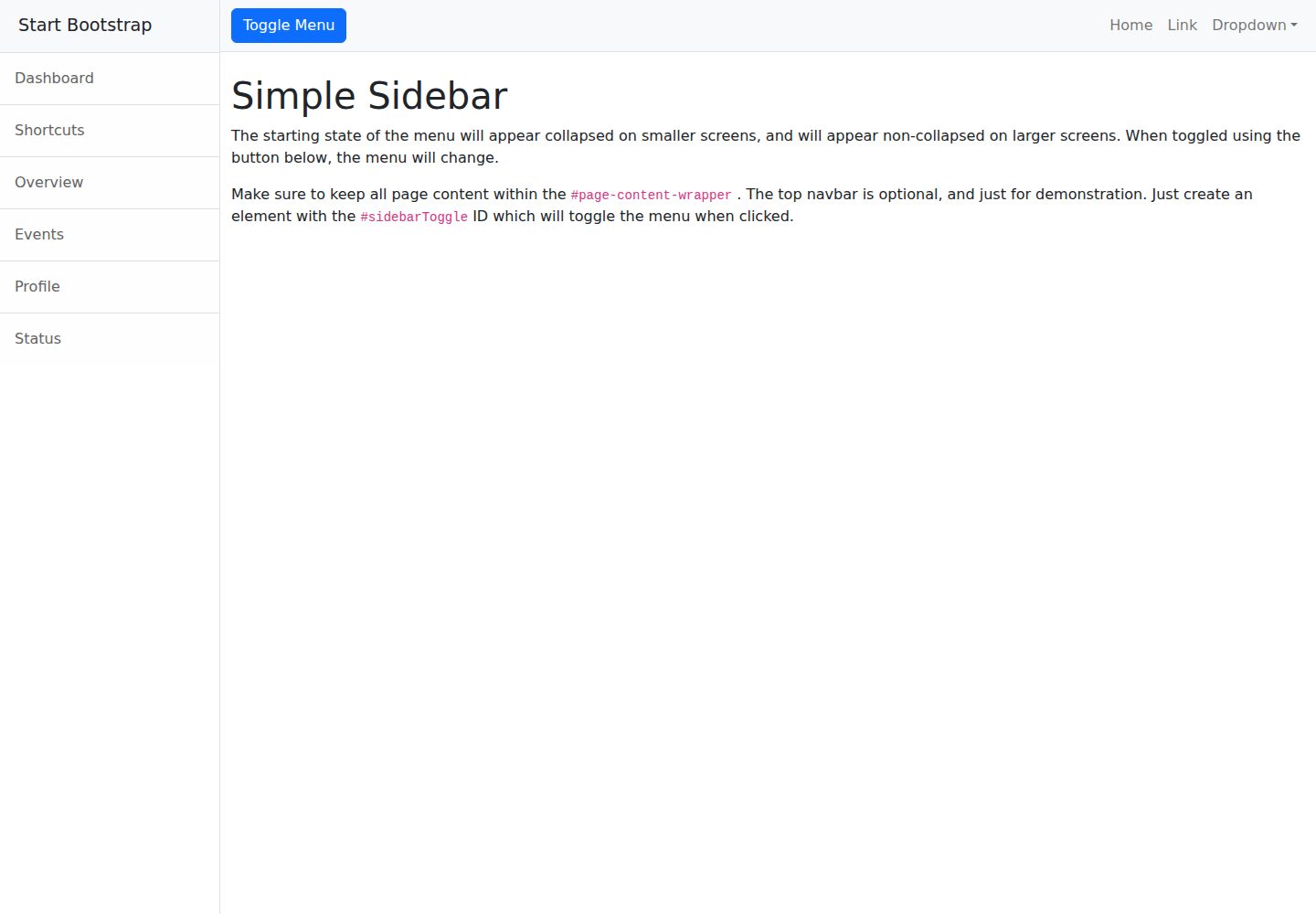
startbootstrap-simple-sidebar
An off canvas sidebar navigation Bootstrap HTML template created by Start Bootstrap
HTML · 启动器
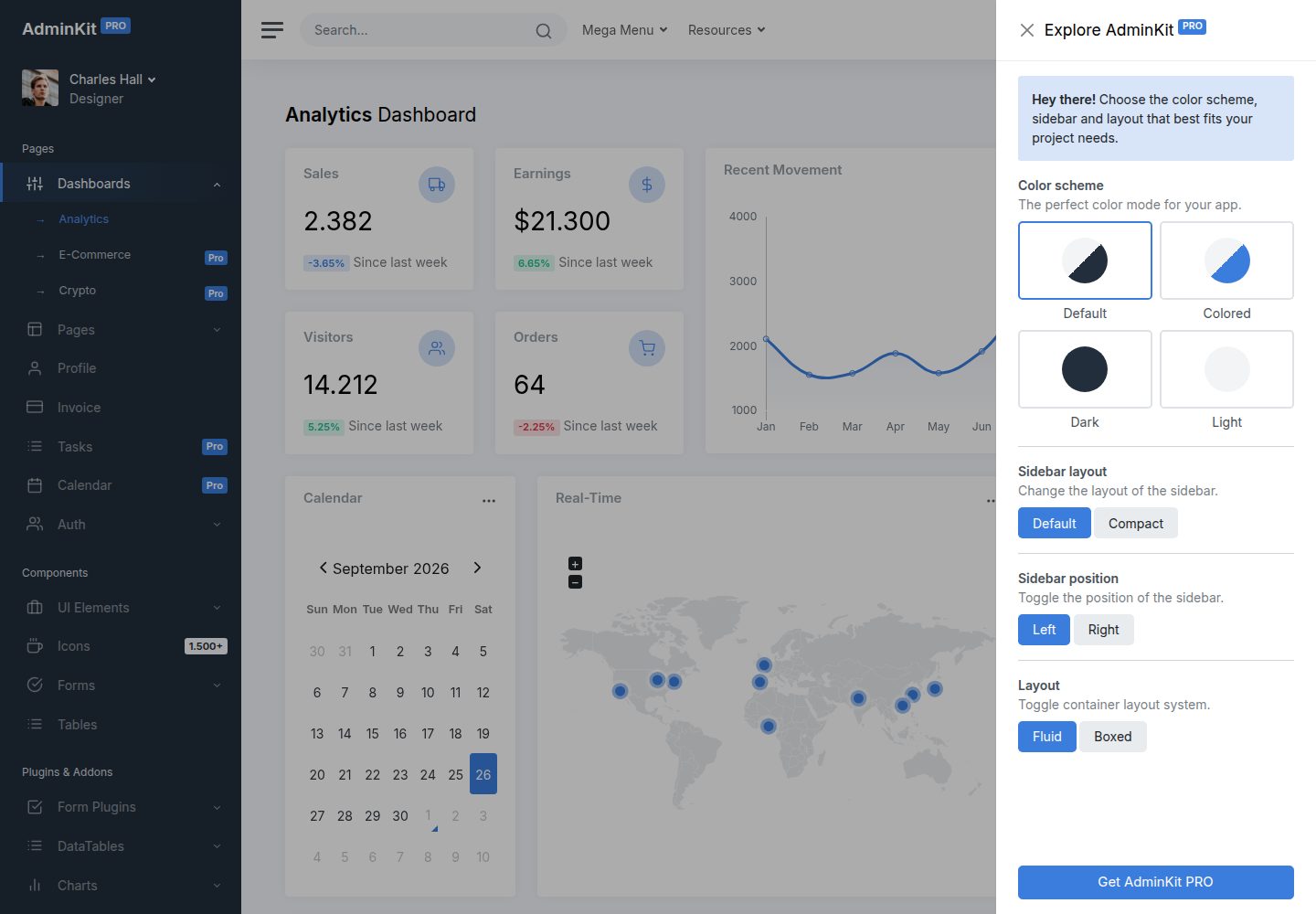
adminkit
AdminKit is a free & open-source HTML dashboard & admin template based on Bootstrap 5
HTML · 后台
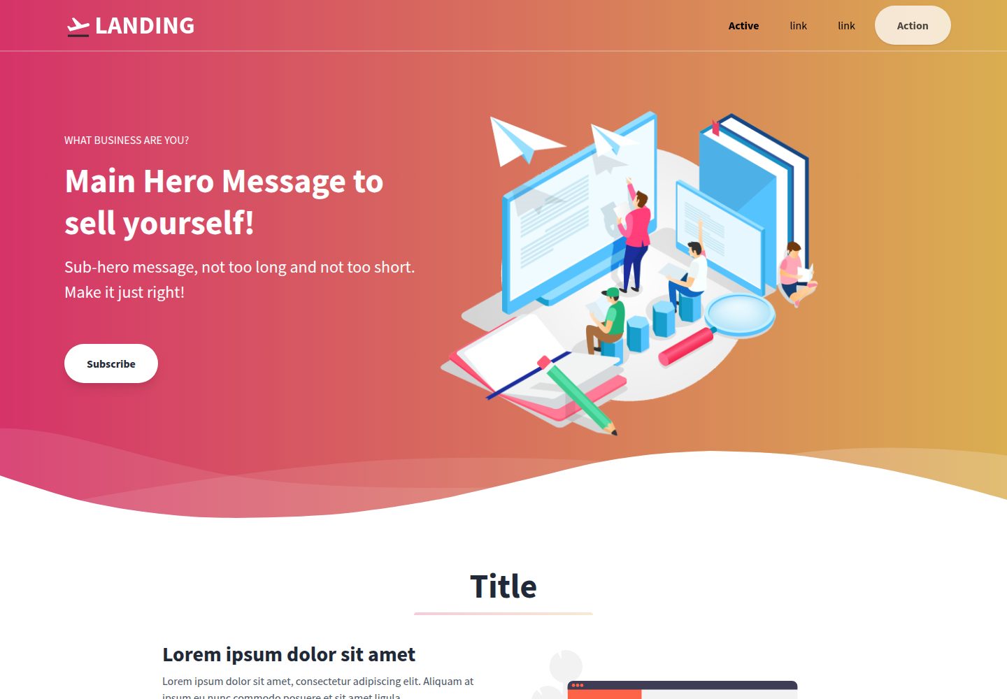
Landing-Page
Tailwind CSS Starter Template - Landing Page
HTML · 企业官网
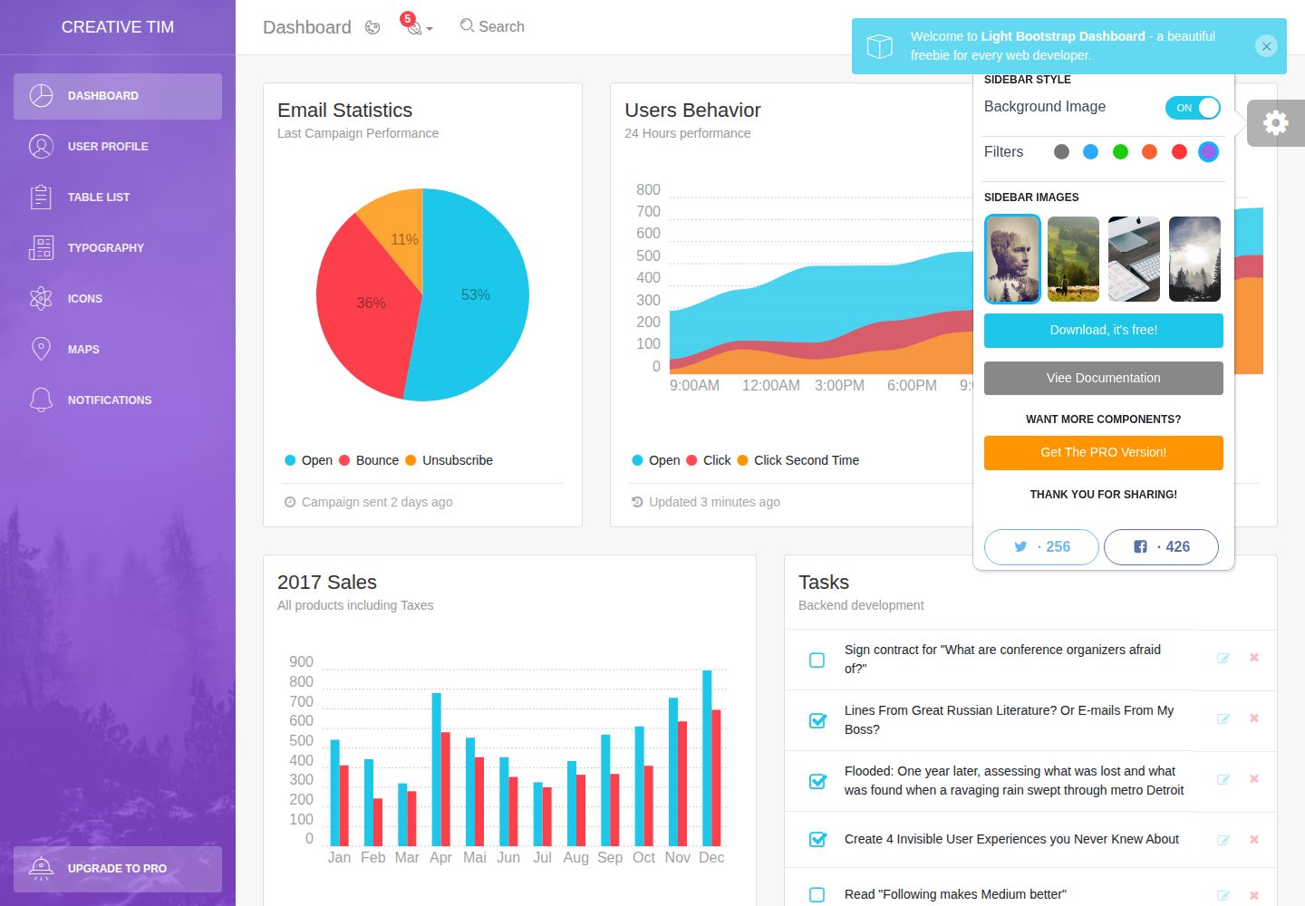
light-bootstrap-dashboard
Light Bootstrap Dashboard is an admin dashboard template designed to be beautiful and simple.
HTML · 后台
sing-app
💥Free and open-source admin dashboard template built with Bootstrap 4.5 💥
HTML · 后台
startbootstrap-modern-business
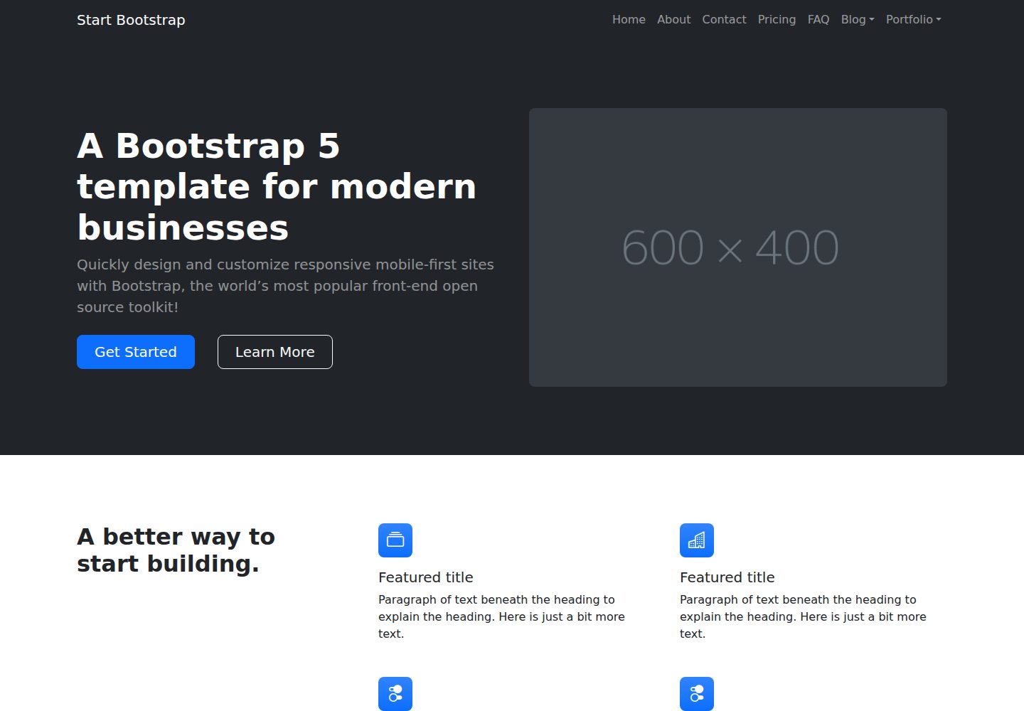
A multipurpose Bootstrap full website template created by Start Bootstrap
HTML · 启动器