包含 40+ 个 HTML 页面,覆盖 3 套首页、12 个仪表盘页面、7 个商店页面与 5 个博客页面
HTML后台电商博客
ludus-free-premium-ecommerce-template — HTML 后台模板
作者 ahmadhuss
Ludus 是一套基于 HTML 与 Sass 的多用途电商模板,包含 40+ 页面、3 套首页、12 个仪表盘页面、7 个商店页面、5 个博客页面以及 10 套配色方案,采用 MIT 许可发布。
看看你的网站会是什么样
浏览真实页面截图,比较内容排版与手机效果。点击下方缩略图切换,放大查看整页细节。
全部页面与视图 2
截图用于了解视觉与布局,交互效果请以实际项目为准。
采集于 2026-10-02查看来源
值得关注的模板亮点
从已有项目资料中,快速了解它的特点。
提供 3 种页头样式、盒式布局版本以及 10 套预生成配色方案
Sass 源码按 abstracts、base、components、layout、pages、vendors-extensions 分层组织
内置导航插件,支持下拉菜单与垂直巨型菜单
提供 8 个滑块方法,分别对应首屏、商品、品牌、评价、博客等区域
包含图片占位比例组件,可为 4:3 与 16:9 图片预设容器高度
模板详细介绍
Ludus 是一套纯 HTML 的多用途电商模板,仓库以 MIT 许可公开,代码可直接使用、修改与分发。模板提供 40+ 个 HTML 文件,覆盖 3 套首页、3 种页头样式、12 个用户仪表盘页面、3 个商品详情页、7 个商店页面和 5 个博客页面,并附带盒式布局版本。样式层使用 Sass 组织,按 abstracts、base、components、layout、pages、vendors-extensions 拆分,编译入口为 app.scss;已生成 10 套配色方案,也可自行扩展。JavaScript 部分包含导航插件(下拉菜单与垂直巨型菜单)、Google 地图初始化、8 个滑块方法以及预加载动画和首页弹窗逻辑。README 说明该模板曾被用于 Codecanyon 上的 DOKANS 脚本,并提供了在线预览地址。
使用限制方面:仓库只包含 HTML 版本,不含后端、数据库或支付逻辑,仪表盘等页面均为静态界面;模板依赖 Google Fonts 的 Open Sans 字体与 Google 地图脚本,实际部署时需自行处理这些外部资源;演示图片、字体、图标等第三方素材的许可需单独核对,不能仅凭代码的 MIT 许可判断。
HTML后台电商博客
适合你的项目吗?
适用场景
- 搭建电商前台页面原型,快速组合首页、商品列表、商品详情与博客内容
- 为店铺后台或用户中心制作静态仪表盘界面
- 基于 Sass 分层结构定制品牌配色与组件样式
- 作为教学或练习素材,学习 HTML 模板的页面组织与组件化 CSS 写法
适合人群
- 需要现成 HTML 电商界面、自行接入后端的前端开发者
- 希望以 Sass 为基础做样式定制的网页设计师
- 用于演示或原型阶段、不要求真实交易功能的项目
上手与定制指南
结合仓库当前版本的说明,按下面的资料检查内容、配置与运行要求。
- 1
解压后仅有一个 HTML 文件夹,直接打开其中的 HTML 文件即可查看静态页面
- 2
样式入口为 css/app.css,其余 app.color2.css 至 app.color10.css 为不同配色版本,按需替换引用
- 3
修改样式需在 scss 目录下编辑并重新编译,主入口为 src/scss/app.scss
- 4
页面默认使用 Google Fonts 的 Open Sans,替换字体需同时修改 HTML 中的字体链接与 CSS 的 font-family 规则
- 5
预加载动画、首页弹窗与各滑块均由 src/js/app.js 中的方法控制,可在该文件中注释对应调用以关闭
授权与来源资料
使用条件与限制
免费使用 · 保留许可声明本次收录的是公开仓库中采用 MIT 许可的免费版本;免费范围为该版本代码,不代表外部服务或第三方素材免费。
使用时需要遵守
- 允许免费使用、修改、商用和分发该版本代码。
- 分发代码副本或实质性部分时,保留原作者版权声明和完整 MIT 许可声明。
- 代码按现状提供;担保与责任限制以原许可证及适用法律为准。
额外费用与待核对事项
- 模板默认通过 Google Fonts 加载 Open Sans 字体,属于外部服务依赖;离线或无法访问 Google 的环境需自行替换字体链接与 CSS 规则。
- 模板包含 Google 地图初始化脚本,实际使用地图功能需依赖 Google 地图服务,可能涉及外部账号、API 密钥或费用。
- README 仅说明该模板曾被用于 Codecanyon 上的付费脚本 DOKANS,属于使用案例陈述,不构成对本模板的额外授权限制。
- 演示图片、字体、图标及其他第三方素材需按各自许可核对,不能仅凭代码的 MIT 许可判断。
- 域名、托管、数据库、支付或 AI 等外部服务可能另外收费。
查看原文依据
Permission is hereby granted, free of charge
许可证原文
The template is using **sans-serif** font **Open Sans** from [Google Fonts](https://fonts.google.com/).
README 原文
This file contains google maps functionality.
README 原文
https://github.com/ahmadhuss/ludus-free-premium-ecommerce-template/blob/master/LICENSEhttps://github.com/ahmadhuss/ludus-free-premium-ecommerce-template/blob/master/README.mdThis template has also been used in a famous Codecanyon script named DOKANS
README 原文
DeepSeek 根据仓库许可证和 README 整理 ·2026-10-02。结果仅覆盖已读取资料,依赖、图片、字体及后续条款变更以各自原文为准。
项目核对记录与介绍依据
模板资料
- 来源平台
- GitHub
- 资料与维护参考分
- 资料较完整 · 81 / 100
- 技术栈
- HTML
- 网站类型
- 后台 · 电商 · 博客
这个分数如何计算
本站按许可资料(最高30分)、演示链接(12分)、预览图(10分)、Star数(15分)、记录的维护时间(15分)、描述完整度(8分)、功能记录(5分)和分类资料(5分)计算。它不是代码、安全或性能测试,也不是 Google 评分;有链接不代表已实测可用。
这个项目需要核对什么
- 记录的仓库更新时间
- 2023-12-19
- 截图检查日期
- 2026-10-02
已收录演示链接。请用你的内容与屏幕尺寸检查;有演示不代表表单、认证或支付已经可用。
目录记录的主要技术栈是 HTML。请通过依赖清单和锁文件核对实际版本与托管要求。这些说明基于收录资料,不代表代码审计或部署实测。
查看具体选型方法 →介绍的制作与核对状态
介绍由 AI 辅助整理目录与仓库资料。仓库作者不等于这篇介绍的审核者。
已完成服务器许可规则与 AI 来源核对;未经过人工编辑审核。
查看当时使用的来源资料
SHA-256: 50398bf377dcadd7b64cc4397654e3dfbe277e57d30aa7ad140d5e0ae522973f
2026-10-02T15:45:36.719Z
来源文件 / 仓库# Ludus Free Premium E-commerce Template
*I want to thank all of you who give stars and fork the repo. I love you all and I have no words in my heart.*
I've developed another open-source eCommerce template that may work for you. [Demo link](https://github.com/ahmadHuss/groover-free-premium-ecommerce-template)
## Real use case:
This template has also been used in a famous Codecanyon script named DOKANS [Demo link](https://bit.ly/3rTQIqp) which has ~300+ sales.
[Live Preview](https://d2r00w08fz6ft0.cloudfront.net/ludus-demo/index.html)

**40+ Pages still not pressed the star & follow button.**
## Contents
- [Getting Started](#getting-started)
- [Downloaded Folders](#downloaded-folders)
- [HTML Folder](#html-folder)
- [Change Features](#change-features)
- [Sources and Credits](#sources-and-credits)
- [Changelog Updates History](#changelog-updates-history)
- [Version](#version)
## Getting Started
Ludus is complete multipurpose polish e-commerce template built with best practices. It will be a perfect solution for your current or future shop, customizable into any store contains responsiveness & great UI. Well tested on compatible browsers.
The template contains **40+ HTML files**, **3 Homepages**, **3 Header Styles**, **12 Dashboard Pages**,
**3 Product Pages**, **7 Shop Pages**,**5 Blog Pages**, **Box mode** and generated **10 Color variations** but could
create unlimited colors.
### Template Features
- Clean CSS structure **(Most of the styles have specificity level 1)**.
- Clean markup **(Markup correctly formatted with comments for setup things)**.
- Fully responsive **(For your desktop and mobile users)**.
- Cross Browser compatibility **(Work on most of the famous browsers)**.
- Fresh Design **(Modern approaches used by many web apps)**.
- User convenient **(Easy to use for any professional and non-professional)**.
- W3C Validated **(All files are passed from W3C validation service)**.
- Well Documented **(Files are commented for users to understand)**.
### Extra Features
- Intrinsic placeholder loading **(Initially set image container height)**.
- Vertical Mega Menu.
- 10 Color schemes generated.
- Box version included.
- Sass compatible.
## Downloaded Folders
When you unpack downloaded archive you'll get folder containing 1 folder.
Here they are, sorted alphabetically:
- **HTML** - HTML version of template
## HTML Version

Inside the **css** folder, we have all the stylesheets and vendor dependencies which our layout needs. You can use the color scheme according to your likeness.
- css/app.css **(Orange-Red color scheme)**
- css/app.color2.css **(Carmine-Red color scheme)**
- css/app.color3.css **(Blue (RYB) color scheme)**
- css/app.color4.css **(Dark-Spring-Green color scheme)**
- css/app.color5.css **(Electric-Purple color scheme)**
- css/app.color6.css **(Old-Burgundy color scheme)**
- css/app.color7.css **(Blue-Sapphire color scheme)**
- css/app.color8.css **(Yale-Blue color scheme)**
- css/app.color9.css **(Eerie-Black color scheme)**
- css/app.color10.css **(Candy-Apple-Red color scheme)**
Inside the **scss** folder, we have **6** folders and these folders have scss files.

**src/scss/abstracts**
The **abstracts** folder gathers all Sass tools and helpers used across the project. Every global variable, function, and mixin should be put in here. The rule of thumb for this folder is that it should not output a single line of CSS when compiled on its own. These are nothing but Sass helpers. Inside this folder it has another folder named **mixins-module**, the file on this folder has a mixin which will generate space utility classes.
**src/scss/utility.scss**
This file is invoking a mixin from **mixins-module** which will generate space utility classes, these utility classes are also called **low-level utility classes** that make it easy to build complex user interfaces.
**src/scss/base**
The **base** folder holds what we might call the boilerplate code for the project. In there, you might find some typographic rules, defining some standard styles for commonly used HTML elements.
**src/scss/components**
**Components** are reusable styles on the layout. It contains all kind of specific modules like a button, a select-box and anything along those lines. There are usually a lot of folders since the whole site/application should be mostly composed of tiny modules. `_all.scss` is just importing file which contains all code base of the folder. In Bottom, you will see all components file and their usage on different places of the layout.
**src/scss/components/breadcrumb/_breadcrumb.scss**

**src/scss/components/button/_button.scss**

**src/scss/components/checkbox-radio/_checkbox-radio.scss**

**src/scss/components/countdown/_countdown.scss**

**src/scss/components/input-counter/_input-counter.scss**

**src/scss/components/input-text/_input-text.scss**

**src/scss/components/modal/_modal.scss**

**src/scss/components/preload-img-aspect-ratio/_preload-img-aspect-ratio.scss**

### What does it mean preload-img-aspect-ratio component?
It's a **component** that associate with some **CSS classes** and these classes help to set default placeholder on **4:3 (SQUARE)** or **16:9 (WIDE)** images.
```html
<!-- Markup:1 For 4:3 (Square) Images -->
<a class="aspect aspect--bg-grey aspect--square u-d-block">
<img src="image.jpg" class="aspect__img" alt="">
</a>
<!-- Markup:2 For 16:9 (Wide) Images -->
<div class="aspect aspect--bg-grey aspect--1286-890">
<img src="image.jpg" class="aspect__img" alt="">
</div>
```
```css
.aspect {
position: relative; }
.aspect--bg-grey {
background-color: #f5f5f5; }
.aspect--bg-grey-fb {
background-color: #fbfbfb; }
.aspect--square {
padding-bottom: 100%; }
/*
* Add this class to image child element.
*/
.aspect__img {
position: absolute;
width: 100%;
height: 100%; }
```
**Some Points to use Aspect Ratio Component classes**
- Make sure the element on which it adds, it would be a block or inline-block element, if it is not then you could add utility class `'u-d-block'`, `'u-d-inline-block'` or you could directly target that element with CSS to make **inline** or **block**.
- By default `'.aspect--square'` or `'.aspect--16:9: resolution'` class takes height according to the **height of the child image element**.
- But if the **parent element** is a **flex element** then aspect ratio technique doesn't work because `'.aspect--square'` or `'.aspect--16:9: resolution'` contains `padding top/bottom` property with a **percentage** value.
- There are also some cases you do not want to have `'.aspect--square'` or `'.aspect--16:9: resolution'` class to take width & height that match with **child image element**. Then you could append **CSS class** or directly target that **parent element** with **CSS** and set your **custom width & height**.
- If the image has **aspect ratio square, i.e. 4:3** then you would add class `'.aspect--square'` on the element. This class has a `padding-bottom:100%` property. **100%** means to take the **entire height of the image**.
- If the image doesn't have **aspect ratio square** then to make a **custom class** like `'.aspect--imageWidth-imageHeight'` and use ready-made **sass function()** `nonsquare(imageWidth,imageHeight)` that returns `padding-bottom` property with the **value calculated according to image resolution**.
- You could also change the `background-color` of placeholder according to your own choice. By default, only **2 classes** are generated.
**src/scss/components/product/_product.scss**

**src/scss/components/select-box/_select-box.scss**

**src/scss/components/textarea/_textarea.scss**

**src/scss/layout**
The **layout** folder contains everything which takes part in laying out the site or application. This folder could have stylesheets for the main parts of the site (header, footer), the grid system or even CSS styles for all the forms.
**src/scss/pages**
Pages folder contains styles **per page**.
**src/scss/vendors-extensions**
It just overrides vendor dependencies and every vendor dependency file is separately created.
**src/scss/app.scss**
This is the main file that is importing all **other scss files** and compiles into the `app.css` file.
Inside the **js** folder, we have all the javascript and vendor dependencies which our layout needs.

**src/js/app.js**
This is the main file which contains all functionality and plugins invocation of our layout.
**src/js/jquery.shopnav.js**
This plugin contains functionality for navigation. Navigation includes **DROP-DOWNS** and **VERTICAL MEGA-MENU**.

**src/js/map-init.js**
This file contains google maps functionality.
**src/js/vendor.js**
This file contains all vendor libraries source code.
## Change Features
**1. Google Fonts**
The template is using **sans-serif** font **Open Sans** from [Google Fonts](https://fonts.google.com/). You could change according to your choice. Erase that line from `html` files, and put new one here.
```html
<link href="https://fonts.googleapis.com/css?family=Open+Sans:400,600,700,800" rel="stylesheet">
```
After that also specify rule in **CSS**.
```css
font-family: "Open Sans", -apple-system, system-ui, BlinkMacSystemFont, "Segoe UI", Roboto, "Helvetica Neue", Arial, sans-serif;
```
**2. Disable Preloader from pages**
The template is using **preloader** until **body** configuration class `config` is not removed. **Preloader** will be hidden when the `config` class is removed. But it is not necessary to show **preloader** during page load. If you remove **preloader** then it doesn't affect the look & feel of the page. So you could disable **preloader**. All HTML files have this markup underneath **body** element.
```html
<div class="preloader is-active">
<div class="preloader__wrap">
<img class="preloader__img" src="images/preloader.png" alt="">
</div>
</div>
```
Remove this markup from all **html** files.
After that in the `app.js` file, there is a method named `RESHOP.appConfiguration()` inside that method comment the line.
```javascript
RESHOP.appConfiguration = function () {
$('body').removeAttr('class');
// $('.preloader').removeClass('is-active');
};
```
**3. Disable Modal**
Default when you visit the **Homepage** a newsletter modal will pop up. You can disable the newsletter modal by editing the file `app.js`. This file is invoking a method named `showNewsletterModal()` inside `window` `load` event, comment that line modal will not show.
```javascript
$(window).on('load', function () {
// RESHOP.showNewsletterModal();
});
```
**4. Slider Options**
The template contains **8 methods** which are associated with **8 sliders**.
```javascript
/*
* Hero Slider / Primary Slider
* Index, Index-2, Index-3
*/
RESHOP.primarySlider();
/*
* Product Slider
*/
RESHOP.productSlider();
/*
* Tab Slider
* Index-2 (Only)
*/
RESHOP.tabSlider();
/*
* Brand Slider
*/
RESHOP.brandSlider();
/*
* Testimonial Slider
*/
RESHOP.testimonialSlider();
/*
* Blog Post Slider
*/
RESHOP.blogPostGallery();
/*
* Product Detail Slider
* Include Thumbnail Slider
* Remember this method doesn't have
* any relation with (Modal Product Detail Slider)
*/
RESHOP.productDetailInit();
/*
* Product Detail Slider
* Include Thumbnail Slider
*/
RESHOP.modalProductDetailInit();
```
Bottom code is showing **methods body** where you could change the slider options.
```javascript
/*
* Hero Slider / Primary Slider
* Index, Index-2, Index-3
*/
RESHOP.primarySlider = function () {
$primarySlider.owlCarousel({});
};
/*
* Product Slider
*/
RESHOP.productSlider = function () {
thisInstance.owlCarousel({});
};
/*
* Tab Slider
* Index-2 (Only)
*/
RESHOP.tabSlider = function () {
thisInstance.owlCarousel({});
};
/*
* Brand Slider
*/
RESHOP.brandSlider = function () {
.owlCarousel({});
};
/*
* Testimonial Slider
*/
RESHOP.testimonialSlider = function () {
.owlCarousel({});
};
/*
* Blog Post Slider
*/
RESHOP.blogPostGallery = function () {
$(this).owlCarousel({});
};
/*
* Product Detail Slider
* Include Thumbnail Slider
* Remember this method doesn't have any
* relation with (Modal Product Detail Slider)
*/
RESHOP.productDetailInit = function () {
$productDetailElement.slick({});
$productDetailElementThumbnail.slick({});
};
/*
* Product Detail Slider
* Include Thumbnail Slider
*/
RESHOP.modalProductDetailInit = function () {
$modalProductDetailElement.slick({});
$modalProductDetailElementThumbnail.slick({});
};
```
**5. Change color scheme**
All **.html** pages are included with default color scheme i.e. `app.css`.
```html
<!DOCTYPE html>
<html class="no-js" lang="en">
<head>
<meta charset="UTF-8">
<!--[if IE]><meta http-equiv="X-UA-Compatible" content="IE=edge"><![endif]-->
<meta name="viewport" content="width=device-width, initial-scale=1, shrink-to-fit=no">
<meta name="description" content="">
<meta name="author" content="">
<link href="images/favicon.png" rel="shortcut icon">
<title>Ludus - Electronics, Apparel, Computers, Books, DVDs & more</title>
<!--====== Google Font ======-->
<link href="https://fonts.googleapis.com/css?family=Open+Sans:400,600,700,800" rel="stylesheet">
<!--====== Vendor Css ======-->
<link rel="stylesheet" href="css/vendor.css">
<!--====== Utility-Spacing ======-->
<link rel="stylesheet" href="css/utility.css">
<!--====== App Default color scheme ======-->
<link rel="stylesheet" href="css/app.css">
</head>
```
You can change the stylesheet according to your **color scheme**, just erase the old `<link>` tag with the new one.
```html
<link rel="stylesheet" href="css/app.color3.css">
```
**6. Change Template from Wide to Box**
You can see all default pages are **wide**. Change page from **wide** into a **box**, by adding this **CSS** class `boxed` on **html** element.
```html
<!DOCTYPE html>
<html class="no-js boxed" lang="en">
```
## Sources and Credits
- [BEM - Block Element Modifier](https://en.bem.info/methodology/quick-start/)
- [Normalize.css](https://necolas.github.io/normalize.css/)
- [Bootstrap 4 with components Grid, Nav, Modal, Tooltip & Transitions](https://getbootstrap.com/)
- [Font Awesome 5](https://fontawesome.com/)
- [Animate.css](https://daneden.github.io/animate.css/)
- [Modernizr](https://modernizr.com/)
- [Popper.js](https://popper.js.org/)
- [Owl Carousel 2](https://owlcarousel2.github.io/OwlCarousel2/)
- [Slick Carousel](https://kenwheeler.github.io/slick/)
- [jQuery](https://jquery.com/)
- [jQuery ScrollUp](https://github.com/markgoodyear/scrollup)
- [jQuery Elevate Zoom](http://elevateweb.co.uk/image-zoom)
- [jQuery Light Gallery](https://sachinchoolur.github.io/lightGallery/)
- [jQuery Fitvids](http://fitvidsjs.com/)
- [Isotope](https://isotope.metafizzy.co/)
- [Final Countdown](https://hilios.github.io/jQuery.countdown/)
## Changelog Updates History
Following you'll find a list of all Ludus theme Template releases with a log of features added and bug fixes next to each one.
## Version
Version 1.0.0 - Feburary 2019 Initial Template Release
看看同类模板
对比同技术栈与用途的模板,找到更适合的视觉与内容结构。
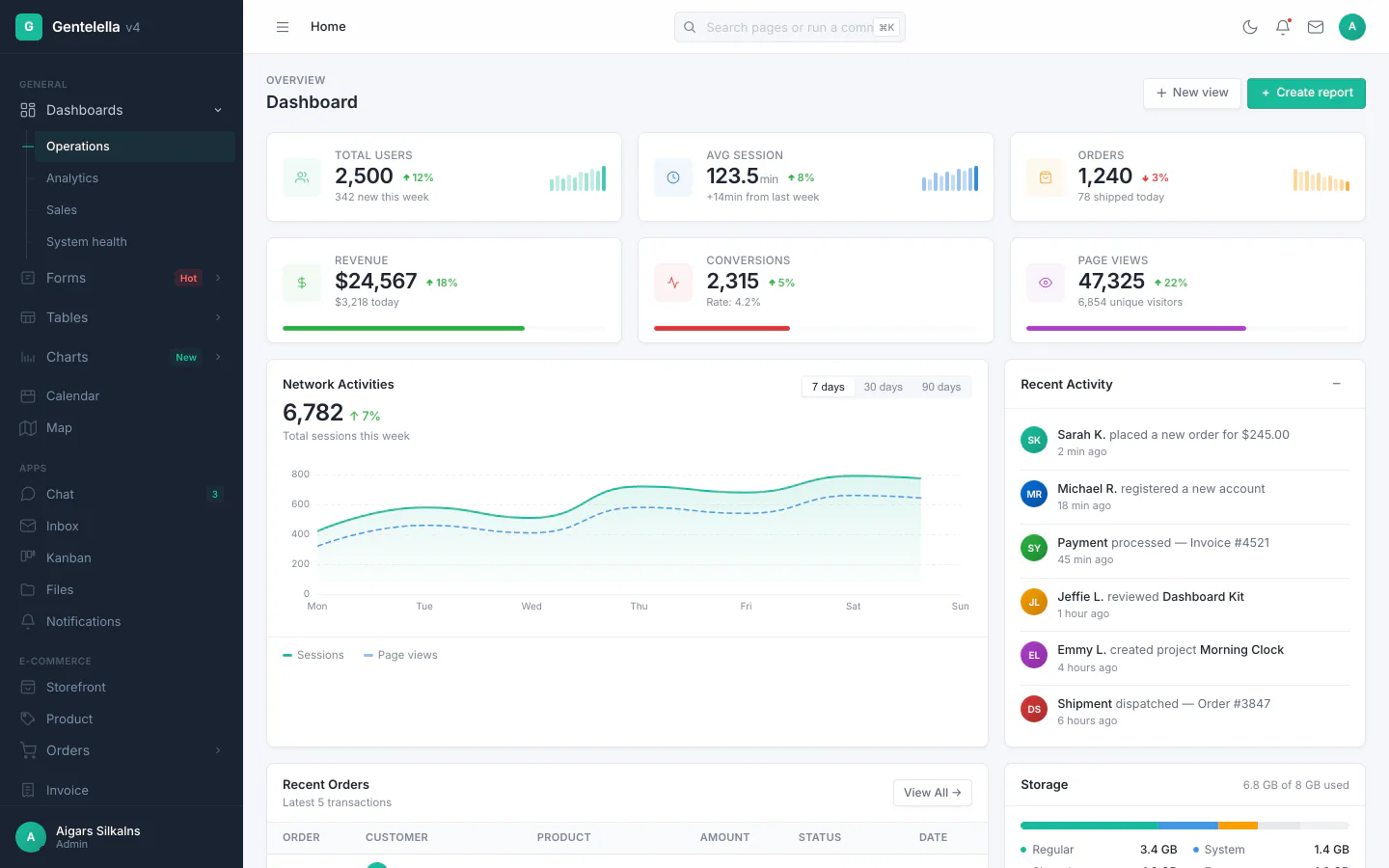
gentelella
Free admin dashboard template — vanilla JS, SCSS, Vite 8. No Bootstrap, no jQuery.
HTML · 后台
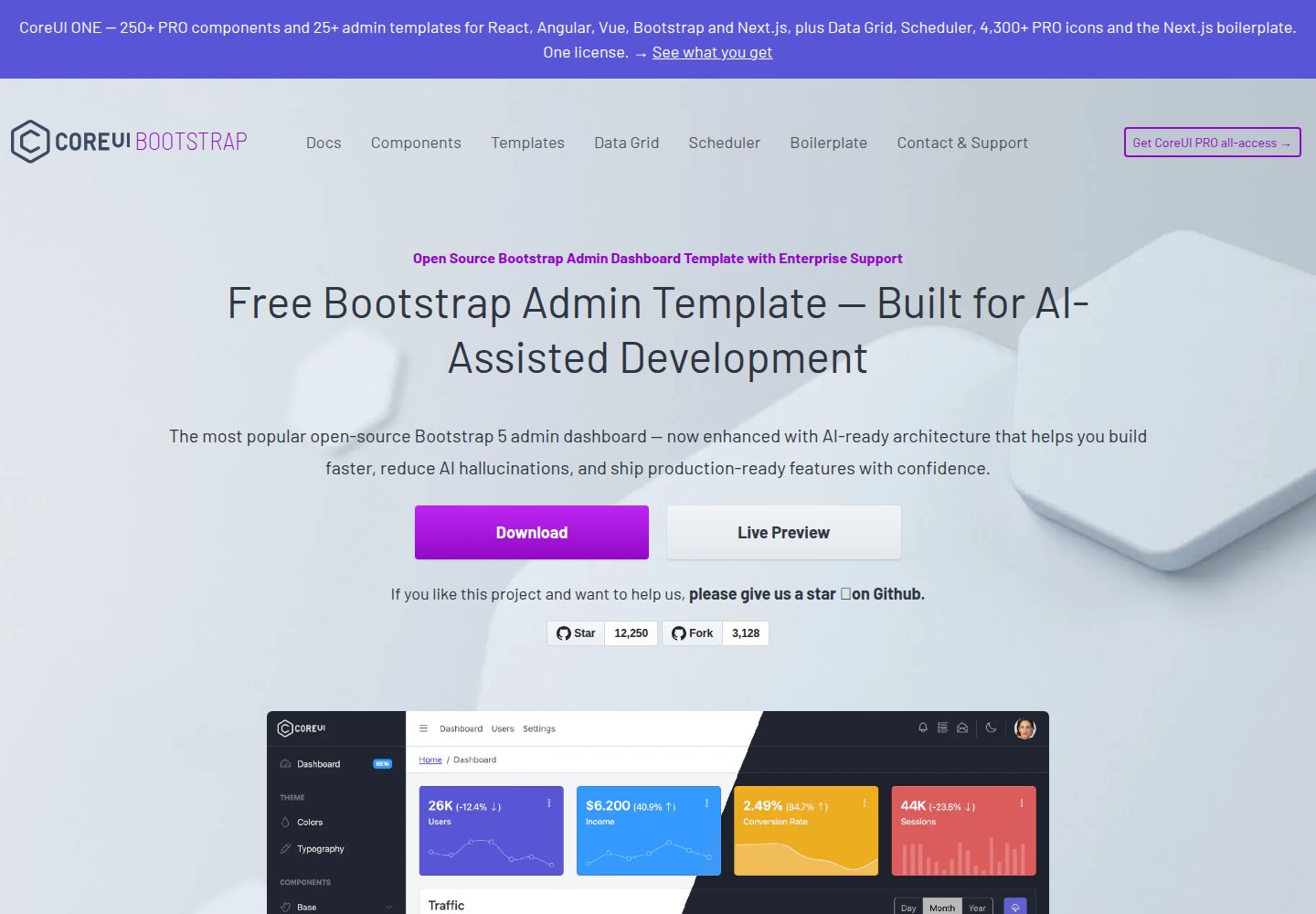
coreui-free-bootstrap-admin-template
Free Bootstrap Admin & Dashboard Template Built for AI-Assisted Development
HTML · 后台
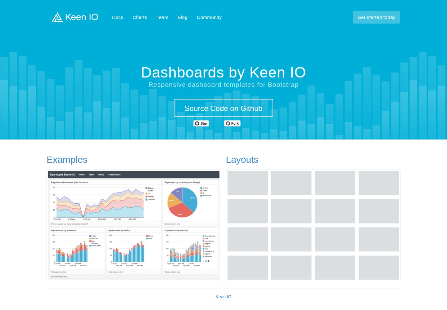
dashboards
Responsive dashboard templates 📊✨
HTML · 后台
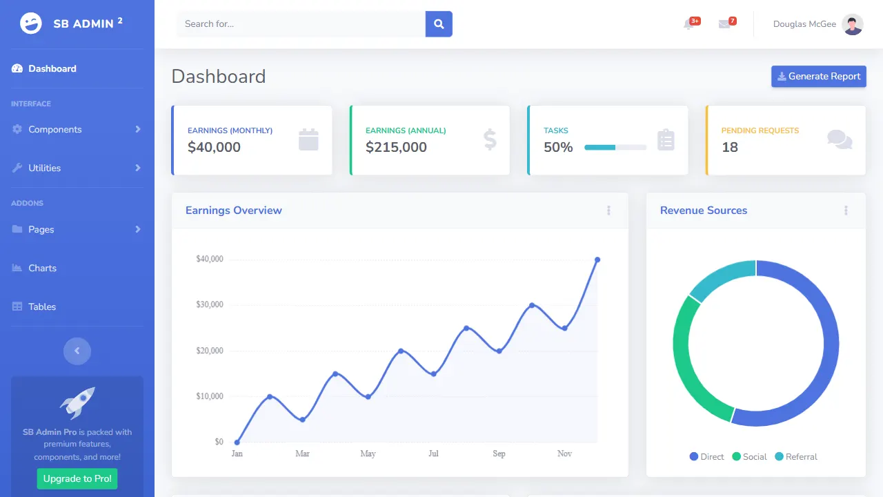
SB Admin 2
SB Admin 2 是 Start Bootstrap 推出的开源后台模板,基于 Bootstrap 构建,整体风格偏向经典管理界面。
HTML · 后台
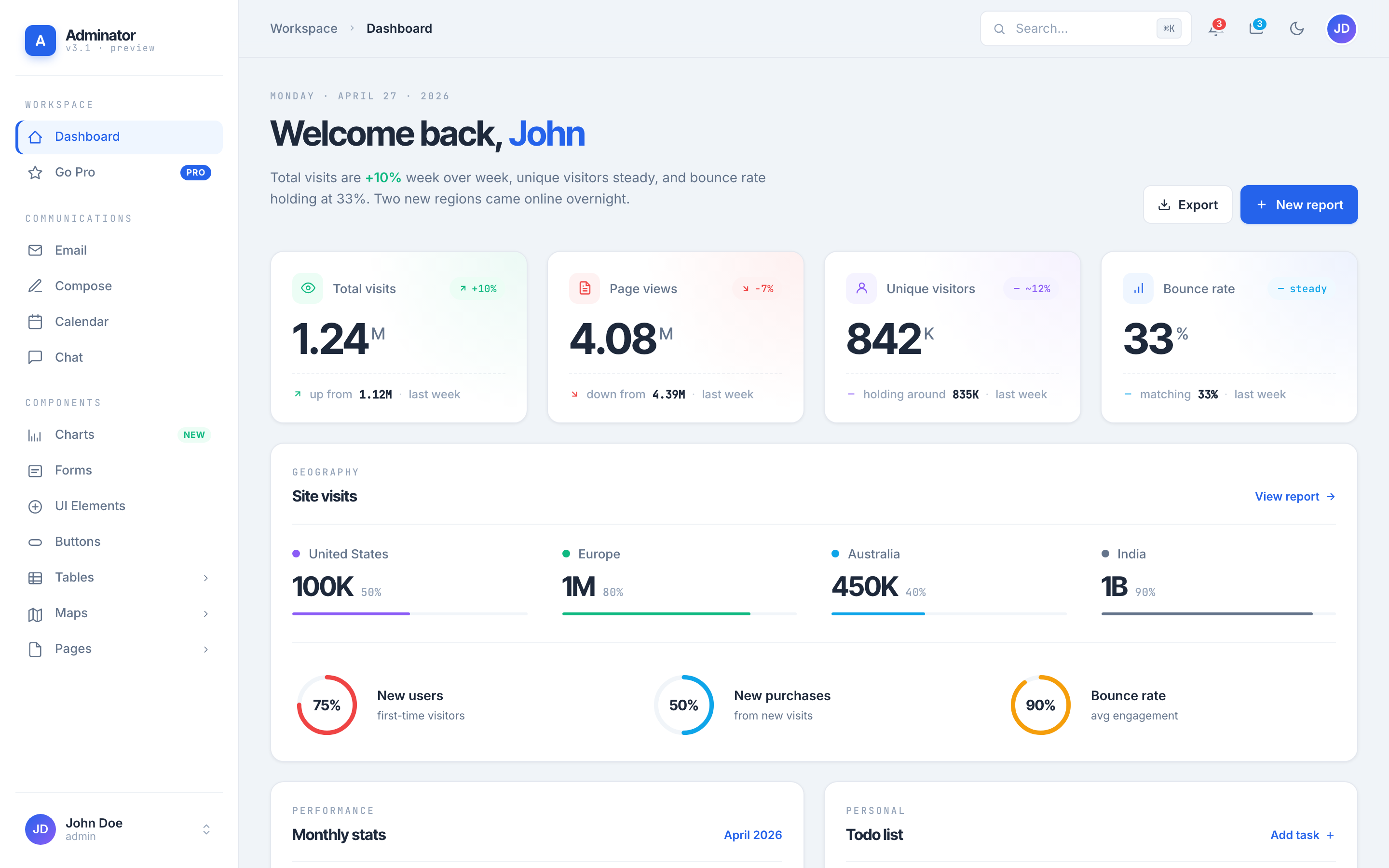
Adminator-admin-dashboard
Adminator is easy to use and well design admin dashboard template with dark mode for web apps, websites, servi…
HTML · 后台
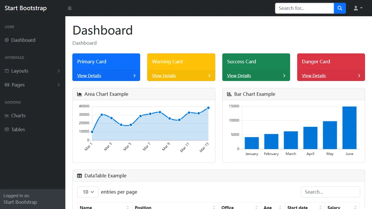
SB Admin
SB Admin 是 Start Bootstrap 推出的开源后台管理模板,基于 Bootstrap 构建,定位是简洁、实用的管理界面。
HTML · 后台