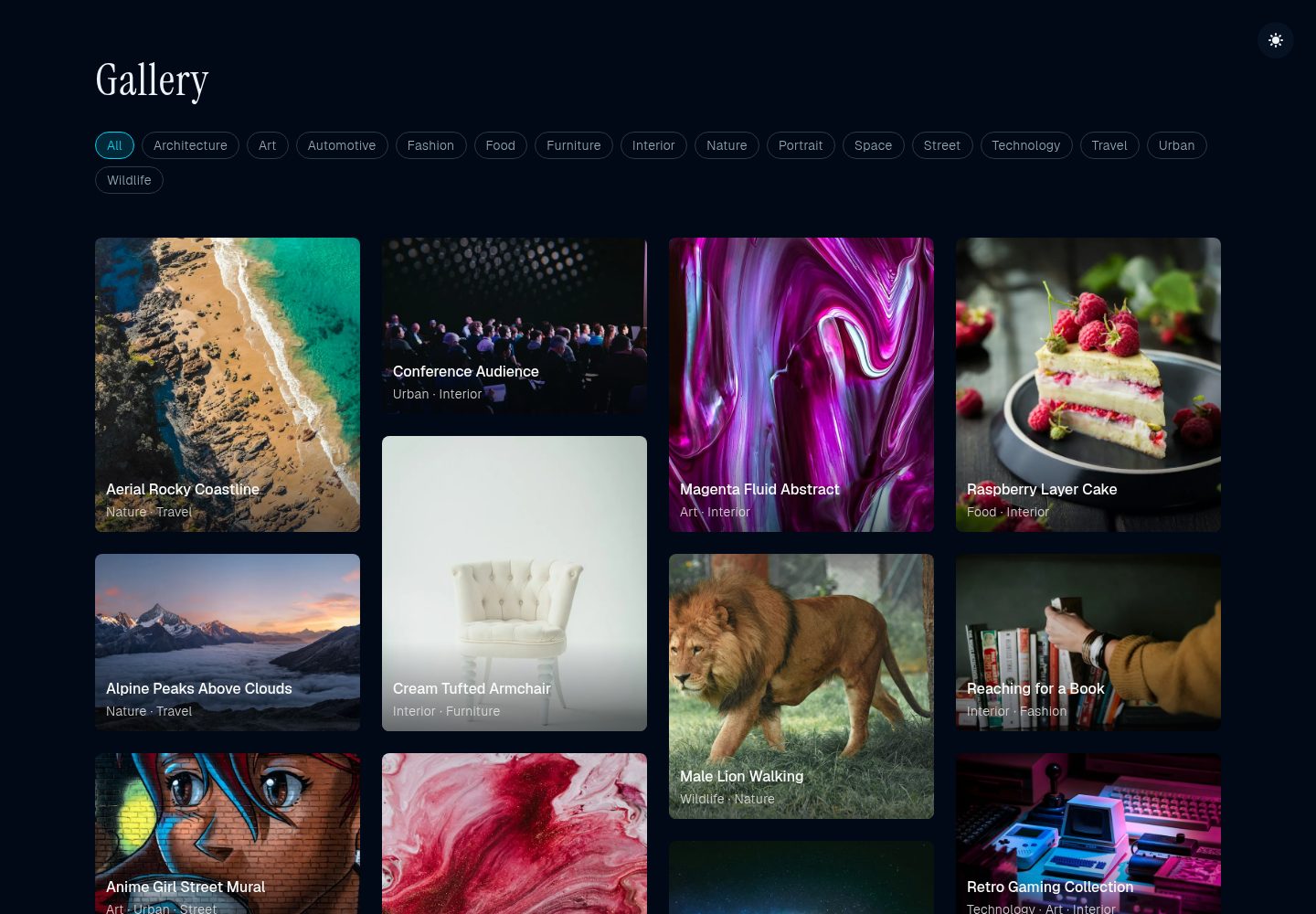
首页画廊网格、分类页与图片详情页三类页面
Astro启动器
astro-frame-shift — Astro 启动器模板
作者 EmaSuriano
基于 Astro 的极简照片画廊模板,使用视图过渡、深浅色主题与响应式瀑布流布局,内置 60 多张示例图片及分类、摄影师署名等元数据。
看看你的网站会是什么样
浏览真实页面截图,比较内容排版与手机效果。点击下方缩略图切换,放大查看整页细节。
全部页面与视图 2
截图用于了解视觉与布局,交互效果请以实际项目为准。
采集于 2026-10-02查看来源
值得关注的模板亮点
从已有项目资料中,快速了解它的特点。
使用 Astro View Transitions 实现页面间平滑导航
分类为真实路由,而非客户端隐藏
深浅色主题切换并持久化保存
基于 CSS 的响应式瀑布流,按屏幕宽度显示 1 至 4 列
gallery.json 集中管理图片元数据,含分类、日期与摄影师署名
模板详细介绍
这是一个用 Astro 构建的极简风格照片画廊启动器。页面由静态生成,包含首页画廊网格、分类页与单张图片详情页;导航切换使用 Astro View Transitions,分类被实现为真实路由(/category/{slug}/),以保证过渡效果可用。
内容数据集中在 src/data/gallery.json,每条记录包含图片地址、替代文本、标题、描述、分类、日期以及摄影师名称和可选链接。图片可归入多个分类,相关图片按标签重合度排序。仓库自带 60 多张示例图片,覆盖建筑、自然、街头摄影、人像等分类。
布局使用基于 CSS 的瀑布流,按屏幕宽度呈现 1 到 4 列;图片通过 Astro 的 Image 组件输出,并配有构建期的图片 URL 校验脚本。主题切换支持深浅两套配色并在本地持久化,界面无边框和阴影,图片信息仅在悬停时显示。
使用前需要留意:示例图片、字体(Inter、JetBrains Mono)等第三方素材的许可需单独核对;图片 URL 校验依赖外部网络可达性;模板以 yarn 作为包管理命令。
Astro启动器
适合你的项目吗?
适用场景
- 搭建个人摄影作品展示站点
- 制作以图片为主的极简作品集
- 需要分类浏览与图片详情页的画廊项目
- 希望使用视图过渡提升浏览连贯性的静态站点
适合人群
- 熟悉 Astro 与 JSON 数据配置的开发者
- 需要极简视觉风格照片画廊的个人或团队
- 接受以 yarn 作为包管理命令的项目
- 愿意自行核对第三方图片与字体许可的使用者
上手与定制指南
结合仓库当前版本的说明,按下面的资料检查内容、配置与运行要求。
- 1
使用 yarn install 安装依赖,yarn dev 启动本地开发服务器(默认 localhost:4321)
- 2
在 src/data/gallery.json 中按既有字段结构添加或替换图片条目
- 3
运行 yarn check-images 校验图片 URL,构建时也会自动执行校验
- 4
主题配色在 tailwind.config.mjs 中调整,浅色使用 stone、深色使用 slate 色板
- 5
示例图片、字体等第三方素材需按各自许可单独确认
授权与来源资料
使用条件与限制
免费使用 · 保留许可声明本次收录的是公开仓库中采用 MIT 许可的免费版本;免费范围为该版本代码,不代表外部服务或第三方素材免费。
使用时需要遵守
- 允许免费使用、修改、商用和分发该版本代码。
- 分发代码副本或实质性部分时,保留原作者版权声明和完整 MIT 许可声明。
- 代码按现状提供;担保与责任限制以原许可证及适用法律为准。
额外费用与待核对事项
- 模板声明兼容 Astro 7,使用前需确认所用 Astro 版本与该主题兼容。
- 图片 URL 校验依赖外部网络可达性,离线或网络受限环境下校验可能失败。
- 构建过程会自动执行图片 URL 校验,若外部图片不可达可能导致构建失败。
- 模板使用 Inter 与 JetBrains Mono 字体,其许可需单独核对,可能与代码许可不同。
- 仓库自带 60 多张示例图片,这些第三方图片素材的许可需单独确认,不随代码许可一并授予。
- 演示图片、字体、图标及其他第三方素材需按各自许可核对,不能仅凭代码的 MIT 许可判断。
- 域名、托管、数据库、支付或 AI 等外部服务可能另外收费。
查看原文依据
Permission is hereby granted, free of charge
许可证原文
This theme is **Astro 7 ready**.
README 原文
Run `yarn check-images` to verify all URLs are accessible
README 原文
Validation runs automatically during build process
README 原文
Clean typography with Inter and JetBrains Mono fonts
README 原文
https://github.com/EmaSuriano/astro-frame-shift/blob/main/LICENSE.mdhttps://github.com/EmaSuriano/astro-frame-shift/blob/main/README.md60+ curated images with metadata
README 原文
DeepSeek 根据仓库许可证和 README 整理 ·2026-10-02。结果仅覆盖已读取资料,依赖、图片、字体及后续条款变更以各自原文为准。
项目核对记录与介绍依据
模板资料
- 来源平台
- Astro Themes
- 资料与维护参考分
- 资料较完整 · 83 / 100
- 技术栈
- Astro
- 网站类型
- 启动器
这个分数如何计算
本站按许可资料(最高30分)、演示链接(12分)、预览图(10分)、Star数(15分)、记录的维护时间(15分)、描述完整度(8分)、功能记录(5分)和分类资料(5分)计算。它不是代码、安全或性能测试,也不是 Google 评分;有链接不代表已实测可用。
这个项目需要核对什么
- 记录的仓库更新时间
- 2026-09-25
- 截图检查日期
- 2026-10-02
已收录演示链接。请用你的内容与屏幕尺寸检查;有演示不代表表单、认证或支付已经可用。
目录记录的主要技术栈是 Astro。请通过依赖清单和锁文件核对实际版本与托管要求。这些说明基于收录资料,不代表代码审计或部署实测。
查看具体选型方法 →介绍的制作与核对状态
介绍由 AI 辅助整理目录与仓库资料。仓库作者不等于这篇介绍的审核者。
已完成服务器许可规则与 AI 来源核对;未经过人工编辑审核。
查看当时使用的来源资料
SHA-256: 5166e3c1acb3d44d8aea038f7772d8d3af732d188d4a756018e5441480d5d3a4
2026-10-02T14:54:12.481Z
来源文件 / 仓库# Astro Frame Shift - Minimalist Photo Gallery
A clean, minimalist photo gallery built with Astro featuring smooth transitions, dark/light theme support, and responsive masonry layout.
This theme is **Astro 7 ready**.
## Screenshots 📸
Captured from the [live demo](https://emasuriano.github.io/astro-frame-shift/) with [shot-scraper](https://github.com/simonw/shot-scraper). Light and dark run as parallel CI jobs via [`shots-light.yml`](shots-light.yml) / [`shots-dark.yml`](shots-dark.yml) (workflow: [`.github/workflows/screenshots.yml`](.github/workflows/screenshots.yml)). Home, Category, and Image detail.
| Light | Dark |
| ----- | ---- |
|  |  |
|  |  |
|  |  |
## ✨ Features
- **Minimalist Design**: Clean, borderless interface with no shadows or visual clutter
- **Dark/Light Theme**: Persistent theme switching with smooth transitions
- **Responsive Masonry Layout**: CSS-based masonry layout that adapts to all screen sizes
- **Image Validation**: Build-time TypeScript script to verify all image URLs are working
- **Smooth Transitions**: Astro View Transitions for seamless navigation between pages
- **Category routes**: Filter tags are real pages (`/category/{slug}/`) so view transitions work; client-side hide broke them
- **Hover Effects**: Image information appears only on hover for maximum minimalism
- **Performance Optimized**: Static site generation with optimized images using Astro's Image component
## 🎨 Design Philosophy
This gallery embraces ultra-minimalism:
- No borders or shadows
- Clean typography with Inter and JetBrains Mono fonts
- Information only appears on hover
- Stone/slate color palette for subtle elegance
- Generous white space and clean layouts
## 🚀 Project Structure
```text
/
├── public/
│ └── favicon.svg
├── src/
│ ├── components/
│ │ └── ThemeToggle.astro # Dark/light theme toggle
│ ├── content/
│ │ └── config.ts # Content collection schema
│ ├── data/
│ │ └── gallery.json # 60+ curated images with metadata
│ ├── layouts/
│ │ └── Layout.astro # Main layout with theme persistence
│ ├── pages/
│ │ ├── index.astro # Gallery grid page
│ │ └── image/
│ │ └── [id].astro # Individual image detail page
│ └── styles/
│ └── global.css # Global styles
├── scripts/
│ └── check-images.ts # Image URL validation script
└── package.json
```
## 🖼️ Gallery Features
- **60+ Images**: Diverse collection spanning multiple categories
- **Category Organization**: Architecture, Nature, Street Photography, Portraits, and more
- **Photographer Attribution**: Credit with optional links to photographer profiles
- **Related Images**: Images can have multiple categories; related images are ranked by tag overlap
- **Responsive Images**: Optimized loading with Astro's Image component
## 🧞 Commands
All commands are run from the root of the project, from a terminal:
| Command | Action |
| :--------------------- | :----------------------------------------------- |
| `yarn install` | Installs dependencies |
| `yarn dev` | Starts local dev server at `localhost:4321` |
| `yarn build` | Build your production site to `./dist/` |
| `yarn preview` | Preview your build locally, before deploying |
| `yarn check-images` | Validate all gallery image URLs |
| `yarn astro ...` | Run CLI commands like `astro add`, `astro check` |
| `yarn astro -- --help` | Get help using the Astro CLI |
## 🛠️ Development
### Adding New Images
Edit `src/data/gallery.json` to add new images:
```json
{
"src": "https://example.com/image.jpg",
"alt": "Image description",
"title": "Image Title",
"description": "Detailed description of the image",
"categories": ["Primary Tag", "Secondary Tag"],
"date": "2024-01-01",
"photographer": "Photographer Name",
"photographerLink": "https://photographer-website.com"
}
```
### Image Validation
The project includes automatic image URL validation:
- Run `yarn check-images` to verify all URLs are accessible
- Validation runs automatically during build process
- Failed URLs are reported for manual review
### Theme Customization
The project uses Tailwind CSS with a stone/slate color palette:
- Light mode: Stone colors (warm, neutral)
- Dark mode: Slate colors (cool blue-gray undertones)
- Easy to customize in `tailwind.config.mjs`
## 📱 Responsive Design
- **Mobile First**: Optimized for mobile viewing
- **Masonry Layout**: 1-4 columns based on screen size
- **Touch Friendly**: Proper hover states and touch interactions
- **Performance**: Lazy loading and optimized images
## 🎯 Performance Features
- **Static Site Generation**: Pre-rendered for maximum speed
- **Image Optimization**: Automatic WebP conversion and responsive sizes
- **View Transitions**: Smooth navigation without full page reloads
- **Minimal JavaScript**: Theme persistence and hover effects only
- **CSS-Based Masonry**: No JavaScript dependencies for layout
看看同类模板
对比同技术栈与用途的模板,找到更适合的视觉与内容结构。
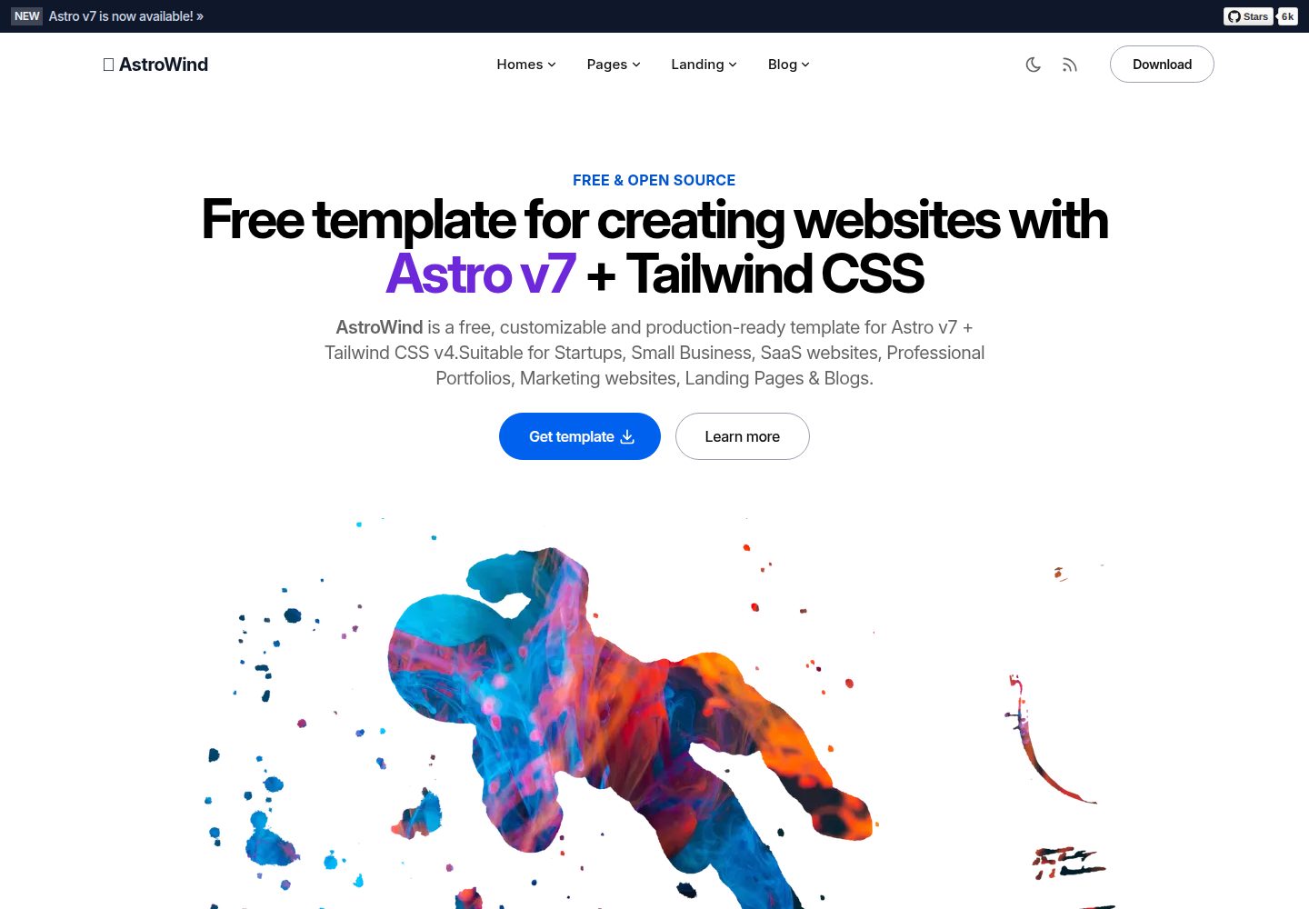
astrowind
⭕️ AstroWind: A free template using Astro v7 and Tailwind CSS v4. Astro starter theme.
Astro · 博客
accessible-astro-starter
Accessible Astro Starter 是一个以无障碍为核心理念的 Astro 6 启动模板,由 incluud 团队维护。
Astro · 博客
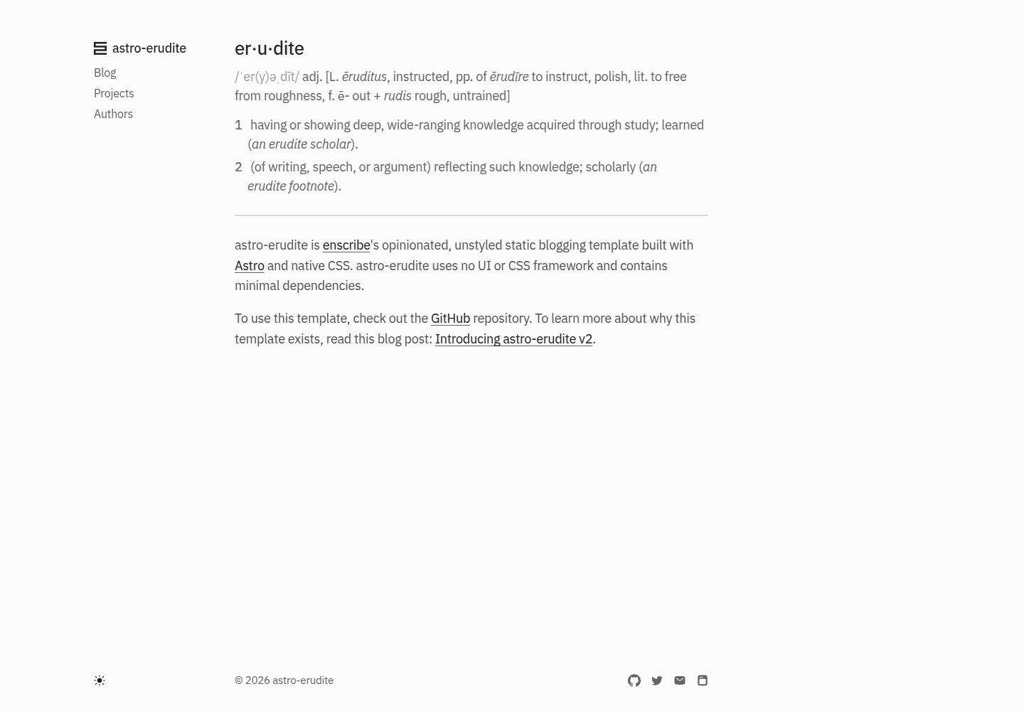
astro-erudite
An opinionated, unstyled static blogging template built with Astro and native CSS.
Astro · 作品集

astro-shopify
astro-shopify 是一个面向开发者的轻量级电商启动模板,用于构建基于 Shopify 的无头店面。
Astro · 电商
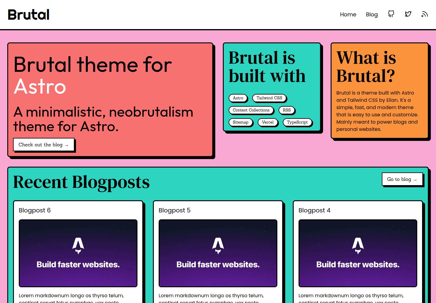
brutal
A neobrutalism Astro starter theme
Astro · 启动器
qwind
⭕️ Qwind: A template to make your website using Qwik + Tailwind CSS.
Astro · 工具站