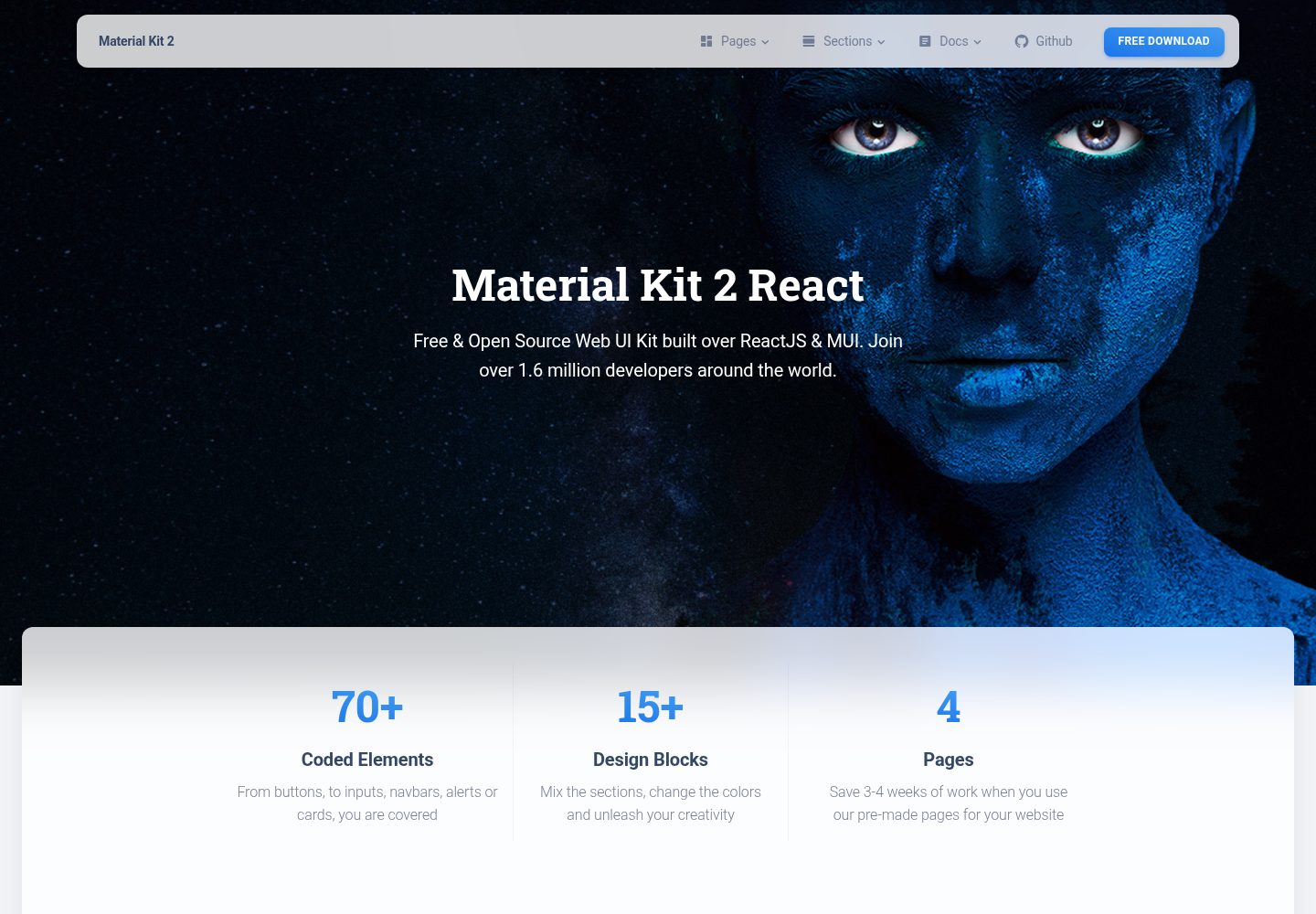
基于 Material Kit React 免费模板构建的个人网站
React作品集
react-material-website — React 作品集模板
作者 franklsm1
基于 Material Kit React 模板搭建的个人网站,使用 React 与 Material-UI 组件,包含落地页、个人资料页、注册页和组件展示页。
看看你的网站会是什么样
浏览真实页面截图,比较内容排版与手机效果。点击下方缩略图切换,放大查看整页细节。
目前有 1 张原始预览,可打开完整图片查看设计细节。
截图用于了解视觉与布局,交互效果请以实际项目为准。
采集于 2026-10-12查看来源
值得关注的模板亮点
从已有项目资料中,快速了解它的特点。
使用 React 与 Material-UI 组件体系
包含 LandingPage、ProfilePage、SignupPage 与 Components 四个页面
提供 Card、Button、CustomInput、CustomTabs、NavPills、Pagination 等可复用组件
样式分为 JSS 与 SCSS 两套目录组织
采用 MIT 许可,可免费使用、修改与分发
模板详细介绍
这是一个个人网站项目,作者在 Creative Tim 的 Material Kit React 免费模板基础上构建。仓库说明写明它使用 Material-UI 作为基础框架,并沿用了 Material Kit 的设计风格。
项目源码结构包含 src/components 下的通用组件(Card、Button、IconButton、CustomInput、CustomTabs、NavPills、Pagination、Snackbar、Typography、Footer、Header、Grid、InfoArea、Badge、Clearfix、CustomDropdown、CustomLinearProgress 等),以及 src/views 下的四个页面:LandingPage(含 ProductSection、TeamSection、WorkSection)、ProfilePage、SignupPage 和 Components(含 SectionBasics、SectionCarousel、SectionCompletedExamples、SectionDownload、SectionExamples、SectionJavascript、SectionNavbars、SectionNotifications、SectionPills、SectionSignup、SectionTabs、SectionTypography 等分节)。样式通过 src/assets/jss 与 src/assets/scss 组织,路由定义在 src/routes/index.jsx。
仓库最后更新于 2018 年,版本记录为 1.0.0(2018-05-08 首次发布)。README 未提供构建、测试或部署脚本的说明,也未描述数据来源或后端接口。模板类型被归类为作品集,但仓库本身并未声明具体用于展示哪类作品。
React作品集
适合你的项目吗?
适用场景
- 搭建个人主页或作品展示页面
- 参考 Material-UI 组件的组织与封装方式
- 以现成页面为起点修改文案与图片
- 学习 React 项目中 JSS 与 SCSS 的样式组织
适合人群
- 需要 React 个人网站起点的开发者
- 希望复用 Material 风格组件的项目
- 想研究 Creative Tim 模板结构的人
上手与定制指南
结合仓库当前版本的说明,按下面的资料检查内容、配置与运行要求。
- 1
仓库 README 未给出安装与运行命令,需自行查看 package.json 确认脚本
- 2
项目最后更新于 2018 年,依赖版本可能已过时
- 3
演示图片、字体、图标等第三方素材需单独核对其许可
- 4
代码采用 MIT 许可,分发时需保留版权声明与许可声明
授权与来源资料
使用条件与限制
免费使用 · 保留许可声明本次收录的是公开仓库中采用 MIT 许可的免费版本;免费范围为该版本代码,不代表外部服务或第三方素材免费。
使用时需要遵守
- 允许免费使用、修改、商用和分发该版本代码。
- 分发代码副本或实质性部分时,保留原作者版权声明和完整 MIT 许可声明。
- 代码按现状提供;担保与责任限制以原许可证及适用法律为准。
额外费用与待核对事项
- 演示图片、字体、图标及其他第三方素材需按各自许可核对,不能仅凭代码的 MIT 许可判断。
- 域名、托管、数据库、支付或 AI 等外部服务可能另外收费。
- README 链接中列出付费的 PRO 版本(Material Dashboard PRO React,起价 59 美元),属于付费升级产品,免费版本不包含其内容。
- README 链接中列出付费的 PRO 版本(Material Kit PRO HTML,起价 79 美元),属于付费升级产品,免费版本不包含其内容。
查看原文依据
Permission is hereby granted, free of charge
许可证原文
[Material Dashboard PRO React](https://timcreative.github.io/material-dashboard-pro-react/#/dashboard) (from $59)
README 原文
https://github.com/franklsm1/react-material-website/blob/full-react-kit/LICENSE.mdhttps://github.com/franklsm1/react-material-website/blob/full-react-kit/README.md[Material Kit PRO HTML](http://demos.creative-tim.com/material-kit-pro/presentation.html) (from $79)
README 原文
DeepSeek 根据仓库许可证和 README 整理 ·2026-10-12。结果仅覆盖已读取资料,依赖、图片、字体及后续条款变更以各自原文为准。
项目核对记录与介绍依据
模板资料
- 来源平台
- GitHub
- 资料与维护参考分
- 资料一般 · 65 / 100
- 技术栈
- React
- 网站类型
- 作品集
这个分数如何计算
本站按许可资料(最高30分)、演示链接(12分)、预览图(10分)、Star数(15分)、记录的维护时间(15分)、描述完整度(8分)、功能记录(5分)和分类资料(5分)计算。它不是代码、安全或性能测试,也不是 Google 评分;有链接不代表已实测可用。
这个项目需要核对什么
- 记录的仓库更新时间
- 2018-05-27
- 截图检查日期
- 2026-10-12
已收录演示链接。请用你的内容与屏幕尺寸检查;有演示不代表表单、认证或支付已经可用。
目录记录的主要技术栈是 React。请通过依赖清单和锁文件核对实际版本与托管要求。这些说明基于收录资料,不代表代码审计或部署实测。
查看具体选型方法 →介绍的制作与核对状态
介绍由 AI 辅助整理目录与仓库资料。仓库作者不等于这篇介绍的审核者。
审核声明: [email protected] · 2026-10-13
查看当时使用的来源资料
SHA-256: c8b3ce43bde61d771a1e84d0cb9237545cd3d6a6a520eec317220f3229571dd0
2026-10-12T21:35:26.146Z
来源文件 / 仓库# [Material Kit React - Free Material-UI Kit](http://creativetimofficial.github.io/material-kit-react/#/)

Material Kit React is a Free Material-UI Kit with a fresh, new design inspired by Google's material design. You asked for it, so we built it. It's a great pleasure to introduce to you the material concepts in an easy to use and beautiful set of components. Along with the restyling of the Material-UI elements, you will find three fully-coded example pages, to help you design your next project.
Material Kit React makes use of light, surface and movement. It uses a deliberate color choice, edge-to-edge imagery and large scale typography. The general layout resembles sheets of paper following multiple different layers, so that the depth and order is obvious. The navigation stays mainly on the left and the actions on the right.
This new design has elements that have been the result of research regarding ink and paper and the way objects and materials interact in real life. The result is a beautiful and consistent set of elements that can get you started with your next project. Material Kit React is a great tool if you are looking to create a web presence for your Android application and need to be consistent, leaving the impression of visually similar elements. It is also a great resource in its own right, looking gorgeous and helping you build your web pages.
Material Kit React uses a framework built by our friends from [mui-org](https://github.com/mui-org/material-ui), who did an amazing job creating the backbone for the material effects, animations, ripples and transitions. Big thanks to this team for the effort and forward thinking they put into it.
## Links:
+ [Live Preview](http://creativetimofficial.github.io/material-kit-react/#/)
+ [Material Dashboard Free React](https://creativetimofficial.github.io/material-dashboard-react/#/dashboard)
+ [Material Dashboard PRO React](https://timcreative.github.io/material-dashboard-pro-react/#/dashboard) (from $59)
+ [Material Kit Free HTML](https://demos.creative-tim.com/material-kit/index.html)
+ [Material Kit PRO HTML](http://demos.creative-tim.com/material-kit-pro/presentation.html) (from $79)
## Quick start
Quick start options:
- [Download from Github](https://github.com/creativetimofficial/material-kit-react.git).
- [Download from Creative Tim](http://www.creative-tim.com/product/material-kit-react).
- Clone the repo: `git clone https://github.com/creativetimofficial/material-kit-react.git`.
### What's included
Within the download you'll find the following directories and files:
```
├── CHANGELOG.md
├── LICENSE.md
├── README.md
├── package.json
├── Documentation
│ ├── assets
│ │ ├── css
│ │ ├── img
│ │ │ └── faces
│ │ └── js
│ └── tutorial-components.html
├── public
│ ├── index.html
│ └── manifest.json
└── src
├── index.js
├── logo.svg
├── routes
│ └── index.jsx
├── assets
│ ├── img
│ │ └── kit
│ │ ├── faces
│ │ └── free
│ │ └── examples
│ ├── jss
│ │ ├── material-kit-react
│ │ │ ├── components
│ │ │ └── views
│ │ │ ├── componentsSections
│ │ │ └── landingPageSections
│ │ └── material-kit-react.jsx
│ └── scss
│ ├── core
│ │ ├── mixins
│ │ └── variables
│ ├── plugins
│ └── material-kit-react.scss
├── components
│ ├── Badge
│ │ └── Badge.jsx
│ ├── Card
│ │ ├── Card.jsx
│ │ ├── CardBody.jsx
│ │ ├── CardFooter.jsx
│ │ └── CardHeader.jsx
│ ├── Clearfix
│ │ └── Clearfix.jsx
│ ├── CustomButtons
│ │ ├── Button.jsx
│ │ └── IconButton.jsx
│ ├── CustomDropdown
│ │ └── CustomDropdown.jsx
│ ├── CustomInput
│ │ └── CustomInput.jsx
│ ├── CustomLinearProgress
│ │ └── CustomLinearProgress.jsx
│ ├── CustomTabs
│ │ └── CustomTabs.jsx
│ ├── Footer
│ │ └── Footer.jsx
│ ├── Grid
│ │ ├── GridContainer.jsx
│ │ └── ItemGrid.jsx
│ ├── Header
│ │ ├── Header.jsx
│ │ └── HeaderLinks.jsx
│ ├── InfoArea
│ │ └── InfoArea.jsx
│ ├── NavPills
│ │ └── NavPills.jsx
│ ├── Pagination
│ │ └── Pagination.jsx
│ ├── Snackbar
│ │ └── SnackbarContent.jsx
│ └── Typography
│ ├── Danger.jsx
│ ├── Info.jsx
│ ├── Muted.jsx
│ ├── Primary.jsx
│ ├── Quote.jsx
│ ├── Small.jsx
│ ├── Success.jsx
│ └── Warning.jsx
└── views
├── Components
│ ├── Components.jsx
│ └── Sections
│ ├── SectionBasics.jsx
│ ├── SectionCarousel.jsx
│ ├── SectionCompletedExamples.jsx
│ ├── SectionDownload.jsx
│ ├── SectionExamples.jsx
│ ├── SectionJavascript.jsx
│ ├── SectionNavbars.jsx
│ ├── SectionNotifications.jsx
│ ├── SectionPills.jsx
│ ├── SectionSignup.jsx
│ ├── SectionTabs.jsx
│ └── SectionTypography.jsx
├── LandingPage
│ ├── LandingPage.jsx
│ └── Sections
│ ├── ProductSection.jsx
│ ├── TeamSection.jsx
│ └── WorkSection.jsx
├── ProfilePage
│ └── ProfilePage.jsx
└── SignupPage
└── SignupPage.jsx
```
### Version logs
## [1.0.0] 2018-05-08
### Original Release
- Added Material-UI as base framework
- Added design from Material Kit by Creative Tim
### License
- Copyright 2018 Creative Tim (http://www.creative-tim.com)
- Licensed under MIT (https://github.com/creativetimofficial/material-kit-react/blob/master/LICENSE.md)
## Useful Links
More products from Creative Tim: <http://www.creative-tim.com/products>
Tutorials: <https://www.youtube.com/channel/UCVyTG4sCw-rOvB9oHkzZD1w>
Freebies: <http://www.creative-tim.com/products>
Affiliate Program (earn money): <http://www.creative-tim.com/affiliates/new>
Social Media:
Twitter: <https://twitter.com/CreativeTim>
Facebook: <https://www.facebook.com/CreativeTim>
Dribbble: <https://dribbble.com/creativetim>
Google+: <https://plus.google.com/+CreativetimPage>
Instagram: <https://instagram.com/creativetimofficial>
看看同类模板
对比同技术栈与用途的模板,找到更适合的视觉与内容结构。
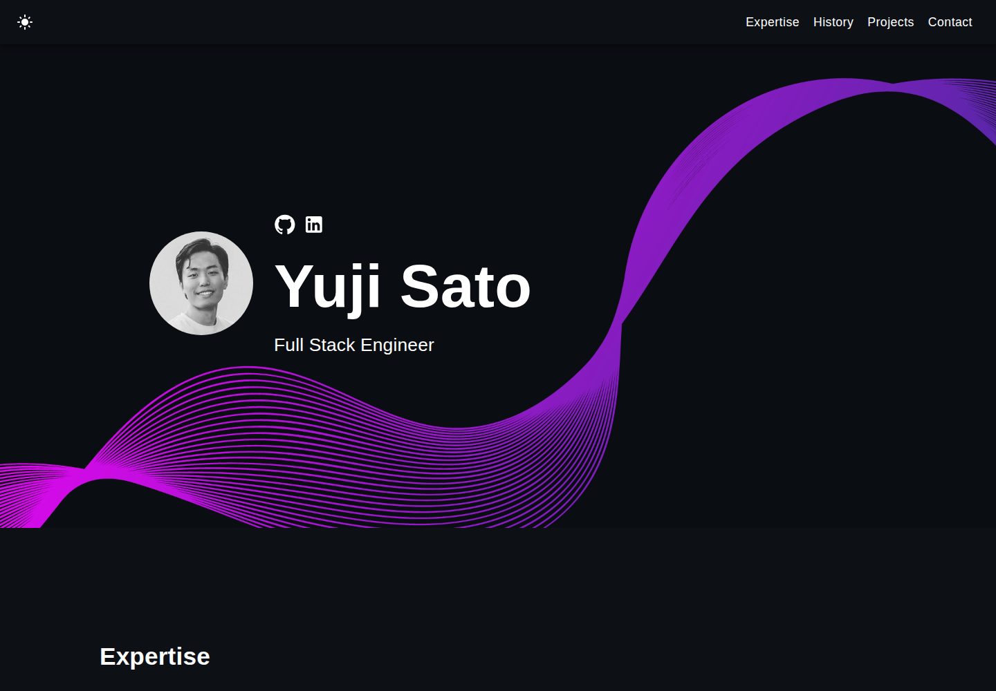
react-portfolio-template
React powered portfolio website template for developers
React · 作品集
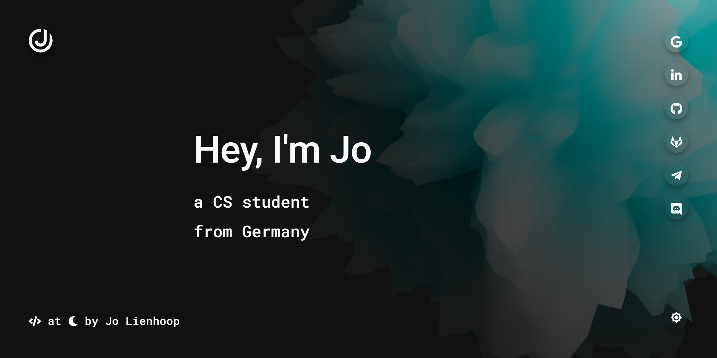
personal-website-react
personal-website-react 是一个面向开发者的个人作品集单页模板,由 React 和 Material-UI 构建,并通过 Create React App 初始化。
React · 作品集
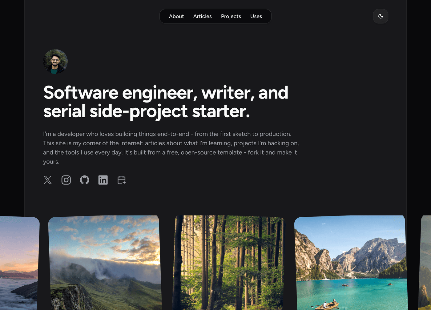
karngyan.com
karngyan.com 是一个面向开发者的个人网站与博客模板,作者用它搭建了自己的站点,并公开了完整代码。 模板的核心定位很明确:让写作者专注于内容,而不是花时间搭建基础设施。
React · 作品集
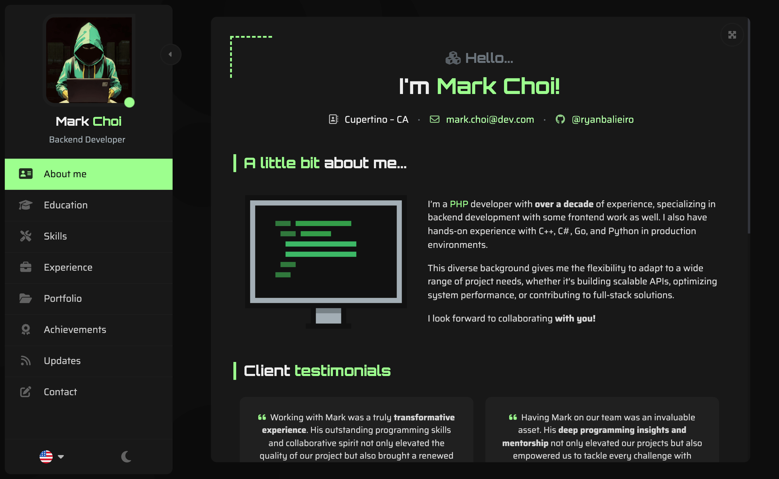
react-portfolio-template
react-portfolio-template 是一个由 Ryan Balieiro 开发的 React 作品集模板,定位为“sleek, futuristic”,适合开发者展示个人履历。
React · 作品集
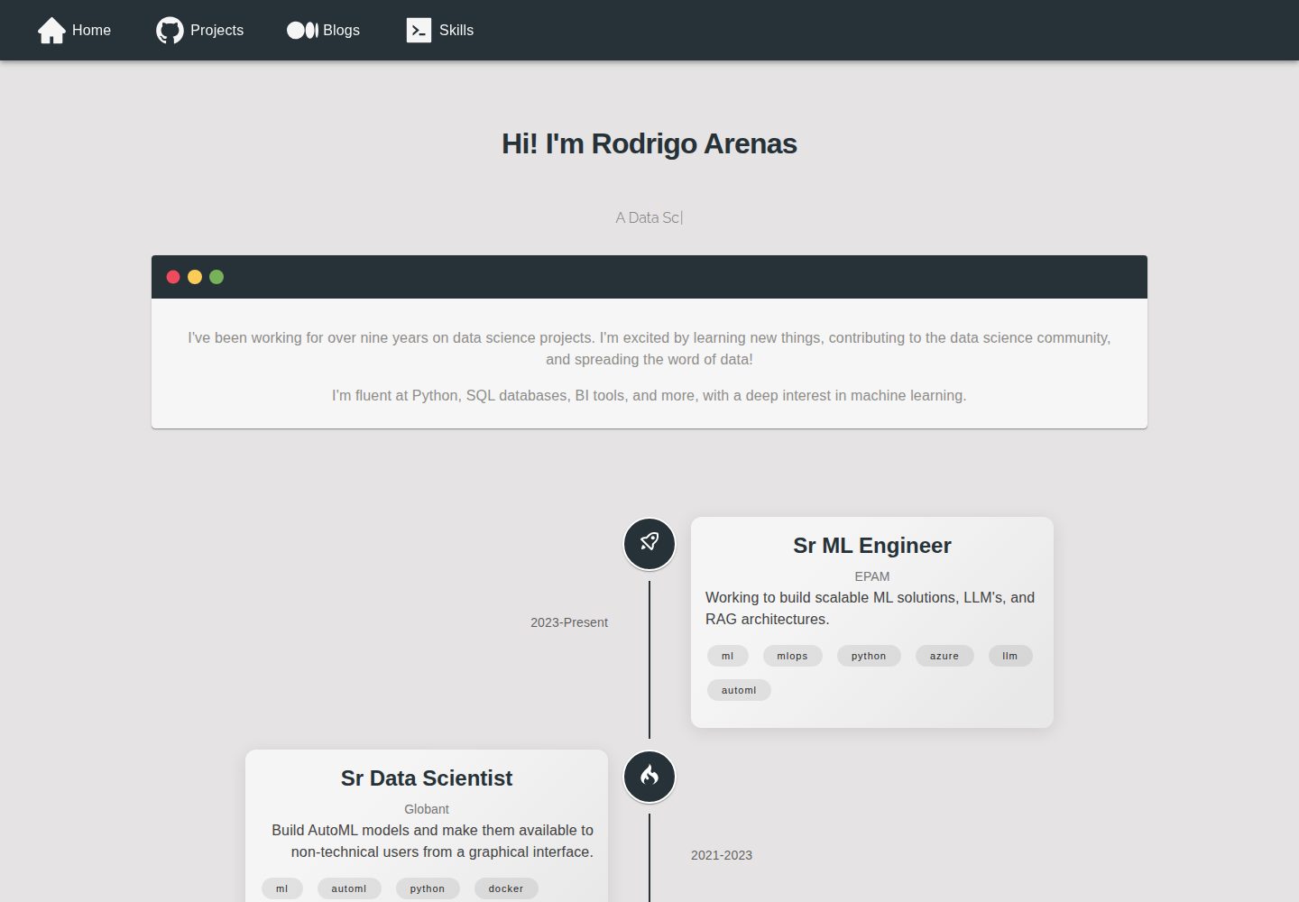
portfolio
Personal website, Data scientist portfolio template
React · 作品集
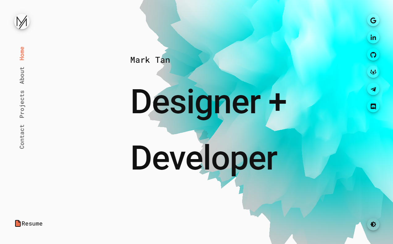
react-portfolio
react-portfolio 是一个面向开发者的个人作品集模板,基于 React 16 和 Create React App 构建,界面样式采用 Material-UI。
React · 作品集