Personal website built on the free Material Kit React template
ReactPortfolio
react-material-website — React Portfolio Template
By franklsm1
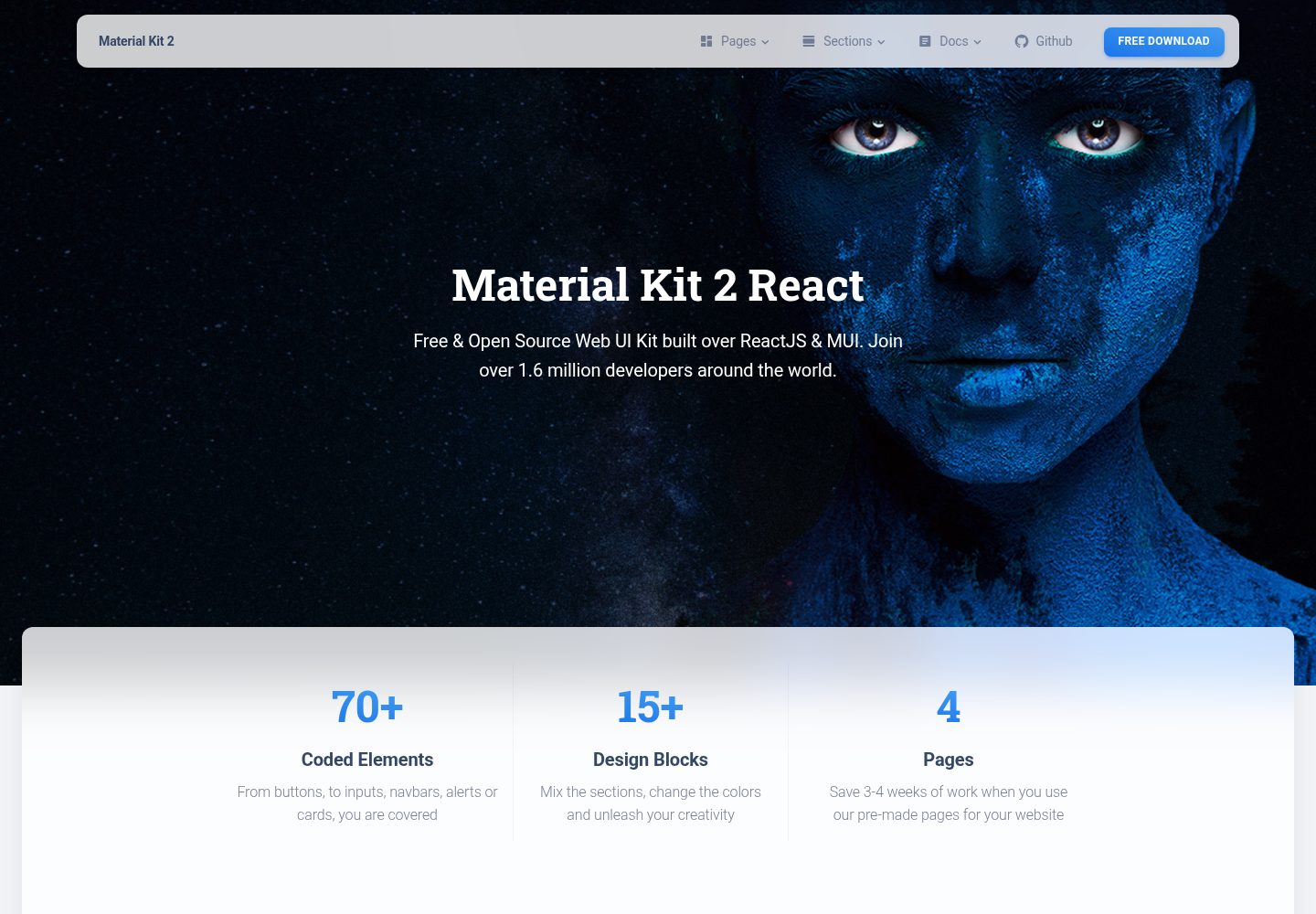
A personal website built on the Material Kit React template, using React and Material-UI components, including a landing page, profile page, signup page, and components showcase page.
Explore the design
Compare the page layouts and mobile experience. Open any screenshot for a closer look.
Desktop homepage
Desktop captureTop of page
Actual screenshot captured by the server browser.
One original preview is available. Open the full image to inspect the design.
Screenshots show visual appearance; interactive behavior may differ.
Recorded 2026-10-12View source
What stands out
A quick read of the recorded project description.
Uses React and the Material-UI component system
Includes four pages: LandingPage, ProfilePage, SignupPage, and Components
Provides reusable components such as Card, Button, CustomInput, CustomTabs, NavPills, and Pagination
Styles are organized into two directories: JSS and SCSS
Licensed under MIT, free to use, modify, and distribute
Template Details
This is a personal website project that the author built on top of Creative Tim's free Material Kit React template. The repository description states that it uses Material-UI as the underlying framework and follows the Material Kit design style.
The source structure includes common components under src/components (Card, Button, IconButton, CustomInput, CustomTabs, NavPills, Pagination, Snackbar, Typography, Footer, Header, Grid, InfoArea, Badge, Clearfix, CustomDropdown, CustomLinearProgress, and others), as well as four pages under src/views: LandingPage (with ProductSection, TeamSection, and WorkSection), ProfilePage, SignupPage, and Components (with sections such as SectionBasics, SectionCarousel, SectionCompletedExamples, SectionDownload, SectionExamples, SectionJavascript, SectionNavbars, SectionNotifications, SectionPills, SectionSignup, SectionTabs, and SectionTypography). Styles are organized through src/assets/jss and src/assets/scss, and routes are defined in src/routes/index.jsx.
The repository was last updated in 2018, with a version record of 1.0.0 (first released on 2018-05-08). The README does not provide instructions for build, test, or deployment scripts, nor does it describe data sources or backend interfaces. The template type is categorized as portfolio, but the repository itself does not state what kind of work it is intended to showcase.
ReactPortfolio
Is it right for your project?
Use Cases
- Building a personal homepage or portfolio display page
- Referencing how Material-UI components are organized and wrapped
- Using the existing pages as a starting point to modify copy and images
- Learning how JSS and SCSS are organized in a React project
Suitable For
- Developers who need a starting point for a React personal website
- Projects that want to reuse Material-style components
- People who want to study the structure of a Creative Tim template
Getting started & customization
Use these recorded setup notes alongside the repository instructions for your chosen version.
- 1
The repository README does not provide installation or run commands; check package.json yourself to confirm the scripts
- 2
The project was last updated in 2018, so dependency versions may be outdated
- 3
Third-party assets such as demo images, fonts, and icons need their licenses checked separately
- 4
The code is under the MIT license; when distributing, retain the copyright notice and license statement
License & source material
Usage conditions & limitations
Free to use · keep license noticeThis entry covers the free version in a public repository under the MIT license; the free scope applies to that version's code and does not mean external services or third-party assets are free.
Must comply with when using
- The code of this version may be used, modified, used commercially, and distributed free of charge.
- When distributing copies or substantial portions of the code, retain the original author's copyright notice and the full MIT license notice.
- The code is provided as is; warranties and limitations of liability are governed by the original license and applicable law.
Additional costs & items to verify
- Demo images, fonts, icons, and other third-party assets must be checked against their respective licenses; the code's MIT license alone is not sufficient to determine this.
- External services such as domains, hosting, databases, payments, or AI may incur separate charges.
- The README links list a paid PRO version (Material Dashboard PRO React, starting at $59), which is a paid upgrade product; the free version does not include its content.
- The README links list a paid PRO version (Material Kit PRO HTML, starting at $79), which is a paid upgrade product; the free version does not include its content.
View Original Text Basis
Permission is hereby granted, free of charge
Original License Text
[Material Dashboard PRO React](https://timcreative.github.io/material-dashboard-pro-react/#/dashboard) (from $59)
Original README
https://github.com/franklsm1/react-material-website/blob/full-react-kit/LICENSE.mdhttps://github.com/franklsm1/react-material-website/blob/full-react-kit/README.md[Material Kit PRO HTML](http://demos.creative-tim.com/material-kit-pro/presentation.html) (from $79)
Original README
Compiled by DeepSeek based on repository license and README ·2026-10-12. Results only cover the materials read; dependencies, images, fonts, and subsequent term changes are subject to their respective original texts.
Project checks & description sources
Template Information
- Source platforms
- GitHub
- Documentation and maintenance reference score
- Partly documented · 65 / 100
- Technologies
- React
- Website type
- Portfolio
How this score is calculated
Our heuristic uses license records (up to 30), a demo link (12), a preview (10), stars (15), recorded maintenance (15), description completeness (8), feature records (5) and classification data (5). It is not a code, security or performance test, or a Google score. A link does not establish tested functionality.
What to verify for this project
- Repository update recorded
- 2018-05-27
- Screenshot last checked
- 2026-10-12
A demo link is listed. Check it with your own content and viewport sizes; its presence does not confirm that forms, authentication or payments work.
The catalog identifies React as the primary stack. Check the actual dependency manifest and lockfile for versions and hosting requirements. These notes use recorded metadata, not a code audit or a deployment test.
Use a selection guide →How this description was prepared
AI-assisted description based on catalog records and repository material. Repository authors are not automatically the reviewers of this description.
Review declaration: [email protected] · 2026-10-13
Inspect the recorded source material
SHA-256: c8b3ce43bde61d771a1e84d0cb9237545cd3d6a6a520eec317220f3229571dd0
2026-10-12T21:35:26.146Z
Source file / repository# [Material Kit React - Free Material-UI Kit](http://creativetimofficial.github.io/material-kit-react/#/)

Material Kit React is a Free Material-UI Kit with a fresh, new design inspired by Google's material design. You asked for it, so we built it. It's a great pleasure to introduce to you the material concepts in an easy to use and beautiful set of components. Along with the restyling of the Material-UI elements, you will find three fully-coded example pages, to help you design your next project.
Material Kit React makes use of light, surface and movement. It uses a deliberate color choice, edge-to-edge imagery and large scale typography. The general layout resembles sheets of paper following multiple different layers, so that the depth and order is obvious. The navigation stays mainly on the left and the actions on the right.
This new design has elements that have been the result of research regarding ink and paper and the way objects and materials interact in real life. The result is a beautiful and consistent set of elements that can get you started with your next project. Material Kit React is a great tool if you are looking to create a web presence for your Android application and need to be consistent, leaving the impression of visually similar elements. It is also a great resource in its own right, looking gorgeous and helping you build your web pages.
Material Kit React uses a framework built by our friends from [mui-org](https://github.com/mui-org/material-ui), who did an amazing job creating the backbone for the material effects, animations, ripples and transitions. Big thanks to this team for the effort and forward thinking they put into it.
## Links:
+ [Live Preview](http://creativetimofficial.github.io/material-kit-react/#/)
+ [Material Dashboard Free React](https://creativetimofficial.github.io/material-dashboard-react/#/dashboard)
+ [Material Dashboard PRO React](https://timcreative.github.io/material-dashboard-pro-react/#/dashboard) (from $59)
+ [Material Kit Free HTML](https://demos.creative-tim.com/material-kit/index.html)
+ [Material Kit PRO HTML](http://demos.creative-tim.com/material-kit-pro/presentation.html) (from $79)
## Quick start
Quick start options:
- [Download from Github](https://github.com/creativetimofficial/material-kit-react.git).
- [Download from Creative Tim](http://www.creative-tim.com/product/material-kit-react).
- Clone the repo: `git clone https://github.com/creativetimofficial/material-kit-react.git`.
### What's included
Within the download you'll find the following directories and files:
```
├── CHANGELOG.md
├── LICENSE.md
├── README.md
├── package.json
├── Documentation
│ ├── assets
│ │ ├── css
│ │ ├── img
│ │ │ └── faces
│ │ └── js
│ └── tutorial-components.html
├── public
│ ├── index.html
│ └── manifest.json
└── src
├── index.js
├── logo.svg
├── routes
│ └── index.jsx
├── assets
│ ├── img
│ │ └── kit
│ │ ├── faces
│ │ └── free
│ │ └── examples
│ ├── jss
│ │ ├── material-kit-react
│ │ │ ├── components
│ │ │ └── views
│ │ │ ├── componentsSections
│ │ │ └── landingPageSections
│ │ └── material-kit-react.jsx
│ └── scss
│ ├── core
│ │ ├── mixins
│ │ └── variables
│ ├── plugins
│ └── material-kit-react.scss
├── components
│ ├── Badge
│ │ └── Badge.jsx
│ ├── Card
│ │ ├── Card.jsx
│ │ ├── CardBody.jsx
│ │ ├── CardFooter.jsx
│ │ └── CardHeader.jsx
│ ├── Clearfix
│ │ └── Clearfix.jsx
│ ├── CustomButtons
│ │ ├── Button.jsx
│ │ └── IconButton.jsx
│ ├── CustomDropdown
│ │ └── CustomDropdown.jsx
│ ├── CustomInput
│ │ └── CustomInput.jsx
│ ├── CustomLinearProgress
│ │ └── CustomLinearProgress.jsx
│ ├── CustomTabs
│ │ └── CustomTabs.jsx
│ ├── Footer
│ │ └── Footer.jsx
│ ├── Grid
│ │ ├── GridContainer.jsx
│ │ └── ItemGrid.jsx
│ ├── Header
│ │ ├── Header.jsx
│ │ └── HeaderLinks.jsx
│ ├── InfoArea
│ │ └── InfoArea.jsx
│ ├── NavPills
│ │ └── NavPills.jsx
│ ├── Pagination
│ │ └── Pagination.jsx
│ ├── Snackbar
│ │ └── SnackbarContent.jsx
│ └── Typography
│ ├── Danger.jsx
│ ├── Info.jsx
│ ├── Muted.jsx
│ ├── Primary.jsx
│ ├── Quote.jsx
│ ├── Small.jsx
│ ├── Success.jsx
│ └── Warning.jsx
└── views
├── Components
│ ├── Components.jsx
│ └── Sections
│ ├── SectionBasics.jsx
│ ├── SectionCarousel.jsx
│ ├── SectionCompletedExamples.jsx
│ ├── SectionDownload.jsx
│ ├── SectionExamples.jsx
│ ├── SectionJavascript.jsx
│ ├── SectionNavbars.jsx
│ ├── SectionNotifications.jsx
│ ├── SectionPills.jsx
│ ├── SectionSignup.jsx
│ ├── SectionTabs.jsx
│ └── SectionTypography.jsx
├── LandingPage
│ ├── LandingPage.jsx
│ └── Sections
│ ├── ProductSection.jsx
│ ├── TeamSection.jsx
│ └── WorkSection.jsx
├── ProfilePage
│ └── ProfilePage.jsx
└── SignupPage
└── SignupPage.jsx
```
### Version logs
## [1.0.0] 2018-05-08
### Original Release
- Added Material-UI as base framework
- Added design from Material Kit by Creative Tim
### License
- Copyright 2018 Creative Tim (http://www.creative-tim.com)
- Licensed under MIT (https://github.com/creativetimofficial/material-kit-react/blob/master/LICENSE.md)
## Useful Links
More products from Creative Tim: <http://www.creative-tim.com/products>
Tutorials: <https://www.youtube.com/channel/UCVyTG4sCw-rOvB9oHkzZD1w>
Freebies: <http://www.creative-tim.com/products>
Affiliate Program (earn money): <http://www.creative-tim.com/affiliates/new>
Social Media:
Twitter: <https://twitter.com/CreativeTim>
Facebook: <https://www.facebook.com/CreativeTim>
Dribbble: <https://dribbble.com/creativetim>
Google+: <https://plus.google.com/+CreativetimPage>
Instagram: <https://instagram.com/creativetimofficial>
Explore similar templates
Compare previews and descriptions within the same stack and category.
react-portfolio-template
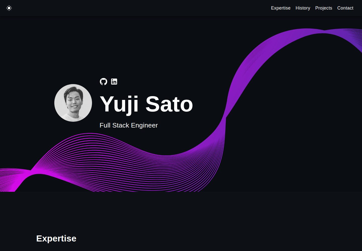
A React-based developer portfolio template for showcasing projects, work history, and skills. It offers a multi-component layout, dark and light modes, and responsive mobile adaptation, with text and images editable in src/components.
React · Portfolio

personal-website-react
A single-page developer portfolio template built with React and Material-UI, driven by a JSON Resume-compliant resume.json. It offers light/dark theme switching with localStorage persistence, a clean responsive layout, and Create React App tooling for simple builds and static deployment.
React · Portfolio
karngyan.com
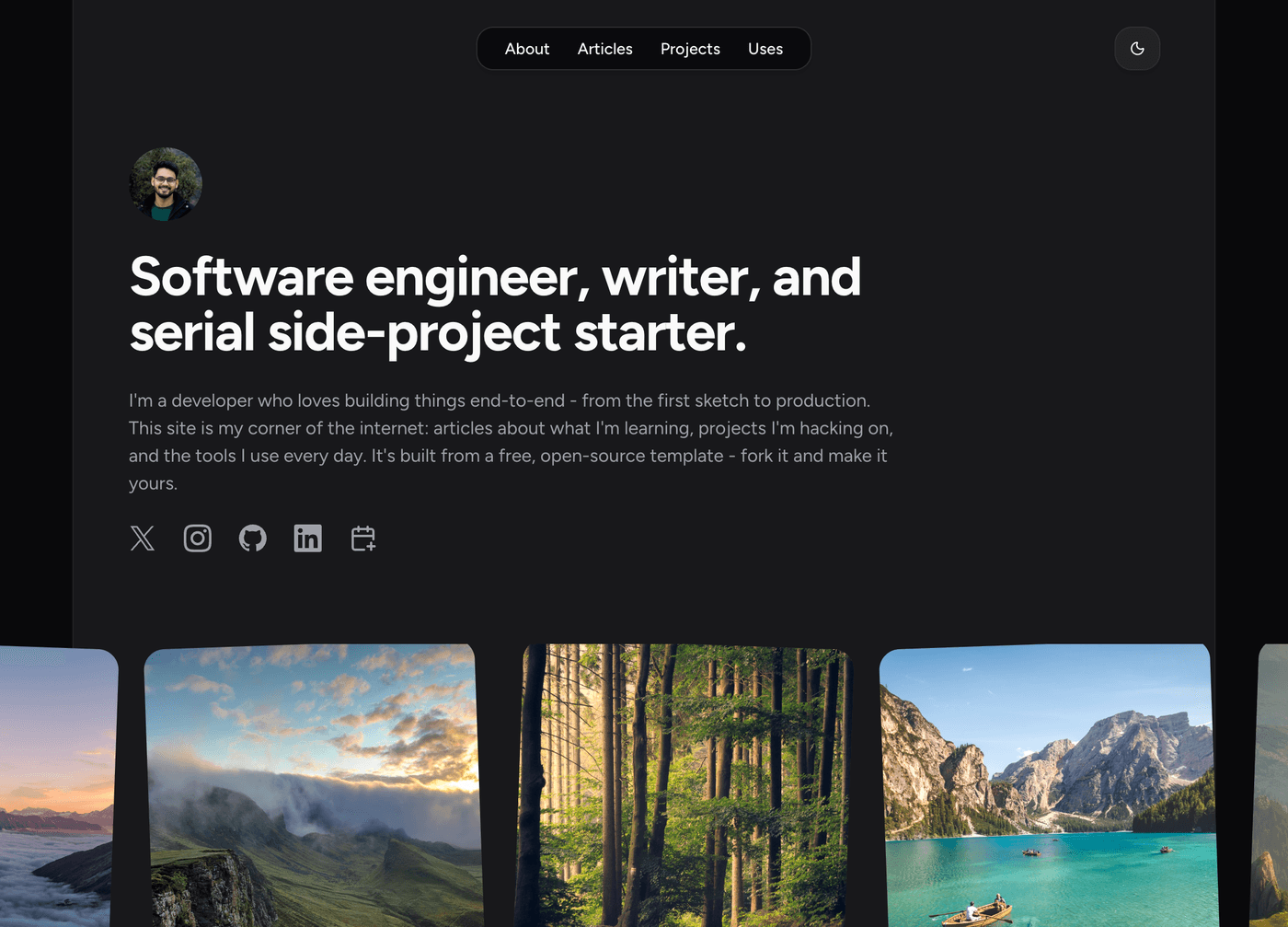
A personal website and blog template for developers, built with TanStack Start, React 19, Tailwind CSS v4, and shadcn/ui. It uses MDX for articles with Shiki highlighting and GFM tables, and automatically generates RSS, sitemap, robots.txt, llms.txt, and OG images.
React · Portfolio
react-portfolio-template
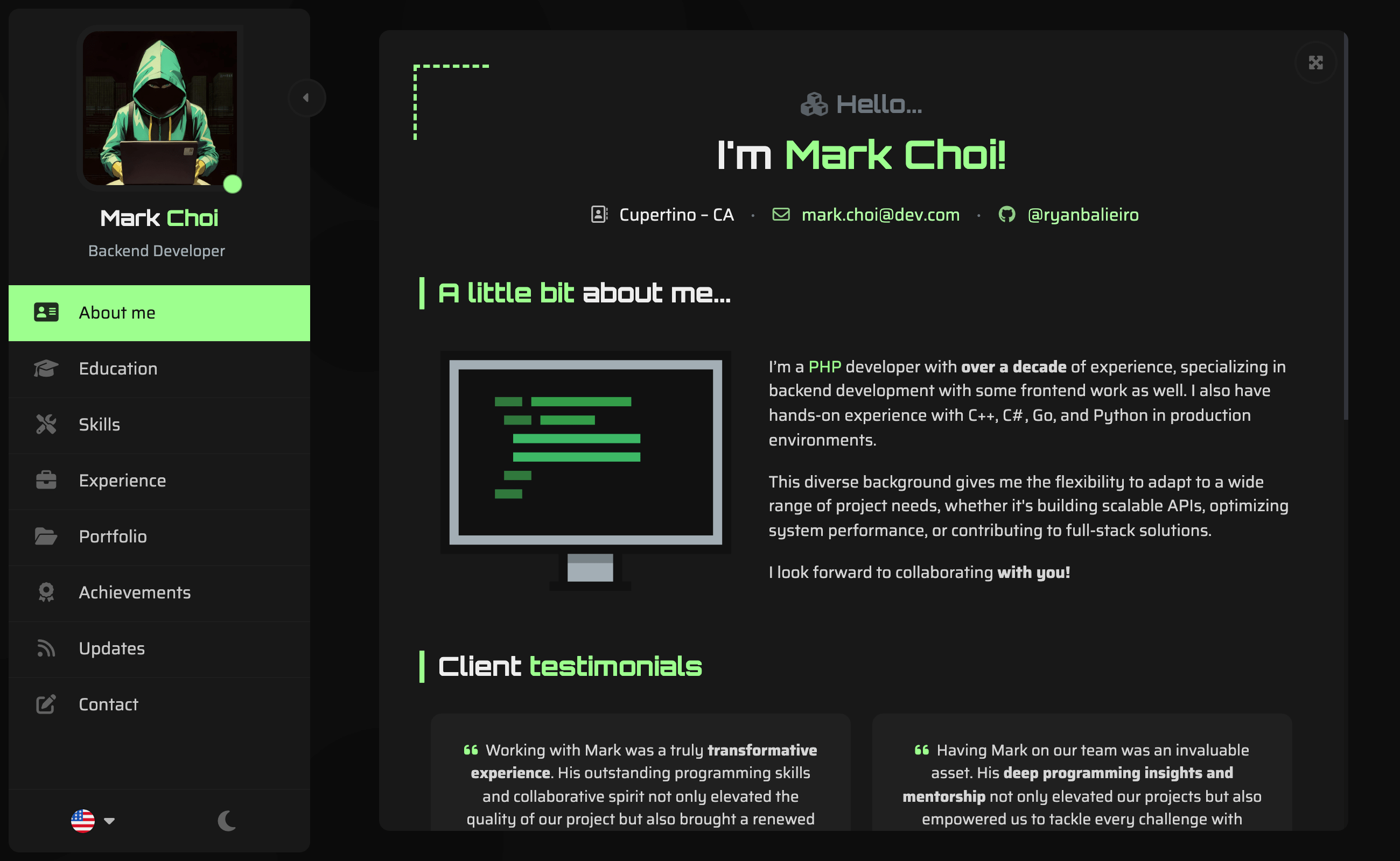
A React portfolio template by Ryan Balieiro with a fixed sidebar and page-turn transitions on desktop, bottom navigation on mobile, multilingual support, light/dark themes, and content components for experience, education, skills, projects, and testimonials.
React · Portfolio
portfolio
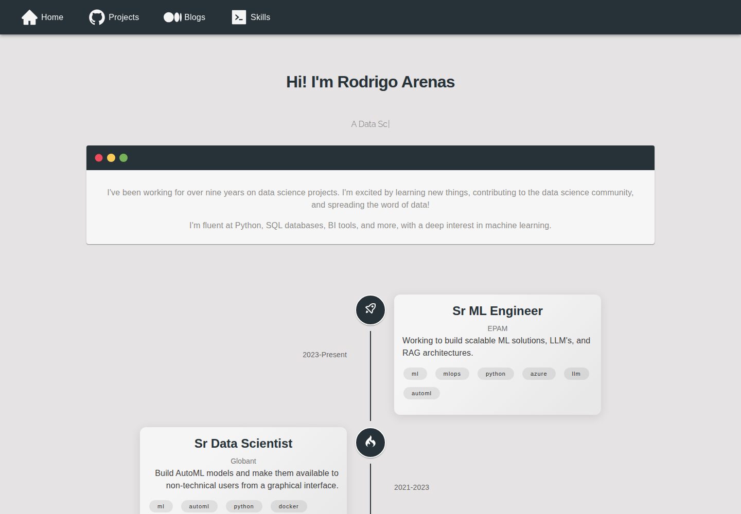
A data scientist personal portfolio template built with React and MUI, with content centrally managed through configuration files in the assets directory.
React · Portfolio
react-portfolio
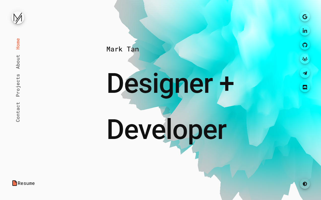
A React 16 and Material-UI developer portfolio template that centralizes personal information in a JSON Resume-compliant resume.json, with light/dark theme switching saved to local storage. It currently provides portfolio display only; resume page templates and structured data enhancements are still planned.
React · Portfolio