同时支持克隆为独立模板和作为 Nuxt Layer 通过 extends 复用
NuxtVue作品集
bentolio — Nuxt 作品集模板
作者 oneminch
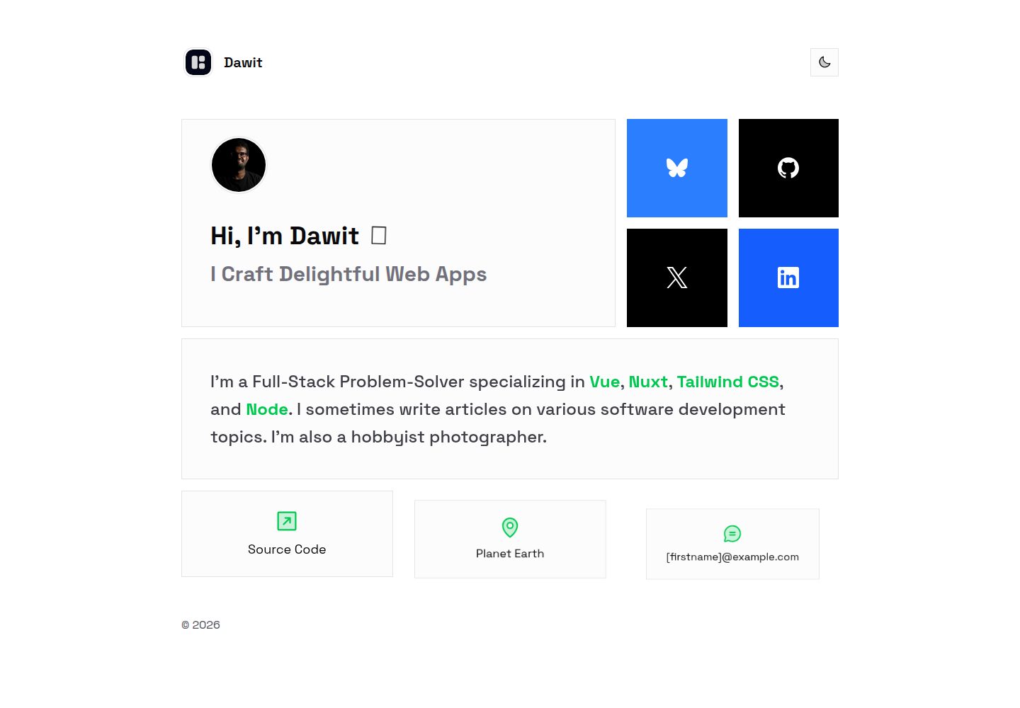
Bentolio 是一个基于 Nuxt 的最小作品集模板,同时可作为 Nuxt Layer 复用,内容与基础样式集中在 app/app.config.ts 中配置,使用 Tailwind CSS 与 GSAP 实现界面和入场动画。
看看你的网站会是什么样
浏览真实页面截图,比较内容排版与手机效果。点击下方缩略图切换,放大查看整页细节。
全部页面与视图 2
截图用于了解视觉与布局,交互效果请以实际项目为准。
采集于 2026-10-02查看来源
值得关注的模板亮点
从已有项目资料中,快速了解它的特点。
页面内容与基础样式集中在 app/app.config.ts,并配有类型定义
使用 Tailwind CSS 与 CSS 主题变量控制主色等样式
通过 GSAP 插件实现入场动画与微交互,animate-element 类控制动画元素
使用 @nuxtjs/color-mode 的 class 策略提供暗色模式切换
默认通过 routeRules 配置静态生成,便于部署到静态托管
模板详细介绍
Bentolio 是面向个人作品集场景的 Nuxt 模板,仓库同时提供模板克隆与 Nuxt Layer 两种使用方式。页面内容、社交链接、CTA 与部分样式开关都集中在 app/app.config.ts 中,并通过 app/utils/types.ts 提供类型提示与校验。默认支持 X、LinkedIn、Bluesky、GitHub 四个社交入口,布局按四个链接设计,扩展更多网络需要修改类型定义与映射。
样式方面,Tailwind 入口为 app/assets/css/tailwind.css,主色通过 CSS 主题变量 --color-primary 调整;暗色模式由 @nuxtjs/color-mode 以 class 策略切换;图标使用 @nuxt/icon 与 Iconify 集合。动画由 GSAP 插件提供,带 animate-element 类的元素在页面加载时执行入场动画,挥手表情动画由 CSS 中的 #wave 控制。
构建与部署上,模板在 nuxt.config.ts 中通过 routeRules 配置为静态生成,页面预渲染后可直接部署到静态托管;OG 图片可由 nuxt-og-image 模块生成。仓库中另有一个不再积极更新的 Astro 版本分支。设计灵感来自 Hover.dev 的 Bento Grid。
Nuxt作品集
适合你的项目吗?
适用场景
- 搭建个人作品集或开发者主页,集中展示简介、社交链接与联系方式
- 在已有 Nuxt 项目中通过 extends 引入该 Layer,快速获得作品集页面与样式
- 作为学习 Nuxt 内容配置、Tailwind 主题变量与 GSAP 入场动画的参考项目
- 需要静态生成并部署到静态托管服务的个人站点
适合人群
- 希望用 Nuxt 快速搭建个人作品集页面的开发者
- 需要在多个 Nuxt 项目间复用同一套作品集界面与配置的团队
- 偏好通过配置文件集中管理页面内容而非逐页编写模板的用户
- 计划将站点以静态方式部署到静态托管平台的用户
上手与定制指南
结合仓库当前版本的说明,按下面的资料检查内容、配置与运行要求。
- 1
作为模板使用时克隆仓库并修改 app/app.config.ts 中的示例内容;作为 Layer 使用时安装 @minch/bentolio 并在 nuxt.config.ts 的 extends 中引入
- 2
替换 public/profile.jpg 头像,并按需更新 public/favicon.svg、public/og-image.png、public/logo.svg
- 3
主色通过 app/assets/css/tailwind.css 中的 --color-primary 主题变量调整,Tailwind 入口同为该文件
- 4
默认仅支持 X、LinkedIn、Bluesky、GitHub 四个社交链接,扩展其他网络需修改 app/utils/types.ts 中的 SocialMediaKey 与 socials 映射
- 5
仓库中的 Astro 版本位于 astro 分支,且说明其不再积极更新
授权与来源资料
使用条件与限制
免费使用 · 保留许可声明本次收录的是公开仓库中采用 MIT 许可的免费版本;免费范围为该版本代码,不代表外部服务或第三方素材免费。
使用时需要遵守
- 允许免费使用、修改、商用和分发该版本代码。
- 分发代码副本或实质性部分时,保留原作者版权声明和完整 MIT 许可声明。
- 代码按现状提供;担保与责任限制以原许可证及适用法律为准。
额外费用与待核对事项
- 仓库中的 Astro 版本位于 astro 分支,README 明确说明该分支不再积极更新,如需该版本需自行承担维护风险。
- 设计灵感来自 Hover.dev 的 Bento Grid,若需使用其原始设计资源,应自行核实第三方素材的授权情况。
- 默认布局仅设计为展示 4 个社交链接,扩展更多网络需修改 app/utils/types.ts 中的 SocialMediaKey 与 socials 映射。
- 演示图片、字体、图标及其他第三方素材需按各自许可核对,不能仅凭代码的 MIT 许可判断。
- 域名、托管、数据库、支付或 AI 等外部服务可能另外收费。
查看原文依据
Permission is hereby granted, free of charge
许可证原文
For the original Astro version (not actively updated), check the [`astro`](https://github.com/oneminch/bentolio/tree/astro) branch.
README 原文
The design is inspired by [@TomIsLoading](https://twitter.com/TomIsLoading)'s Bento Grid from [Hover.dev](https://hover.dev).
README 原文
https://github.com/oneminch/bentolio/blob/main/LICENSEhttps://github.com/oneminch/bentolio/blob/main/README.mdThe layout is designed to only display 4 social links by default.
README 原文
DeepSeek 根据仓库许可证和 README 整理 ·2026-10-02。结果仅覆盖已读取资料,依赖、图片、字体及后续条款变更以各自原文为准。
项目核对记录与介绍依据
模板资料
- 来源平台
- GitHub
- 资料与维护参考分
- 资料较完整 · 87 / 100
- 技术栈
- Nuxt · Vue
- 网站类型
- 作品集
这个分数如何计算
本站按许可资料(最高30分)、演示链接(12分)、预览图(10分)、Star数(15分)、记录的维护时间(15分)、描述完整度(8分)、功能记录(5分)和分类资料(5分)计算。它不是代码、安全或性能测试,也不是 Google 评分;有链接不代表已实测可用。
这个项目需要核对什么
- 记录的仓库更新时间
- 2026-08-14
- 截图检查日期
- 2026-10-02
已收录演示链接。请用你的内容与屏幕尺寸检查;有演示不代表表单、认证或支付已经可用。
目录记录的主要技术栈是 Nuxt。请通过依赖清单和锁文件核对实际版本与托管要求。这些说明基于收录资料,不代表代码审计或部署实测。
查看具体选型方法 →介绍的制作与核对状态
介绍由 AI 辅助整理目录与仓库资料。仓库作者不等于这篇介绍的审核者。
已完成服务器许可规则与 AI 来源核对;未经过人工编辑审核。
查看当时使用的来源资料
SHA-256: c6ee504290805644eec7a93a9054b758d3dda54e13e0a10968ff145a9d23cbd6
2026-10-02T17:22:47.836Z
来源文件 / 仓库# Bentolio
A minimal portfolio template and Nuxt layer built with Nuxt 4, Tailwind CSS 4, and GSAP.
All content and basic styling are configured via `app/app.config.ts`.

> For the original Astro version (not actively updated), check the [`astro`](https://github.com/oneminch/bentolio/tree/astro) branch.
## Features
- **Nuxt Layer**: Modern DX, serverless-friendly, and SSG by default
- **Tailwind CSS 4**: Zero-config utility classes with CSS-first authoring
- **GSAP animations**: Smooth entrance animations and micro‑interactions
- **Dark Mode**: Toggle via `@nuxtjs/color-mode` (class strategy)
- **Icons**: `@nuxt/icon` with Iconify collections (e.g., `ph`, `simple-icons`)
- **Type‑safe app config**: Autocompletion and validation for your site data
- **Static generation**: Pre‑rendered pages for easy deployment to any static host
- **OG Image**: Automatically generated OG image via `nuxt-og-image`
## Configure Your Portfolio
To use as a template, you can simply clone and update the files to your liking.
Alternatively, you can also use it as a Nuxt layer:
```bash
npm i -D @minch/bentolio
```
```ts
export default defineNuxtConfig({
extends: ["@minch/bentolio"]
});
```
Have a look at [.playground](/.playground/) to see how to set up as a layer.
All page content lives in `app/app.config.ts` and is fully typed (see `app/utils/types.ts`). Edit the example values to your own:
```ts
// app/app.config.ts (excerpt)
export default defineAppConfig({
style: {
roundedItems: false
},
portfolio: {
name: "Your Name",
subtitle: "What you do",
// company: "[COMPANY]",
avatar: "/profile.jpg",
bio: {
// Prefer html for rich content; fallback to text if html is empty
html: "I'm a <span class='font-bold text-primary'>Full‑Stack</span> Dev...",
text: "I'm a Full‑Stack Dev..."
},
socials: {
GitHub: {
socialMediaIcon: "simple-icons:github",
profileUrl: "https://github.com/your-handle",
socialMediaBgColor: "bg-black!",
socialMediaBorderColor: "border-black!",
socialMediaTextColor: "text-white!"
}
// X, LinkedIn, Bluesky are also supported
},
cta: {
contact: "[email protected]",
location: "Your City",
link: { url: "https://your-site.com", label: "Portfolio" }
}
}
});
```
Supported social keys by default: `"X" | "LinkedIn" | "Bluesky" | "GitHub"`. To add more networks, extend the `SocialMediaKey` union and the `socials` mapping in `app/utils/types.ts`. The layout is designed to only display 4 social links by default.
### Assets
- Replace `public/profile.jpg` with your own avatar.
- Update `public/favicon.svg`, `public/og-image.png`, `public/logo.svg` and `public/logo.svg` if desired.
- OG image can be auto-generated using the `nuxt-og-image` module.
### Theming and Styles
- Tailwind entry is `app/assets/css/tailwind.css`.
- Primary color is set via CSS theme variable:
```css
@import "@minch/bentolio/tailwind";
/* Change `--color-primary` to customize your accent. */
@theme {
--color-primary: var(--color-lime-500);
}
```
### Animations
- GSAP is provided via a Nuxt plugin (`$gsap`). See `app/layouts/default.vue` for entrance animations.
- Elements with the `animate-element` utility class will animate in on page load. The initial state and transitions are defined in `app/assets/css/tailwind.css`.
- The waving hand emoji animation is controlled via the `#wave` id in CSS.
## Deployment
This template is configured for static generation via `routeRules` in `nuxt.config.ts`.
## Credit
The design is inspired by [@TomIsLoading](https://twitter.com/TomIsLoading)'s Bento Grid from [Hover.dev](https://hover.dev).
看看同类模板
对比同技术栈与用途的模板,找到更适合的视觉与内容结构。
canvas
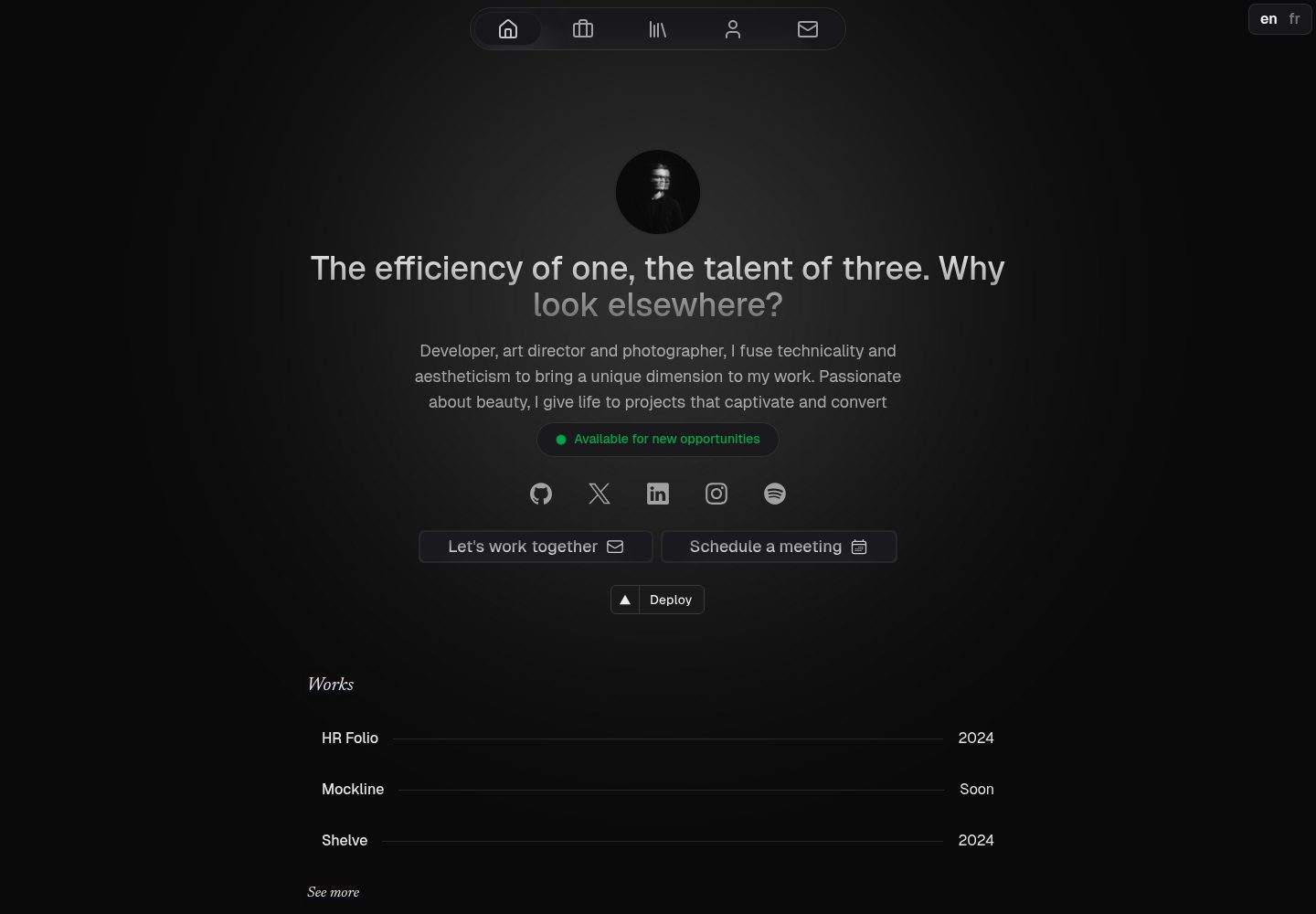
Portfolio template made with Nuxt 3, Nuxt Content v3, NuxtUI v3 and TailwindCSS v4
Nuxt · 作品集
portfolio
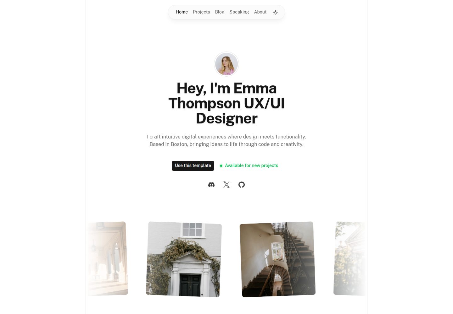
Nuxt Portfolio Template made with Nuxt UI and Nuxt Content.
Nuxt · 作品集
nuxtjs-tailwindcss-portfolio
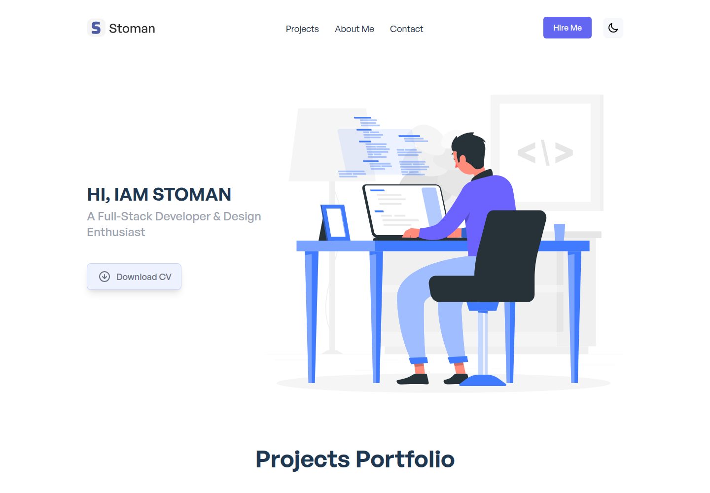
Nuxt.js & Tailwind CSS version of the portfolio project.
Nuxt · 作品集
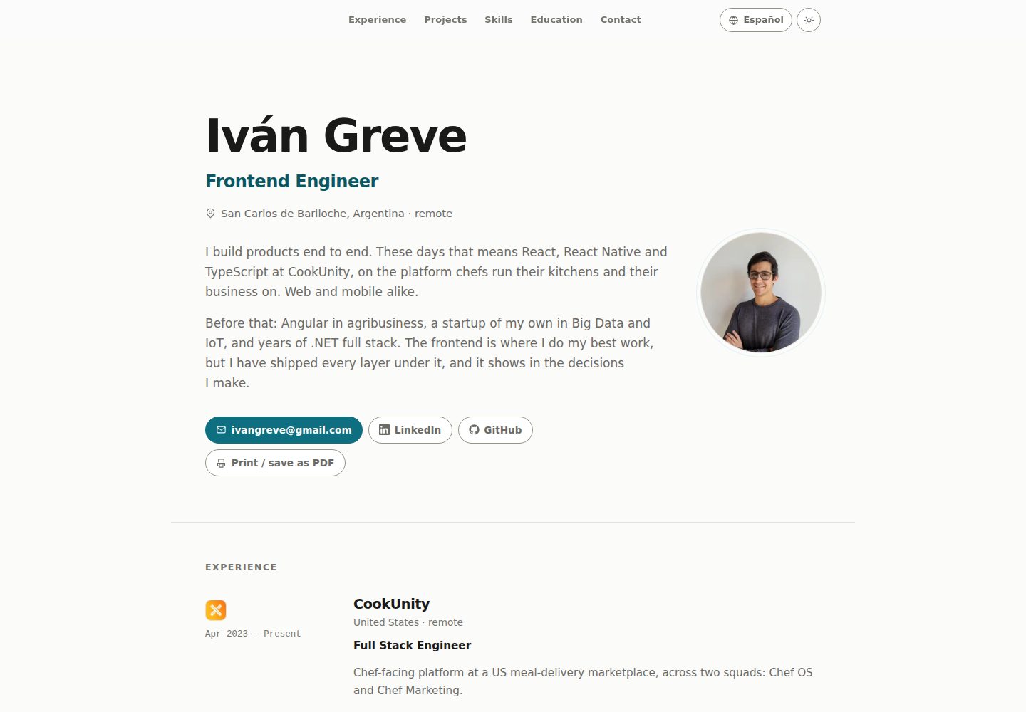
nuxt-resume
Personal resume template, VueJs + Nuxt
Nuxt · 作品集
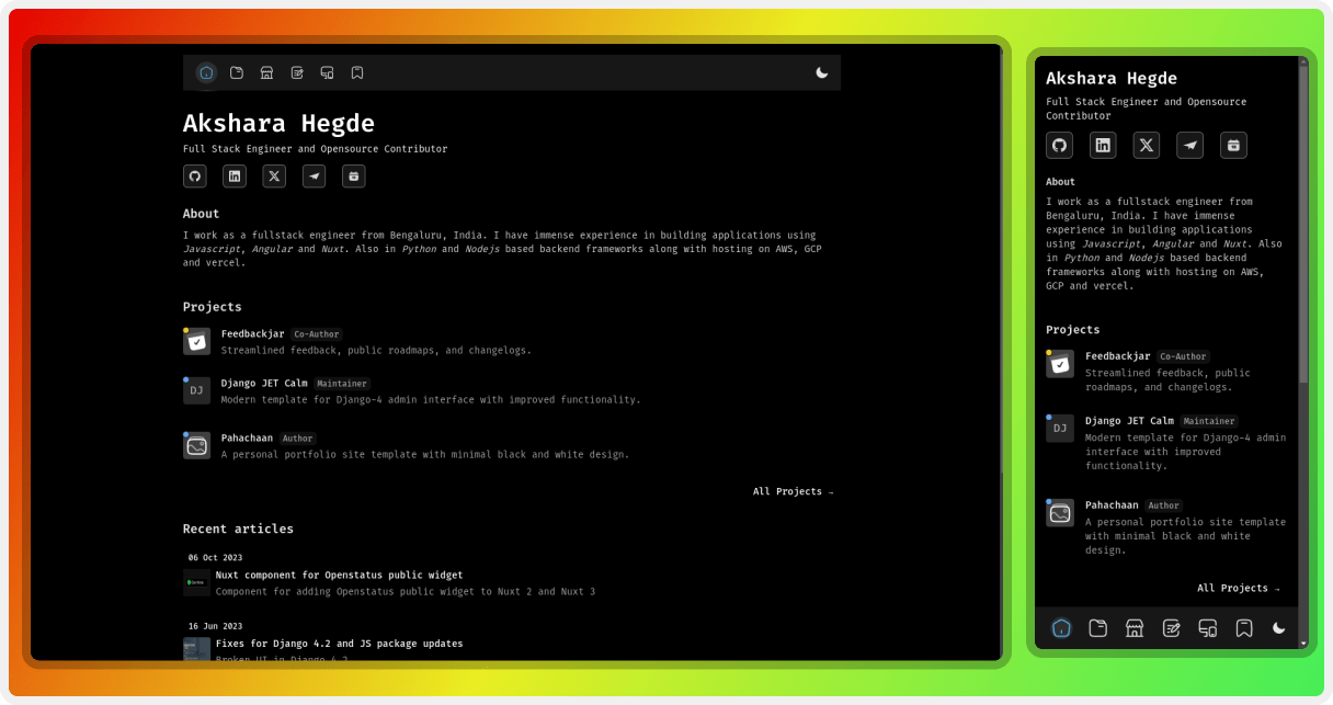
pahachaan
Opensource portfolio template using Nuxt 4 with Nuxt Studio support
Nuxt · 作品集
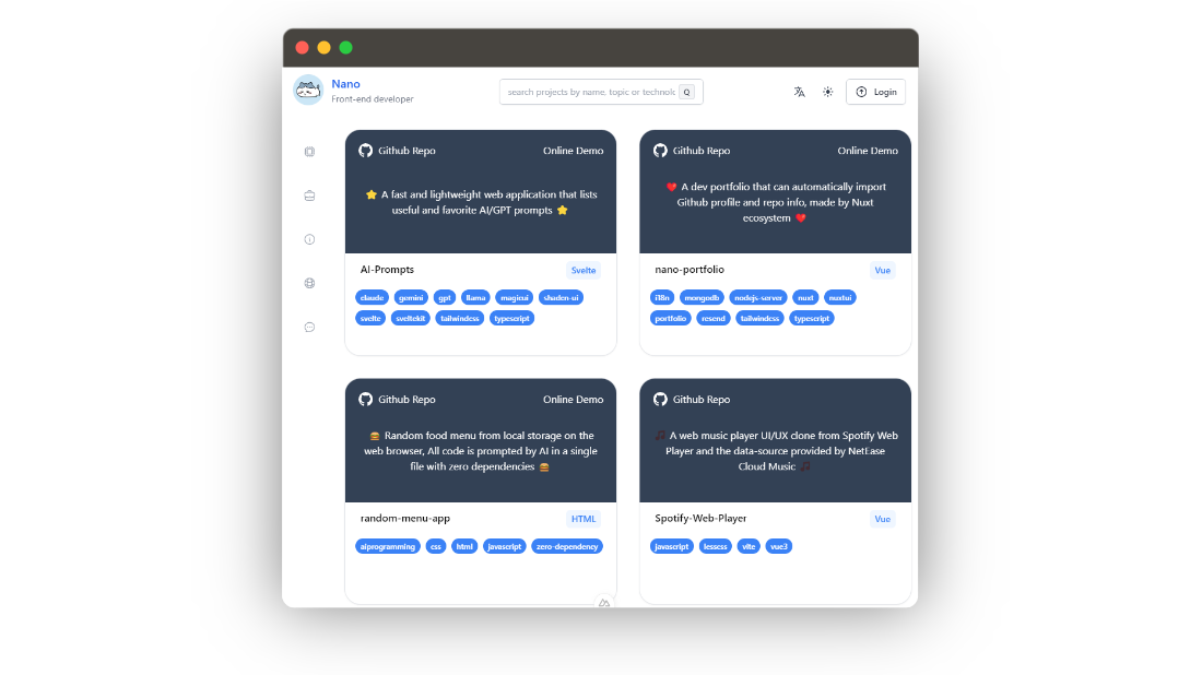
nano-portfolio
Nano Portfolio 是一个面向开发者的开源作品集模板,基于 Nuxt 3 生态构建,核心卖点是能通过 GitHub Octokit 自动拉取你的 GitHub 个人资料与仓库信息,省去手动维护项目列表的麻烦。
Nuxt · 作品集