A single plugin entry gives a Starlight documentation site the same brand identity as archmax.ai
AstroDocumentation
starlight-theme — Astro Documentation Template
By archmax-ai
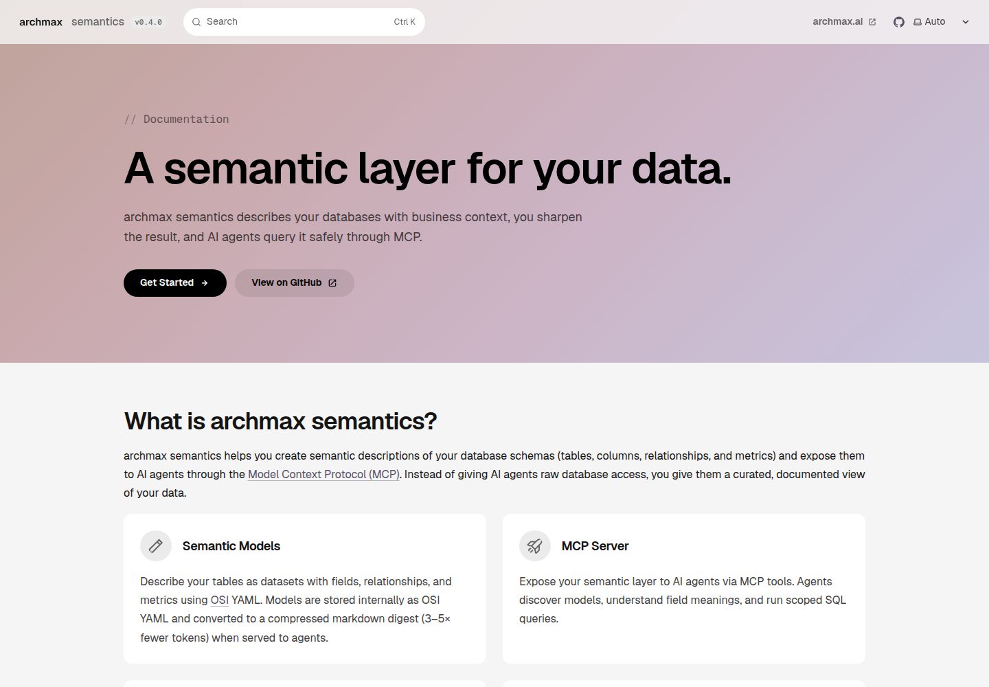
archmax brand theme for Astro Starlight documentation sites, providing brand tokens, Geist fonts, borderless surfaces, pill navigation, a gradient hero and an archmax footer, integrated through a single plugin entry.
Explore the design
Compare the page layouts and mobile experience. Open any screenshot for a closer look.
Desktop homepage1 / 2
Desktop captureTop of page
Actual screenshot captured by the server browser.
All pages & views 2
Screenshots show visual appearance; interactive behavior may differ.
Recorded 2026-10-01View source
What stands out
A quick read of the recorded project description.
Provides brand/tokens.css brand tokens that can be imported separately from Starlight
styles/starlight.css maps Starlight's --sl-* variables to the brand tokens
styles/components.css overrides interface elements such as the sidebar, header, cards, pagination, asides, code, galleries and steps
Supports a gradient hero on template: splash pages and stops the animation under prefers-reduced-motion
Ships two landing-page utility classes, .screenshot-grid and .steps-strip
Template Details
This is the archmax brand theme for Astro Starlight documentation sites, applying the archmax.ai visual identity to documentation sites through a single Starlight plugin entry. The theme includes brand design tokens, Geist fonts, borderless surfaces, pill navigation, a ci-palette gradient hero and an archmax footer.
To use it, import the archmaxTheme plugin in the Starlight configuration in astro.config.mjs and pass options such as product, version, tagline, links and copyrightHolder; the theme takes over the styles and components otherwise provided by customCss or components, and any retained custom content loads after the theme.
The theme's CSS is organized in three layers: brand/tokens.css defines HSL brand tokens with the same names as the archmax website, the ci-palette, gradient stops and Geist fonts, and can be imported on its own; styles/starlight.css maps Starlight's --sl-* variables to the brand tokens; styles/components.css handles Starlight interface elements such as the sidebar, header, cards, pagination, asides, code, galleries and steps. To change brand values, edit brand/tokens.css only.
For landing pages, pages with template: splash and a hero block render the gradient hero, with the page description as the subtitle, and the gradient animation stops under prefers-reduced-motion; the theme also ships two utility classes, .screenshot-grid and .steps-strip.
The package is not published to npm and must be installed from the repository by release tag. It depends on @astrojs/starlight and astro as peer dependencies, has no build step, and provides components, styles and fonts as source files.
AstroDocumentation
Is it right for your project?
Use Cases
- Applying a unified archmax brand look to an Astro Starlight documentation site
- Enabling a landing page with a gradient hero and pill navigation in Starlight documentation
- Using the brand tokens separately on non-Starlight pages or components
- Overriding Starlight's default styles and components through a plugin while retaining custom override capability
Suitable For
- Projects that build documentation sites with Astro Starlight and want to adopt the archmax brand style
- Teams that need to drive Starlight theme variables with design tokens
- Projects that accept installing dependencies from a GitHub repository by release tag rather than from npm
Getting started & customization
Use these recorded setup notes alongside the repository instructions for your chosen version.
- 1
The package is not published to npm and must be installed from the repository by release tag, for example npm install github:archmax-ai/starlight-theme#v0.1.0 or pnpm add github:archmax-ai/starlight-theme#v0.1.0
- 2
The peer dependencies are @astrojs/starlight and astro; confirm that the version ranges match before installing
- 3
Import archmaxTheme through plugins in the Starlight configuration in astro.config.mjs and pass options such as product and links
- 4
After using the theme, remove duplicate entries otherwise provided by customCss or components; retained custom content loads after the theme
- 5
To change brand values, edit brand/tokens.css only; all other styles derive from it
License & source material
Usage conditions & limitations
Free to use · keep license noticeThis listing covers the free version in the public repository under the MIT license; the free scope is the code of that version and does not mean that external services or third-party assets are free.
Must comply with when using
- Free use, modification, commercial use and distribution of this version's code are permitted.
- When distributing copies or substantial portions of the code, retain the original author's copyright notice and the full MIT license notice.
- The code is provided as is; warranties and limitations of liability are governed by the original license and applicable law.
Additional costs & items to verify
- The package is not published to npm and must be installed from the GitHub repository by release tag (for example npm install github:archmax-ai/starlight-theme#v0.1.0); it cannot be installed by a regular npm package name.
- Before use, you must install and match the peer dependencies @astrojs/starlight ^0.42 and astro ^7; if the versions do not match, integration will not work properly.
- After integrating the theme, remove duplicate entries otherwise provided by customCss or components, or they may conflict with the theme's styles or components.
- Demo images, fonts, icons and other third-party assets must be checked against their respective licenses; the code's MIT license alone does not determine this.
- External services such as domains, hosting, databases, payments or AI may incur separate charges.
View Original Text Basis
Permission is hereby granted, free of charge
Original License Text
The package is installed straight from this repository, pinned to a release tag. It is not published to npm.
Original README
Peer dependencies: `@astrojs/starlight ^0.42` and `astro ^7`.
Original README
https://github.com/archmax-ai/starlight-theme/blob/main/LICENSEhttps://github.com/archmax-ai/starlight-theme/blob/main/README.mdRemove any `customCss` or `components` entries the theme now provides.
Original README
Compiled by DeepSeek based on repository license and README ·2026-10-01. Results only cover the materials read; dependencies, images, fonts, and subsequent term changes are subject to their respective original texts.
Project checks & description sources
Template Information
- Source platforms
- GitHub
- Documentation and maintenance reference score
- More documented · 80 / 100
- Technologies
- Astro
- Website type
- Documentation
How this score is calculated
Our heuristic uses license records (up to 30), a demo link (12), a preview (10), stars (15), recorded maintenance (15), description completeness (8), feature records (5) and classification data (5). It is not a code, security or performance test, or a Google score. A link does not establish tested functionality.
What to verify for this project
- Repository update recorded
- 2026-09-22
- Screenshot last checked
- 2026-10-01
A demo link is listed. Check it with your own content and viewport sizes; its presence does not confirm that forms, authentication or payments work.
The catalog identifies Astro as the primary stack. Check the actual dependency manifest and lockfile for versions and hosting requirements. These notes use recorded metadata, not a code audit or a deployment test.
Use a selection guide →How this description was prepared
AI-assisted description based on catalog records and repository material. Repository authors are not automatically the reviewers of this description.
Automatically checked against source and license rules; no manual editorial review.
Inspect the recorded source material
SHA-256: 3ceaa145a4095621a67a8e9052563900af504d54d79041912e134d466161e417
2026-10-01T01:04:17.368Z
Source file / repository# @archmax-ai/starlight-theme
The archmax brand theme for [Astro Starlight](https://starlight.astro.build) documentation sites: brand tokens, Geist fonts, borderless surfaces, pill navigation, the ci-palette gradient hero, and the archmax footer. One plugin entry gives a Starlight site the same identity as [archmax.ai](https://archmax.ai).
## Install
The package is installed straight from this repository, pinned to a release tag. It is not published to npm.
```bash
npm install github:archmax-ai/starlight-theme#v0.1.0
# or
pnpm add github:archmax-ai/starlight-theme#v0.1.0
```
Peer dependencies: `@astrojs/starlight ^0.42` and `astro ^7`. There is no build step: the plugin entry is plain JavaScript and the components, styles, and fonts ship as source.
## Use
```js
// astro.config.mjs
import { defineConfig } from "astro/config";
import starlight from "@astrojs/starlight";
import { archmaxTheme } from "@archmax-ai/starlight-theme";
export default defineConfig({
integrations: [
starlight({
title: "My product",
plugins: [
archmaxTheme({
product: "my-product",
links: { github: "https://github.com/archmax-ai/my-product" },
}),
],
}),
],
});
```
Remove any `customCss` or `components` entries the theme now provides. Anything you keep is loaded after the theme, so your rules win, and a component slot you set yourself is never overwritten.
## Options
| Option | Default | Purpose |
| --- | --- | --- |
| `product` | none | Product name next to the archmax wordmark in the header and footer |
| `version` | `APP_VERSION` env, then `"dev"` | Text of the version badge in the header |
| `tagline` | archmax tagline | Line under the wordmark in the footer |
| `links.website` | `https://archmax.ai` | Header link and footer link |
| `links.github` | Starlight `social` GitHub entry | Footer link |
| `links.imprint` | `https://archmax.ai/imprint` | Footer legal link |
| `links.privacy` | `https://archmax.ai/privacy` | Footer legal link |
| `copyrightHolder` | `"archmax"` | Name in the footer copyright line |
## Landing page hero
Pages with `template: splash` and a `hero` block render the gradient hero:
```yaml
hero:
tagline: Documentation # monospace eyebrow, rendered as "// Documentation"
title: A semantic layer for your data.
actions:
- text: Get Started
link: /getting-started/
icon: right-arrow
variant: primary # black pill (light), light pill (dark)
- text: GitHub
link: https://github.com/archmax-ai/semantics
icon: external
variant: minimal # translucent pill
```
The page `description` becomes the hero subtitle. The gradient animation stops under `prefers-reduced-motion`.
Two utility classes ship with the theme for landing pages: `.screenshot-grid` (a grid of `<figure>` elements on card surfaces) and `.steps-strip` (a numbered `<ol>` of linked cards).
## How the CSS is layered
- `brand/tokens.css`: the archmax design tokens as HSL triplets with the same names and values as the website (`--background`, `--foreground`, `--card`, `--muted`, `--border`, `--primary`, `--accent`, `--ring`, `--radius`), the ci-palette, gradient stops, and the Geist font faces. No Starlight selectors, so it can be used on its own: `import "@archmax-ai/starlight-theme/brand/tokens.css"`.
- `styles/starlight.css`: maps every Starlight `--sl-*` variable onto the brand tokens.
- `styles/components.css`: Starlight chrome (sidebar, header, cards, pagination, asides, code, gallery, steps).
To change a brand value, edit `brand/tokens.css` only. Everything else derives from it.
## Development
```bash
npm install
npm run typecheck
npm test
```
Releases are Git tags following semver (`v0.1.0`). Bump `version` in `package.json`, tag the commit, push the tag, then bump the pinned tag in each consuming site. The `@astrojs/starlight` peer range is widened only after the theme's selectors have been checked against the new Starlight version.
## License
MIT
Explore similar templates
Compare previews and descriptions within the same stack and category.
AnvilWiki
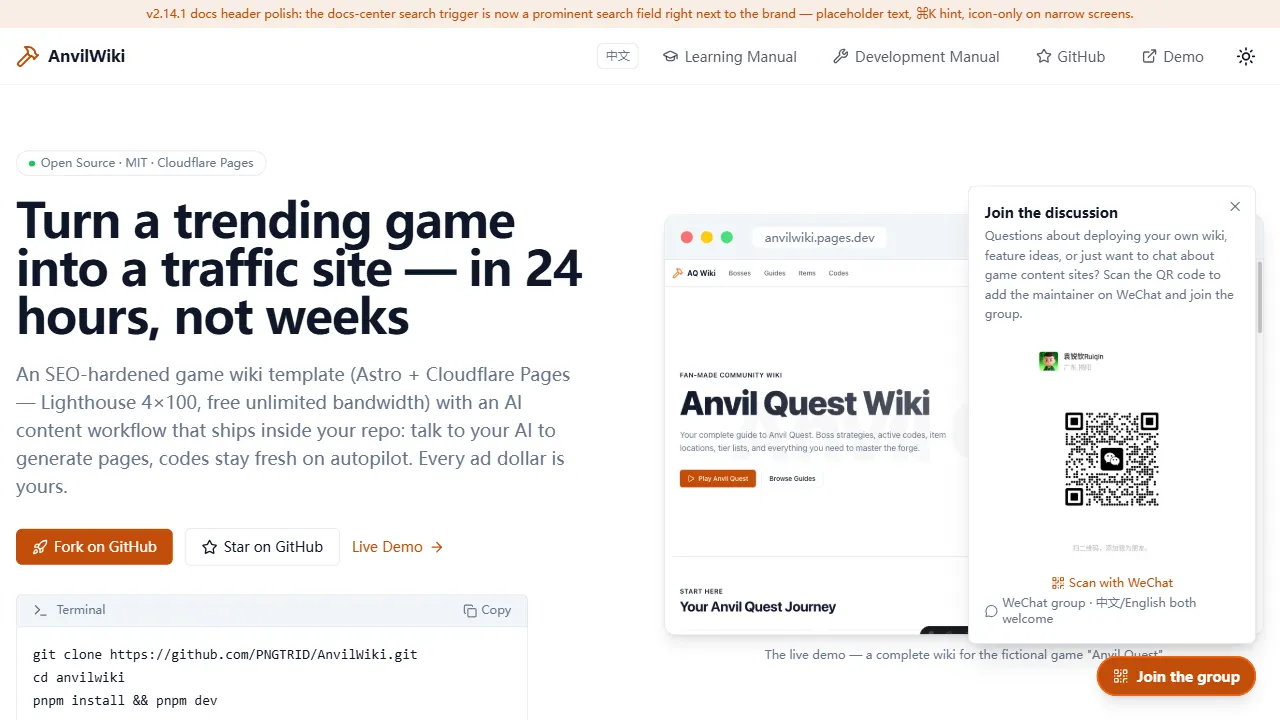
AnvilWiki is an Astro static Wiki template for game guide and compendium sites, with a built-in AI content workflow and monetization components. It outputs static pages by default and deploys on Cloudflare Pages, emphasizing zero server cost and out-of-the-box performance.
Astro · Game Site
starlight-theme-rapide
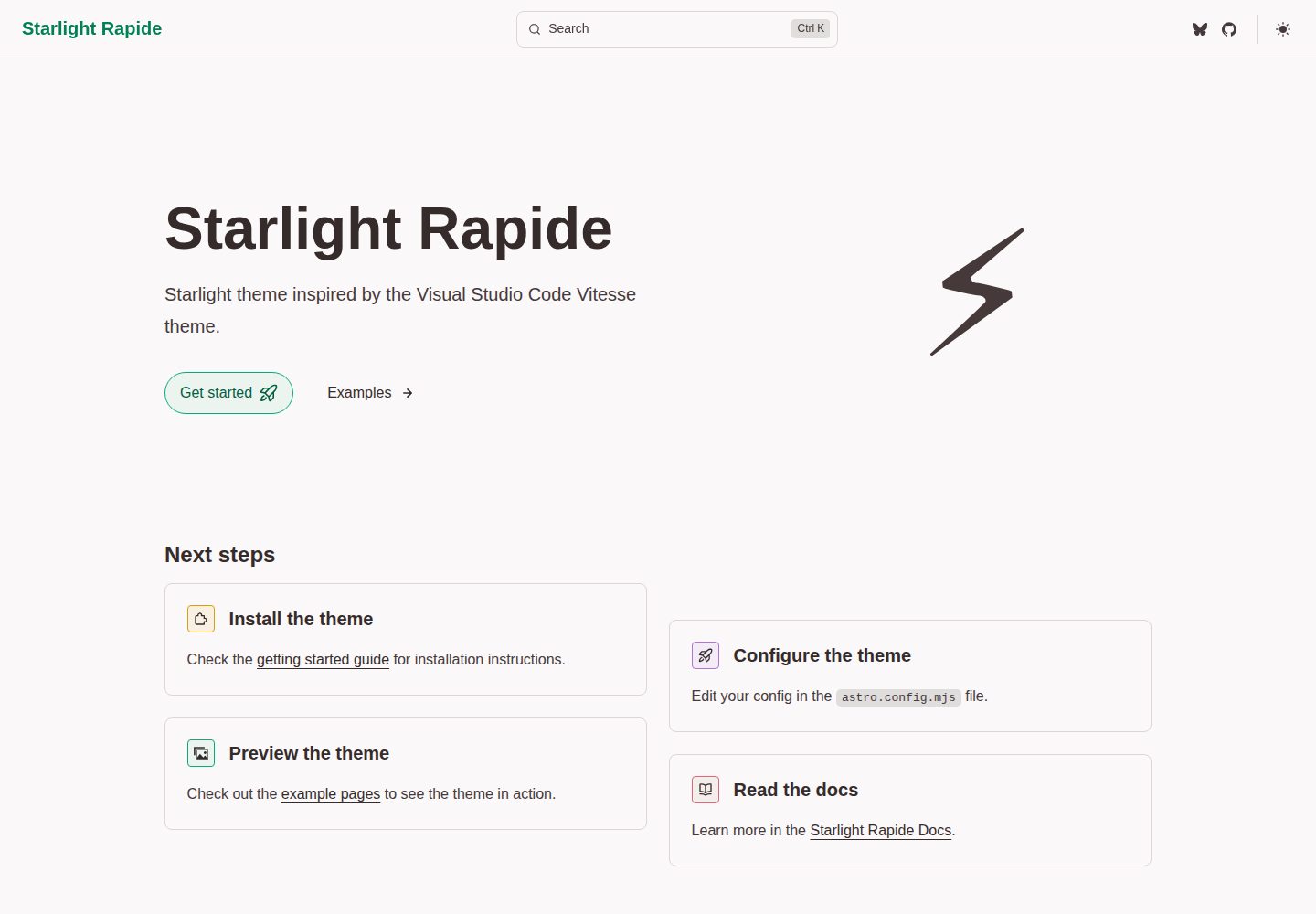
starlight-theme-rapide is an Astro Starlight documentation site theme inspired by the Visual Studio Code Vitesse theme, offering dark and light modes and released under the MIT license.
Astro · Documentation
CelestialDocs
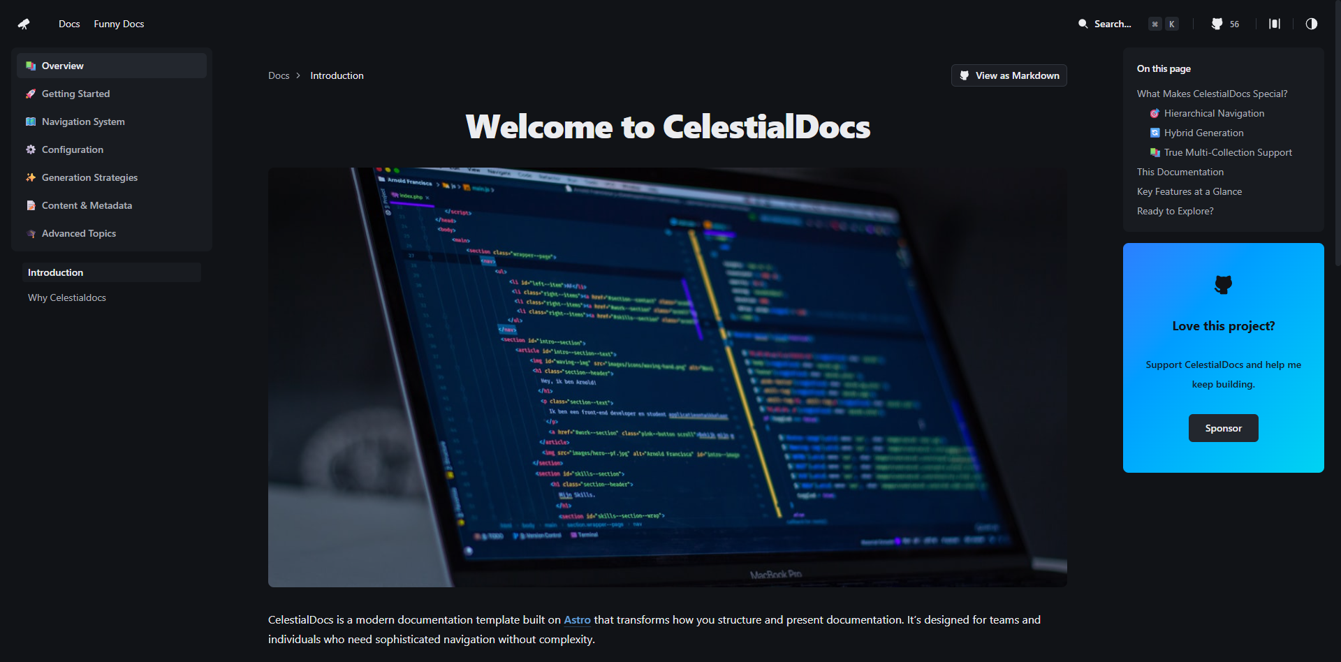
CelestialDocs is an Astro-based documentation platform template that maintains documentation, blog, and product pages in a single repository through a multi-collection architecture.
Astro · Documentation
astro-big-doc
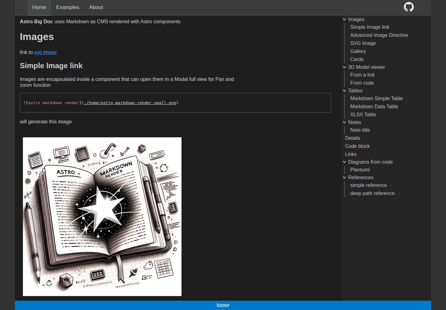
astro-big-doc is an Astro-based documentation site theme that renders standard Markdown and automatically generates a hierarchical menu and table of contents from the file directory structure with zero configuration.
Astro · Documentation
stellar
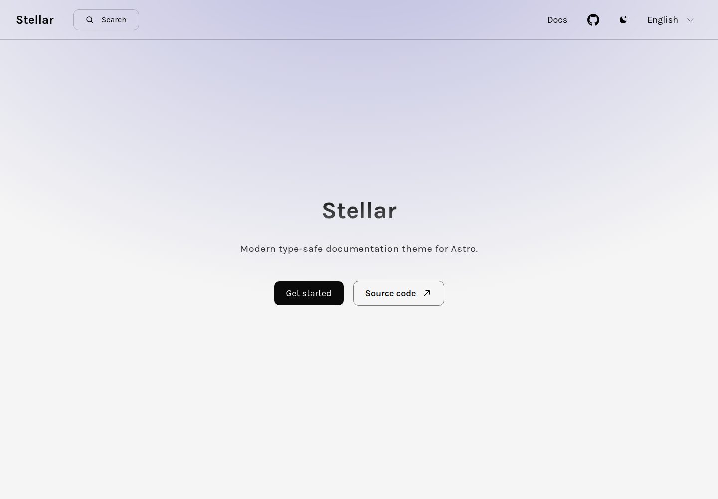
Stellar is a modern, type-safe documentation theme for Astro, suited for technical documentation sites written in Markdown or MDX. It offers dark mode, type-safe i18n, fuse.js local search, Tailwind styling, the View Transitions API, Shiki code highlighting, and custom import paths.
Astro · Documentation
starlight-theme-black
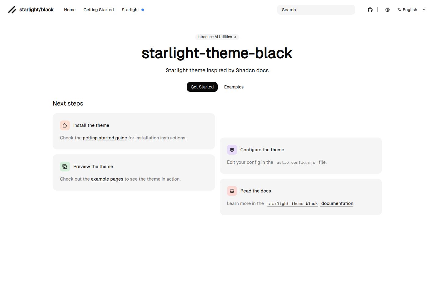
starlight-theme-black is an Astro Starlight theme by adrian-ub that replaces the default look with a black palette, green accent (#22c55e), and editorial layout inspired by shadcn documentation.
Astro · Documentation