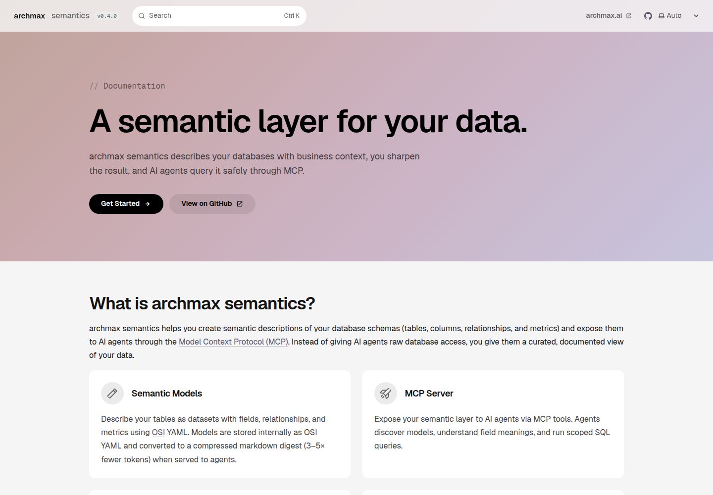
一个插件入口即可让 Starlight 文档站获得与 archmax.ai 一致的品牌标识
Astro文档
starlight-theme — Astro 文档模板
作者 archmax-ai
archmax 品牌主题,用于 Astro Starlight 文档站,提供品牌令牌、Geist 字体、无边框表面、胶囊导航、渐变 Hero 与 archmax 页脚,通过一个插件入口接入。
看看你的网站会是什么样
浏览真实页面截图,比较内容排版与手机效果。点击下方缩略图切换,放大查看整页细节。
全部页面与视图 2
截图用于了解视觉与布局,交互效果请以实际项目为准。
采集于 2026-10-01查看来源
值得关注的模板亮点
从已有项目资料中,快速了解它的特点。
提供 brand/tokens.css 品牌令牌,可脱离 Starlight 单独导入使用
styles/starlight.css 将 Starlight 的 --sl-* 变量映射到品牌令牌
styles/components.css 覆盖侧边栏、页头、卡片、分页、提示块、代码、画廊与步骤等界面
支持 template: splash 页面的渐变 Hero,并在 prefers-reduced-motion 下停止动画
附带 .screenshot-grid 与 .steps-strip 两个落地页工具类
模板详细介绍
这是 archmax 为 Astro Starlight 文档站提供的品牌主题,通过一个 Starlight 插件入口把 archmax.ai 的视觉标识应用到文档站点。主题包含品牌设计令牌、Geist 字体、无边框表面、胶囊导航、ci-palette 渐变 Hero 以及 archmax 页脚。
使用方式是在 astro.config.mjs 的 Starlight 配置中引入 archmaxTheme 插件,并传入 product、version、tagline、links、copyrightHolder 等选项;主题会接管原本由 customCss 或 components 提供的样式与组件,保留的自定义内容会在主题之后加载。
主题的 CSS 分为三层:brand/tokens.css 定义与 archmax 网站同名的 HSL 品牌令牌、ci-palette、渐变停靠点与 Geist 字体,可单独导入;styles/starlight.css 把 Starlight 的 --sl-* 变量映射到品牌令牌;styles/components.css 处理侧边栏、页头、卡片、分页、提示块、代码、画廊与步骤等 Starlight 界面。修改品牌值只需编辑 brand/tokens.css。
落地页方面,带有 template: splash 与 hero 块的页面会渲染渐变 Hero,页面 description 作为副标题,渐变动画在 prefers-reduced-motion 下停止;主题还附带 .screenshot-grid 与 .steps-strip 两个工具类。
该包不发布到 npm,需从仓库按发布标签安装,依赖 @astrojs/starlight 与 astro 作为 peer 依赖,无构建步骤,组件、样式与字体以源码形式提供。
Astro文档
适合你的项目吗?
适用场景
- 为 Astro Starlight 文档站统一应用 archmax 品牌视觉
- 在 Starlight 文档中启用渐变 Hero 与胶囊导航的落地页
- 需要将品牌令牌单独用于非 Starlight 页面或组件时
- 希望以插件方式覆盖 Starlight 默认样式与组件,同时保留自定义覆盖能力
适合人群
- 使用 Astro Starlight 构建文档站并希望采用 archmax 品牌样式的项目
- 需要以设计令牌驱动 Starlight 主题变量的团队
- 接受从 GitHub 仓库按发布标签安装依赖、而非从 npm 安装的项目
上手与定制指南
结合仓库当前版本的说明,按下面的资料检查内容、配置与运行要求。
- 1
该包未发布到 npm,需从仓库按发布标签安装,例如 npm install github:archmax-ai/starlight-theme#v0.1.0 或 pnpm add github:archmax-ai/starlight-theme#v0.1.0
- 2
peer 依赖为 @astrojs/starlight 与 astro,安装前需确认版本范围匹配
- 3
在 astro.config.mjs 的 Starlight 配置中通过 plugins 引入 archmaxTheme,并传入 product、links 等选项
- 4
使用主题后应移除原本由 customCss 或 components 提供的重复条目;保留的自定义内容会在主题之后加载
- 5
修改品牌值只需编辑 brand/tokens.css,其余样式均由其派生
授权与来源资料
使用条件与限制
免费使用 · 保留许可声明本次收录的是公开仓库中采用 MIT 许可的免费版本;免费范围为该版本代码,不代表外部服务或第三方素材免费。
使用时需要遵守
- 允许免费使用、修改、商用和分发该版本代码。
- 分发代码副本或实质性部分时,保留原作者版权声明和完整 MIT 许可声明。
- 代码按现状提供;担保与责任限制以原许可证及适用法律为准。
额外费用与待核对事项
- 该包未发布到 npm,必须从 GitHub 仓库按发布标签安装(如 npm install github:archmax-ai/starlight-theme#v0.1.0),无法通过常规 npm 包名安装。
- 使用前需自行安装并匹配 peer 依赖 @astrojs/starlight ^0.42 与 astro ^7,版本不符时无法正常接入。
- 接入主题后需移除原本由 customCss 或 components 提供的重复条目,否则可能与主题样式或组件冲突。
- 演示图片、字体、图标及其他第三方素材需按各自许可核对,不能仅凭代码的 MIT 许可判断。
- 域名、托管、数据库、支付或 AI 等外部服务可能另外收费。
查看原文依据
Permission is hereby granted, free of charge
许可证原文
The package is installed straight from this repository, pinned to a release tag. It is not published to npm.
README 原文
Peer dependencies: `@astrojs/starlight ^0.42` and `astro ^7`.
README 原文
https://github.com/archmax-ai/starlight-theme/blob/main/LICENSEhttps://github.com/archmax-ai/starlight-theme/blob/main/README.mdRemove any `customCss` or `components` entries the theme now provides.
README 原文
DeepSeek 根据仓库许可证和 README 整理 ·2026-10-01。结果仅覆盖已读取资料,依赖、图片、字体及后续条款变更以各自原文为准。
项目核对记录与介绍依据
模板资料
- 来源平台
- GitHub
- 资料与维护参考分
- 资料较完整 · 80 / 100
- 技术栈
- Astro
- 网站类型
- 文档
这个分数如何计算
本站按许可资料(最高30分)、演示链接(12分)、预览图(10分)、Star数(15分)、记录的维护时间(15分)、描述完整度(8分)、功能记录(5分)和分类资料(5分)计算。它不是代码、安全或性能测试,也不是 Google 评分;有链接不代表已实测可用。
这个项目需要核对什么
- 记录的仓库更新时间
- 2026-09-22
- 截图检查日期
- 2026-10-01
已收录演示链接。请用你的内容与屏幕尺寸检查;有演示不代表表单、认证或支付已经可用。
目录记录的主要技术栈是 Astro。请通过依赖清单和锁文件核对实际版本与托管要求。这些说明基于收录资料,不代表代码审计或部署实测。
查看具体选型方法 →介绍的制作与核对状态
介绍由 AI 辅助整理目录与仓库资料。仓库作者不等于这篇介绍的审核者。
已完成服务器许可规则与 AI 来源核对;未经过人工编辑审核。
查看当时使用的来源资料
SHA-256: 3ceaa145a4095621a67a8e9052563900af504d54d79041912e134d466161e417
2026-10-01T01:04:17.368Z
来源文件 / 仓库# @archmax-ai/starlight-theme
The archmax brand theme for [Astro Starlight](https://starlight.astro.build) documentation sites: brand tokens, Geist fonts, borderless surfaces, pill navigation, the ci-palette gradient hero, and the archmax footer. One plugin entry gives a Starlight site the same identity as [archmax.ai](https://archmax.ai).
## Install
The package is installed straight from this repository, pinned to a release tag. It is not published to npm.
```bash
npm install github:archmax-ai/starlight-theme#v0.1.0
# or
pnpm add github:archmax-ai/starlight-theme#v0.1.0
```
Peer dependencies: `@astrojs/starlight ^0.42` and `astro ^7`. There is no build step: the plugin entry is plain JavaScript and the components, styles, and fonts ship as source.
## Use
```js
// astro.config.mjs
import { defineConfig } from "astro/config";
import starlight from "@astrojs/starlight";
import { archmaxTheme } from "@archmax-ai/starlight-theme";
export default defineConfig({
integrations: [
starlight({
title: "My product",
plugins: [
archmaxTheme({
product: "my-product",
links: { github: "https://github.com/archmax-ai/my-product" },
}),
],
}),
],
});
```
Remove any `customCss` or `components` entries the theme now provides. Anything you keep is loaded after the theme, so your rules win, and a component slot you set yourself is never overwritten.
## Options
| Option | Default | Purpose |
| --- | --- | --- |
| `product` | none | Product name next to the archmax wordmark in the header and footer |
| `version` | `APP_VERSION` env, then `"dev"` | Text of the version badge in the header |
| `tagline` | archmax tagline | Line under the wordmark in the footer |
| `links.website` | `https://archmax.ai` | Header link and footer link |
| `links.github` | Starlight `social` GitHub entry | Footer link |
| `links.imprint` | `https://archmax.ai/imprint` | Footer legal link |
| `links.privacy` | `https://archmax.ai/privacy` | Footer legal link |
| `copyrightHolder` | `"archmax"` | Name in the footer copyright line |
## Landing page hero
Pages with `template: splash` and a `hero` block render the gradient hero:
```yaml
hero:
tagline: Documentation # monospace eyebrow, rendered as "// Documentation"
title: A semantic layer for your data.
actions:
- text: Get Started
link: /getting-started/
icon: right-arrow
variant: primary # black pill (light), light pill (dark)
- text: GitHub
link: https://github.com/archmax-ai/semantics
icon: external
variant: minimal # translucent pill
```
The page `description` becomes the hero subtitle. The gradient animation stops under `prefers-reduced-motion`.
Two utility classes ship with the theme for landing pages: `.screenshot-grid` (a grid of `<figure>` elements on card surfaces) and `.steps-strip` (a numbered `<ol>` of linked cards).
## How the CSS is layered
- `brand/tokens.css`: the archmax design tokens as HSL triplets with the same names and values as the website (`--background`, `--foreground`, `--card`, `--muted`, `--border`, `--primary`, `--accent`, `--ring`, `--radius`), the ci-palette, gradient stops, and the Geist font faces. No Starlight selectors, so it can be used on its own: `import "@archmax-ai/starlight-theme/brand/tokens.css"`.
- `styles/starlight.css`: maps every Starlight `--sl-*` variable onto the brand tokens.
- `styles/components.css`: Starlight chrome (sidebar, header, cards, pagination, asides, code, gallery, steps).
To change a brand value, edit `brand/tokens.css` only. Everything else derives from it.
## Development
```bash
npm install
npm run typecheck
npm test
```
Releases are Git tags following semver (`v0.1.0`). Bump `version` in `package.json`, tag the commit, push the tag, then bump the pinned tag in each consuming site. The `@astrojs/starlight` peer range is widened only after the theme's selectors have been checked against the new Starlight version.
## License
MIT
看看同类模板
对比同技术栈与用途的模板,找到更适合的视觉与内容结构。
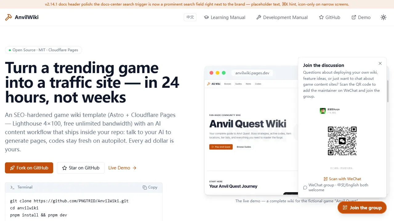
AnvilWiki
AnvilWiki 是一个围绕游戏攻略站场景设计的 Astro 静态模板,目标用户是希望快速搭建游戏内容站、通过 SEO 获取流量并利用广告变现的创作者。
Astro · 游戏站
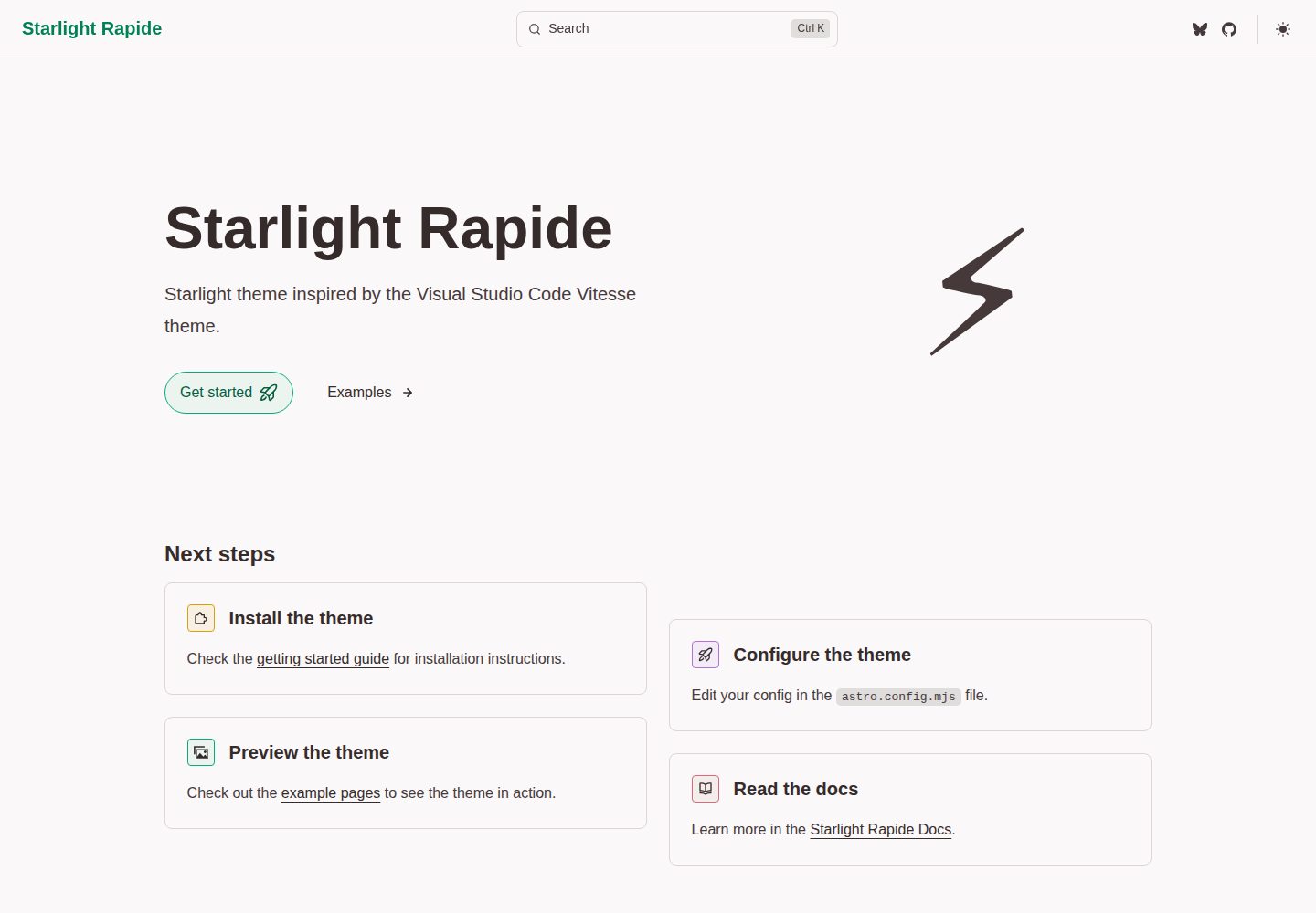
starlight-theme-rapide
Starlight theme inspired by the Visual Studio Code Vitesse theme
Astro · 文档
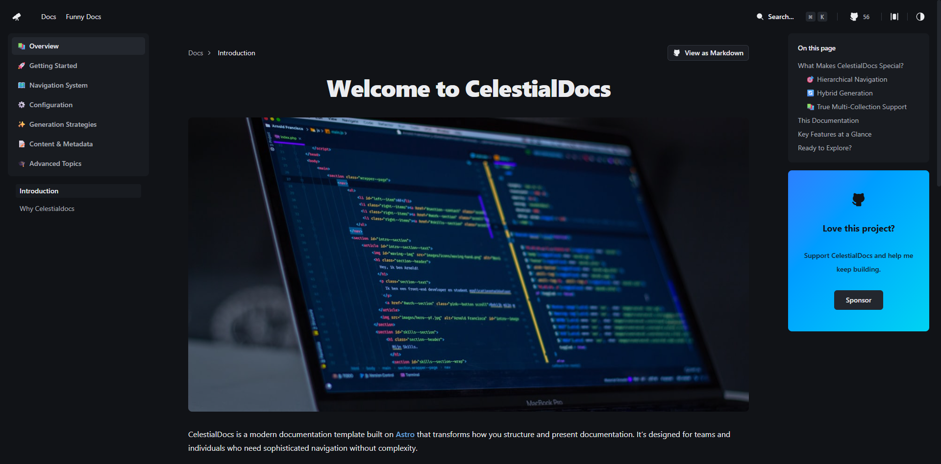
CelestialDocs
CelestialDocs 是一个基于 Astro 的文档平台模板,定位是让团队在一个仓库里同时维护文档、博客和产品页面。
Astro · 文档
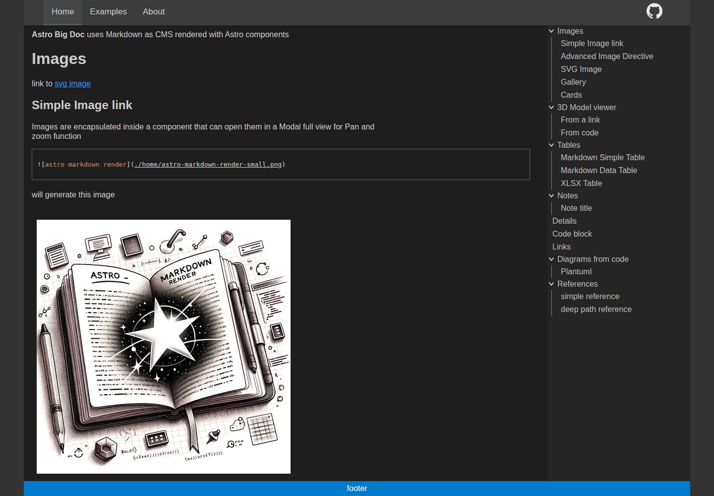
astro-big-doc
Astro Theme with zero config hierarchical menu and table of content, render pure standard Markdown .md with cu…
Astro · 文档
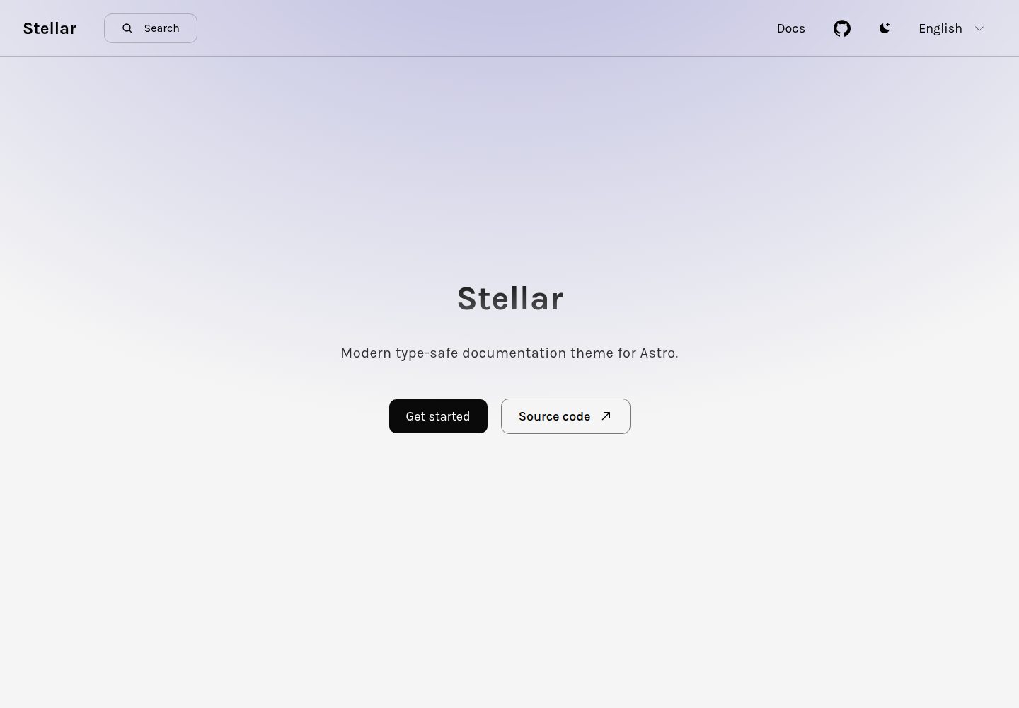
stellar
Modern type-safe documentation theme for Astro.
Astro · 文档
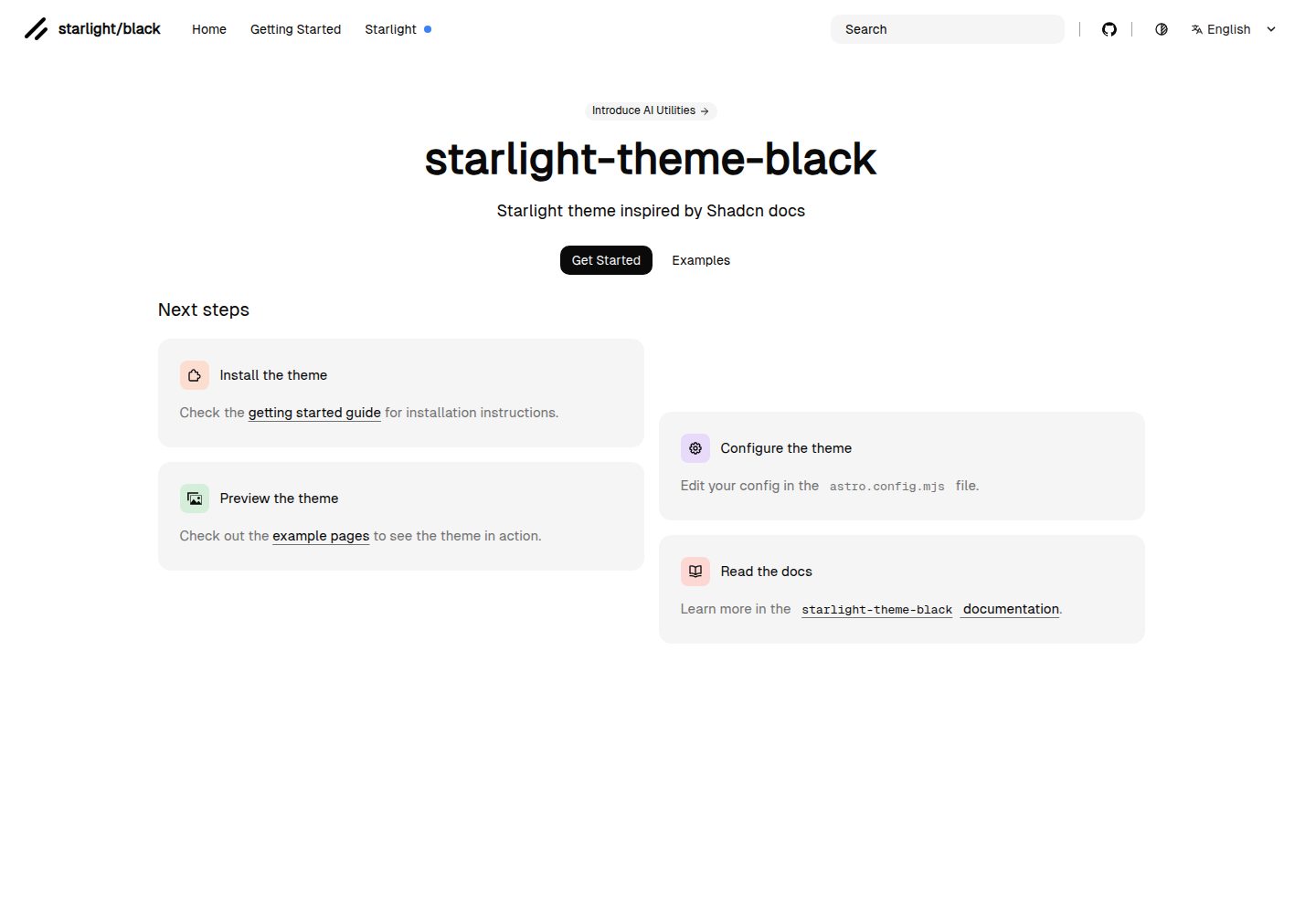
starlight-theme-black
Starlight theme inspired by @shadcn docs
Astro · 文档