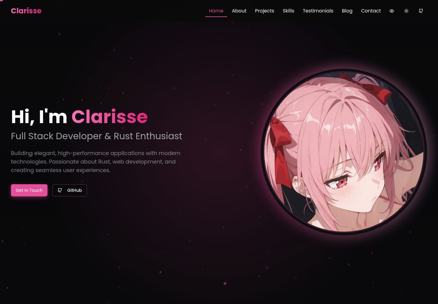
Built with Next.js and TypeScript, with components split by section for a clear structure
Next.jsReactPortfolio
Clarisse-Portfolio — Next.js Portfolio Template
By VoxDroid
A personal portfolio template built with Next.js and TypeScript, including home, projects, skills, blog, testimonials, and contact form modules, with light and dark theme switching.
Explore the design
Compare the page layouts and mobile experience. Open any screenshot for a closer look.
Desktop homepage1 / 2
Desktop captureTop of page
Actual screenshot captured by the server browser.
All pages & views 2
Screenshots show visual appearance; interactive behavior may differ.
Recorded 2026-10-04View source
What stands out
A quick read of the recorded project description.
Includes light and dark theme switching, with colors adjustable via Tailwind configuration and CSS variables
Contains common portfolio sections such as projects, skills, blog, testimonials, and contact form
Provides a particle animation background and Framer Motion transition effects, with parameters adjustable in the corresponding components
The projects section includes category filtering, icons use Lucide, and UI components reference shadcn/ui
Uses the MIT license, allowing free use, modification, commercial use, and distribution of this version of the code
Template Details
Clarisse Portfolio is a personal portfolio website template built with Next.js and TypeScript. The interface is assembled from multiple reusable components, suitable for showcasing a personal profile, project work, skills, articles, and client testimonials. The README lists sections such as Home Hero, About, Projects, Skills, Testimonials, Blog, and Contact. Each section corresponds to a separate file in the components directory, and content changes are mainly made within the data arrays or copy inside the components.
For styling, it uses Tailwind CSS. Colors are adjusted through theme.extend.colors in tailwind.config.ts and CSS variables in app/globals.css (such as --primary), with separate definitions for light and dark themes. Animations are provided by Framer Motion, and components/particles-background.tsx implements a particle background; the particle count and color can be modified in that file. The projects section includes category filtering, icons use Lucide, and UI components reference shadcn/ui.
The template includes desktop and mobile home page screenshots. The repository uses the MIT license, allowing free use, modification, commercial use, and distribution of this version of the code, provided the copyright notice and license notice are retained when distributing. The demo site is deployed on Vercel. The performance and SEO descriptions in the README are the author's own statements and were not independently verified in this material; third-party assets such as demo images, fonts, and icons need to be checked separately under their respective licenses.
Next.jsPortfolio
Is it right for your project?
Use Cases
- Building a personal portfolio website to showcase projects and skills in one place
- As a starting point for front-end developers to practice component-based development with Next.js and TypeScript
- Static showcase sites that need light and dark themes and an animated background
- Content-oriented pages that supplement a personal introduction with a blog and testimonials
Suitable For
- Developers with React or Next.js experience who want to quickly build a personal portfolio
- Users who need a template with modifiable colors and copy rather than a fixed design
- Users who accept preparing their own images, fonts, and other assets and verifying third-party licenses
Getting started & customization
Use these recorded setup notes alongside the repository instructions for your chosen version.
- 1
Requires Node.js 18.0 or higher, and npm or yarn
- 2
After cloning the repository, run npm install (or yarn install), then run npm run dev to start the development server, accessible by default at http://localhost:3000
- 3
Content changes are concentrated in files such as hero, about, projects, skills, testimonials, blog, and contact in the components directory
- 4
Colors are adjusted in tailwind.config.ts and app/globals.css; particle background parameters are modified in components/particles-background.tsx
- 5
Third-party assets such as demo images, fonts, and icons need to be checked under their respective licenses; external services such as hosting may incur separate charges
License & source material
Usage conditions & limitations
Free to use · keep license noticeThis entry covers the free version in the public repository under the MIT license; the free scope applies to this version of the code and does not mean external services or third-party assets are free.
Must comply with when using
- Free use, modification, commercial use, and distribution of this version of the code are permitted.
- When distributing copies or substantial portions of the code, retain the original author's copyright notice and the full MIT license notice.
- The code is provided as is; warranties and limitations of liability are governed by the original license and applicable law.
Additional costs & items to verify
- Demo images, fonts, icons, and other third-party assets need to be checked under their respective licenses and cannot be judged solely by the code's MIT license.
- External services such as domains, hosting, databases, payments, or AI may incur separate charges.
View Original Text Basis
https://github.com/VoxDroid/Clarisse-Portfolio/blob/main/LICENSEhttps://github.com/VoxDroid/Clarisse-Portfolio/blob/main/README.mdPermission is hereby granted, free of charge
Original License Text
Compiled by DeepSeek based on repository license and README ·2026-10-04. Results only cover the materials read; dependencies, images, fonts, and subsequent term changes are subject to their respective original texts.
Project checks & description sources
Template Information
- Source platforms
- GitHub
- Documentation and maintenance reference score
- More documented · 83 / 100
- Technologies
- Next.js · React
- Website type
- Portfolio
How this score is calculated
Our heuristic uses license records (up to 30), a demo link (12), a preview (10), stars (15), recorded maintenance (15), description completeness (8), feature records (5) and classification data (5). It is not a code, security or performance test, or a Google score. A link does not establish tested functionality.
What to verify for this project
- Repository update recorded
- 2026-02-20
- Screenshot last checked
- 2026-10-04
A demo link is listed. Check it with your own content and viewport sizes; its presence does not confirm that forms, authentication or payments work.
The catalog identifies Next.js as the primary stack. Check the actual dependency manifest and lockfile for versions and hosting requirements. These notes use recorded metadata, not a code audit or a deployment test.
Use a selection guide →How this description was prepared
AI-assisted description based on catalog records and repository material. Repository authors are not automatically the reviewers of this description.
Review declaration: [email protected] · 2026-10-04
Inspect the recorded source material
SHA-256: ea889b6e350c44a55423f55d5292b8c2319d0ed5470801e4ee899cf68250dbfd
2026-10-04T03:11:32.895Z
Source file / repository# Clarisse Portfolio

A modern, customizable, and responsive portfolio template built with **Next.js** and **TypeScript**. Designed to showcase your skills, projects, and personality with a sleek interface, animated background, and professional features.
### **Live Demo**: Check out the deployed version at [clarisse-portfolio.vercel.app](https://clarisse-portfolio.vercel.app)
---
## Badges
[](https://nextjs.org/)
[](https://www.typescriptlang.org/)
[](https://tailwindcss.com/)
[](https://github.com/voxdroid/clarisse-portfolio/blob/main/LICENSE)
[](https://github.com/voxdroid/clarisse-portfolio)
[](https://github.com/voxdroid/clarisse-portfolio/issues)
[](https://github.com/voxdroid/clarisse-portfolio/commits/main)
[](https://github.com/voxdroid/clarisse-portfolio/releases)
[](https://clarisse-portfolio.vercel.app)
---
## Table of Contents
- [Features](#features)
- [Screenshots](#screenshots)
- [Getting Started](#getting-started)
- [Usage](#usage)
- [Customization](#customization)
- [Project Structure](#project-structure)
- [Built With](#built-with)
- [Dependencies](#dependencies)
- [Releases](#releases)
- [Key Features Explained](#key-features-explained)
- [License](#license)
- [Acknowledgments](#acknowledgments)
- [Contact](#contact)
- [Contributing](#contributing)
- [Support](#support)
---
## Features
- Light/Dark Mode: Toggle between light and dark themes seamlessly.
- Fully Customizable: Adjust colors, fonts, and content to match your brand.
- Responsive Design: Optimized for mobile, tablet, and desktop devices.
- Animated Background: Dynamic particle animations for visual appeal.
- Smooth Animations: Powered by Framer Motion for fluid transitions.
- Modular Components: Well-organized, reusable component structure.
- Interactive UI: Includes tooltips, hover effects, and engaging elements.
- SEO Optimized: Built with search engine visibility in mind.
- High Performance: Fast load times and optimized assets.
- Skills Visualization: Dynamic representation of your expertise.
- Blog Section: Share articles and insights.
- Testimonials: Display feedback from clients or peers.
- Contact Form: Easy way for visitors to reach out.
---
## Screenshots
| Feature | Light Mode | Dark Mode |
|--------------------|-------------------------------------|------------------------------------|
| Home Page |  |  |
| Projects Section |  |  |
| Skills Section |  |  |
---
## Getting Started
Set up and run the portfolio locally with these steps.
### Prerequisites
- **Node.js**: Version 18.0 or higher
- **Package Manager**: `npm` or `yarn`
### Installation
1. **Clone the Repository**
```bash
git clone https://github.com/VoxDroid/Clarisse-Portfolio
```
2. **Navigate to the Project Directory**
```bash
cd Clarisse-Portfolio
```
3. **Install Dependencies**
```bash
npm install
# or
yarn install
```
4. **Start the Development Server**
```bash
npm run dev
# or
yarn dev
```
5. Open **[http://localhost:3000](http://localhost:3000)** in your browser to view the portfolio.
---
## Usage
Once the portfolio is running, you can explore and customize it to suit your needs. Below are key sections and how to use them effectively.
### Getting Started
- Launch the development server as described above.
- Navigate the site via the browser to preview the default layout and content.
- Use the customization options below to personalize it.
### Hero Section
- **Purpose**: Introduce yourself with a striking headline and background animation.
- **How to Use**: Edit `components/hero.tsx` to update your name, tagline, and image.
### Projects Section
- **Purpose**: Showcase your work with interactive filters and project cards.
- **How to Use**: Add projects to `components/projects.tsx` (see [Adding Projects](#adding-projects)) and test the filters in the browser.
### Skills Section
- **Purpose**: Visualize your skills dynamically.
- **How to Use**: Update the skills list in `components/skills.tsx` with your expertise.
### Settings (Theme Toggle)
- **Purpose**: Switch between light and dark modes.
- **How to Use**: Test the toggle in `components/theme-toggle.tsx` via the UI; no additional setup needed.
---
## Customization
Tailor the template to reflect your personal style and content.
### Changing Colors
Modify the color scheme in `tailwind.config.ts`:
```typescript
// tailwind.config.ts
const config = {
theme: {
extend: {
colors: {
primary: {
DEFAULT: "hsl(330, 73%, 60%)", // Customize here
foreground: "hsl(330, 10%, 95%)",
},
},
},
},
};
```
Adjust CSS variables in `app/globals.css`:
```css
:root {
--primary: 330 73% 60%; /* Light mode */
}
.dark {
--primary: 330 73% 70%; /* Dark mode */
}
```
### Updating Content
Edit these files to update your information:
- Hero: `components/hero.tsx`
- About: `components/about.tsx`
- Projects: `components/projects.tsx`
- Skills: `components/skills.tsx`
- Testimonials: `components/testimonials.tsx`
- Blog: `components/blog.tsx`
- Contact: `components/contact.tsx`
### Adding Projects
Add projects to the `projects` array in `components/projects.tsx`:
```typescript
const projects = [
{
title: "Sample Project",
description: "A brief overview of the project.",
image: "/images/sample-project.jpg",
tags: ["React", "TypeScript"],
github: "https://github.com/voxdroid/sample-project",
demo: "https://sample-project-demo.com",
icon: <CodeIcon className="h-6 w-6" />,
},
// Add more projects here
];
```
### Customizing Particle Background
Tweak the animation in `components/particles-background.tsx`:
```typescript
const particleCount = Math.min(120, Math.floor((window.innerWidth * window.innerHeight) / 9000));
const colors = [
"rgba(236, 72, 153, 0.5)", // Adjust colors
"rgba(219, 39, 119, 0.5)",
];
```
---
## Project Structure
```plaintext
clarisse-portfolio/
├── app/ # Next.js app directory
│ ├── globals.css # Global styles
│ ├── layout.tsx # Root layout
│ └── page.tsx # Home page
├── components/ # Reusable React components
│ ├── about.tsx # About section
│ ├── blog.tsx # Blog section
│ ├── contact.tsx # Contact form
│ ├── hero.tsx # Hero section
│ ├── navbar.tsx # Navigation bar
│ ├── particles-background.tsx # Animated background
│ ├── projects.tsx # Projects showcase
│ ├── skills.tsx # Skills visualization
│ ├── testimonials.tsx # Testimonials display
│ └── theme-toggle.tsx # Theme switcher
├── public/ # Static assets (images, etc.)
├── styles/ # Additional CSS
├── tailwind.config.ts # Tailwind CSS configuration
├── tsconfig.json # TypeScript configuration
└── package.json # Dependencies and scripts
```
---
## Built With
- [Next.js](https://nextjs.org/) - React framework for production-grade apps
- [TypeScript](https://www.typescriptlang.org/) - Typed JavaScript for reliability
- [Tailwind CSS](https://tailwindcss.com/) - Utility-first CSS framework
- [Framer Motion](https://www.framer.com/motion/) - Animation library
- [Lucide Icons](https://lucide.dev/) - Consistent icon set
- [shadcn/ui](https://ui.shadcn.com/) - Reusable UI components
---
## Dependencies
To run this project, the following Node.js packages are required (listed in `package.json`):
- `next` - Core framework
- `react` and `react-dom` - React libraries
- `typescript` - Type checking
- `tailwindcss` - Styling
- `framer-motion` - Animations
- `@lucide/react` - Icons
- Various `shadcn/ui` dependencies (e.g., `@radix-ui/*`)
Install them with:
```bash
npm install
```
---
## Releases
- Check the [Releases page](https://github.com/voxdroid/clarisse-portfolio/releases) for versioned updates.
- Each release includes notes on new features, bug fixes, and improvements.
- The source code is the primary distribution method; no pre-built binaries are provided.
---
## Key Features Explained
### Animated Particle Background
A semi-transparent particle system moves diagonally, customizable in `components/particles-background.tsx`.
### Interactive Project Filters
Category filters with animated icons and glow effects, implemented in `components/projects.tsx`.
### Custom Tooltip System
Toggleable tooltips managed in `context/tooltip-context.tsx` for enhanced interactivity.
### Responsive Design
Mobile-first design ensures compatibility across devices, built into all components.
---
## License
This project is licensed under the [MIT License](LICENSE). See the license file for details.
---
## Acknowledgments
- [shadcn/ui](https://ui.shadcn.com/) - Reusable UI components
- [Lucide Icons](https://lucide.dev/) - Beautiful icon library
- [Framer Motion](https://www.framer.com/motion/) - Smooth animations
- [Tailwind CSS](https://tailwindcss.com/) - Efficient styling
- [Next.js](https://nextjs.org/) - Robust framework
---
## Contact
Questions or feedback? Reach out:
- **GitHub**: [@VoxDroid](https://github.com/VoxDroid)
---
## Contributing
Contributions are welcome! Please read our [Contributing Guide](CONTRIBUTING.md) for details on how to contribute, and review our [Code of Conduct](CODE_OF_CONDUCT.md) to ensure a positive and inclusive community.
To contribute:
1. Fork the repository: [https://github.com/VoxDroid/Clarisse-Portfolio](https://github.com/VoxDroid/Clarisse-Portfolio)
2. Create a feature branch (`git checkout -b feature-name`)
3. Commit your changes (`git commit -m "Add feature"`)
4. Push to the branch (`git push origin feature-name`)
5. Open a pull request
---
## Support
For support, please refer to our [Support Guide](SUPPORT.md). If you encounter security issues, please review our [Security Policy](SECURITY.md).
If you find this project useful, consider supporting its development:
- **Ko-fi**: [Buy me a coffee](https://ko-fi.com/izeno)
[](https://ko-fi.com/izeno)
- **Star the Repository**: Give it a star on [GitHub](https://github.com/voxdroid/clarisse-portfolio)
- **Report Issues**: Submit bugs or suggestions on the [Issues page](https://github.com/voxdroid/clarisse-portfolio/issues)
---
**Developed by VoxDroid**
[GitHub](https://github.com/VoxDroid) | [Ko-fi](https://ko-fi.com/izeno)Explore similar templates
Compare previews and descriptions within the same stack and category.
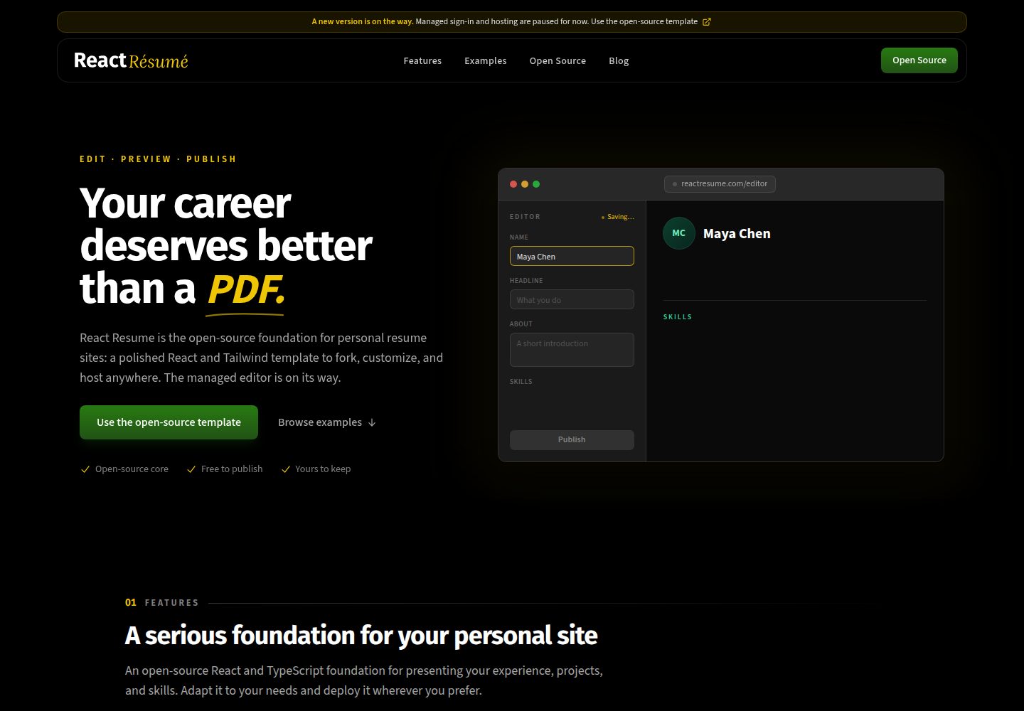
react-resume-template
A personal resume website template for software developers, built with Next.js, React, and TypeScript and styled with Tailwind CSS. Site content is driven by a single data file at /src/data/data.tsx, with types in dataDef.ts and images in src/images/.
Next.js · Portfolio
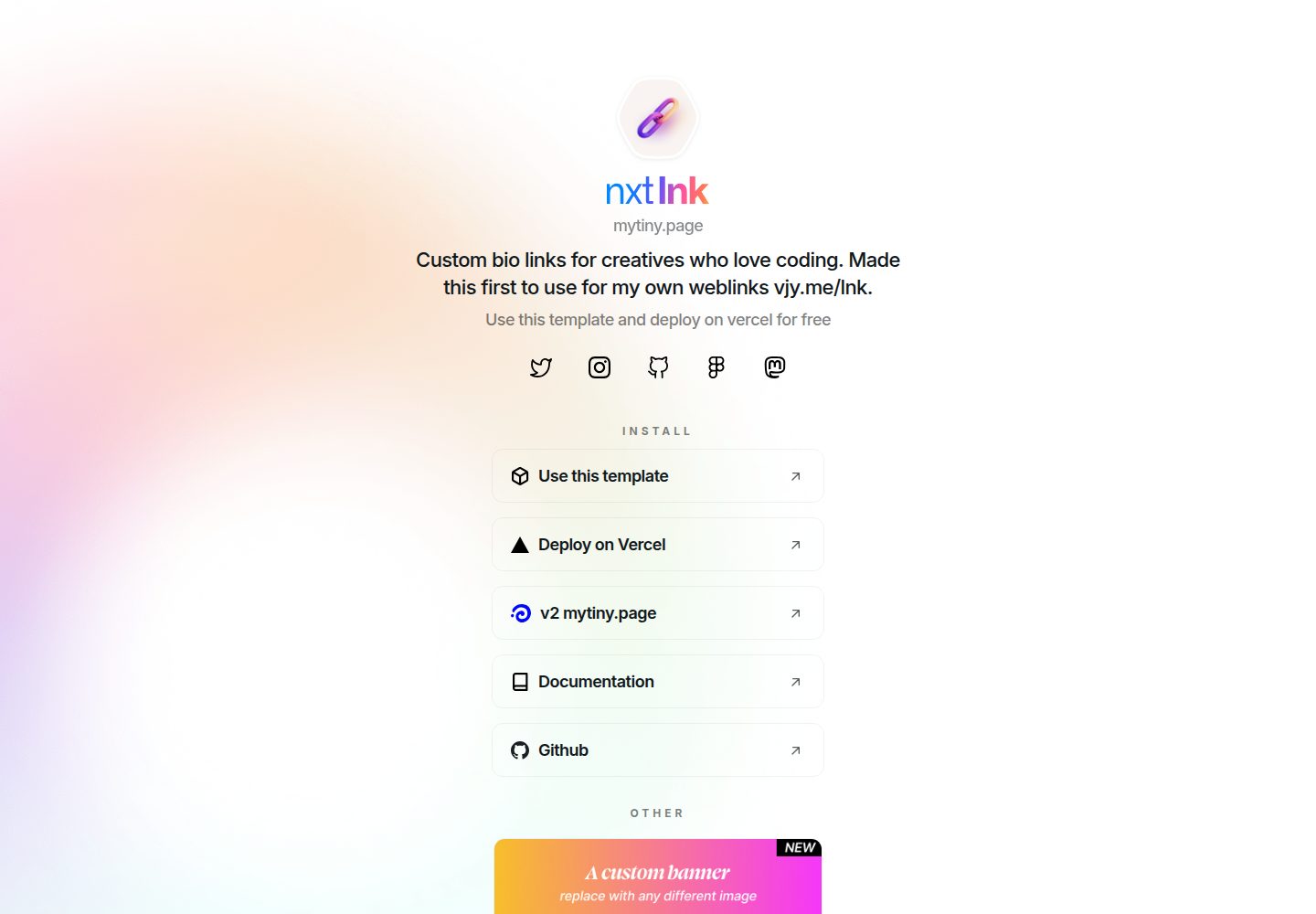
nxt-lnk
nxt-lnk is a Next.js-based bio link page template that manages personal information and links via BioData.js and LinksData.js, positioned as a self-hosted alternative to Linktree. It groups links by type, supports enabling/disabling individual links, and offers hexagonal or oval avatars.
Next.js · Portfolio
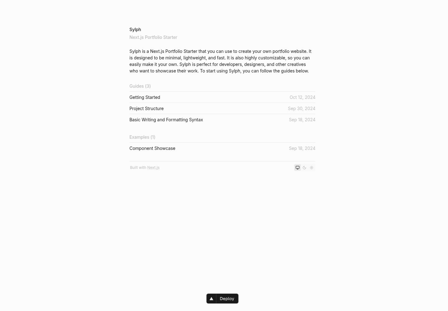
sylph
Sylph is a minimal portfolio and blog template built on Next.js, supporting MDX/Markdown writing, light/dark themes, and automatic OG image generation. It includes sitemap, robots.txt, metadata, and syntax highlighting, with automatic blog timestamps.
Next.js · Portfolio
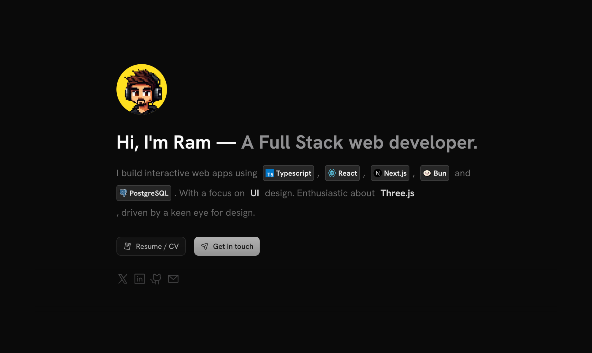
sleek-portfolio
A modern, responsive portfolio template built with Next.js 15, TypeScript, Tailwind CSS, and Shadcn UI. It includes an MDX blog, project showcase, work experience timeline, and a contact form that receives messages via Telegram Bot.
Next.js · Portfolio
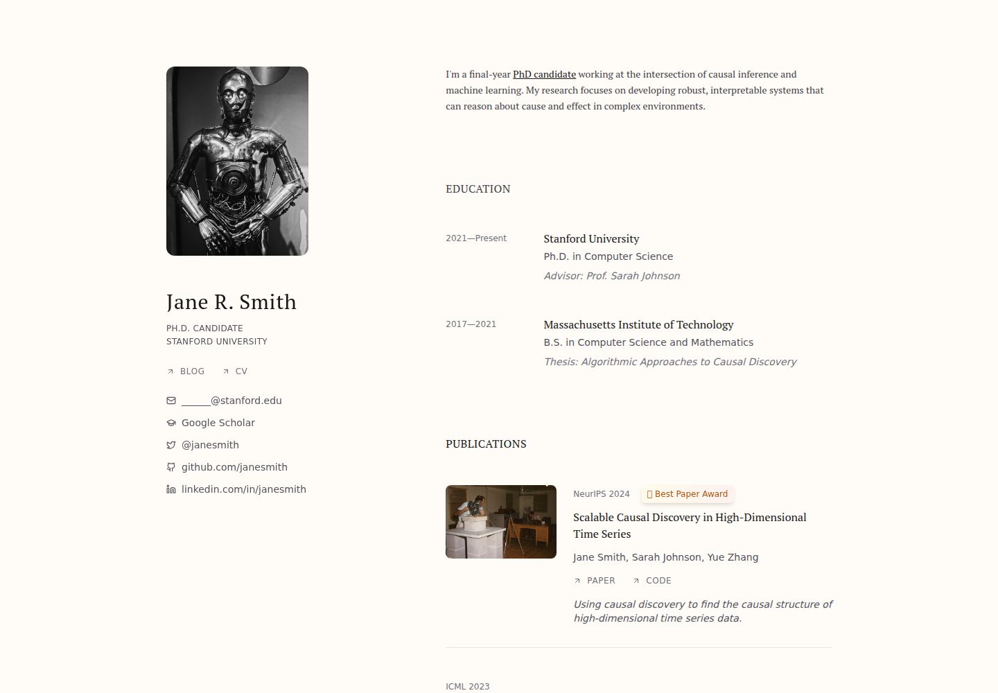
research-website-template
A React + Next.js template for research personal websites, aimed at PhD students and researchers. It centralizes publications, projects, and other content in src/data as arrays of objects, with optional fields automatically generating UI components.
Next.js · Portfolio
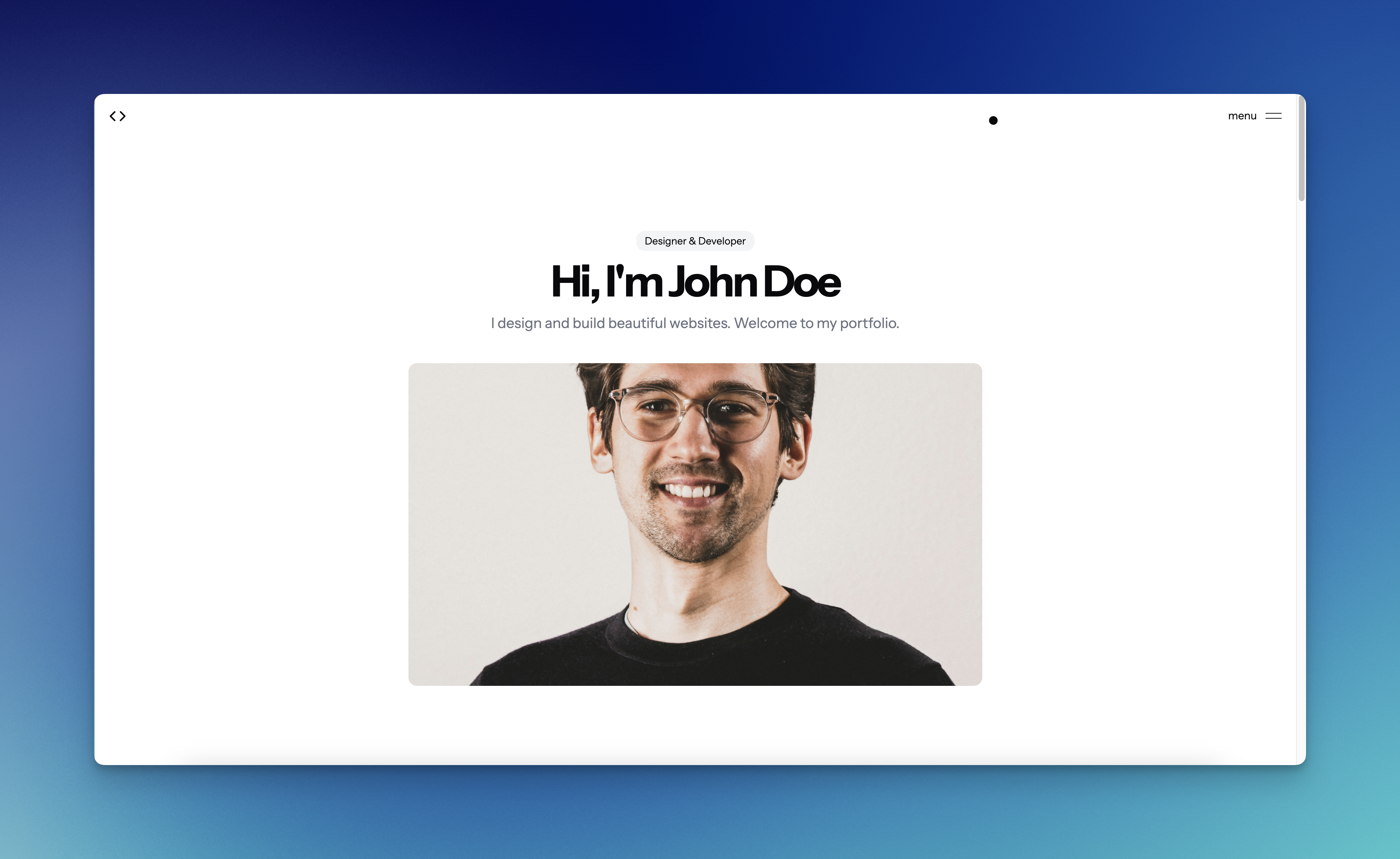
shadcn-portfolio
A developer portfolio template built with Next.js 15, shadcn/ui, Tailwind CSS, and Framer Motion, featuring an MDX blog, light and dark modes, responsive design, and SEO meta tags.
Next.js · Portfolio