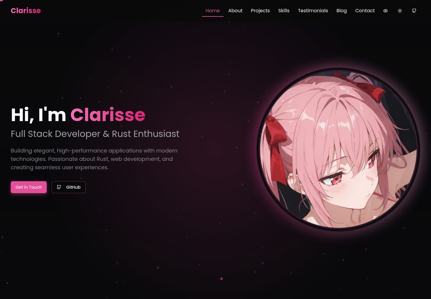
使用 Next.js 与 TypeScript 构建,组件按区块拆分,结构清晰
Next.jsReact作品集
Clarisse-Portfolio — Next.js 作品集模板
作者 VoxDroid
基于 Next.js 与 TypeScript 的个人作品集模板,包含首页、项目、技能、博客、推荐语与联系表单等模块,支持明暗主题切换。
看看你的网站会是什么样
浏览真实页面截图,比较内容排版与手机效果。点击下方缩略图切换,放大查看整页细节。
全部页面与视图 2
截图用于了解视觉与布局,交互效果请以实际项目为准。
采集于 2026-10-04查看来源
值得关注的模板亮点
从已有项目资料中,快速了解它的特点。
内置明暗主题切换,颜色可通过 Tailwind 配置与 CSS 变量调整
包含项目、技能、博客、推荐语、联系表单等作品集常用区块
提供粒子动画背景与 Framer Motion 过渡效果,参数可在对应组件中调整
项目区带分类筛选,图标使用 Lucide,UI 组件参考 shadcn/ui
采用 MIT 许可,可免费使用、修改、商用和分发该版本代码
模板详细介绍
Clarisse Portfolio 是一个用 Next.js 和 TypeScript 构建的个人作品集网站模板,界面由多个可复用组件拼装而成,适合展示个人简介、项目作品、技能、文章与客户评价。README 中列出了首页 Hero、About、Projects、Skills、Testimonials、Blog、Contact 等区块,每个区块对应 components 目录下的独立文件,修改内容主要在组件内的数据数组或文案中完成。
样式方面使用 Tailwind CSS,颜色通过 tailwind.config.ts 的 theme.extend.colors 与 app/globals.css 中的 CSS 变量(如 --primary)调整,明暗两套主题分别定义。动画由 Framer Motion 提供,另有 components/particles-background.tsx 实现粒子背景,粒子数量与颜色可在该文件中修改。项目区带分类筛选,图标使用 Lucide,UI 组件参考 shadcn/ui。
模板附带桌面端与手机端首页截图,仓库采用 MIT 许可,可免费使用、修改、商用和分发该版本代码,分发时需保留版权声明与许可声明。演示站点部署在 Vercel。README 中的性能与 SEO 描述属于作者自述,未在本次资料中独立验证;演示图片、字体、图标等第三方素材需按各自许可单独核对。
Next.js作品集
适合你的项目吗?
适用场景
- 搭建个人作品集网站,集中展示项目与技能
- 作为前端开发者练习 Next.js 与 TypeScript 组件化开发的起点
- 需要明暗主题与动画背景的静态展示型站点
- 以博客与推荐语补充个人介绍的内容型页面
适合人群
- 有 React 或 Next.js 基础、希望快速搭建个人作品集的开发者
- 需要可自行修改颜色与文案的模板,而非固定设计稿的用户
- 接受自行准备图片、字体等素材并核对第三方许可的使用者
上手与定制指南
结合仓库当前版本的说明,按下面的资料检查内容、配置与运行要求。
- 1
需要 Node.js 18.0 或更高版本,以及 npm 或 yarn
- 2
克隆仓库后执行 npm install(或 yarn install),再运行 npm run dev 启动开发服务器,默认访问 http://localhost:3000
- 3
内容修改集中在 components 目录下的 hero、about、projects、skills、testimonials、blog、contact 等文件
- 4
颜色在 tailwind.config.ts 与 app/globals.css 中调整,粒子背景参数在 components/particles-background.tsx 中修改
- 5
演示图片、字体、图标等第三方素材需按各自许可核对,托管等外部服务可能另行收费
授权与来源资料
使用条件与限制
免费使用 · 保留许可声明本次收录的是公开仓库中采用 MIT 许可的免费版本;免费范围为该版本代码,不代表外部服务或第三方素材免费。
使用时需要遵守
- 允许免费使用、修改、商用和分发该版本代码。
- 分发代码副本或实质性部分时,保留原作者版权声明和完整 MIT 许可声明。
- 代码按现状提供;担保与责任限制以原许可证及适用法律为准。
额外费用与待核对事项
- 演示图片、字体、图标及其他第三方素材需按各自许可核对,不能仅凭代码的 MIT 许可判断。
- 域名、托管、数据库、支付或 AI 等外部服务可能另外收费。
查看原文依据
https://github.com/VoxDroid/Clarisse-Portfolio/blob/main/LICENSEhttps://github.com/VoxDroid/Clarisse-Portfolio/blob/main/README.mdPermission is hereby granted, free of charge
许可证原文
DeepSeek 根据仓库许可证和 README 整理 ·2026-10-04。结果仅覆盖已读取资料,依赖、图片、字体及后续条款变更以各自原文为准。
项目核对记录与介绍依据
模板资料
- 来源平台
- GitHub
- 资料与维护参考分
- 资料较完整 · 83 / 100
- 技术栈
- Next.js · React
- 网站类型
- 作品集
这个分数如何计算
本站按许可资料(最高30分)、演示链接(12分)、预览图(10分)、Star数(15分)、记录的维护时间(15分)、描述完整度(8分)、功能记录(5分)和分类资料(5分)计算。它不是代码、安全或性能测试,也不是 Google 评分;有链接不代表已实测可用。
这个项目需要核对什么
- 记录的仓库更新时间
- 2026-02-20
- 截图检查日期
- 2026-10-04
已收录演示链接。请用你的内容与屏幕尺寸检查;有演示不代表表单、认证或支付已经可用。
目录记录的主要技术栈是 Next.js。请通过依赖清单和锁文件核对实际版本与托管要求。这些说明基于收录资料,不代表代码审计或部署实测。
查看具体选型方法 →介绍的制作与核对状态
介绍由 AI 辅助整理目录与仓库资料。仓库作者不等于这篇介绍的审核者。
审核声明: [email protected] · 2026-10-04
查看当时使用的来源资料
SHA-256: ea889b6e350c44a55423f55d5292b8c2319d0ed5470801e4ee899cf68250dbfd
2026-10-04T03:11:32.895Z
来源文件 / 仓库# Clarisse Portfolio

A modern, customizable, and responsive portfolio template built with **Next.js** and **TypeScript**. Designed to showcase your skills, projects, and personality with a sleek interface, animated background, and professional features.
### **Live Demo**: Check out the deployed version at [clarisse-portfolio.vercel.app](https://clarisse-portfolio.vercel.app)
---
## Badges
[](https://nextjs.org/)
[](https://www.typescriptlang.org/)
[](https://tailwindcss.com/)
[](https://github.com/voxdroid/clarisse-portfolio/blob/main/LICENSE)
[](https://github.com/voxdroid/clarisse-portfolio)
[](https://github.com/voxdroid/clarisse-portfolio/issues)
[](https://github.com/voxdroid/clarisse-portfolio/commits/main)
[](https://github.com/voxdroid/clarisse-portfolio/releases)
[](https://clarisse-portfolio.vercel.app)
---
## Table of Contents
- [Features](#features)
- [Screenshots](#screenshots)
- [Getting Started](#getting-started)
- [Usage](#usage)
- [Customization](#customization)
- [Project Structure](#project-structure)
- [Built With](#built-with)
- [Dependencies](#dependencies)
- [Releases](#releases)
- [Key Features Explained](#key-features-explained)
- [License](#license)
- [Acknowledgments](#acknowledgments)
- [Contact](#contact)
- [Contributing](#contributing)
- [Support](#support)
---
## Features
- Light/Dark Mode: Toggle between light and dark themes seamlessly.
- Fully Customizable: Adjust colors, fonts, and content to match your brand.
- Responsive Design: Optimized for mobile, tablet, and desktop devices.
- Animated Background: Dynamic particle animations for visual appeal.
- Smooth Animations: Powered by Framer Motion for fluid transitions.
- Modular Components: Well-organized, reusable component structure.
- Interactive UI: Includes tooltips, hover effects, and engaging elements.
- SEO Optimized: Built with search engine visibility in mind.
- High Performance: Fast load times and optimized assets.
- Skills Visualization: Dynamic representation of your expertise.
- Blog Section: Share articles and insights.
- Testimonials: Display feedback from clients or peers.
- Contact Form: Easy way for visitors to reach out.
---
## Screenshots
| Feature | Light Mode | Dark Mode |
|--------------------|-------------------------------------|------------------------------------|
| Home Page |  |  |
| Projects Section |  |  |
| Skills Section |  |  |
---
## Getting Started
Set up and run the portfolio locally with these steps.
### Prerequisites
- **Node.js**: Version 18.0 or higher
- **Package Manager**: `npm` or `yarn`
### Installation
1. **Clone the Repository**
```bash
git clone https://github.com/VoxDroid/Clarisse-Portfolio
```
2. **Navigate to the Project Directory**
```bash
cd Clarisse-Portfolio
```
3. **Install Dependencies**
```bash
npm install
# or
yarn install
```
4. **Start the Development Server**
```bash
npm run dev
# or
yarn dev
```
5. Open **[http://localhost:3000](http://localhost:3000)** in your browser to view the portfolio.
---
## Usage
Once the portfolio is running, you can explore and customize it to suit your needs. Below are key sections and how to use them effectively.
### Getting Started
- Launch the development server as described above.
- Navigate the site via the browser to preview the default layout and content.
- Use the customization options below to personalize it.
### Hero Section
- **Purpose**: Introduce yourself with a striking headline and background animation.
- **How to Use**: Edit `components/hero.tsx` to update your name, tagline, and image.
### Projects Section
- **Purpose**: Showcase your work with interactive filters and project cards.
- **How to Use**: Add projects to `components/projects.tsx` (see [Adding Projects](#adding-projects)) and test the filters in the browser.
### Skills Section
- **Purpose**: Visualize your skills dynamically.
- **How to Use**: Update the skills list in `components/skills.tsx` with your expertise.
### Settings (Theme Toggle)
- **Purpose**: Switch between light and dark modes.
- **How to Use**: Test the toggle in `components/theme-toggle.tsx` via the UI; no additional setup needed.
---
## Customization
Tailor the template to reflect your personal style and content.
### Changing Colors
Modify the color scheme in `tailwind.config.ts`:
```typescript
// tailwind.config.ts
const config = {
theme: {
extend: {
colors: {
primary: {
DEFAULT: "hsl(330, 73%, 60%)", // Customize here
foreground: "hsl(330, 10%, 95%)",
},
},
},
},
};
```
Adjust CSS variables in `app/globals.css`:
```css
:root {
--primary: 330 73% 60%; /* Light mode */
}
.dark {
--primary: 330 73% 70%; /* Dark mode */
}
```
### Updating Content
Edit these files to update your information:
- Hero: `components/hero.tsx`
- About: `components/about.tsx`
- Projects: `components/projects.tsx`
- Skills: `components/skills.tsx`
- Testimonials: `components/testimonials.tsx`
- Blog: `components/blog.tsx`
- Contact: `components/contact.tsx`
### Adding Projects
Add projects to the `projects` array in `components/projects.tsx`:
```typescript
const projects = [
{
title: "Sample Project",
description: "A brief overview of the project.",
image: "/images/sample-project.jpg",
tags: ["React", "TypeScript"],
github: "https://github.com/voxdroid/sample-project",
demo: "https://sample-project-demo.com",
icon: <CodeIcon className="h-6 w-6" />,
},
// Add more projects here
];
```
### Customizing Particle Background
Tweak the animation in `components/particles-background.tsx`:
```typescript
const particleCount = Math.min(120, Math.floor((window.innerWidth * window.innerHeight) / 9000));
const colors = [
"rgba(236, 72, 153, 0.5)", // Adjust colors
"rgba(219, 39, 119, 0.5)",
];
```
---
## Project Structure
```plaintext
clarisse-portfolio/
├── app/ # Next.js app directory
│ ├── globals.css # Global styles
│ ├── layout.tsx # Root layout
│ └── page.tsx # Home page
├── components/ # Reusable React components
│ ├── about.tsx # About section
│ ├── blog.tsx # Blog section
│ ├── contact.tsx # Contact form
│ ├── hero.tsx # Hero section
│ ├── navbar.tsx # Navigation bar
│ ├── particles-background.tsx # Animated background
│ ├── projects.tsx # Projects showcase
│ ├── skills.tsx # Skills visualization
│ ├── testimonials.tsx # Testimonials display
│ └── theme-toggle.tsx # Theme switcher
├── public/ # Static assets (images, etc.)
├── styles/ # Additional CSS
├── tailwind.config.ts # Tailwind CSS configuration
├── tsconfig.json # TypeScript configuration
└── package.json # Dependencies and scripts
```
---
## Built With
- [Next.js](https://nextjs.org/) - React framework for production-grade apps
- [TypeScript](https://www.typescriptlang.org/) - Typed JavaScript for reliability
- [Tailwind CSS](https://tailwindcss.com/) - Utility-first CSS framework
- [Framer Motion](https://www.framer.com/motion/) - Animation library
- [Lucide Icons](https://lucide.dev/) - Consistent icon set
- [shadcn/ui](https://ui.shadcn.com/) - Reusable UI components
---
## Dependencies
To run this project, the following Node.js packages are required (listed in `package.json`):
- `next` - Core framework
- `react` and `react-dom` - React libraries
- `typescript` - Type checking
- `tailwindcss` - Styling
- `framer-motion` - Animations
- `@lucide/react` - Icons
- Various `shadcn/ui` dependencies (e.g., `@radix-ui/*`)
Install them with:
```bash
npm install
```
---
## Releases
- Check the [Releases page](https://github.com/voxdroid/clarisse-portfolio/releases) for versioned updates.
- Each release includes notes on new features, bug fixes, and improvements.
- The source code is the primary distribution method; no pre-built binaries are provided.
---
## Key Features Explained
### Animated Particle Background
A semi-transparent particle system moves diagonally, customizable in `components/particles-background.tsx`.
### Interactive Project Filters
Category filters with animated icons and glow effects, implemented in `components/projects.tsx`.
### Custom Tooltip System
Toggleable tooltips managed in `context/tooltip-context.tsx` for enhanced interactivity.
### Responsive Design
Mobile-first design ensures compatibility across devices, built into all components.
---
## License
This project is licensed under the [MIT License](LICENSE). See the license file for details.
---
## Acknowledgments
- [shadcn/ui](https://ui.shadcn.com/) - Reusable UI components
- [Lucide Icons](https://lucide.dev/) - Beautiful icon library
- [Framer Motion](https://www.framer.com/motion/) - Smooth animations
- [Tailwind CSS](https://tailwindcss.com/) - Efficient styling
- [Next.js](https://nextjs.org/) - Robust framework
---
## Contact
Questions or feedback? Reach out:
- **GitHub**: [@VoxDroid](https://github.com/VoxDroid)
---
## Contributing
Contributions are welcome! Please read our [Contributing Guide](CONTRIBUTING.md) for details on how to contribute, and review our [Code of Conduct](CODE_OF_CONDUCT.md) to ensure a positive and inclusive community.
To contribute:
1. Fork the repository: [https://github.com/VoxDroid/Clarisse-Portfolio](https://github.com/VoxDroid/Clarisse-Portfolio)
2. Create a feature branch (`git checkout -b feature-name`)
3. Commit your changes (`git commit -m "Add feature"`)
4. Push to the branch (`git push origin feature-name`)
5. Open a pull request
---
## Support
For support, please refer to our [Support Guide](SUPPORT.md). If you encounter security issues, please review our [Security Policy](SECURITY.md).
If you find this project useful, consider supporting its development:
- **Ko-fi**: [Buy me a coffee](https://ko-fi.com/izeno)
[](https://ko-fi.com/izeno)
- **Star the Repository**: Give it a star on [GitHub](https://github.com/voxdroid/clarisse-portfolio)
- **Report Issues**: Submit bugs or suggestions on the [Issues page](https://github.com/voxdroid/clarisse-portfolio/issues)
---
**Developed by VoxDroid**
[GitHub](https://github.com/VoxDroid) | [Ko-fi](https://ko-fi.com/izeno)看看同类模板
对比同技术栈与用途的模板,找到更适合的视觉与内容结构。
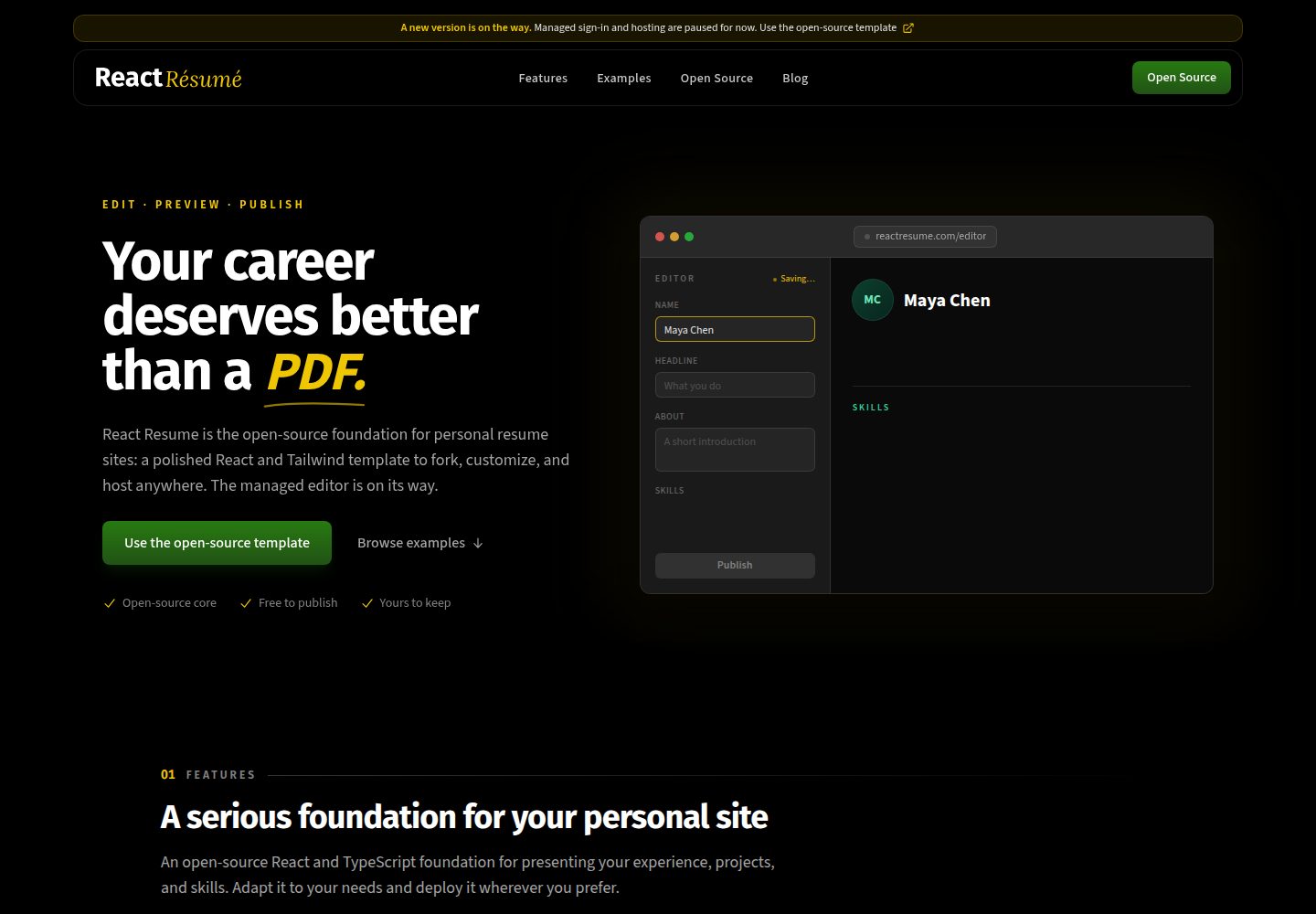
react-resume-template
A personal resume website template built with React.js, Typescript, Next.js, and styled with Tailwind css
Next.js · 作品集
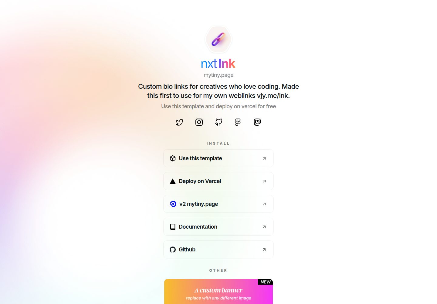
nxt-lnk
Custom bio links for creatives who love coding. A perfect custom alternative for linktree, bio and other short…
Next.js · 作品集
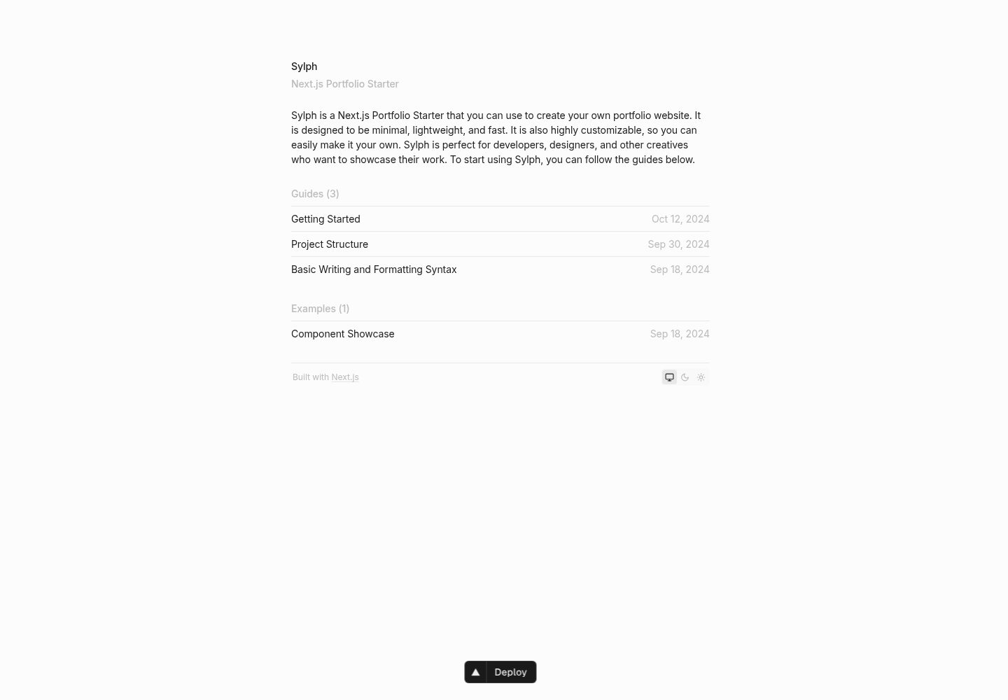
sylph
A minimal portfolio template.
Next.js · 作品集
sleek-portfolio
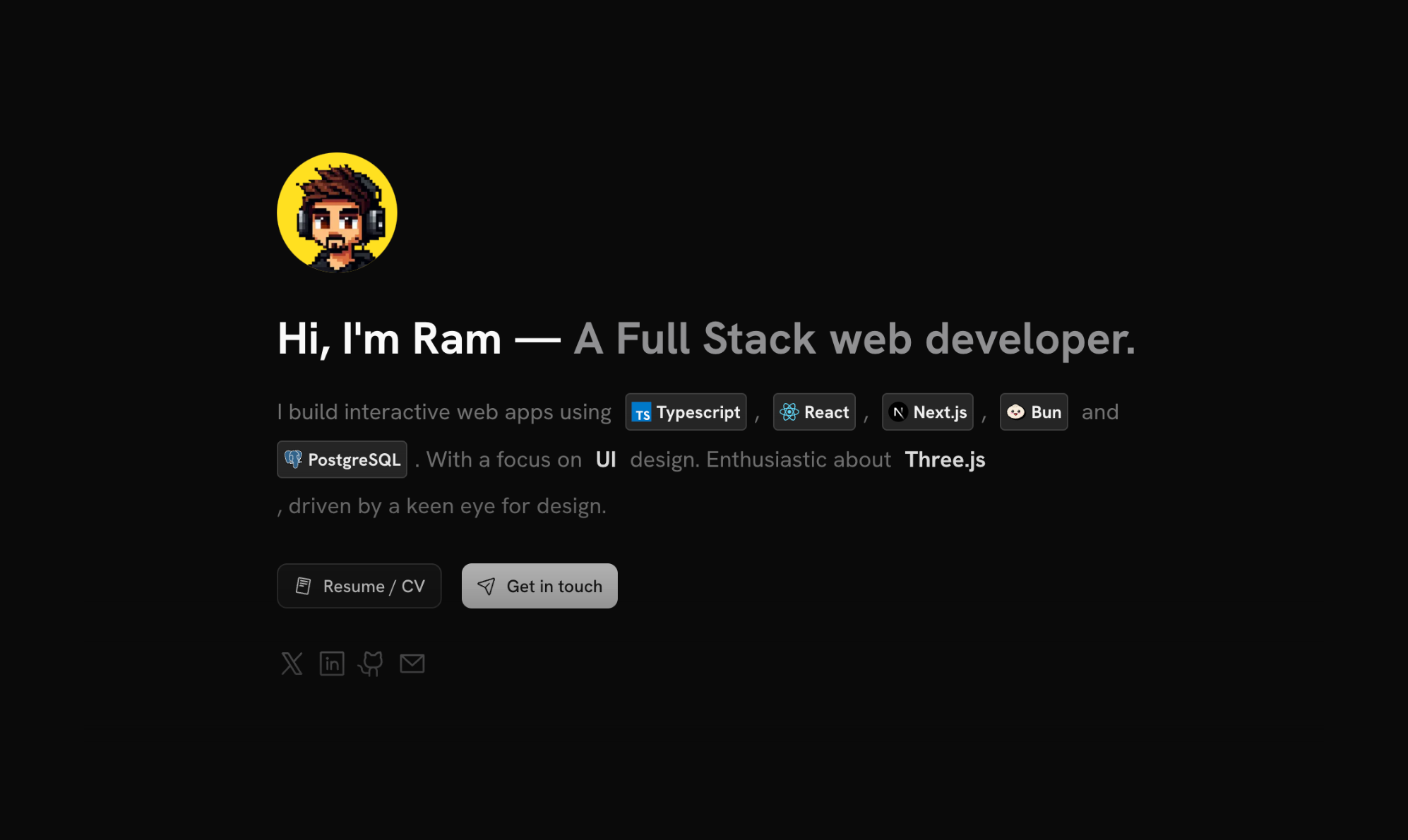
sleek-portfolio 是一个面向开发者个人品牌展示的现代作品集模板,基于 Next.js 15、TypeScript、Tailwind CSS 和 Shadcn UI 构建。
Next.js · 作品集
research-website-template
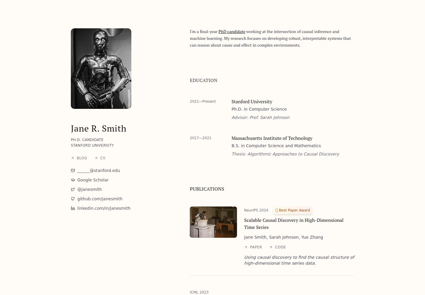
React + Next.js template for research websites (for PhD students, researchers, etc)
Next.js · 作品集
shadcn-portfolio
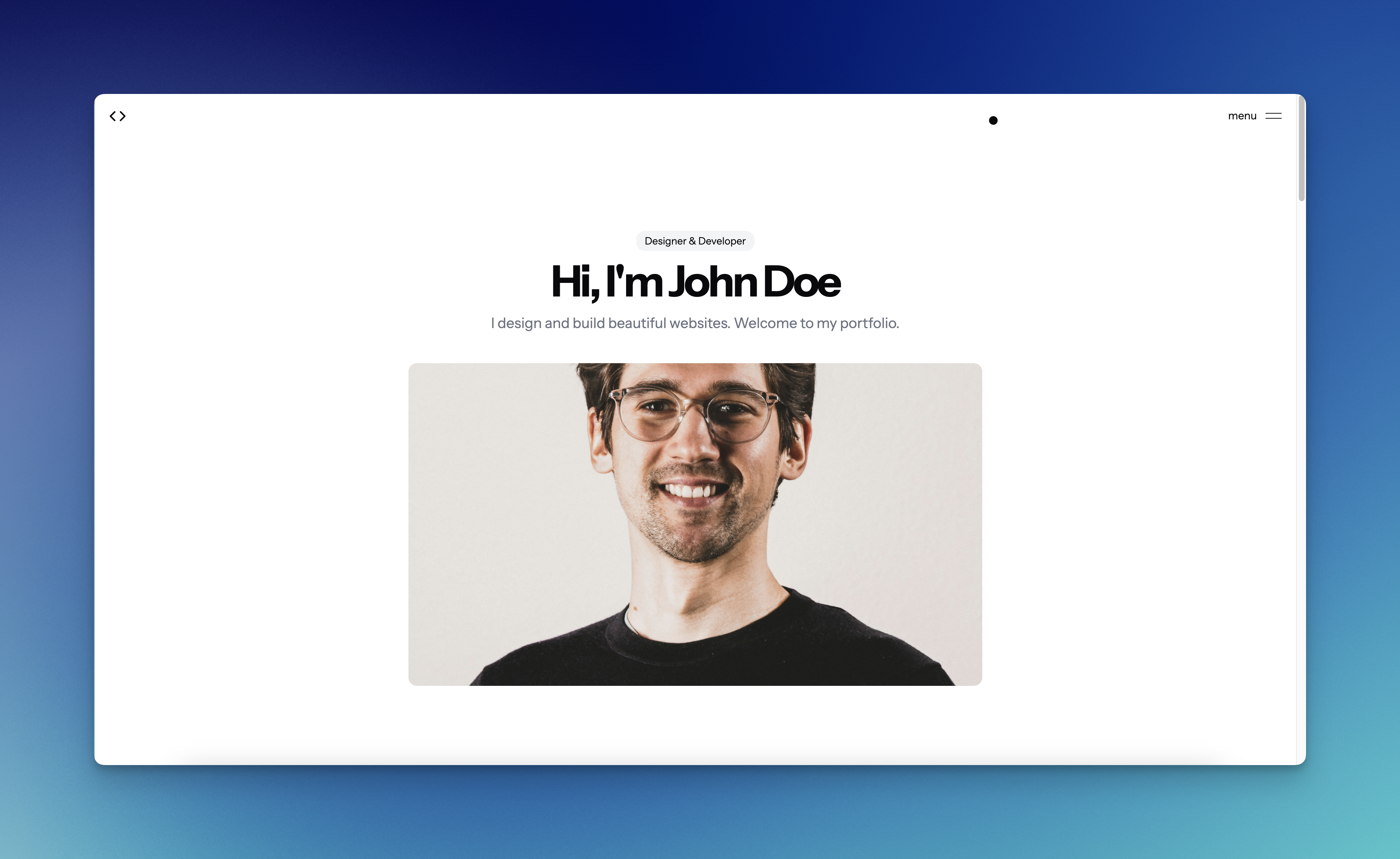
shadcn-portfolio 是一个面向开发者的作品集模板,技术栈为 Next.js 15、shadcn/ui、Tailwind CSS 和 Framer Motion。
Next.js · 作品集