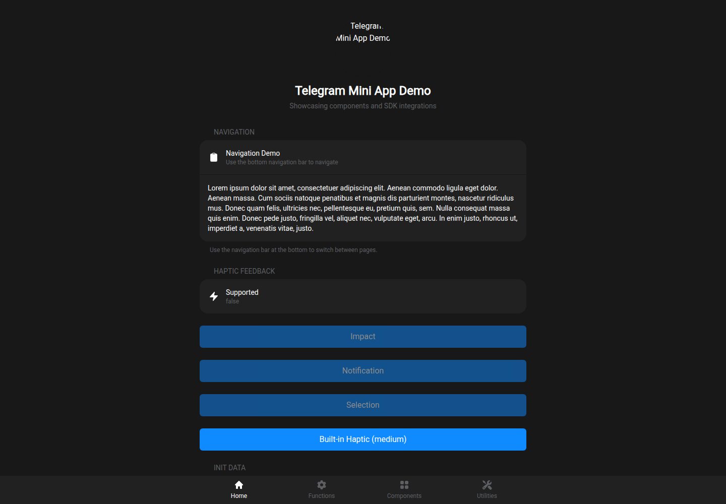
集成 Telegram WebApp SDK,提供主按钮、返回按钮、触感反馈、用户数据、主题参数等 composable
NuxtVue启动器
nuxt-telegram-mini-app — Nuxt 启动器模板
作者 patricktobias86
基于 Nuxt 的 Telegram Mini App 启动模板,内置 Telegram WebApp SDK 集成、Tailwind 样式与一套 Tg 组件,附带 Netlify SPA 部署配置。
看看你的网站会是什么样
浏览真实页面截图,比较内容排版与手机效果。点击下方缩略图切换,放大查看整页细节。
全部页面与视图 2
截图用于了解视觉与布局,交互效果请以实际项目为准。
采集于 2026-10-02查看来源
值得关注的模板亮点
从已有项目资料中,快速了解它的特点。
内置 TgButton、TgCell、TgContent、TgNav、TgSection 等 Telegram 风格组件
使用 Tailwind CSS,并接入 Telegram 主题颜色变量
以 SPA 模式构建,附带 Netlify 的 _redirects 配置以支持深链接
可作为 Nuxt Layer 被其他项目安装、扩展或覆盖
包含 Vitest 测试配置、Telegram WebApp 类型定义与数据校验服务端路由
模板详细介绍
该模板面向 Telegram Mini App 开发,使用 Nuxt 与 Vue 3、TypeScript、Tailwind CSS 构建,并预置了 Telegram WebApp SDK 的集成层。项目以 SPA 模式运行,附带 Netlify 的 SPA 重定向配置,用于保留 Telegram 的 #tgWebAppData 哈希。
模板提供一组以 Tg 为前缀的界面组件(按钮、列表单元、内容容器、底部导航、区块)以及 Hero 头部组件,并封装了多个 composable 用于访问 Telegram 的主按钮、返回按钮、触感反馈、用户数据、主题参数、视口控制、主屏快捷方式、设备存储与分享等能力。仓库还包含 Vitest 测试配置、Telegram WebApp 类型定义,以及一个用于校验 Telegram 数据的服务端 API 路由。
该模板可作为 Nuxt Layer 被其他 Nuxt 项目扩展或覆盖。需要注意的是,README 中标注的部分版本号与依赖清单可能不一致,实际使用时以项目依赖文件为准;设备相关 API 采用特性检测方式调用,并非所有 Telegram 客户端都支持。
Nuxt启动器
适合你的项目吗?
适用场景
- 快速搭建一个在 Telegram 内运行的 Mini App 前端界面
- 为已有 Nuxt 项目引入 Telegram WebApp 能力与主题适配
- 作为 Nuxt Layer 复用 Telegram 组件与 composable
- 在 Netlify 上部署 SPA 形式的 Telegram Mini App
适合人群
- 需要 Telegram Mini App 启动模板的 Nuxt 开发者
- 希望使用 Tailwind 与 TypeScript 构建 Telegram 界面的团队
- 计划以 Nuxt Layer 方式复用 Telegram 集成代码的项目
- 准备在 Netlify 上部署 SPA 的 Telegram 小程序项目
上手与定制指南
结合仓库当前版本的说明,按下面的资料检查内容、配置与运行要求。
- 1
需要 Node.js 18 及以上版本,并使用 npm、yarn 或 pnpm 安装依赖
- 2
开发运行 npm run dev,生产构建使用 npm run generate 生成 dist 目录
- 3
部署到 Netlify 时依赖 public/_redirects 中的 SPA 回退规则,其他平台需配置等效规则
- 4
README 中的部分版本号与依赖清单可能不一致,请以实际依赖文件为准
- 5
演示图片、字体、图标等第三方素材需单独核对其许可
授权与来源资料
使用条件与限制
免费使用 · 保留许可声明本次收录的是公开仓库中采用 MIT 许可的免费版本;免费范围为该版本代码,不代表外部服务或第三方素材免费。
使用时需要遵守
- 允许免费使用、修改、商用和分发该版本代码。
- 分发代码副本或实质性部分时,保留原作者版权声明和完整 MIT 许可声明。
- 代码按现状提供;担保与责任限制以原许可证及适用法律为准。
额外费用与待核对事项
- 模板会自动在页面中引入 Telegram 官方脚本 https://telegram.org/js/telegram-web-app.js,运行时依赖 Telegram 客户端环境,脱离 Telegram 时相关 API 不可用。
- 部分较新的 Telegram API 采用特性检测调用,实际可用性取决于用户所用 Telegram 客户端版本,并非所有客户端都支持全部功能。
- 部署到 Netlify 时依赖 public/_redirects 中的 SPA 回退规则;若部署到其他平台,需自行配置等效的 history 回退规则,否则深链接无法解析。
- 部署时需在托管平台自行配置环境变量(如 ENV=production),属于外部部署要求。
- 演示图片、字体、图标及其他第三方素材需按各自许可核对,不能仅凭代码的 MIT 许可判断。
- 域名、托管、数据库、支付或 AI 等外部服务可能另外收费。
查看原文依据
Permission is hereby granted, free of charge
许可证原文
The template automatically includes the Telegram WebApp script.
README 原文
The wrapper feature-detects newer APIs because the available API version depends on the user's Telegram client.
README 原文
Netlify requires a SPA redirect so deep links resolve to `index.html`.
README 原文
https://github.com/patricktobias86/nuxt-telegram-mini-app/blob/main/LICENSEhttps://github.com/patricktobias86/nuxt-telegram-mini-app/blob/main/README.mdSet these in your deployment platform:
README 原文
DeepSeek 根据仓库许可证和 README 整理 ·2026-10-02。结果仅覆盖已读取资料,依赖、图片、字体及后续条款变更以各自原文为准。
项目核对记录与介绍依据
模板资料
- 来源平台
- GitHub
- 资料与维护参考分
- 资料较完整 · 87 / 100
- 技术栈
- Nuxt · Vue
- 网站类型
- 启动器
这个分数如何计算
本站按许可资料(最高30分)、演示链接(12分)、预览图(10分)、Star数(15分)、记录的维护时间(15分)、描述完整度(8分)、功能记录(5分)和分类资料(5分)计算。它不是代码、安全或性能测试,也不是 Google 评分;有链接不代表已实测可用。
这个项目需要核对什么
- 记录的仓库更新时间
- 2026-10-02
- 截图检查日期
- 2026-10-02
已收录演示链接。请用你的内容与屏幕尺寸检查;有演示不代表表单、认证或支付已经可用。
目录记录的主要技术栈是 Nuxt。请通过依赖清单和锁文件核对实际版本与托管要求。这些说明基于收录资料,不代表代码审计或部署实测。
查看具体选型方法 →介绍的制作与核对状态
介绍由 AI 辅助整理目录与仓库资料。仓库作者不等于这篇介绍的审核者。
已完成服务器许可规则与 AI 来源核对;未经过人工编辑审核。
查看当时使用的来源资料
SHA-256: 6184dde92874bf5a3038f610d0c93bf2febb46e1954be1589da0ebd9a3f04435
2026-10-02T10:28:47.421Z
来源文件 / 仓库# 🚀 Nuxt Telegram Mini App Template
A comprehensive template for building Telegram Mini Apps using Nuxt 4, Vue 3, TypeScript, and Tailwind CSS, ready for deployment on Netlify.



<img height="600" alt="Localhost" src="https://github.com/user-attachments/assets/2bbf6549-25db-42d5-b380-fc4f20884538" />
## ✨ Features
### 🎯 Core Features
- **🔧 Complete Nuxt 4 Setup** - Latest Nuxt with TypeScript support
- **📱 Telegram WebApp SDK** - Full integration with Telegram Mini App APIs
- **🎨 Tailwind CSS** - Utility-first CSS framework with Telegram theme integration
- **⚡ SPA Mode** - Optimized for Telegram Mini App deployment
- **🌐 Netlify Ready** - Pre-configured for seamless deployment
### 🧩 Components Library
- **TgButton** - Telegram-styled buttons with haptic feedback
- **TgCell** - List cells with navigation and interaction support
- **TgContent** - Main content wrapper with proper spacing
- **TgNav** - Bottom navigation bar with up to 4 menu options and icons
- **TgSection** - Content sections with proper styling
- **Hero** - Header component for pages
### 📡 Telegram SDK Integration
- **🎮 Haptic Feedback** - Impact, notification, and selection feedback
- **🔄 Main Button** - Configurable main action button
- **⬅️ Back Button** - Navigation back button control
- **👤 User Data** - Access to Telegram user information
- **🎨 Theme Integration** - Automatic Telegram theme colors
- **📐 Viewport Control** - Fullscreen, safe-area, and responsive viewport management
- **🏠 Home Screen Shortcuts** - Add/check Mini App shortcut support
- **📍 Device APIs** - Feature-detected storage, location, and motion access
- **🔗 Deep Linking** - External and Telegram link handling
- **📤 Sharing** - Built-in sharing functionality
### 🧪 Testing & Quality
- **⚡ Vitest** - Fast unit testing framework
- **🧪 Component Tests** - Comprehensive test coverage
- **🔍 TypeScript** - Full type safety
- **📋 Type Definitions** - Complete Telegram WebApp types
## 🚀 Quick Start
### Prerequisites
- Node.js 18+
- npm or yarn or pnpm
### 1. Use This Template
Click the "Use this template" button on GitHub or clone the repository:
```bash
git clone https://github.com/patricktobias86/nuxt-telegram-mini-app.git my-telegram-app
cd my-telegram-app
```
### 2. Install Dependencies
```bash
npm install
# or
yarn install
# or
pnpm install
```
### 3. Development
```bash
npm run dev
```
Open [http://localhost:3000](http://localhost:3000) in your browser to see the demo.
### 4. Build for Production
```bash
npm run generate
```
## 📁 Project Structure
```
├── app/ # Nuxt app directory
│ ├── assets/ # CSS and static assets
│ │ └── css/
│ │ ├── main.css # Global styles
│ │ └── tailwind.css # Tailwind imports
│ ├── components/ # Vue components
│ │ ├── Hero.vue # Hero component
│ │ ├── ErrorBoundary.vue
│ │ └── tg/ # Telegram components
│ │ ├── Button.vue # Telegram button
│ │ ├── Cell.vue # List cell
│ │ ├── Content.vue # Content wrapper
│ │ ├── Nav.vue # Bottom navigation
│ │ └── Section.vue # Content section
│ ├── composables/ # Vue composables
│ │ └── telegram.ts # Telegram SDK integration
│ ├── pages/ # App pages
│ │ ├── index.vue # Home page with SDK demo
│ │ ├── components.vue # Components showcase
│ │ ├── utilities.vue # Utilities demo
│ │ └── functions.vue # Functions page
│ ├── types/ # TypeScript definitions
│ │ └── telegram-webapp.ts
│ └── utils/ # Utility functions
│ └── color.ts # Color conversion utilities
├── server/ # Nuxt server API
│ └── api/
│ └── verify-telegram-data.post.ts # Telegram data verification
├── public/ # Static assets
├── tests/ # Test files
│ └── telegram.spec.ts
├── nuxt.config.ts # Nuxt configuration
├── tailwind.config.ts # Tailwind configuration
└── vitest.config.ts # Test configuration
```
## 🎯 Usage Guide
### Creating Your First Page
1. **Create a new page** in `app/pages/`:
```vue
<!-- app/pages/my-page.vue -->
<template>
<TgContent>
<Hero
title="My Page"
subtitle="Description of my page"
image-src="/img/hero-user.svg"
/>
<TgSection title="My Section" inset>
<TgCell
title="My Cell"
subtitle="Cell description"
icon="i-heroicons-star-20-solid"
/>
</TgSection>
</TgContent>
</template>
<script setup lang="ts">
import { ref } from 'vue'
import { useRouter } from 'vue-router'
const router = useRouter()
const goHome = () => router.push('/')
</script>
```
### Using Telegram SDK Features
```vue
<script setup lang="ts">
import {
useMainButton,
useBackButton,
useHapticFeedback,
useInitData,
useThemeParams,
useViewport,
useHomeScreen,
useTelegramStorage
} from '~/composables/telegram'
const main = useMainButton()
const back = useBackButton()
const haptic = useHapticFeedback()
const init = useInitData()
const theme = useThemeParams()
const viewport = useViewport()
const homeScreen = useHomeScreen()
const storage = useTelegramStorage('device')
// Configure main button
onMounted(() => {
main.mount()
main.setParams({
is_visible: true,
is_active: true,
text: 'My Action'
})
const off = main.onClick(() => {
haptic.impactOccurred('medium')
// Your action here
})
onBeforeUnmounted(() => off?.())
})
// Access user data
const userName = computed(() => init.user.value?.first_name || 'Guest')
// Newer Telegram APIs are feature-detected
function openFullscreen() {
if (!viewport.fullscreen.value) {
viewport.requestFullscreen()
}
}
function rememberPreference() {
storage.setItem('preferred_mode', theme.dark.value ? 'dark' : 'light')
}
// Use theme colors
const bgColor = computed(() => theme.backgroundColor.value)
</script>
```
### Custom Components
The template includes pre-built Telegram-styled components:
```vue
<!-- Buttons -->
<TgButton title="Primary" status="primary" haptic @click="handleClick" />
<TgButton title="Secondary" status="secondary" haptic="impact-light" />
<TgButton title="Outline" status="outline" />
<TgButton title="Destructive" status="destructive" />
<!-- Cells -->
<TgCell title="Basic Cell" subtitle="With subtitle" />
<TgCell title="With Icon" icon="i-heroicons-star-20-solid" />
<TgCell title="Navigable" to="/target-page" />
<TgCell title="Interactive" @click="handleCellClick" />
<!-- Sections -->
<TgSection title="My Section" inset>
<!-- Section content -->
</TgSection>
```
## 🧩 Using as a Nuxt Layer
This template is compatible with Nuxt Layers, allowing you to use it as a reusable layer in other Nuxt projects or extend it with additional layers.
### What are Nuxt Layers?
Nuxt Layers provide a way to extend and customize Nuxt applications by sharing configurations, components, pages, composables, and more across multiple projects. Layers can be local directories or published npm packages.
### Using This Template as a Layer
To use this Telegram Mini App template as a layer in another Nuxt project, install it as an NPM package:
1. **Install the NPM package**:
```bash
npm install nuxt-telegram-mini-app
# or
yarn add nuxt-telegram-mini-app
# or
pnpm add nuxt-telegram-mini-app
```
2. **Configure your Nuxt project** to extend this layer:
```ts
// nuxt.config.ts
export default defineNuxtConfig({
extends: [
'nuxt-telegram-mini-app'
],
// Your custom config here
})
```
Alternatively, if you prefer to use a local clone or git dependency:
```bash
# Clone as a subdirectory
git clone https://github.com/patricktobias86/nuxt-telegram-mini-app.git layers/telegram-app
# Or add as git dependency in package.json:
# "dependencies": {
# "nuxt-telegram-mini-app": "github:patricktobias86/nuxt-telegram-mini-app"
# }
```
Then configure:
```ts
// nuxt.config.ts
export default defineNuxtConfig({
extends: [
'./layers/telegram-app'
// or 'nuxt-telegram-mini-app' for git dependency
],
// Your custom config here
})
```
3. **Access layer features** in your project:
- **Components**: Use `<TgButton>`, `<TgCell>`, etc. in your pages
- **Composables**: Import `useMainButton`, `useHapticFeedback`, etc.
- **Pages**: Extend or override existing pages
- **Styles**: Inherit Tailwind and Telegram theme integration
### Extending This Layer
This template includes an `extends: []` configuration, allowing you to further extend it with additional layers:
```ts
// nuxt.config.ts in this template
export default defineNuxtConfig({
extends: [
// Add your custom layers here
// './layers/my-custom-layer',
// 'my-published-layer'
],
// ... rest of config
})
```
### Layer Structure
The template follows Nuxt's layer conventions:
- `app/` directory contains all extendable content
- `nuxt.config.ts` at root level defines layer configuration
- Components, pages, and composables are automatically merged
### Best Practices
- **Override selectively**: Only override what you need to customize
- **Maintain compatibility**: Keep Telegram SDK integration intact
- **Test thoroughly**: Ensure Telegram features work in your extended app
- **Version control**: Pin layer versions for stability
## 🚀 Deployment
### Manual Deployment
1. **Build the project**:
```bash
npm run generate
```
2. **Deploy the `dist` folder** to your hosting provider
### Netlify (SPA routing)
- This project uses Vue Router history mode to preserve Telegram's `#tgWebAppData` hash.
- Netlify requires a SPA redirect so deep links resolve to `index.html`.
- Included file: `public/_redirects` with `/* /index.html 200`.
- If you deploy elsewhere, add an equivalent history fallback rule.
### Environment Variables
Set these in your deployment platform:
```env
ENV=production
```
## 🧪 Testing
Run tests with:
```bash
# Run tests once
npm run test
# Run tests in watch mode
npm run test:watch
```
The project includes:
- **Unit tests** for Telegram composables
- **Component tests** for UI components
- **Integration tests** for user flows
## 🎨 Customization
### Theme Customization
The template automatically inherits Telegram's theme colors. Customize in `app/assets/css/main.css`:
```css
:root {
/* Telegram theme variables are automatically set */
--custom-color: #your-color;
}
```
### Tailwind Configuration
Extend Tailwind in `tailwind.config.ts`:
```ts
export default {
theme: {
extend: {
colors: {
'custom': '#your-color',
}
}
}
}
```
### Adding New Components
1. Create component in `app/components/`
2. Follow the existing patterns for styling and props
3. Add TypeScript interfaces for props
4. Include tests in `tests/`
## 📖 API Reference
### Composables
#### `useTelegramWebApp()`
- `webApp` - WebApp instance
- `isReady` - Ready state
- `isAvailable` - Availability check
#### `useMainButton()`
- `setParams(params)` - Configure button
- `onClick(callback)` - Handle clicks
- `visible` - Visibility state
- Supports shine effect, custom emoji icon, and other current BottomButton params
#### `useBackButton()`
- `show()` / `hide()` - Control visibility
- `onClick(callback)` - Handle clicks
#### `useHapticFeedback()`
- `impactOccurred(style)` - Trigger impact
- `notificationOccurred(type)` - Trigger notification
- `selectionChanged()` - Trigger selection
#### `useInitData()`
- `user` - User information
- `queryId` - Query ID
- `startParam` - Start parameter
#### `useThemeParams()`
- `backgroundColor` - Theme background
- `textColor` - Theme text color
- `buttonColor` - Theme button color
- And more theme colors...
#### `useViewport()`
- `requestFullscreen()` / `exitFullscreen()` - Toggle Telegram fullscreen when supported
- `insets` - Device safe-area insets
- `contentInsets` - Content safe-area insets
#### `useMiniApp()`
- `hideKeyboard()` - Hide the native keyboard when supported
- `lockOrientation()` / `unlockOrientation()` - Control device orientation when supported
- `enableVerticalSwipes()` / `disableVerticalSwipes()` - Control vertical swipe gestures
#### New Telegram APIs
- `useSecondaryButton()` - Control Telegram's secondary bottom button
- `useSettingsButton()` - Control the Mini App settings menu button
- `useHomeScreen()` - Add/check home screen shortcuts
- `useEmojiStatus()` - Request emoji status access and open the set-status dialog
- `useTelegramStorage(type)` - Use `cloud`, `device`, or `secure` Telegram storage
- `useLocationManager()` - Initialize and request native location data
- `useDeviceMotion()` - Access accelerometer, orientation, and gyroscope objects
- `shareToStory()`, `shareMessage()`, `downloadFile()`, `requestChat()` - Wrappers for newer Telegram actions
### Components
#### `<TgButton>`
Props-driven styling so you don’t need extra Tailwind classes.
```vue
<TgButton
title="Label"
status="primary|secondary|outline|danger|destructive"
size="sm|md|lg"
:block="true"
:loading="false"
:disabled="false"
icon="i-heroicons-star-20-solid"
icon-position="left|right"
elevated
uppercase
haptic="selection|impact-light|impact-medium|impact-heavy|notification-success|notification-warning|notification-error"
@click="handleClick"
/>
```
TgButton props
| Prop | Required | Default | Description |
| --- | --- | --- | --- |
| `title` | yes | — | Button label text |
| `status` | no | `primary` | Visual style variant |
| `size` | no | `md` | Size of the button |
| `block` | no | `true` | Full width when true |
| `loading` | no | `false` | Shows spinner and disables |
| `disabled` | no | `false` | Disables interaction |
| `icon` | no | — | Icon name for `@nuxt/icon` |
| `icon-position` | no | `left` | Icon placement relative to text |
| `elevated` | no | `false` | Adds a subtle shadow |
| `uppercase` | no | `false` | Uppercase label |
| `to` | no | — | Internal route, uses `NuxtLink` |
| `href` | no | — | External link, uses `<a>` |
| `share-url` | no | — | Triggers Telegram share on click |
| `haptic` | no | `false` | Haptic feedback type or boolean |
Notes:
- Prefer `to` (router) for internal navigation to avoid conflicts with bottom Nav.
- `small` is still supported but `size` is preferred.
#### `<TgCell>`
```vue
<TgCell
title="Cell Title"
subtitle="Cell Subtitle"
:description="dynamicDescription"
icon="i-heroicons-star-20-solid"
color="var(--tg-theme-link-color)"
icon-color="#888"
tone="default|secondary"
:border="true"
:clickable="false"
:chevron="undefined|true|false"
to="/navigation-target"
href="https://example.com"
@click="handleClick"
/>
```
TgCell props
| Prop | Required | Default | Description |
| --- | --- | --- | --- |
| `title` | no | `''` | Title text |
| `subtitle` | no | — | Subtitle text |
| `description` | no | — | Description text |
| `icon` | no | — | Icon name for `@nuxt/icon` |
| `color` | no | — | Title color override |
| `icon-color` | no | — | Icon color override |
| `line-clamp` | no | `0` | Clamp lines for text (0 = none) |
| `border` | no | `true` | Bottom divider line |
| `tone` | no | `default` | Background tone |
| `clickable` | no | `false` | Hover style even without link |
| `chevron` | no | `auto` | Force chevron visibility |
| `to` | no | — | Internal route, uses `NuxtLink` |
| `href` | no | — | External link, uses `<a>` |
#### `<TgContent>`
```vue
<TgContent as="main|section|div" />
```
Behavior
- Automatically adds bottom safe-area padding when a `<TgNav>` exists on the page.
- Default container styles: `max-w-2xl`, `p-4`, and `space-y-6`.
TgContent props
| Prop | Required | Default | Description |
| --- | --- | --- | --- |
| `as` | no | `main` | Render element |
| `max-width-class` | no | — | Optional override for container max width |
| `class` | no | `''` | Extra classes to merge |
#### `<TgSection>`
```vue
<TgSection title="Section" inset tone="default|secondary" :append-border="true" />
```
Behavior
- Rounded corners by default; larger rounding when `inset`.
- No outer border around the body.
TgSection props
| Prop | Required | Default | Description |
| --- | --- | --- | --- |
| `title` | no | — | Optional section header |
| `inset` | no | `false` | Indented, iOS-like style |
| `tone` | no | `default` | Background tone for body |
| `append-border` | no | `true` | Thin border above append slot |
| `class` | no | `''` | Extra classes on wrapper |
#### `<TgNav>`
```vue
<TgNav
:items="navItems"
:model-value="activeKey"
tone="default|secondary"
:border="true"
height="12|14"
:safe-area="true"
root-class="custom-nav-class"
@select="handleSelect"
@update:model-value="handleActiveChange"
/>
```
TgNav props
| Prop | Required | Default | Description |
| --- | --- | --- | --- |
| `items` | yes | — | List of items `{ key, label, icon?, to? }` |
| `model-value` | no | — | Controlled active key |
| `tone` | no | `default` | Background tone |
| `border` | no | `true` | Top border visibility |
| `height` | no | `14` | Item height (Tailwind number) |
| `safe-area` | no | `true` | Adds bottom safe area spacer |
| `root-class` | no | `''` | Extra classes on root nav |
Navigation items structure:
```ts
interface TgNavItem {
key: string // Unique identifier
label: string // Display text
icon?: string // Icon name (optional)
to?: string // Route path (optional)
}
```
Routing guidance
- Use `to` (router) for internal navigation to avoid conflicts with the fixed `<TgNav>`.
- Reserve `href` for external links.
## 🔧 Configuration
### Nuxt Configuration
Key settings in `nuxt.config.ts`:
```ts
export default defineNuxtConfig({
ssr: false, // SPA mode for Telegram
srcDir: 'app', // App source directory
router: {
options: {
// Use history mode so Telegram's #tgWebAppData is not rewritten to a route
hashMode: false
}
},
modules: [
'@nuxt/icon', // Icon support
'@nuxtjs/tailwindcss', // Tailwind CSS
],
app: {
head: {
script: [{
src: 'https://telegram.org/js/telegram-web-app.js?62'
}]
}
}
})
```
### Telegram WebApp Script
The template automatically includes the Telegram WebApp script. The wrapper feature-detects newer APIs because the available API version depends on the user's Telegram client.
## 🤝 Contributing
1. **Fork** the repository
2. **Create** a feature branch
3. **Make** your changes
4. **Add** tests for new features
5. **Submit** a pull request
## 📝 License
MIT License - see [LICENSE](LICENSE) file for details.
## 🆘 Support
- **📖 Documentation**: Check this README and inline code comments
- **🐛 Issues**: Report bugs via GitHub Issues
- **💡 Discussions**: Use GitHub Discussions for questions
- **📚 Telegram Docs**: [Telegram Mini Apps Documentation](https://core.telegram.org/bots/webapps)
## 🏗️ Built With
- [Nuxt 4](https://nuxt.com/) - The Vue.js Framework
- [Vue 3](https://vuejs.org/) - The Progressive JavaScript Framework
- [TypeScript](https://www.typescriptlang.org/) - JavaScript with syntax for types
- [Tailwind CSS](https://tailwindcss.com/) - A utility-first CSS framework
- [Vitest](https://vitest.dev/) - A blazing fast unit testing framework
- [Telegram WebApp API](https://core.telegram.org/bots/webapps) - Telegram Mini Apps Platform
## 🔗 Links
- [Demo](https://your-demo-url.netlify.app) - Live demo
- [Telegram Mini Apps Guide](https://core.telegram.org/bots/webapps)
- [Nuxt 4 Documentation](https://nuxt.com/docs)
- [Vue 3 Documentation](https://vuejs.org/guide/)
---
**Made with ❤️ using Nuxt 4**
看看同类模板
对比同技术栈与用途的模板,找到更适合的视觉与内容结构。

laravel-nuxt
A Laravel-Nuxt starter kit.
Nuxt · 启动器
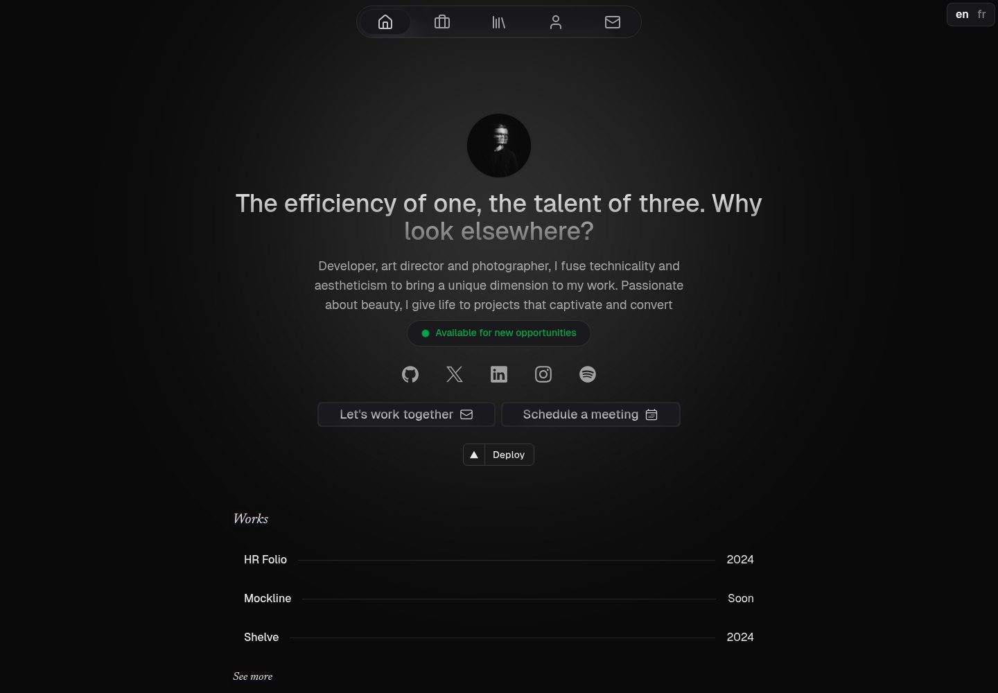
canvas
Portfolio template made with Nuxt 3, Nuxt Content v3, NuxtUI v3 and TailwindCSS v4
Nuxt · 作品集
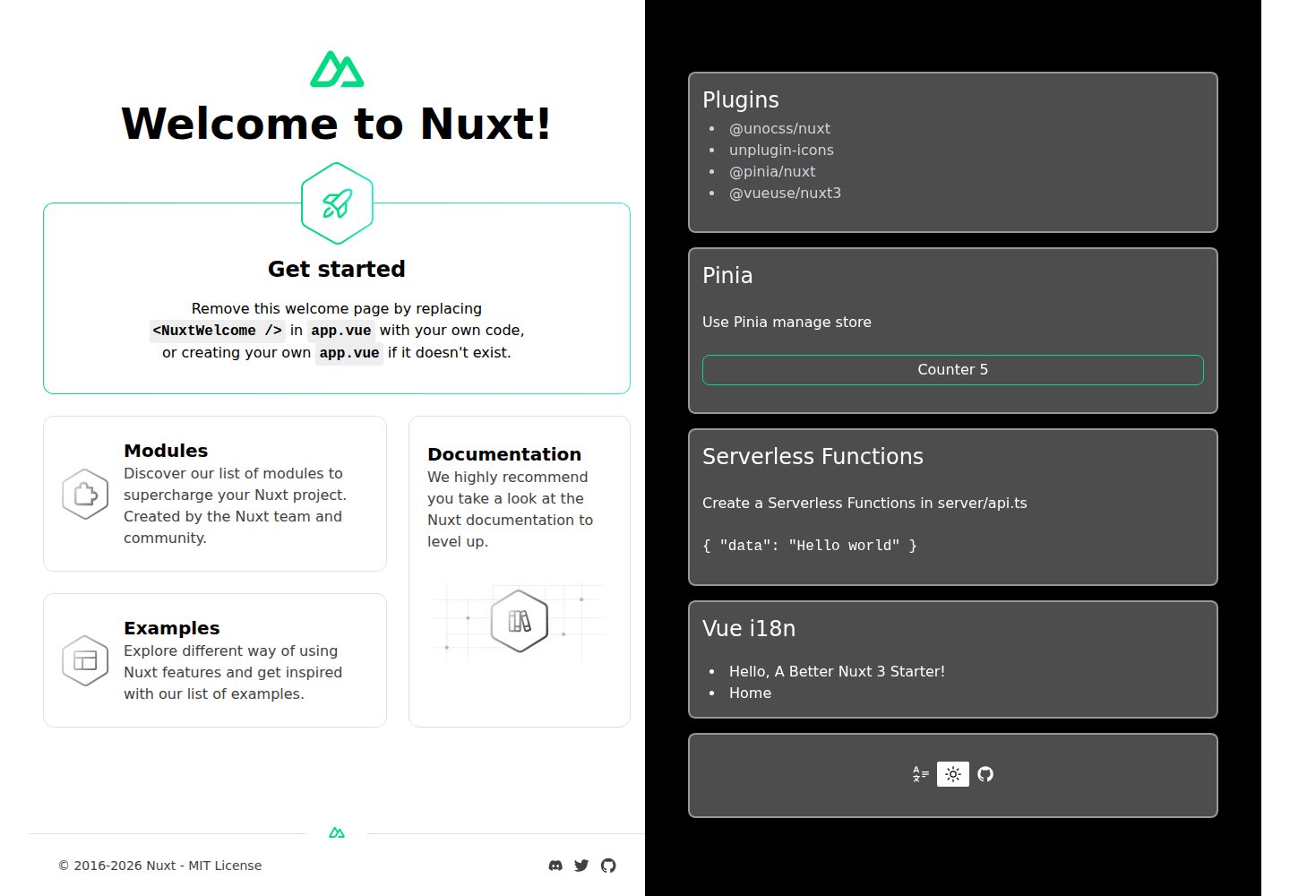
nuxt3-starter
💚 A Better Nuxt 3 Starter Template,generate by nuxi.
Nuxt · 启动器
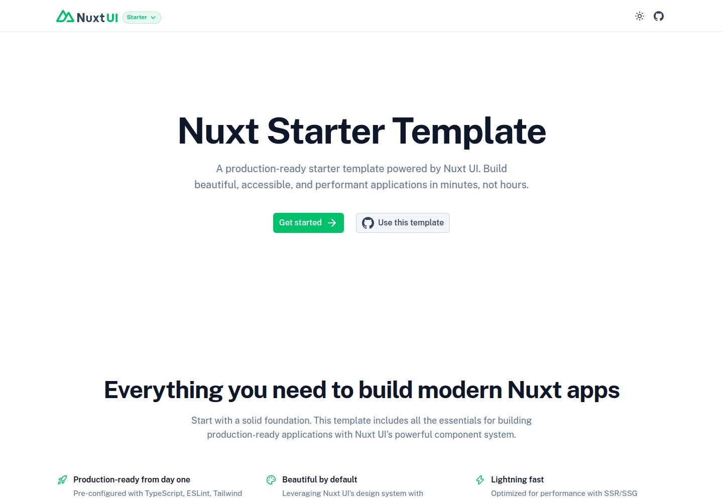
starter
Nuxt Starter Template for Nuxt UI.
Nuxt · 启动器
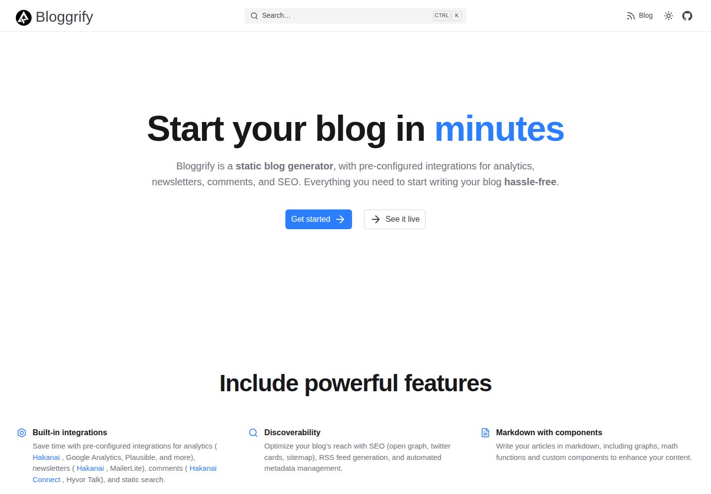
bloggrify
Run a blog from Markdown files. Themes, SEO, analytics, newsletter and comments preconfigured. Like Docus, but…
Nuxt · 博客
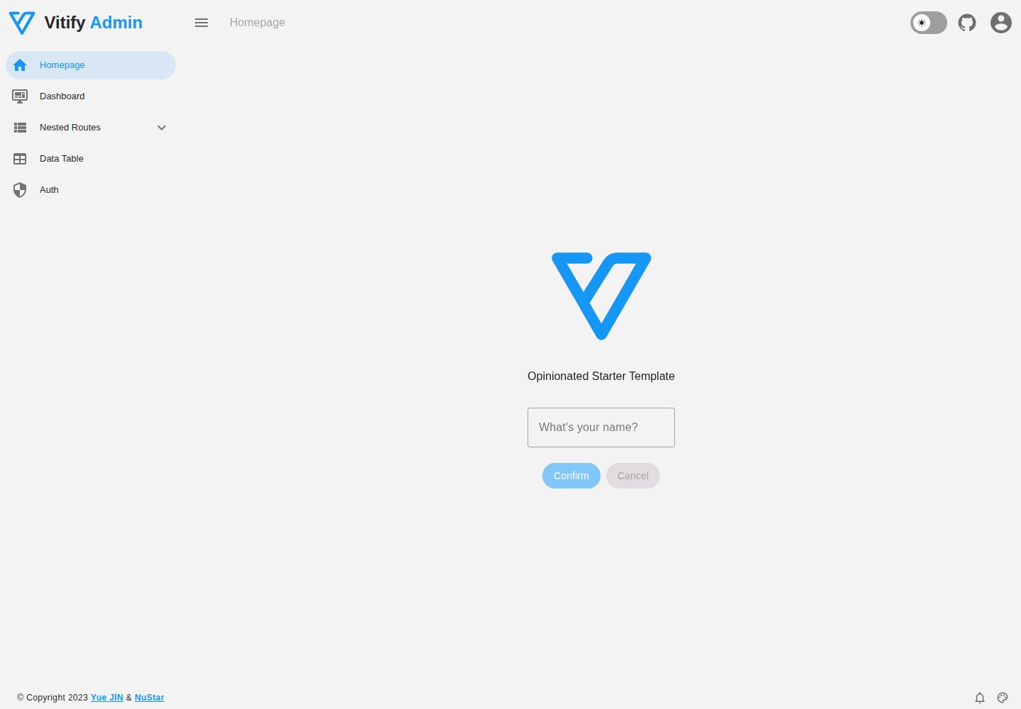
vitify-nuxt
🔽🏔 Vuetify + Nuxt Starter Template
Nuxt · 后台