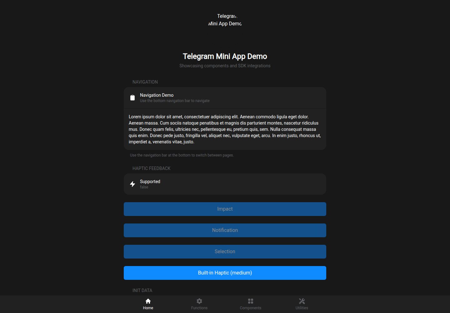
Integrates the Telegram WebApp SDK, providing composables for main button, back button, haptic feedback, user data, theme parameters, and more
NuxtVueStarter
nuxt-telegram-mini-app — Nuxt Starter Template
By patricktobias86
A Nuxt-based Telegram Mini App starter template with built-in Telegram WebApp SDK integration, Tailwind styling, a set of Tg components, and Netlify SPA deployment configuration.
Explore the design
Compare the page layouts and mobile experience. Open any screenshot for a closer look.
Desktop homepage1 / 2
Desktop captureTop of page
Actual screenshot captured by the server browser.
All pages & views 2
Screenshots show visual appearance; interactive behavior may differ.
Recorded 2026-10-02View source
What stands out
A quick read of the recorded project description.
Includes built-in Telegram-style components such as TgButton, TgCell, TgContent, TgNav, and TgSection
Uses Tailwind CSS and integrates Telegram theme color variables
Builds in SPA mode with Netlify _redirects configuration to support deep links
Can be installed, extended, or overridden as a Nuxt Layer by other projects
Includes Vitest test configuration, Telegram WebApp type definitions, and a data validation server route
Template Details
This template targets Telegram Mini App development, built with Nuxt, Vue 3, TypeScript, and Tailwind CSS, and includes a preconfigured integration layer for the Telegram WebApp SDK. The project runs in SPA mode and includes Netlify SPA redirect configuration to preserve Telegram's #tgWebAppData hash.
The template provides a set of UI components prefixed with Tg (button, list cell, content container, bottom navigation, section) as well as a Hero header component, and wraps multiple composables for accessing Telegram's main button, back button, haptic feedback, user data, theme parameters, viewport control, home screen shortcuts, device storage, and sharing capabilities. The repository also includes Vitest test configuration, Telegram WebApp type definitions, and a server API route for validating Telegram data.
The template can be used as a Nuxt Layer to be extended or overridden by other Nuxt projects. Note that some version numbers and dependency lists in the README may be inconsistent; in actual use, refer to the project dependency files. Device-related APIs are called via feature detection, and not all Telegram clients support them.
NuxtStarter
Is it right for your project?
Use Cases
- Quickly set up a Mini App frontend interface that runs inside Telegram
- Add Telegram WebApp capabilities and theme adaptation to an existing Nuxt project
- Reuse Telegram components and composables as a Nuxt Layer
- Deploy an SPA-form Telegram Mini App on Netlify
Suitable For
- Nuxt developers who need a Telegram Mini App starter template
- Teams looking to build Telegram interfaces with Tailwind and TypeScript
- Projects planning to reuse Telegram integration code as a Nuxt Layer
- Telegram mini program projects preparing to deploy an SPA on Netlify
Getting started & customization
Use these recorded setup notes alongside the repository instructions for your chosen version.
- 1
Requires Node.js 18 or higher, and install dependencies using npm, yarn, or pnpm
- 2
Run npm run dev for development; use npm run generate for production builds to generate the dist directory
- 3
Deployment to Netlify relies on the SPA fallback rule in public/_redirects; other platforms require equivalent rules
- 4
Some version numbers and dependency lists in the README may be inconsistent; refer to the actual dependency files
- 5
Third-party assets such as demo images, fonts, and icons need separate license verification
License & source material
Usage conditions & limitations
Free to use · keep license noticeThis entry covers the free version under the MIT license in the public repository; the free scope applies to that version's code and does not imply that external services or third-party assets are free.
Must comply with when using
- Free use, modification, commercial use, and distribution of this version's code are permitted.
- When distributing copies or substantial portions of the code, retain the original author's copyright notice and the full MIT license notice.
- The code is provided as is; warranties and limitations of liability are governed by the original license and applicable law.
Additional costs & items to verify
- The template automatically includes the official Telegram script https://telegram.org/js/telegram-web-app.js in the page; runtime depends on the Telegram client environment, and related APIs are unavailable outside Telegram.
- Some newer Telegram APIs are called via feature detection; actual availability depends on the user's Telegram client version, and not all clients support all features.
- Deployment to Netlify relies on the SPA fallback rule in public/_redirects; if deployed to other platforms, equivalent history fallback rules must be configured, otherwise deep links cannot resolve.
- Deployment requires configuring environment variables (e.g., ENV=production) on the hosting platform, which is an external deployment requirement.
- Demo images, fonts, icons, and other third-party assets must be checked against their respective licenses and cannot be judged solely by the code's MIT license.
- External services such as domain, hosting, database, payment, or AI may incur additional charges.
View Original Text Basis
Permission is hereby granted, free of charge
Original License Text
The template automatically includes the Telegram WebApp script.
Original README
The wrapper feature-detects newer APIs because the available API version depends on the user's Telegram client.
Original README
Netlify requires a SPA redirect so deep links resolve to `index.html`.
Original README
https://github.com/patricktobias86/nuxt-telegram-mini-app/blob/main/LICENSEhttps://github.com/patricktobias86/nuxt-telegram-mini-app/blob/main/README.mdSet these in your deployment platform:
Original README
Compiled by DeepSeek based on repository license and README ·2026-10-02. Results only cover the materials read; dependencies, images, fonts, and subsequent term changes are subject to their respective original texts.
Project checks & description sources
Template Information
- Source platforms
- GitHub
- Documentation and maintenance reference score
- More documented · 87 / 100
- Technologies
- Nuxt · Vue
- Website type
- Starter
How this score is calculated
Our heuristic uses license records (up to 30), a demo link (12), a preview (10), stars (15), recorded maintenance (15), description completeness (8), feature records (5) and classification data (5). It is not a code, security or performance test, or a Google score. A link does not establish tested functionality.
What to verify for this project
- Repository update recorded
- 2026-10-02
- Screenshot last checked
- 2026-10-02
A demo link is listed. Check it with your own content and viewport sizes; its presence does not confirm that forms, authentication or payments work.
The catalog identifies Nuxt as the primary stack. Check the actual dependency manifest and lockfile for versions and hosting requirements. These notes use recorded metadata, not a code audit or a deployment test.
Use a selection guide →How this description was prepared
AI-assisted description based on catalog records and repository material. Repository authors are not automatically the reviewers of this description.
Automatically checked against source and license rules; no manual editorial review.
Inspect the recorded source material
SHA-256: 6184dde92874bf5a3038f610d0c93bf2febb46e1954be1589da0ebd9a3f04435
2026-10-02T10:28:47.421Z
Source file / repository# 🚀 Nuxt Telegram Mini App Template
A comprehensive template for building Telegram Mini Apps using Nuxt 4, Vue 3, TypeScript, and Tailwind CSS, ready for deployment on Netlify.



<img height="600" alt="Localhost" src="https://github.com/user-attachments/assets/2bbf6549-25db-42d5-b380-fc4f20884538" />
## ✨ Features
### 🎯 Core Features
- **🔧 Complete Nuxt 4 Setup** - Latest Nuxt with TypeScript support
- **📱 Telegram WebApp SDK** - Full integration with Telegram Mini App APIs
- **🎨 Tailwind CSS** - Utility-first CSS framework with Telegram theme integration
- **⚡ SPA Mode** - Optimized for Telegram Mini App deployment
- **🌐 Netlify Ready** - Pre-configured for seamless deployment
### 🧩 Components Library
- **TgButton** - Telegram-styled buttons with haptic feedback
- **TgCell** - List cells with navigation and interaction support
- **TgContent** - Main content wrapper with proper spacing
- **TgNav** - Bottom navigation bar with up to 4 menu options and icons
- **TgSection** - Content sections with proper styling
- **Hero** - Header component for pages
### 📡 Telegram SDK Integration
- **🎮 Haptic Feedback** - Impact, notification, and selection feedback
- **🔄 Main Button** - Configurable main action button
- **⬅️ Back Button** - Navigation back button control
- **👤 User Data** - Access to Telegram user information
- **🎨 Theme Integration** - Automatic Telegram theme colors
- **📐 Viewport Control** - Fullscreen, safe-area, and responsive viewport management
- **🏠 Home Screen Shortcuts** - Add/check Mini App shortcut support
- **📍 Device APIs** - Feature-detected storage, location, and motion access
- **🔗 Deep Linking** - External and Telegram link handling
- **📤 Sharing** - Built-in sharing functionality
### 🧪 Testing & Quality
- **⚡ Vitest** - Fast unit testing framework
- **🧪 Component Tests** - Comprehensive test coverage
- **🔍 TypeScript** - Full type safety
- **📋 Type Definitions** - Complete Telegram WebApp types
## 🚀 Quick Start
### Prerequisites
- Node.js 18+
- npm or yarn or pnpm
### 1. Use This Template
Click the "Use this template" button on GitHub or clone the repository:
```bash
git clone https://github.com/patricktobias86/nuxt-telegram-mini-app.git my-telegram-app
cd my-telegram-app
```
### 2. Install Dependencies
```bash
npm install
# or
yarn install
# or
pnpm install
```
### 3. Development
```bash
npm run dev
```
Open [http://localhost:3000](http://localhost:3000) in your browser to see the demo.
### 4. Build for Production
```bash
npm run generate
```
## 📁 Project Structure
```
├── app/ # Nuxt app directory
│ ├── assets/ # CSS and static assets
│ │ └── css/
│ │ ├── main.css # Global styles
│ │ └── tailwind.css # Tailwind imports
│ ├── components/ # Vue components
│ │ ├── Hero.vue # Hero component
│ │ ├── ErrorBoundary.vue
│ │ └── tg/ # Telegram components
│ │ ├── Button.vue # Telegram button
│ │ ├── Cell.vue # List cell
│ │ ├── Content.vue # Content wrapper
│ │ ├── Nav.vue # Bottom navigation
│ │ └── Section.vue # Content section
│ ├── composables/ # Vue composables
│ │ └── telegram.ts # Telegram SDK integration
│ ├── pages/ # App pages
│ │ ├── index.vue # Home page with SDK demo
│ │ ├── components.vue # Components showcase
│ │ ├── utilities.vue # Utilities demo
│ │ └── functions.vue # Functions page
│ ├── types/ # TypeScript definitions
│ │ └── telegram-webapp.ts
│ └── utils/ # Utility functions
│ └── color.ts # Color conversion utilities
├── server/ # Nuxt server API
│ └── api/
│ └── verify-telegram-data.post.ts # Telegram data verification
├── public/ # Static assets
├── tests/ # Test files
│ └── telegram.spec.ts
├── nuxt.config.ts # Nuxt configuration
├── tailwind.config.ts # Tailwind configuration
└── vitest.config.ts # Test configuration
```
## 🎯 Usage Guide
### Creating Your First Page
1. **Create a new page** in `app/pages/`:
```vue
<!-- app/pages/my-page.vue -->
<template>
<TgContent>
<Hero
title="My Page"
subtitle="Description of my page"
image-src="/img/hero-user.svg"
/>
<TgSection title="My Section" inset>
<TgCell
title="My Cell"
subtitle="Cell description"
icon="i-heroicons-star-20-solid"
/>
</TgSection>
</TgContent>
</template>
<script setup lang="ts">
import { ref } from 'vue'
import { useRouter } from 'vue-router'
const router = useRouter()
const goHome = () => router.push('/')
</script>
```
### Using Telegram SDK Features
```vue
<script setup lang="ts">
import {
useMainButton,
useBackButton,
useHapticFeedback,
useInitData,
useThemeParams,
useViewport,
useHomeScreen,
useTelegramStorage
} from '~/composables/telegram'
const main = useMainButton()
const back = useBackButton()
const haptic = useHapticFeedback()
const init = useInitData()
const theme = useThemeParams()
const viewport = useViewport()
const homeScreen = useHomeScreen()
const storage = useTelegramStorage('device')
// Configure main button
onMounted(() => {
main.mount()
main.setParams({
is_visible: true,
is_active: true,
text: 'My Action'
})
const off = main.onClick(() => {
haptic.impactOccurred('medium')
// Your action here
})
onBeforeUnmounted(() => off?.())
})
// Access user data
const userName = computed(() => init.user.value?.first_name || 'Guest')
// Newer Telegram APIs are feature-detected
function openFullscreen() {
if (!viewport.fullscreen.value) {
viewport.requestFullscreen()
}
}
function rememberPreference() {
storage.setItem('preferred_mode', theme.dark.value ? 'dark' : 'light')
}
// Use theme colors
const bgColor = computed(() => theme.backgroundColor.value)
</script>
```
### Custom Components
The template includes pre-built Telegram-styled components:
```vue
<!-- Buttons -->
<TgButton title="Primary" status="primary" haptic @click="handleClick" />
<TgButton title="Secondary" status="secondary" haptic="impact-light" />
<TgButton title="Outline" status="outline" />
<TgButton title="Destructive" status="destructive" />
<!-- Cells -->
<TgCell title="Basic Cell" subtitle="With subtitle" />
<TgCell title="With Icon" icon="i-heroicons-star-20-solid" />
<TgCell title="Navigable" to="/target-page" />
<TgCell title="Interactive" @click="handleCellClick" />
<!-- Sections -->
<TgSection title="My Section" inset>
<!-- Section content -->
</TgSection>
```
## 🧩 Using as a Nuxt Layer
This template is compatible with Nuxt Layers, allowing you to use it as a reusable layer in other Nuxt projects or extend it with additional layers.
### What are Nuxt Layers?
Nuxt Layers provide a way to extend and customize Nuxt applications by sharing configurations, components, pages, composables, and more across multiple projects. Layers can be local directories or published npm packages.
### Using This Template as a Layer
To use this Telegram Mini App template as a layer in another Nuxt project, install it as an NPM package:
1. **Install the NPM package**:
```bash
npm install nuxt-telegram-mini-app
# or
yarn add nuxt-telegram-mini-app
# or
pnpm add nuxt-telegram-mini-app
```
2. **Configure your Nuxt project** to extend this layer:
```ts
// nuxt.config.ts
export default defineNuxtConfig({
extends: [
'nuxt-telegram-mini-app'
],
// Your custom config here
})
```
Alternatively, if you prefer to use a local clone or git dependency:
```bash
# Clone as a subdirectory
git clone https://github.com/patricktobias86/nuxt-telegram-mini-app.git layers/telegram-app
# Or add as git dependency in package.json:
# "dependencies": {
# "nuxt-telegram-mini-app": "github:patricktobias86/nuxt-telegram-mini-app"
# }
```
Then configure:
```ts
// nuxt.config.ts
export default defineNuxtConfig({
extends: [
'./layers/telegram-app'
// or 'nuxt-telegram-mini-app' for git dependency
],
// Your custom config here
})
```
3. **Access layer features** in your project:
- **Components**: Use `<TgButton>`, `<TgCell>`, etc. in your pages
- **Composables**: Import `useMainButton`, `useHapticFeedback`, etc.
- **Pages**: Extend or override existing pages
- **Styles**: Inherit Tailwind and Telegram theme integration
### Extending This Layer
This template includes an `extends: []` configuration, allowing you to further extend it with additional layers:
```ts
// nuxt.config.ts in this template
export default defineNuxtConfig({
extends: [
// Add your custom layers here
// './layers/my-custom-layer',
// 'my-published-layer'
],
// ... rest of config
})
```
### Layer Structure
The template follows Nuxt's layer conventions:
- `app/` directory contains all extendable content
- `nuxt.config.ts` at root level defines layer configuration
- Components, pages, and composables are automatically merged
### Best Practices
- **Override selectively**: Only override what you need to customize
- **Maintain compatibility**: Keep Telegram SDK integration intact
- **Test thoroughly**: Ensure Telegram features work in your extended app
- **Version control**: Pin layer versions for stability
## 🚀 Deployment
### Manual Deployment
1. **Build the project**:
```bash
npm run generate
```
2. **Deploy the `dist` folder** to your hosting provider
### Netlify (SPA routing)
- This project uses Vue Router history mode to preserve Telegram's `#tgWebAppData` hash.
- Netlify requires a SPA redirect so deep links resolve to `index.html`.
- Included file: `public/_redirects` with `/* /index.html 200`.
- If you deploy elsewhere, add an equivalent history fallback rule.
### Environment Variables
Set these in your deployment platform:
```env
ENV=production
```
## 🧪 Testing
Run tests with:
```bash
# Run tests once
npm run test
# Run tests in watch mode
npm run test:watch
```
The project includes:
- **Unit tests** for Telegram composables
- **Component tests** for UI components
- **Integration tests** for user flows
## 🎨 Customization
### Theme Customization
The template automatically inherits Telegram's theme colors. Customize in `app/assets/css/main.css`:
```css
:root {
/* Telegram theme variables are automatically set */
--custom-color: #your-color;
}
```
### Tailwind Configuration
Extend Tailwind in `tailwind.config.ts`:
```ts
export default {
theme: {
extend: {
colors: {
'custom': '#your-color',
}
}
}
}
```
### Adding New Components
1. Create component in `app/components/`
2. Follow the existing patterns for styling and props
3. Add TypeScript interfaces for props
4. Include tests in `tests/`
## 📖 API Reference
### Composables
#### `useTelegramWebApp()`
- `webApp` - WebApp instance
- `isReady` - Ready state
- `isAvailable` - Availability check
#### `useMainButton()`
- `setParams(params)` - Configure button
- `onClick(callback)` - Handle clicks
- `visible` - Visibility state
- Supports shine effect, custom emoji icon, and other current BottomButton params
#### `useBackButton()`
- `show()` / `hide()` - Control visibility
- `onClick(callback)` - Handle clicks
#### `useHapticFeedback()`
- `impactOccurred(style)` - Trigger impact
- `notificationOccurred(type)` - Trigger notification
- `selectionChanged()` - Trigger selection
#### `useInitData()`
- `user` - User information
- `queryId` - Query ID
- `startParam` - Start parameter
#### `useThemeParams()`
- `backgroundColor` - Theme background
- `textColor` - Theme text color
- `buttonColor` - Theme button color
- And more theme colors...
#### `useViewport()`
- `requestFullscreen()` / `exitFullscreen()` - Toggle Telegram fullscreen when supported
- `insets` - Device safe-area insets
- `contentInsets` - Content safe-area insets
#### `useMiniApp()`
- `hideKeyboard()` - Hide the native keyboard when supported
- `lockOrientation()` / `unlockOrientation()` - Control device orientation when supported
- `enableVerticalSwipes()` / `disableVerticalSwipes()` - Control vertical swipe gestures
#### New Telegram APIs
- `useSecondaryButton()` - Control Telegram's secondary bottom button
- `useSettingsButton()` - Control the Mini App settings menu button
- `useHomeScreen()` - Add/check home screen shortcuts
- `useEmojiStatus()` - Request emoji status access and open the set-status dialog
- `useTelegramStorage(type)` - Use `cloud`, `device`, or `secure` Telegram storage
- `useLocationManager()` - Initialize and request native location data
- `useDeviceMotion()` - Access accelerometer, orientation, and gyroscope objects
- `shareToStory()`, `shareMessage()`, `downloadFile()`, `requestChat()` - Wrappers for newer Telegram actions
### Components
#### `<TgButton>`
Props-driven styling so you don’t need extra Tailwind classes.
```vue
<TgButton
title="Label"
status="primary|secondary|outline|danger|destructive"
size="sm|md|lg"
:block="true"
:loading="false"
:disabled="false"
icon="i-heroicons-star-20-solid"
icon-position="left|right"
elevated
uppercase
haptic="selection|impact-light|impact-medium|impact-heavy|notification-success|notification-warning|notification-error"
@click="handleClick"
/>
```
TgButton props
| Prop | Required | Default | Description |
| --- | --- | --- | --- |
| `title` | yes | — | Button label text |
| `status` | no | `primary` | Visual style variant |
| `size` | no | `md` | Size of the button |
| `block` | no | `true` | Full width when true |
| `loading` | no | `false` | Shows spinner and disables |
| `disabled` | no | `false` | Disables interaction |
| `icon` | no | — | Icon name for `@nuxt/icon` |
| `icon-position` | no | `left` | Icon placement relative to text |
| `elevated` | no | `false` | Adds a subtle shadow |
| `uppercase` | no | `false` | Uppercase label |
| `to` | no | — | Internal route, uses `NuxtLink` |
| `href` | no | — | External link, uses `<a>` |
| `share-url` | no | — | Triggers Telegram share on click |
| `haptic` | no | `false` | Haptic feedback type or boolean |
Notes:
- Prefer `to` (router) for internal navigation to avoid conflicts with bottom Nav.
- `small` is still supported but `size` is preferred.
#### `<TgCell>`
```vue
<TgCell
title="Cell Title"
subtitle="Cell Subtitle"
:description="dynamicDescription"
icon="i-heroicons-star-20-solid"
color="var(--tg-theme-link-color)"
icon-color="#888"
tone="default|secondary"
:border="true"
:clickable="false"
:chevron="undefined|true|false"
to="/navigation-target"
href="https://example.com"
@click="handleClick"
/>
```
TgCell props
| Prop | Required | Default | Description |
| --- | --- | --- | --- |
| `title` | no | `''` | Title text |
| `subtitle` | no | — | Subtitle text |
| `description` | no | — | Description text |
| `icon` | no | — | Icon name for `@nuxt/icon` |
| `color` | no | — | Title color override |
| `icon-color` | no | — | Icon color override |
| `line-clamp` | no | `0` | Clamp lines for text (0 = none) |
| `border` | no | `true` | Bottom divider line |
| `tone` | no | `default` | Background tone |
| `clickable` | no | `false` | Hover style even without link |
| `chevron` | no | `auto` | Force chevron visibility |
| `to` | no | — | Internal route, uses `NuxtLink` |
| `href` | no | — | External link, uses `<a>` |
#### `<TgContent>`
```vue
<TgContent as="main|section|div" />
```
Behavior
- Automatically adds bottom safe-area padding when a `<TgNav>` exists on the page.
- Default container styles: `max-w-2xl`, `p-4`, and `space-y-6`.
TgContent props
| Prop | Required | Default | Description |
| --- | --- | --- | --- |
| `as` | no | `main` | Render element |
| `max-width-class` | no | — | Optional override for container max width |
| `class` | no | `''` | Extra classes to merge |
#### `<TgSection>`
```vue
<TgSection title="Section" inset tone="default|secondary" :append-border="true" />
```
Behavior
- Rounded corners by default; larger rounding when `inset`.
- No outer border around the body.
TgSection props
| Prop | Required | Default | Description |
| --- | --- | --- | --- |
| `title` | no | — | Optional section header |
| `inset` | no | `false` | Indented, iOS-like style |
| `tone` | no | `default` | Background tone for body |
| `append-border` | no | `true` | Thin border above append slot |
| `class` | no | `''` | Extra classes on wrapper |
#### `<TgNav>`
```vue
<TgNav
:items="navItems"
:model-value="activeKey"
tone="default|secondary"
:border="true"
height="12|14"
:safe-area="true"
root-class="custom-nav-class"
@select="handleSelect"
@update:model-value="handleActiveChange"
/>
```
TgNav props
| Prop | Required | Default | Description |
| --- | --- | --- | --- |
| `items` | yes | — | List of items `{ key, label, icon?, to? }` |
| `model-value` | no | — | Controlled active key |
| `tone` | no | `default` | Background tone |
| `border` | no | `true` | Top border visibility |
| `height` | no | `14` | Item height (Tailwind number) |
| `safe-area` | no | `true` | Adds bottom safe area spacer |
| `root-class` | no | `''` | Extra classes on root nav |
Navigation items structure:
```ts
interface TgNavItem {
key: string // Unique identifier
label: string // Display text
icon?: string // Icon name (optional)
to?: string // Route path (optional)
}
```
Routing guidance
- Use `to` (router) for internal navigation to avoid conflicts with the fixed `<TgNav>`.
- Reserve `href` for external links.
## 🔧 Configuration
### Nuxt Configuration
Key settings in `nuxt.config.ts`:
```ts
export default defineNuxtConfig({
ssr: false, // SPA mode for Telegram
srcDir: 'app', // App source directory
router: {
options: {
// Use history mode so Telegram's #tgWebAppData is not rewritten to a route
hashMode: false
}
},
modules: [
'@nuxt/icon', // Icon support
'@nuxtjs/tailwindcss', // Tailwind CSS
],
app: {
head: {
script: [{
src: 'https://telegram.org/js/telegram-web-app.js?62'
}]
}
}
})
```
### Telegram WebApp Script
The template automatically includes the Telegram WebApp script. The wrapper feature-detects newer APIs because the available API version depends on the user's Telegram client.
## 🤝 Contributing
1. **Fork** the repository
2. **Create** a feature branch
3. **Make** your changes
4. **Add** tests for new features
5. **Submit** a pull request
## 📝 License
MIT License - see [LICENSE](LICENSE) file for details.
## 🆘 Support
- **📖 Documentation**: Check this README and inline code comments
- **🐛 Issues**: Report bugs via GitHub Issues
- **💡 Discussions**: Use GitHub Discussions for questions
- **📚 Telegram Docs**: [Telegram Mini Apps Documentation](https://core.telegram.org/bots/webapps)
## 🏗️ Built With
- [Nuxt 4](https://nuxt.com/) - The Vue.js Framework
- [Vue 3](https://vuejs.org/) - The Progressive JavaScript Framework
- [TypeScript](https://www.typescriptlang.org/) - JavaScript with syntax for types
- [Tailwind CSS](https://tailwindcss.com/) - A utility-first CSS framework
- [Vitest](https://vitest.dev/) - A blazing fast unit testing framework
- [Telegram WebApp API](https://core.telegram.org/bots/webapps) - Telegram Mini Apps Platform
## 🔗 Links
- [Demo](https://your-demo-url.netlify.app) - Live demo
- [Telegram Mini Apps Guide](https://core.telegram.org/bots/webapps)
- [Nuxt 4 Documentation](https://nuxt.com/docs)
- [Vue 3 Documentation](https://vuejs.org/guide/)
---
**Made with ❤️ using Nuxt 4**
Explore similar templates
Compare previews and descriptions within the same stack and category.

laravel-nuxt
A Laravel + Nuxt decoupled starter kit with built-in login, registration, email verification, password reset, and Socialite third-party login (GitHub example), switchable between SPA and SSR.
Nuxt · Starter
canvas
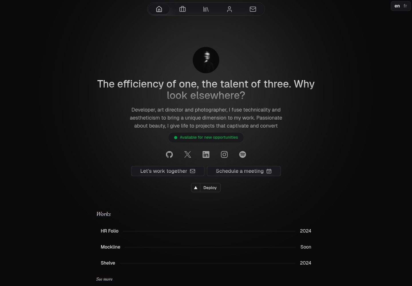
Canvas is a Nuxt-based portfolio template that uses Nuxt Content for content management and Nuxt UI with Tailwind CSS for pages.
Nuxt · Portfolio
nuxt3-starter
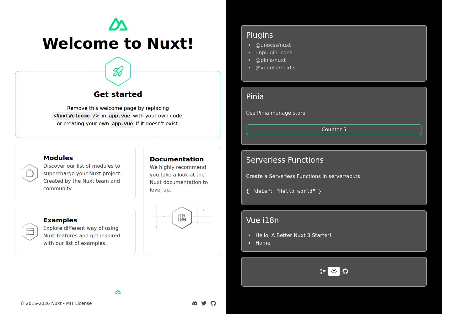
A Nuxt 3 starter template generated by nuxi, preconfigured with UnoCSS, unplugin-icons, Pinia, and VueUse. It suits developers who need a quick Nuxt 3 project skeleton with atomic CSS and auto-import workflows, and is available under the MIT license.
Nuxt · Starter
starter
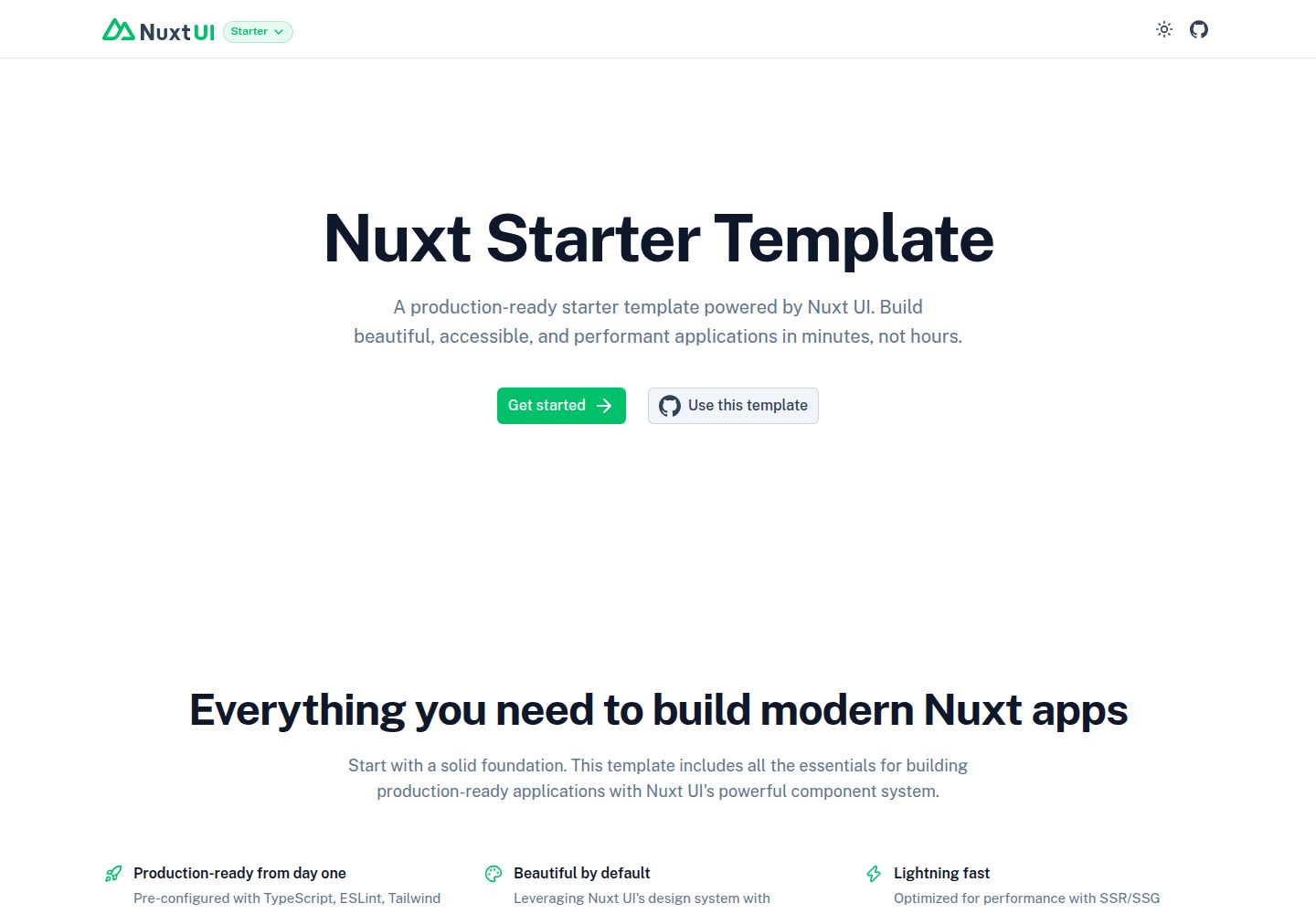
The official Nuxt starter template for Nuxt UI, based on Nuxt and Vue. It provides a runnable project skeleton, an online demo, and Nuxt UI installation documentation, with README commands for creating, installing, developing, building, and previewing.
Nuxt · Starter
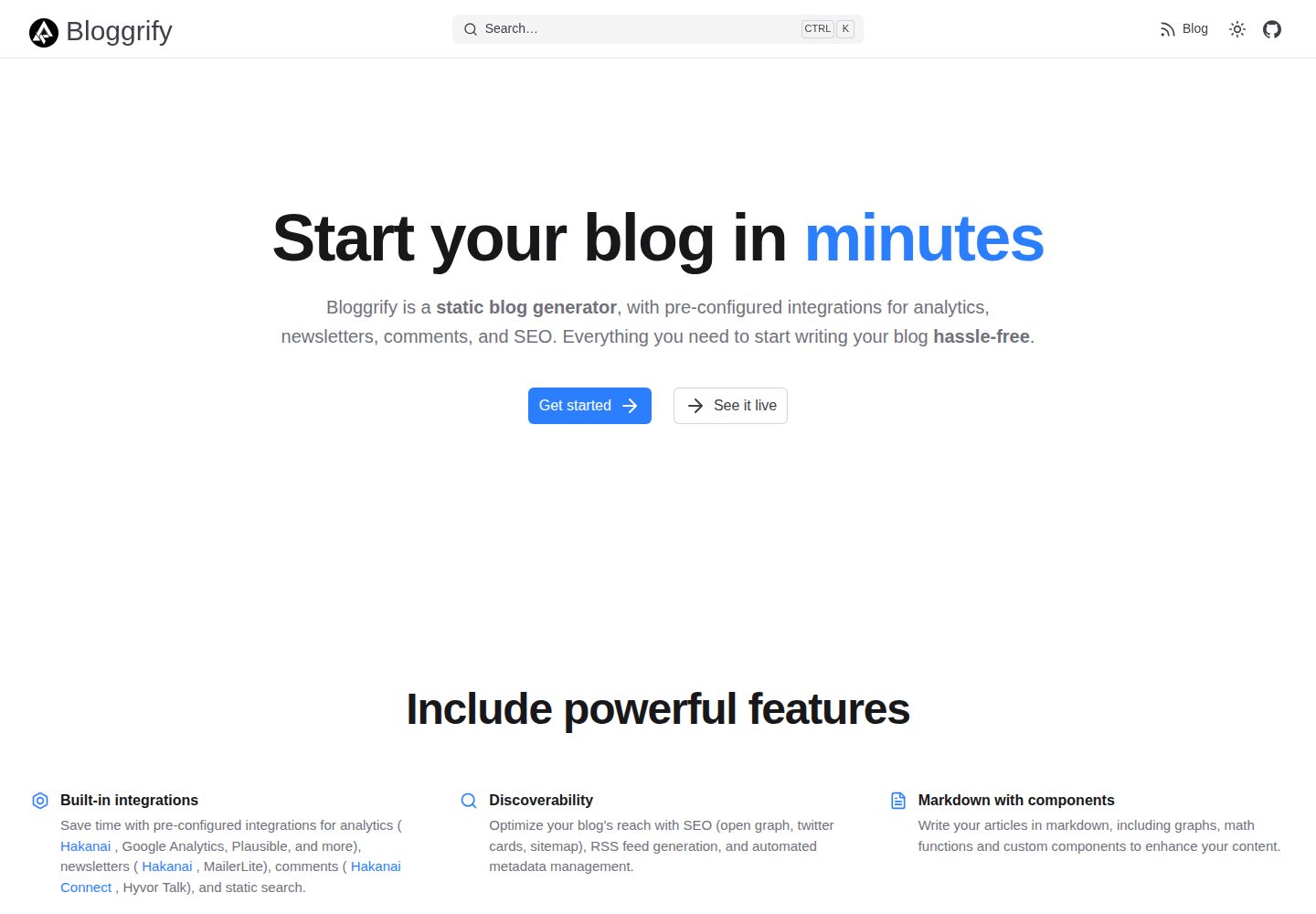
bloggrify
Bloggrify is a Nuxt layer that turns Markdown files into a blog site, built on Nuxt Content with preconfigured analytics, newsletter, comments, SEO, RSS, and content components.
Nuxt · Blog
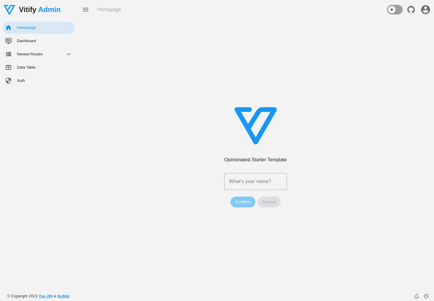
vitify-nuxt
Vitify Nuxt is an admin dashboard starter template built on Nuxt and Vuetify, featuring a drawer layout, automatic navigation and breadcrumbs, notification state, ECharts charts, theming and dark mode, and authentication via nuxt-auth-utils.
Nuxt · Admin dashboard