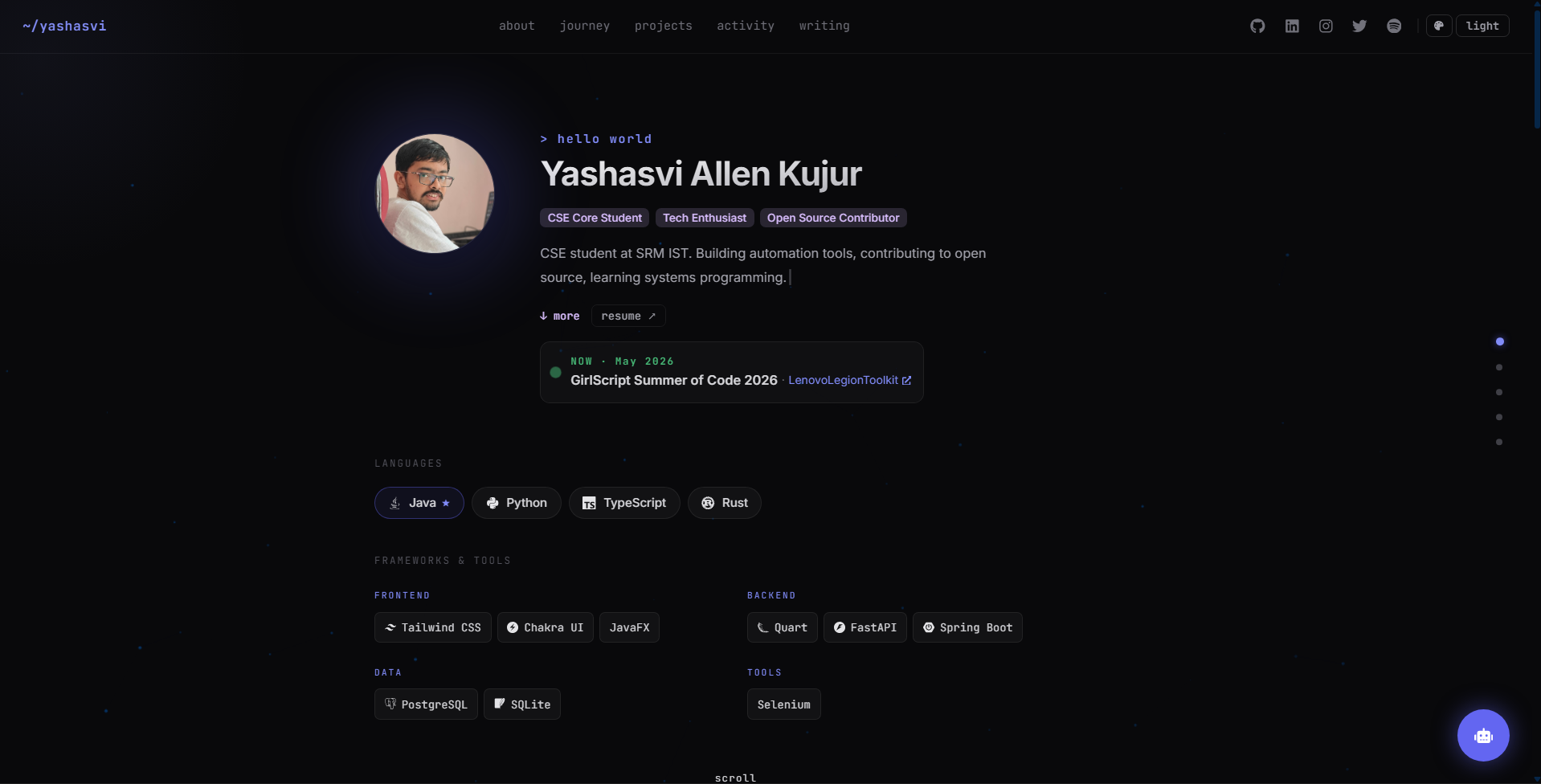
All personal information is centralized in src/data/me.ts, with no need to modify component code
ViteReactPortfolio
portfolio-template (JavaProgswing) — Vite Portfolio Template
By JavaProgswing
A personal portfolio template built with React, TypeScript, and Vite. All content is centralized in src/data/me.ts, so personal information can be replaced without modifying component code.
Explore the design
Compare the page layouts and mobile experience. Open any screenshot for a closer look.
Author preview
Author-provided preview
Preview provided in the project README.
One original preview is available. Open the full image to inspect the design.
Screenshots show visual appearance; interactive behavior may differ.
Recorded 2026-10-02View source
What stands out
A quick read of the recorded project description.
Single-page scrolling with six sections; desktop dot navigation and sticky top navigation can jump between sections
The project grid automatically sorts by GitHub stars, update time, and topic, and supports merging handwritten projects
Ten color themes, four minimal themes supporting light mode, switchable via the command palette or URL parameters
Built-in interactions such as a command palette, keyboard navigation, a console page, a mini-game, and a guestbook
Optional features such as AI chat, guestbook, and visitor counter are supported by a FastAPI backend and degrade gracefully when absent
Template Details
This is a personal portfolio template built with React, TypeScript, and Vite, with content separated from components: name, bio, experience, projects, blog posts, contact information, and more are all written in src/data/me.ts, and no component code needs to be changed. The page uses a single-page scrolling structure with six sections, a right-side dot navigation on desktop, and a sticky top navigation; both can jump between sections.
The template includes a particle constellation background, mouse parallax, and a cursor spotlight effect, and offers ten color themes, four of which are minimal themes that support light mode. For interaction, there is a command palette (⌘K), keyboard navigation, a shortcuts modal, a console page, a mini-game, a guestbook, and hidden achievements. The projects section automatically sorts GitHub repositories by stars, update time, and topic, and handwritten projects can also be merged into the sorted grid. The activity section uses tabs to display public API data from Codeforces and LeetCode, recent contributions from the GitHub Events API, and the accounts and projects you follow. Blog posts expand within the page and do not require an external CMS.
Optional features include an AI chat widget (with a backend proxy for the Gemini API, keeping the key on the server), a guestbook, a visitor counter, and a Spotify now-playing badge; these depend on a FastAPI backend. When the backend is not deployed, the related features degrade gracefully and the rest of the site works normally. The build output goes to dist/ and can be deployed to any static hosting.
Usage limitations: third-party assets such as demo images, fonts, and icons must be checked separately under their respective licenses and cannot be judged solely by the code's MIT license; external services such as domains, hosting, databases, or AI may incur additional charges.
ViteReactPortfolio
Is it right for your project?
Use Cases
- Individual developers building a portfolio site to showcase experience, projects, and articles
- Scenarios where content and components are separated and only one data file needs to be edited before launch
- Wanting to automatically generate and sort a project list from GitHub repository data
- Personal sites that want to add interactive elements such as a command palette, theme switching, and a mini-game
- Deploying to static hosting such as Vercel, Netlify, GitHub Pages, or Cloudflare Pages
Suitable For
- Developers familiar with React and TypeScript who are willing to edit data files
- Personal portfolios that need to quickly replace content without changing the component structure
- Users who accept optional backend dependencies or do not need AI chat and guestbook features
- Individuals or teams who want to modify and distribute code under the MIT license
Getting started & customization
Use these recorded setup notes alongside the repository instructions for your chosen version.
- 1
After cloning the repository, run npm install; the first npm run dev will generate src/data/* from the example files
- 2
Edit src/data/me.ts to fill in name, bio, experience, projects, blog, and contact information
- 3
Run npm run fetch-repos to fetch and score project repositories from GitHub
- 4
AI chat requires configuring GEMINI_API_KEY in backend/.env; the key is kept on the server
- 5
npm run build outputs dist/, which can be deployed to any static hosting; the optional backend must be deployed separately
License & source material
Usage conditions & limitations
Free to use · keep license noticeThis entry covers the free version under the MIT license in the public repository; the free scope is the code of that version and does not mean that external services or third-party assets are free.
Must comply with when using
- The code of this version may be used, modified, used commercially, and distributed for free.
- When distributing copies or substantial portions of the code, retain the original author's copyright notice and the full MIT license notice.
- The code is provided as is; warranties and limitations of liability are governed by the original license and applicable law.
Additional costs & items to verify
- The guestbook, visitor counter, Spotify proxy, and AI chat depend on an optional FastAPI backend; when the backend is not deployed, these features degrade and the rest of the site remains usable.
- The AI chat feature requires applying for a Gemini API key yourself and configuring it in backend/.env; this is an external service dependency.
- The Spotify now-playing badge requires additionally deploying the third-party spotify-github-profile service and configuring an endpoint; otherwise only a regular link is shown.
- Automatically discovering Vercel projects requires configuring VERCEL_TOKEN (and VERCEL_TEAM_ID for team scope), which is an external service credential requirement.
- The automatic sorting of the project grid depends on fetching repository data from GitHub and requires access to the GitHub API.
- Demo images, fonts, icons, and other third-party assets must be checked under their respective licenses and cannot be judged solely by the code's MIT license.
- External services such as domains, hosting, databases, payments, or AI may incur additional charges.
View Original Text Basis
Permission is hereby granted, free of charge
Original License Text
The FastAPI backend (guestbook, visitor count, Spotify proxy, AI chat) is optional. Without it, those features fall back gracefully.
Original README
Get a free key at [aistudio.google.com/apikey](https://aistudio.google.com/apikey)
Original README
Set `nowPlayingApi` on the Spotify contact in `me.ts` to a deployed [spotify-github-profile](https://github.com/kittinan/spotify-github-profile) endpoint.
Original README
or set `VERCEL_TOKEN` (and `VERCEL_TEAM_ID` for team scopes) when running `npm run probe-deploys` to discover Vercel projects automatically.
Original README
https://github.com/JavaProgswing/portfolio-template/blob/main/LICENSEhttps://github.com/JavaProgswing/portfolio-template/blob/main/README.mdProject repos are auto-fetched and scored from GitHub with `npm run fetch-repos`.
Original README
Compiled by DeepSeek based on repository license and README ·2026-10-02. Results only cover the materials read; dependencies, images, fonts, and subsequent term changes are subject to their respective original texts.
Project checks & description sources
Template Information
- Source platforms
- GitHub
- Documentation and maintenance reference score
- Partly documented · 73 / 100
- Technologies
- Vite · React
- Website type
- Portfolio
How this score is calculated
Our heuristic uses license records (up to 30), a demo link (12), a preview (10), stars (15), recorded maintenance (15), description completeness (8), feature records (5) and classification data (5). It is not a code, security or performance test, or a Google score. A link does not establish tested functionality.
What to verify for this project
- Repository update recorded
- 2026-10-02
- Screenshot last checked
- 2026-10-02
No demo link is recorded. Use the repository instructions to evaluate the project locally; the screenshot alone cannot establish interactive behavior.
The catalog identifies Vite as the primary stack. Check the actual dependency manifest and lockfile for versions and hosting requirements. These notes use recorded metadata, not a code audit or a deployment test.
Use a selection guide →How this description was prepared
AI-assisted description based on catalog records and repository material. Repository authors are not automatically the reviewers of this description.
Automatically checked against source and license rules; no manual editorial review.
Inspect the recorded source material
SHA-256: b70cf1f1fd12ad0357844f9f3b63b50e18008102054274eeda7ce47f11fde1d3
2026-10-02T11:35:14.279Z
Source file / repository# Portfolio
A personal portfolio template built with React, TypeScript, and Vite. All content lives in one file (`src/data/me.ts`), so you fill in your details and never touch component code.
### Hero

One scrolling page, six sections. A right-side dot navigator (desktop) and a sticky top nav both jump between them.
Avatar, an animated typing bio, and role tags. A live **Now** card highlights what you are currently working on. Below it, your stack: primary languages as pills (first one starred), then frameworks and tools grouped side by side into **Frontend**, **Backend**, **Data**, and **Tools**. Unrecognized tools show their name without a placeholder icon.
### My Journey

A vertical timeline of roles and milestones. Each entry is dated and can carry "evidence" links that back up the claim (repos, demos, write-ups).
### What I've Built

Pinned flagship work sits on top, marked with a star accent. Below it, a grid auto-ranked from your GitHub by stars, recency, and topics. Cards show language, stars/forks, and links to repo and live demo. You can also merge hand-written projects into the ranked grid.
### Beyond Projects

Tabbed activity:
- **competitive** - live Codeforces and LeetCode stats via public APIs, with graceful fallback if an API is slow or down
- **open source** - recent contributions from the GitHub Events API
- **what i follow** - accounts and projects you keep up with
### Notes & Posts

An inline blog. Posts expand in place with tags, references, and a comment link, so there is no external CMS to run.

The footer carries a `⌘K` command-palette hint, a guestbook link, a console prompt, and a live clock.
## Features
- Particle constellation background with mouse parallax, plus a cursor spotlight
- 10 color themes; several add audio-visual effects, the four minimal ones also support light mode
- Command palette (`⌘K`), keyboard navigation (`g` then a section key), and a `?` shortcuts modal
- Console page, mini-games (`/play`), guestbook, and hidden achievements
- Easter eggs: Konami code, matrix rain, rainbow mode, logo-click confetti
- AI chat widget backed by the Gemini API, proxied server-side and primed on your `me.ts`
- Responsive and mobile-friendly; respects `prefers-reduced-motion`
## Quick Start
```bash
git clone https://github.com/yourusername/my-portfolio.git
cd my-portfolio
npm install
npm run dev # first run creates src/data/* from the examples
```
Then edit `src/data/me.ts`.
Open [http://localhost:5173](http://localhost:5173).
`me.ts` is the single source of truth: name, bio, journey, projects, blog posts, contacts, and theme defaults. Project repos are auto-fetched and scored from GitHub with `npm run fetch-repos`.
### Your data files
Nothing personal is hardcoded in components. Everything you own lives in gitignored files; each has a checked-in example that `scripts/init-data.mjs` copies on first `dev`/`build`.
| File | What it holds |
|---|---|
| `src/data/me.ts` | Profile, journey, projects, blog posts, contacts, `lab` overrides |
| `src/data/certificates.json` | Certificates and hackathon results for `/certificates` and `/resume`. Put the files in `public/files/certificates/` |
| `src/data/lab-sites.json` | Live sites with no GitHub repo homepage (CLI deploys, private repos) for `/lab` |
| `src/data/repo-curation.json` | Ranking hints for `npm run fetch-repos` |
| `portfolio.config.json` | Machine-specific script settings: SSH deploy target, resume PDF path |
| `public/resume.pdf`, `public/me.jpg` | Your resume and photo |
Generated by scripts (also gitignored): `repos.json` (fetch-repos), `deploy-status.json`, `github-stats.json`, `vercel-sites.json` (probe-deploys).
### Live sites in `/lab`
`/lab` shows your GitHub repos on a Windows / Ubuntu / Debian style desktop, and visitors can load any GitHub user. A repo counts as deployed when its GitHub **Website** field points at a live site, so new repos appear without a rebuild. Sites without a repo go in `lab-sites.json`, or set `VERCEL_TOKEN` (and `VERCEL_TEAM_ID` for team scopes) when running `npm run probe-deploys` to discover Vercel projects automatically. `probe-deploys` also records which sites are down or block embedding.
The FastAPI backend (guestbook, visitor count, Spotify proxy, AI chat) is optional. Without it, those features fall back gracefully. See [`backend/README.md`](backend/README.md) to deploy, and [`DEPLOY.md`](DEPLOY.md) for full production setup (nginx + systemd).
## AI Chat (optional)
A floating widget calls the backend at `/api/portfolio/chat`, which proxies the Gemini API. The key stays server-side. The system prompt is built from `me.ts`.
1. Get a free key at [aistudio.google.com/apikey](https://aistudio.google.com/apikey)
2. Add to `backend/.env`:
```bash
GEMINI_API_KEY=AIza...
GEMINI_MODEL=gemini-2.0-flash # default, works on all free-tier keys
```
3. Restart: `sudo systemctl restart portfolio-api`
If the key is missing, the chat button shows offline and the rest of the site works normally. Model options and rate limits live in [`backend/README.md`](backend/README.md).
## Spotify Now Playing (optional)
Set `nowPlayingApi` on the Spotify contact in `me.ts` to a deployed [spotify-github-profile](https://github.com/kittinan/spotify-github-profile) endpoint. The badge then shows a live now-playing popover; without it, it stays a plain link.
## Project Structure
```
src/
components/ UI sections and widgets
pages/ Routed pages (console, play, guestbook, ...) + games/
data/ Your content (gitignored) + *.example templates
themes/ Theme palettes
services/ Tech and social icon mapping
lib/ Achievements, theme sound engine, /lab data
hooks/ Custom hooks
App.tsx Routes and layout
theme.ts Chakra theme
index.css Global styles and per-theme variables
```
## Deployment
```bash
npm run build # outputs to dist/
```
Deploy `dist/` to any static host (Vercel, Netlify, GitHub Pages, Cloudflare Pages). The optional backend deploys separately.
## Themes
Ten palettes ship by default. Switch from the nav, deep-link with `?theme=<key>`, or pick one from the command palette. The choice is saved to `localStorage`.
### Requesting a theme
Open a GitHub issue with:
- a name and a one-line vibe (and any inspiration: an editor theme, a game, a site)
- three hex colors: a background and two accents
- optional: whether it should support light mode or audio-visual effects
That is enough for a maintainer to build it.
### Adding a theme
The minimum is two files, both keyed by the same lowercase `key`.
1. `src/themes/palettes.ts` - add an entry to `THEMES`:
```ts
{
key: "mytheme", // unique slug, referenced everywhere
name: "My Theme",
desc: "Short one-line vibe",
swatch: ["#0b0b0f", "#ff7a59", "#ffd36e"], // [bg, accent1, accent2] for the switcher preview
}
```
2. `src/index.css` - add a matching block with the same slug:
```css
body[data-palette="mytheme"] {
background-color: #0b0b0f !important;
background-image: radial-gradient(ellipse at 50% 0%, #15151f 0%, #060608 70%) !important;
--chakra-colors-brand-300: #ffd36e;
--chakra-colors-brand-400: #ff7a59; /* primary accent, used the most */
--chakra-colors-brand-500: #e0563b;
--chakra-colors-brand-600: #c0432c;
--cursor-glow: rgba(255, 122, 89, 0.12);
}
```
The `brand-300..600` vars retint every accent across the site; `--cursor-glow` colors the cursor spotlight. That is all a theme needs - the switcher and command palette read `THEMES` directly, so it appears automatically.
#### Optional: light mode
Add the key to `MINIMAL_THEMES` in `palettes.ts`, then add a light override in `index.css` (higher specificity wins over the dark block):
```css
body[data-palette="mytheme"][data-mode="light"] {
background-color: #faf7f0 !important;
background-image: radial-gradient(ellipse at 50% 0%, #fffdf8 0%, #efe9dd 70%) !important;
--chakra-colors-brand-400: #c0432c; /* darker accents for contrast on a light bg */
/* ...brand-300/500/600, --cursor-glow */
}
```
Only themes listed in `MINIMAL_THEMES` show the light/dark toggle; the rest are dark-only.
#### Optional: audio-visual effects
Register a `SetupFn` under the same key in `THEME_FX` (`src/components/ThemeFx.tsx`). The simplest route is `liteTheme({ intro, onClick, ambient })`; see the existing themes. Sounds come from `src/lib/sound.ts` (mallet, bell, pluck, blip8, ... all routed through a shared reverb + compressor bus); `nextNote(key, root, scale)` makes repeated clicks walk a scale. Tag any DOM you inject with `data-themefx="1"` so it is removed on theme change. Add the theme's `fx` flags in `palettes.ts` so the picker shows the right icons. The global mute (`src/lib/fx.ts`) silences everything automatically.
Each theme can also have an at-rest identity (heading font, background texture, button shapes) in the "Theme identities" block at the end of `src/index.css`.
### Where themes are referenced
| File | Role |
|------|------|
| `src/themes/palettes.ts` | Source of truth: `THEMES`, `DEFAULT_THEME`, `MINIMAL_THEMES`, `isMinimalTheme`, `applyTheme`, `resolveInitialTheme` |
| `src/index.css` | `body[data-palette="<key>"]` colors, optional `[data-mode="light"]` overrides, and `fx-*` keyframes |
| `src/components/ThemeFx.tsx` | `THEME_FX` registry of per-theme click/ambient effects |
| `src/lib/sound.ts`, `src/lib/fx.ts` | Synth voices + audio bus, and the global mute |
| `src/components/ThemeSwitcher.tsx` | Renders the palette grid from `THEMES` (no edits needed) |
| `src/components/Shortcuts.tsx` | Adds one command-palette entry per theme (no edits needed) |
| `src/components/NavBar.tsx`, `src/components/ColorModeSync.tsx` | Gate light mode via `isMinimalTheme` |
| `src/pages/ColophonPage.tsx` | Prose list of themes - update by hand |
`applyTheme(key)` sets `document.body.dataset.palette`, persists to `localStorage`, and dispatches a `themechange` event that `ThemeFx`, the nav, and `ColorModeSync` listen for.
## License
[MIT](LICENSE)
Explore similar templates
Compare previews and descriptions within the same stack and category.
Resumify
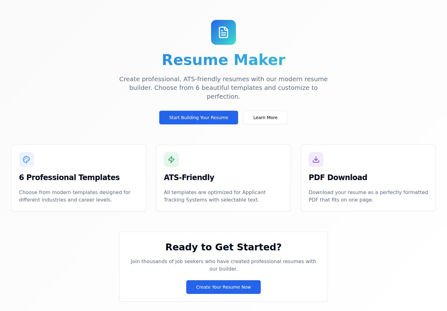
Resumify is a browser-based resume builder built with React, TypeScript, and Vite.
Vite · Portfolio
showlit
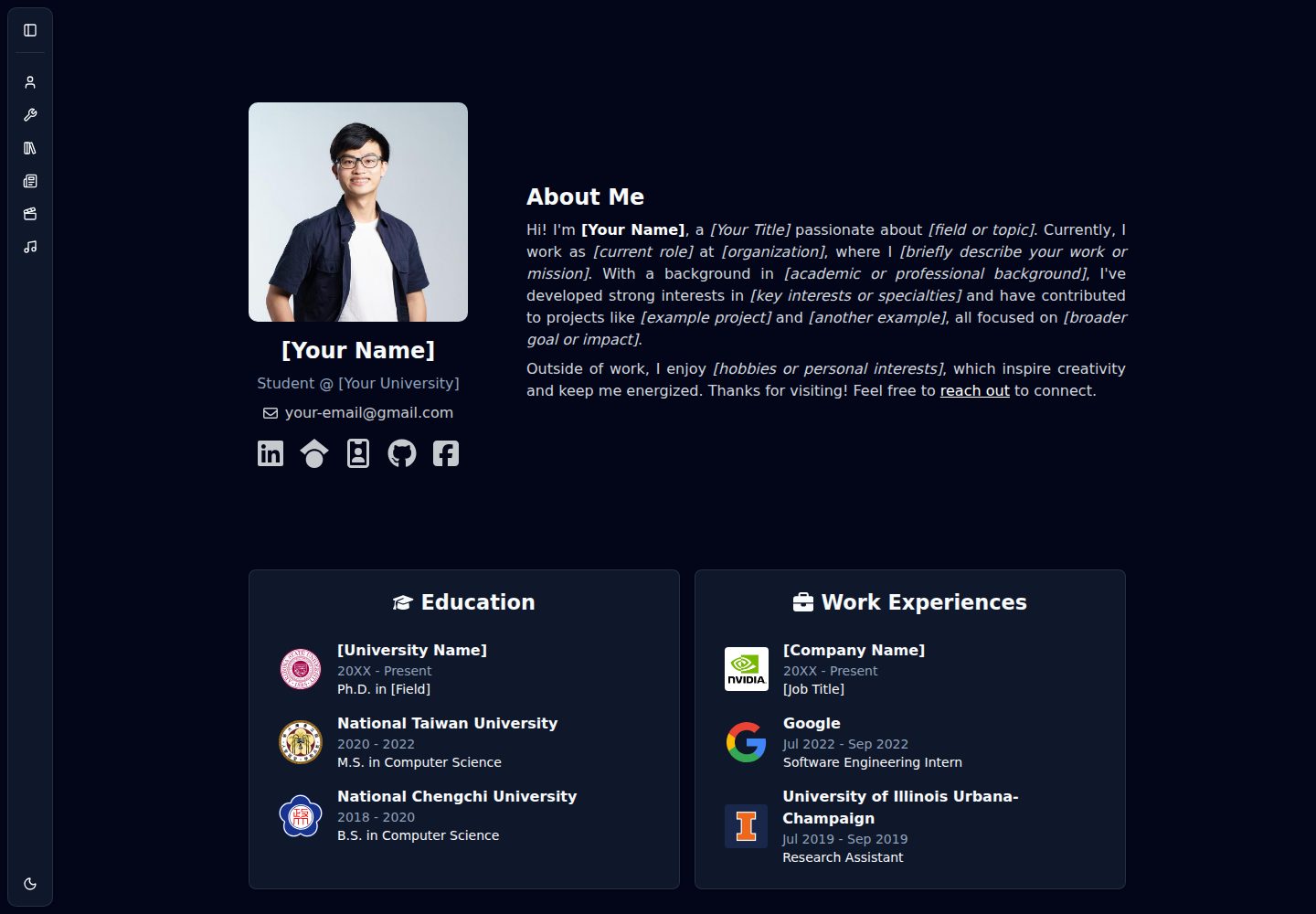
Showlit is a personal website template built with React, Vite, TypeScript, Tailwind CSS, and shadcn/ui.
Vite · Portfolio
folium
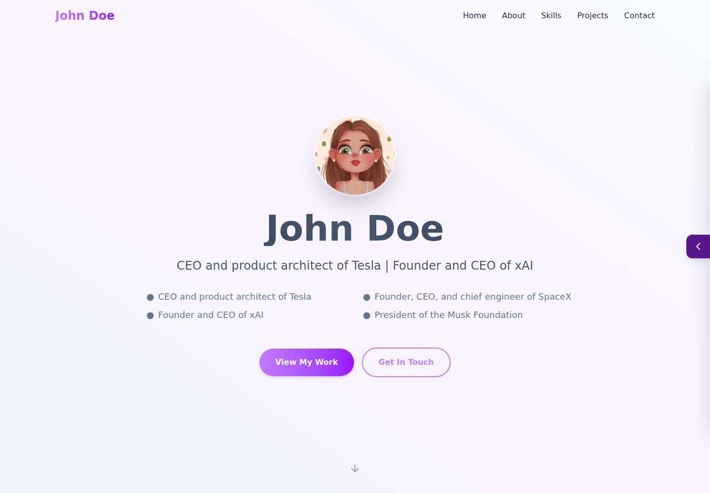
A developer portfolio template built with Vite, React, TypeScript, and Tailwind CSS.
Vite · Portfolio
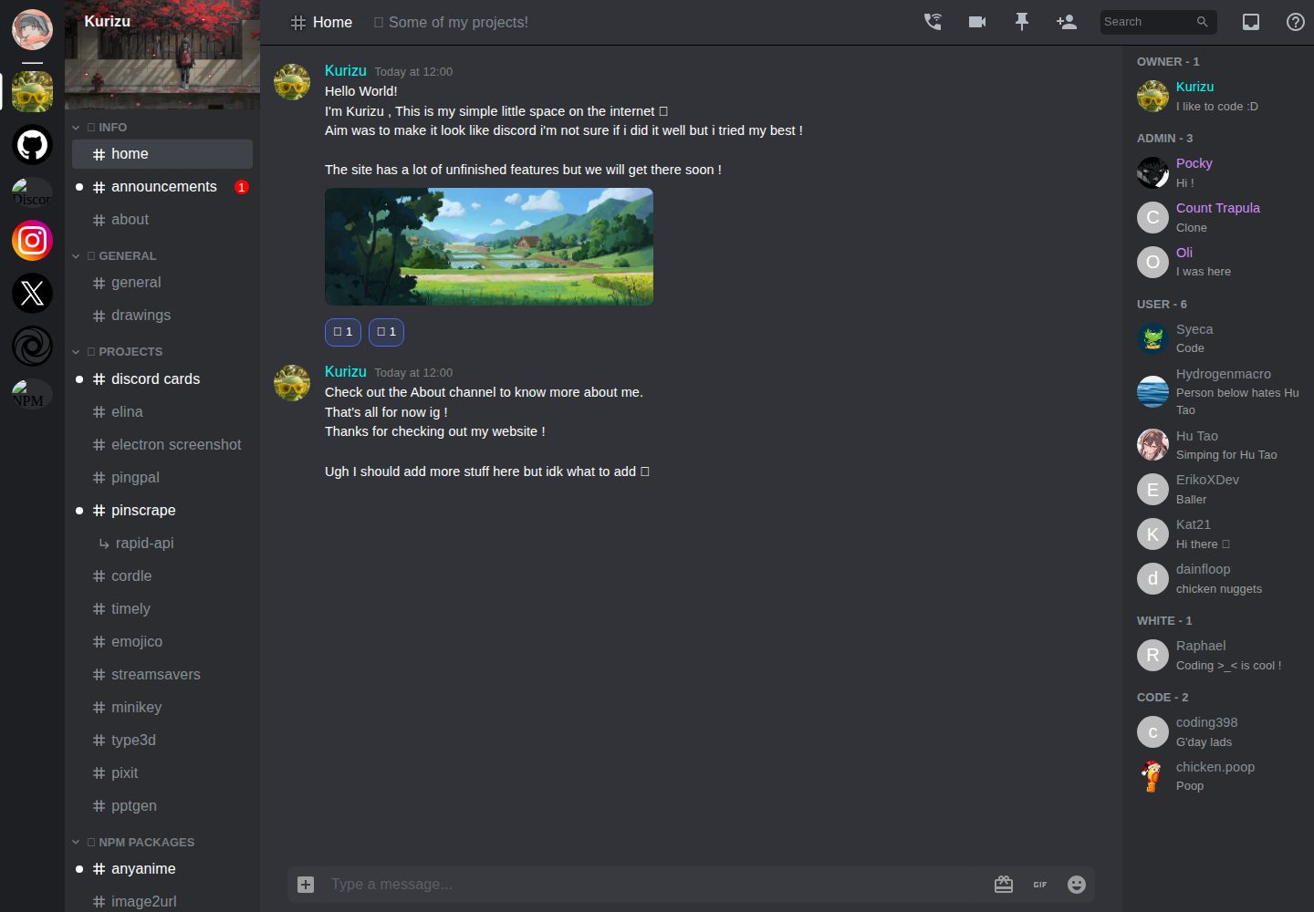
kurizu-discord
A personal portfolio website built with React and Vite that mimics the Discord desktop app, organizing projects, skills, and experience into customizable channels, threads, a member list, and emoji reactions.
Vite · Portfolio
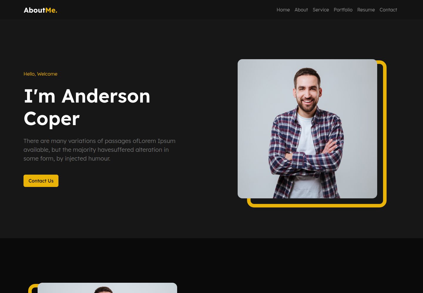
about-me-personal-portfolio-website-template
AboutMe is a free personal website template built with Bootstrap and Vite, released under the MIT license. It provides a single-page index.html with organized src directories for images, JavaScript, and SCSS, along with npm scripts for development and build.
Vite · Portfolio
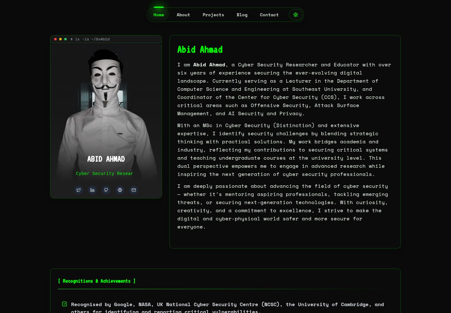
HackFolio
HackFolio is a hacker-style personal portfolio template for ethical hackers, penetration testers, bug bounty hunters, red teamers, and cybersecurity professionals.
Vite · Portfolio