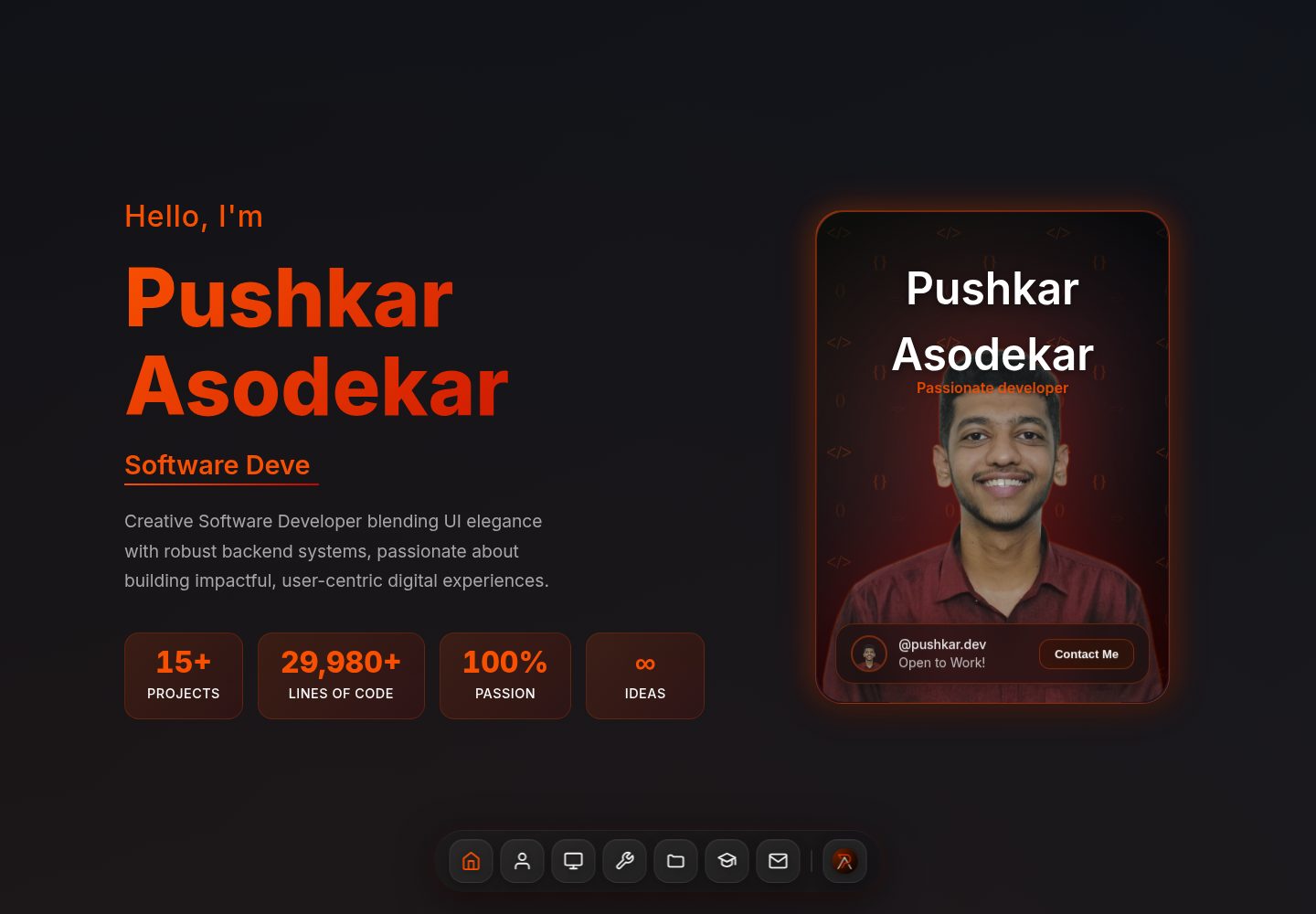
Built with React + Vite, animations driven by Framer Motion
ViteReactPortfolio
Portfolio (Pushkaraso19) — Vite Portfolio Template
By Pushkaraso19
A dark-themed personal portfolio template built with React and Vite, using Framer Motion for transition animations. Content is centralized in portfolioData.js and section components, making it easy to replace with personal information.
Explore the design
Compare the page layouts and mobile experience. Open any screenshot for a closer look.
Desktop homepage1 / 2
Desktop captureTop of page
Actual screenshot captured by the server browser.
All pages & views 2
Screenshots show visual appearance; interactive behavior may differ.
Recorded 2026-10-13View source
What stands out
A quick read of the recorded project description.
Dark theme with gradient colors, geared towards developer aesthetics
Clear section component structure, including navigation, Hero, about, skills, projects, experience, education, contact, and other modules
Social links and contact information centralized in src/data/portfolioData.js for easy unified replacement
README provides a file-by-file customization checklist and deployment instructions for Vercel, Netlify, and GitHub Pages
Template Details
This is a portfolio website template for developers to showcase their work, built with React and Vite, with animations provided by Framer Motion and icons from Lucide React. The page uses a dark color scheme with gradients and includes sections for navigation, Hero, about, skills, projects, experience, education, and contact, along with a Dock navigation component.
The template centralizes social links, email, phone, etc. in src/data/portfolioData.js, while other text and placeholder content are scattered across the corresponding section components; project images go in public/projects/, and the avatar goes in src/assets/photo.png. The README provides a file-by-file customization checklist, but the contact form is frontend-only; to receive messages, you need to integrate a backend yourself.
The repository uses the MIT license, allowing free use, modification, and distribution, but third-party assets such as demo images, fonts, and icons require separate license verification; for deployment, the README provides three methods: Vercel, Netlify, and GitHub Pages.
ViteReactPortfolio
Is it right for your project?
Use Cases
- Developers building a personal portfolio website to showcase projects, skills, and experience
- As a component structure reference for React + Vite projects
- Quickly replace placeholder content and deploy to static hosting platforms
Suitable For
- Developers who want to maintain a personal portfolio with React
- Showcase sites that prefer a dark theme and animated transitions
- Users who need a ready-made component section structure and will replace text and images themselves
Getting started & customization
Use these recorded setup notes alongside the repository instructions for your chosen version.
- 1
After cloning the repository, run npm install to install dependencies, then npm run dev to start the development server
- 2
Follow the README checklist to replace placeholder text, social links, project links, and images in each section component
- 3
Place project images in public/projects/, and replace the avatar at src/assets/photo.png
- 4
The contact form has no backend by default; to receive messages, you need to integrate a service yourself
- 5
Before deployment, run npm run build, then upload the dist directory or configure automatic deployment according to your chosen platform
License & source material
Usage conditions & limitations
Free to use · keep license noticeThis entry covers the free version under the MIT license from a public repository; the free scope applies to that version's code and does not imply that external services or third-party assets are free.
Must comply with when using
- Free use, modification, commercial use, and distribution of this version's code are permitted.
- When distributing copies or substantial portions of the code, retain the original author's copyright notice and the full MIT license notice.
- The code is provided as is; warranties and limitations of liability are governed by the original license and applicable law.
Additional costs & items to verify
- Demo images, fonts, icons, and other third-party assets require verification under their respective licenses; they cannot be judged solely by the code's MIT license.
- External services such as domains, hosting, databases, payments, or AI may incur additional charges.
- The contact form is frontend-only by default and does not include a backend; to actually receive messages submitted by users, you must integrate a backend service yourself.
- The projects section contains placeholder content by default and must be replaced with the user's own real projects; it cannot be used directly as a finished showcase.
- Much of the template's text is placeholder text and must be replaced item by item with the user's own information before use.
- The about section avatar is a placeholder image and must be replaced with the user's own photo.
- The project showcase images are placeholders and must be replaced with the user's own project screenshots.
View Original Text Basis
Permission is hereby granted, free of charge
Original License Text
Customize the contact form (add backend integration if needed)
Original README
Replace placeholder projects with your actual work
Original README
Replace all placeholder text with your information
Original README
Replace the user icon/photo in `src/assets/photo.png`
Original README
https://github.com/Pushkaraso19/Portfolio/blob/main/LICENSEhttps://github.com/Pushkaraso19/Portfolio/blob/main/README.mdReplace placeholder images with actual project screenshots in `public/projects/`
Original README
Compiled by DeepSeek based on repository license and README ·2026-10-13. Results only cover the materials read; dependencies, images, fonts, and subsequent term changes are subject to their respective original texts.
Project checks & description sources
Template Information
- Source platforms
- GitHub
- Documentation and maintenance reference score
- More documented · 85 / 100
- Technologies
- Vite · React
- Website type
- Portfolio
How this score is calculated
Our heuristic uses license records (up to 30), a demo link (12), a preview (10), stars (15), recorded maintenance (15), description completeness (8), feature records (5) and classification data (5). It is not a code, security or performance test, or a Google score. A link does not establish tested functionality.
What to verify for this project
- Repository update recorded
- 2026-05-27
- Screenshot last checked
- 2026-10-13
A demo link is listed. Check it with your own content and viewport sizes; its presence does not confirm that forms, authentication or payments work.
The catalog identifies Vite as the primary stack. Check the actual dependency manifest and lockfile for versions and hosting requirements. These notes use recorded metadata, not a code audit or a deployment test.
Use a selection guide →How this description was prepared
AI-assisted description based on catalog records and repository material. Repository authors are not automatically the reviewers of this description.
Review declaration: [email protected] · 2026-10-13
Inspect the recorded source material
SHA-256: 8471c272e49562ebfc00718ac3d539c43ebc8d3ef3b9f4134e018c5b7f5a56af
2026-10-13T02:12:11.626Z
Source file / repository# Modern Portfolio Website 🚀 A modern, minimalist portfolio website built with React, Vite, and Framer Motion. Features a dark theme, programmer-friendly aesthetics, and smooth animations. ## ✨ Features - **Responsive Design** – Works perfectly on all devices - **Modern Dark Theme** – Sleek programmer-inspired design - **Smooth Animations** – Powered by Framer Motion - **Interactive Components** – Engaging user experience - **Fast & Optimized** – Built with Vite for lightning-fast performance - **Easy to Customize** – Well-structured components for easy modifications ## 🛠️ Tech Stack - **React 19** – Latest React with modern features - **Framer Motion** – Production-ready motion library - **Lucide React** – Beautiful & consistent icon library - **Vite** – Next generation frontend tooling ## 🚀 Getting Started 1. **Clone or download** this project 2. **Install dependencies**: ```bash npm install ``` 3. **Start development server**: ```bash npm run dev ``` 4. **Open your browser** and visit `http://localhost:5173` ## 🎨 Customization Guide ### 1. Personal Information - **Navbar** (`src/components/Navbar.jsx`): - Change the logo to your own - Update social media links in the `portfolioData.js` file (`src/data/portfolioData.js`) - **Hero Section** (`src/components/HeroSection/HeroSection.jsx`): - Replace "Your Name" in the code snippet - Modify the subtitle and description - Update the greeting message - **About Section** (`src/components/AboutSection/AboutSection.jsx`): - Replace the user icon/photo in `src/assets/photo.png` - Update the description paragraph - Modify the stats (projects completed, experience, etc.) - Customize the journey timeline - **Skills Section** (`src/components/SkillsSection/SkillsSection.jsx`): - Update skill categories and proficiency levels - Add or remove technologies - Modify the "Languages I Speak" section - **Projects Section** (`src/components/ProjectsSection/ProjectsSection.jsx`): - Replace placeholder projects with your actual work - Update project descriptions, technologies used - Add real GitHub and live demo links - Replace placeholder images with actual project screenshots in `public/projects/` - **Contact Section** (`src/components/ContactSection/ContactSection.jsx`): - Update email address and phone number in `portfolioData.js` - Modify location information - Update social media links - Customize the contact form (add backend integration if needed) - **Footer** (part of `ContactSection`): - Update copyright information - Modify quick links - Update contact information ## 🎯 Quick Customization Checklist - [ ] Replace all placeholder text with your information - [ ] Update social media links (GitHub, LinkedIn, etc.) - [ ] Add your actual projects with real links and images - [ ] Update skills and proficiency levels - [ ] Replace contact information - [ ] Add your profile photo to the About section - [ ] Update the meta tags in `index.html` - [ ] Customize the favicon ## 📁 Project Structure ``` src/ ├── assets/ # Images, PDFs, icons ├── data/ │ └── portfolioData.js # Centralized portfolio data ├── components/ │ ├── Navbar.jsx # Navigation bar │ ├── AboutSection/ │ │ ├── AboutSection.jsx │ │ └── AboutSection.css │ ├── ContactSection/ │ │ ├── ContactSection.jsx │ │ └── ContactSection.css │ ├── Dock/ │ │ ├── Dock.jsx │ │ └── Dock.css │ ├── EducationSection/ │ │ ├── EducationSection.jsx │ │ └── EducationSection.css │ ├── ExperienceSection/ │ │ ├── ExperienceSection.jsx │ │ └── ExperienceSection.css │ ├── HeroSection/ │ │ ├── HeroSection.jsx │ │ └── HeroSection.css │ │ └── ProfileCard/ │ │ ├── ProfileCard.jsx │ │ └── ProfileCard.css │ ├── ProjectsSection/ │ │ ├── ProjectsSection.jsx │ │ └── ProjectsSection.css │ ├── SkillsSection/ │ │ ├── SkillsSection.jsx │ │ └── SkillsSection.css ├── App.jsx # Main app component ├── App.css # Global styles ├── index.css # Global imports └── main.jsx # App entry point ``` ## 🌐 Deployment ### Deploy to Vercel 1. Push your code to GitHub 2. Connect your repo to [Vercel](https://vercel.com) 3. Deploy with one click ### Deploy to Netlify 1. Build the project: `npm run build` 2. Upload the `dist` folder to [Netlify](https://netlify.com) ### Deploy to GitHub Pages 1. Install gh-pages: `npm install --save-dev gh-pages` 2. Add to package.json scripts: ```json "homepage": "https://yourusername.github.io/portfolio", "predeploy": "npm run build", "deploy": "gh-pages -d dist" ``` 3. Run: `npm run deploy` ## 🎨 Color Scheme The portfolio uses a modern dark color palette and gradients: - **Primary Background**: `#232222` (Deep Charcoal) - **Gradient Background**: `linear-gradient(135deg, #0d1117 0%, #161b22 50%, #0d1117 100%)` - **Card Background**: `linear-gradient(135deg, rgba(51, 51, 51, 0.9), rgba(100, 100, 100, 0.9))` - **Text Primary**: `#fff` (White) - **Text Secondary**: `#A7A7A7` (Muted Gray) - **Accent Gradient**: `linear-gradient(to right, #F85002, #C10801)` (Orange-Red) - **Accent Solid**: `#F85002` (Orange), `#C10801` (Red) - **Card Border**: `rgba(167, 167, 167, 0.3)` - **Scrollbar**: `#1f2937` (Track), `#4b5563` (Thumb), `#F85002` (Thumb Hover) ## 📱 Responsive Design The portfolio is fully responsive with breakpoints: - **Mobile**: 320px and up - **Tablet**: 768px and up - **Desktop**: 1024px and up - **Large Desktop**: 1280px and up ## ⚡ Performance - **Lighthouse Score**: 95+ on all metrics - **Bundle Size**: Optimized with Vite - **Images**: Optimized and lazy-loaded - **Animations**: Hardware accelerated ## 🤝 Contributing Feel free to fork this project and make it your own! If you create something cool, I'd love to see it. ## 📄 License This project is open source and available under the [MIT License](LICENSE). --- **Happy coding!** 🎉 If you have any questions or need help customizing your portfolio, feel free to reach out!
Explore similar templates
Compare previews and descriptions within the same stack and category.
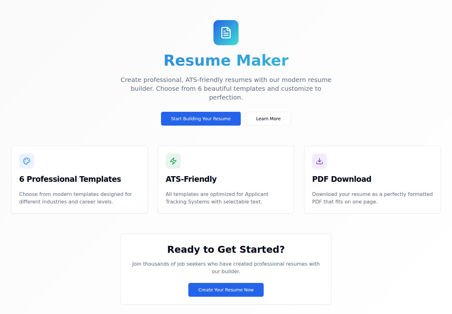
Resumify
Resumify is a browser-based resume builder built with React, TypeScript, and Vite.
Vite · Portfolio
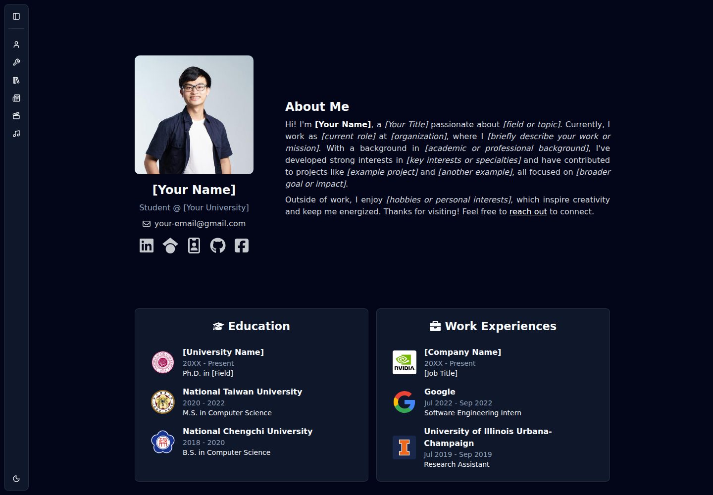
showlit
Showlit is a personal website template built with React, Vite, TypeScript, Tailwind CSS, and shadcn/ui.
Vite · Portfolio
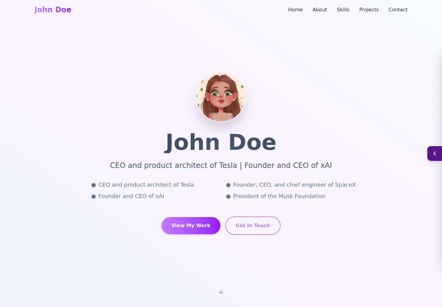
folium
A developer portfolio template built with Vite, React, TypeScript, and Tailwind CSS.
Vite · Portfolio
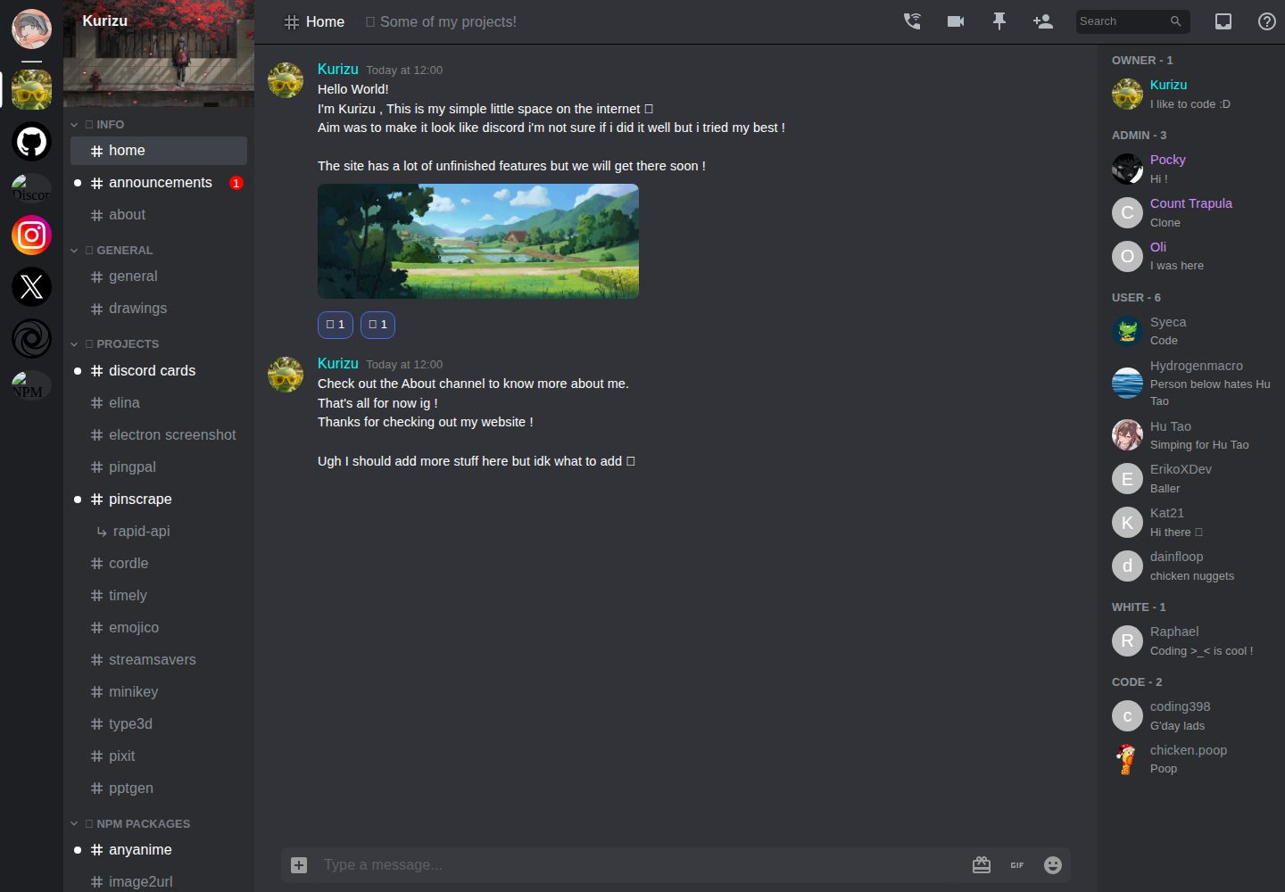
kurizu-discord
A personal portfolio website built with React and Vite that mimics the Discord desktop app, organizing projects, skills, and experience into customizable channels, threads, a member list, and emoji reactions.
Vite · Portfolio
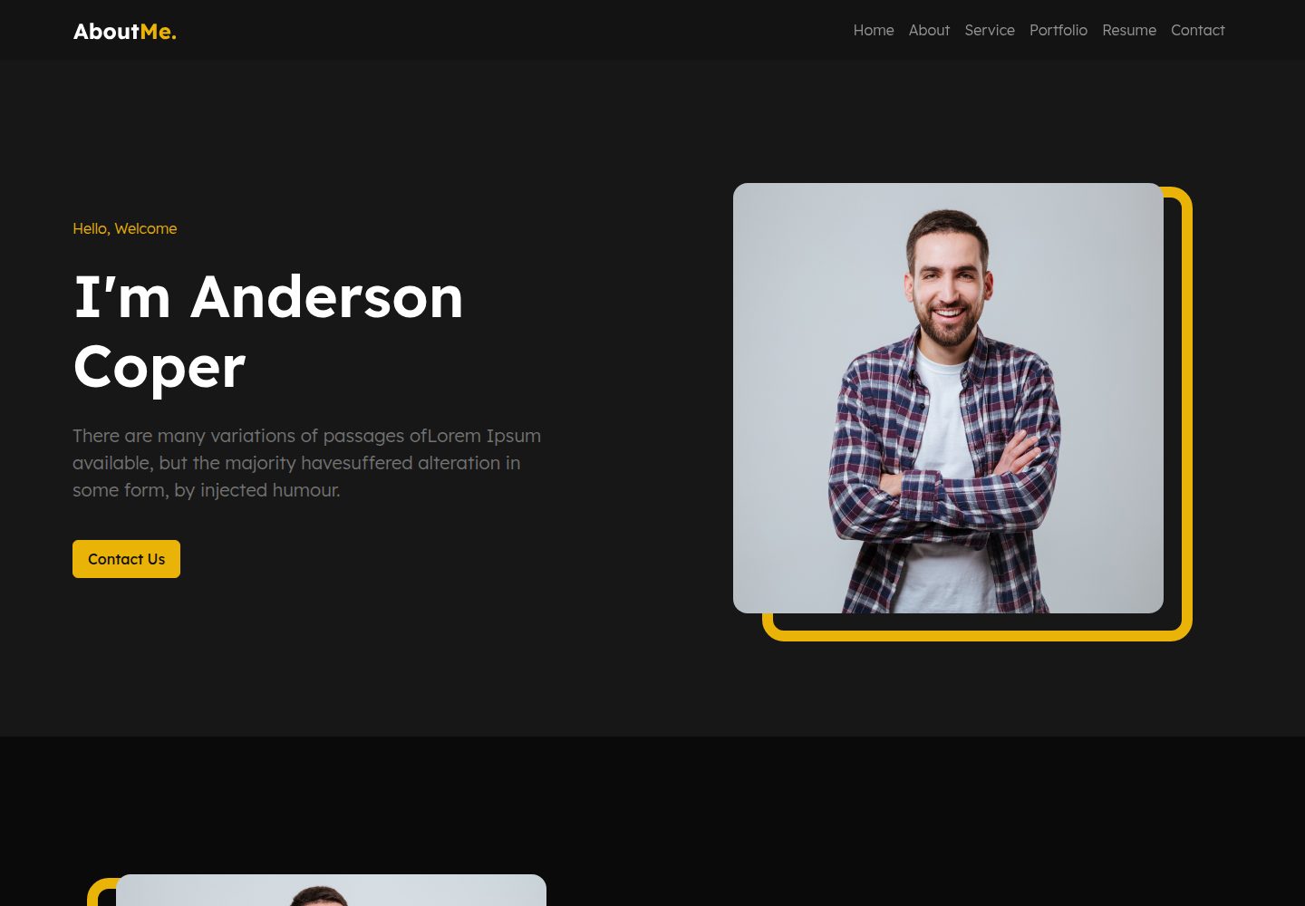
about-me-personal-portfolio-website-template
AboutMe is a free personal website template built with Bootstrap and Vite, released under the MIT license. It provides a single-page index.html with organized src directories for images, JavaScript, and SCSS, along with npm scripts for development and build.
Vite · Portfolio
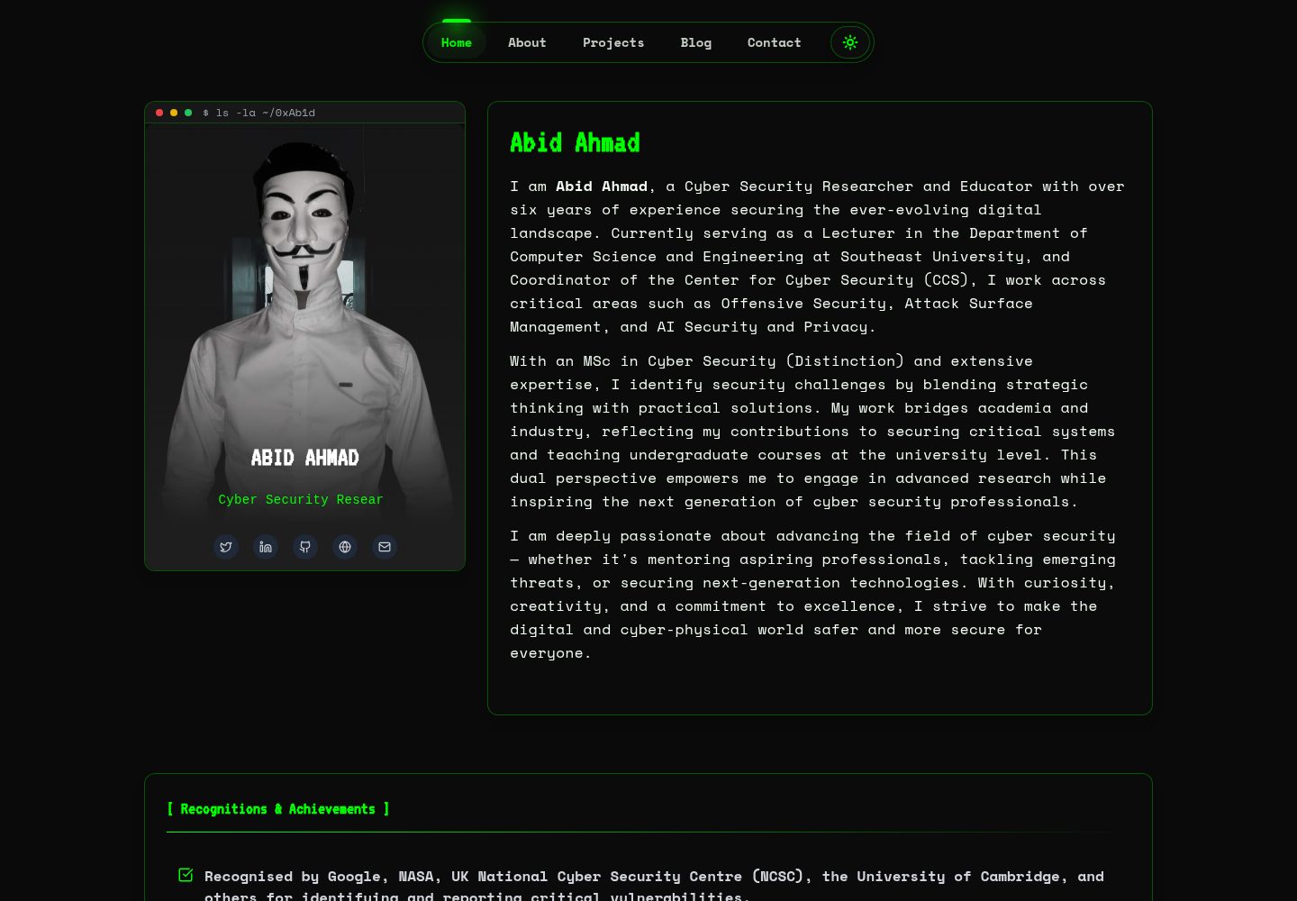
HackFolio
HackFolio is a hacker-style personal portfolio template for ethical hackers, penetration testers, bug bounty hunters, red teamers, and cybersecurity professionals.
Vite · Portfolio