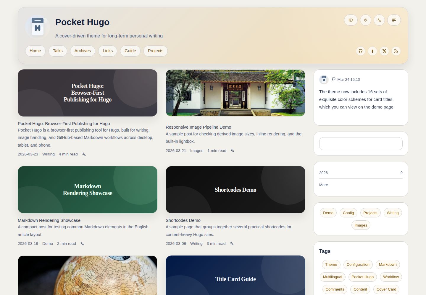
多语言发布:支持翻译链接、canonical 与 hreflang 元数据
Hugo启动器
pocket-hugo-theme — Hugo 启动器模板
作者 h2dcc
Pocket Hugo Theme 是一款面向多语言个人博客的 Hugo 主题,强调以内容为先的排版,适合长文、随笔、社交笔记与演讲记录。
看看你的网站会是什么样
浏览真实页面截图,比较内容排版与手机效果。点击下方缩略图切换,放大查看整页细节。
全部页面与视图 3
截图用于了解视觉与布局,交互效果请以实际项目为准。
采集于 2026-10-03查看来源
值得关注的模板亮点
从已有项目资料中,快速了解它的特点。
封面优先的卡片布局:首页、分类与文章页均围绕封面图设计
本地搜索:可选是否将全文纳入索引
Talks 页面与订阅输出:含首页小组件及独立 RSS / JSON 输出
可选评论:支持 Giscus 或 Twikoo
多套内置配色与访客端切换,列表宽度可选单栏或双栏
模板详细介绍
Pocket Hugo Theme 由 h2dcc 开发,采用 MIT 许可,基于 Hugo Extended 构建。主题以「平静、内容优先」为设计取向,适合个人博客、双语文章、社交笔记和长文写作。它既可与 Pocket Hugo 配合使用,也可作为独立 Hugo 主题运行。
功能方面,主题提供多语言发布支持,包括翻译链接、canonical 与 hreflang 元数据;首页、分类与文章页采用封面优先的卡片布局;内置本地搜索,可选全文索引;提供 talks 页面与首页小组件,并支持独立的 RSS / JSON 输出;友链 shortcode 支持本地或远程图片;评论可选 Giscus 或 Twikoo。此外还有可配置的小组件标题显隐、文章摘要、反向链接、目录、阅读时间与返回顶部按钮,多套内置配色方案及访客端配色切换,列表宽度预设(单栏 / 双栏),以及内联图片高度策略和主题感知的图片亮度设置。仓库附带示例站点,覆盖多语言页面、shortcode、内容适配器、talks 订阅源与图片设置。
使用限制:主题要求 Hugo Extended >= 0.149.0,开发与测试环境为 0.157.x 与 0.158.x。免费范围仅限该 MIT 许可版本代码,演示图片、字体、图标等第三方素材需按各自许可核对,域名、托管等外部服务可能另外收费。
Hugo启动器
适合你的项目吗?
适用场景
- 搭建多语言个人博客,发布双语文章与长文
- 记录社交笔记、链接分享与轻量更新
- 整理演讲、活动记录并输出独立订阅源
- 为个人站点配置封面卡片、目录、阅读时间与返回顶部等阅读辅助功能
适合人群
- 使用 Hugo Extended 并希望快速启动个人博客的开发者或写作者
- 需要多语言发布与翻译链接的个人站点
- 偏好封面驱动、内容优先排版的长文写作者
- 希望以本地搜索替代第三方搜索服务的站点
上手与定制指南
结合仓库当前版本的说明,按下面的资料检查内容、配置与运行要求。
- 1
需安装 Hugo Extended >= 0.149.0,开发测试环境为 0.157.x 与 0.158.x
- 2
通过 git submodule 将主题添加至 themes/pocket-hugo-theme,并在站点配置中设置 theme = "pocket-hugo-theme"
- 3
可运行 hugo server --source exampleSite --themesDir ../.. 在本地预览示例站点
- 4
仓库提供英文与中文注释的示例配置,以及中文说明文档 README.zh-CN.md
- 5
演示图片、字体、图标等第三方素材需按各自许可单独核对
授权与来源资料
使用条件与限制
免费使用 · 保留许可声明本次收录的是公开仓库中采用 MIT 许可的免费版本;免费范围为该版本代码,不代表外部服务或第三方素材免费。
使用时需要遵守
- 允许免费使用、修改、商用和分发该版本代码。
- 分发代码副本或实质性部分时,保留原作者版权声明和完整 MIT 许可声明。
- 代码按现状提供;担保与责任限制以原许可证及适用法律为准。
额外费用与待核对事项
- 使用该主题需安装 Hugo Extended 0.149.0 或更高版本,普通版 Hugo 不受支持。
- 开发与测试环境为 Hugo Extended 0.157.x 与 0.158.x,其他版本未经验证。
- 评论功能为可选,启用 Giscus 或 Twikoo 需依赖对应的第三方评论服务。
- 使用 Twikoo 评论需自行部署服务并提供 envId 地址。
- 自定义字体扩展点若引用 Google Fonts 等远程资源,需自行承担外部服务依赖。
- 主题面向个人发布场景优化,不适合大型门户类首页。
- 演示图片、字体、图标及其他第三方素材需按各自许可核对,不能仅凭代码的 MIT 许可判断。
- 域名、托管、数据库、支付或 AI 等外部服务可能另外收费。
查看原文依据
Permission is hereby granted, free of charge
许可证原文
Hugo Extended `>= 0.149.0`
README 原文
Development and testing environment: Hugo Extended `0.157.x` and `0.158.x`
README 原文
Optional Giscus or Twikoo comments
README 原文
# envId = "https://your-service.example.com"
README 原文
for remote font links such as Google Fonts or self-hosted font loaders
README 原文
https://github.com/h2dcc/pocket-hugo-theme/blob/master/LICENSEhttps://github.com/h2dcc/pocket-hugo-theme/blob/master/README.mdThe theme is optimized for personal publishing rather than large portal homepages.
README 原文
DeepSeek 根据仓库许可证和 README 整理 ·2026-10-03。结果仅覆盖已读取资料,依赖、图片、字体及后续条款变更以各自原文为准。
项目核对记录与介绍依据
模板资料
- 来源平台
- Hugo Themes
- 资料与维护参考分
- 资料较完整 · 83 / 100
- 技术栈
- Hugo
- 网站类型
- 启动器
这个分数如何计算
本站按许可资料(最高30分)、演示链接(12分)、预览图(10分)、Star数(15分)、记录的维护时间(15分)、描述完整度(8分)、功能记录(5分)和分类资料(5分)计算。它不是代码、安全或性能测试,也不是 Google 评分;有链接不代表已实测可用。
这个项目需要核对什么
- 记录的仓库更新时间
- 2026-08-27
- 截图检查日期
- 2026-10-03
已收录演示链接。请用你的内容与屏幕尺寸检查;有演示不代表表单、认证或支付已经可用。
目录记录的主要技术栈是 Hugo。请通过依赖清单和锁文件核对实际版本与托管要求。这些说明基于收录资料,不代表代码审计或部署实测。
查看具体选型方法 →介绍的制作与核对状态
介绍由 AI 辅助整理目录与仓库资料。仓库作者不等于这篇介绍的审核者。
审核声明: [email protected] · 2026-10-04
查看当时使用的来源资料
SHA-256: bf3aa0eb904828f408aeee6d1de2d0009f47030ed13ae1e7ff700c4bb5961561
2026-10-03T13:44:33.150Z
来源文件 / 仓库# Pocket Hugo Theme
A calm, content-first Hugo theme for multilingual blogs, long-form writing, talks, links, and cover-driven reading.
`pocket-hugo-theme` is designed to pair naturally with [Pocket Hugo](https://github.com/h2dcc/pocket-hugo), but it also works as a standalone Hugo theme for personal sites that value readable typography, lightweight publishing, and flexible theme configuration.
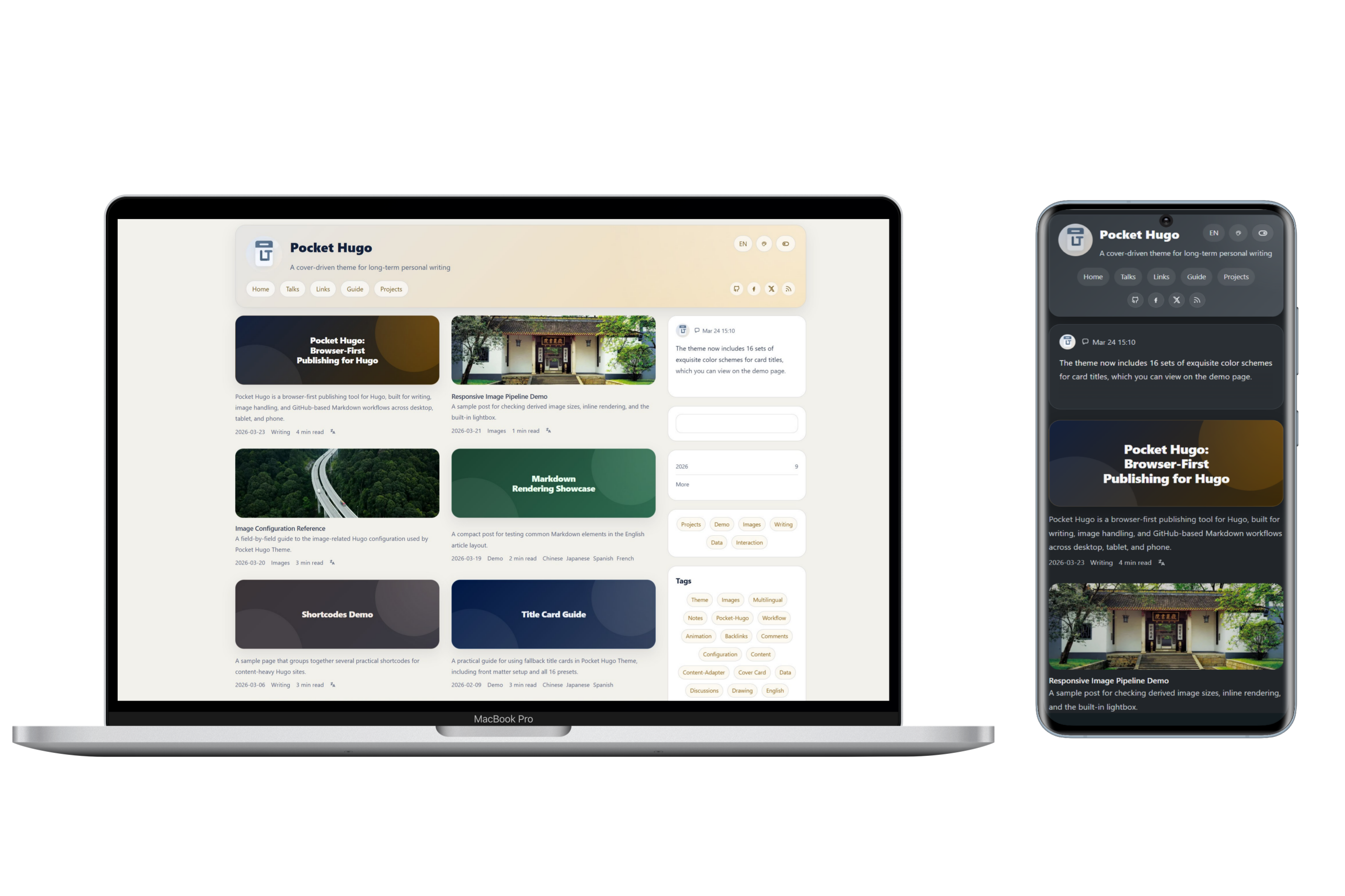
## Features
- Multilingual publishing with translation links, canonical handling, and `hreflang` metadata
- Cover-first article cards with homepage, taxonomy, and article layouts tuned for personal blogs
- Local search with optional full-text indexing
- Talks page with homepage widget support and standalone RSS / JSON outputs
- Friend links shortcode with local or remote images
- Optional Giscus or Twikoo comments
- Configurable widget title visibility, article summaries, backlinks, TOC, reading time, and back-to-top button
- Multiple built-in color palettes plus optional visitor-side palette switching
- Configurable list width presets for single-column and double-column homepage/list layouts
- Configurable inline image height strategy and theme-aware image brightness settings
- Example site covering multilingual pages, shortcodes, content adapters, talks feeds, and image settings
## Requirements
- Hugo Extended `>= 0.149.0`
- Development and testing environment: Hugo Extended `0.157.x` and `0.158.x`
## Installation
```bash
git submodule add https://github.com/h2dcc/pocket-hugo-theme.git themes/pocket-hugo-theme
```
```toml
theme = "pocket-hugo-theme"
```
## Quick Start
Run the bundled example site locally:
```bash
hugo server --source exampleSite --themesDir ../..
```
The repository includes:
- `exampleSite/hugo.toml`: English-commented example configuration
- `exampleSite/hugo.zh-cn.toml`: Chinese-commented example configuration
- `README.zh-CN.md`: Chinese introduction and configuration notes
## Core Configuration
A typical site-level setup may look like this:
```toml
[params]
favicon = "/img/logo-default.svg"
appleTouchIcon = "/img/avatar.webp"
summaryLength = 0
articleWords = false
backToTop = false
viewTransitions = false
[params.search]
provider = "local"
fullText = false
[params.article]
showSummary = true
backlinks = true
backlinksLimit = 5
toc = true
readingTime = true
[params.layout]
listMode = "double"
[params.colorScheme]
toggle = true
default = "auto"
preset = "morandi-mist"
showPicker = true
```
## Layout Options
`[params.layout]`
- `listMode = "double"`
- Use the wider homepage/list layout (`1320px`) and enable the double-column list presentation on large screens.
- `listMode = "single"`
- Use the more compact homepage/list layout (`1080px`) for a calmer single-column reading rhythm.
## Built-in Color Palettes
`[params.colorScheme]`
- `toggle`
- Show or hide the light/dark mode switch in the header.
- `default`
- `auto`, `light`, or `dark`.
- `preset`
- Choose the default palette.
- `showPicker`
- Show or hide the visitor-side palette picker in the header.
Available presets:
- `golden-summer-fields`
- `soft-pastel-shades`
- `black-gold-elegance`
- `fresh-greens`
- `light-steel`
- `deep-sea-blue`
- `morandi-mist`
- `monochrome-core`
Example:
```toml
[params.colorScheme]
toggle = true
default = "auto"
preset = "deep-sea-blue"
showPicker = true
```
## Minimal View (Bear-style)
A minimal, Bear-Blog-like stylesheet (`assets/css/min.css`) is bundled with the theme and can be toggled directly on the page - no rebuild or manual CSS swap required.
`[params.minMode]`
- `enabled`
- Whether to show the "Minimal" toggle button in the header. Defaults to `true`.
- `default`
- Whether the minimal view is enabled on first visit. Defaults to `false` (regular theme).
The visitor's choice is stored in `localStorage` (key `PocketMinMode`) and restored automatically on the next visit. The minimal view borrows the original site's warm cocoa palette and typography: narrow single column, hidden sidebar, title + date post list, dotted-link article content, and the original chroma code palette.
Example:
```toml
[params.minMode]
enabled = true
default = false
```
## Search Options
`[params.search]`
- `provider`
- Currently `local`.
- `fullText`
- `false`: search title, description, slug, categories, and tags only.
- `true`: include full article text in the local search index.
## SEO Options
`[params.seo]`
- `tagline`
- Optional site tagline used by SEO title patterns.
- `homeDescription`
- Homepage meta description used by search engines and social previews.
- `descriptionLength`
- Maximum length used when truncating SEO descriptions.
- `separator`
- Separator string used by title templates.
`[params.seo.title]`
- `home`
- `post`
- `page`
- `group`
- `archive`
Available placeholders:
- `[site_name]`
- `[tagline]`
- `[separator]`
- `[post_title]`
- `[page_title]`
- `[group_title]`
- `[archive_title]`
Example:
```toml
[params.seo]
tagline = "A cover-driven theme for long-term personal writing"
homeDescription = "Pocket Hugo Theme is a multilingual, cover-driven Hugo theme for long-form writing and calm publishing."
descriptionLength = 180
separator = " · "
[params.seo.title]
home = "[site_name]"
post = "[post_title][separator][site_name]"
page = "[page_title][separator][site_name]"
group = "[group_title][separator][site_name]"
archive = "[archive_title][separator][site_name]"
```
## Article List and Summary Options
`[params.article]`
- `showListSummary`
- Control whether article cards render summaries below the title/meta row.
- This affects homepage, archives, taxonomy pages, and other list/card views.
- `showPageDescription`
- Control whether the single article/page view renders `.Description` below the title.
- This is separate from card excerpts.
- `showSummary`
- Legacy alias for `showListSummary`.
- Still supported for compatibility, but new configs should prefer `showListSummary`.
- `backlinks`
- Enable backlinks on article pages.
- `backlinksLimit`
- Limit the number of backlink items shown.
- `toc`
- Enable the article table of contents.
- `readingTime`
- Show reading time metadata.
`[params]`
- `summaryLength`
- Control how long generated list summaries should be.
- `summaryLength = 0` means “do not truncate automatically and show the full summary”, not “hide summaries”.
## Image Settings
### Cover Images
`[params.images.cover]`
- `useFill`
- Whether homepage/list covers should use Hugo `Fill` cropping.
- Set to `false` to preserve the original image instead of generating a cropped cover.
- `cardFill`
- Hugo `Fill` spec for homepage and normal list cards.
- `taxonomyFill`
- Hugo `Fill` spec for taxonomy cards.
- `openGraphVariant`
- Variant used for `og:image` and `twitter:image`.
- Usually `card` for a cropped social image, or `single` for the uncropped article cover.
- `useDefault`
- `listTitle`
- Whether generated gradient cards on homepage, taxonomy, archive, and other list pages show the outer title.
- This site-level switch only affects generated gradient cards, not normal image covers.
- `fallbackMode`
- Fallback cover mode when the current post or page does not define one.
- Use `image` for a normal default image, or `gradient` for a generated title card.
- `openGraphUseDefault`
- When the page has no own image, still use `default` as `og:image` / `twitter:image`.
- `defaultMode`
- Legacy alias kept for backward compatibility.
- `default`
- Local path or remote URL for the fallback cover image when `fallbackMode = "image"`.
Example:
```toml
[params.images.cover]
useFill = true
cardFill = "640x300 Center q85"
taxonomyFill = "640x300 Center q85"
openGraphVariant = "card"
useDefault = true
fallbackMode = "gradient"
openGraphUseDefault = true
default = "/img/default-cover.webp"
```
### Per-page Title Cards
You can force a generated title card from front matter even when the page has an `image`.
Simple form:
```yaml
coverCard: "a"
```
- `a` to `h`: the 8 light presets
- `A` to `H`: the 8 dark presets
- any other value: automatic random preset
When `coverCard` is set, the generated title card takes priority over `image`.
To hide the repeated outer title for a single page:
```yaml
listTitle: false
```
- On list pages, this hides the outer card title.
- On single pages, if the page is using a generated title card, it also hides the separate page title block.
If you do nothing, the theme can still generate a fallback title card automatically when:
- `params.images.cover.useDefault = true`
- `params.images.cover.fallbackMode = "gradient"`
### Inline Content Images
`[params.images.content]`
- `enableMaxHeight`
- Enable or disable max-height control for inline article images.
- `limitHeight`
- When `true`, use one shared height on all breakpoints.
- `unifiedMaxHeight`
- Shared height used when `limitHeight = true`.
- `mobileMaxHeight`
- `tabletMaxHeight`
- `desktopMaxHeight`
- Per-breakpoint max-height values used when `limitHeight = false`.
- `fullWidthFit`
- `object-fit` strategy for full-width inline images, such as `cover` or `contain`.
Example:
```toml
[params.images.content]
enableMaxHeight = true
limitHeight = false
unifiedMaxHeight = "320px"
mobileMaxHeight = "160px"
tabletMaxHeight = "250px"
desktopMaxHeight = "350px"
fullWidthFit = "cover"
```
### Image Brightness by Theme
`[params.images.brightness]`
- `light`
- CSS `brightness()` value for images in light mode.
- `dark`
- CSS `brightness()` value for images in dark mode.
Example:
```toml
[params.images.brightness]
light = "1"
dark = "0.92"
```
### Hugo Image Pipeline
`[params.images.pipeline]`
- `responsive`
- Enable responsive derived images.
- `format`
- Output format such as `webp`.
- `quality`
- Image quality.
- `coverWidths`
- Generated widths for cover images.
- `contentWidths`
- Generated widths for inline content images.
## Comments
The theme supports three optional comment providers:
- `giscus`
- `twikoo`
- `custom`
Example:
```toml
[params.comments]
enabled = false
provider = "giscus"
[params.comments.giscus]
mapping = "pathname"
theme = "preferred_color_scheme"
[params.comments.twikoo]
# envId = "https://your-service.example.com"
```
## Custom Extension Partials
The theme includes three no-op partials you can override in your own site project without editing the theme itself:
- `layouts/partials/custom/fonts.html`
- for remote font links such as Google Fonts or self-hosted font loaders
- `layouts/partials/custom/css.html`
- for loading a custom stylesheet after the theme CSS
- `layouts/partials/custom/comments.html`
- for integrating a custom comment provider when `provider = "custom"`
These are intended as stable extension points for site-specific customization.
Minimal examples:
```html
<!-- layouts/partials/custom/fonts.html -->
<link rel="preconnect" href="https://fonts.googleapis.com">
<link rel="preconnect" href="https://fonts.gstatic.com" crossorigin>
<link href="https://fonts.googleapis.com/css2?family=IBM+Plex+Sans:wght@400;500;700&display=swap" rel="stylesheet">
```
```html
<!-- layouts/partials/custom/css.html -->
<link rel="stylesheet" href="{{ "css/custom.css" | relURL }}">
```
```css
/* static/css/custom.css */
:root {
--content-width: 1180px;
}
```
```toml
[params.comments]
enabled = true
provider = "custom"
```
```html
<!-- layouts/partials/custom/comments.html -->
<div id="custom-comments"></div>
<script src="https://example.com/comments.js" defer></script>
```
## Talks and Lightweight Publishing
The theme includes a dedicated talks page layout and homepage widget pattern for lightweight updates.
- Talks pages can output standalone RSS and JSON feeds.
- The homepage widget can reuse the first talk item.
- This works especially well with Pocket Hugo's timeline-style quick publishing flow.
## Example Site Coverage
The bundled `exampleSite/` demonstrates:
- multilingual menus and translation links
- article pages, talks, links, and about pages
- title-card fallback behavior and all 16 title-card presets
- shortcodes
- content adapters
- image configuration reference pages
- comment provider examples
- palette switching and layout configuration
## Repository Layout
- `theme.toml`: Hugo theme metadata
- `hugo.toml`: minimum Hugo version for the theme itself
- `images/`: theme preview assets
- `exampleSite/`: runnable demo site
## Notes
- The theme is optimized for personal publishing rather than large portal homepages.
- If you use Pocket Hugo, this theme is intended to be its recommended presentation layer.
- For Chinese users, see [README.zh-CN.md](README.zh-CN.md).
看看同类模板
对比同技术栈与用途的模板,找到更适合的视觉与内容结构。
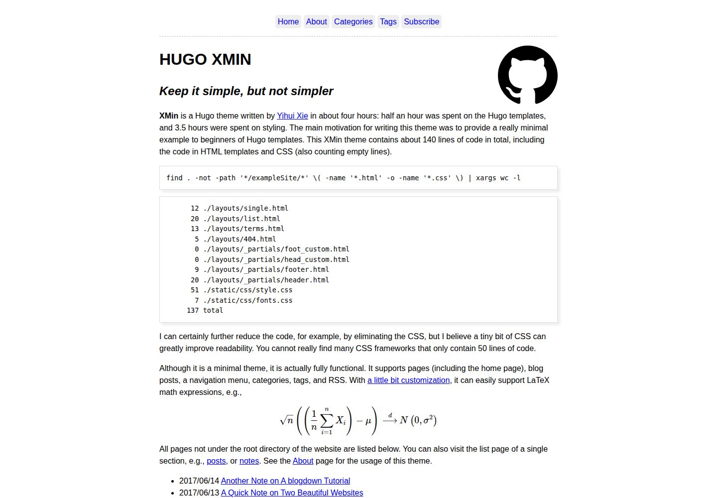
hugo-xmin
eXtremely Minimal Hugo theme: about 140 lines of code in total, including HTML and CSS (with no dependencies)
Hugo · 启动器
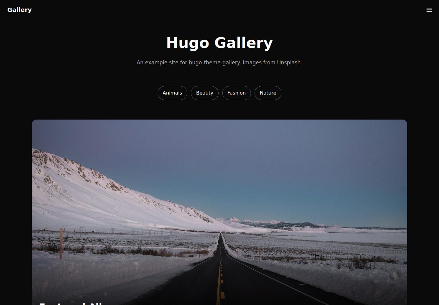
hugo-theme-gallery
Gallery Theme for Hugo
Hugo · 启动器
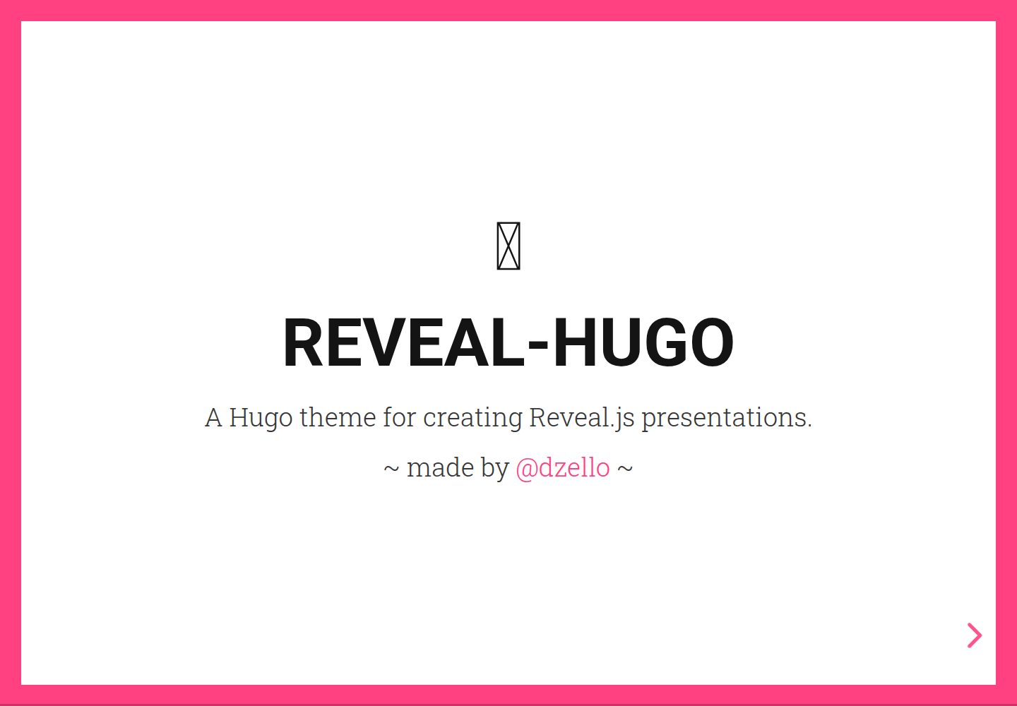
reveal-hugo
📽️ Create rich HTML-based presentations with Hugo and Reveal.js
Hugo · 启动器
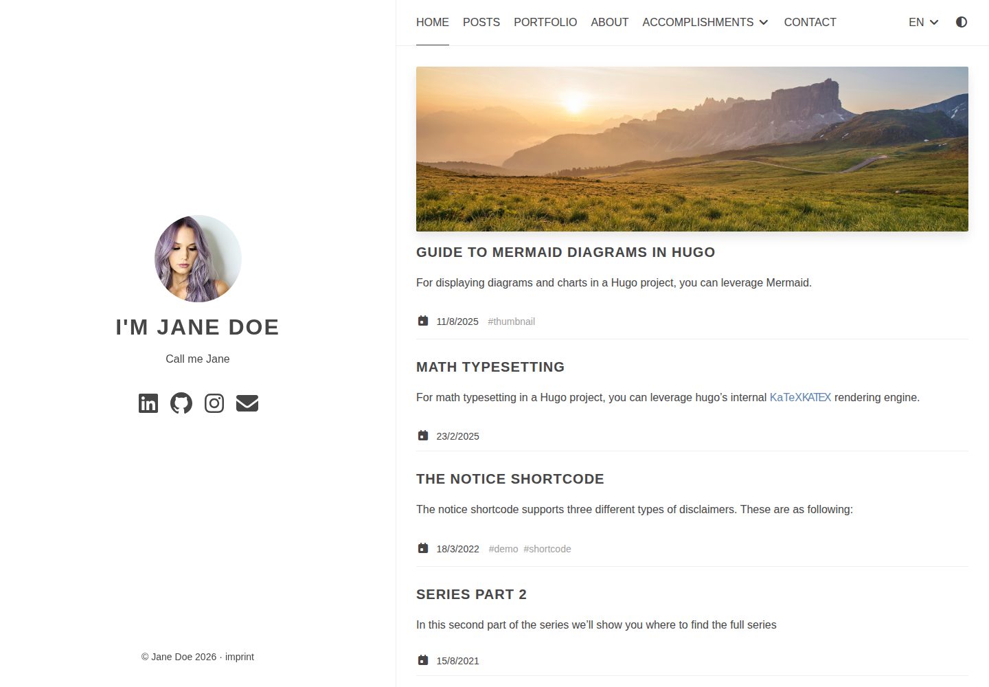
anatole
Anatole is a minimalistic two-column theme for Hugo.
Hugo · 启动器
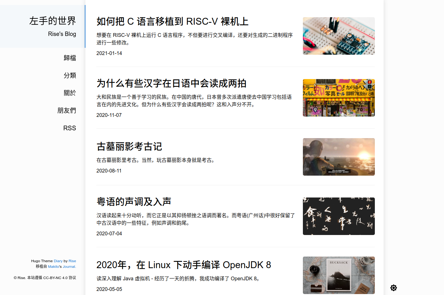
hugo-theme-diary
Moments piled up. A Hugo theme ported from SumiMakito/hexo-theme-Journal.
Hugo · 启动器
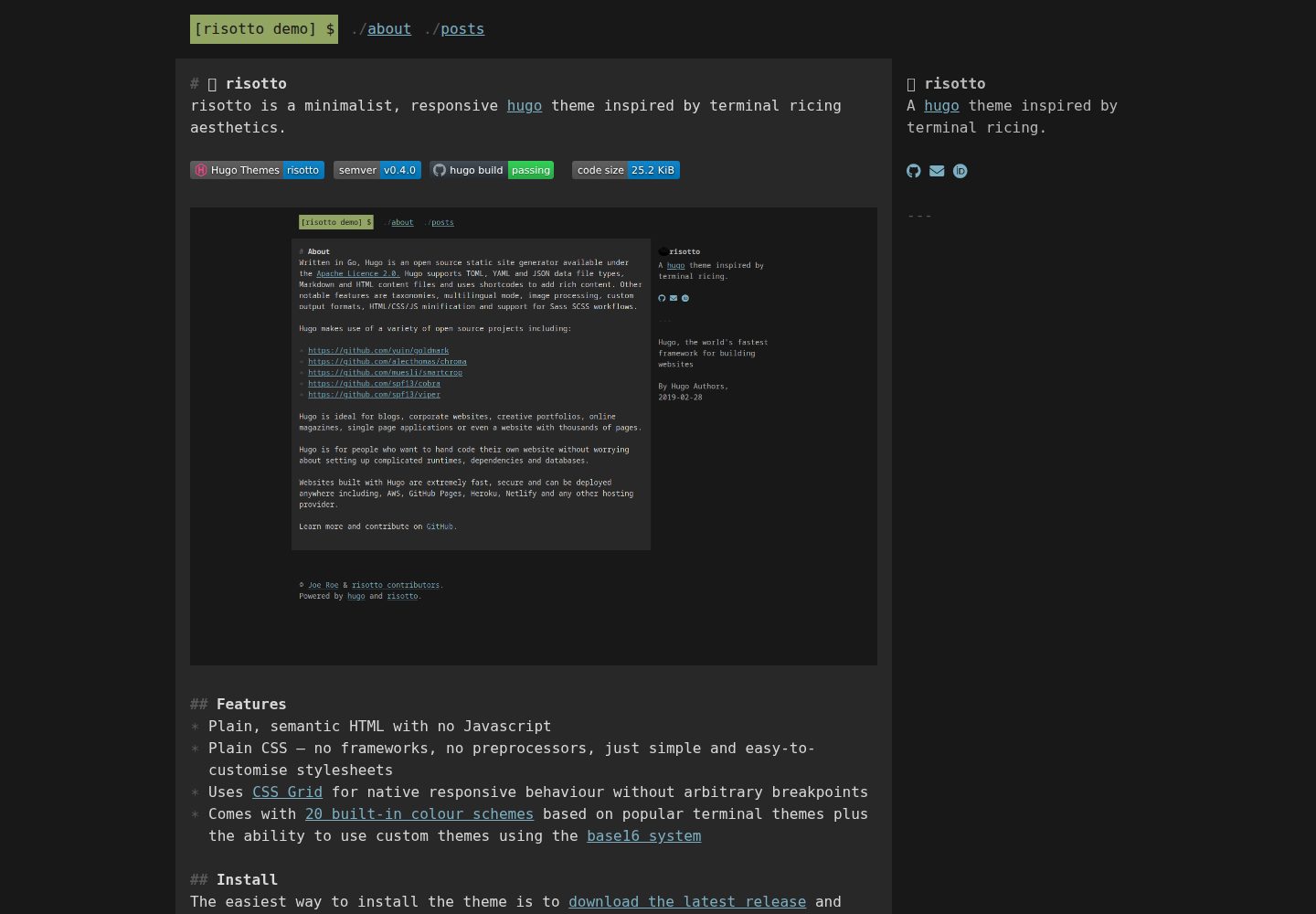
risotto
A minimalist, responsive hugo theme inspired by terminal ricing aesthetics.
Hugo · 启动器