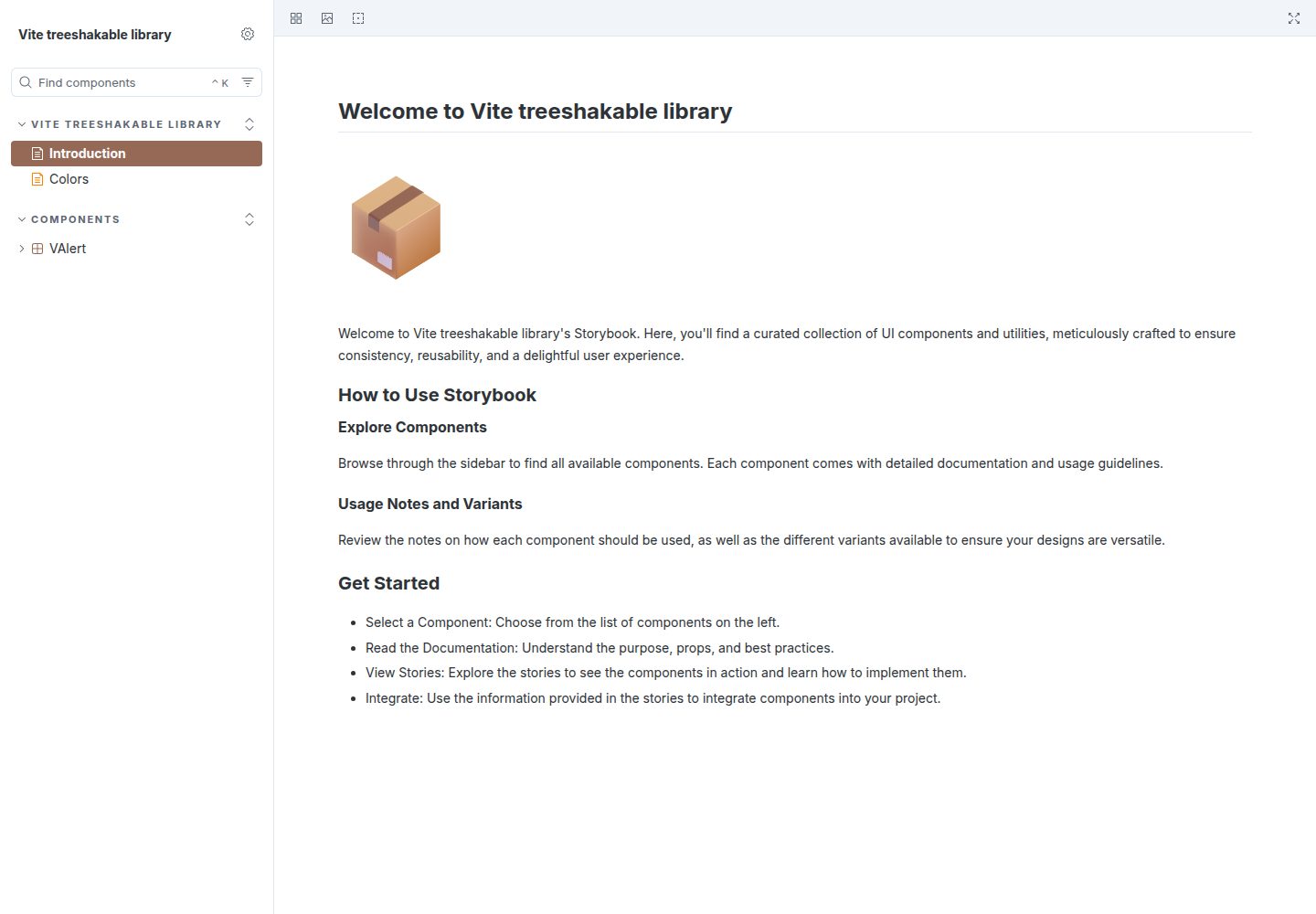
The Vite build configuration uses createEntries to generate a separate entry for each file under lib, facilitating Rollup chunk splitting and tree-shaking
VueViteStarter
vite-treeshakable-library — Vue Starter Template
By kouts
A Vite-based library development starter template preconfigured with Vue 3, Tailwind CSS, Storybook, and TypeScript for building tree-shakable npm component libraries.
Explore the design
Compare the page layouts and mobile experience. Open any screenshot for a closer look.
Desktop homepage1 / 2
Desktop captureTop of page
Actual screenshot captured by the server browser.
All pages & views 2
Screenshots show visual appearance; interactive behavior may differ.
Recorded 2026-10-04View source
What stands out
A quick read of the recorded project description.
Integrates Vue 3 and Tailwind CSS by default, with VAlert as the example component
Outputs TypeScript declaration files to the dist directory during build
Integrates Storybook for component development and documentation, with a GitHub Actions workflow for deploying to GitHub Pages
Uses Vitest for unit testing and provides Playwright for visual regression testing of Storybook stories
Automates version publishing via semantic-release and npm Trusted Publishers (OIDC)
Template Details
This template is aimed at JavaScript library authors who need to publish to npm. The repository itself is a Vite template that integrates Vue 3 and Tailwind CSS by default, but the documentation notes it can be replaced with React, vanilla JavaScript, or other frameworks.
The template provides a playground directory for isolated component previews, a lib/components directory for components, unit tests, and Storybook stories, and uses the createEntries function in vite.config.ts to generate a separate entry for each file under lib, allowing Rollup to split chunks so consumers only bundle the code they actually reference. The build outputs TypeScript declaration files to the dist directory.
For styling, it uses Tailwind CSS's @theme directive to define design tokens in lib/assets/lib.css. This CSS is exported with the library, and consumers must install Tailwind CSS and the corresponding Vite plugin themselves and import this stylesheet. The release process uses semantic-release with GitHub Actions and npm Trusted Publishers (OIDC) to automatically determine versions and publish.
The example component is VAlert, and the repository name and title need to be manually replaced after cloning. Before use, verify the licenses of third-party assets such as demo images, fonts, and icons; external hosting or services may incur separate charges.
VueViteStarter
Is it right for your project?
Use Cases
- Developing and publishing a tree-shakable Vue 3 component library to npm
- Isolating previews and debugging of components not yet integrated into the library in the playground directory
- Writing component documentation with Storybook and deploying to GitHub Pages
- Automating version determination and npm publishing via conventional commits and GitHub Actions
- Maintaining design tokens centrally in lib/assets/lib.css for consumers to import
Suitable For
- Developers who need to package Vue 3 components or utility functions as an npm library and care about tree-shaking
- Teams that want a template already including TypeScript, Storybook, Vitest, ESLint, and Prettier configurations
- Projects planning to use semantic-release and OIDC for automated release workflows
- Users willing to manually replace the library name after cloning and adjust the configuration to work with React or vanilla JavaScript
Getting started & customization
Use these recorded setup notes alongside the repository instructions for your chosen version.
- 1
Clone the template with npx degit @kouts/vite-treeshakable-library my-library, and replace the library name and title in files such as package.json, README.md, and vite.config.ts
- 2
Install dependencies with pnpm install, start the playground with pnpm run dev, and build the library and generate TypeScript declaration files with pnpm run build
- 3
Consumers need to install Tailwind CSS and its Vite plugin, and import @kouts/vite-treeshakable-library/assets/lib.css in their project CSS to use theme tokens and component styles
- 4
Before publishing, configure a Trusted Publisher in the npm package settings, select GitHub Actions, and fill in the organization or user, repository, and workflow filename; the workflow must include the id-token: write permission
- 5
Commit messages must follow the conventional commit specification so semantic-release can determine versions and generate changelogs
License & source material
Usage conditions & limitations
Free to use · keep license noticeThis entry covers the free version under the MIT license in the public repository; the free scope is the code of this version and does not imply that external services or third-party assets are free.
Must comply with when using
- Free use, modification, commercial use, and distribution of this version's code are permitted.
- When distributing copies or substantial portions of the code, retain the original author's copyright notice and the full MIT license notice.
- The code is provided as is; warranties and limitations of liability are governed by the original license and applicable law.
Additional costs & items to verify
- Consumer projects must install Tailwind CSS v4 and its Vite plugin themselves; the template does not include this dependency.
- Automated publishing requires configuring a Trusted Publisher on npmjs.com and depends on GitHub Actions and OIDC permissions, which are external service and account requirements.
- The publishing workflow must include the id-token: write permission; otherwise, it cannot generate a token via OIDC to complete publishing.
- Commit messages must follow the conventional commit specification; otherwise, semantic-release cannot correctly determine versions.
- Demo images, fonts, icons, and other third-party assets must be checked against their respective licenses and cannot be judged solely by the code's MIT license.
- External services such as domains, hosting, databases, payments, or AI may incur additional charges.
View Original Text Basis
Permission is hereby granted, free of charge
Original License Text
Install Tailwind CSS v4 and its Vite plugin
Original README
Navigate to your package settings on [npmjs.com](https://www.npmjs.com/) and find the "Trusted Publisher" section.
Original README
Ensure your GitHub Actions workflow includes the `id-token: write` permission
Original README
https://github.com/kouts/vite-treeshakable-library/blob/main/LICENSEhttps://github.com/kouts/vite-treeshakable-library/blob/main/README.mdEnsure all changes are committed using **conventional commit messages**
Original README
Compiled by DeepSeek based on repository license and README ·2026-10-04. Results only cover the materials read; dependencies, images, fonts, and subsequent term changes are subject to their respective original texts.
Project checks & description sources
Template Information
- Source platforms
- GitHub
- Documentation and maintenance reference score
- More documented · 88 / 100
- Technologies
- Vue · Vite
- Website type
- Starter
How this score is calculated
Our heuristic uses license records (up to 30), a demo link (12), a preview (10), stars (15), recorded maintenance (15), description completeness (8), feature records (5) and classification data (5). It is not a code, security or performance test, or a Google score. A link does not establish tested functionality.
What to verify for this project
- Repository update recorded
- 2026-06-07
- Screenshot last checked
- 2026-10-04
A demo link is listed. Check it with your own content and viewport sizes; its presence does not confirm that forms, authentication or payments work.
The catalog identifies Vue as the primary stack. Check the actual dependency manifest and lockfile for versions and hosting requirements. These notes use recorded metadata, not a code audit or a deployment test.
Use a selection guide →How this description was prepared
AI-assisted description based on catalog records and repository material. Repository authors are not automatically the reviewers of this description.
Review declaration: [email protected] · 2026-10-04
Inspect the recorded source material
SHA-256: 117ad5616a31bf0fba1614aacab3cea4a83d705f327d59814eab27db393a2e79
2026-10-04T02:31:22.263Z
Source file / repository# vite-treeshakable-library <a href="https://npm.im/@kouts/vite-treeshakable-library"><img src="https://badgen.net/npm/v/@kouts/vite-treeshakable-library"></a> 
This repository provides a [Vite](https://vite.dev/) template for creating JavaScript libraries optimized for tree-shaking. While it is pre-configured to support [Vue 3](https://vuejs.org/) and [Tailwind CSS](https://tailwindcss.com/), it is flexible enough to be adapted for React, vanilla JavaScript, or other frameworks. The goal of this template is to simplify the process of building, documenting, testing, and publishing modern libraries to [npm](https://www.npmjs.com/).
## Features
- **Vite-Powered Development:**
- Fast development and optimized builds.
- Pre-configured for tree-shaking to reduce bundle sizes.
- **TypeScript Support:**
- TypeScript setup for type safety and better developer experience.
- Emits TypeScript declaration files for strong type support.
- **Component Library Support:**
- Out-of-the-box support for Vue 3 components and utilities.
- Includes example components such as `VAlert`.
- **Tailwind CSS Integration:**
- Includes Tailwind theme and custom styles for shared design tokens and utility classes.
- **Storybook Integration:**
- Documentation and components preview via [Storybook](https://storybook.js.org/).
- Storybook deployment to GitHub Pages.
- Visual regression testing with Playwright for Storybook stories.
- **Playground Environment:**
- A playground setup for testing and previewing your components in isolation.
- **Path Aliases:**
- Simplify imports with path aliases for library development.
- **Testing:**
- Unit testing with [Vitest](https://vitest.dev/).
- Starting with 100% test coverage.
- **Code Quality:**
- Pre-configured [ESLint](https://eslint.org/) and [Prettier](https://prettier.io/).
- [Lint-staged](https://github.com/lint-staged/lint-staged) and [Husky](https://typicode.github.io/husky/) for pre-commit hooks.
- **Automated Releases:**
- [Semantic-release](https://github.com/semantic-release/semantic-release) and GitHub Actions to automate versioning and `npm` publishing.
---
## Getting Started
### Clone the Repository
Clone the repository using `degit`:
```bash
npx degit @kouts/vite-treeshakable-library my-library
```
### Rename the Library
The template uses the name `vite-treeshakable-library` in various files and also `Vite treeshakable library` as the title. Replace this with your desired library name:
1. Update `name` and other relevant fields in `package.json`.
2. Replace occurrences of `vite-treeshakable-library` in:
- `README.md`
- `vite.config.ts`
- Any other relevant files.
This ensures your library is correctly identified during builds and deployment.
### Install Dependencies
```bash
pnpm install
```
### Playground
The template includes a **playground** for testing and previewing your components in an isolated environment. To launch the playground:
```bash
pnpm run dev
```
The playground can be found in the `playground` directory. Add pages or components there to test them independently before integrating them into the library.
### Building the Library
To build the library for production and check the output files in the `dist` directory:
```bash
pnpm run build
```
### Storybook
Run Storybook for interactive component development:
```bash
pnpm run storybook
```
Visit the Storybook UI at `http://localhost:6006`.
To deploy Storybook to GitHub Pages, this template includes a pre-configured GitHub Actions workflow. Simply push your changes to the `main` branch, and the workflow will:
1. Build the Storybook static files.
2. Deploy the `storybook-static` directory to GitHub Pages automatically.
No manual steps are needed to deploy Storybook.
### Adding Components
It is recommended to co-locate components with their tests and stories for better organization. Components are located in the `lib/components` directory.
To add a new component:
1. Create a new component file e.g. `lib/components/{component-name}/{component-name}.vue`
2. Add unit tests in the corresponding `lib/components/{component-name}/{component-name}.spec.ts` file.
3. Create Storybook stories for the component under `lib/components/{component-name}/{component-name}.stories.ts`.
4. Export your component in `lib/components/index.ts`.
### Vite Configuration / Tree-Shaking
In `vite.config.ts`, the `build.lib.entry` option defines the entry points for the library. The `createEntries` function dynamically generates an entry point for each file in the `lib/` directory (such as `.ts` and `.vue` files), allowing Rollup to split them into separate chunks. This approach ensures effective tree-shaking by including *only* the used code in the final bundle. It also excludes unnecessary files, such as tests or Storybook stories, avoiding the creation of redundant chunks and optimizing the output. This method offers greater flexibility and control over the chunking process compared to using `output.preserveModules`. For more details, see the [Rollup documentation](https://rollupjs.org/configuration-options/#input).
### Tailwind Theme and Styles
This library uses [Tailwind CSS v4](https://tailwindcss.com/), which introduces a CSS-first configuration approach using the `@theme` directive.
The library's design tokens (colors, fonts, etc.) are defined in `lib/assets/lib.css` using the `@theme` directive. This file can also include any custom utility classes or component styles:
```css
@theme {
--color-midnight: #1e293b;
--color-ocean: #0ea5e9;
/* ... more tokens */
}
```
This CSS file is automatically bundled and exported as `@kouts/vite-treeshakable-library/assets/lib.css`. Consumer projects import this CSS to access the library's theme tokens, custom utility classes, and component styles.
To use the library's Tailwind theme and styles in a consumer project:
1. Install Tailwind CSS v4 and its Vite plugin:
```bash
pnpm i -D tailwindcss @tailwindcss/vite
```
2. Add the Tailwind plugin to your `vite.config.ts`:
```ts
import tailwindcss from '@tailwindcss/vite'
export default defineConfig({
plugins: [tailwindcss()],
})
```
3. Import the library's styles in your project's main CSS file:
```css
@import 'tailwindcss';
@import '@kouts/vite-treeshakable-library/assets/lib.css';
```
This gives your project access to the library's theme tokens (e.g., `bg-midnight`, `text-ocean`), custom utility classes, and component styles.
---
## Using Path Aliases
This template supports path aliases for cleaner imports. When building the project, path aliases will get replaced with relative paths (using [resolve-tspaths](https://github.com/benyap/resolve-tspaths)) so that the resulting code can be consumed correctly without any errors.
The aliases are configured in the following files:
- **`vite.config.ts`:**
```ts
resolve: {
alias: {
'@': resolve(__dirname, 'playground'),
'@lib': resolve(__dirname, 'lib'),
'@assets': resolve(__dirname, 'playground/assets'),
},
},
```
- **`tsconfig.json` and `tsconfig.lib.json`:**
```json
{
"compilerOptions": {
"paths": {
"@/*": ["playground/*"],
"@lib/*": ["lib/*"],
"@assets/*": ["playground/assets/*"]
}
}
}
```
Use these aliases in your code to simplify imports, e.g., `import { VAlert } from '@lib/components'`.
---
## TypeScript Declaration Files
The build process emits TypeScript declaration files to ensure strong type support. These files are generated into the `dist` directory during the build step. Ensure your components and utilities are properly typed for better developer experience.
To build and emit the TypeScript declaration files, run:
```bash
pnpm run build
```
Verify the `dist/lib/index.d.ts` file for the declarations.
---
## Using the Template for other Frameworks
To adapt this template for frameworks like React or vanilla JavaScript:
1. Replace Vue-specific dependencies with those for your framework.
2. Update `vite.config.ts` and other configuration files as needed.
3. Modify the example components and utilities to match your framework.
---
## Publishing Your Library
This repository uses **semantic-release** for automated `npm` publishing with [Trusted Publishers](https://docs.npmjs.com/trusted-publishers) (OIDC authentication). This eliminates the need for long-lived npm tokens, providing enhanced security through short-lived, workflow-specific credentials.
### Setting Up Trusted Publishing
1. Navigate to your package settings on [npmjs.com](https://www.npmjs.com/) and find the "Trusted Publisher" section.
2. Select "GitHub Actions" as your provider.
3. Configure the following fields:
- **Organization or user**: Your GitHub username or organization name
- **Repository**: Your repository name
- **Workflow filename**: `release.yml` (or your release workflow filename)
- **Environment name** (optional): If using GitHub environments for deployment protection
For more details, refer to the [npm Trusted Publishers documentation](https://docs.npmjs.com/trusted-publishers).
### Release Process
Follow these steps for a seamless release:
1. Ensure all changes are committed using **conventional commit messages**:
- Example commit message: `feat: add new button component`
- For guidance, refer to the [Conventional Commits](https://www.conventionalcommits.org/) specification.
2. Push your changes to the `main` branch. The GitHub Actions workflow will:
- Run tests and validate your code.
- Determine the next version based on your commit messages.
- Publish the package to npm automatically using OIDC authentication.
- Generate provenance attestations for your package.
- Update the changelog and create a GitHub release.
3. Monitor the Actions tab in your repository to ensure the release completes successfully.
**Note:** Ensure your GitHub Actions workflow includes the `id-token: write` permission, which is required for OIDC token generation. Refer to the [semantic-release documentation](https://semantic-release.gitbook.io/semantic-release/) for more information.
---
## Contributing
Contributions are welcome! Please ensure that your code adheres to the following:
- **Conventional Commits:** Use conventional commit messages for versioning and changelog generation.
- **Testing:** Add tests for all new components and features.
- **Code Style:** Run `pnpm run lint-fix` before committing.
---
## Feedback
If you find this template useful or have suggestions for improvement, feel free to open an issue or submit a pull request.
---
> Use the following boilerplate for the README.md file of your library.
# README boilerplate
The [Vite treeshakable library](https://github.com/kouts/vite-treeshakable-library) is a comprehensive suite of feature-rich UI components and utilities.
The library is built using [Vue 3](https://vuejs.org/) and [Tailwind CSS](https://tailwindcss.com/) and is designed to be used in Vue 3 projects.
[Vite](https://vitejs.dev/) is used as the build tool for the library and [Storybook](https://storybook.js.org/) is used for component development and documentation.
## Installation and Usage
Install the package and its dependencies using `pnpm`:
```bash
pnpm i vue @kouts/vite-treeshakable-library
```
Install Tailwind CSS v4 and its Vite plugin:
```bash
pnpm i -D tailwindcss @tailwindcss/vite
```
Add the Tailwind plugin to your `vite.config.ts`:
```ts
import tailwindcss from '@tailwindcss/vite'
export default defineConfig({
plugins: [tailwindcss()],
})
```
Import Tailwind and the library's styles in your project's `main.css` file:
```css
@import 'tailwindcss';
@import '@kouts/vite-treeshakable-library/assets/lib.css';
```
Import and use the components you need in your Vue 3 project:
```html
<template>
<VAlert type="success">This is a success alert</VAlert>
</template>
<script setup lang="ts">
import { VAlert } from '@kouts/vite-treeshakable-library';
</script>
```
If you are using Jest for unit testing in your consumer project, you will need to add the following to your Jest configuration:
```js
{
moduleNameMapper: {
'^@kouts/vite-treeshakable-library$': '<rootDir>/node_modules/@kouts/vite-treeshakable-library/dist/cjs',
}
}
```
## Contributing
:fire: **HEADS UP!** This repo uses [conventional commits](https://www.conventionalcommits.org/en/v1.0.0/) and [semantic-release](https://github.com/semantic-release/semantic-release) to automate the whole package release workflow including: determining the next version number, generating the release notes, and publishing the package to npm.
Commit messages have to follow the commit message format when contributing.
---
When adding a new component to the library, please make sure to add unit tests and Storybook stories for it.
We strive to maintain a high level of code quality and test coverage in this project.
## Project setup for development
This project uses [pnpm](https://pnpm.io/) as the package manager.
### Install dependencies
```bash
pnpm install
```
### Start the dev server
```bash
pnpm run dev
```
### Run Storybook
```bash
pnpm run storybook
```
### Run Storybook tests
```bash
pnpm run test-storybook
```
## Run unit tests
```bash
pnpm run test:unit
```
## Run unit tests and generate coverage report
```bash
pnpm run test:unit-coverage
```
### Lint files
```bash
pnpm run lint
```
### Lint and fix files
```bash
pnpm run lint-fix
```
### Run Typechecks
```bash
pnpm run typecheck
```
Explore similar templates
Compare previews and descriptions within the same stack and category.
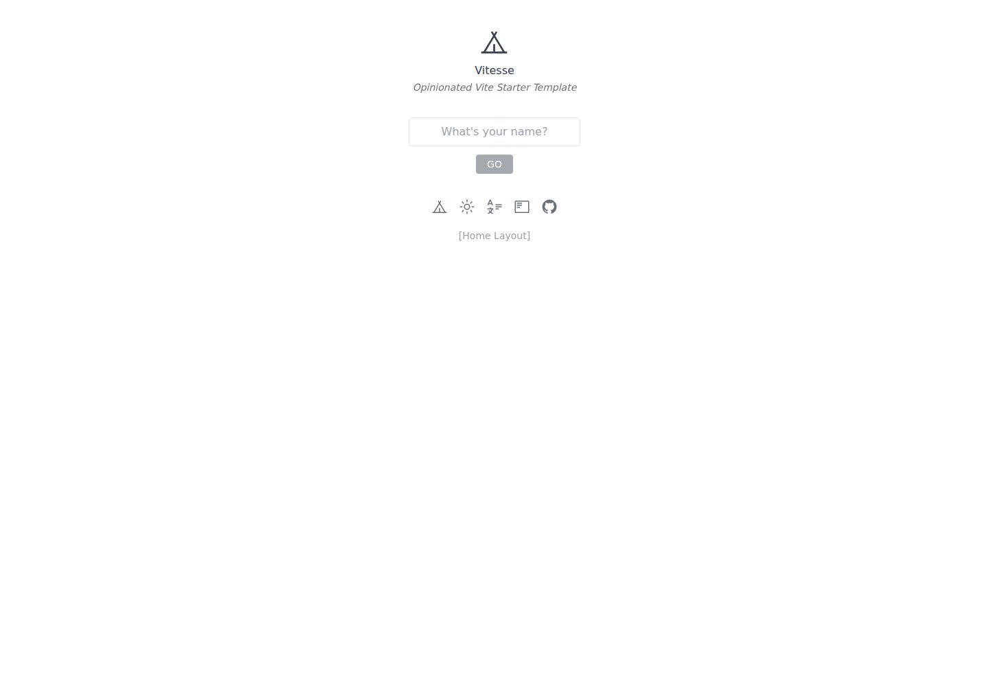
vitesse
Vitesse is an opinionated Vite + Vue 3 starter template maintained by antfu-collective, offering file-based routing, component and API auto-import, Pinia, UnoCSS, PWA, i18n, Markdown, vite-ssg, TypeScript, Vitest, and Cypress.
Vue · Starter
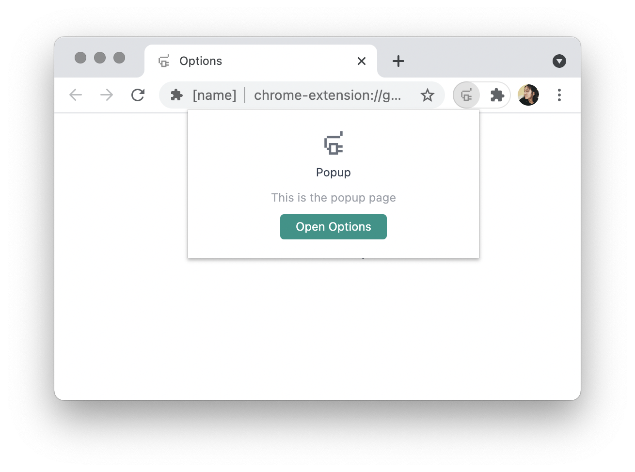
vitesse-webext
vitesse-webext is a Vite-powered WebExtension starter template using Vue 3 and TypeScript, with built-in popup, options, and content script examples. It targets Chrome and Firefox, integrates webextension-polyfill, webext-bridge, UnoCSS, VueUse, and unplugin tools, and supports hot reload during development.
Vue · Starter
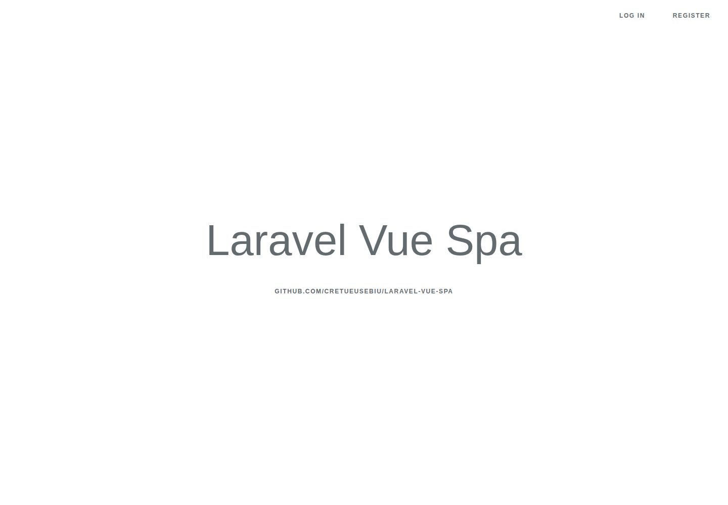
laravel-vue-spa
A Laravel + Vue SPA starter kit for quickly building a decoupled web application skeleton. It includes login, registration, email verification, and password reset flows, uses JWT for authentication, and integrates Laravel Socialite with GitHub as an example provider.
Vue · Starter
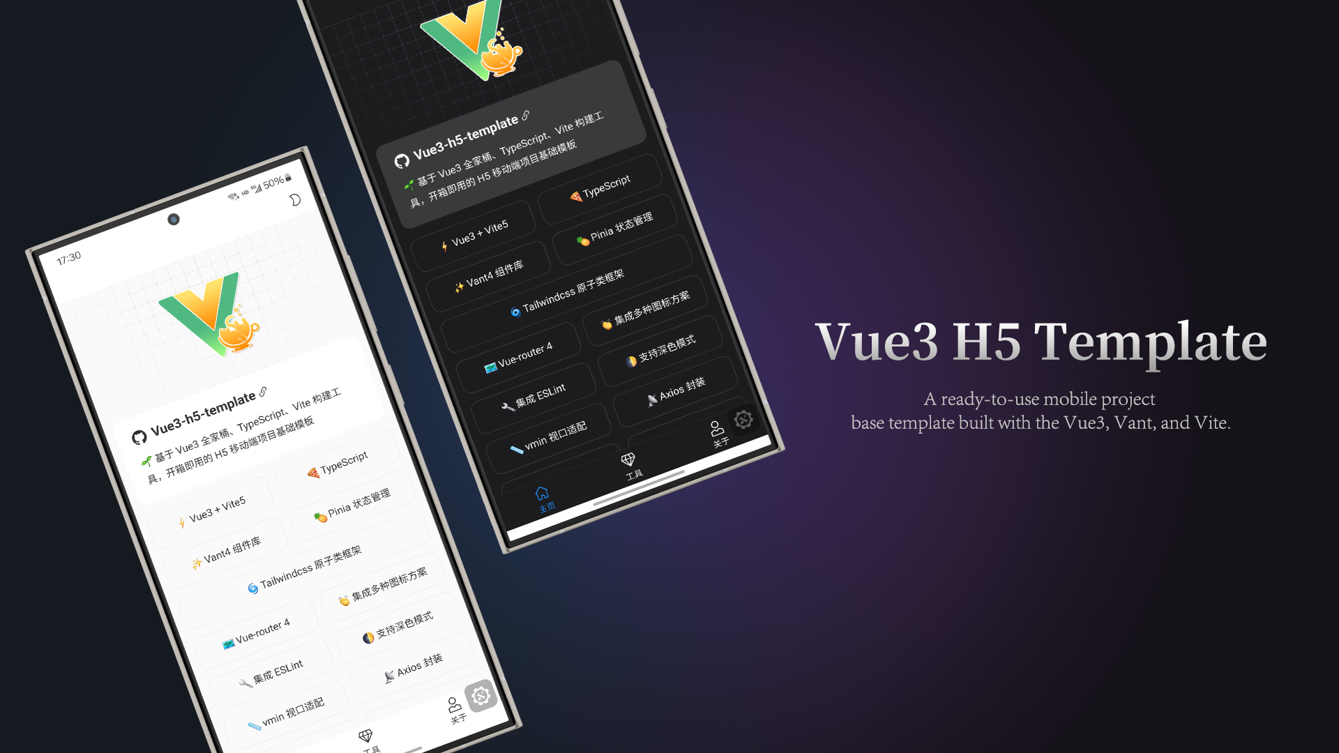
vue3-h5-template
A mobile H5 starter template built on Vue3, Vite, and Vant4, with TypeScript by default and JavaScript and i18n branches.
Vue · Starter
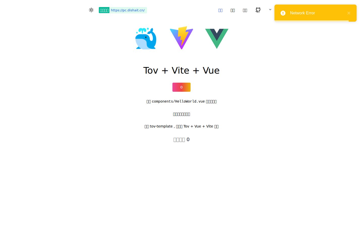
tov-template
tov-template is an MIT-licensed Vite + Vue 3 + TypeScript starter maintained by dishait. It bundles file-based routing, layouts, Mock, auto-imports, UnoCSS, Pinia, vue-request, Vitest, i18n, dark mode, Dockerfile, and engineering scripts.
Vue · Starter
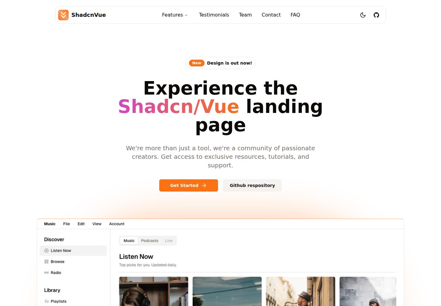
shadcn-vue-landing-page
A Vue + Shadcn-Vue + TypeScript + Tailwind landing page template with sections like Navbar, Hero, Pricing, FAQ, Team, and Contact, plus dark mode and responsive layout.
Vue · Corporate Website